What is Natural Wine Low-Fi?什么是 Natural Wine Low-Fi?
Natural Wine Low-Fi turned the scrappy warmth of a vigneron's marker into a full visual dialect — cream paper, hand-script, and pastel scribbles that feel poured rather than designed.自然酒低保真风格把酒农手中那支记号笔的粗粝温度,变成了一整套视觉方言——奶油纸、手写体与粉彩涂鸦,像是随手倒出来的,而不是设计出来的。
Natural Wine Low-Fi in briefNatural Wine Low-Fi 速览
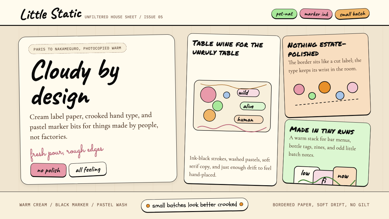
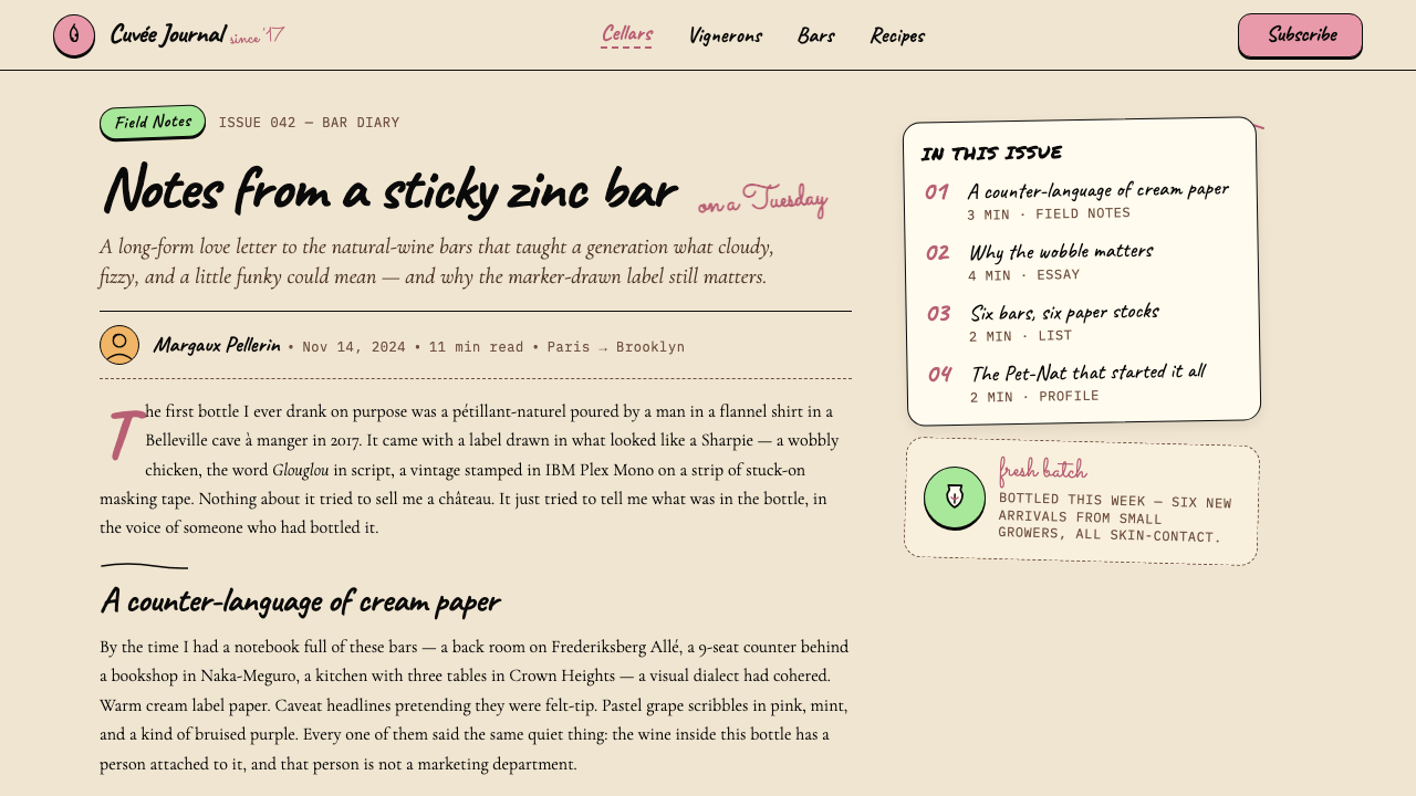
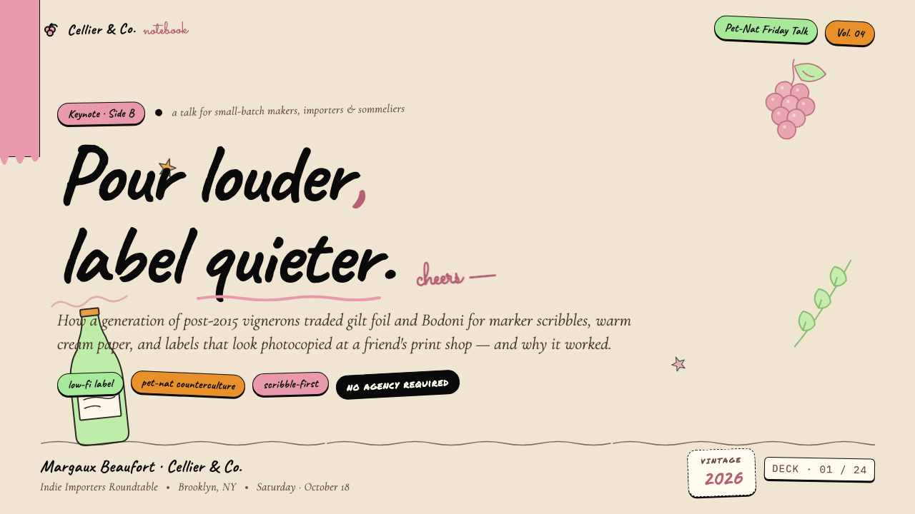
Natural Wine Low-Fi is the visual language that emerged alongside the post-2015 natural-wine bar explosion, spreading from Parisian cave à manger counters to Brooklyn bottle shops to Tokyo's orange-wine izakayas. Its hallmarks are warm cream grounds, deliberately imperfect hand-drawn linework, loose hand-script typefaces with generous letter-spacing, and small clusters of pastel-toned organic shapes scattered like stickers across a surface. Every composition feels touched rather than produced — a deliberate rejection of the polished corporate label in favor of something that looks like it was drawn on a napkin at the bar itself.自然酒低保真风格是一套随 2015 年后自然酒吧浪潮一同涌现的视觉语言,从巴黎的 cave à manger 小馆蔓延至布鲁克林的精选酒铺,再到东京的橙酒居酒屋。它的标志性元素是温润的奶油底色、刻意不规整的手绘线条、字距宽松的手写字体,以及像贴纸一样散落在画面中的粉彩有机色块。每一张构图都像是被人触摸过,而不是被生产出来——这是对精致企业酒标的刻意拒绝,转而选择一种看起来像在吧台餐巾纸上随手画就的东西。
The aesthetic occupies a specific cultural position: it signals authenticity, small-batch production, and rejection of the mainstream wine industry's heritage codes — gilt foil, Bodoni roman, formal crests, and the implied authority of a grand château. Where those conventions communicate prestige through distance, Natural Wine Low-Fi communicates trust through proximity. The doodle, the wobbly outline, the slightly-off registration of color — each of these is a deliberate gesture of approachability, the visual equivalent of a vigneron pouring you a glass across a zinc bar and saying the wine is alive.这套美学占据着一个独特的文化位置:它传递真实性、小批量生产,以及对主流葡萄酒行业传承符码的排斥——那些符码包括金箔烫印、Bodoni 正文体、正式纹章,以及大酒庄所暗示的权威感。在那些惯例以距离感传递声望的地方,自然酒低保真风格以亲近感传递信任。涂鸦、摇摆的轮廓、略微错位的色彩——每一处都是刻意的可亲近姿态,相当于一位酒农隔着锌制吧台递给你一杯酒,说这酒是活的。
Unlike minimalist design languages that also reject ornamentation, Natural Wine Low-Fi is not sparse. It is deliberately warm and tactile: textures suggest worn paper, line weights vary as if drawn freehand, color sits unevenly as if applied with a brush or crayon. The style shares DNA with independent zine culture, 1990s lo-fi music packaging, and mid-century French bistro illustration, but its contemporary form is distinctly its own — a visual shorthand instantly legible to anyone who has ever queued for a Pet-Nat at a neighborhood natural wine shop.不同于同样拒绝装饰的极简设计语言,自然酒低保真风格并不稀疏。它是刻意温暖而有触感的:纹理暗示磨损的纸张,线条粗细如手绘般起伏变化,色彩铺陈不均匀,仿佛是用画笔或蜡笔涂抹上去的。这套风格的 DNA 与独立 Zine 文化、1990 年代低保真音乐包装以及中世纪法国小酒馆插图有所交叠,但其当代形态是独属于它自己的——一种视觉简码,任何曾经在街角自然酒铺排队等一瓶 Pet-Nat 的人都能立刻读懂。
See the Natural Wine Low-Fi design system查看 Natural Wine Low-Fi 完整设计系统
Where does Natural Wine Low-Fi come from?Natural Wine Low-Fi 从何而来?
The cultural roots of Natural Wine Low-Fi lie in the natural wine movement itself, whose modern intellectual foundations were laid by Jules Chauvet — a Beaujolais négociant and chemist who began arguing in the 1950s and 1960s that wine made without sulfur additions and with minimal cellar intervention was not only possible but superior. Marcel Lapierre, Chauvet's student and neighbor in Villié-Morgon, put these ideas into practice at scale through the 1980s and became one of the movement's canonical producers. By the early 2000s, a loose international network of growers in Burgundy, the Loire Valley, Jura, and Georgia had coalesced around similar principles, and the term 'natural wine' had become shorthand for a broad counterculture stance against industrial viticulture.自然酒低保真风格的文化根源在于自然酒运动本身。这一运动的现代思想基础由朱尔·肖维奠定——这位博若莱酒商兼化学家从 1950 至 1960 年代开始主张,不添加亚硫酸盐、以最小限度酒窖干预酿造的葡萄酒不仅可行,而且更优越。肖维的学生与邻居、来自 Villié-Morgon 的马塞尔·拉皮埃尔在整个 1980 年代将这些理念付诸大规模实践,成为运动中最具标志性的酿酒人之一。到 2000 年代初,勃艮第、卢瓦尔河谷、汝拉与格鲁吉亚的一批种植者已围绕相似原则形成松散的国际网络,「自然酒」一词成为对抗工业酿造的宽泛反文化立场的简称。
The visual identity that now defines the style did not crystallize until after 2015, when natural wine bars proliferated rapidly in Paris, New York, London, Berlin, Copenhagen, and Tokyo. These venues — typically small, typically run by wine obsessives rather than hospitality professionals — created a new context for wine branding: not the shelf of a supermarket or the cellar list of a fine-dining restaurant, but a chalkboard, a paper menu, an Instagram post, a hand-labeled bottle sold to a regular. The economics of small-batch natural wine production meant that labels were often designed by the winemakers themselves or by friends with some graphic sensibility, using whatever tools were at hand. The lo-fi quality was not an aesthetic choice first — it was a production reality that became a celebrated quality.如今定义这套风格的视觉身份,直到 2015 年之后才真正凝固成形——彼时自然酒吧在巴黎、纽约、伦敦、柏林、哥本哈根与东京迅速涌现。这些场所——通常很小,通常由葡萄酒痴迷者而非餐饮业专业人士经营——为葡萄酒品牌塑造了一个全新的语境:不是超市货架或高级餐厅的酒窖单,而是黑板、纸质菜单、一条 Instagram 帖子、一瓶卖给熟客的手标酒。小批量自然酒生产的经济现实意味着酒标往往由酿酒人自己或有些美术感觉的朋友设计,用手边随便什么工具完成。低保真品质首先不是美学选择,而是生产现实——然后这种现实变成了一种被珍视的品质。
Isabelle Legeron MW, who founded RAW WINE in 2012 and became arguably the most visible international advocate for natural wine, helped formalize the movement's public identity at a moment when its visual codes were still fluid. The fairs and publications she championed created a concentrated visual culture — the same hand-drawn animals, loose scripts, and warm cream tones appearing across hundreds of small producers from dozens of countries. This cross-pollination, amplified by Instagram from roughly 2016 onward, accelerated the consolidation of the aesthetic into a recognizable genre.2012 年创立 RAW WINE 的伊莎贝尔·勒让 MW,成为自然酒运动最具国际能见度的倡导者之一,她在这套视觉符码仍处于流动状态时帮助将运动的公众形象正式化。她所推动的展会与出版物创造了一种集中的视觉文化——来自数十个国家的数百位小型酒农使用着相同的手绘动物、松散手写体与温润奶油色调。这种交叉感染从 2016 年前后经由 Instagram 放大,加速了这套美学固化为可辨识风格的过程。
By 2020, Natural Wine Low-Fi had been fully canonized as a style — not just for wine labels but as a broader visual language applied to natural food shops, third-wave coffee bars, independent bookshops, and any brand that wanted to signal the same values of authenticity, craft, and gentle irreverence toward polish. The style's adoption beyond wine is the clearest marker of its cultural success: it had escaped its origin context and become a broadly legible code for a certain kind of contemporary earnestness.到 2020 年,自然酒低保真风格已被完全规范化为一种风格——不仅适用于酒标,更作为更广泛的视觉语言,被应用于自然食品店、第三波咖啡馆、独立书店,以及任何想传递真实性、手作感与对精致感的温柔不驯的品牌。这种风格在葡萄酒之外的广泛采用,是其文化成功最清晰的标志:它已经逃逸出原始语境,成为当代某种真诚姿态的广泛可读符码。
What defines the Natural Wine Low-Fi look?Natural Wine Low-Fi 的视觉特征是什么?
Color Palette色彩基调
The foundational ground is warm cream — not white, never stark — evoking uncoated label paper, aged newsprint, or the inside of a cardboard wine box. On top of this ground, colors are drawn from a muted pastel register: dusty terracotta, sage green, soft coral, pale mustard, and washed lavender. These are never saturated or neon; they look as though they have been sitting in sunlight for a season. Occasional pops of deeper, earthier tone — wine red, bottle green, inky plum — anchor the palette without tipping into formality.底色是温润的奶油色——不是白色,绝不是冷白——唤起无涂层酒标纸、陈旧新闻纸或纸板酒箱内壁的质感。在这个底色之上,色彩来自一个低饱和的粉彩音域:暗赭红、鼠尾草绿、柔珊瑚、淡芥末黄与洗白薰衣草紫。这些颜色从不饱和、从不荧光;它们看起来像在阳光下晒了一整季。偶尔出现的更深、更质朴的色调——酒红、瓶绿、墨李紫——在不滑入正式感的前提下锚定整体色盘。
Hand-Script Typography手写字体排印
Typefaces feel written rather than set. Hand-script styles with irregular baseline, variable stroke width, and visible pen pressure are canonical — the letters seem to breathe and lean. Letter-spacing is generous to the point of looseness, giving each word room to exist on the page without crowding. When a second typeface appears, it is often a roughened or slightly distressed version of a simple roman or grotesque, rather than a formal second family. Hierarchy is established through size and weight variation rather than through a strict typographic system.字体感觉是写出来的,而不是排出来的。基线不规整、笔画粗细变化、可以看到笔压痕迹的手写风格是标准配置——字母像在呼吸,像在倾斜。字距宽松到近乎散漫,让每个词都有足够的空间在页面上存在,互不拥挤。当第二种字体出现时,通常是一种略显粗糙或轻微做旧的简单罗马体或无衬线体,而不是正式的第二字体家族。层级通过尺寸与字重变化来建立,而不是通过严格的排印系统。
Doodle and Hand-Drawn Motifs涂鸦与手绘图案
Illustration is central rather than decorative, and it is deliberately imperfect. Grapes, bottles, vines, small animals — rabbits, roosters, donkeys, snails — and abstract botanical shapes appear as quick sketches rather than finished drawings. Lines wobble, proportions are naive, hatching is inconsistent. The effect is intimate and human, recalling the kind of drawing you might find on a winemaker's personal correspondence or a handwritten chalk menu. Illustration is never photorealistic, never vector-clean; it looks like it was drawn in a single sitting with a felt-tip pen.插图是核心而非装饰,且刻意不完美。葡萄、酒瓶、葡萄藤、小动物——兔子、公鸡、驴、蜗牛——以及抽象植物形状,以快速草图而非完成作品的形态出现。线条摇摆,比例朴拙,排线不均匀。效果亲密而有人情味,让人想起酒农私人信件上的那种涂鸦,或黑板菜单上的手写画。插图绝不写实,绝不像矢量图那样干净;它看起来像是用毡头笔一口气画完的。
Tactile Texture and Surface触感纹理与表面质感
Even in digital applications, the style simulates physical surface. Backgrounds carry a subtle paper grain or linen texture rather than rendering as flat digital white. Color blocks have slightly uneven edges, as though applied with a broad brush stroke. This textural quality — roughness, grain, the suggestion of physical material — is essential to the warmth of the aesthetic. It signals handmade process and resists the pristine finish associated with corporate production, even when the actual medium is a screen or a printed offset sheet.即便在数字应用中,这套风格也模拟物理表面。背景带有微妙的纸张颗粒感或亚麻纹理,而不是平坦的数字白色。色块的边缘略显不均匀,仿佛用宽笔刷涂抹而成。这种纹理品质——粗糙感、颗粒感、物质材料的暗示——对于这套美学的温度至关重要。即便实际介质是屏幕或平版印刷纸张,它依然传递手工制作的过程感,抗拒与企业生产相关联的光洁完美。
Loose Geometric Accents松散几何点缀
Scattered across compositions are small, irregular geometric shapes — ovals, rounded rectangles, rough circles — used as sticker-like color fields or label backgrounds. These shapes are not precisely drawn; they have the quality of a quick brush mark or a torn piece of colored paper collaged onto the surface. They function as compositional anchors and color carriers without imposing the rigidity of a formal grid. Their informal placement — slightly tilted, slightly overlapping text — reinforces the lo-fi, handmade register.构图中散落着小型不规整几何形——椭圆、圆角矩形、粗略的圆——用作贴纸般的色彩色块或标签底版。这些形状不是精确绘制的;它们有快速笔刷留下的印记感,或像一块撕下来的彩纸拼贴上去。它们充当构图锚点和色彩载体,却不会施加正式网格的严整感。它们随意的摆放——略微倾斜、与文字略有重叠——强化了低保真、手工制作的整体调性。
Restrained Imperfection克制的不完美
The lo-fi quality is controlled, not chaotic. Natural Wine Low-Fi is not grunge, not deliberately ugly, and not maximalist. Its imperfections are curated: a slightly uneven baseline here, a wobbly line there, a color block with a rough edge — but the overall composition reads clearly and the hierarchy holds. The style occupies a precise middle ground between artisanal authenticity and graphic legibility. Too polished and it loses warmth; too rough and it loses readability. The discipline is knowing exactly how much imperfection signals sincerity without tipping into affectation.低保真品质是受控的,而不是混乱的。自然酒低保真风格不是垃圾风,不是刻意丑陋,也不是最大化主义。它的不完美是经过筛选的:这里一条略显不均匀的基线,那里一根摇摆的线条,一个边缘粗糙的色块——但整体构图依然清晰可读,层级依然成立。这套风格精确地占据了手工真实性与图形可读性之间的中间地带。太精致则失去温度;太粗糙则失去可读性。这里的功力在于精确拿捏:不完美到何种程度能传递真诚,而不会滑入矫饰。
Anti-Corporate Composition反企业构图逻辑
Layouts resist the centered, symmetrical formality of conventional luxury wine design. Compositions are casual and slightly off-balance — a label that bleeds to one edge, a title that sits unexpectedly low, white space used generously but not architecturally. There is no sense of a rigid grid enforcing order. Instead, elements relate to each other with the looseness of a sketchbook page or a handwritten card. This informality is not accidental; it encodes the cultural values of the natural wine world — independence, human scale, skepticism of institutional authority — directly into the visual structure.版面布局抗拒传统奢侈葡萄酒设计那种居中、对称的正式感。构图随意而略显失衡——一张出血到某一边缘的酒标,一个位置出人意料地偏低的标题,留白用得慷慨但没有建筑感。没有严格网格强制秩序的感觉。取而代之,各元素之间的关系带着速写本或手写卡片的松散感。这种随意性不是偶然的;它把自然酒世界的文化价值——独立性、人的尺度、对机构权威的怀疑——直接编码进视觉结构之中。
See the Natural Wine Low-Fi design system查看 Natural Wine Low-Fi 完整设计系统
Who shaped Natural Wine Low-Fi?谁塑造了 Natural Wine Low-Fi?
A Beaujolais négociant, chemist, and jazz pianist, Chauvet began articulating the case for sulfur-free, unmanipulated wine in the 1950s. Working from his laboratory in La Chapelle-de-Guinchay, he combined rigorous enological science with a romantic commitment to expressing terroir without technological mediation. His ideas circulated informally for decades before the broader natural wine movement gave them mainstream traction. Chauvet never sought celebrity, but the visual culture that now defines natural wine — humble, handmade, anti-monumental — could be read as a portrait of his working method.朱尔·肖维是一位博若莱酒商、化学家与爵士钢琴家,从 1950 年代起开始系统阐述不添加亚硫酸盐、不干预酿造的理念。他在 La Chapelle-de-Guinchay 的实验室里将严谨的酿酒科学与对风土表达的浪漫信念结合在一起。他的思想以非正式方式流传数十年,直到更广泛的自然酒运动赋予它主流影响力。肖维从不追求名声,但如今定义自然酒的视觉文化——谦逊、手工、反纪念碑感——可以被理解为他工作方式的一幅肖像。
Lapierre was Chauvet's most celebrated student and the figure most responsible for translating natural wine philosophy into a viable commercial reality. His domaine in Villié-Morgon produced Morgon bottlings that became reference points for the movement globally. The labels of his wines — unpretentious, quietly idiosyncratic — became templates of a kind: proof that a wine bottle could communicate authenticity without borrowing the visual grammar of prestige. His cellar and his table became meeting points for winemakers across France and beyond, and the informal, communal culture he fostered is inseparable from the aesthetic that developed around it.拉皮埃尔是肖维最著名的学生,也是最有力地将自然酒哲学转化为可行商业现实的人物。他在 Villié-Morgon 的酒庄出产的 Morgon 装瓶成为全球运动的参照点。他的酒标——不矫饰、安静地带有个性——成为一种模板:证明一只酒瓶可以不借用声望的视觉语法而传递真实性。他的酒窖与餐桌成为法国及更远地方酿酒人的聚集点,他所培育的随意、共同的文化与围绕它发展起来的美学不可分割。
Legeron founded RAW WINE in 2012, creating the first dedicated international fair for natural, organic, and biodynamic wines. Beyond organizing events, she authored the book Natural Wine (2014), which gave the movement a coherent public narrative at a critical moment of growth. Her work created a concentrated visual and cultural milieu — hundreds of small producers from dozens of countries assembled in one context — that accelerated the consolidation of Natural Wine Low-Fi into a recognizable, cross-national aesthetic. She represents the movement's editorial and institutional layer, the force that helped scattered visual impulses cohere into a style.勒让于 2012 年创立 RAW WINE,打造了第一个专门面向自然酒、有机酒与生物动力法葡萄酒的国际展会。除组织活动外,她还于 2014 年出版了《Natural Wine》一书,在运动快速成长的关键时刻赋予它连贯的公众叙事。她的工作创造了一个集中的视觉与文化场域——来自数十个国家的数百位小型酒农汇聚于同一语境——加速了自然酒低保真风格固化为可辨识的跨国美学的过程。她代表了这一运动的编辑与机构层面,是帮助分散的视觉冲动凝聚为风格的力量。
The American wine writer and journalist Alice Feiring has been one of the movement's most persistent English-language advocates since her 2008 book The Battle for Wine and Love. Her writing — personal, polemical, and grounded in the sensory specificity of individual bottles and people — helped shape the natural wine world's self-image as anti-establishment and deeply human. Her voice contributed to the cultural register that the Low-Fi aesthetic expresses visually: the preference for the particular over the generic, the handmade over the manufactured, the story of a person over the authority of an institution.美国葡萄酒作家与记者爱丽丝·菲林自 2008 年出版《The Battle for Wine and Love》以来,一直是这一运动最持久的英语倡导者之一。她的写作——个人化、论战性,植根于具体酒瓶与具体人物的感官特殊性——帮助塑造了自然酒世界的自我形象:反建制,深度人文。她的声音为低保真美学在视觉上所表达的文化音域作出了贡献:偏爱特殊而非通用,偏爱手工而非制造,偏爱一个人的故事而非机构的权威。
Brochet is the founder of Château Feely and Ampelidae, and an early practitioner of biodynamic viticulture in the Loire Valley whose label designs became quiet touchstones of the lo-fi aesthetic. His bottlings — featuring hand-drawn lettering and simple illustrations of birds and botanical elements on uncoated paper — were among the first to demonstrate that the natural wine label could be a complete visual statement without the apparatus of conventional prestige. His work influenced a generation of winemakers who came after him in deciding that their labels should look like letters written to a friend rather than entries in a wine competition.布罗谢是 Château Feely 与 Ampelidae 的创始人,也是卢瓦尔河谷生物动力法葡萄栽培的早期实践者,他的酒标设计成为低保真美学安静的参照点。他的装瓶——在无涂层纸上配以手写字母与鸟类及植物元素的简单插图——是最早证明自然酒标签可以成为完整视觉陈述的案例之一,完全不依赖传统声望的全套装备。他的工作影响了继他而来的一代酿酒人,令他们决定自己的酒标应该看起来像写给朋友的信,而不是参加葡萄酒大赛的参赛作品。
How do you use Natural Wine Low-Fi today?今天怎么用 Natural Wine Low-Fi?
Natural Wine Low-Fi translates most naturally into contexts where warmth, craft, and a gentle anti-establishment attitude are core brand values. The fundamental application principle is the same as it is for the wine labels that originated the style: every design decision should feel like it could have been made by a person, not a committee. Loose hand-script headings, cream paper textures, slightly-tilted label shapes, and small doodle motifs are the vocabulary — but they must be deployed with restraint, not crammed together at maximum density.自然酒低保真风格最自然地转化为那些以温暖感、手作感与温柔的反建制姿态为核心品牌价值的语境。其基本应用原则与催生这套风格的酒标相同:每一个设计决策都应该感觉像是某个人做出的,而不是某个委员会。松散的手写体标题、奶油纸张纹理、略微倾斜的标签形状与小涂鸦图案是这套词汇——但必须克制地运用,而不是以最大密度堆砌在一起。
For presentation slides, the style works best when the deck has a low-formality context: a pitch for an artisan food brand, a portfolio presentation for an independent creative practice, a workshop for a community organization. Cover slides benefit from a generous cream ground with a single large hand-drawn illustration — a botanical motif, an animal sketch — offset asymmetrically against a hand-script title. Content slides should stay open: one or two text blocks set in a loose hand-script or roughened grotesque, with pastel color shapes used sparingly as section markers or pull-quote backgrounds. Data slides are the trickiest; charts should be treated as hand-drawn objects with imperfect lines and muted fill colors from the pastel palette, with annotations in a casual script rather than a formal label style.对于演示文稿,这套风格在低正式度语境下效果最好:一个手工食品品牌的融资路演、一个独立创意实践的作品集展示、一个社区组织的工作坊。封面幻灯片适合用宽裕的奶油底色搭配一张大型手绘插图——植物图案、动物素描——以不对称方式偏置于手写体标题旁。内容幻灯片应保持开放感:一到两段文字以松散手写体或略显粗糙的无衬线字体排列,粉彩色块仅作为章节标记或引用语底版克制使用。数据幻灯片最为棘手;图表应被处理为手绘对象,用不完美的线条和粉彩色盘中的低饱和填色,用随意的手写风格标注而非正式的数据标签。
For web interfaces, the style is well-suited to e-commerce storefronts for artisan food and drink brands, restaurant and wine bar websites, wellness and organic lifestyle landing pages, and any digital product that wants to communicate warmth and human scale against the polished sterility of conventional consumer tech. The approach: use a cream or warm off-white background throughout, avoid drop shadows with soft blur in favor of hard-edge or no-shadow treatments, set body text in a simple readable typeface and reserve hand-script for headings and accent labels only. Navigation should be typographic and casual. Buttons and calls to action work as rough-edged color shapes rather than polished pill forms. Photography, if used, should feel candid and grain-textured rather than studio-lit.对于网页界面,这套风格非常适合手工食品与饮料品牌的电商店面、餐厅与自然酒吧网站、健康与有机生活方式落地页,以及任何想在传统消费科技那种光洁无菌感之外传递温暖与人的尺度的数字产品。方法:全程使用奶油色或温暖的米白色背景,避免柔化模糊的投影,改用硬边或无投影处理;正文选用简单可读的字体,手写体仅保留给标题与点缀标签;导航应字体化而随意;按钮与行动号召以粗糙边缘的色彩形状呈现,而不是抛光的胶囊形态;若使用摄影图像,应感觉像随手抓拍、带有颗粒感,而不是棚拍打光。
For editorial and marketing work — magazine spreads, brand identity systems, social cards, packaging copy — the style carries best when it leans into the specific visual vocabulary of the source culture: the wine bar chalkboard, the market stall hand-label, the small-batch bottle with a hand-numbered tag. A brand identity system built on Natural Wine Low-Fi works best when it has one dominant warm neutral ground, one or two signature pastel accent colors used consistently, a single hand-script or quasi-hand typeface for display use, and a simple motif — an animal, a fruit, a botanical — that recurs across touchpoints. Social cards and promotional graphics benefit from a single centered or slightly-off-center illustration with a loose hand-lettered phrase, on a cream or pale pastel ground, with minimal other elements.对于编辑与营销内容——杂志展开页、品牌视觉识别系统、社交卡片、包装文案——当这套风格倾向于其来源文化的具体视觉词汇时效果最佳:自然酒吧的黑板、市集摊位的手写标签、小批量装瓶上手写编号的标签。建立在自然酒低保真风格上的品牌视觉识别系统,在以下情况下效果最好:有一个主导的温暖中性底色,一到两种一致使用的标志性粉彩强调色,一种用于展示用途的单一手写或准手写字体,以及一个在各触点反复出现的简单图案——动物、水果或植物。社交卡片与推广图形适合在奶油或浅粉彩底色上呈现单一居中或略微偏置的插图,配以松散的手写体短句,其他元素保持最少。
The most common mistake when applying this style is mistaking imperfection for anything-goes looseness. Natural Wine Low-Fi has a precise emotional register — warm, earnest, quietly confident — and designs that overshoot into chaos or undershoot into conventional clean minimalism both miss it. A second common mistake is over-texturing: layering grain on grain, adding multiple distressed elements, burying the composition under too much lo-fi signal. The texture and imperfection should be light — enough to read as handmade, not so much that it reads as degraded. A third mistake is applying the palette incorrectly: the muted pastels should sit against warm cream, not against pure white or gray, because the warmth of the ground is what makes the pastels feel organic rather than washed-out.应用这套风格时最常见的错误,是把不完美误解为随意散漫。自然酒低保真风格有一个精确的情感音域——温暖、真诚、安静地自信——过于混乱或过于退回到传统干净极简主义的设计,都会错过它。第二个常见错误是过度叠加纹理:层层叠加颗粒感,添加多个做旧元素,把构图埋在过多低保真信号之下。纹理与不完美应该是轻的——足以被读作手工感,但不至于被读作劣化。第三个错误是错误应用色盘:低饱和粉彩应该坐落在温润奶油色上,而不是纯白或灰色上,因为底色的温度正是让粉彩感觉有机而非褪色的关键。
See the Natural Wine Low-Fi design system查看 Natural Wine Low-Fi 完整设计系统
Natural Wine Low-Fi — FAQNatural Wine Low-Fi · 常见问题
Is Natural Wine Low-Fi the same as general lo-fi or indie design?自然酒低保真风格和一般的低保真风格或独立设计是同一回事吗?
They share influences — zine culture, DIY music packaging, craft print aesthetics — but Natural Wine Low-Fi is a distinct genre with a specific palette, a specific illustration vocabulary (grapes, animals, botanicals), and a specific cultural context. General lo-fi design covers a much broader range from pixel art to cassette-tape nostalgia to hand-stamped stationery. Natural Wine Low-Fi is warm and pastoral rather than nostalgic for technology; it evokes countryside and cellar rather than bedroom studios or record shops. The cream ground, the muted pastel accents, the particular looseness of its composition, and the consistent reference to vineyards and drink culture give it a specificity that distinguishes it from lo-fi as a broad category.它们共享一些来源——Zine 文化、DIY 音乐包装、手工印刷美学——但自然酒低保真风格是一个独特的流派,拥有特定的色盘、特定的插图词汇(葡萄、动物、植物)以及特定的文化语境。一般的低保真设计涵盖更宽泛的范围,从像素艺术到卡带怀旧感再到手工钢印文具。自然酒低保真风格是温暖而田园感的,而非对某种技术的怀旧;它唤起的是乡村与酒窖,而非卧室录音棚或唱片店。奶油底色、低饱和粉彩强调色、构图特有的松散感,以及对葡萄园与饮酒文化的持续参照,赋予它一种特殊性,使其区别于低保真作为宽泛类别的含义。
Can this style work for brands outside food and drink?这套风格能用于食品饮料之外的品牌吗?
Yes, and it increasingly does. By 2020 the style had migrated to independent bookshops, slow-fashion brands, wellness and skincare companies, organic household goods, and third-wave coffee bars — anywhere that the same cluster of values applies: authenticity, small-batch quality, craft process, and skepticism of corporate polish. The key test is not product category but value alignment. If a brand's core proposition involves human craft, transparency about process, and a warm relationship with the customer, Natural Wine Low-Fi can translate. It does not work well for brands whose core proposition is efficiency, authority, or technical precision — the warmth and imperfection of the style actively undermine those signals.是的,而且越来越多地如此。到 2020 年,这套风格已经迁移到独立书店、慢时尚品牌、健康与护肤公司、有机家居用品和第三波咖啡馆——任何同一价值集群适用的地方:真实性、小批量品质、手工过程,以及对企业精致感的怀疑。关键的测试标准不是产品类别,而是价值对齐。如果一个品牌的核心主张涉及人的手作、过程的透明,以及与客户的温暖关系,自然酒低保真风格就可以转化。它不适合那些核心主张是效率、权威或技术精度的品牌——这套风格的温暖感与不完美会主动削弱那些信号。
How do I avoid the style looking like a pastiche or a trend-chasing imitation?如何避免这套风格看起来像是拙劣模仿或追赶潮流的山寨版?
The difference between authentic application and pastiche is almost always specificity. Pastiche grabs the surface markers — cream, hand-script, a doodle — and combines them generically. Authentic work chooses each element because of what it communicates in this particular context, for this particular brand, about this particular set of values. That means the illustration motif should be specific to the brand's world rather than drawn from a stock vocabulary of wine clichés. It means the color palette should have a rationale — perhaps drawn from the actual colors of the product or place — rather than being borrowed wholesale from what looks like the style. It also means restraint: the fewer lo-fi signals a design uses, the more each one reads as considered rather than decorative. One distinctive imperfection outweighs ten generic ones.真实应用与拙劣模仿之间的差异几乎总是特殊性。模仿抓取表面标记——奶油色、手写体、一个涂鸦——然后通用地组合。真实的作品选择每个元素,是因为它在这个特定语境下,对这个特定品牌,关于这套特定价值,所传达的内容。这意味着插图图案应该特定于品牌的世界,而不是从葡萄酒陈词滥调的库存词汇中取用。这意味着色盘应该有一个理由——也许来源于产品或地点的实际颜色——而不是整套借用自看起来像是这种风格的东西。这也意味着克制:一个设计使用的低保真信号越少,每一个就越像是经过考量的,而非装饰性的。一个有特色的不完美胜过十个通用的不完美。
Does Natural Wine Low-Fi work in dark-mode or dark-background layouts?自然酒低保真风格能用在暗黑模式或深色背景版面中吗?
Rarely, and with significant caveats. The style's warmth is fundamentally dependent on the cream ground — it is what makes the muted pastels read as organic and generous rather than cold and washed-out. A dark inversion strips out that warmth and leaves only the imperfection, which without the cream ground tends to read as grungy rather than artisanal. If a dark variant is required, the most workable approach is to shift the ground from cream to a very dark warm tone — deep brown, charcoal with warmth — and to restrict the palette to one or two lighter accent tones. The hand-drawn illustration style and loose typography can survive the inversion; the pastel color palette mostly cannot.很少,且有显著限制。这套风格的温暖感从根本上依赖于奶油色底色——正是它让低饱和粉彩读起来有机而慷慨,而不是冷淡而褪色。深色反转剥去了那种温暖,只留下不完美感,而没有奶油底色的不完美感往往读作颓废感而非手工感。如果必须使用深色变体,最可行的方案是将底色从奶油色转移到一种非常深的暖色调——深棕色、带暖意的炭灰色——并将色盘限制为一到两种更浅的强调色调。手绘插图风格与松散排印可以在反转中存活;粉彩色盘大多不能。
How many lo-fi signals should appear in a single composition?单一构图中应该出现多少个低保真信号?
As few as necessary. The most common overuse pattern is stacking every marker simultaneously: cream ground plus heavy grain texture plus hand-script headline plus wobbly illustration plus rough-edge color shape plus distressed border plus off-register second color. At that density, the signals cancel each other out and the composition reads as chaotic rather than warm. A considered Natural Wine Low-Fi composition typically uses two or three lo-fi signals at most — perhaps a hand-script headline, a single hand-drawn motif, and a cream paper texture — and lets the simplicity of those choices carry the register. The warmth of the style comes from the quality and specificity of each individual decision, not from the quantity of decisions stacked.越少越好。最常见的滥用模式是同时堆叠每一个标记:奶油底色加上厚重颗粒纹理加上手写体标题加上摇摆插图加上粗糙边缘色块加上做旧边框加上错位第二颜色。在那种密度下,各种信号相互抵消,构图读起来混乱而非温暖。一个经过考量的自然酒低保真构图通常最多使用两到三个低保真信号——也许是手写体标题、单一手绘图案和奶油纸张纹理——让这些选择的简洁性来承载整体调性。这套风格的温暖感来自每个单独决策的品质与特殊性,而不是来自叠加的决策数量。
Related design styles相关设计风格
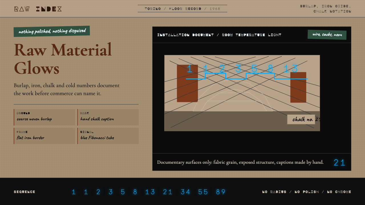 Arte Povera (Merz, 1968)Material refuses polish. Burlap ground, rust serif, chalk marks, neon Fibonac…材料拒绝抛光:麻布底、铁锈衬线、粉笔标注与霓虹斐波那契。
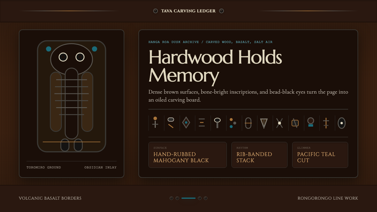 Chilean Rapa Nui Toromiro (Easter Island)Ancient weight, dusk-lit. Toromiro brown, Cinzel capitals, rib bands, obsidia…古老而沉重:托罗米罗褐、Cinzel碑文体、肋骨横带与黑曜石珠。
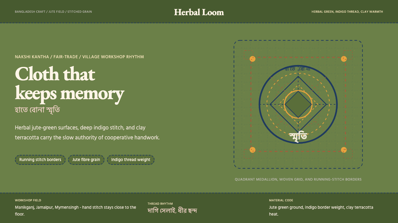 Bangladeshi Jute CraftMemory stays stitched. Jute green, indigo borders, terracotta warmth.记忆被缝进画面。黄麻绿、靛蓝虚线、陶土暖调。
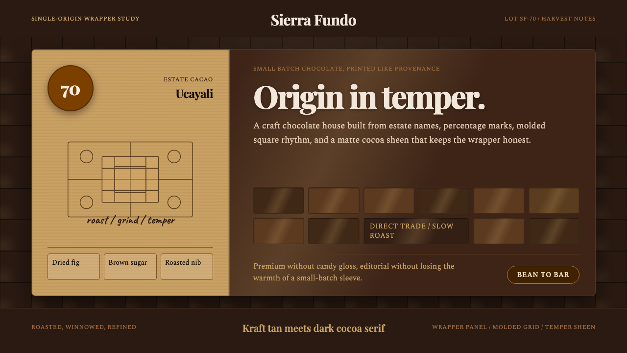 Bean-to-Bar ChocolateOrigin tastes tactile. Cocoa serif, kraft panel, and molded squares carry the…产地感可触:可可衬线、牛皮纸面板与巧克力方格讲述手作。
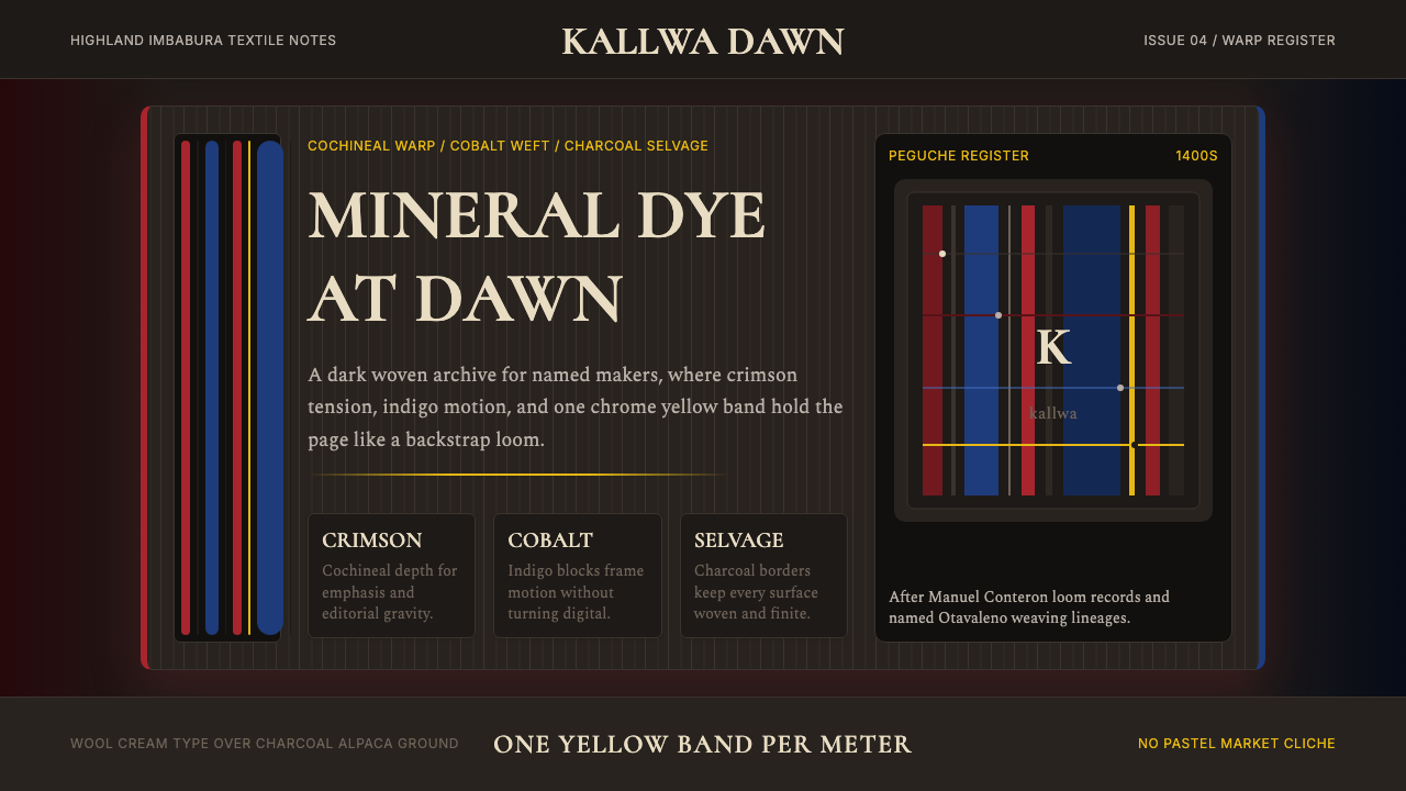 Ecuadorian Otavalo Cochineal LoomHandwoven gravity. Cochineal and cobalt stripes tense against charcoal, cut b…手织般厚重:胭脂红与钴蓝经纬压在炭黑上,只留一条铬黄线。
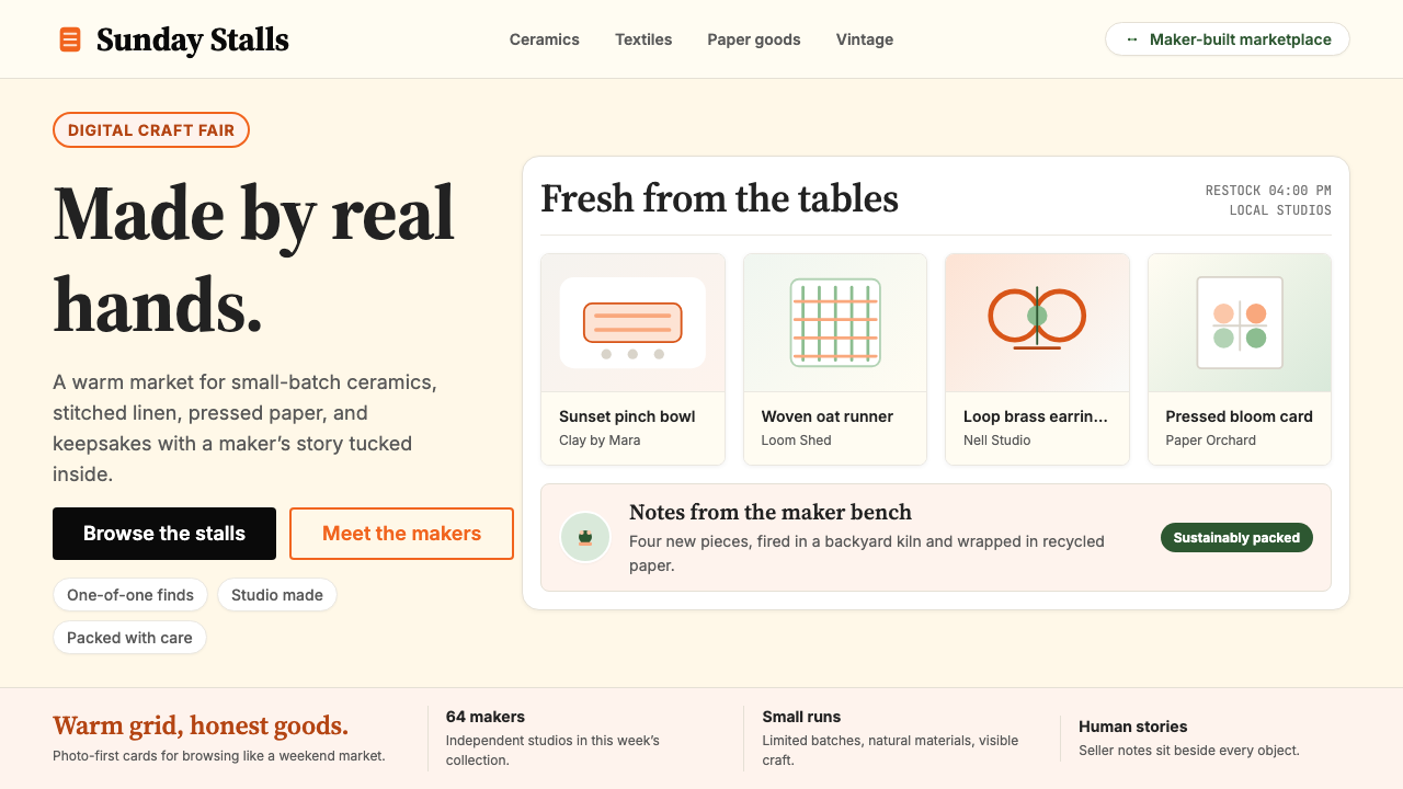 Etsy HandmadeA digital craft fair, in orange. Hand-drawn accents, cream backgrounds, delib…数字时代的手工艺集市:标志性 Etsy 橙、奶油底色、手绘插画点缀——每件物品…