What is Etsy Handmade?什么是 Etsy Handmade?
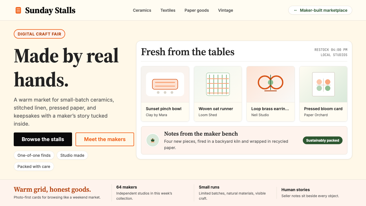
Etsy Handmade turns digital commerce into a craft fair — warm orange, cream grounds, and hand-drawn accents signal that every item was made by a real person.Etsy Handmade 将数字商业变成一场手工艺集市——温暖的橙色、奶油底色与手绘点缀,无声诉说着每件物品背后真实的双手。
Etsy Handmade in briefEtsy Handmade 速览
Etsy Handmade is the visual design language of the Etsy marketplace — a system built around warmth, authenticity, and deliberate imperfection. Where most e-commerce platforms pursue corporate neutrality, Etsy's aesthetic leans in the opposite direction: cream and warm white backgrounds, a signature orange that reads like kiln-fired clay, serif typefaces that evoke letterpress printing, and photography that looks like it was shot at a maker's market stall rather than a professional studio.Etsy Handmade 是 Etsy 市场平台的视觉设计语言——一套围绕温暖、真实与刻意不完美建立起来的视觉体系。大多数电商平台追求企业化的中性风格,而 Etsy 的审美却走向了相反的方向:奶油与暖白底色、一种如同窑烧陶土般的标志性橙色、让人联想到凸版印刷的衬线字体,以及看起来像是在手作市集摊位拍摄而非专业摄影棚完成的产品照片。
The style is defined as much by what it refuses as by what it employs. High-gloss finishes, cool grays, hard-edged geometric minimalism, and the visual vocabulary of enterprise software are all consciously absent. In their place are organic edges, hand-drawn illustration accents, tactile product photography, and a typography palette that mixes serif warmth with readable sans-serif practicality. The overall impression is of a platform that values human involvement over automated efficiency.这种风格与其说由使用了什么定义,不如说由拒绝了什么来定义。高光泽质感、冷灰色调、硬边几何极简主义以及企业软件的视觉语汇,全部被刻意回避。取而代之的是有机边线、手绘插图点缀、具有触感的产品摄影,以及将衬线字体的温度与无衬线字体的可读性融合在一起的字体组合。整体印象是:这是一个将人的参与置于自动化效率之上的平台。
Etsy Handmade is not folk art or nostalgia for its own sake. It is a carefully engineered brand language that uses approachability and craft cues to build trust with a specific audience: buyers who consciously prefer goods with a story over commodities with a price tag. Every visual decision — the warmth of the orange, the deliberate imperfection in illustrated accents, the unhurried breathing room in product layouts — reinforces that the marketplace is governed by human hands, not algorithms.Etsy Handmade 不是民间艺术,也不是纯粹的怀旧情绪。它是一套经过精心设计的品牌语言,借助亲近感与手工艺线索,在特定受众群体中建立信任——这些买家有意选择有故事的商品,而非有价格的商品。每一个视觉决策——橙色的暖度、插图点缀中刻意保留的不完美、产品版面中不急迫的呼吸空间——都在强化同一个信息:这个市场由人的双手而非算法主宰。
Where does Etsy Handmade come from?Etsy Handmade 从何而来?
Etsy was founded in June 2005 by Rob Kalin, Chris Maguire, and Haim Schoppik in a Brooklyn apartment. Kalin, a furniture maker and photographer, conceived the platform as a direct response to what he saw as the soullessness of mainstream e-commerce. The name 'Etsy' had no particular prior meaning — Kalin later said he wanted a nonsense word that would be easy to trademark and remember — but the visual identity he and the early team assembled was anything but arbitrary. It drew on the visual culture of independent craft markets, letterpress revival printing, and the indie-craft movement that had been building momentum in American cities since the late 1990s.Etsy 于2005年6月由 Rob Kalin、Chris Maguire 和 Haim Schoppik 在布鲁克林的一间公寓里创立。Kalin 是一位家具匠兼摄影师,他构想这个平台是对主流电商平台在他眼中缺乏灵魂的直接回应。「Etsy」这个名字本无特定含义——Kalin 后来说他想要一个容易商标注册和记忆的无意义词——但他和早期团队构建的视觉身份却绝非随意。它汲取了独立手工艺市集、凸版印刷复兴运动以及自1990年代末在美国城市中积聚能量的独立手工艺运动的视觉文化。
The indie-craft movement, which found its clearest expression in events like the Renegade Craft Fair (founded in Chicago in 2003) and publications like Craft magazine (launched by O'Reilly Media in 2006), positioned handmade goods as a form of cultural and economic resistance to mass production. This was not nostalgia alone — it carried a genuine political dimension, linked to anti-globalization sentiment and the emerging 'buy local' consciousness. Etsy's visual language absorbed this context directly: warm, human-scaled, deliberately non-corporate, it signaled membership in a community of makers rather than a transaction with a retailer.独立手工艺运动——在「Renegade Craft Fair」(2003年创立于芝加哥)等活动和《Craft》杂志(2006年由 O'Reilly Media 创刊)等出版物中找到最清晰表达——将手工制品定位为对抗大规模生产的文化与经济抵抗形式。这不只是怀旧情绪,它承载着真实的政治维度,与反全球化情绪和正在兴起的「购买本地」意识紧密相连。Etsy 的视觉语言直接吸收了这一背景:温暖、人性化尺度、刻意的非企业化气质,它传递的是「加入创作者社群」的归属感,而非「与零售商交易」的商业感。
The current visual identity — with its refined orange, its confident use of serif display type, and its consistent warmth — emerged through a series of brand evolutions, with the most significant refinements arriving between roughly 2018 and 2024 as the Etsy Brand team professionalized the system. The early site had a looser, scrappier aesthetic; the mature brand tightened the palette, standardized the illustration style, and brought the photography direction under clearer creative control. Through all iterations, the core signal remained: imperfection is intentional, warmth is structural, and every product has a maker behind it.当前的视觉识别——精炼的橙色、自信的衬线展示字体运用、贯穿始终的温暖感——经由一系列品牌演进逐渐成形,最显著的优化出现在大约2018年至2024年间,彼时 Etsy 品牌团队将这套体系专业化。早期网站的美学更为松散、粗粝;成熟期的品牌收紧了色板、规范了插图风格,并对摄影方向实施了更清晰的创意管控。在所有迭代版本中,核心信号始终如一:不完美是刻意的,温暖是结构性的,每件产品背后都有一位创作者。
Etsy's growth — from a niche crafts marketplace to a public company with tens of millions of active buyers — put the design system under enormous pressure. The risk, which the Brand team navigated with considerable skill, was that professionalization would strip the handmade aesthetic of its authenticity and produce something that merely performed warmth while operating at corporate scale. The solution the team arrived at was to treat the handmade cues not as decorative frosting but as structural values: the orange is not a brand color selected for differentiation alone, it is a warmth signal; the imperfect illustration style is not a nostalgic flourish, it is a proof of human authorship. This distinction between performed authenticity and structural authenticity is the core intellectual achievement of the Etsy Handmade design language.Etsy 从一个小众手工艺市场成长为拥有数千万活跃买家的上市公司,这一过程给设计体系带来了巨大压力。风险在于——而品牌团队以相当高超的技巧应对了这一风险——专业化可能剥去手作美学的真实性,制造出一种仅仅在表演温暖、却以企业规模运营的东西。团队找到的解决方案是:将手工艺线索不作为装饰性糖霜,而作为结构性价值来处理。橙色不只是为了差异化而选择的品牌色,它是一个温度信号;不完美的插图风格不是怀旧点缀,而是人类创作权的证明。「表演性真实」与「结构性真实」之间的这一区分,是 Etsy Handmade 设计语言最核心的智识成就。
What defines the Etsy Handmade look?Etsy Handmade 的视觉特征是什么?
Signature Warm Orange标志性暖橙色
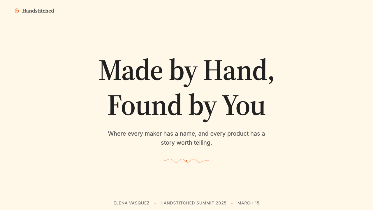
The defining hue of the Etsy Handmade palette is a deep, warm orange that sits closer to terracotta and kiln-fired clay than to the bright traffic orange common in tech branding. It carries the visual weight of something natural and handmade — earthy, warm, and slightly unpredictable. This orange functions as the system's primary anchor: used for key calls to action, brand moments, and high-attention interface elements. It is never used ironically or at low saturation; its warmth is always fully committed.Etsy Handmade 色板的定义色调是一种深沉的暖橙色,更接近赤陶土和窑烧陶瓷,而非科技品牌中常见的明亮交通橙。它承载着一种天然与手作的视觉重量——质朴、温暖、略带不可预测性。这一橙色充当整个体系的主要锚点:用于关键的行动号召、品牌时刻和高注意力界面元素。它从不以低饱和度或反讽方式使用;它的温暖始终是全情投入的。
Cream and Warm White Grounds奶油与暖白底色
Backgrounds in the Etsy Handmade system are never cool white or neutral gray. They lean warm — cream, off-white, and occasionally a very light warm beige — giving every layout a sense of aged paper, linen, or the natural ground of a craft fair table. This warmth extends to the negative space itself: even the empty areas of a page feel tactile and human-scaled rather than digital and infinite. The warm ground is what prevents the orange accent from reading as aggressive.Etsy Handmade 体系中的背景从不使用冷白或中性灰。它们偏向暖调——奶油色、米白色,偶尔是非常浅的暖米色——赋予每个版面一种陈年纸张、亚麻布或手工艺集市桌面的质感。这种温暖延伸至留白本身:即便是页面的空白区域,也让人感到有触感、有人的尺度,而不是数字化的无限延伸。正是暖色底面使橙色强调色不会显得咄咄逼人。
Serif Typography with Human Warmth富有人文温度的衬线字体
Display and headline type in the Etsy system favors serif letterforms — the kind of type associated with letterpress printing, book covers, and artisanal packaging. Serifs carry an implicit history: they reference a time when type was set by hand, letter by letter, and that association is precisely why they work within this system. Body text may shift to a clean, humanist sans-serif for readability at smaller sizes, but the emotional register of the system is set by its serif display choices. The type is never geometric or grotesque — it always retains some calligraphic warmth in its stroke variation.Etsy 体系中的展示与标题字体偏向衬线字形——这类字体与凸版印刷、书籍封面和手工包装相关联。衬线字体承载着隐含的历史:它们唤起一个字体逐字手工排版的时代,而正是这种联想使它们在这套体系中得以成立。正文在较小尺寸下可以切换至简洁的人文主义无衬线字体以保证可读性,但整个体系的情感基调是由衬线展示字体的选择所奠定的。字体绝不显得几何化或怪诞——在笔画粗细变化中,它总是保留着某种书法式的温暖。
Hand-Drawn Illustration Accents手绘插图点缀
One of the most distinctive features of the Etsy Handmade aesthetic is its use of hand-drawn illustration as an accent layer — small botanical sketches, loose gestural marks, imperfect borders and frames, and illustrated icons that deliberately retain the evidence of a drawing hand. These illustrations are not polished vector constructions; they are designed to look as though a real person drew them with an actual tool. The imperfection is not a flaw — it is proof of human authorship, and it is precisely this proof that makes the system feel trustworthy to its audience.Etsy Handmade 美学最具辨识度的特征之一是将手绘插图用作点缀层——小型植物素描、松散的手势笔触、不完美的边框与框架,以及刻意保留绘画手感痕迹的插图图标。这些插图并非精致的矢量构建物;它们被设计成看起来像真人用真实工具画出来的样子。不完美不是缺陷——它是人类创作权的证明,而正是这种证明让整个体系在受众眼中显得可信。
Tactile Product Photography具有触感的产品摄影
Product photography in the Etsy system avoids the antiseptic perfection of commercial catalog photography. Shots are styled with natural light, imperfect backgrounds — raw wood, linen cloth, weathered surfaces — and are composed to suggest discovery rather than presentation. Objects are photographed with context: a hand holding a mug, a necklace laid on a journal, a knitted blanket on a rumpled bed. This contextual styling converts product display into narrative, implying that each item has a life beyond the transaction and a place within a real person's world.Etsy 体系中的产品摄影刻意回避商业产品目录摄影那种无菌式的完美。照片以自然光布景,背景带有不完美感——原木、亚麻布、风化表面——构图暗示的是发现,而非展示。物品在情境中被拍摄:一只手握着马克杯,一条项链放在日记本上,一条针织毯盖在乱了的床上。这种情境化布景将产品展示转化为叙事,暗示每件物品在交易之外都有其生命,并在真实的人的世界中占有一席之地。
Breathing Layout and Generous Margins宽松版面与充足边距
Layouts in the Etsy Handmade system give content room to breathe. There is no compression, no information density for its own sake. Product listings are spacious; category pages give each item enough white space that it reads as singular rather than as part of an undifferentiated mass. This generosity of space is a form of respect — for the maker who created the object, for the buyer who is considering it, and for the object itself. It is the digital equivalent of a well-arranged market stall where each item has its own territory.Etsy Handmade 体系中的版面让内容有充分的呼吸空间。没有压缩,没有为了信息密度而牺牲的留白。产品列表是宽松的;分类页面给每件商品足够的空白,使其作为个体被阅读,而非淹没在无差别的群体之中。这种空间的慷慨是一种尊重——对创作物品的匠人、对正在考量的买家、对物品本身的尊重。这是实体集市摆放精心、每件物品各有领地的数字等价物。
Warmth Through Color Temperature通过色彩温度传递温暖
Across the entire palette, every color choice skews warm. Secondary colors — sage greens, dusty roses, muted mustards — are selected for their warmth and natural origin rather than their vibrancy or digital brightness. Cool blues, electric greens, and stark neutrals are absent. Even the blacks used in the system lean toward warm dark brown rather than pure cool black. This systematic warmth is not accidental; it is a deliberate signal that the platform operates in an emotional register defined by human touch, seasonal materials, and natural pigments rather than the cold precision of digital manufacturing.纵观整个色板,每一个色彩选择都偏向暖调。辅助色——鼠尾草绿、尘玫瑰、沉哑芥末黄——以其温暖感和自然起源而被选用,而非鲜艳度或数字亮度。冷蓝色、电气绿和生硬的中性色全部缺席。即便是体系中使用的黑色,也偏向暖深棕而非纯粹的冷黑。这种系统性的温暖并非偶然;它是一个刻意的信号,表明这个平台在一个由人手触感、季节性材料和天然颜料所定义的情感语调中运作,而非数字制造的冷峻精准。
Who shaped Etsy Handmade?谁塑造了 Etsy Handmade?
Rob Kalin co-founded Etsy in 2005 and served as CEO through the company's early years. A furniture maker and photographer before he was a technologist, Kalin brought a craftsman's sensibility to the platform's founding vision — the belief that making things by hand was a legitimate economic and cultural alternative to mass production. His background in physical craft directly shaped the visual vocabulary of the early Etsy identity, which borrowed its warmth and imperfection from the indie-craft culture he was part of. Kalin left the company in 2011, but the aesthetic DNA he helped establish proved durable enough to survive multiple rounds of brand evolution.Rob Kalin 于2005年联合创办 Etsy,并在公司早期担任 CEO。在成为技术创业者之前,他是一位家具匠兼摄影师。Kalin 将工匠的感性带入了平台的创立愿景——相信手工制造是大规模生产之外一种合理的经济与文化选择。他在实体手工艺领域的背景直接塑造了早期 Etsy 视觉语汇,借鉴了他所身处的独立手工艺文化的温暖感与不完美性。Kalin 于2011年离开公司,但他参与奠定的视觉 DNA 被证明足够持久,经历了多轮品牌演进而保存下来。
Chris Maguire was a co-founder and the primary technical architect behind the original Etsy platform. His contribution to the visual identity was less about art direction and more about establishing the technical infrastructure that allowed the brand to be applied consistently across a marketplace built on user-generated content. The challenge of maintaining a warm, handmade aesthetic across millions of seller storefronts — each controlled by a different maker — was a structural design problem as much as a visual one, and Maguire's engineering decisions shaped the constraints within which the brand could operate.Chris Maguire 是 Etsy 的联合创始人,也是原始平台背后的主要技术架构师。他对视觉识别的贡献与其说是艺术指导,不如说是建立了技术基础设施——使品牌得以在一个由用户生成内容构建的市场中保持一致应用。在数百万各由不同创作者控制的卖家店铺中维持温暖、手作的美学,既是一个结构性设计问题,也是视觉问题,而 Maguire 的工程决策塑造了品牌得以运作的约束条件。
Haim Schoppik was the third co-founder of Etsy and played a central role in the early product and design decisions that set the platform's initial visual direction. Working alongside Kalin and Maguire in the Brooklyn apartment where the site was built, Schoppik helped translate the craft-market ethos into a digital interface — a translation that required finding digital equivalents for the sensory qualities of browsing a real maker's market. His work during the founding period established many of the design principles that the Etsy Brand team would later systematize and scale.Haim Schoppik 是 Etsy 的第三位联合创始人,在早期产品与设计决策中扮演了核心角色,奠定了平台最初的视觉方向。在布鲁克林公寓——网站就在那里诞生——与 Kalin 和 Maguire 并肩工作,Schoppik 帮助将手工艺市集的精神转化为数字界面——这一转译需要为浏览真实手作市集的感官品质找到数字等价物。他在创立期间的工作确立了许多设计原则,而 Etsy 品牌团队此后将这些原则系统化并推向规模化。
The Etsy Brand team — the in-house design and brand organization that grew substantially through the company's public years — is responsible for the mature, codified version of the Etsy Handmade visual identity. Working through the 2018–2024 period in particular, the team rationalized the color system, standardized the illustration vocabulary, professionalized the photography direction, and built the design system documentation that made consistent application possible across a global platform. Their achievement was preserving the authentic warmth and craft-market feeling of the original identity while scaling it to operate at the level of a multi-billion dollar marketplace.Etsy 品牌团队——随着公司上市而大幅扩张的内部设计与品牌组织——负责塑造了成熟、系统化的 Etsy Handmade 视觉识别。尤其是在2018年至2024年间,团队理顺了色彩体系,规范了插图语汇,将摄影方向专业化,并构建了设计体系文档,使一致应用在全球平台上成为可能。他们的成就在于:在将原始视觉识别的真实温暖与手作市集感推向数十亿美元规模市场的同时,将其完整保存。
How do you use Etsy Handmade today?今天怎么用 Etsy Handmade?
The Etsy Handmade aesthetic is highly transferable to any context where warmth, authenticity, and human-scale storytelling are the desired values. Applying it correctly is a matter of understanding what the visual system is actually communicating — that this was made by a person, not a machine; that imperfection is a feature, not a defect; that the relationship between buyer and maker is personal, not transactional — and then building that communication into every design decision rather than applying it as a surface layer.Etsy Handmade 的美学高度可移植到任何以温暖、真实与人性化叙事为期望价值的场景中。正确应用它需要理解这套视觉体系实际上在传达什么——这是人而非机器制造的;不完美是特性,不是缺陷;买家与创作者之间的关系是个人化的,不是交易性的——然后将这种传达建入每一个设计决策之中,而不是把它当作表面涂层。
For presentation slides, the Etsy Handmade style works particularly well when the content involves brand storytelling, creative industries, craft-adjacent markets, or any narrative where human connection is a selling point. Cover slides benefit from a warm-ground layout anchored by the signature orange and a serif headline set at generous scale. Content slides should carry the breathing room of the marketplace itself: one idea per slide, generous margins, product or maker photography given space to read without crowding. Data and chart slides can incorporate hand-drawn graphic accents — imperfect circles for icons, loose rectangular frames for callouts — to keep the statistical content from feeling cold and corporate.对于演示文稿,Etsy Handmade 风格在内容涉及品牌叙事、创意产业、手工艺相关市场,或任何人际连接是卖点的叙事时,表现尤为出色。封面幻灯片受益于以标志性橙色锚定的暖底色版面,以及以充裕字号设置的衬线标题。内容幻灯片应当承载市场本身的呼吸节奏:每页一个想法,充足的边距,产品或创作者照片有足够空间被阅读而不显拥挤。数据与图表幻灯片可以融入手绘图形点缀——用于图标的不完美圆形、用于引文框的松散矩形——以防止统计内容显得冷漠而企业化。
For web interfaces, the style is well-suited to marketplaces, portfolio platforms, independent shop storefronts, creative agency sites, and any web product where the maker-to-buyer relationship is central. Navigation should favor serif wordmarks and clear typographic hierarchy over icon-heavy minimalism. Card components work best with warm shadow treatments — not the cool, diffuse shadows of corporate design systems, but warmer, slightly more opaque treatments that echo the shadow of an object on a wooden table. Pricing and feature pages should use the orange sparingly and intentionally, reserving it for moments of genuine decision.对于网页界面,这种风格适合市集平台、作品集平台、独立店铺门面、创意机构网站,以及任何以创作者与买家关系为核心的网页产品。导航应偏向衬线文字标识和清晰的字体层级,而非图标密集的极简主义。卡片组件配合暖色投影效果最佳——不是企业设计体系中那种冷漠、漫射的阴影,而是更温暖、略微更不透明的处理,呼应物品在木桌上投下的影子。定价与功能页面应克制而有意地使用橙色,将其保留给真正需要决策的时刻。
For editorial and marketing work, the Etsy Handmade visual language supports rich, narrative-first content design. Magazine-style layouts with generous left or right margins for pull quotes and metadata, section breaks marked by a hand-drawn rule or botanical accent rather than a geometric divider, and photography that feels candid and contextual rather than staged and clinical — these elements together build the feeling of a thoughtfully produced independent publication rather than a corporate content hub. Marketing campaigns are strongest when they lead with the maker story rather than the product specifications, because the system's warmth derives from human narrative.对于编辑与营销内容,Etsy Handmade 视觉语言支持以叙事为先的丰富内容设计。杂志风格的版面配有用于引文和元数据的宽裕左边距或右边距;章节分隔以手绘线条或植物插图点缀而非几何分隔线标记;摄影呈现出随性而情境化的感觉,而非摆拍或无菌——这些元素共同营造出一种精心制作的独立出版物的感觉,而非企业内容中心。当营销活动以创作者故事而非产品规格作为开场时效果最强,因为这套体系的温暖来自人的叙事。
A common mistake when applying Etsy Handmade is mistaking the aesthetic for mere nostalgia and over-applying the rustic elements — too many hand-drawn textures, too much deliberately aged type, too many sepia-toned photographs — until the result feels like a parody of craft rather than a celebration of it. The authentic version of this style is not about looking old; it is about feeling human. The warmth should come from color temperature and typographic choice, the imperfection from illustration accents used sparingly, and the authenticity from photography that shows real objects in real contexts. Every rustic element added beyond necessity undermines the credibility it is meant to establish.应用 Etsy Handmade 时最常见的错误是将这种美学误读为纯粹的怀旧,并过度应用质朴元素——过多的手绘纹理、过多刻意做旧的字体、过多棕褐色调的照片——直到结果感觉像是对手工艺的戏仿,而非对它的颂扬。这种风格的真实版本不是为了看起来古老;它是为了感觉有人的温度。温暖应当来自色彩温度和字体选择,不完美来自克制使用的插图点缀,真实性来自展示真实物品处于真实情境中的摄影。每一个超出必要的质朴元素,都在削弱它本意要建立的可信度。
Etsy Handmade — FAQEtsy Handmade · 常见问题
Is Etsy Handmade the same as a general 'rustic' or 'vintage' aesthetic?Etsy Handmade 和一般的「质朴」或「复古」美学是一回事吗?
They overlap but are distinct. Rustic and vintage aesthetics are primarily about period references and material patina — aged textures, antique typefaces, sepia tones. Etsy Handmade is not about evoking a specific era; it is about communicating the presence of a human maker. The warm orange is a contemporary brand color, not a vintage hue. The hand-drawn accents signal current human authorship, not historical period style. The key difference: rustic looks old, Etsy Handmade looks made-by-someone. A vintage poster and an Etsy product page may share certain textures, but their emotional signals are entirely different.两者有交集,但截然不同。质朴与复古美学主要关于特定时期的参照和材料包浆——陈年纹理、古董字体、棕褐色调。Etsy Handmade 不是要唤起某个特定时代;它是要传达人类创作者的在场。标志性的暖橙色是当代品牌色,不是复古色调。手绘点缀传递的是当下的人类创作权,不是历史时期风格。关键区别在于:质朴看起来古老,Etsy Handmade 看起来是某人亲手制作的。一张复古海报和一个 Etsy 产品页面或许共享某些纹理,但它们的情感信号完全不同。
Can the Etsy Handmade style work for digital or software products, not just physical goods?Etsy Handmade 风格能用于数字或软件产品吗,还是只适合实体商品?
Yes, with selectivity. The style works for any digital product where the human-made quality of the experience is a genuine differentiator: small-team software tools, creative applications, independent publishing platforms, personal finance apps targeting creative entrepreneurs, educational platforms for makers. It works less well for enterprise software, data-intensive applications, or any product where authority and precision are the primary trust signals. The question to ask is: does the warmth of this aesthetic reinforce what our product actually is, or does it create a mismatch between the brand promise and the product reality?可以,但需要有选择性。这种风格适用于任何以体验的人工制作品质作为真正差异化因素的数字产品:小团队软件工具、创意应用、独立出版平台、面向创意创业者的个人财务应用、面向创作者的教育平台。它不太适合企业软件、数据密集型应用,或任何以权威性和精确性为主要信任信号的产品。需要问的问题是:这种美学的温暖感是在强化我们的产品实际上是什么,还是在品牌承诺与产品现实之间制造错位?
How do you handle dark mode in the Etsy Handmade system?在 Etsy Handmade 体系中如何处理深色模式?
Dark mode is genuinely challenging for this system, because the warmth of the aesthetic is deeply tied to its light, cream-ground palette. A straight inversion — cream becomes dark brown, orange remains — can work but produces something closer to a candlelit interior than the craft-fair feeling of the light version. The most successful dark variants in this style use a very deep warm brown rather than true black as the ground, preserve the orange as the primary accent, and reduce the number of active colors to two at most. Hand-drawn illustration accents become more legible on dark grounds when rendered in a light cream rather than dark ink, reversing the usual relationship. Expect some loss of the original warmth — it is a genuine trade-off, not a solved problem.深色模式对这套体系来说确实具有挑战性,因为这种美学的温暖感与其浅色奶油底色调密不可分。直接反转——奶油色变为深棕色,橙色保持——可以奏效,但产生的效果更接近烛光室内,而非浅色版本的手工艺集市感。这种风格中最成功的深色变体使用非常深的暖棕色而非纯黑色作为底色,保留橙色作为主要强调色,并将活跃色数量减少至最多两种。手绘插图点缀在深色底面上若以浅奶油色而非深墨色呈现会更清晰,颠倒了通常的关系。预期会损失一些原有的温暖感——这是真实的权衡,不是已解决的问题。
What is the right amount of imperfection in Etsy Handmade design?在 Etsy Handmade 设计中,「不完美」的适量是多少?
Imperfection in this system is a seasoning, not a main ingredient. It should appear in the illustration layer — slightly wobbly lines, non-uniform stroke weights, botanical details that look drawn rather than constructed — and in the photography styling, where real surfaces and natural light do the work. It should not appear in the typography (type should be correctly set and well-kerned), the layout grid (spacing should be consistent and intentional), or the color application (the orange should be consistently the same orange). A useful test: if you removed all the hand-drawn elements and photographed everything on a clean studio background, would the remaining design still feel warm and human? If not, you have been relying on imperfection as a crutch rather than as a complement.这套体系中的不完美是一种调味料,不是主要成分。它应当出现在插图层——略微颤动的线条、不均匀的笔触粗细、看起来是画出来而非构建出来的植物细节——以及摄影布景中,由真实表面和自然光来完成工作。它不应出现在字体排印(字体应当设置正确、字间距良好)、版面网格(间距应当一致而有意)或色彩应用(橙色应当始终是同一种橙色)中。一个有用的测试:如果去掉所有手绘元素,在干净的摄影棚背景下拍摄所有内容,剩余的设计是否仍然感觉温暖而有人的温度?如果不是,你就是在依赖不完美作为拐杖,而非将其作为补充。
Does Etsy Handmade work when you do not actually have handmade products to show?当你没有真正的手工制品可以展示时,Etsy Handmade 风格还有效吗?
The style can work without literal handmade products, but it requires honesty about what you are communicating. The aesthetic signals human involvement, care, and craft — values that exist in many contexts beyond physical goods: services designed with attention, educational content made by real experts, tools built by small teams for specific communities. If those values genuinely describe your product or organization, the style is appropriate. If they do not — if you are a large automated platform, a data-driven service with no human curation, or a product whose primary value is speed and efficiency — then adopting this aesthetic creates a misleading promise. The warmth of Etsy Handmade only converts to trust when it accurately represents what lies behind it.这种风格可以在没有字面意义上手工制品的情况下使用,但这需要对你所传达的内容保持诚实。这种美学传递的是人的参与、用心与手工艺价值——这些价值存在于实体商品之外的许多场景中:经过精心设计的服务、由真正专家制作的教育内容、由小团队为特定社群构建的工具。如果这些价值真实描述了你的产品或组织,这种风格就是恰当的。如果不是——如果你是一个大型自动化平台、一个无人工策展的数据驱动服务,或一个主要价值是速度与效率的产品——那么采用这种美学就制造了误导性的承诺。Etsy Handmade 的温暖只有在准确代表其背后之物时,才能转化为信任。
Related design styles相关设计风格
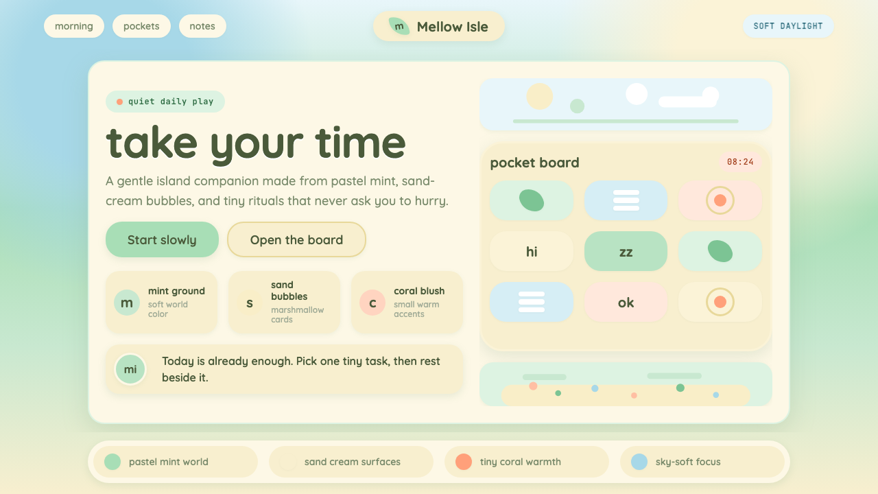 Animal Crossing — New HorizonsNo pressure, only daylight. Mint fields and sand bubbles soften every edge.没有压力,只有日光。薄荷地与沙奶油气泡软化所有边角。
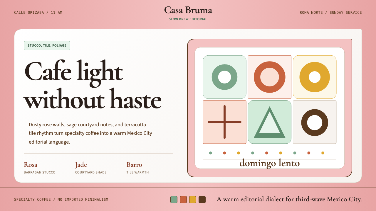 CDMX Roma Norte CafeMexico City coffee, unhurried. Dusty rose, sage jade, and serif rhythm carry…从容的墨城咖啡感:灰玫瑰、鼠尾草绿与衬线节奏传递温度。
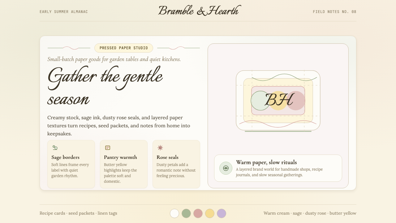 CottagecoreRural romance, hand-drawn. Sage and dusty rose, gingham textures, serif paire…工业化前的乡村浪漫:鼠尾草绿与灰粉、亚麻方格纹质感、衬线搭配手写体——慢生活的…
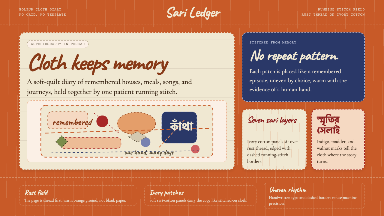 Bengali Kantha Running StitchAutobiography in thread. Rust stitch fields and Caveat lettering float on ivo…线中的自传。铁锈橙跑针与Caveat手写体浮在象牙纱丽布片上。
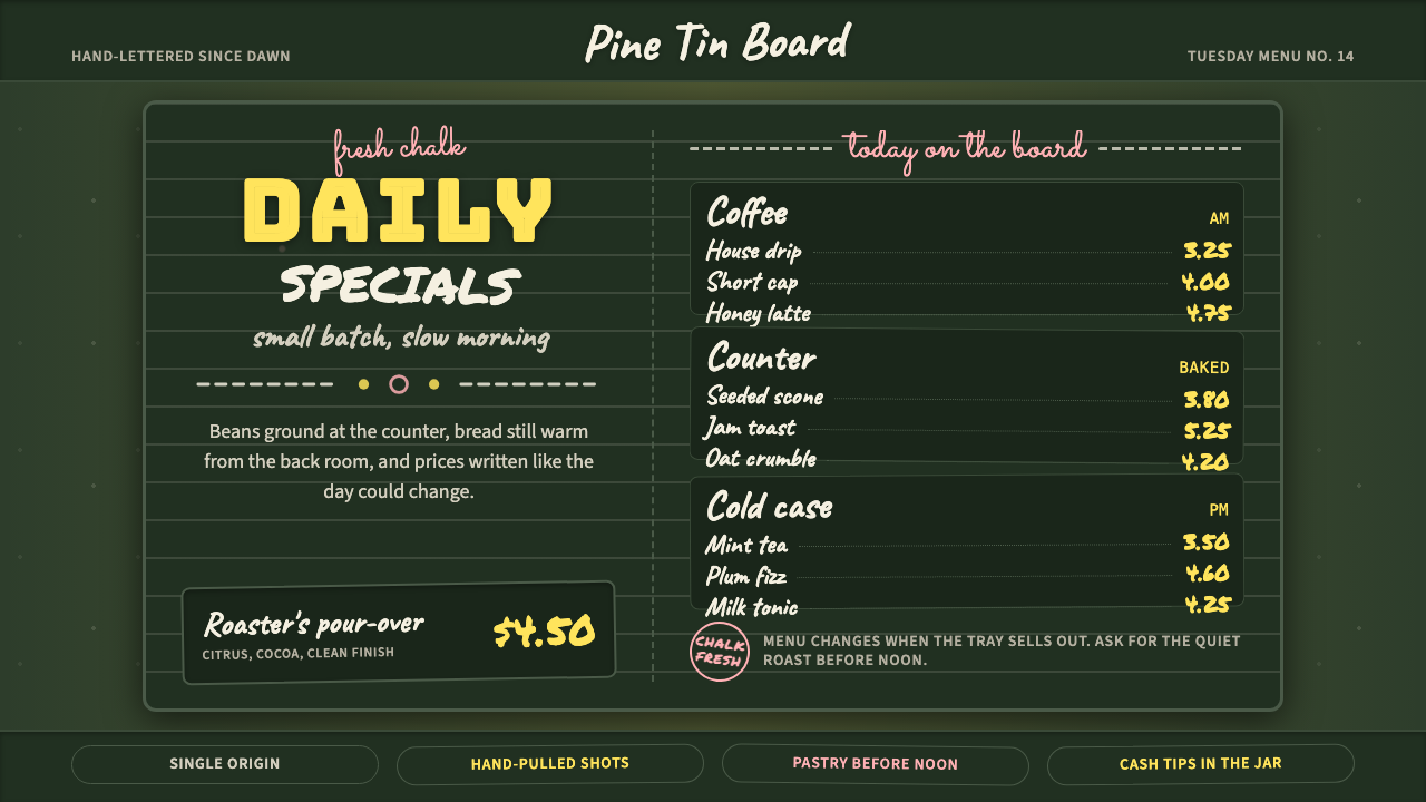 Chalkboard Cafe Menu (2010)Warm craft, handwritten. Chalk-white stacks on green slate with yellow prices…温暖手作感:深绿板面上粉白堆叠,黄价与粉色花饰点亮。
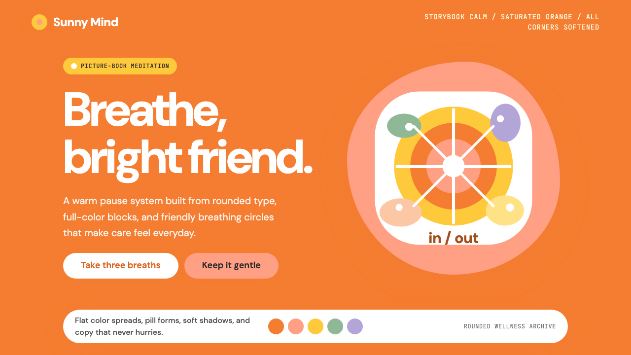 Headspace Orange MeditationMeditation becomes friendly. Orange blocks, DM Sans, and pill shapes soften e…冥想变得亲切:橙色块、DM Sans 与药丸圆角软化一切。