Design style guide设计风格指南
What is CDMX Roma Norte Cafe?什么是 CDMX Roma Norte Cafe?
Roma Norte's cafe aesthetic is Mexico City's most coherent contemporary design dialect — dusty Barragán pinks, sage-jade greens, and the unhurried warmth of a slow-brew Sunday on Calle Orizaba.罗马北区的咖啡馆美学是墨西哥城最具辨识度的当代设计语言——巴拉甘式灰玫瑰粉、鼠尾草翡翠绿,与奥里萨巴街慢冲周日的从容温度。
CDMX Roma Norte Cafe in briefCDMX Roma Norte Cafe 速览
The CDMX Roma Norte Cafe aesthetic is a visual system distilled from Mexico City's third-wave specialty coffee scene — a coherent design language that emerged in the neighborhoods of Colonia Roma Norte, Condesa, and Juárez between roughly 2014 and 2024. It is not a single brand's invention but a collective visual agreement forged across dozens of independent cafes, roasters, and design studios working in close geographic and cultural proximity.墨西哥城罗马北区咖啡馆美学,是从这座城市第三波精品咖啡场景中凝练而成的视觉系统——一套连贯的设计语言,大约在2014至2024年间,在罗马北区、孔德萨区与华雷斯区的街巷之间逐渐成形。它并非某一品牌的独创,而是数十家独立咖啡馆、烘焙商与设计工作室在地理与文化紧密接触下共同缔造的视觉共识。
At its core, the aesthetic reconciles two inheritances: the warm, sensory richness of Mexican material culture — terracotta tile, hand-plastered stucco, foliage-draped courtyards — with the disciplined visual restraint of contemporary specialty coffee branding. The result is neither generic Scandinavian minimalism nor folkloric maximalism. It is unmistakably Mexican, unmistakably contemporary, and rooted in a specific urban experience: the morning light of a Roma townhouse patio, filtered through bougainvillea.这套美学在本质上调和了两种传承:墨西哥物质文化温暖而感官丰富的一面——赤陶砖、手工抹灰的灰泥、绿植蔓延的庭院——与当代精品咖啡品牌视觉语言的克制与自律。结果既非泛泛的斯堪的纳维亚极简主义,也非民俗式的繁复堆砌。它是当代的,也是不折不扣墨西哥的,深深扎根于一种具体的城市体验:罗马区联排别墅露台的晨光,穿过九重葛过滤而来。
The style carries a distinct emotional register. It communicates quality and intentionality without coldness, warmth without nostalgia, and sophistication without exclusion. This balance — simultaneously inviting and refined — explains why it has traveled beyond its geographic origin into independent hospitality and lifestyle branding across Latin America and internationally.这种风格承载着独特的情感基调:它传递品质与用心,却不流于冷漠;传递温度,却不陷入怀旧;传递精致,却不拒人于千里之外。这种平衡——既亲切又雅致——正是它得以走出地理原点,在拉丁美洲及国际范围内的独立餐饮与生活方式品牌中广泛流传的原因。
See the CDMX Roma Norte Cafe design system →查看 CDMX Roma Norte Cafe 完整设计系统 →
Where does CDMX Roma Norte Cafe come from?CDMX Roma Norte Cafe 从何而来?
The story begins with Mexico City's third-wave coffee awakening. For most of the twentieth century, Mexico was a major coffee-producing nation that paradoxically drank little of its finest exports. The specialty coffee shift arrived in earnest around 2010 to 2014, led by pioneering roasters and cafe owners who had trained or traveled in Australia, Japan, and Northern Europe. Colonia Roma Norte — a dense, walkable neighborhood of Art Nouveau townhouses, leafy streets, and a long tradition of artistic and intellectual bohemia — became the natural epicenter. Its low rents, culturally adventurous residents, and built environment of warm masonry and interior courtyards provided the perfect incubator.故事从墨西哥城的第三波咖啡觉醒说起。二十世纪的大部分时间里,墨西哥作为咖啡主产国,却自相矛盾地极少饮用本国最优质的出口豆。精品咖啡的转型大约在2010至2014年间真正到来,由一批曾在澳大利亚、日本和北欧受训或游历的先行者引领。罗马北区——一个布满新艺术运动联排别墅、绿荫街道,并长期孕育艺术与知识分子波西米亚传统的步行宜居社区——成为天然的震中。低廉的租金、充满文化冒险精神的居民,以及温暖的砖石肌理与室内庭院构成的建筑环境,提供了最理想的孵化土壤。
Key figures shaped the aesthetic consensus. Pepe Vega and Pedro Cano were among the baristas and cafe founders whose venues gave the scene its early visual grammar — editorial serif signage, warm terracotta and sage color palettes, hand-lettered chalk boards that gestured toward craft without performing rusticity. Sebastian Romero contributed through design work that linked the specialty coffee scene to Mexico City's broader independent design culture. Catalina Mladin brought curatorial sensibility and an eye for how material choices — glazed ceramic cups, linen napkins, unfinished concrete counters beside warm wood — could add up to a coherent spatial identity. The influential Buna cafe, founded in 2014, offered an early and unusually complete expression of what the aesthetic could be at its most resolved.几位关键人物共同塑造了这套美学共识。佩佩·维加与佩德罗·卡诺是其中最早的咖啡馆创始人与咖啡师,他们的场所为这一场景提供了早期视觉语法——编辑感的衬线招牌、温暖的赤陶色与鼠尾草色,以及手写粉笔黑板,传递手工精神而不流于伪乡村风。塞巴斯蒂安·罗梅罗通过设计工作,将精品咖啡圈与墨西哥城更广泛的独立设计文化连接起来。卡塔琳娜·姆拉丁带来了策展人的眼光,善于把握物料选择——上釉陶瓷杯、亚麻餐巾、温暖木材旁未经处理的混凝土台面——如何叠加成连贯的空间身份。2014年创立的Buna咖啡馆,是早期最完整、最成熟地呈现这一美学的典范。
The movement drew deeply from mid-century Mexican modernism — specifically from the architectural and chromatic legacy of Luis Barragán, whose use of dusty pinks, muted yellows, and saturated earth tones in his residential and garden designs had long defined a distinctively Mexican approach to color. The cafe designers who followed were not quoting Barragán directly, but his palette had seeped into the visual consciousness of Mexico City so thoroughly that it became a natural reference point for anyone trying to create spaces that felt simultaneously sophisticated and rooted in local culture.这场运动深深汲取于墨西哥中世纪现代主义——尤其是建筑师路易斯·巴拉甘的建筑与色彩遗产。巴拉甘在其住宅与园林设计中对灰粉色、柔和黄与浓郁大地色的运用,早已定义了一种独特的墨西哥色彩哲学。跟随其后的咖啡馆设计师并非直接引用巴拉甘,但他的色板已如此深入地渗透进墨西哥城的视觉意识,以至于任何试图创造既精致又植根于本地文化空间的人,都会自然而然地以此为参照。
Between 2018 and 2024, the aesthetic consolidated and codified. Graphic design studios working with the Roma Norte cafe scene began producing identities that shared a recognizable visual family: serif logotypes with editorial weight, palettes anchored in dusty rose, sage jade, and terracotta, paper textures and stamp-printed finishes that evoked artisanal process without folk-art pastiche, and typographic hierarchies that borrowed from early twentieth-century Mexican editorial design. The visual system crossed from print into digital channels — Instagram grids, website design, packaging — and in doing so became one of the most widely recognized contemporary design signatures to emerge from Latin America.2018至2024年间,这套美学逐渐巩固并走向系统化。与罗马北区咖啡圈合作的平面设计工作室开始产出拥有共同视觉血统的品牌形象:具有编辑感字重的衬线标志字体、以灰玫瑰、鼠尾草翡翠与赤陶为核心的色板、纸张质感与印章印刷工艺(传递手工过程而不落入民间艺术的俗套),以及借鉴二十世纪初墨西哥编辑设计的文字层级体系。这套视觉系统从印刷延伸至数字渠道——Instagram图格、网页设计、包装——并由此成为拉丁美洲最具辨识度的当代设计标志之一。
What defines the CDMX Roma Norte Cafe look?CDMX Roma Norte Cafe 的视觉特征是什么?
Palette色彩
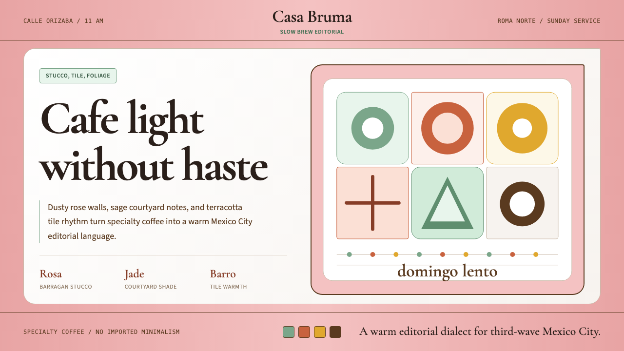
The palette is built around three anchors: a dusty, muted rose that recalls Barragán's famous pink walls; a sage-jade green borrowed from the foliage of courtyard plants and glazed ceramic; and a warm terracotta that echoes the patio tile of a Colonia Roma townhouse. These are supported by warm neutrals — creamy off-whites, warm stone, and mid-century walnut tones — rather than stark white or gray. The overall register is warm, slightly desaturated, and sunlit. Colors coexist in quiet harmony rather than high-contrast opposition, giving the system its characteristic sense of unhurried ease.色板围绕三个锚点构建:令人联想到巴拉甘标志性粉墙的灰粉玫瑰色;借自庭院绿植与上釉陶瓷的鼠尾草翡翠绿;以及呼应罗马区联排别墅露台砖色的温暖赤陶色。这三者由温暖的中性色调托底——奶油白、暖石色、中世纪胡桃木色——而非冷白或灰色。整体色调温暖、略微去饱和、富有阳光感。各色在静谧的和谐中共存,而非形成高对比度的对抗,赋予这套系统其特有的从容安闲气质。
Typography字体排印
Editorial serif typefaces anchor the visual identity. The preference runs toward typefaces with old-style proportions and moderate contrast — letterforms that carry cultural authority without formality, and that echo the mastheads of early twentieth-century Mexican periodicals. Serif headlines are typically set at generous sizes with relaxed tracking, projecting confidence and calm. Supporting text may use a warm humanist companion — a typeface with the organic, hand-influenced qualities that complement the overall material warmth of the palette. The typographic hierarchy is legible but never clinical, always communicating craft and intentionality.编辑感衬线字体是视觉识别的核心锚点。偏好具有旧式比例与适中对比度的字体——字形兼具文化权威感而不失亲和力,呼应二十世纪初墨西哥期刊的版头风格。衬线标题通常以宽裕的字号与从容的字距设置,传递自信与平静。辅助文字可采用温暖的人文主义衬线——一种具有有机感、受手写影响的字体,与整体物料温度相互呼应。排版层级清晰可读,却从不冷硬,始终传递手工感与用心。
Texture and Material质感与材质
Tactile material quality is central to the aesthetic. Stucco textures, uncoated paper stocks, letterpress or risograph printing effects, hand-stamped marks, and the patina of aged ceramic all contribute to an overall sense of material richness that digital applications simulate through careful use of texture overlays and grain. The aesthetic actively resists the frictionless glossiness of generic digital design, asserting instead that quality is something you can feel — rough, warm, and specific to place.可触的物料品质是这套美学的核心。灰泥质感、无涂层纸张、凸版或风险印刷效果、手工印章痕迹,以及老旧陶瓷的包浆——这一切共同构成丰富的物料感,在数字应用中通过精心的质感叠层与颗粒感加以模拟。这套美学主动抵抗通用数字设计的光滑无摩擦感,坚持主张:品质是你能感受到的——粗粝的、温暖的、与地方紧密相连的。
Spatial Rhythm and Negative Space空间节奏与留白
Layouts favor generous negative space and a relaxed, unhurried rhythm — qualities that mirror the experience of sitting in a Roma Norte cafe on a weekday morning. Compositions are never crowded. Elements are given room to breathe, and the space between them carries as much meaning as the elements themselves. This stands in deliberate contrast to the information-dense visual compression of mass-market design. The message encoded in the white space is the same as the message encoded in a single well-made espresso: less, done better.版面偏好慷慨的留白与从容的节奏——这与在平日清晨坐于罗马北区咖啡馆中的体验如出一辙。构图从不拥挤,元素得以充分呼吸,元素间的空隙与元素本身同样富有意义。这与大众市场设计的信息密集型视觉压缩形成刻意的对比。留白所编码的信息,与一杯精心制作的浓缩咖啡所传递的信息一致:更少,做得更好。
Ornamental Restraint装饰的克制
Decorative elements appear sparingly and are always rooted in material or cultural logic: a hand-drawn botanical sprig, a simple tile-pattern border, a stamp that reads like a mark of origin rather than a flourish. Ornamentation is never applied for visual busyness. When it appears, it carries referential weight — to Mexican craft tradition, to botanical courtyard life, to the cafe's geographic and cultural specificity. The system is warm rather than austere, but the warmth comes from palette and texture, not from decorative accumulation.装饰元素出现得克制而审慎,且始终根植于物料或文化逻辑:手绘植物小枝、简洁的砖瓦纹边框、一枚读来像产地标记而非花哨点缀的印章。装饰绝不为增加视觉繁复而存在。每当出现,它都承载指涉的分量——指向墨西哥手工艺传统、庭院植物生活,以及咖啡馆的地理与文化特殊性。这套系统温暖而非严苛,但温暖来自色板与质感,而非装饰的堆积。
Photography and Visual Imagery摄影与视觉图像
Photography in the Roma Norte aesthetic favors warm, natural light and an intimate editorial quality — the kind of imagery that feels observed rather than staged. Close-ups of ceramic cups, light falling across a tiled surface, foliage against stucco, hands at a pour-over — these compositions emphasize texture, material specificity, and the unhurried quality of physical experience. Color grading skews warm and slightly desaturated, consistent with the overall palette. Images rarely feature the heroic or aspirational framings of mainstream lifestyle photography; the register is quiet, specific, and confident.罗马北区美学中的摄影偏好温暖的自然光与亲密的编辑感——那种令人感到是在记录而非摆拍的图像气质。陶瓷杯的特写、阳光洒落瓷砖表面、绿植映衬灰泥墙、手持手冲壶的姿态——这些构图强调质感、物料特殊性,以及身体体验的从容品质。色彩调校偏暖、略微去饱和,与整体色板保持一致。图像很少采用主流生活方式摄影的英雄式或激励性取景;基调是安静的、具体的、自信的。
Cultural Rootedness文化根植性
The aesthetic's most distinctive quality is that it feels genuinely located — in a specific city, a specific neighborhood, a specific moment in Mexican cultural history. Unlike globalized minimalism, which achieves coherence by erasing local character, the Roma Norte style achieves coherence by deepening it. The Barragán palette, the colonial courtyard architecture, the mid-century Mexican editorial tradition, the Colonia Roma bohemian intellectual culture — these are not decorative references but structural foundations. The style is contemporary but not stateless.这套美学最独特之处,在于它真实地坐落于某处——一座特定的城市、一个特定的街区、墨西哥文化史上一个特定的时刻。不同于全球化的极简主义通过抹去地方性而获得连贯感,罗马北区风格通过深化地方性而获得连贯感。巴拉甘色板、殖民地庭院建筑、墨西哥中世纪编辑传统、罗马区波西米亚知识分子文化——这些不是装饰性引用,而是结构性根基。这套风格是当代的,却不是无处所属的。
See the CDMX Roma Norte Cafe design system →查看 CDMX Roma Norte Cafe 完整设计系统 →
Who shaped CDMX Roma Norte Cafe?谁塑造了 CDMX Roma Norte Cafe?
Though not a cafe designer himself, the architect Luis Barragán (1902–1988) is the single most important aesthetic ancestor of the Roma Norte style. His use of dusty pinks, warm yellows, and deep earth tones in his residential walls, water gardens, and plazas established that these colors were not decorative choices but structural ones — capable of carrying emotional and cultural weight. The Barragán palette became the shared visual inheritance of Mexico City design culture, and the Roma Norte cafe scene is among its most direct contemporary expressions.路易斯·巴拉甘(1902—1988)本人并非咖啡馆设计师,却是罗马北区风格最重要的美学先祖。他在住宅围墙、水花园与广场中对灰粉色、暖黄色和深沉大地色的运用,确立了这些色彩不只是装饰选择,而是结构性的——能够承载情感与文化重量。巴拉甘色板成为墨西哥城设计文化共同的视觉遗产,罗马北区咖啡馆场景是其最直接的当代表达之一。
Pepe Vega was among the early baristas and cafe founders whose venues helped establish the visual and experiential grammar of the Roma Norte scene. His work in shaping cafe spaces — the material choices, the spatial rhythm, the relationship between counter, seating, and light — contributed to the collective understanding of what a Mexico City specialty coffee space could and should look like. He represents the broader group of practitioner-founders whose aesthetic decisions, made in close proximity to each other, produced a coherent neighborhood style.佩佩·维加是早期帮助确立罗马北区场景视觉与体验语法的咖啡师与咖啡馆创始人之一。他在塑造咖啡馆空间方面的工作——物料选择、空间节奏、吧台与座位区及光线的关系——共同构建了对墨西哥城精品咖啡空间应有面貌的集体理解。他代表着更广泛的实践者-创始人群体,正是他们在相互紧密接触中做出的美学决定,催生了一种连贯的街区风格。
Pedro Cano's contribution sits at the intersection of barista culture and visual identity. As one of the founding-generation figures of Mexico City's specialty coffee movement, his sensibility helped define what the scene valued aesthetically — craft legibility, material honesty, the avoidance of international-chain pastiche. His presence in the scene during its formative years at Colonia Roma Norte gave him influence over the collective standards that shaped what came to be recognized as the neighborhood's distinctive design language.佩德罗·卡诺的贡献处于咖啡师文化与视觉身份的交汇点。作为墨西哥城精品咖啡运动创始世代的人物之一,他的审美感性帮助定义了这一场景的价值取向——工艺可读性、物料诚实感、对国际连锁品牌风格的主动规避。在罗马北区成形期间的深度参与,使他对塑造这一街区独特设计语言的集体标准产生了深远影响。
Sebastian Romero represents the bridge between the Roma Norte cafe scene and Mexico City's broader independent design culture. His design work for cafes and related brands helped translate the spatial and material sensibility of the physical cafe experience into graphic and digital form — logotypes, packaging, print collateral, and eventually digital interfaces. This translation work is what allowed the aesthetic to travel beyond its geographic origin and establish itself as a recognizable design signature across independent hospitality and lifestyle branding internationally.塞巴斯蒂安·罗梅罗是罗马北区咖啡圈与墨西哥城更广泛独立设计文化之间的桥梁。他为咖啡馆及相关品牌所做的设计工作,将咖啡馆实体体验中的空间感与物料感性转化为平面与数字形式——标志字体、包装、印刷物料,以及最终的数字界面。正是这种转译工作,使这套美学得以走出地理原点,在国际范围内的独立餐饮与生活方式品牌中确立为一种可辨识的设计标志。
Catalina Mladin brought a curatorial and editorial intelligence to the Roma Norte scene that elevated it above mere trend. Her ability to read how individual material and design choices — a specific glaze on a ceramic cup, the weight of a particular paper stock, the proportion of a shelf against a stucco wall — accumulated into a coherent spatial and brand identity was formative. She represents the editorial layer of the scene: the discernment that distinguished considered, rooted design from superficial imitation of international cafe aesthetics.卡塔琳娜·姆拉丁为罗马北区带来了一种策展人与编辑者的智识,使这一场景超越了单纯的流行趋势。她能够读懂个别物料与设计选择——某只陶瓷杯的特定釉色、某种纸张的克重手感、书架与灰泥墙面的比例关系——如何积累成连贯的空间与品牌身份。这种敏锐力是形成期最关键的塑造力量。她代表着这一场景的编辑层:将深思熟虑、扎根于地的设计与对国际咖啡馆美学的浮浅模仿区别开来的那份辨别力。
How do you use CDMX Roma Norte Cafe today?今天怎么用 CDMX Roma Norte Cafe?
The Roma Norte cafe aesthetic translates into contemporary design work with unusual directness, because its visual logic is grounded in material and emotional truth rather than trend. Applying it well requires understanding what the system is doing beneath the surface: building warmth through desaturation rather than saturation, earning refinement through restraint rather than complexity, and signaling cultural specificity rather than aspirational placelessness. When those principles are honored, the output feels genuine. When they are ignored in favor of surface-level palette borrowing, the output reads as pastiche.罗马北区咖啡馆美学以不同寻常的直接性转化为当代设计实践,因为它的视觉逻辑根植于物料与情感的真实,而非潮流。正确应用它,需要理解这套系统表层之下的运作方式:通过去饱和而非高饱和度来构建温度,通过克制而非复杂来赢得精致感,通过传达文化特殊性而非渴望性的无根感来建立身份。当这些原则得到尊重,产出便是真实的;当它们被忽视而仅停留于色板借用时,产出就只是模仿。
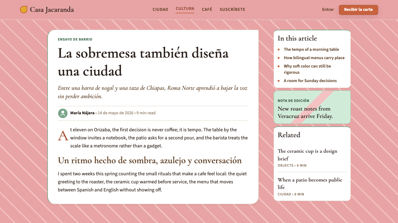
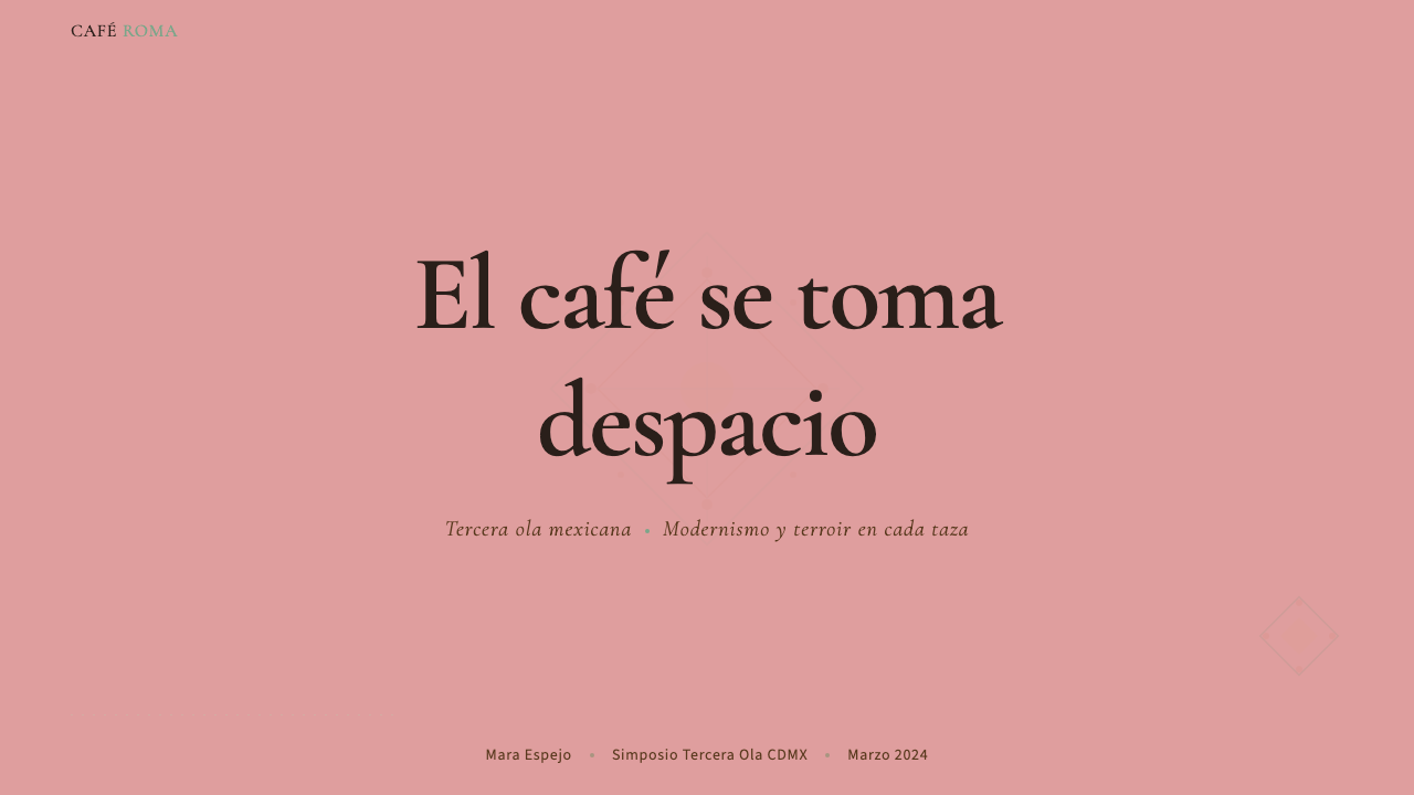
For presentation slides, the style is best suited to cover and section-divider pages, and to any slide where atmosphere matters as much as information density. A cover built in this system uses warm, generous negative space, a single editorial serif heading set at a relaxed pace, and a palette pulled from the dusty rose, sage, and terracotta range against a warm off-white ground. Content slides should resist the urge to add texture everywhere — one textured background element per slide is enough. Data slides work best when charts are treated as part of the composition rather than dropped-in objects: warm neutrals for base bars, the terracotta or sage as highlight color, no cold blue or stark gray.在演示文稿中,这套风格最适合封面页与章节分隔页,以及任何氛围与信息密度同等重要的幻灯片。以这套系统构建的封面使用温暖、慷慨的留白,单一编辑感衬线标题以从容的节奏排布,色板从灰玫瑰、鼠尾草与赤陶范围中取色,铺于温暖的米白底面之上。内容页应克制在所有地方添加质感的冲动——每张幻灯片一个质感背景元素已足够。数据页的图表最好被当作构图的一部分而非嵌入对象处理:暖中性色用于基础条形,赤陶色或鼠尾草色用于高亮,不使用冷蓝或冷灰。
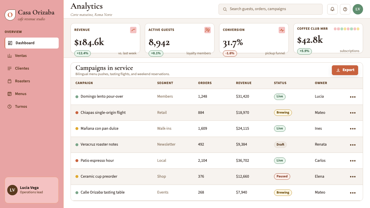
For web interfaces — particularly in hospitality, independent retail, food and beverage, and lifestyle categories — the system excels. A well-executed Roma Norte web UI uses a warm off-white body background, serif headings with editorial weight, card components that rely on subtle grain and warm shadow rather than hard borders, and navigation typography that reads as confident without being aggressive. Pricing pages benefit from the system's natural warmth: the tone communicates quality and care, which softens the transactional register. Dashboard applications should use the aesthetic selectively — the full system reads as slow and ambient in high-information-density contexts, so pare back texture and let the palette do the structural work instead.对于网页界面——尤其是餐饮、独立零售、食品饮料与生活方式类目——这套系统表现出色。执行良好的罗马北区网页界面采用温暖米白色主体背景、具有编辑感字重的衬线标题、依靠细腻颗粒感与暖调阴影而非硬边框线的卡片组件,以及读来自信而不咄咄逼人的导航排版。定价页面从这套系统的天然温暖感中获益:气质传递品质与用心,软化了交易感。仪表板类应用应选择性使用这套美学——完整系统在高信息密度场景下读来过于缓慢和环境化,此时应削减质感,让色板承担结构性工作。
For editorial and marketing work, the style's heritage in print and poster design makes it particularly strong. Long-form editorial layouts benefit from the system's relaxed typographic rhythm: wider margins, generous leading, and section breaks marked by a warm rule or small botanical ornament rather than a hard geometric line. Marketing campaigns with a warmth-and-quality brand positioning — specialty food, independent hotels, artisanal goods, wellness — can use the system's visual vocabulary directly. Hero images should follow the photographic sensibility described above: warm, intimate, observational. Avoid the cold-blue or high-key white photography conventions of generic e-commerce.对于编辑与营销工作,这套风格在印刷与海报设计中的传承使其尤为出色。长篇编辑版面从系统的从容排版节奏中受益:更宽的页边距、宽松的行距,以及以暖色细线或小型植物装饰而非冷硬几何线段标记的段落分隔。具有温暖与品质品牌定位的营销活动——精品食品、独立酒店、手工艺品、健康品类——可以直接运用这套系统的视觉词汇。主视觉图片应遵循前述的摄影感性:温暖、亲密、观察式。避免通用电商惯用的冷蓝调或高曝光白色摄影风格。
A common mistake when applying this aesthetic is reaching for the palette without honoring the spatial philosophy. Dusty pink, sage, and terracotta on a crowded, information-dense layout does not produce Roma Norte — it produces confusion. The white space is not optional; it is structural. A second common error is mixing this system with global-tech design conventions: sharp-corner cards, dark-mode defaults, icon-heavy navigation, and micro-animation all undercut the system's warmth and sense of place. The Roma Norte aesthetic requires a slower register, and that slowness is a feature, not a limitation.应用这套美学时最常见的错误,是拿到色板却不尊重空间哲学。将灰粉、鼠尾草与赤陶叠加于拥挤、信息密集的版面,产生的不是罗马北区——而是混乱。留白不是可选项,它是结构性的。第二个常见错误是将这套系统与全球科技设计惯例混用:直角卡片、深色模式默认值、图标密集的导航,以及微动效,都会消解系统的温度与场所感。罗马北区美学需要更慢的节奏,而这种缓慢是特性,不是局限。
See the CDMX Roma Norte Cafe design system →查看 CDMX Roma Norte Cafe 完整设计系统 →
CDMX Roma Norte Cafe — FAQCDMX Roma Norte Cafe · 常见问题
Is this style tied to Mexico City specifically, or can it work for any cafe or hospitality brand?这种风格是否只适用于墨西哥城场景,还是任何咖啡馆或餐饮品牌都可以使用?
The style emerged from a specific place and carries genuine cultural rootedness — that specificity is part of what makes it powerful. A brand that applies it without any connection to the cultural tradition risks producing something that looks borrowed rather than authentic. That said, the underlying principles — warmth through desaturated palettes, refinement through restraint, spatial generosity, craft-legible typography — are transferable, and independent hospitality brands globally have applied these values in locally meaningful ways. The key is to adapt the system to your own cultural and geographic specificity rather than applying it as a global costume.这种风格脱胎于特定的地方,承载着真实的文化根植性——正是这种特殊性使其具有力量。一个与该文化传统毫无关联的品牌若直接套用,产出的结果往往看起来像借来的,而非真实的。话虽如此,其底层原则——通过去饱和色板构建温度、通过克制赢得精致、空间的慷慨留白、传递手工感的排版——是可以迁移的。全球各地的独立餐饮品牌已经以各自本地化的方式实践了这些价值观。关键在于将这套系统适配于自身的文化与地理特殊性,而非将其当作一套全球化戏服穿上。
How does this style differ from Scandinavian minimalism or Japanese wabi-sabi, which also emphasize restraint and natural material?这种风格与同样强调克制和自然材质的斯堪的纳维亚极简主义或日本侘寂风有何不同?
All three value restraint and material honesty, but their emotional and chromatic registers are distinct. Scandinavian minimalism tends toward cool, clean neutrals — whites, light grays, pale woods — with a functional and egalitarian ethos. Wabi-sabi emphasizes impermanence and the beauty of aging, with a palette that skews toward ash, silver, and muted brown. The Roma Norte palette is warmer, more saturated (in a dusky, sunlit way), and more chromatic — the pinks and greens carry cultural resonance rather than just tonal warmth. The mood is sociable and generative rather than contemplative or ascetic. Think of it as warmth with editorial intelligence, rather than austerity with aesthetic principle.三者都重视克制与物料诚实,但其情感与色彩基调截然不同。斯堪的纳维亚极简主义倾向于清冷的中性色——白色、浅灰、浅色木材——带有功能性与平等主义的精神内核。侘寂强调无常与岁月之美,色板偏向灰烬色、银色与沉郁棕。罗马北区的色板更温暖,饱和度更高(以一种暮色、阳光的方式),且更具色相——粉色与绿色承载的是文化共鸣,而非单纯的色调温度。整体氛围是社交性的、生发性的,而非冥想性或苦行的。可以这样理解:这是带有编辑智性的温度,而非以美学原则驱动的简朴。
Can this aesthetic work in digital product design, or is it limited to branding and print?这套美学能用于数字产品设计吗,还是仅限于品牌与印刷领域?
It works in digital contexts, but requires thoughtful adaptation. The aesthetic emerged from physical spaces — the light, texture, and material of actual cafes — and some of its qualities (rough plaster, handmade ceramics, the warmth of a specific afternoon light) do not translate directly into pixels. Successful digital applications focus on the elements that do translate: the warm palette, the editorial typographic hierarchy, the generous negative space, and the avoidance of cold or high-contrast visual language. Texture can be simulated through careful layering, though subtlety is key — heavy grain or paper effects quickly read as decoration rather than system. The slowness and spaciousness of the aesthetic make it better suited to websites and marketing landing pages than to dense, fast-moving application interfaces.在数字场景中是可行的,但需要审慎的适配。这套美学源于实体空间——真实咖啡馆的光线、质感与物料——其中某些品质(粗糙灰泥、手工陶瓷、特定午后光线的温度)无法直接转化为像素。成功的数字应用专注于那些确实能转化的元素:温暖的色板、编辑感的排版层级、慷慨的留白,以及对冷调或高对比度视觉语言的主动规避。质感可以通过精心的图层叠加来模拟,但分寸是关键——过重的颗粒或纸张效果很快会被读作装饰而非系统。这套美学的缓慢感与空间感,使其更适合网站与营销落地页,而非信息密集、节奏快速的应用界面。
What is the most common error designers make when borrowing from this aesthetic?设计师借鉴这套美学时最常见的错误是什么?
The most common error is palette-first, philosophy-last: copying the dusty rose and sage without internalizing the spatial principles that give those colors meaning. The result is a crowded, busy layout in Roma Norte colors — which produces neither the Roma Norte feeling nor any other coherent feeling. The second most common error is treating the aesthetic as nostalgic or retro: adding aged texture, distressed type, and vintage ornament to evoke a past that the original scene never actually referenced. The Roma Norte style is contemporary, not historicist — its warmth comes from cultural rootedness, not from simulated age. A third error is applying it to contexts where warmth and slowness work against the product's purpose: high-frequency trading tools, emergency services interfaces, or any application where speed and urgency are non-negotiable values.最常见的错误是先拿色板、后考虑哲学:复制了灰玫瑰与鼠尾草色,却没有内化赋予这些颜色意义的空间原则。结果是一个拥挤、繁忙的版面穿着罗马北区的颜色——既没有罗马北区的感觉,也没有任何其他连贯的感觉。第二常见的错误是将这套美学处理成怀旧或复古的:添加做旧质感、斑驳字体与古典装饰,以唤起一个原始场景实际上从未援引的过去。罗马北区风格是当代的,而非历史主义的——它的温度来自文化根植性,而非模拟的岁月感。第三个错误是将其应用于温度与缓慢感与产品目的相悖的场景:高频交易工具、紧急服务界面,或任何速度与紧迫感是不可妥协价值的应用。
How does the Roma Norte aesthetic relate to broader trends in Latin American design?罗马北区美学与拉丁美洲设计的更广泛趋势有何关联?
The Roma Norte aesthetic is part of a broader movement in Latin American design that reasserts regional identity against the homogenizing pressure of global brand culture. Across Mexico, Colombia, Argentina, and Brazil, a generation of designers has developed visual systems that are simultaneously contemporary in their craft and production standards, and explicitly rooted in local material, chromatic, and cultural traditions. This stands in contrast to the previous generation's tendency to import European or North American design conventions wholesale. The Roma Norte scene is notable within this broader movement for having achieved particularly wide international visibility — its coherence, its Instagram-legible visual character, and its timing at the intersection of specialty coffee culture and global design platform culture all contributed to its reach beyond Mexico City.罗马北区美学是拉丁美洲设计中一场更广泛运动的组成部分——这场运动以重申地区身份来抵抗全球品牌文化的同质化压力。在墨西哥、哥伦比亚、阿根廷和巴西,一代设计师开发出视觉系统,在工艺与制作标准上与当代接轨,同时明确扎根于本地物料、色彩与文化传统。这与上一代人倾向于整体引进欧美设计惯例形成鲜明对比。罗马北区场景在这场更广泛的运动中之所以值得关注,在于它获得了格外广泛的国际能见度——其连贯性、Instagram可读的视觉特征,以及恰好处于精品咖啡文化与全球设计平台文化交汇点的时机,共同促成了它在墨西哥城之外的广泛影响。
Related design styles相关设计风格
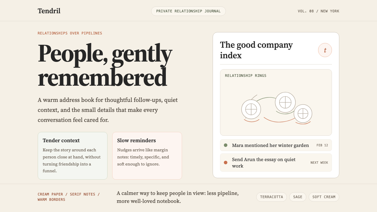 Clay 2024CRM as a sketchbook, not a sales pipeline. Cream backgrounds, terracotta, han…把 CRM 重新想象为安静的私人速写本:奶油底色、陶土点缀、手绘人物线描——拒…
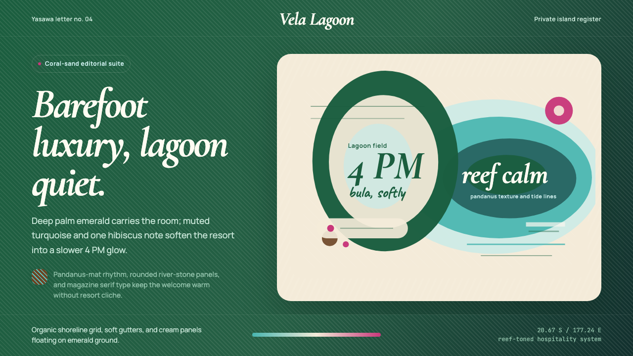 Fiji Tropical Resort Luxe ModernBarefoot luxury breathes slowly. Emerald field, cream panels, and lagoon curv…赤足奢华慢下来。深绿底、奶油面板与泻湖曲线定调。
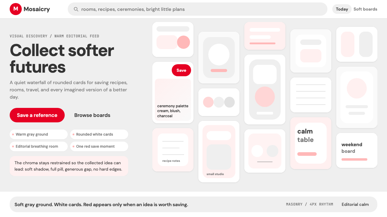 Pinterest 2024Aspirational calm. Warm gray masonry, rounded white pins, one surgical red sa…向往感很安静:暖灰瀑布流、白色圆角卡片、一颗红色保存按钮。
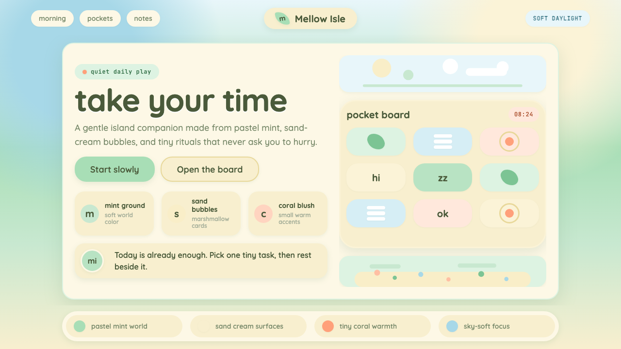 Animal Crossing — New HorizonsNo pressure, only daylight. Mint fields and sand bubbles soften every edge.没有压力,只有日光。薄荷地与沙奶油气泡软化所有边角。
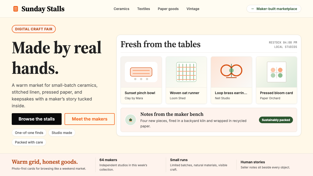 Etsy HandmadeA digital craft fair, in orange. Hand-drawn accents, cream backgrounds, delib…数字时代的手工艺集市:标志性 Etsy 橙、奶油底色、手绘插画点缀——每件物品…
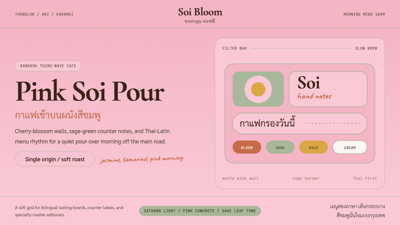 Bangkok Third-Wave CafeBangkok feels soft but sure. Cherry pink, sage borders, and Thai-Latin menu r…曼谷柔和却自信:樱花粉、鼠尾草边框与泰英菜单节奏。