What is Fiji Tropical Resort Luxe Modern?什么是 Fiji Tropical Resort Luxe Modern?
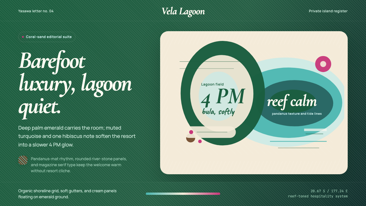
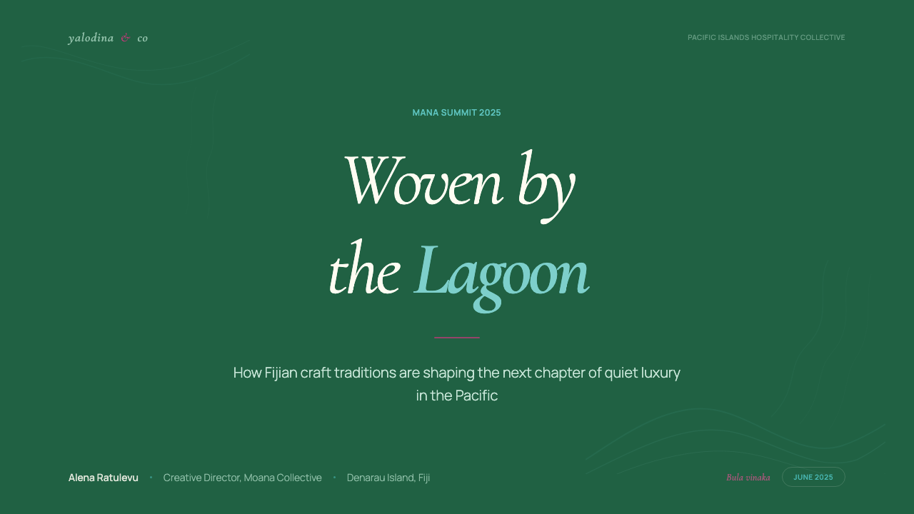
Barefoot luxury at its most editorial: deep palm-frond emerald, lagoon-curve geometry, and the unhurried warmth of a Yasawa overwater bungalow at golden hour.最具编辑感的赤足奢华:深棕榈叶翠绿、泻湖曲线几何,以及亚萨瓦水上别墅黄金时刻的悠然温度。
Fiji Tropical Resort Luxe Modern in briefFiji Tropical Resort Luxe Modern 速览
Fiji Tropical Resort Luxe Modern is a design language drawn from the visual identity of the world's most refined private-island hospitality — Likuliku Lagoon Resort, COMO Laucala, and Six Senses Fiji among its primary touchstones. Its palette centers on a deep, saturated palm-frond emerald as the dominant ground, tempered by a soft lagoon turquoise that recalls still water in morning light, and punctuated by a single hibiscus-magenta accent that carries all the emotional warmth of a Bula greeting without competing with the surrounding green.斐济热带度假奢华现代风格是一套提炼自全球最精致私人岛屿酒店视觉语言的设计体系,其主要参照包括利库利库泻湖度假村、科莫劳卡拉岛与六善斐济。色板以深邃、饱满的棕榈叶翠绿为主色调,辅以令人联想起晨光中静水的柔和泻湖青绿,再以一抹木槿洋红点缀——这一强调色传递着「Bula」问候的全部情感温度,却不与周围绿色形成竞争。
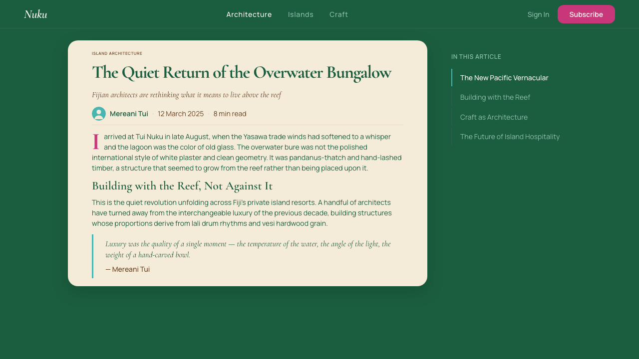
The style achieves its signature tension between restraint and richness by pairing editorial discipline with Melanesian craft warmth. Layouts are unhurried — generous white and cream space allows each element to breathe the way a resort allows guests to slow down. Organic, river-stone-inspired curves soften what might otherwise become a rigid system, and pandanus-mat weave textures appear as subtle surface motifs rather than background noise. The overall register is that of a Travel + Leisure editorial spread: authoritative but never cold, luxurious but never gilded.这种风格在克制与丰盈之间达成了独特的张力,其秘诀在于将编辑式纪律与美拉尼西亚工艺温度相结合。版面从容不迫——充裕的白色与奶油色留白让每个元素得以呼吸,正如度假村让宾客放慢脚步。鹅卵石般有机圆润的曲线柔化了系统本可能呈现的刚硬,而露兜叶编织纹理则以精妙的表面肌理而非背景噪声的形态出现。整体格调如《Travel + Leisure》杂志的专题摄影页:权威而不冰冷,奢华而不镀金。
Typography reinforces the dual character: a Cormorant Garamond italic display weight carries the languorous grace of a hand-lettered resort sign, while a clean, modern wayfinding face provides the operational clarity that premium hospitality demands. This pairing — expressive display with rational text — is the typographic equivalent of the resort's architectural logic: thatched bure rooflines over poured-concrete pools.字体排印强化了这种双重气质:Cormorant Garamond 斜体陈列字重承载着手写度假村招牌般的慵懒优雅,而简洁现代的导视字体则提供了顶级酒店所要求的操作清晰度。这一配对——富于表现力的陈列字体与理性的正文字体——是度假村建筑逻辑的排印版本:茅草覆盖的布瑞式小屋屋顶,俯瞰着混凝土浇筑的泳池。
See the Fiji Tropical Resort Luxe Modern design system查看 Fiji Tropical Resort Luxe Modern 完整设计系统
Where does Fiji Tropical Resort Luxe Modern come from?Fiji Tropical Resort Luxe Modern 从何而来?
The mature form of this aesthetic emerged between roughly 2015 and the present, coinciding with what hospitality analysts call the private-island resort era — a period in which ultra-high-net-worth travelers began demanding experiences that felt simultaneously wild and curated, remote and effortlessly comfortable. Fiji's Yasawa Islands, Mamanuca Islands, and Vanua Levu became the geographic crucible for this sensibility. The islands' extraordinary combination of ancient Melanesian culture, French Polynesian-adjacent marine ecology, and relatively accessible Pacific routing made them the preferred canvas for a new generation of barefoot-luxury resorts.这一美学的成熟形态大约于2015年至今形成,与酒店业分析人士所称的「私人岛屿度假村时代」同步出现——在这一时期,超高净值旅行者开始追求同时兼具野性与策展感、偏远与毫不费力的舒适感的体验。斐济亚萨瓦群岛、玛玛努卡群岛与瓦努阿岛成为这种感性的地理熔炉。这些岛屿将古老美拉尼西亚文化、近似法属波利尼西亚的海洋生态与相对便捷的太平洋航线融为一体的独特组合,使其成为新一代赤足奢华度假村的首选画布。
COMO Laucala, developed on an island previously owned by Malcolm Forbes and later by Dietrich Mateschitz — the Red Bull co-founder — represents perhaps the clearest articulation of the aesthetic in built form. Laucala's design brief was essentially: no compromise between ecological authenticity and sensory richness. The resort's architecture uses locally sourced stone and timber in ways that feel structurally honest, its palette draws directly from the reef and forest surrounding it, and its graphic identity translates those material choices into a two-dimensional system precise enough to carry across print collateral, digital interfaces, and wayfinding signage without losing coherence. Mateschitz's vision of Laucala as a self-sufficient ecosystem — with its own farm, dairy, and coral restoration program — gave the aesthetic an ethical backbone that reinforced its visual restraint.科莫劳卡拉岛或许是这一美学最清晰的实体陈述——该岛屿此前曾由马尔科姆·福布斯持有,后由红牛联合创始人迪特里希·马特希茨开发。劳卡拉的设计要义本质上是:生态真实性与感官丰盈之间不作妥协。度假村的建筑以当地采石与木材呈现出结构诚实感,色板直接取材自周围礁石与森林,其平面视觉识别将这些物质选择转化为一套二维体系,精确到足以在印刷物料、数字界面与指示标牌之间保持连贯而不失真。马特希茨将劳卡拉构想为一个自给自足生态系统的愿景——拥有自家农场、乳品厂与珊瑚修复项目——赋予了这一美学以道德骨架,强化了其视觉克制。
Australian developer Lang Walker and resort designer Lynda Anne Anstey, through projects including Kokomo Private Island and several Yasawa properties, developed a parallel strand of the style that leaned more explicitly into Pacific-Melanesian craft traditions. Pandanus-leaf weaving, hand-carved ivi-timber joinery, and tapa-cloth surface patterns entered the design vocabulary not as decorative pastiche but as structural gestures — forms that communicated provenance and artisanal labor as legibly as any logo. This craft-revival thread transformed what might have been a generic tropical luxury visual system into something culturally located.澳大利亚开发商朗·沃克与度假村设计师琳达·安妮·安斯蒂,通过科科莫私人岛屿及若干亚萨瓦岛目的地项目,发展出这种风格更明确植根于太平洋-美拉尼西亚工艺传统的平行脉络。露兜叶编织、手工雕刻伊维木拼接与塔帕布表面纹样进入设计词汇,不是作为装饰性拟古,而是作为结构性姿态——这些形式以与任何商标同等清晰的方式传达着产地与手工劳动的价值。这条工艺复兴线索将一套本可能流于通俗热带奢华视觉体系的东西,转化为具有文化坐标的独特语言。
The aesthetic's third major influence is the regenerative-tourism marketing movement, which gained momentum in the late 2010s as luxury travelers began demanding that their indulgences leave a positive ecological and community footprint. Resorts operating under this philosophy needed design systems that communicated simultaneously: sensory pleasure, environmental responsibility, and cultural respect. The result was a visual language in which restraint carries moral weight — cream and emerald chosen not merely because they are beautiful but because they suggest stewardship, patience, and a relationship with place that predates the arrival of any guest.这一美学的第三股主要影响来自再生旅游营销运动。随着奢华旅行者在2010年代末开始要求其消费行为留下积极的生态与社区印迹,这一运动势头日盛。在这一理念下运营的度假村需要一套设计体系,能够同时传递:感官愉悦、环境责任与文化尊重。其结果是一种视觉语言,其中克制本身承载着道德重量——奶油色与翠绿色的选择,不仅仅因为它们美丽,更因为它们暗示着管护责任、耐心,以及一种先于任何宾客到来便已存在的地方情感。
What defines the Fiji Tropical Resort Luxe Modern look?Fiji Tropical Resort Luxe Modern 的视觉特征是什么?
Color Palette色彩体系
The palette is organized around three principals: a deep, forest-saturated emerald that functions as the dominant ground — dark enough to carry weight, rich enough to suggest the interior canopy of a Fijian palm grove; a soft, desaturated lagoon turquoise used for secondary fields and hover states, evoking the pale shallow water visible from overwater bungalow decks at midday; and a single hibiscus-magenta accent deployed with restraint for moments that demand emotional warmth or a call to action. Cream and warm off-white serve as the text and panel ground throughout, never pure white. Charcoal, not black, anchors typographic hierarchy.色彩体系由三个主角构成:深邃而饱满的森林翠绿作为主色调底面——深度足以承载重量,丰富度足以令人联想起斐济棕榈林的林下空间;柔和、低饱和度的泻湖青绿用于次级区域与悬停状态,唤起正午时分从水上别墅甲板俯瞰的浅浅碧水;以及一抹木槿洋红作为唯一强调色,克制地出现在需要情感温度或行动召唤的时刻。奶油色与暖调米白贯穿全程充当文字与面板底面,从不使用纯白。字体层级的锚点是炭灰而非黑色。
Organic Geometry有机几何
Where other luxury systems reach for hard edges, this style insists on softened corners, gentle arcs, and forms that echo the river stones, wave-worn shells, and lagoon outlines of the Fijian coastal landscape. Dividers curve rather than cut. Card components have corners that feel rounded by water rather than specified by a style guide. Large decorative shapes — section backgrounds, image masks, pull-quote containers — read as organic rather than constructed, as though they were traced from a map of the reef rather than drawn in a vector editor.当其他奢华体系倾向于硬朗边缘时,这种风格坚持柔化的转角、温和的弧线,以及回应斐济海岸地景中河卵石、波浪磨圆的贝壳与泻湖轮廓的形态。分割线以弧线曲折而非切割。卡片组件的圆角感觉像被水流打磨,而非由样式规范指定。大型装饰形状——版块背景、图像遮罩、引言容器——呈现有机感而非建构感,仿佛是从珊瑚礁地图上描摹而来,而非在矢量编辑器中绘制。
Texture as Restraint作为克制的肌理
Pandanus-mat weave patterns, tapa-cloth geometric motifs, and the subtle grain of natural linen appear as background textures or micro-surface treatments — never loud, never central. Their role is to prevent the palette's depth from tipping into flatness, and to signal craft provenance without competing with content. Applied well, these textures make the layout feel like it was produced by a thoughtful studio rather than assembled from a generic template. The key discipline is scale: used large, they read as cultural cliché; kept small and low-contrast against the ground, they read as material honesty.露兜叶编织纹样、塔帕布几何母题与天然亚麻的细腻纹理,以背景肌理或微表面处理的形式出现——从不喧宾夺主,从不居于核心。它们的作用是防止色板的深度滑向平板感,并在不与内容竞争的前提下传递工艺出处。运用得当时,这些肌理使版面感觉出自一个用心工作室之手,而非组装自通用模板。关键的纪律在于尺度:放大使用则沦为文化陈词滥调;在底色上保持小尺度与低对比度,则读来如同材料的诚实表达。
Typography: Display and Wayfinding字体排印:陈列与导视
The typographic system pairs two voices that should never compete: an italic serif display face with high stroke contrast and classical proportions — the kind of letterform that communicates heritage, hand-craft, and slow time — alongside a clean geometric sans-serif used for all functional text, labels, pricing, and navigation. Headlines lean into the serif's natural slope to suggest unhurried elegance; body text in the sans stands upright and legible at any size. Mixing these two registers within a single component — a serif headline over a sans-serif descriptor — is the system's defining typographic gesture.排印体系将两种声音配对,令其从不产生竞争:一款高笔画对比度、经典比例的斜体衬线陈列字体——这类字形传递传承感、手工艺感与慢时间——以及一款简洁几何无衬线字体,用于所有功能性文字、标签、定价与导航。标题倾向于借助衬线字体的自然斜度表达悠然的优雅;正文的无衬线字体直立而清晰,在任何尺寸下皆易于阅读。在单一组件内混用这两种层次——衬线标题搭配无衬线说明文字——是这套体系最具标志性的排印手势。
Generous Negative Space充裕的留白
Resort design teaches guests that slowness is a luxury. This style carries the same lesson into two-dimensional work: whitespace and cream space are not gaps waiting to be filled — they are the pacing of the layout. Section margins are wide. Inter-element spacing within cards and panels is generous. Pull quotes and callouts occupy more vertical territory than their content strictly requires. The effect is a layout that feels costly not because it deploys expensive materials but because it refuses to crowd. Density is the opposite of luxury here.度假村设计告诉宾客:慢,本身就是奢华。这种风格将同样的课题带入二维工作:留白与奶油色空间不是等待填充的空隙——它们是版面的节奏。版块边距宽阔,卡片与面板内部的元素间距充裕,引言与标注占据的垂直空间超出其内容本身的严格需求。最终效果是一个感觉造价不菲的版面——不是因为它使用了昂贵的材料,而是因为它拒绝拥挤。在这里,密度是奢华的反义词。
Photographic Register摄影调性
Imagery in this system works within a carefully controlled tonal range: warm-shifted, softly golden, and consistently overexposed enough to feel like afternoon light rather than studio flash. The subject matter prioritizes natural detail — the texture of reef coral, the translucency of a palm frond against sky, the grain of hand-planed timber — over human figures or action. When people appear, they are typically peripheral, scale figures, or shot from behind, preserving the sense that the landscape is the protagonist. No HDR drama, no deep shadows, no travel-stock wide angles: every image should look as though it was taken by someone who lives there.这套体系中的图像在严格控制的色调范围内运作:暖调偏移、柔和金黄,且始终保持足够的过曝感以呈现午后自然光而非摄影棚闪光的质感。题材优先关注自然细节——礁石珊瑚的纹理、棕榈叶逆光的透明感、手刨木料的纹路——而非人物或动作。当人物出现时,通常是画面边缘的比例参照、或从背后拍摄,以保留景观才是主角的感知。没有HDR戏剧感,没有深重阴影,没有旅行图库式大广角:每一张图像都应看起来像是一个住在那里的人随手拍摄的。
Ornament Hierarchy装饰层级
Unlike minimalist systems that eliminate ornament entirely, this style permits decoration — but places it firmly in service of cultural context. A tapa-inspired border on a section divider communicates Pacific provenance. A hibiscus-derived motif in a corner serves as wayfinding. A woven-mat pattern in a table header distinguishes it from body rows. What is not permitted is ornament for its own sake: gradient overlays that add visual noise without meaning, decorative flourishes borrowed from unrelated traditions, or drop shadows softened merely to suggest depth. Decoration must earn its place by saying something specific about where this aesthetic comes from.与彻底消除装饰的极简体系不同,这种风格允许装饰的存在——但将其明确置于文化语境服务的位置。版块分割线上源自塔帕布的边饰传递着太平洋出处;角落里来自木槿图形的母题充当导视;表格表头中的编织纹样将其与正文行区分开来。不被允许的是为装饰而装饰:增加视觉噪声却无实意的渐变叠加、借用自无关传统的装饰花样、或仅为暗示深度而软化的投影。装饰必须通过明确传递这一美学的来处来赢得自己的位置。
See the Fiji Tropical Resort Luxe Modern design system查看 Fiji Tropical Resort Luxe Modern 完整设计系统
Who shaped Fiji Tropical Resort Luxe Modern?谁塑造了 Fiji Tropical Resort Luxe Modern?
The Austrian co-founder of Red Bull acquired Laucala Island and developed it into COMO Laucala — widely regarded as the design benchmark for the Pacific private-island category. Mateschitz's insistence on total ecological and operational self-sufficiency (the island runs its own organic farm, dairy, desalination system, and coral restoration program) gave the resort's visual identity an ethical dimension that became integral to the aesthetic: restraint and richness coexisting because one earns the other.这位红牛奥地利联合创始人收购劳卡拉岛并将其开发为科莫劳卡拉岛度假村——被广泛视为太平洋私人岛屿品类的设计标杆。马特希茨坚持实现完整的生态与运营自给自足(岛屿自营有机农场、乳品厂、海水淡化系统与珊瑚修复项目),赋予了度假村视觉识别以道德维度,使其成为这一美学不可或缺的组成部分:克制与丰盈并存,因为一者为另一者赢得了存在的正当性。
Working alongside developer Steve Anstey on several Fijian resort projects including Kokomo Private Island, Lynda Anne Anstey helped define the craft-inflected strand of the style — the integration of traditional pandanus weaving, hand-carved timber, and Melanesian textile traditions into contemporary resort interiors and, by extension, the graphic systems that represent those interiors. Her work demonstrates that the aesthetic's warmth is not applied surface decoration but a consequence of genuine material and cultural engagement.琳达·安妮·安斯蒂与开发商史蒂夫·安斯蒂合作,参与了包括科科莫私人岛屿在内的多个斐济度假村项目,帮助定义了这种风格中注入手工艺精神的脉络——将传统露兜叶编织、手雕木料与美拉尼西亚纺织传统整合进当代度假村室内,并由此延伸至代表这些室内空间的平面体系。她的工作证明,这一美学的温度不是表面涂抹的装饰,而是真诚的材料与文化介入的结果。
Australian property developer and philanthropist Lang Walker brought this aesthetic register to commercial scale through his Fiji investments, demonstrating that the visual language of ultra-private island hospitality could be sustained across properties with different geographic characters — reef-facing versus interior-valley — without collapsing into formula. His projects helped establish the regional expectation that high-end Fijian resort design should carry legible cultural specificity, not generic tropical luxury.澳大利亚地产开发商与慈善家朗·沃克通过在斐济的投资,将这种美学格调推向商业规模,证明了极私密岛屿酒店的视觉语言能够跨越地理特征各异的项目——面礁与腹地谷地——而不至于沦为公式化套路。他的项目帮助确立了一种区域性期望:高端斐济度假村设计应携带清晰可辨的文化特殊性,而非通用的热带奢华语汇。
Six Senses' Fijian property brought the brand's signature wellness-inflected restraint to the Pacific register, helping establish the convention that barefoot-luxury design should never feel energetically aggressive. The Six Senses approach — slow reveal, sensory layering, deliberate pace in every designed interaction from arrival sequence to menu typography — contributed the wellness-design principle that this visual style inherits: comfort should be achieved through subtraction, not addition.六善斐济的创意团队将品牌标志性的健康克制格调带入太平洋语境,帮助确立了一种惯例:赤足奢华设计在气场上决不应令人感到咄咄逼人。六善的方式——缓慢揭示、感官分层、从抵达动线到菜单排印的每一处设计互动都刻意放慢节奏——为这种视觉风格注入了健康设计原则:舒适应通过减法而非加法来实现。
While not a single individual, the editorial art direction of Travel + Leisure magazine over the past decade functioned as the primary taste-arbiter for the aspirational Pacific luxury aesthetic. Its typographic choices — pairing editorial serifs with functional sans-serifs, using white space as editorial luxury, treating photography as documentary evidence rather than fantasy marketing — directly shaped how Fijian and broader Pacific resort brands understood their own visual identity, and how design teams working for those brands were briefed.虽然不是某位具体个人,《Travel + Leisure》杂志过去十年的编辑视觉指导,作为太平洋奢华度假向往美学的主要品味仲裁者发挥着关键作用。其排印选择——将编辑衬线字体与功能无衬线字体配对、以留白作为编辑性奢华、将摄影视为纪录性证据而非幻想营销——直接塑造了斐济及更广泛太平洋度假村品牌对自身视觉识别的理解方式,以及为这些品牌工作的设计团队所接受的创作简报。
How do you use Fiji Tropical Resort Luxe Modern today?今天怎么用 Fiji Tropical Resort Luxe Modern?
Fiji Tropical Resort Luxe Modern is a contextually specific style: its values — sensory richness earned through restraint, cultural provenance as a design argument, organic warmth in opposition to corporate polish — must align with the product's own positioning for the style to work. Applied correctly, it communicates premium quality, geographical and cultural authenticity, and a considered slowness that feels like a meaningful differentiator in crowded luxury markets. The checklist before applying it: does the product belong in or aspire to the premium hospitality, sustainable travel, wellness, or editorial lifestyle category? If yes, proceed.斐济热带度假奢华现代风格是一种有特定语境指向的风格:它的价值观——通过克制赢得的感官丰盈、文化出处作为设计论点、有机温度对抗企业光洁感——必须与产品自身的定位对齐,风格才能奏效。正确应用时,它传递顶级品质、地理与文化真实性,以及在拥挤的奢华市场中感觉像是有意义差异化的那种从容。应用前的核查清单:这个产品是否属于或渴望进入顶级酒店业、可持续旅行、健康养生或编辑生活方式类别?若答案是肯定的,可以继续。
For presentation slides, this style works best on decks where the selling point is experiential or aspirational rather than analytical. A cover slide benefits from a full-bleed emerald ground with cream typography: the title set in an italic serif display face, the subtitle in a smaller geometric sans-serif directly beneath, and a single organic shape — an arcing lagoon-curve panel in lagoon turquoise — as the sole compositional element beyond type. Content slides should breathe: one strong image or data point per slide, generous top and bottom margins, section titles in the serif and body in the sans. Data slides adopt the color system directly: use the emerald for primary series, turquoise for secondary, and reserve the magenta accent exclusively for the highest-value or most critical data point on the chart.对于演示文稿,这种风格最适合主要卖点是体验性或向往性而非分析性的幻灯片组。封面幻灯片适合采用满版翠绿底面搭配奶油色字体:标题使用斜体衬线陈列字体,副标题以较小的几何无衬线字体紧随其下,唯一的构图元素(除文字外)是泻湖青绿色的弧形泻湖曲线面板。内容幻灯片应当留有充裕空间:每张幻灯片只放一个核心图像或数据点,保持宽阔的上下边距,版块标题使用衬线字体,正文使用无衬线字体。数据幻灯片直接采用色彩体系:翠绿用于主数据系列,青绿用于次要系列,洋红强调色专门保留给图表上价值最高或最关键的那个数据点。
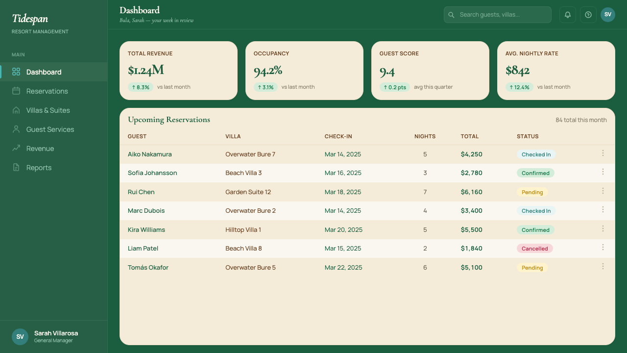
For web and dashboard interfaces, the style suits premium brand homepages, booking flows, resort membership portals, and wellness subscription platforms. Define a layout grid with wide outer margins — the negative space is not wasted, it signals category. Use the emerald as a hero section background with cream text, the lagoon turquoise for card borders and hover states, and cream panels for content areas. Organic-curve image masks and rounded section containers carry the resort character into digital form without requiring literal photography of beaches. Interactive states use the magenta accent. Navigation is typographic — serif wordmark, sans-serif links — no icon-only navigation.对于网页与仪表板界面,这种风格适合顶级品牌首页、预订流程、度假村会员门户与健康订阅平台。定义一套宽外边距的版面网格——留白不是浪费,它在发出品类信号。以翠绿作为英雄版块背景搭配奶油色文字,以泻湖青绿用于卡片边框与悬停状态,以奶油色面板承载内容区域。有机曲线图像遮罩与圆角版块容器将度假村气质带入数字形态,无需真实的沙滩摄影。交互状态使用洋红强调色。导航采用字体方案——衬线文字标识、无衬线链接——不使用纯图标导航。
For editorial and marketing materials — printed brochures, digital magazines, social card templates, email campaigns — the style's poster-like quality translates directly. An email header in deep emerald with cream italic headline and a single turquoise horizontal rule has the tonal authority of a resort letter. Marketing pages work well with alternating section treatments: cream-ground sections with emerald type alternating with full-emerald sections with cream type. The magenta accent appears once per page, at most, for the primary call to action. Photography should follow the overexposed, warm-shifted, detail-centric brief described above; stock imagery with hard flash lighting, HDR skies, or artificial color grading will break the aesthetic immediately.对于编辑与营销物料——印刷宣传册、数字杂志、社交卡片模板、电子邮件营销活动——这种风格的海报式品质可直接转化。深翠绿背景上搭配奶油色斜体标题与单条青绿水平线的电子邮件页眉,具有度假村信函般的格调权威感。营销页面适合采用交替版块处理:奶油色底面搭配翠绿文字的版块,与全翠绿底面搭配奶油色文字的版块交替出现。洋红强调色在整页最多出现一次,用于主要行动召唤。摄影应遵循上文描述的过曝、暖调、以细节为中心的简报要求;使用强闪光灯、HDR天空或人工调色的图库图像将立即瓦解这一美学。
A common mistake when applying this style is treating the emerald as a background color that permits dense text and complex layouts on top of it. In practice, dark grounds require sparser composition, larger type, and more breathing room than light grounds — not less. Designers who carry over their light-ground content density into the emerald sections produce slides and pages that feel heavy and unreadable. A related error is reaching for the magenta accent too frequently: used more than once or twice per composition, it stops reading as a warm punctuation and starts reading as an alert or error state. The entire palette must maintain its resort-pace cadence — generous, deliberate, unhurried — or the style collapses into something that merely uses tropical colors.应用这种风格时最常见的错误,是将翠绿色视为可以在其上放置密集文字与复杂版面的背景色。实际上,深色底面比浅色底面需要更稀疏的构图、更大的字号与更充裕的呼吸空间——而不是更少。将浅色底面内容密度照搬到翠绿版块的设计师,会产生沉重而难以阅读的幻灯片与页面。另一个相关错误是过于频繁地触碰洋红强调色:在单一构图中出现两次以上,它就不再被读作温暖的标点,而开始被读作警告或错误状态。整套色板必须保持度假村步调的节奏——充裕、从容、不慌不忙——否则这种风格会坍塌为一套仅仅使用热带色彩的普通方案。
See the Fiji Tropical Resort Luxe Modern design system查看 Fiji Tropical Resort Luxe Modern 完整设计系统
Fiji Tropical Resort Luxe Modern — FAQFiji Tropical Resort Luxe Modern · 常见问题
How is this different from generic tropical design?这与通用热带设计风格有何不同?
Generic tropical design reaches for maximum vibrancy: saturated teal, hot coral, white grounds, and palm-leaf motifs reproduced at decorative scale. Fiji Tropical Resort Luxe Modern moves in the opposite direction — the emerald is deep rather than bright, the accent is restrained to a single hibiscus-magenta moment per composition, and the palm-leaf and pandanus motifs appear as micro-texture rather than hero imagery. The cultural reference is specific (Melanesian craft, Yasawa island geography) rather than generically tropical. Where generic tropical says 'vacation,' this style says 'private island' — and that distinction requires disciplined restraint in color weight, ornament frequency, and spatial density.通用热带设计追求最大鲜艳度:饱和青绿、热珊瑚色、白色底面,以及以装饰性尺度复现的棕榈叶母题。斐济热带度假奢华现代风格朝相反方向移动——翠绿深邃而非明亮,强调色克制到每个构图仅有一处木槿洋红时刻,而棕榈叶与露兜叶母题以微肌理而非主视觉图像的形式出现。文化参照是具体的(美拉尼西亚工艺、亚萨瓦岛地理)而非泛泛的热带风情。通用热带风格说的是「度假」,这种风格说的是「私人岛屿」——这一区分需要在色彩分量、装饰频率与空间密度上的严格克制。
Can this style work on a dark or night-mode layout?这种风格能用于深色或夜间模式版面吗?
Yes, but with specific adjustments. The deep emerald ground, which functions as the hero color in light-mode compositions, becomes an even richer near-black when pushed toward the dark end of its tonal range — this works well as a full-page night mode background. The cream that serves as body-text ground in light mode should shift to a warm white or pale gold for maximum legibility against dark grounds. The lagoon turquoise accent becomes more active on dark grounds and requires proportional reduction in surface area to maintain the same visual weight it carries against cream. The magenta accent should be used even more sparingly in dark mode — its energy reads amplified on dark backgrounds. The overall effect in dark mode should still feel like 4 AM at a resort: quiet, warm, unhurried.可以,但需要做出特定调整。在浅色模式构图中充当主色的深翠绿底面,当被推向其色调范围的深端时,会变成更为浓郁的近黑色——这作为整页夜间模式背景效果良好。在浅色模式中充当正文底面的奶油色,在深色底面上应转换为暖白或淡金色以获得最佳可读性。泻湖青绿色强调在深色底面上会变得更为活跃,需要相应减少使用面积,以维持其在奶油色底面上所具有的视觉分量。洋红强调色在夜间模式下应使用得更为节制——它的能量在深色背景上读来会被放大。深色模式下的整体效果仍应有度假村凌晨四点的感觉:宁静、温暖、从容。
How do I handle data-heavy slides without losing the resort aesthetic?如何在数据密集的幻灯片中保持度假村美学而不失真?
The single most important rule is: one insight per slide. Resort design works on the principle of reveal — you do not see the whole property at once, you discover it room by room, view by view. Apply the same principle to data: resist the temptation to combine three charts on one slide. For the charts themselves, use the emerald-turquoise-magenta system strictly — emerald for the primary series, turquoise for comparison, magenta for the single most critical value only. Keep gridlines hair-thin and in a warm mid-tone rather than standard gray. Replace standard chart borders with organic curve containers. Label directly on or beside data points rather than relying on legend boxes, which add visual weight without adding resort cadence.最重要的一条规则是:每张幻灯片只放一个洞察。度假村设计建立在「揭示」原则上——你不会一次看到整个度假村,而是逐室、逐景发现它。将同样的原则应用于数据:抵制将三张图表合并到一张幻灯片的诱惑。对于图表本身,严格使用翠绿-青绿-洋红体系——翠绿用于主数据系列,青绿用于对比系列,洋红仅用于唯一最关键的数值。保持网格线极细并使用暖调中间色调而非标准灰色。用有机曲线容器替代标准图表边框。直接在数据点上或旁边标注,而非依赖图例框——后者增加视觉重量却无助于维持度假村节奏。
Does this style suit B2B or enterprise software contexts?这种风格适合B2B或企业软件场景吗?
It is a poor fit for most standard B2B and enterprise software contexts, where the expected design register is one of efficiency, rationality, and scalability — values better served by Swiss-influenced systems, flat neutral palettes, and typographic hierarchies that prioritize legibility over elegance. The exceptions are enterprise tools built for the hospitality, travel, or wellness verticals — property management systems for boutique resort groups, booking platforms for high-end travel agencies, internal dashboards for resort operations teams. In these contexts, the style can create meaningful product-market coherence: the software feels like it belongs in the same world as the properties it manages. Outside those verticals, using this style in B2B contexts risks communicating leisureliness where clients expect rigor.对于大多数标准B2B与企业软件场景,这种风格并不适合——这些场景所期望的设计格调是效率、理性与可扩展性,这些价值观更适合由受瑞士影响的体系、平淡中性的色板与优先考虑可读性而非优雅感的字体层级来服务。例外情况是为酒店、旅行或健康养生垂直领域构建的企业工具——精品度假村集团的物业管理系统、高端旅行社的预订平台、度假村运营团队的内部仪表板。在这些场景中,这种风格能够创造有意义的产品与市场连贯性:软件感觉像是与它所管理的物业属于同一个世界。在这些垂直领域之外,在B2B场景中使用这种风格,会面临在客户期待严谨之处传递出悠闲感的风险。
What is the most common mistake that makes this style feel generic?哪种错误最容易让这种风格显得流于俗套?
Over-saturation of the accent and under-restraint on ornament. The magenta hibiscus accent exists to create one warm emotional beat per composition — when it appears on every button, every icon, every highlighted line, it ceases to be an accent and becomes noise. Simultaneously, when pandanus-mat textures, wave motifs, and palm-leaf patterns are all present simultaneously at high contrast, the layout stops saying 'Fiji private island' and starts saying 'generic tropical hotel lobby.' The discipline is subtractive: for every motif or accent touch you want to add, remove one that is already there. The style reads most authentically when it feels as though a considered editorial hand removed everything that was not essential — which is exactly the experience that its source resorts are designed to produce.强调色过饱和、装饰克制度不足。洋红木槿强调色的存在,是为了在每个构图中制造一个温暖的情感节拍——当它出现在每个按钮、每个图标、每条高亮线上时,它就不再是强调色,而变成了噪声。与此同时,当露兜叶编织纹理、波浪母题与棕榈叶图案同时以高对比度出现时,版面就不再传递「斐济私人岛屿」,而开始传递「通用热带酒店大堂」。这门纪律是减法式的:每想要添加一个母题或强调色触点,就从已有的元素中移除一个。当整体感觉像是一双有见地的编辑之手移除了所有非必要之物时,这种风格读来最为真实——而这正是其源头度假村所设计要传递的体验。
Related design styles相关设计风格
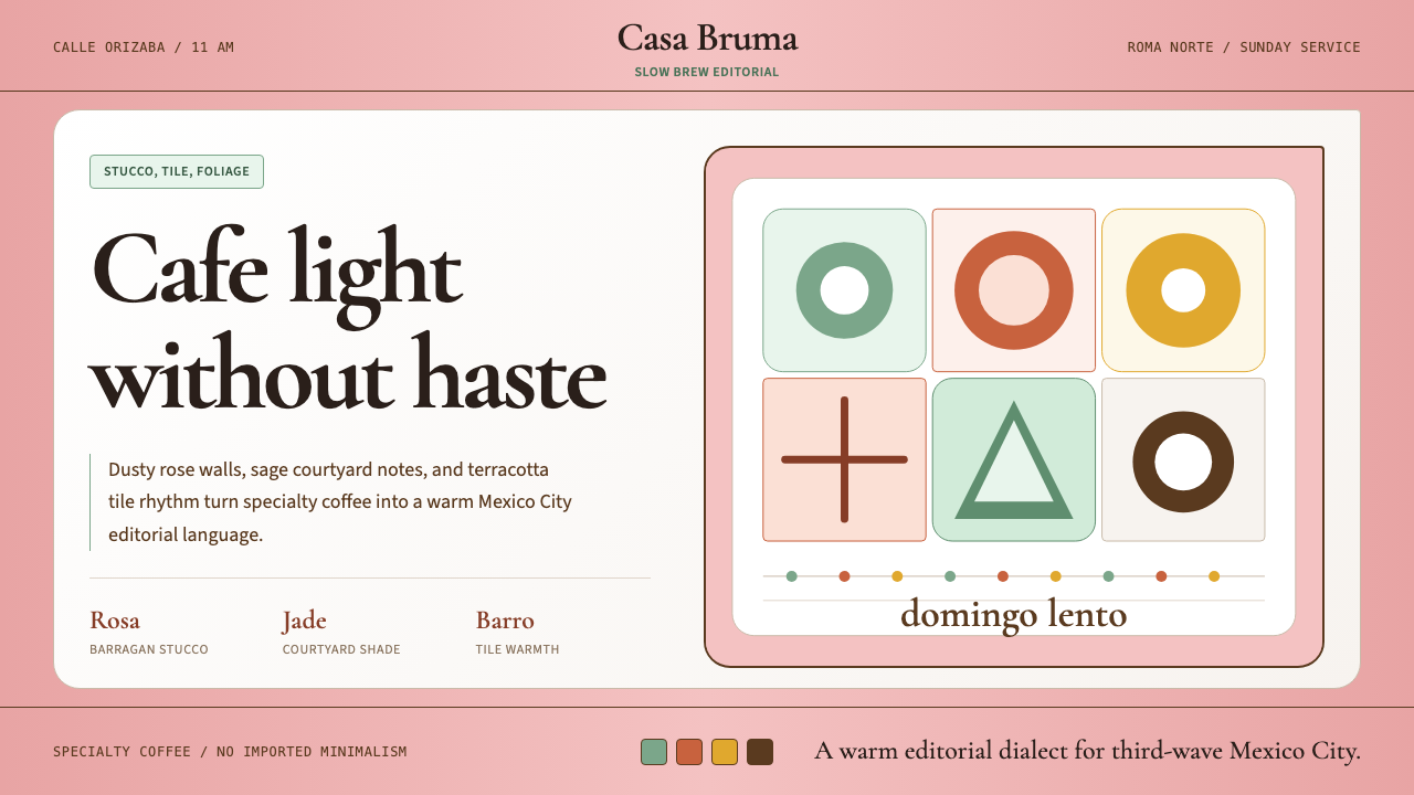 CDMX Roma Norte CafeMexico City coffee, unhurried. Dusty rose, sage jade, and serif rhythm carry…从容的墨城咖啡感:灰玫瑰、鼠尾草绿与衬线节奏传递温度。
 Clay 2024CRM as a sketchbook, not a sales pipeline. Cream backgrounds, terracotta, han…把 CRM 重新想象为安静的私人速写本:奶油底色、陶土点缀、手绘人物线描——拒…
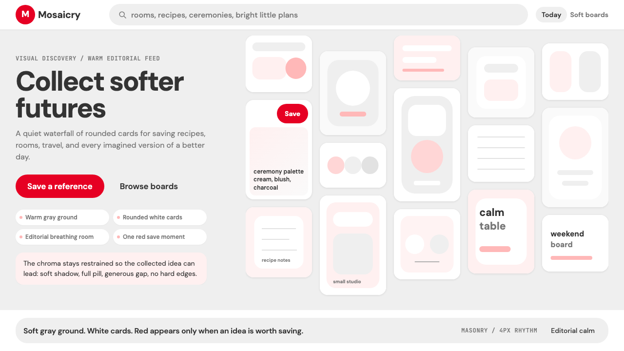 Pinterest 2024Aspirational calm. Warm gray masonry, rounded white pins, one surgical red sa…向往感很安静:暖灰瀑布流、白色圆角卡片、一颗红色保存按钮。
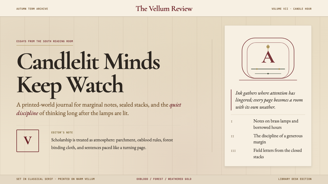 Dark AcademiaCandlelit nostalgia for old books. Parchment grounds, oxblood accents, classi…西方古典教育的浪漫想象:羊皮纸底色、牛血红点缀、古典衬线——一本被翻阅无数次的…
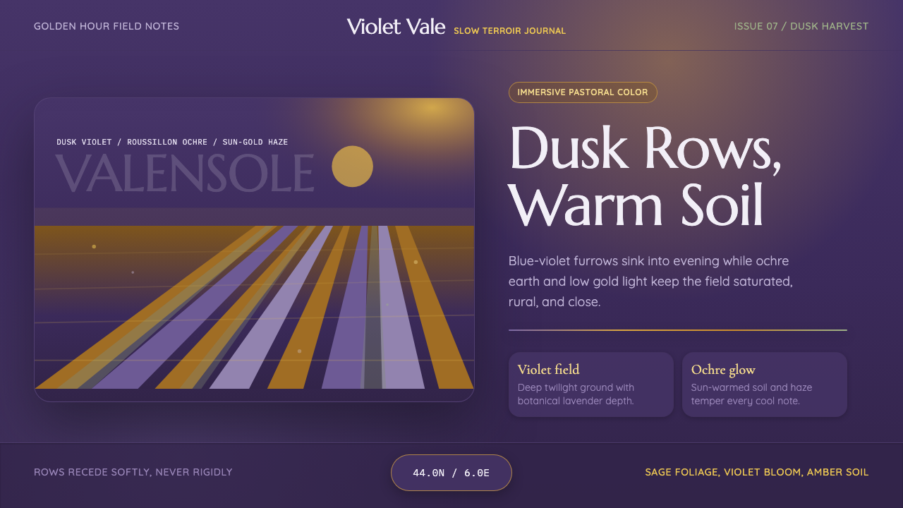 Provence LavenderSaturated pastoral dusk. Violet rows, ochre soil, and sun-gold haze build the…饱和的田园黄昏:紫色花垄、赭土与金色暮霭定调。
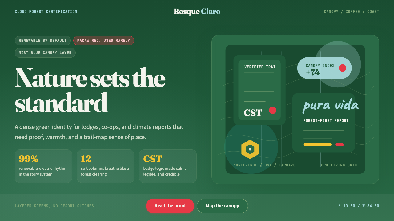 Costa Rica Pura Vida EcoAlive without greenwash. Cloud-forest green, Fraunces serif, and scarlet acce…拒绝漂绿:云雾森林绿、Fraunces衬线与猩红点缀撑起生机。