What is Provence Lavender?
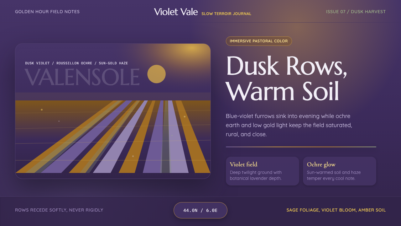
Provence Lavender takes the Valensole plateau at golden hour — endless violet furrows over warm ochre soil under a sun-gold haze — and builds a saturated, immersive pastoral mood around it.
Provence Lavender in brief
Provence Lavender draws its entire visual logic from a single, specific landscape: the lavender plateaus of southern France in the hour before sunset, when rows of blue-violet flower spikes stretch to the horizon over sun-warmed earth. Unlike the pale, pastel version of lavender that shows up in gift-shop packaging and soap labels, this system commits to the color as it actually appears in the field at dusk — deep, saturated, almost dusky violet, not a diluted lilac.
The palette pairs that violet with warm ochre and terracotta earth tones drawn from the Roussillon region's famous ochre cliffs, sage-green foliage, and a low, golden evening light that touches every surface with warmth rather than glare. This is rural French pastoral treated as an immersive, saturated experience rather than a decorative motif — closer to standing in the field at the end of a long summer day than to a printed pattern on a tea towel.
Structurally, the system favors long horizontal bands — echoing the furrowed rows of a lavender field — over grid-based composition, and it uses the warm-to-cool contrast between the gold evening light and the violet flowers as its primary source of visual depth, rather than relying on hard shadow or sharp geometric edges.
Where does Provence Lavender come from?
Lavandula angustifolia, the species most associated with this landscape, was formally classified in the eighteenth century by the Swedish botanist Carl Linnaeus as part of his broader project to systematize plant nomenclature, though the plant itself had been cultivated and prized for its scent across the Mediterranean for far longer, with roots in ancient Roman bathing culture — the word lavender is widely traced to the Latin lavare, to wash.
The dense, cultivated rows that define the modern image of Provence are a comparatively recent agricultural landscape. Large-scale lavender farming on plateaus such as Valensole expanded through the nineteenth and twentieth centuries as the perfume industry centered in nearby Grasse, long the historic capital of French perfumery, created sustained commercial demand for lavender essential oil, which is distilled from the harvested flower spikes in the weeks after the summer bloom.
The region's product was formally protected in 1981 with the establishment of the Appellation d'Origine Contrôlée for Huile essentielle de lavande de Haute-Provence, a designation that ties the oil's identity to the specific soil, altitude, and climate of the Haute-Provence plateaus in the same way a wine appellation protects a terroir — recognition that the landscape itself, not just the plant, is part of what the product is selling.
By the late twentieth and early twenty-first centuries, the fields had become a landscape as much photographed and traveled to as farmed, drawing visitors during the short window of the July bloom for the specific golden-hour view of violet rows against warm evening light that this system takes as its subject — a contemporary tourism and editorial phenomenon layered on top of a much older agricultural and perfumery tradition.
What defines the Provence Lavender look?
Color
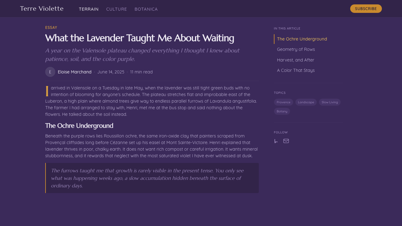
The palette commits to saturated dusk-violet as its dominant note, paired with warm ochre and terracotta earth tones and touches of sage green. Every color is warmed by an implied late-afternoon light rather than cooled toward pastel — this is field-at-dusk violet, not gift-shop lilac.
Horizontal Banding
Composition favors long horizontal bands that echo the furrowed rows of a cultivated lavender field, receding toward a horizon rather than organizing content into a rigid rectangular grid. This gives layouts a landscape-like sense of depth and distance.
Warm Light
A low, golden evening glow is treated as an active compositional element rather than a passive backdrop — it warms every surface it touches, softening the contrast between violet and ochre and giving the whole system a late-day, sun-soaked atmosphere.
Botanical Texture
Foliage and flower-spike forms appear as soft, repeated, organic texture rather than crisp botanical illustration — the impression of a field seen at a slight distance, where individual stems blur into a continuous violet mass.
Earth Grounding
Ochre and terracotta soil tones anchor the bottom of any composition, grounding the saturated violet above it and preventing the palette from floating into purely decorative pastel territory — the earth is always present underneath the color.
Immersive Saturation
Colors are kept saturated and full rather than desaturated or muted, aiming for the feeling of standing inside the landscape at the end of a long summer day rather than looking at a diluted, souvenir-shop version of it.
Who shaped Provence Lavender?
The Swedish botanist formally classified Lavandula angustifolia in the eighteenth century as part of his systematic project to name and categorize the plant world, giving the species most associated with Provençal fields its scientific identity even as its cultivation and scent had been prized around the Mediterranean for centuries beforehand.
The farming communities of the Valensole plateau expanded lavender cultivation into the vast, geometrically furrowed fields that define the modern landscape, turning what began as scattered wild and small-plot cultivation into the large-scale agricultural pattern now recognized worldwide.
The historic perfume industry centered in Grasse, near Provence, created the sustained commercial demand for distilled lavender oil that drove the expansion of the plateau fields, linking the region's visual identity as firmly to the perfume trade as to agriculture itself.
Established in 1981, this protected designation of origin ties the identity of Haute-Provence lavender oil to the specific terroir of its plateaus, formally recognizing that the landscape's soil, altitude, and climate — not the plant alone — are what define the product's character.
How do you use Provence Lavender today?
Applying Provence Lavender well means committing fully to saturation rather than reaching for the pale, gift-shop version of lavender that most people default to. The system depends on the tension between deep violet and warm ochre — soften either one too far and the landscape effect collapses into generic pastel decoration.
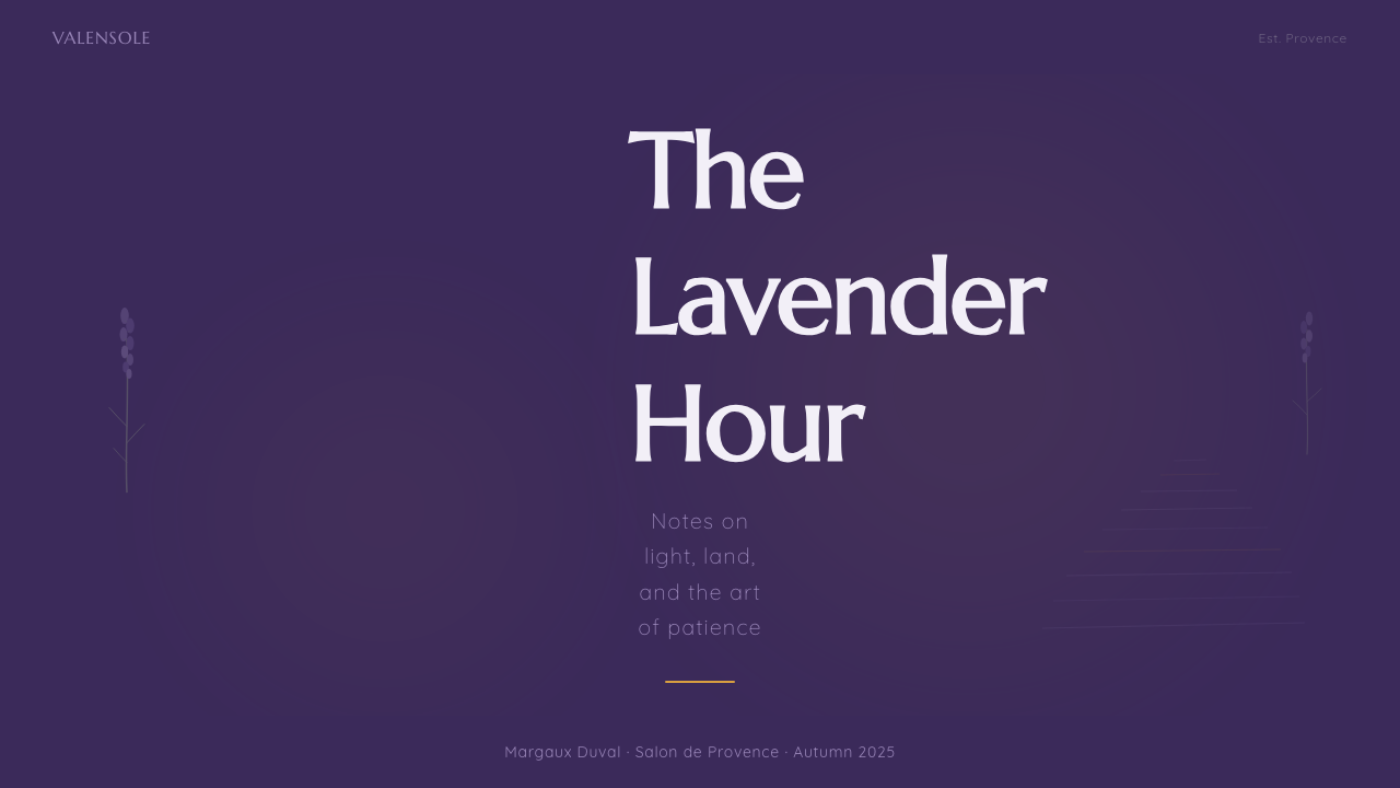
For presentation slides, a cover page works beautifully with a full-bleed horizontal-banded field as the background and title type sitting in a warm, high-contrast tone near the top third, echoing a sky above a field. Content slides should keep the violet-to-ochre gradient as an accent rather than a full background so text stays legible; data slides can use the same warm-to-cool contrast to distinguish positive and negative values or categories.
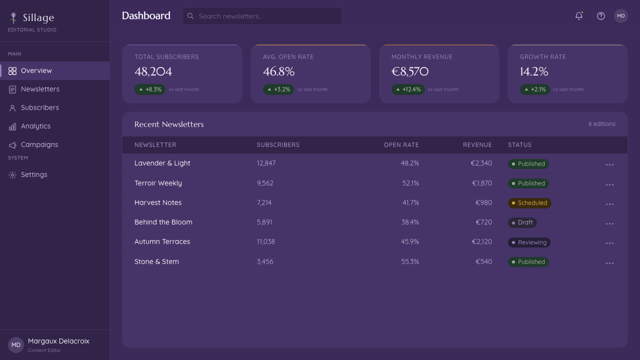
For web interfaces, the palette suits hospitality, travel, wellness, and lifestyle products where a warm, sun-soaked mood supports the brand — landing pages and about pages benefit more than dense dashboards, since the system's strength is atmosphere rather than fine-grained data hierarchy. Buttons and calls to action read well in the deep violet against an ochre or cream field.
For editorial and marketing work, the style suits travel writing, seasonal or terroir-driven food and wine content, and any brand built around slow living or rural French identity. Full-bleed photography-style color washes at the top of an article, transitioning from gold to violet, echo the golden-hour subject directly.
A common mistake is diluting the palette toward pale lilac and cream in the name of elegance, which erases the saturated, immersive quality that gives the system its identity. Another is overusing decorative floral illustration where the photographic, landscape-scale color logic would do the job more convincingly on its own.
Provence Lavender — FAQ
Why does this system use such a saturated violet instead of a softer, more common lavender pastel?
Because the source material is the field itself at golden hour, not a diluted decorative reference to it. Real cultivated lavender rows, seen at a landscape scale in warm evening light, read as deep and saturated rather than pale — the pastel version most people associate with lavender comes from packaging and soap design, not from the actual plateau.
Is this style specific to lavender, or does it work for other agricultural landscapes?
The underlying structural idea — long horizontal furrowed bands, warm-to-cool color contrast, golden-hour light — transfers well to other field crops with a strong single-color identity, such as sunflower or vineyard landscapes, though the specific violet-and-ochre palette here belongs distinctly to lavender and should not be substituted casually if the brand's subject is different.
Does the style work in a light, minimal layout, or does it need full-bleed imagery?
It works best when at least one dominant surface — a hero section, a cover, a section background — commits to the full saturated palette; trying to express it only through small accent swatches on an otherwise white, minimal layout loses the immersive, landscape-scale quality that defines the system.
How should this system handle text legibility given the saturated background colors?
Reserve the deepest, most saturated violet for large background fields and keep text in high-contrast cream, warm white, or deep near-black tones rather than a mid-tone that competes with the background. The earth-toned ochre band at the bottom of a composition can also serve as a calmer zone for denser body text.
What is the most common way this style is misapplied?
Treating it as a generic purple color scheme rather than a specific landscape reference. Without the horizontal banding, the warm ochre grounding, and the golden-hour light logic, a purple palette reads as abstract branding rather than as this particular field at this particular hour — the landscape structure is what makes the color mean something.
Related design styles
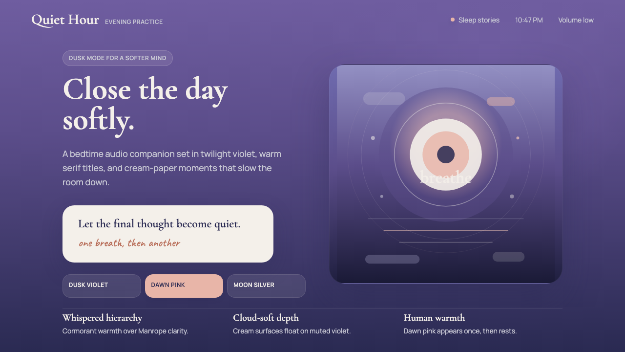 Calm App Purple MeditationWhispers at bedtime. Dusk-purple gradients, cream serif type, and dawn-pink w…
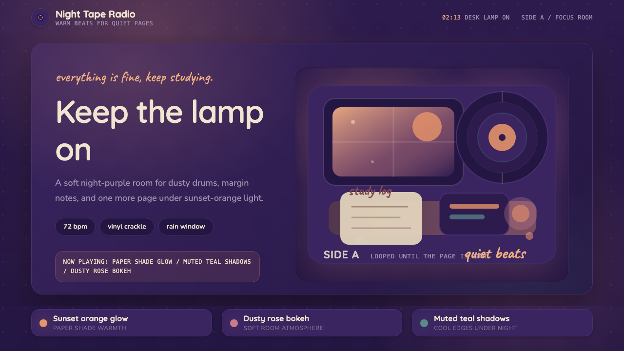 Lo-fi Hip Hop / ChillhopCozy focus at 2am. Night purple, Quicksand type, and sunset-orange lamp glow.
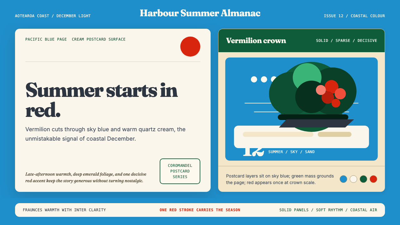 NZ Pōhutukawa SummerSummer arrives in one red stroke. Pacific blue and Fraunces type frame cream…
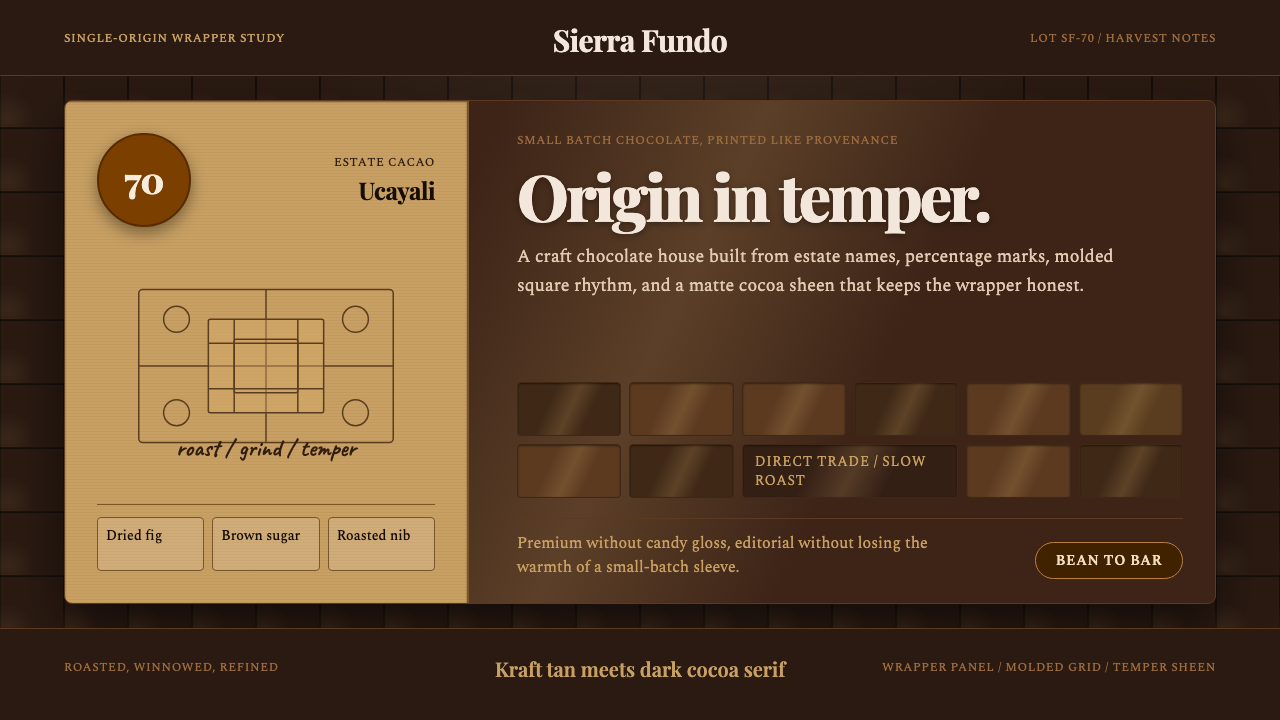 Bean-to-Bar ChocolateOrigin tastes tactile. Cocoa serif, kraft panel, and molded squares carry the…
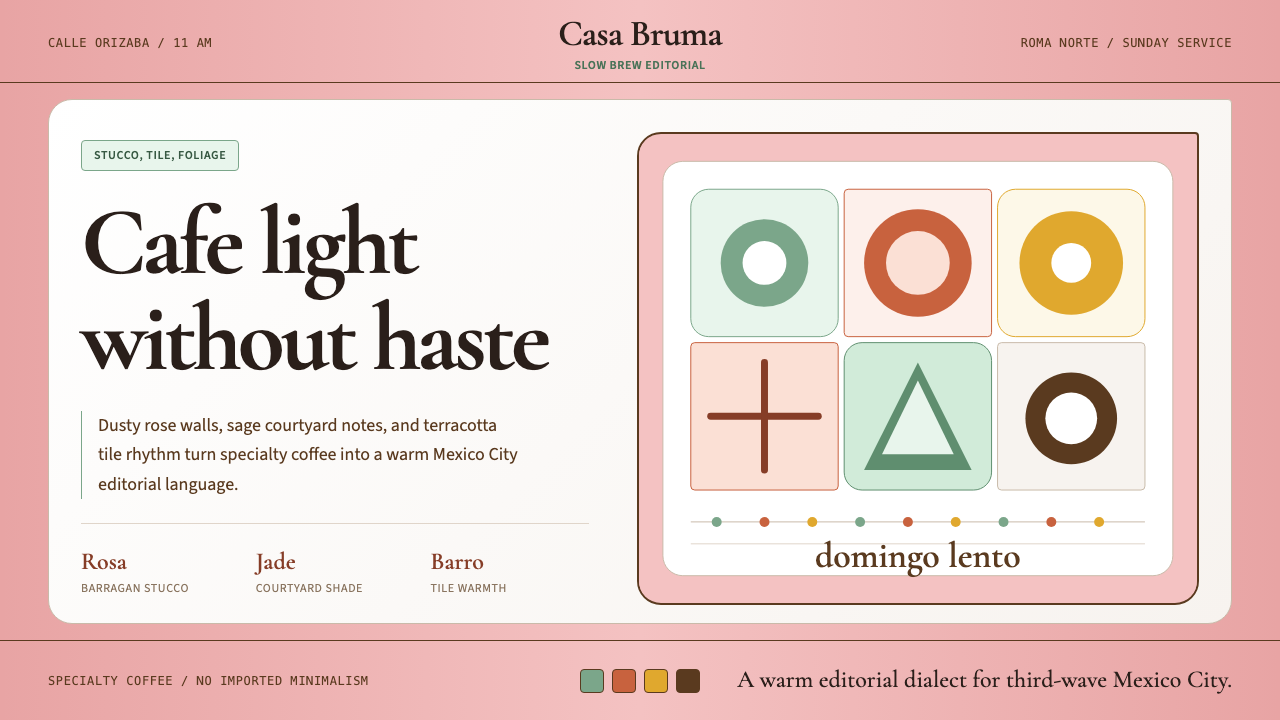 CDMX Roma Norte CafeMexico City coffee, unhurried. Dusty rose, sage jade, and serif rhythm carry…
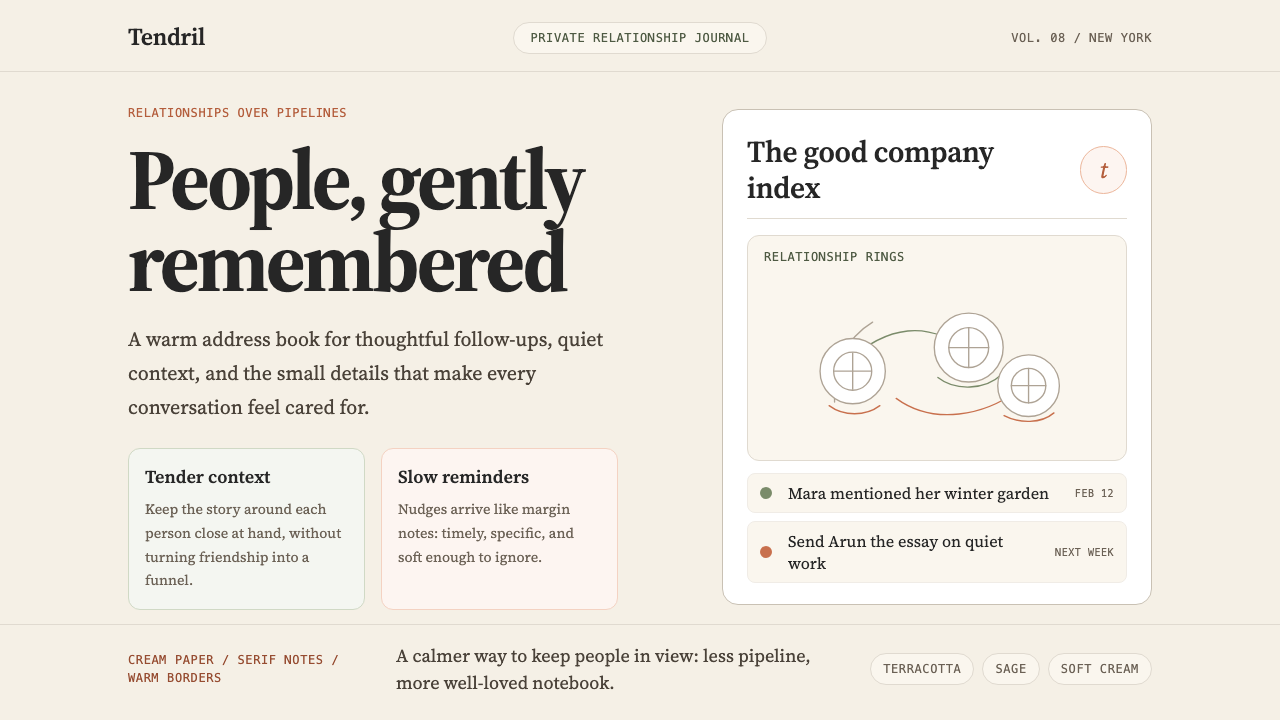 Clay 2024CRM as a sketchbook, not a sales pipeline. Cream backgrounds, terracotta, han…