What is Bean-to-Bar Chocolate?
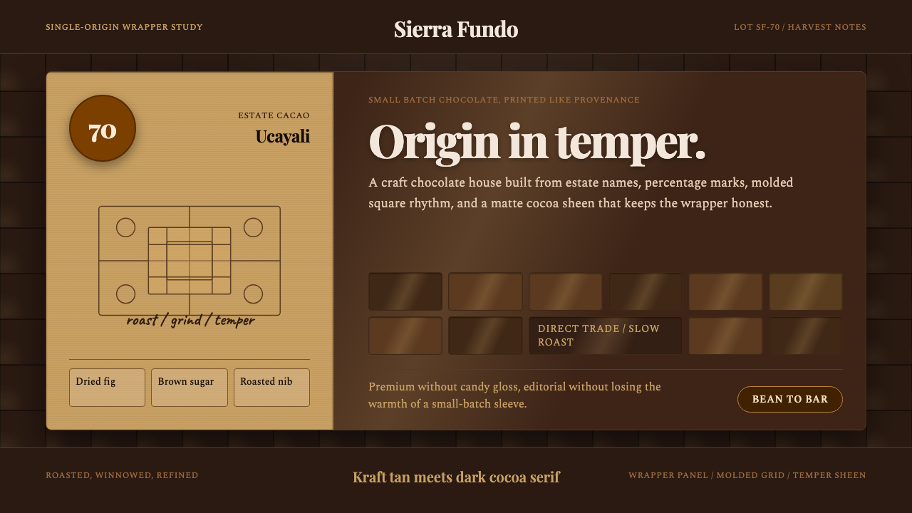
Bean-to-Bar Chocolate design tells the story of craft before it is unwrapped — dark tempered grounds, pressed-serif wordmarks, hand-drawn cacao botanicals, and the honest texture of kraft paper transform a percentage badge into a passport from farm to palate.
Bean-to-Bar Chocolate in brief
Bean-to-Bar Chocolate is the visual language of the modern craft-chocolate movement, emerging from the early 2010s as small-batch makers began sourcing single-origin cacao directly from farms in Latin America, West Africa, and Southeast Asia. The aesthetic grew out of a need to communicate radical transparency: the origin country, the farmer cooperative, the cacao variety, and the fermentation notes all carry as much weight as the brand name itself. Design became the medium for this provenance storytelling.
The palette rests on dark tempered-chocolate tones — deep browns edged with a faint matte sheen — offset by kraft-paper tan and warm cream. These are the colors of the actual materials: the cacao mass, the wrapper, the unbleached parchment inside the box. Refined serif typefaces carry the wordmark and percentage numerals, lending editorial authority to what might otherwise read as a rustic product. Hand-drawn cacao pods, leaf outlines, and cross-section illustrations provide organic counterweight to the typographic precision.
What distinguishes Bean-to-Bar Chocolate from generic artisan or farmhouse aesthetics is its specific combination of the premium and the tactile. It is not rustic in the way of a country farmstand, nor is it sleek in the way of a luxury confectioner. It occupies a third register: editorial-grade craft. The molded chocolate-square grid, the embossed or debossed headline, the percentage-forward hierarchy — these are design choices that speak to a sophisticated buyer who reads ingredient panels and knows the difference between Criollo and Forastero cacao.
Where does Bean-to-Bar Chocolate come from?
The bean-to-bar movement is historically recent, tracing its origins to the late 1990s and early 2000s in the United States, when a small number of makers — most without confectionery training — began importing raw cacao and processing it in-house from roasting to tempering. Scharffen Berger, founded in Berkeley in 1996, is often credited as one of the earliest American bean-to-bar operations. The founders were driven by a conviction, borrowed partly from the specialty coffee world, that terroir — the combination of soil, climate, fermentation, and drying conditions — produced flavor variation as profound as in fine wine, and that conventional chocolate manufacturing had systematically destroyed that variation in pursuit of uniformity.
The visual identity of early bean-to-bar brands drew heavily on the then-emerging language of artisanal food packaging: kraft paper, letterpress printing, hand-lettered serifs, and color palettes derived from earth and raw material. This was partly practical — many early makers had small budgets and letterpress printing was affordable through the craft-printing revival — and partly philosophical. The wrinkled, tactile, imperfect wrapper communicated exactly the values the product wanted to claim: handmade, honest, unprocessed. As the movement grew through the 2010s, a more refined vocabulary emerged. Brands like Dandelion Chocolate in San Francisco, Mast Brothers in New York, and Rózsavölgyi Csokoládé in Hungary developed packaging that retained the material warmth of kraft and earth tones while adding typographic precision and botanical illustration derived from nineteenth-century natural history publishing.
Single-origin sourcing was the conceptual engine behind the aesthetic. When a maker prints 'Hacienda La Rioja, Venezuela, 72%' on a bar, the design must communicate that this specificity matters — that this bar is not interchangeable with any other 72%. The percentage badge, which had appeared on mass-market dark chocolate bars primarily as a technical specification, became in bean-to-bar branding an act of provenance declaration, styled with the weight of a wine vintage label. Origin maps, farmer portraits, and harvest-year details became standard design elements, framing the chocolate as a document of a specific place and season.
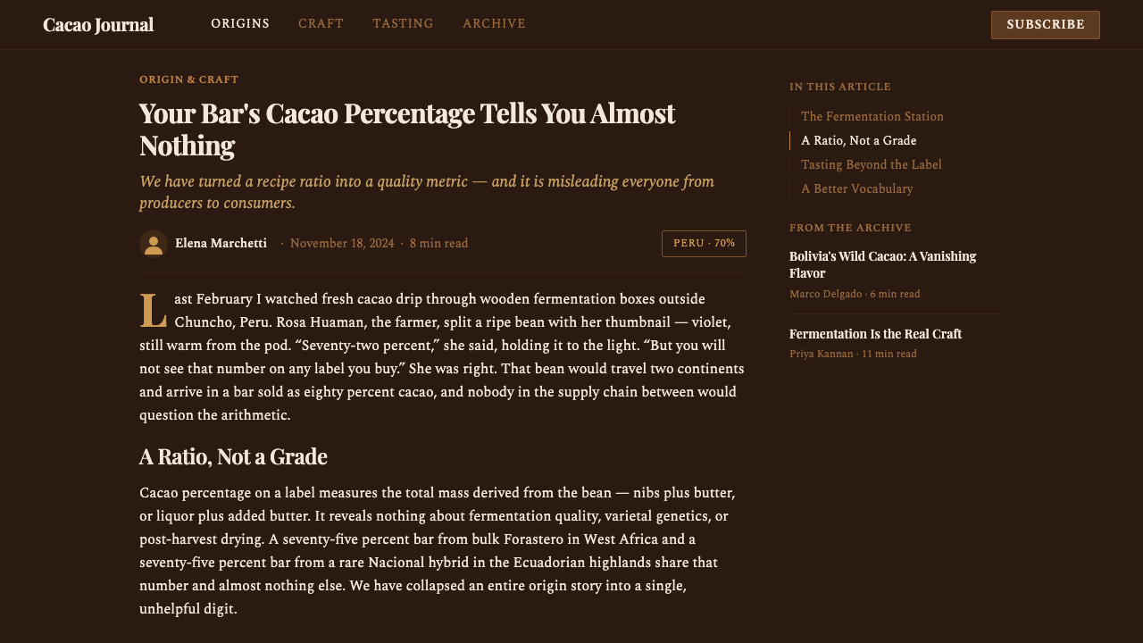
The aesthetic has since expanded beyond packaging into digital and editorial contexts, as bean-to-bar makers began building websites, subscription experiences, and tasting kits that required the same visual language to carry into screen-based formats. The challenge — and the design opportunity — was translating the tactile qualities of embossed paper and matte-surface chocolate into an interface that cannot be touched. The solution was typographic: dark backgrounds that evoke tempered chocolate, cream and tan type that reads like text printed on kraft, botanical SVG illustrations that preserve the hand-drawn quality, and a deliberate restraint on photography that prevents the design from tipping into food-lifestyle territory.
What defines the Bean-to-Bar Chocolate look?
Color: Dark Ground and Earth Palette
The dominant background is a deep, warm dark tone — evoking tempered dark chocolate at the moment it sets — rather than pure black. Against this ground, the accent palette is narrow: kraft tan, warm cream, and occasional muted ochre or terracotta. Bright colors are structurally absent. The darkness carries meaning: this is not the levity of milk chocolate but the gravity of a single-origin 70%, and the design stakes that claim immediately through its ground.
Typography: Serif Authority and Numeral Emphasis
Refined serif typefaces carry the wordmark and primary headlines — not the ornate Victorian serifs of generic artisan branding, but carefully drawn classical or transitional serifs with optical precision. The percentage numeral is treated as a display element in its own right: large, centered or prominently anchored, it functions as both a quality signal and a compositional anchor. Secondary information — origin country, cacao variety, harvest notes — appears in smaller, often lighter weight, creating a clear three-level hierarchy without resorting to color differentiation.
Botanical Illustration: Hand-Drawn Organics
Hand-drawn cacao pods, cross-section illustrations showing the bean arrangement inside the pod, leaf forms, and flowering branches are central decorative and communicative elements. Rendered as fine-line drawings in cream or tan against the dark ground, they perform double duty: they reference the actual agricultural origin of the product and provide organic visual texture that softens the typographic precision. The drawing style deliberately references nineteenth-century botanical illustration — precise enough to be taken seriously, loose enough to feel made by hand.
Grid: Molded Square and Modular Structure
The molded chocolate-square grid — the arrangement of individual squares in a broken or intact bar — appears as a recurring structural motif. Whether as a background texture, a dividing element, or an explicit product representation, it provides a modular, repeatable unit that organizes space in a way both visually distinctive and directly referential to the product. This is not arbitrary geometric pattern but a grid derived from manufacturing reality, giving the design an integrity that purely aesthetic choices would lack.
Texture: Matte, Emboss, and Temper Sheen
Bean-to-Bar Chocolate design is preoccupied with surface quality in a way that purely typographic styles are not. The vocabulary of matte versus gloss — the same contrast that appears on the physical bar where a tempered surface catches light differently from its wrapper — translates into design through selective highlighting, subtle gradient suggestions on product imagery, and the choice of matte-finish layouts interrupted by a single gloss element. Embossed and debossed headline treatments reinforce the tactile register. These quality signals communicate that the maker considers every surface a decision.
Provenance Hierarchy: Origin as Primary Identity
Unlike most food packaging, which leads with brand name, Bean-to-Bar design treats origin information as co-equal with or even superior to the brand. The country of origin, the farm or cooperative name, the cacao variety, and the percentage all appear prominently, often given more visual weight than the maker's own wordmark. This hierarchy is not a branding miscalculation but a deliberate statement of values: the maker is saying that the cacao and the place it came from are the story, and the brand is the custodian of that story.
Restraint: Premium Without Glamour
Bean-to-Bar Chocolate design consistently refuses the signals of mass-market luxury — no gold foil beyond a deliberate accent, no high-gloss surfaces, no celebrity endorsements or lifestyle photography, no gradient metallic effects. Its premium register is communicated through precision, material honesty, and information density rather than opulence. A bar that costs several times the supermarket equivalent communicates that premium not through glittering excess but through the sober confidence of a maker who knows exactly where the cacao came from and wants you to know it too.
Who shaped Bean-to-Bar Chocolate?
Often cited as the founding reference point for American bean-to-bar chocolate, Scharffen Berger was established by wine critic Robert Steinberg and physician John Scharffenberger, who sourced cacao from specific origins and processed it entirely in-house. Their packaging — dark grounds, clean serif typography, percentage-forward labeling — established visual conventions that the entire subsequent movement would build on. The brand was acquired by Hershey in 2005, a transaction that many in the movement cite as a cautionary tale about the tension between craft identity and industrial scale.
Dandelion became a reference point for the editorial end of bean-to-bar design, developing packaging and print materials that combined dark-ground layouts with botanical illustration and a near-academic attention to origin documentation. Their annual flavor guide — listing tasting notes for each bar alongside farm information and harvest data — set a standard for information density in craft-chocolate communication that positioned the product firmly in the same cultural register as specialty wine or single-origin coffee.
The Mast Brothers became the most photographed and discussed bean-to-bar operation of the 2010s, in part because of a packaging program that was unusually sophisticated for a young company — wrapping paper designed in collaboration with artists and illustrators, producing limited editions that were collector objects as much as food products. They extended the aesthetic vocabulary of the movement in the direction of contemporary art and design collaboration, demonstrating that bean-to-bar packaging could function as a design object with a market independent of the chocolate itself.
Hungary's Rózsavölgyi brought a Central European typographic sensibility to bean-to-bar packaging, combining botanical and architectural illustration with classical serif wordmarks in a way that referenced the country's rich pre-war design heritage. Their work demonstrated that the aesthetic was not limited to the American artisan idiom but could absorb very different cultural and typographic influences while remaining legible as part of the same movement — expanding the visual vocabulary in the direction of European bookmaking and botanical illustration traditions.
No individual figure dominates the conceptual center of this aesthetic more than the collective presence of the cacao farmer — typically organized through cooperatives in countries like Ecuador, Madagascar, Peru, Vietnam, and Tanzania. Bean-to-bar design makes farmers visible in a way almost unprecedented in food branding: their names, their farms, their practices, and their regions appear on packaging that reaches urban consumers thousands of miles away. This is not charity branding but a structural claim about value: the design insists that the farmer is part of the product, and that knowing where the cacao comes from changes what you taste.
How do you use Bean-to-Bar Chocolate today?
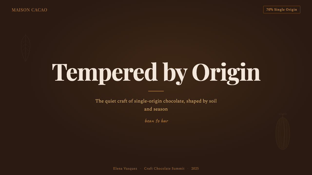
Bean-to-Bar Chocolate design carries well into presentation slides when the subject matter calls for a premium, grounded, or provenance-rich register. A cover slide benefits from a dark tempered ground with a single elegant serif title and a botanical line drawing placed asymmetrically — the botanical grounds the organic reference while the serif carries authority. Content slides work best on a cream or warm white background, using the dark tone only as an accent bar or section divider. Data visualizations — particularly those tracking quality metrics, origin data, or sourcing maps — take on an editorial weight when placed against muted earth tones, using the color palette as a signal of category rather than decoration.
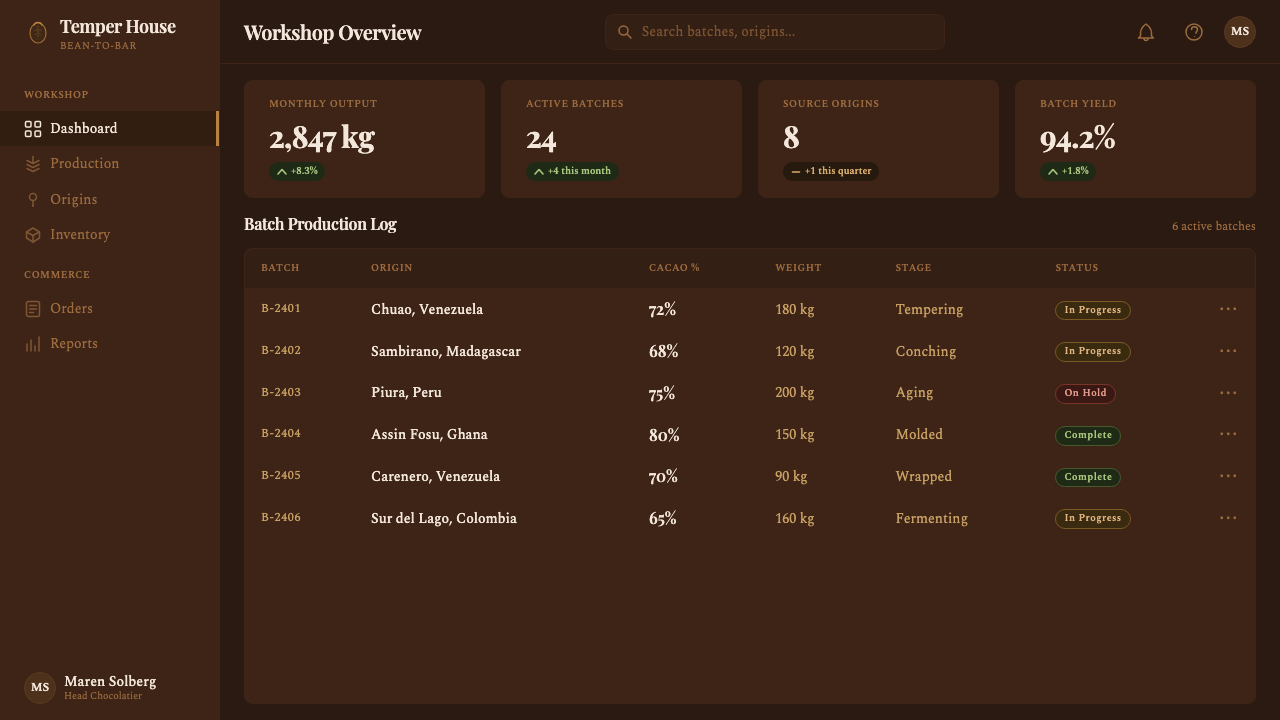
For web interfaces and digital products, the aesthetic is best deployed in contexts where trust, provenance, and quality communication are primary goals: product detail pages, subscription landing pages, tasting note archives, and brand editorial sections. The approach: a dark hero section anchored by a serif headline and a botanical SVG, transitioning to a cream or off-white content section for body copy and product grid. The percentage badge, translated into a digital component, functions effectively as a quality indicator in product cards. Navigation and footer should remain typographic and spare — no iconographic clutter should interrupt the editorial register.
For editorial and marketing design — print or digital long-form — the style supports structured information hierarchy combined with genuine warmth. Section headers in serif weight, body text in a slightly warmer neutral, and botanical dividers between sections produce a reading experience that feels researched and handcrafted simultaneously. Origin maps as decorative-informational elements translate particularly well into editorial spreads. Marketing pages aimed at gifting occasions, subscription products, or tasting experiences can use the full vocabulary: dark cover panels, prominent percentage or tier badging, crop imagery of cacao pods rather than finished bars, and matte-surface product photography treated as a flat design element.
One mistake that frequently undermines Bean-to-Bar Chocolate applications is importing generic food-photography lifestyle aesthetics — bright windows, marble surfaces, overhead flat-lays with mixed props — that conflict with the documentary and provenance-driven logic of the style. The Bean-to-Bar visual language is not about the experience of eating chocolate; it is about the knowledge of where the chocolate came from. Photography, when used, should reference agricultural origin rather than consumption occasion: cacao pods on a tree, fermentation boxes, roasting equipment, the maker's workshop. The moment the visual shifts to 'someone enjoying chocolate by a fireplace,' the provenance narrative collapses into lifestyle marketing, and everything distinctive about the aesthetic is lost.
Bean-to-Bar Chocolate — FAQ
How does Bean-to-Bar Chocolate design differ from generic artisan or farmhouse aesthetics?
Generic artisan branding borrows the surface signals of craft — rough textures, hand-lettering, mason jars — without the underlying informational logic. Bean-to-Bar Chocolate design is organized around provenance documentation: every element exists to communicate where the cacao came from, who grew it, and how it was processed. The result is more editorial than rustic — closer in register to a wine label or a specialty coffee bag than to a farmers' market aesthetic. The percentage badge, the farm name, and the harvest data are not decorative; they are the primary content, and the design is built to carry them with the gravity they deserve.
Can this aesthetic work for products beyond chocolate?
Yes, with important constraints. The aesthetic transfers well to any product where single-origin sourcing, provenance transparency, and small-batch craft are genuine product values — specialty coffee, craft spirits, single-estate olive oil, artisan cheese, and premium tea are natural adjacencies. The key condition is that the provenance narrative must be real: applying Bean-to-Bar visual language to a mass-produced product creates an honesty problem that sophisticated consumers will notice. The percentage-badge equivalent in each category must be specific and verifiable, or the design reads as aesthetic appropriation rather than genuine communication.
Why is the percentage number treated so prominently in this design system?
The percentage — typically the cacao content by weight — is the primary quality specification in craft chocolate, functioning analogously to alcohol percentage in wine or harvest year in specialty coffee. It communicates flavor intensity, bitterness-to-sweetness ratio, and indirectly, the maker's philosophy about how much cacao character should dominate the finished bar. Bean-to-Bar makers who choose to work with 70%, 75%, or 85% cacao are making a statement about flavor commitment, and displaying that percentage prominently is an act of transparency that differentiates them from commodity chocolate brands, which tend to minimize or obscure this information. Visually, the numeral also functions as a bold geometric element that anchors composition in a style that otherwise relies on typographic restraint.
How should botanical illustration be used without making the design feel generic or decorative?
Botanical illustration in Bean-to-Bar design should be specific rather than generic — it should depict the actual cacao plant, Theobroma cacao, in recognizable forms: the elongated pod, the ribbed exterior, the internal bean arrangement visible in cross-section, the leaves' distinctive veining. Generic leaf motifs or abstract botanical flourishes that could apply to any agricultural product undermine the specificity that gives the style its authority. Placement matters too: botanical elements that frame or anchor the origin information reinforce the provenance logic, while botanical elements deployed as pure surface pattern drift toward the farmhouse aesthetic the style is trying to distinguish itself from.
Does this aesthetic work on light backgrounds, or does it require the dark ground?
The dark tempered-chocolate ground is the canonical and most distinctive form, but a light version is viable and common in practice — particularly for inside-the-wrapper materials, tasting note cards, and digital editorial content where sustained dark backgrounds create reading fatigue. A light Bean-to-Bar layout uses cream or warm white as the primary background, with dark typography that reads as ink on parchment rather than screen text, and botanical illustration reversed to dark line on light ground. The key is maintaining the warm, muted quality of the palette: pure white backgrounds that read as cold or clinical undermine the tactile warmth the style depends on. The light version trades the drama of the dark ground for a more intimate, readerly quality that suits long-form content.
Related design styles
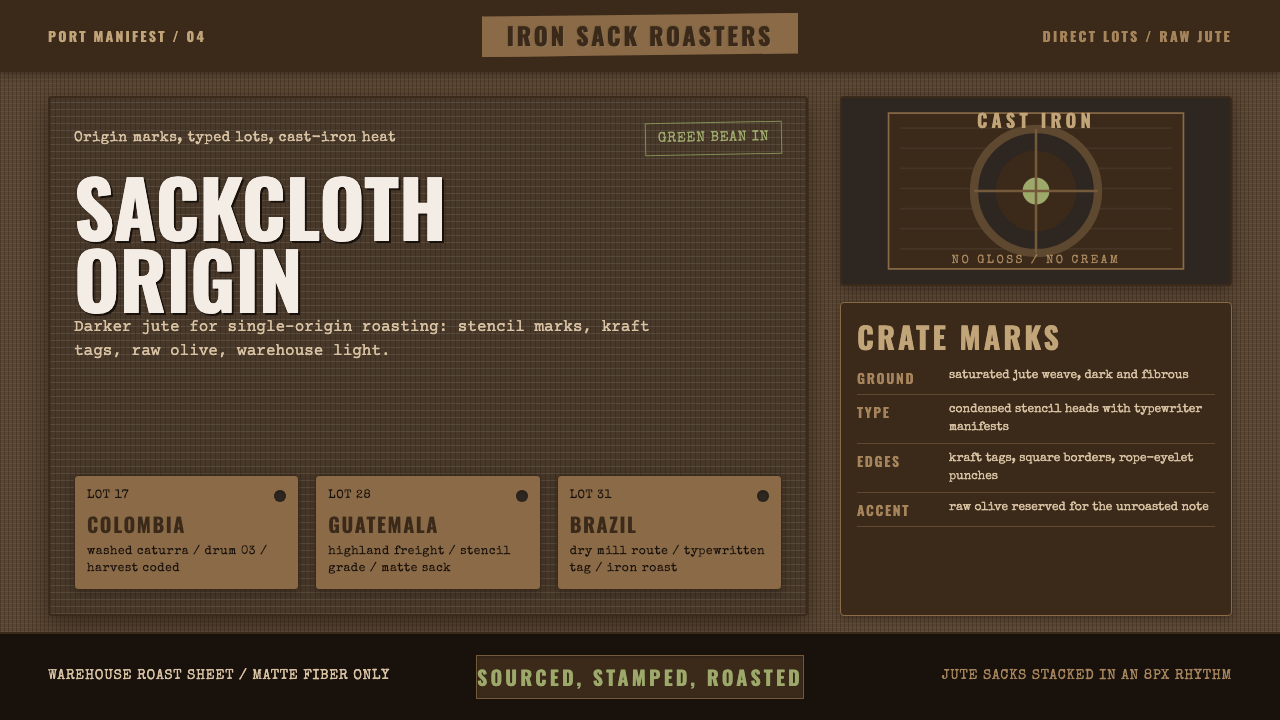 Coffee Roastery BurlapRaw craft, never cream. Dark jute weave, stencil type, and one olive accent.
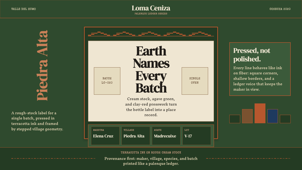 Mexican Mezcal CraftRooted and exact. Agave green, terracotta borders, and DM Serif labels tell t…
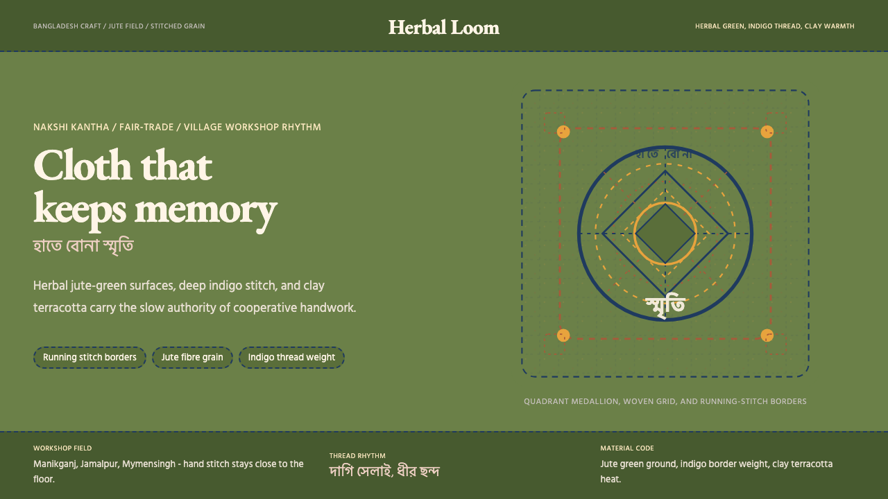 Bangladeshi Jute CraftMemory stays stitched. Jute green, indigo borders, terracotta warmth.
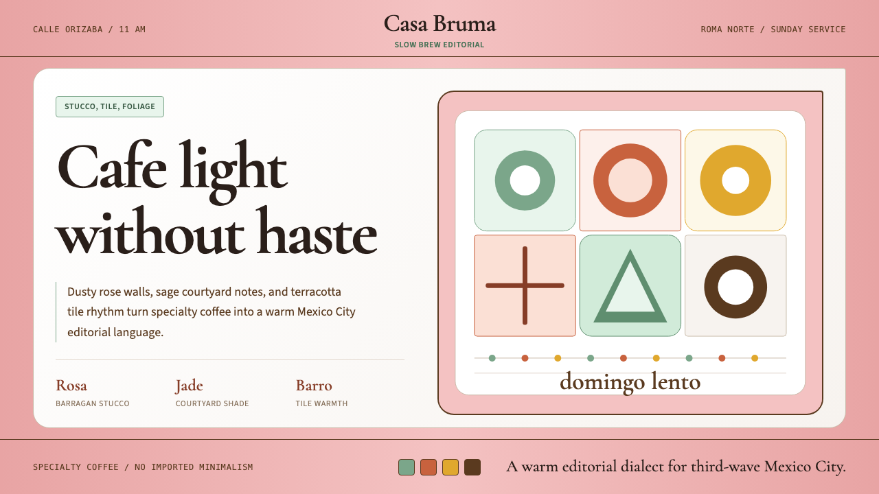 CDMX Roma Norte CafeMexico City coffee, unhurried. Dusty rose, sage jade, and serif rhythm carry…
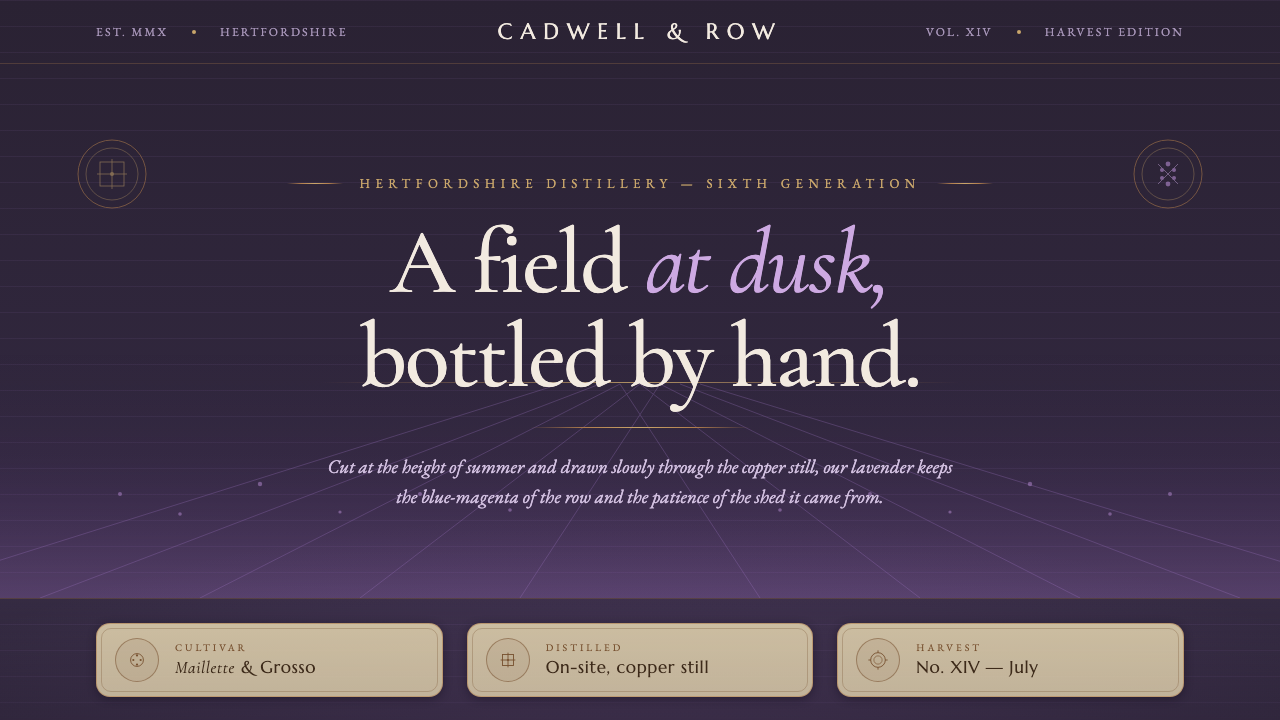 Lavender DistilleryA field at dusk, bottled by hand. Twilight purple rows, copper hairlines, Mar…
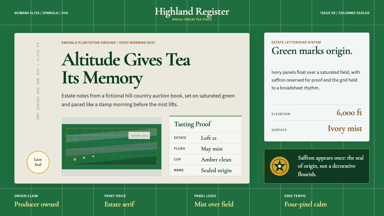 Sri Lanka Ceylon Tea ModernProvenance is emerald. Ivory mist panels and one saffron seal make origin fee…