Design style guide设计风格指南
What is Sri Lanka Ceylon Tea Modern?什么是 Sri Lanka Ceylon Tea Modern?
Ceylon tea's modern visual identity transforms a hillside plantation into a design language — emerald provenance, ivory stillness, and a single saffron seal that makes origin feel like authority.锡兰茶的现代视觉语言将山地茶园转化为一套设计系统——翡翠色的产地感、象牙色的静谧,以及一枚让原产地散发权威气质的藏红花印章。
Sri Lanka Ceylon Tea Modern in briefSri Lanka Ceylon Tea Modern 速览
Sri Lanka Ceylon Tea Modern is a visual identity system rooted in the saturated reality of a high-altitude plantation. Its organizing principle is provenance — origin not merely as a fact but as an aesthetic. Saturated emerald carries the color of a freshly plucked leaf. Ivory panels float like morning mist over the Nuwara Eliya hills. A saffron-gold lion seal, drawn from the national emblem, anchors authenticity without a word of explanation.斯里兰卡锡兰茶现代风格是一套植根于高海拔茶园真实感与饱和色彩的视觉识别系统。这套风格以产地作为核心组织原则——原产地不仅是一个事实,更是一种美学——并以此为支点构建每一处版面。饱和翡翠绿承载着刚采摘茶叶的色泽,象牙色面板如努瓦拉埃利耶山间的晨雾轻盈浮动,一枚取自斯里兰卡国徽的藏红花金色狮子印章无需一字说明便锚定了正统。
The result is editorial and unhurried — the confidence of an estate letterhead that does not need to sell itself because its credentials are already established. Photography shows altitude: terraced rows disappearing into cloud, real hands on real leaves. Copy is sparse, declarative, and lapidary.整体风格既具编辑气质,又从容不迫。它不追求生活方式品牌的消费温情,也不采用企业形象设计的锐利攻势,而是沉淀为一份庄园信笺的笃定——那种无需自我推销便已凭资历立威的文件气质。摄影捕捉海拔:层叠茶垄消失于云层,真实的双手触碰真实的茶叶,薄雾并非后期制作的产物。文案稀疏、断言式,字字如金石。
This system emerged as Sri Lankan brands moved to reclaim their heritage from colonial-era tea marketing, which had rendered Ceylon tea in sepia nostalgia and generic tropicalia. The new visual language asserted that the island's teas were living, geographically specific products — the design equivalent of the appellation contrôlée tradition in European wine.这套视觉体系在二十世纪末至二十一世纪初逐渐成形,其背景是斯里兰卡品牌开始从殖民时代茶叶营销的遗产中夺回自身话语权。殖民时代的锡兰茶营销将这片土地渲染为棕褐色怀旧与泛热带风情,而新的视觉语言则宣告:斯里兰卡的茶叶不是遗物,而是有生命、有地理特指性的活态产品——相当于欧洲葡萄酒原产地命名体系在设计领域的对应物。
See the Sri Lanka Ceylon Tea Modern design system →查看 Sri Lanka Ceylon Tea Modern 完整设计系统 →
Where does Sri Lanka Ceylon Tea Modern come from?Sri Lanka Ceylon Tea Modern 从何而来?
Tea cultivation in Sri Lanka — known as Ceylon until 1972 — began in earnest in 1867, when James Taylor established the first commercial plantation at the Loolecondera estate in Kandy. Taylor had arrived to grow coffee, but a devastating fungal blight destroyed the island's coffee industry in the 1870s, forcing a pivot that redefined the colony's economy. By 1900, Ceylon was among the world's largest tea exporters, with highland estates spanning Nuwara Eliya, Dimbula, Uva, Kandy, and the lower-grown Ruhuna, each producing teas with distinct profiles shaped by altitude, rainfall, and soil.斯里兰卡——1972年之前以「锡兰」著称——的茶叶种植业正式起步于1867年,苏格兰种植者詹姆斯·泰勒在康提的卢勒孔德拉庄园建立了第一座商业茶园。泰勒最初赴岛是为了种植咖啡,然而一种名为「锈病菌」的毁灭性真菌病害在19世纪70年代摧毁了整个岛的咖啡产业,被迫转型的历史就此重塑了这片殖民地的经济命运。到1900年,锡兰已成为全球最大茶叶出口地之一,其高地庄园——横跨努瓦拉埃利耶、丁布拉、乌瓦、康提以及低地茶区鲁胡纳——各自因海拔、降雨量与土壤差异而生产出风味迥异的茶叶。
The visual language of this era was almost entirely colonial: lithographed tins depicting pastoral scenes of plantation workers, romanticized British hill stations, and the colonial lion crest transplanted onto tropical foliage. Ceylon tea was sold abroad as an imperial product — its origin romanticized, its laborers aestheticized — with little connection to how the island's people understood themselves.伴随这一时代的视觉语言几乎完全是殖民主义的:彩色石印铁罐与标签描绘田园牧歌式的场景——顺从的泰米尔茶园工人、理想化的英国山间度假地、嫁接在热带植被上的殖民地狮子徽章。锡兰茶作为帝国产品在海外销售,其原产地被浪漫化,其劳动者被审美化,与这片土地和岛上人民的自我认知几乎毫无关联。
The shift began after independence in 1948 and accelerated after the country became the Republic of Sri Lanka in 1972. The government established the Tea Board to promote the nation's teas internationally under their own identity. The decisive moment came in 1988, when Merrill J. Fernando — trained as a tea taster in London — founded Dilmah with the determination to maintain direct quality control from bush to cup. His insistence on single-origin certification and a visual identity centered on the island's own landscape became a template subsequent Sri Lankan brands would follow.转变始于1948年独立后,并在1972年斯里兰卡共和国成立后显著加速。政府设立斯里兰卡茶叶局,推动本国茶叶以自有身份而非通过英国贸易行走向国际市场。当代品牌塑造的决定性时刻出现在1988年——曾赴伦敦受训、归国后立志创立家族品牌并直接掌控品质的斯里兰卡茶叶鉴定师梅里尔·J·费尔南多创办了迪尔玛。费尔南多对单一产地认证、道德劳工标准的坚持,以及将品牌视觉聚焦于岛屿自身景观而非殖民意象的主张,成为后继斯里兰卡茶叶品牌效仿的范本。
Anselm Perera and other designers for Dilmah and contemporaneous Sri Lankan brands developed the core vocabulary: saturated emerald from the actual color of the highlands, the ivory panel evoking mist, and the saffron-gold lion seal drawn from the national flag. This was a post-colonial act of visual reclamation — asserting that the origin story was not nostalgia but a living geographic fact. The style found fullest expression in the premium segment, where brands like Basilur (founded 2008 in Colombo) extended the vocabulary into gift-packaging that treated the tea tin as a collector's object.安塞尔姆·佩雷拉等为迪尔玛及同期斯里兰卡茶叶品牌工作的设计师,发展出了定义现代风格的核心视觉词汇:借用高地真实色彩的饱和翡翠绿、既唤起薄雾轻盈感又为品牌精致排版提供中性底面的象牙色面板,以及取自国旗与国徽的藏红花金色狮子印章。这是一次后殖民主义的视觉夺权——宣告原产地故事不是殖民怀旧之旅,而是有生命的地理事实。这套风格在高端细分市场中得到最充分的表达:巴西鲁(2008年创立于科伦坡)等品牌将这套视觉词汇延伸至精致礼品包装,将茶叶铁罐视为收藏品,将标签视为编辑设计作品。
What defines the Sri Lanka Ceylon Tea Modern look?Sri Lanka Ceylon Tea Modern 的视觉特征是什么?
Provenance Color产地色彩
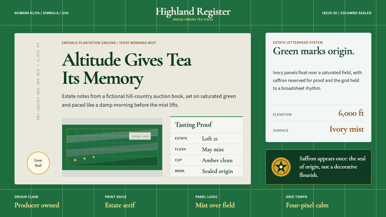
The dominant hue is a deep, saturated emerald that references the actual color of the highland plantation — the two-leaves-and-a-bud of hand-plucking at elevation, seen against morning mist. This is not a generic tropical green; it has the density and coolness of altitude. Against this ground, ivory and saffron-gold function as counterweights: ivory provides the neutral breathing space that lets the emerald read as landscape, saffron provides the single warm accent that signals heritage and national identity.主导色调是一种深沉、饱和的翡翠绿,呼应高地茶园的真实色彩——海拔处手工采摘的「一芽两叶」,映衬于晨雾之中。这种绿色并非泛化的热带绿,它有着高海拔特有的浓度与凉意,而非低地森林的明亮。以此为底,象牙色与藏红花金色作为对位元素发挥作用:象牙色提供中性的呼吸空间,使翡翠绿得以作为景观被感知;藏红花色提供唯一的暖调强调,传递传承感与民族身份。这套色板之所以有效,在于其来源的真实性——每一种颜色都可追溯至品牌所主张代表的那个环境中真实存在的事物。
Mist Panels and Negative Space雾面板与留白
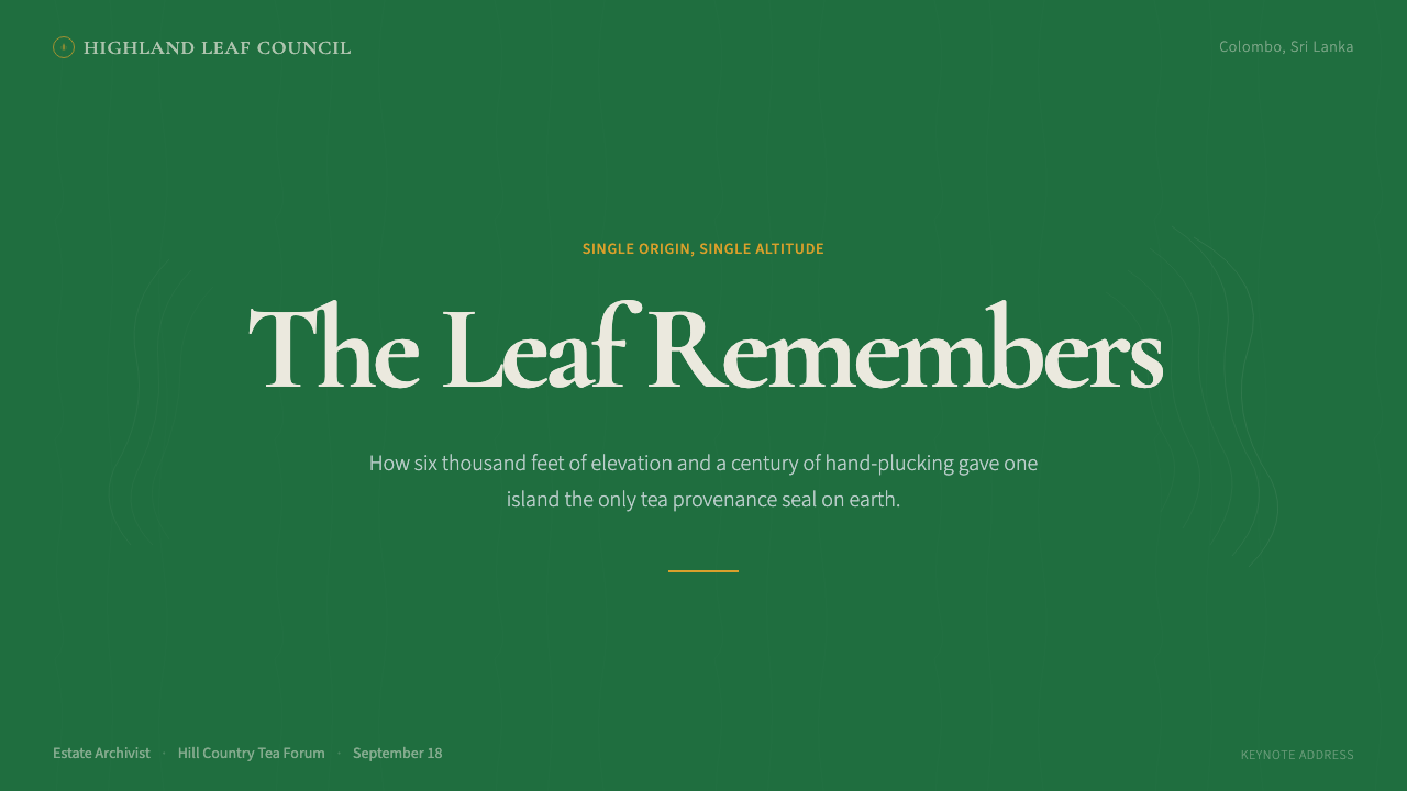
The ivory panel is not merely a background — it is a compositional device that enacts the experience of looking at a hillside through cloud. Layouts use the panel to float content above the saturated emerald ground, creating layered depth without shadows or gradients. The generosity of white and ivory space is deliberate: the style treats negative space as the visual equivalent of the pause before a tasting note, an invitation to attend rather than to consume.象牙色面板并非单纯的背景元素,而是一种构图装置,再现了透过云层凝视山坡的视觉体验。版面利用这一面板将内容浮于饱和底色之上,在不借助阴影或渐变的情况下制造出层次感。白色与象牙色空间的慷慨留白是刻意为之:这套风格将负空间视为品茶前那一停顿的视觉等价物——一种邀请人细细品鉴而非快速消费的姿态。宽阔的页边距、舒缓的行距与克制的文字量,共同强化了这一气质。
The Authenticating Seal认证印章
A single heraldic seal — the Sri Lankan lion derived from the national flag, rendered in saffron-gold — serves as the style's ultimate provenance marker. Its function is closer to a wax seal on a legal document than to a conventional logo: it does not describe the product but validates it. The seal is positioned with deliberate asymmetry, sometimes overlapping the ivory panel edge, to suggest it was applied to an existing document rather than designed as part of a branding system.一枚单一的纹章印章——通常是取自国旗的斯里兰卡狮子,以藏红花金色呈现——充当这套风格最终的产地标记。其功能更接近法律文件上的火漆印章,而非常规营销意义上的标志:它不描述产品,而是对产品进行认证。印章通常以刻意的非对称方式定位,有时叠压在象牙色面板或翡翠色底面的边缘,暗示它是被盖在一份既有文件上的,而非作为品牌体系的一部分被设计出来。这种表演性的认证行为是该风格权威感的核心。
Estate Typography庄园式排版
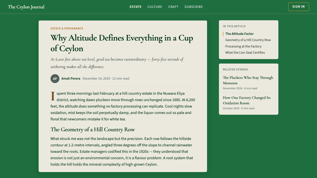
Headlines are set in high-contrast, classically proportioned serif letterforms that evoke English mercantile letterhead and estate documents — formal without feeling archaic. Body text uses generous leading and conservative measure, reinforcing the unhurried quality that distinguishes the style from fast-moving consumer goods packaging. Uppercase spaced-letter settings are used selectively for estate names and geographic designations, lending them the quality of official nomenclature.标题与展示文字采用高对比度、经典比例的衬线字体,唤起英国商业信函与庄园文件的信笺传统。衬线字体的分量感与正式感并不显得陈旧,而是在殖民时代行政档案与当代高端编辑之间架起一座桥梁。正文排版行距宽裕、行宽保守,强化了这套风格区别于现代快消品包装的从容气质。大写字母间距设置被选择性地用于庄园名称、地理标识与等级标记,赋予它们官方命名的气质。
Full-Bleed Documentary Photography全出血纪实摄影
Photographic imagery is treated as evidence rather than atmosphere. Images show the specific: the elevation at which leaves are plucked, the worn hands of experienced pickers, the texture of a particular soil. There is no tropical genericism — no anonymous palms or generic waters. Every image makes a geographic claim. Photography is used at full bleed, saturating the field and embodying the emerald palette rather than decorating a frame.摄影图像被视为证据而非氛围。影像呈现具体之物:采摘茶叶的精确海拔、经验丰富的采茶人布满纹路的双手、特定土壤的质感,以及云层在树冠线以下成形时某一高度的午后光线角度。没有泛化的热带意象——没有无名棕榈或泛化的碧蓝海水。每一张图像都在进行地理性的主张。摄影以全出血方式使用,令其饱满地充盈画面,作为翡翠色色板的化身而存在,而非作为框架内的装饰性插图。
Restrained Gold Detailing克制的金色细节
Beyond the authenticating seal, gold appears as a narrow vocabulary of detail: a thin rule framing a panel edge, a foil-stamped grade designation, a cartouche around a geographic name. The restraint is essential — the moment gold becomes abundant, it slides toward generic luxury. One application at high contrast against the emerald reads as official; five read as gilded kitsch. Using gold only where it performs a specific certifying or framing function is one of the harder disciplines of this style.除认证印章外,金色在这套系统中仅出现于一套有限的细节词汇:框定面板边缘的细线、烫金的等级标注、地理标识周围的卷轴外框轮廓。克制是关键——一旦金色变得丰盛,便会滑入这套风格刻意回避的泛化奢华领域。一处藏红花金色与翡翠绿的高对比度应用读来是官方感;五处应用则读来是镀金俗气。将金色仅用于承担特定认证或框定功能之处,是这套风格中最难坚守的纪律之一。
Geographic Specificity as Hierarchy地理特指性作为层级
The style deploys regional designations — Nuwara Eliya, Dimbula, Uva, Ruhuna, Kandy — as primary organizational elements, treating geography the way a wine label treats appellation: as the quality signal that precedes all other description. This hierarchy communicates that terroir is real and meaningful in tea. The visual weight given to geographic specificity makes the provenance claim structural rather than decorative — part of the layout's architecture, not a footnote.这套风格将地区名称——努瓦拉埃利耶、丁布拉、乌瓦、鲁胡纳、康提——作为版面的主要组织元素,对待地理的方式如同葡萄酒标签对待原产地命名:将其视为先于一切描述的首要品质信号。这种地区层级结构传达出一个信息:茶叶的风土是真实的、有意义的,反驳了茶叶不过是可相互替换的大宗商品这一认知。赋予地理特指性的视觉分量,使产地主张成为结构性的而非装饰性的——它是版面建筑的一部分,而非附注。
See the Sri Lanka Ceylon Tea Modern design system →查看 Sri Lanka Ceylon Tea Modern 完整设计系统 →
Who shaped Sri Lanka Ceylon Tea Modern?谁塑造了 Sri Lanka Ceylon Tea Modern?
Taylor established the first commercial tea plantation on the Loolecondera estate in Kandy in 1867, pivoting from coffee after the blight that wiped out the island's coffee industry. His meticulous record-keeping of soil conditions, altitude variations, and processing methods laid the empirical groundwork for understanding Ceylon's regional terroir — the geographic specificity that became the central subject of the style's visual language.泰勒于1867年在康提的卢勒孔德拉庄园建立了第一座商业茶园,在摧毁全岛咖啡产业的病害之后从咖啡种植转型而来。他对土壤条件、海拔差异与加工方法的一丝不苟的记录,为理解锡兰各地区风土奠定了实证基础——这种地理特指性后来成为这套视觉语言的核心主题。若非泰勒坚持记录各生长区域与海拔之间的差异,这套设计系统所讲述的产地故事便将缺乏实质内容。
Fernando founded Dilmah in 1988 after training as a tea taster in London and returning determined to create a family-owned brand with direct control over quality from bush to cup. His insistence on single-origin certification transformed the brand's visual language: Dilmah's packaging was among the first to place Sri Lankan highland landscape — rather than colonial imagery — at the center of its identity, demonstrating that the island's own identity was a commercial asset.费尔南多在伦敦接受茶叶鉴定培训后于1988年创立迪尔玛,归国时已下定决心创建一个从茶树到茶杯全程直控品质的家族品牌。他对单一产地认证与道德采购的坚持,不仅重塑了品牌的供应链,也重塑了其视觉语言:迪尔玛的包装成为首批将斯里兰卡高地景观——而非殖民意象——置于品牌身份核心位置的包装之一。费尔南多的模式证明了以产地为基础的品牌塑造可以支撑溢价定价,而这座岛屿自身的身份是一种商业资产。
Perera was among the Sri Lankan designers who worked on the visual translation of post-colonial tea brand identity, helping to develop the vocabulary — the emerald palette, the ivory panel, the authenticating seal — that became the shared visual grammar of premium Ceylon tea branding, establishing aesthetic parameters that subsequent brands would inherit.佩雷拉是在后殖民锡兰茶品牌视觉身份成形期参与其视觉转化工作的斯里兰卡设计师之一,帮助发展出了那套视觉词汇——翡翠色色板、象牙色面板、认证印章——这些词汇后来成为高端锡兰茶品牌共同的视觉语法。他的工作有助于构建一套能够传递真实性与地理特指性的设计语言,而无需借助殖民怀旧或泛化热带意象,为后来在同一语境中工作的品牌确立了美学参数。
Established after independence to promote Ceylon tea internationally, the Tea Board created the Lion Logo — a certification mark drawn from the national emblem — that became foundational to the entire Ceylon tea design system. The mark transformed a heraldic element into an international quality guarantee and established the authenticating seal as the style's central device.独立后由政府设立、旨在以统一国家身份在国际推广锡兰茶的茶叶局,创建了取自国家纹章的「狮子标志」认证商标,这一商标后来成为整个锡兰茶设计系统最基础的视觉元素之一。凡带有狮子标志的茶叶均经认证为在斯里兰卡境内加工包装的纯锡兰茶。这枚印章将一个纹章元素转化为国际品质保证,并确立了认证印章作为这套风格核心装置的先例。
Founded in Colombo in 2008, Basilur extended the Ceylon tea design vocabulary into the luxury gift market, treating the tea tin as a collector-object canvas. Its themed collections — drawing on cartography and botanical illustration while retaining the provenance palette — demonstrated how the core visual grammar of emerald, ivory, and saffron-gold could support diverse surface treatments without losing its essential character.2008年创立于科伦坡的巴西鲁将锡兰茶的视觉词汇延伸至奢华礼品市场,将茶叶铁罐视为编辑插画与收藏品包装的画布。其主题系列——援引地图学、植物图谱与新艺术运动装饰的同时保留产地色板——展示了翡翠、象牙与藏红花金色的核心视觉语法如何在不失本质特征的前提下支撑多样的表面处理。巴西鲁在国际市场的成功证实了后殖民锡兰茶美学作为奢华信号确实具备出口影响力。
How do you use Sri Lanka Ceylon Tea Modern today?今天怎么用 Sri Lanka Ceylon Tea Modern?
Ceylon Tea Modern is a deeply specific style, not a universal one. It works when the product or content has a genuine relationship to provenance, craft, or geographic specificity. Applied where that claim cannot be made honestly — a fast-casual brand, a generic SaaS interface — the style's formal weight reads as affectation. Before applying it, ask whether the content can genuinely assert that origin matters and that the details are real.锡兰茶现代风格并非一种通用风格,而是一种高度特指性的风格。它最适合那些与产地、真实性、工艺或地理特指性有真实关联的产品、服务或内容。若不恰当地应用——强贴在快休闲概念或SaaS仪表板上——这套风格的形式分量与刻意节奏会被解读为矫揉造作而非权威。在应用这套系统之前首先要问的问题是:所设计的内容能否真正做出与这套风格相同的主张——产地重要、细节真实、受众有时间细细品鉴。
For presentation slides, the style excels on covers and section dividers. A cover might use a full-bleed highland landscape as ground, float an ivory panel with the title over it, and position a certification seal with deliberate asymmetry. Content slides should adopt an estate-ledger quality: wide margins, restrained body text, geographic designations as primary section headers, no ornamental dividers. Data slides can use documentary photography as background rather than a generic fill.在演示文稿中,这套风格在封面与章节分隔页上表现最为突出,其构图张力可在全尺度充分展开。一张这种风格的封面可以将高地或乡村环境的全出血景观摄影作为底面,在其上浮置含有标题的象牙色面板,并以刻意的非对称性定位认证印章——一个机构标志、一枚认证徽章,或一个日期标记。内容页应采用庄园账簿式的气质:宽阔的左侧页边距、克制的正文、以地理或类别标识作为主要组织性标题,无装饰性直线或装饰分隔符。数据页可借鉴纪实摄影的方式——用图像作为被量化现象的证据,让柱状图叠压在相关的环境摄影之上,而非泛化的背景之上。
For web interfaces, the style suits contexts that communicate measured authority rather than speed: premium subscription landing pages, origin-certification portals, or brand identity systems for established regional producers. Use a near-white or ivory ground, deploy emerald sparingly as a navigational accent, and reserve a single gold detail for tier markers or certification indicators. Photography should always be purposefully geographic and documentary — never atmospheric stock.对于网页界面与数字产品,这套风格适合需要传递从容权威而非速度或新奇感的语境:高端订阅落地页、原产地认证门户、品质审计仪表板,或老牌地区生产商的品牌识别系统。方法是:以接近白色或象牙色为底,翡翠绿节制地用作导航强调色或分区背景,单一金色细节保留用于等级标记或认证指标。卡片组件应使用精致的细边框而非粗重阴影,摄影图像始终应具有明确的地理性和纪实性特征。
For editorial and marketing contexts, the style supports a confident, specific, unhurried voice. Wide margins create sanctuary for pull-quotes and geographic callouts. A section opening with a regional designation in spaced uppercase type, then developing into measured prose, mirrors what the style does visually: establishes standing before making its case. Marketing pages work with alternating full-width blocks — emerald for provenance statements, ivory for product detail — with gold for calls to action or certification claims.对于编辑与营销语境——品牌手册、样本册、包装文案或长篇专题写作——这套风格支持一种笃定、具体、从容的语调。版面受益于为引用语与地理标注创造视觉庇护空间的宽阔页边距。以间距大写字体的地域标识开篇、继而展开详尽而节制的叙述,这样的章节与这套风格在视觉上所做的事情相同:确立发言者的资质,并表明这一主题值得细细审视。营销页面适合采用交替的全宽区块——翡翠色底面用于产地陈述,象牙色底面用于产品细节——金色严格保留用于行动号召或认证主张。
The common mistake is confusing this palette with generic green-and-gold luxury, producing results that look like high-end packaging for any agricultural product. The distinction is specificity: imagery must be geographically specific, copy must make real claims, and the seal must genuinely certify something. Emerald used as a decorative background without a provenance anchor is just a color. Gold deployed as a general luxury signal rather than as a single authenticating element loses its weight. The style only works when every element earns its place by performing a documentary or certifying function.应用这套风格时最常见的错误是将其色板与泛化的绿色加金色奢华混为一谈,结果看起来像任何农产品的高端包装,而非关于锡兰茶与后殖民身份的特定视觉论点。区别在于特指性:图像必须有地理特指性,文案必须提出真实主张,印章或徽章必须真正对某件事进行认证。将翡翠绿作为装饰性背景应用而不将其锚定于具体的产地主张,会将它降格为一种颜色选择。同样,将金色作为泛化的奢华信号过度部署而非作为单一认证元素,会稀释其力量。只有当每个元素通过承担特定的纪实性或认证性功能而赢得自己的位置时,这套风格才能真正生效。
See the Sri Lanka Ceylon Tea Modern design system →查看 Sri Lanka Ceylon Tea Modern 完整设计系统 →
Sri Lanka Ceylon Tea Modern — FAQSri Lanka Ceylon Tea Modern · 常见问题
Is this style only suitable for tea or beverage brands?这套风格只适合茶叶或饮品品牌吗?
Not at all. The style transfers well to any premium agricultural or artisanal product — single-origin coffee, specialty spices, estate botanicals, regional textiles — where the story of origin is the central differentiator. It also works for institutional contexts that need measured authority: museum exhibition design, heritage communications, archival publications, regional tourism identity. The requirement is that the content can support the style's implicit claim: that origin matters and that the audience is invited to attend carefully.并非如此,尽管在产地与地理来源是核心价值的语境中,这套风格的基因最为清晰。它很好地迁移至任何以产地故事为主要差异化因素的高端农业或手工艺产品——单一产地咖啡、特色香料、庄园种植的植物原料、地区纺织品。它同样适用于需要展现从容权威的机构与教育语境:博物馆展览设计、文化遗产基金会传播、档案性或纪录性出版物,以及地区旅游品牌识别。关键要求是:内容能够支撑这套风格隐含的主张——产地重要、细节具体、受众被邀请细心品鉴而非快速交易。
How does the Ceylon Tea Modern style differ from British colonial tea branding?锡兰茶现代风格与英国殖民时代的茶叶品牌有何不同?
The distinction is both visual and ideological. Colonial tea branding depicted the plantation as an imperial idyll — pastoral workers in romanticized landscapes, British heraldry adapted for tropical products. Ceylon Tea Modern reverses this. The landscape is shot at altitude and at eye level with the workers; the seal is Sri Lankan, not British; the geographic designations are Tamil and Sinhala place names. The style makes the island the subject of its own story — and that reversal explains why the vocabulary reads as authority rather than nostalgia.这种区别既是视觉上的,也是意识形态上的。殖民时代的茶叶品牌将茶园描绘为田园牧歌式的帝国场景,以殖民管理者的视角为中心:被浪漫化景观中的牧歌式工人、为热带产品改造的英国纹章,以及一种泛化的仁慈所有权美学。锡兰茶现代风格将这一切彻底颠转。景观在海拔处、以与工人平视的角度拍摄;印章是斯里兰卡的,而非英国的;地理标识是泰米尔语和僧伽罗语地名,而非英国行政区划。这套风格使这座岛屿成为自身故事的主体,而非他人故事的背景。那种后殖民主义的颠转并非附带之物——它是这套风格的核心论点,也解释了为何这套设计词汇让人感受到的是权威而非怀旧。
Can the style work in a dark or night-mode interface?这套风格能在深色或夜间模式界面中使用吗?
A dark inversion is possible but requires care. The style's logic depends on ivory floating over an emerald ground. On a very dark ground, emerald reads as a mid-tone and ivory loses contrast. In dark mode, use a very dark forest or near-black green as dominant, reserve saturated emerald as an accent for borders, and use a soft warm off-white for text. The saffron-gold seal carries more visual weight in this configuration. The risk is losing the style's documentary freshness and sliding into generic dark luxury.深色反转版本是可行的,但需要格外谨慎。这套风格的逻辑依赖于象牙色面板浮于翡翠绿底色之上——这一关系之所以有效,是因为象牙色在中深色调饱和绿色上是浅色。在极深色的底面上,这一关系发生反转:翡翠绿此时被读为中间调而非主导色,象牙色以较少的对比度向前浮动。要在深色模式中维持产地感,一种方式是以极深的森林色或接近黑色的绿作为主导底色,将饱和翡翠绿保留为边框或字体高亮的强调色,并以温暖的近白色代替纯象牙色用于文字。藏红花金色印章在这种配置中可以承载更重的视觉分量,这适合高端数字语境。风险在于这套风格可能失去其纪实的清新感而滑入泛化的深色奢华——同样的特指性纪律是必需的。
How important is photography to the style, and what happens if photography isn't available?摄影对这套风格有多重要?如果没有摄影图像会怎样?
Photography is the primary carrier of the provenance claim. Without it, the style can rely on cartographic elements: illustrated maps of the growing regions, botanical illustration, or typographic layouts that treat regional designations and estate names as visual anchors. The ivory panel and emerald palette still signal provenance, but carry less evidential weight without imagery of the actual landscape. If only generic stock photography is available, use none — a vague tropical background actively undermines the style's authority.摄影在结构上至关重要——它是这套风格产地主张的主要载体。没有它,视觉系统必须更费力地通过其他手段确立地理特指性。在缺乏纪实摄影的情况下,这套风格可以更多地依赖地图学元素:产茶区的插画地图、茶树各品种的植物图谱,或以地区标识和庄园名称作为视觉锚点的重排版式版面。象牙色面板与翡翠色色板仍能作为产地信号发挥作用,但若缺乏展示真实景观的图像,它们承载的证明性分量将减少。如果只有泛化或图库摄影可用,完全不用摄影图像好过使用任何热带岛屿都可能拍到的热带意象——这套风格的权威性依赖于特指性,而模糊的背景图像会主动削弱它。
What makes the saffron-gold seal feel authoritative rather than merely decorative?是什么使藏红花金色印章让人感受到权威而非单纯的装饰?
Its function is specific and earned. The saffron lion derives from Sri Lanka's national flag — a symbol with constitutional standing, not a designed ornament. Applied to a layout, it imports that standing into the product: it certifies genuine origin. That certification weight distinguishes it from a gold flourish applied for richness. The seal only maintains authority when used as a genuine certifying element, appearing alone with compositional deliberateness. Multiplied or used as a pattern element, it becomes decoration and undermines the style's core proposition.它的功能是具体的、经过赢得的。藏红花狮子取自斯里兰卡国旗与国徽——一个具有宪法地位与历史积淀的符号,而非一种被设计出来的装饰物。当它被应用于茶叶包装或版面时,它将这一地位引入产品:印章证明这款茶确实来自斯里兰卡,符合茶叶局监管的标准,其产地主张并非营销虚构。那种认证的分量正是使印章感觉有别于为装饰丰富性而添加的金色花饰之处。在实践中,这意味着印章只有在正确语境中——作为真实的认证元素——且以审慎的构图意图单独出现时,才能维持其权威性。一旦被复数使用或作为图案元素,它便失去了认证标记的特质,沦为装饰,此时它非但无法强化、反而会削弱这套风格的核心主张。
Related design styles相关设计风格
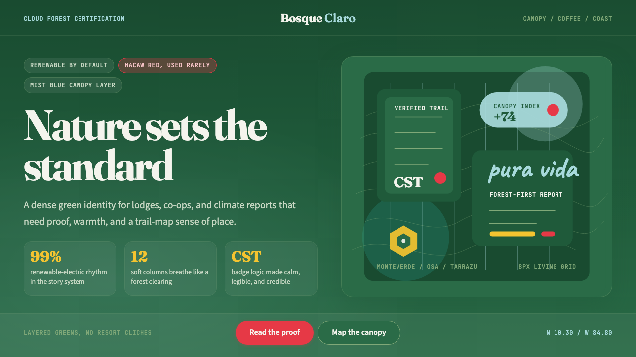 Costa Rica Pura Vida EcoAlive without greenwash. Cloud-forest green, Fraunces serif, and scarlet acce…拒绝漂绿:云雾森林绿、Fraunces衬线与猩红点缀撑起生机。
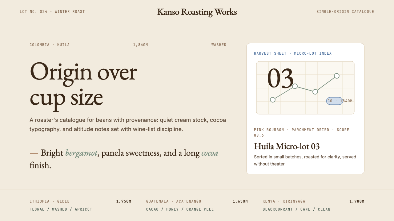 Third Wave CoffeeCoffee as catalogue. Cream paper, cocoa serif, mono origin specs, one sage no…咖啡如图录:奶油纸底、可可衬线、等宽产地规格与鼠尾草绿。
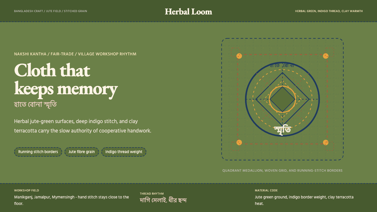 Bangladeshi Jute CraftMemory stays stitched. Jute green, indigo borders, terracotta warmth.记忆被缝进画面。黄麻绿、靛蓝虚线、陶土暖调。
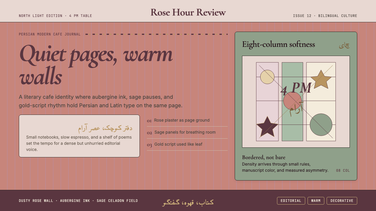 Tehran Cafe ModernismQuietly dense, warmly literary. Dusty rose, sage panels, and italic serif gri…温暖而书卷气十足。玫瑰灰粉底、鼠尾草绿分栏与斜体衬线成形。
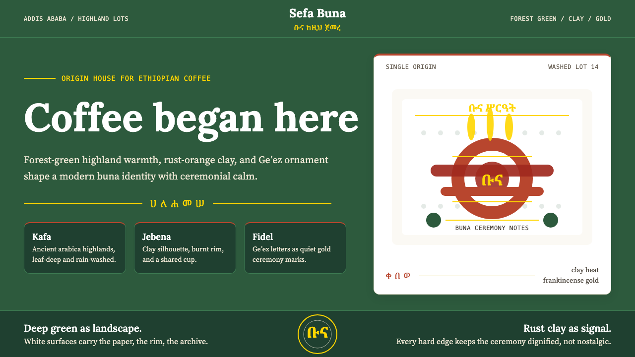 Ethiopian Coffee BunaOrigin feels ceremonial. Forest green, rust clay, Lora serif, and Geʽez gold…起源感庄重:森林绿、陶土橙、Lora 衬线与金色吉兹分隔。
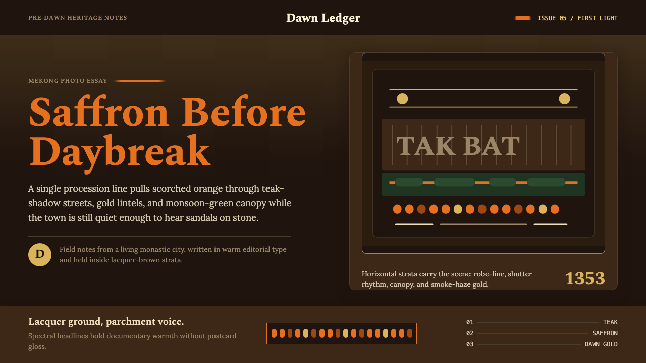 Luang Prabang Saffron AlmsDawn has weight. Saffron bands cut through teak brown and smoke-gold editoria…黎明有重量:藏红带穿过柚木棕与烟金色编辑字体。