What is Tehran Cafe Modernism?什么是 Tehran Cafe Modernism?
Tehran Cafe Modernism brews Qajar miniature sensibility, mid-century Iranian poster art, and contemporary European design into a quietly dense, bookish aesthetic that feels like a north-Tehran cafe at four in the afternoon.德黑兰咖啡馆现代主义将卡扎尔细密画的感性、伊朗中世纪海报艺术与当代欧洲设计融合为一种安静而书卷气的美学——仿佛置身北德黑兰下午四点的独立咖啡馆。
Tehran Cafe Modernism in briefTehran Cafe Modernism 速览
Tehran Cafe Modernism is a contemporary Iranian graphic design aesthetic that emerged from the third-wave cafe culture of Tehran in the 2010s. Its visual language is built around a palette of dusty rose, sage celadon, and aubergine — warm, slightly desaturated tones that reference both the faded grandeur of Qajar-era interiors and the muted palettes of mid-century European modernist printing. The result is a style that is simultaneously literary and cosmopolitan, intimate and composed.德黑兰咖啡馆现代主义是一种当代伊朗平面设计美学,兴起于2010年代德黑兰第三波咖啡馆文化。其视觉语言围绕玫瑰灰粉、鼠尾草青瓷与茄紫色构建——这些温暖而略显去饱和的色调,既呼应卡扎尔时代室内陈设的褪色辉煌,也回响着二十世纪中叶欧洲现代主义印刷的柔化色板。最终呈现出一种既有书卷气又有国际视野、既亲密又沉着的风格。
What distinguishes this aesthetic from generic international cafe design is its insistence on bilingualism as a structural principle rather than an afterthought. Persian calligraphic tradition and contemporary Latin typography coexist on the same surface, each informing the rhythm and density of the other. The grid breathes differently when Nastaliq script flows alongside italic serif Latin — the vertical axis opens, the horizontal relationships become more textured, and the page acquires a layered density that purely Latin or purely Persian layouts rarely achieve.这种美学与通行的国际咖啡馆设计的根本区别,在于它将双语性视为结构原则而非事后补贴。波斯书法传统与当代拉丁字体在同一版面上共存,彼此影响着对方的节奏与密度。当纳斯塔利格体(Nastaliq)草书与斜体衬线拉丁字并排流淌时,网格的呼吸方式变得不同——纵轴打开,横向关系变得更有质感,页面获得一种纯粹拉丁或纯粹波斯版面都难以企及的层叠密度。
The style is self-consciously literary: it gravitates toward serif type, italic cuts, generous leading, and the visual grammar of the literary journal and the art-book cover. It resists both the austerity of Western minimalism and the orientalist theatricality that international brands sometimes impose on Middle Eastern aesthetics. The goal is not to perform Persianness for an outside gaze but to represent a genuine contemporary Iranian creative culture — one that reads Pessoa and Hafez in the same afternoon.这种风格有着自觉的文学性:它倾向于衬线字体、斜体切割、宽松的行距,以及文学期刊封面和艺术书籍的视觉语法。它既拒绝西方极简主义的清冷,也回避国际品牌有时强加于中东美学的东方主义戏剧感。它的目标不是为外部凝视表演「波斯性」,而是呈现一种真实的当代伊朗创意文化——一种可以在同一个下午阅读佩索阿和哈菲兹的文化。
See the Tehran Cafe Modernism design system查看 Tehran Cafe Modernism 完整设计系统
Where does Tehran Cafe Modernism come from?Tehran Cafe Modernism 从何而来?
The roots of Tehran Cafe Modernism reach back to the post-revolution typographic experimentation that transformed Iranian graphic design from the 1980s onward. After 1979, Iranian designers worked under conditions that severed many direct connections to Western commercial culture while simultaneously intensifying engagement with the country's own classical visual heritage — Persian manuscript illumination, Safavid tile patterns, Qajar portraiture, and the rich tradition of Persian calligraphy in its many scripts. This enforced inwardness, paradoxically, produced a generation of designers deeply fluent in both international modernism and indigenous visual language.德黑兰咖啡馆现代主义的根源可追溯至革命后的字体排印实验——这场实验从1980年代起重塑了伊朗平面设计。1979年后,伊朗设计师在切断了与西方商业文化诸多直接联系的条件下工作,同时被迫更深入地接触本国古典视觉遗产——波斯手抄本装饰、萨法维时代瓷砖图案、卡扎尔肖像画,以及各种字体流派中丰富的波斯书法传统。这种被强迫的内向性,悖论式地培养出一代对国际现代主义和本土视觉语言都深度精通的设计师。
The cafe wave that catalyzed the aesthetic into a recognizable style began around 2012, concentrated in Tehran's Tajrish and Vali-Asr districts — neighborhoods where a young, educated, cosmopolitan population gathered in independent cafes that doubled as gallery spaces, reading rooms, and informal publishing venues. These establishments needed visual identities that could speak to an audience simultaneously steeped in Persian literary culture and conversant with contemporary European design. The menus, posters, tote bags, and zines produced for these spaces constitute the founding archive of the aesthetic.触发这种美学结晶为可辨认风格的咖啡馆浪潮,大约始于2012年,集中在德黑兰的塔吉里什(Tajrish)和瓦利-阿斯尔(Vali-Asr)地区——在那些街区,受过良好教育的年轻世界公民聚集在独立咖啡馆中,这些场所同时充当画廊空间、阅读室和非正式出版场地。这些机构需要视觉识别系统,能够同时与深浸波斯文学文化和熟悉当代欧洲设计的受众对话。为这些空间制作的菜单、海报、帆布袋和独立杂志,构成了这种美学的创始档案。
The movement's intellectual debts are multiple and layered. From contemporary Iranian graphic design it inherits a commitment to calligraphic experimentation and typographic density. From post-revolution neo-Qajar revivalism it takes its color warmth and its taste for intricate surface pattern held in tension with clean structure. From mid-century Iranian poster art — itself a synthesis of Socialist Realist influence and Persian miniature tradition — it borrows compositional boldness and a willingness to place text and image in genuine dialogue rather than hierarchy. European influences, particularly from Italian and Swiss editorial design of the 1960s and 1970s, provide the grid logic and the serif-italic sensibility.这个运动的知识债务是多元而层叠的。它从当代伊朗平面设计继承了对书法实验和字体排印密度的承诺;从革命后的新卡扎尔复兴主义中汲取色彩的温暖感,以及在繁复表面图案与清洁结构之间保持张力的品味;从二十世纪中叶的伊朗电影海报艺术——其本身就是社会主义现实主义影响与波斯细密画传统的综合——借鉴了构图的大胆性,以及让文字与图像进行真正对话而非等级划分的意愿。欧洲影响,尤其是1960至70年代意大利和瑞士编辑设计的影响,提供了网格逻辑和衬线斜体的感性基础。
Key figures in the broader contemporary Iranian graphic design field, including Reza Abedini, Saed Meshki, Iman Raad, and Kourosh Beigpour, provided both direct examples and a cultural permission structure that made this kind of synthesis legible as serious design rather than eclectic pastiche. Abedini's work in particular demonstrated that Persian calligraphic forms could be treated with the same structural rigor as Latin typography — not as exotic ornament but as a fully functional visual architecture. This precedent is the conceptual foundation on which Tehran Cafe Modernism builds.当代伊朗平面设计领域的关键人物——包括礼萨·阿贝迪尼(Reza Abedini)、萨伊德·梅什基(Saed Meshki)、伊曼·拉德(Iman Raad)和库鲁什·贝格普尔(Kourosh Beigpour)——既提供了直接的范例,也构建了一种文化许可结构,使这种综合性创作被认知为严肃设计而非折中拼贴。阿贝迪尼的工作尤其具有示范意义:他证明了波斯书法形式可以被赋予与拉丁字体同等的结构严谨性——不作为异域装饰,而作为完全功能性的视觉建筑。这一先例是德黑兰咖啡馆现代主义赖以建立的概念基础。
What defines the Tehran Cafe Modernism look?Tehran Cafe Modernism 的视觉特征是什么?
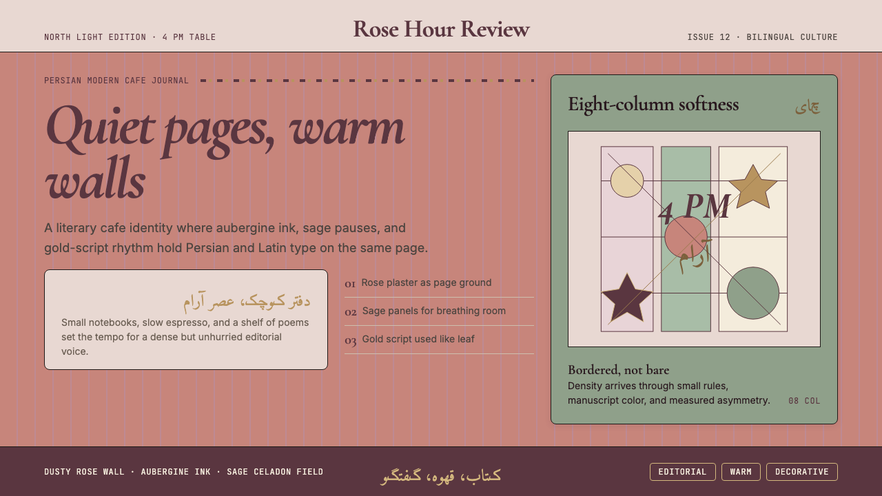
Color Palette色彩体系
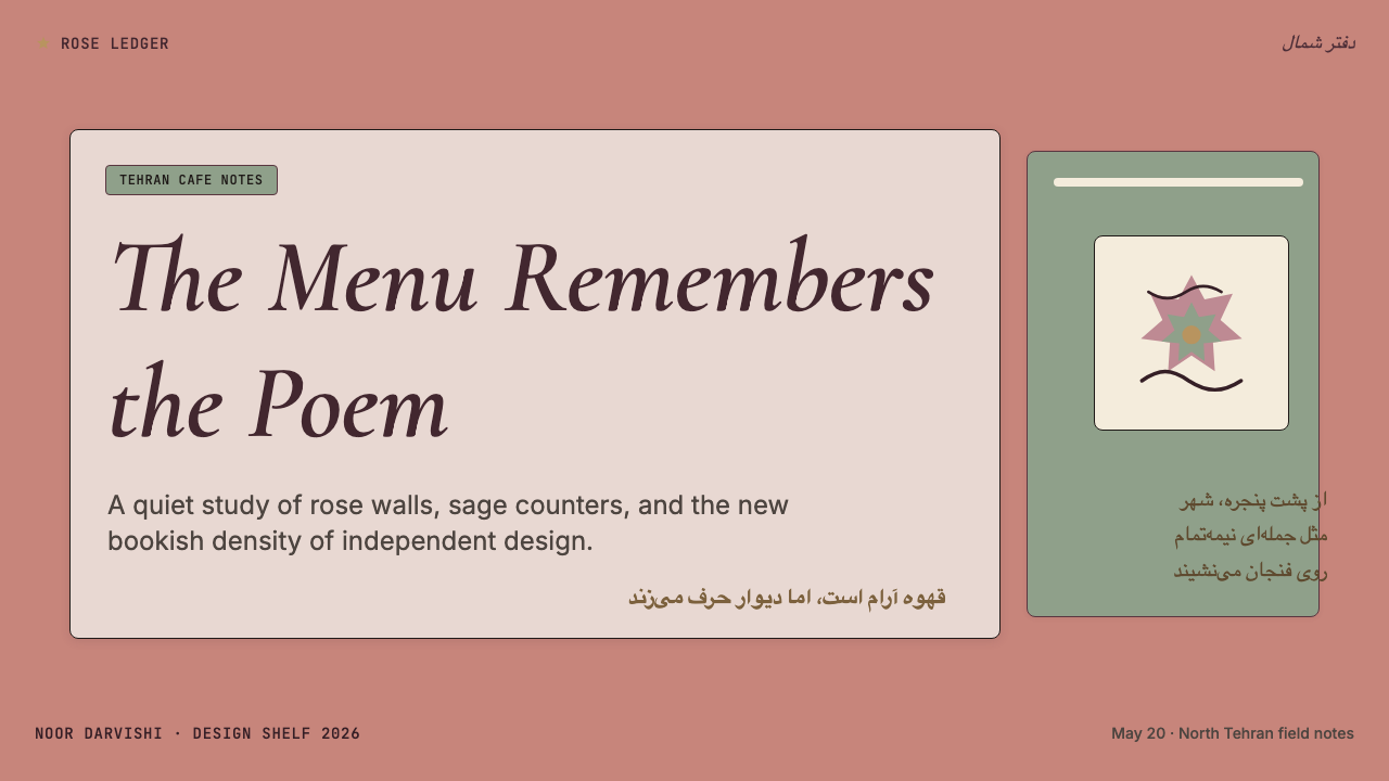
The palette centers on dusty rose, sage celadon, and aubergine — all at reduced saturation, as if slightly sun-faded or seen through translucent paper. These anchor tones are supported by warm off-white or parchment grounds and, occasionally, deep indigo or charcoal for typographic contrast. The overall temperature is warm and slightly amber-shifted, evoking both the light quality of north-Tehran afternoons and the aged pigments of Qajar manuscript decoration. There is no pure, cold white and no neon — everything has been warmed and quieted.色板以玫瑰灰粉、鼠尾草青瓷和茄紫为核心——均处于降低的饱和度,仿佛略微日晒褪色,或透过半透明纸张观看。这些锚定色调由温暖的米白或羊皮纸底面支撑,偶尔用深靛蓝或炭灰形成字体对比。整体色温偏暖,略带琥珀偏移,同时唤起北德黑兰下午的光线质感和卡扎尔手抄本装饰中陈旧的颜料感。没有纯冷白,没有霓虹——一切都被温暖化和静化了。
Bilingual Typography双语排印
The defining structural feature is the coexistence of Persian script — typically Nastaliq or a contemporary calligraphic variant — and Latin type on the same surface. Rather than segregating the two systems into separate zones, Tehran Cafe Modernism allows them to interpenetrate: a Persian headline might anchor the top of a composition while an italic Latin caption runs across its baseline. The tension between the right-to-left rhythm of Persian and the left-to-right logic of Latin is treated as a compositional resource, producing visual complexity that neither language alone could generate.这种美学的决定性结构特征是波斯文字——通常是纳斯塔利格体或当代书法变体——与拉丁字体在同一版面上的共存。它并不将两种系统隔离在各自区域,而是让它们相互渗透:波斯语标题可能锚定构图顶部,而斜体拉丁说明文字则沿其基线横跨。波斯语从右到左的节奏与拉丁语从左到右的逻辑之间的张力,被视为一种构图资源,产生任何单一语言都无法单独生成的视觉复杂性。
Serif and Italic Sensibility衬线与斜体感性
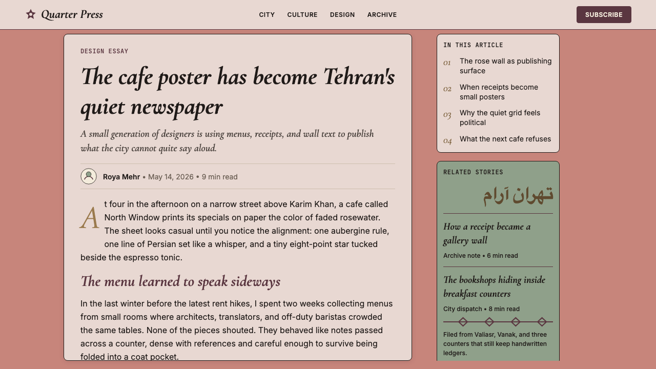
Where many contemporary cafe aesthetics default to geometric sans-serif, Tehran Cafe Modernism privileges serif typefaces and their italic cuts. The preference reflects the aesthetic's literary orientation — serifs carry associations with the printed book, the journal, the carefully typeset page. Italics in particular are used structurally rather than merely for emphasis: a full passage set in italic becomes a textural element, a visual field that contrasts with upright roman text the way a shadow contrasts with a lit surface.许多当代咖啡馆美学默认使用几何无衬线字体,而德黑兰咖啡馆现代主义则偏爱衬线字体及其斜体切割。这种偏好反映了该美学的文学取向——衬线字体与印刷书籍、期刊和精心排版的页面有所关联。斜体尤其被用于结构性目的而非单纯强调:整段以斜体排版的文字成为一种肌理性元素,形成与正体文字对比的视觉场域,如同阴影与受光面的对比。
Grid Density网格密度
The layouts are notably dense by contemporary standards — multiple text elements, decorative rule lines, column dividers, and marginal notations coexist on a single page without the generous white space that international minimalism prescribes. This density is controlled rather than chaotic: an underlying grid organizes the composition, and the layering follows a clear hierarchy. The effect is closer to the designed page of a literary magazine than to a social media card, which is precisely the cultural register the aesthetic inhabits.以当代标准衡量,这种风格的版面密度相当高——多个文字元素、装饰性细线、分栏线和边注同时出现在单一页面上,没有国际极简主义所规定的充裕留白。这种密度是被控制的而非混乱的:底层网格组织着构图,层叠遵循清晰的层级。效果更接近文学杂志的设计页面,而非社交媒体卡片——这正是该美学所栖居的文化语域。
Soft Pattern and Miniature Ornament柔性图案与细密画装饰
Unlike styles that prohibit decoration on principle, Tehran Cafe Modernism admits ornamental elements — but keeps them subordinate and texturally integrated. Qajar-derived floral borders, geometric tile-pattern fills used as background texture, and small medallion motifs appear as structural accents rather than primary visual statements. They occupy the same visual register as a drop cap or a rule line — elements that enrich the surface without disrupting the compositional logic.与原则上禁止装饰的风格不同,德黑兰咖啡馆现代主义允许装饰性元素存在——但使其保持从属地位并在质感上融入整体。源自卡扎尔时代的花卉边框、用作背景纹理的几何瓷砖图案填充,以及小型圆形徽章母题,作为结构性点缀出现,而非主要视觉陈述。它们与首字下沉或细线处于同一视觉层次——丰富表面而不破坏构图逻辑的元素。
Warm Literary Mood温暖的文学氛围
The overall mood is intimate and unhurried — a quality achieved through the combination of warm color temperature, serif type, and measured density. There is a deliberate evocation of the atmosphere of reading: the feeling of sitting with a book and a coffee in a room with afternoon light. This mood differentiates the aesthetic sharply from both the clinical efficiency of Scandinavian minimalism and the high-energy visual noise of trend-driven social media design. It asks the viewer to slow down.整体氛围是亲密而不急迫的——这种品质通过温暖色温、衬线字体和有节制的密度的组合来实现。它刻意唤起阅读的氛围:坐在午后光线洒落的房间里,手持一本书和一杯咖啡的感受。这种氛围使该美学与斯堪的纳维亚极简主义的临床效率和潮流驱动的社交媒体设计的高能视觉噪声都截然不同。它要求观者放慢脚步。
Cultural Specificity Without Exoticism无异域化的文化特殊性
Tehran Cafe Modernism is culturally rooted but not culturally exclusive. Its Persian references — calligraphic forms, Qajar color and pattern, Iranian literary iconography — are deployed with the ease of a designer working from inside a tradition, not performing that tradition for an outside audience. This distinction is perceptible: the ornamental elements feel like structural decisions rather than identity signaling, and the overall composition feels authored rather than assembled from a toolkit of cultural markers.德黑兰咖啡馆现代主义有文化根源,但并不具有文化排他性。它的波斯语参照——书法形式、卡扎尔的色彩与图案、伊朗文学图像学——被部署得如同一位从传统内部工作的设计师的自然行为,而非为外部受众表演那种传统。这种区别是可感知的:装饰性元素感觉像是结构性决定,而非身份标签;整体构图感觉是被创作出来的,而非从一套文化标记工具箱中拼装出来的。
See the Tehran Cafe Modernism design system查看 Tehran Cafe Modernism 完整设计系统
Who shaped Tehran Cafe Modernism?谁塑造了 Tehran Cafe Modernism?
Reza Abedini is the most internationally recognized figure in contemporary Iranian graphic design and a pivotal precursor to the Tehran cafe aesthetic. His work demonstrated that Persian calligraphic forms — Nastaliq, Naskh, and experimental hybrids — could be treated with the same structural discipline as Latin typography, functioning as architectural rather than decorative elements. His poster work for Iranian theater and cinema through the 1990s and 2000s established a visual vocabulary in which script, image, and color interpenetrate as equals. Abedini's international recognition (he has exhibited and lectured widely in Europe and North America) also helped establish the cultural legitimacy of the broader tradition he represents.礼萨·阿贝迪尼是当代伊朗平面设计中国际认可度最高的人物,也是德黑兰咖啡馆美学的关键先驱。他的作品证明了波斯书法形式——纳斯塔利格体、纳斯赫体及实验性混合体——可以被赋予与拉丁字体同等的结构纪律,以建筑性而非装饰性功能运作。他在1990至2000年代为伊朗戏剧和电影创作的海报作品,确立了一套文字、图像与色彩相互平等渗透的视觉词汇。阿贝迪尼的国际认可(他在欧洲和北美广泛展览和演讲)也帮助确立了他所代表的更广泛传统的文化合法性。
Saed Meshki is a Tehran-based graphic designer and typographer whose work on Persian typeface design has been central to expanding the expressive range available to designers working in the Tehran cafe idiom. His typefaces bridge the historical forms of Persian calligraphy and the technical requirements of contemporary digital typography, making it possible to work with Persian script at small sizes and in complex grid contexts without sacrificing calligraphic character. His influence is felt particularly in the bookish, literary quality of Tehran cafe materials — the sense that Persian text has been set with the same care and intentionality as a well-produced European literary journal.萨伊德·梅什基是一位德黑兰平面设计师和字体排印师,他在波斯字体设计上的工作,对于扩展在德黑兰咖啡馆风格中工作的设计师的表达范围至关重要。他的字体在波斯书法的历史形式与当代数字字体排印的技术要求之间架桥,使得在小字号和复杂网格语境中使用波斯文字成为可能,同时不牺牲书法特征。他的影响尤其体现在德黑兰咖啡馆材料的书卷气和文学品质上——那种感觉:波斯文字被以与精心制作的欧洲文学期刊同等的用心和意图来排印。
Iman Raad's work represents the younger generation of Iranian designers who came of age after the cafe wave had already begun to consolidate the aesthetic. His practice is notable for pushing the bilingual compositional principle into more formally experimental territory — questioning where the boundary between script as letterform and script as image actually lies, and exploiting the visual ambiguity that results. His work has been particularly influential on the editorial and zine culture that runs parallel to the cafe design scene, and his approach to color demonstrates how the Tehran cafe palette can be used with greater restraint and philosophical intention.伊曼·拉德的工作代表了在咖啡馆浪潮已开始巩固该美学之后成长起来的年轻一代伊朗设计师。他的实践以将双语构图原则推向更正式实验性领域而著称——质疑文字作为字形与文字作为图像之间的边界究竟在哪里,并利用由此产生的视觉歧义。他的工作对平行于咖啡馆设计场景的编辑和独立杂志文化影响尤深;他对色彩的处理方式展示了如何以更大的克制和哲学意图使用德黑兰咖啡馆色板。
Kourosh Beigpour's contribution lies primarily in demonstrating the viability of the Tehran cafe aesthetic in commercial and institutional contexts beyond the independent cafe milieu that gave rise to it. His work for cultural institutions, publishing houses, and events has shown that the style's literary density and bilingual sophistication can sustain the weight of serious institutional identity without losing the warmth and intimacy that makes it distinctive. His practice is a useful model for designers who want to apply the aesthetic outside its original cafe and zine context — proving that it scales up without becoming generic.库鲁什·贝格普尔的贡献主要在于证明了德黑兰咖啡馆美学在独立咖啡馆环境之外的商业和机构场景中的可行性。他为文化机构、出版社和活动所做的工作表明,这种风格的文学密度和双语精致感,能够承载严肃机构身份的重量,同时不失使其独特的温暖和亲密感。他的实践是设计师在其原始咖啡馆和独立杂志语境之外应用该美学的有用范本——证明了它的可扩展性,而不会变得通用化。
How do you use Tehran Cafe Modernism today?今天怎么用 Tehran Cafe Modernism?
Tehran Cafe Modernism is a style with strong cultural specificity, which means it applies best when its particular mood — warm, literary, bilingual, quietly dense — aligns with the product's identity. It is especially well-suited to creative agencies, independent publishers, cultural institutions, literary platforms, specialty food and beverage brands, boutique travel and hospitality, and any product positioning itself within an educated, cosmopolitan audience that values depth over efficiency. It is a poor fit for products that depend on clinical clarity, aggressive speed, or the visual vocabulary of pure technology.德黑兰咖啡馆现代主义是一种具有强烈文化特殊性的风格,这意味着它最适合在其特定氛围——温暖、文学性、双语、安静密集——与产品身份相契合时应用。它尤其适合创意机构、独立出版商、文化机构、文学平台、精品食品和饮料品牌、精品旅行和酒店业,以及任何将自身定位于重视深度胜过效率的受过良好教育的世界公民受众的产品。对于依赖临床清晰度、强烈速度感或纯粹技术视觉词汇的产品,它并不适合。
For presentation slides, the style works beautifully on both cover and content pages. A cover benefits from a warm, off-white or parchment ground with a headline in a large italic serif, anchored by a single tonal ornamental element — a thin rule, a small medallion, a subtle tile-pattern band — in dusty rose or sage. Content slides should maintain the sense of a carefully typeset page: narrow body-text columns, generous leading, and hierarchy established through type size and weight rather than color. Data slides can adopt a restrained palette drawn from the anchor tones, treating chart elements as compositional objects rather than data-visualization widgets.在演示文稿中,这种风格在封面和内容页上都表现出色。封面适合使用温暖的米白或羊皮纸底面,配以大号斜体衬线标题,由单一色调装饰元素锚定——玫瑰灰粉或鼠尾草色的细线、小徽章或微妙的瓷砖纹带。内容页应保持精心排版页面的感觉:窄幅正文栏、宽松行距,以及通过字号和字重而非色彩来建立层级。数据页可以采用从锚定色调中提炼的克制色板,将图表元素视为构图对象,而非数据可视化组件。
For web interfaces, the style suits editorial landing pages, portfolio sites, cultural institution pages, and boutique product pages more naturally than dashboards or analytical tools. The approach involves warm backgrounds rather than pure white, serif or bracketed body type, and a restrained use of the palette's warm tones for interactive accents. Navigation benefits from a typographic rather than iconic treatment. Card components should have visible structure — thin borders in a muted tone rather than shadow — maintaining the style's flat, page-like quality. If a dashboard must be built in this aesthetic, treat each data module as a framed composition rather than a floating card.对于网页界面,这种风格比仪表板或分析工具更自然地适合编辑类落地页、作品集网站、文化机构页面和精品产品页面。方法是使用温暖背景而非纯白,正文采用衬线或带括号字体,色板的暖色调用于交互强调时要克制。导航受益于字体性而非图标性的处理。卡片组件应具有可见的结构——低调色调的细边框而非阴影——保持这种风格平面、页面式的质感。如果必须以这种美学构建仪表板,应将每个数据模块视为一个带框的构图,而非浮动卡片。
For editorial and marketing work, the style's natural home, the approach is to lean into its literary density. A feature article layout works well with a narrow measure for body text, wide outer margins for pull quotes or annotations, and section breaks marked by ornamental rule combinations rather than whitespace alone. Marketing pages can use the aesthetic's poster-like sensibility: full-width sections that alternate between the warm ground palette and a deeper aubergine or indigo tone, with italic serif headlines and body text in careful proportion. Bilingual treatment — even a single line of Persian or another language used as design texture — enriches the surface without requiring full translation.对于编辑和营销工作——这种风格的天然归宿——方法是充分发挥其文学密度。功能性文章版面适合为正文使用窄行宽,为引用语或注释保留宽阔外边距,以装饰性细线组合而非单纯空白标记段落分隔。营销页面可以运用该美学的海报式感性:全宽区块在温暖底面色板和更深的茄紫或靛蓝色调之间交替,配以斜体衬线标题和比例精确的正文。双语处理——哪怕只是作为设计纹理使用的单行波斯语或其他语言——可以丰富表面,而无需完整翻译。
A common mistake when applying this style is mistaking warmth for looseness. Tehran Cafe Modernism is warm but not casual — its density is controlled, its ornamental elements are structurally placed, and its typography is careful. Designers who borrow only the palette without attending to the grid, the type hierarchy, and the quality of typographic spacing will produce work that feels merely nostalgic or vaguely ethnic rather than genuinely compositional. A second common mistake is using too many ornamental elements simultaneously, which dissolves the contrast between structured type and decorative accent that gives the style its tension. One or two well-chosen ornamental gestures per composition is almost always enough.应用这种风格时常见的错误是将温暖误解为随意。德黑兰咖啡馆现代主义是温暖的,但并非随意的——其密度是被控制的,其装饰性元素是结构性放置的,其排版是精心的。只借用色板而不关注网格、字体层级和字体间距质量的设计师,会产出仅仅感觉怀旧或隐约带有民族风情的作品,而非真正构图性的作品。第二个常见错误是同时使用过多装饰性元素,这会消解结构性字体与装饰性点缀之间的对比——而正是这种对比赋予了这种风格以张力。每个构图中一到两个精心选择的装饰性姿态,几乎总是足够的。
See the Tehran Cafe Modernism design system查看 Tehran Cafe Modernism 完整设计系统
Tehran Cafe Modernism — FAQTehran Cafe Modernism · 常见问题
Is this style appropriate for brands outside Iran or the Middle East?这种风格适合伊朗或中东以外的品牌使用吗?
Yes, with intentionality. Tehran Cafe Modernism is a design system, not a cultural costume — its structural principles (bilingual grid logic, warm serif palette, controlled density, literary mood) are transferable to any context where those aesthetic values align with the brand's identity. What matters is whether the brand genuinely occupies the aesthetic's cultural register: educated, cosmopolitan, literary, unhurried. Applying it mechanically for its decorative surface without that underlying alignment tends to produce work that reads as cultural borrowing without cultural understanding. When the alignment is genuine, the style brings warmth and specificity that purely international aesthetics rarely achieve.可以,但需要有意识地进行。德黑兰咖啡馆现代主义是一个设计系统,而非一套文化服装——其结构原则(双语网格逻辑、温暖衬线色板、被控制的密度、文学氛围)可以转移到任何这些审美价值与品牌身份契合的语境中。关键在于品牌是否真正占据该美学的文化语域:受过良好教育、有国际视野、具文学性、不急迫。在没有这种深层契合的情况下机械地借用其装饰表面,往往会产出被解读为有文化借用而无文化理解的作品。当契合是真实的,这种风格会带来纯粹国际性美学鲜少能够实现的温暖和特殊性。
Does this style require actual Persian or Farsi text, or can it be applied with only Latin type?这种风格需要真正的波斯语或法尔西文吗?还是只用拉丁字体也可以应用?
The bilingual dimension is central to the style's identity, but there are degrees of engagement. A full application uses both Persian script and Latin type as structural coequals, which requires working with a designer fluent in Persian typographic conventions. A lighter application can evoke the style's mood — warm palette, serif italic type, controlled density, literary register — without Persian script, producing work that feels adjacent to Tehran Cafe Modernism rather than fully within it. Using Persian text decoratively, as texture rather than communication, is a middle path that works visually but should be approached with care and, ideally, with the involvement of someone who can verify the text's appropriateness.双语维度是这种风格身份的核心,但存在不同程度的介入。完整的应用将波斯文字和拉丁字体作为结构性平等元素共同使用,这需要与精通波斯字体排印惯例的设计师合作。较轻的应用可以在不使用波斯文字的情况下唤起这种风格的氛围——温暖色板、衬线斜体字、被控制的密度、文学语域——产出感觉邻近德黑兰咖啡馆现代主义而非完全置身其中的作品。将波斯文字作为纹理而非传达内容来装饰性使用,是一条视觉上可行的中间路径,但应谨慎处理,理想情况下应有能够核实文字适当性的人员参与。
How does this style differ from other warm, literary design aesthetics like Italian editorial or French cafe design?这种风格与其他温暖的文学设计美学(如意大利编辑设计或法国咖啡馆设计)有何不同?
The surface similarities — serif type, warm palette, literary density — are real, and Tehran Cafe Modernism is partly indebted to both Italian and Swiss editorial traditions. The key differences lie in color temperature, script complexity, and ornamental philosophy. Italian editorial design tends toward higher contrast and cooler blacks; French cafe design tends toward more neutral grounds and cleaner minimalism. Tehran Cafe Modernism is warmer in tone, more amber-shifted in its whites, and admits ornamental pattern in a way that European editorial traditions rarely do. The bilingual structure is the most distinctive difference: no European editorial tradition has to negotiate the visual coexistence of two scripts with opposed directionality, and that negotiation is what gives the Tehran version its particular density and compositional character.表面上的相似性——衬线字体、温暖色板、文学密度——是真实的,德黑兰咖啡馆现代主义部分确实得益于意大利和瑞士编辑传统。关键差异在于色温、文字复杂性和装饰哲学。意大利编辑设计倾向于更高对比度和更冷的黑色;法国咖啡馆设计倾向于更中性的底面和更清洁的极简主义。德黑兰咖啡馆现代主义色温更暖,白色有更多琥珀偏移,并以欧洲编辑传统鲜少有的方式允许装饰图案。双语结构是最独特的差异:没有任何欧洲编辑传统需要协商两种方向相反的文字的视觉共存,而正是这种协商赋予了德黑兰版本其特定的密度和构图特质。
Can this style work in dark mode or on dark backgrounds?这种风格能在深色模式或深色背景下使用吗?
A dark-ground version is possible and can be evocative — think of the atmosphere of a Tehran cafe late in the evening, candles on tables, dark walls hung with framed prints. The approach inverts the palette: aubergine or deep indigo as ground, dusty rose and sage as accent and type tones, off-white or warm cream for body text. What to avoid is true black grounds, which strip away the warmth that is central to the aesthetic. The ornamental elements — thin rules, small medallions, tile-pattern textures — survive the inversion well if handled at reduced opacity rather than full contrast. The bilingual typography holds up in dark versions; if anything, the contrast between script systems becomes more legible against a consistent dark ground.深色底面版本是可能的,且可以很有感染力——想象一下德黑兰咖啡馆深夜的氛围:桌上的蜡烛,挂着装帧版画的深色墙壁。方法是反转色板:茄紫或深靛蓝作为底面,玫瑰灰粉和鼠尾草作为强调和字体色调,米白或温暖奶油色作为正文。需要避免的是纯黑底面,它会剥夺美学核心的温暖感。装饰性元素——细线、小徽章、瓷砖纹理——如果以降低的不透明度而非全对比度处理,在反转版本中依然表现良好。双语排版在深色版本中同样成立;如果说有什么变化,文字系统之间的对比在一致的深色底面上反而变得更清晰可读。
What is the biggest risk when applying this aesthetic, and how do you avoid it?应用这种美学的最大风险是什么?如何避免?
The biggest risk is orientalism — reducing a living, complex creative culture to a set of decorative surface markers (geometric tiles, calligraphic script used as texture, warm earth tones) without engaging the structural logic and cultural intelligence that make the style coherent. The result is a kind of design tourism: work that looks vaguely Middle Eastern without saying anything specific. The way to avoid it is to engage with the style at the level of its principles — the bilingual grid, the literary density, the precise color relationships — rather than its symptoms. Working with designers who have genuine knowledge of the tradition, using Persian text only when it communicates real content, and understanding the historical sources of the aesthetic's visual choices are the practical safeguards.最大的风险是东方主义——将一种鲜活复杂的创意文化简化为一套装饰性表面标记(几何瓷砖、用作纹理的书法文字、温暖的大地色调),而不接触使该风格连贯的结构逻辑和文化智识。结果是一种设计旅游主义:作品看起来模糊地带有中东风情,却没有表达任何具体内容。避免这一问题的方法是在原则层面而非症状层面介入这种风格——双语网格、文学密度、精确的色彩关系。实际的保障措施包括:与对该传统有真正了解的设计师合作,仅在波斯文字传达真实内容时才使用它,以及理解该美学视觉选择的历史来源。
Related design styles相关设计风格
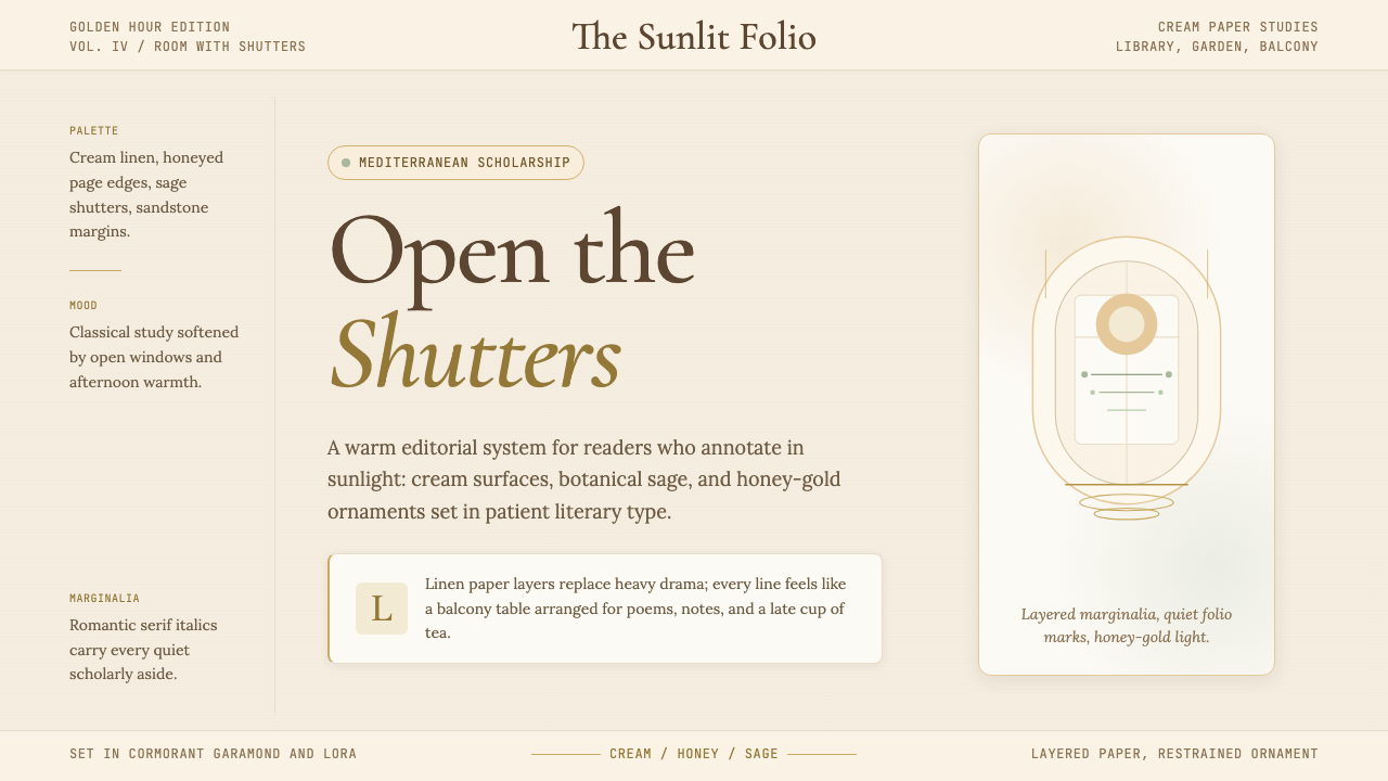 Light AcademiaScholarship turns sunlit. Cream linen, honey gold, sage botanicals, and roman…学术被阳光照亮:奶油亚麻、蜂蜜金、鼠尾草植物与浪漫斜体。
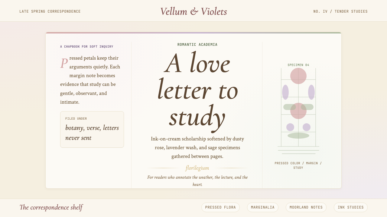 Romantic AcademiaScholarship turns tender. Dusty rose and lavender frame ink-on-cream poetry w…学问变得温柔:灰玫瑰与薰衣草框住米白纸上的墨字与压花。
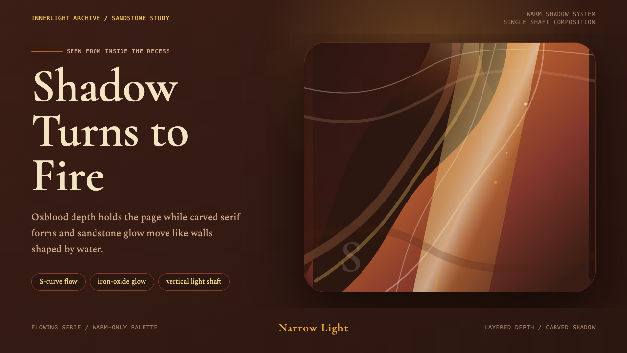 Antelope Slot CanyonGlows from shadow. Oxblood ground, sandstone S-curves, and one warm gold shaf…从阴影中发光:酒红褐底、砂岩 S 曲线与金色光柱。
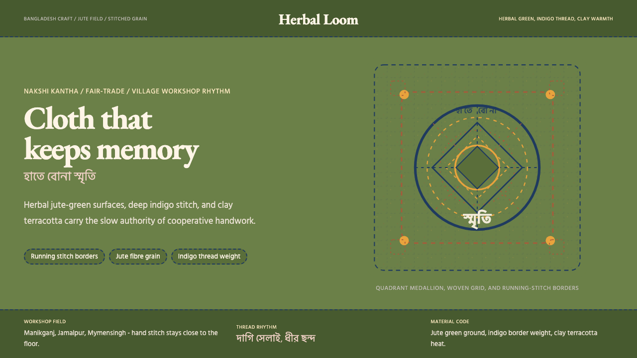 Bangladeshi Jute CraftMemory stays stitched. Jute green, indigo borders, terracotta warmth.记忆被缝进画面。黄麻绿、靛蓝虚线、陶土暖调。
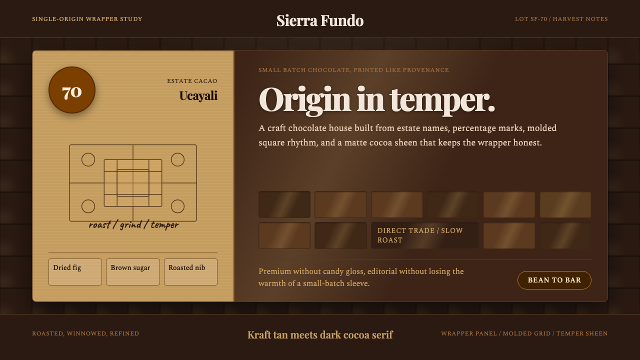 Bean-to-Bar ChocolateOrigin tastes tactile. Cocoa serif, kraft panel, and molded squares carry the…产地感可触:可可衬线、牛皮纸面板与巧克力方格讲述手作。
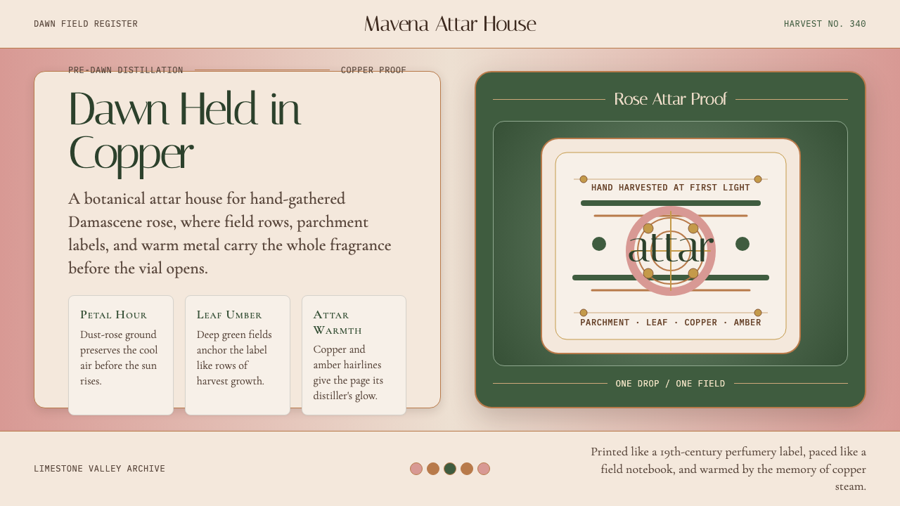 Bulgarian Kazanlak Rose ValleyDawn feels distilled. Dust-rose ground, leaf green, and copper label geometry…黎明被蒸馏:暮粉底、叶绿面与铜色标签几何留住香气。