What is Romantic Academia?什么是 Romantic Academia?
Romantic Academia turns scholarship into a love letter — dusty rose and lavender wrapping ink-on-cream poetry with pressed botanicals and the tender longing of the English Romantic tradition.浪漫学院风将学术化为一封情书——灰玫瑰与薰衣草紫,裹挟着压花标本与英国浪漫主义的柔情,在米白纸上以墨水书写诗意。
Romantic Academia in briefRomantic Academia 速览
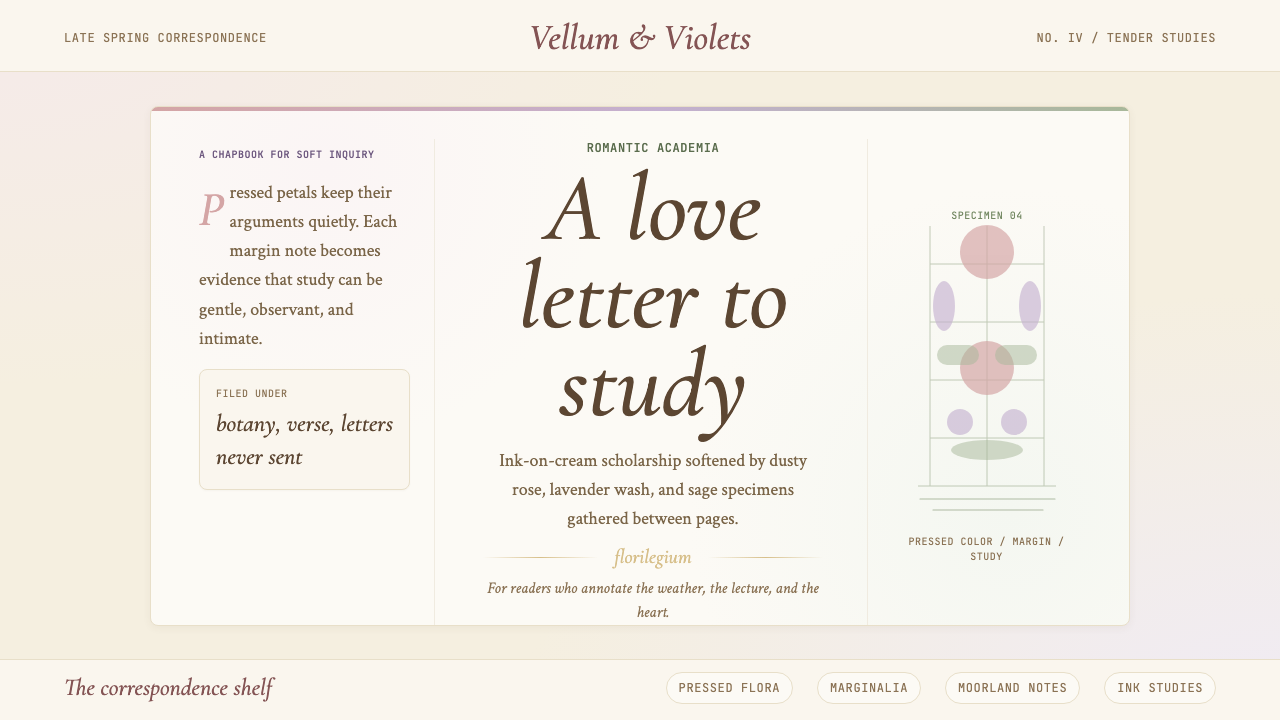
Romantic Academia is a design aesthetic rooted in the visual vocabulary of English Romantic poetry, Pre-Raphaelite painting, and Edwardian botanical illustration. It is the poetic-tender counterpart to Dark Academia — where that style reaches for gothic shadows and the amber gravity of old libraries, Romantic Academia reaches instead for the soft luminosity of a pressed-flower herbarium, a handwritten letter on cream stationery, a watercolor wash drying at the edge of a botanical drawing.浪漫学院风是一种根植于英国浪漫主义诗歌、前拉斐尔派绘画与爱德华时代植物学插图视觉语汇的设计美学。它是暗黑学院风的诗意对照——后者追求哥特式阴影与古旧图书馆的琥珀沉重,浪漫学院风则转向压花标本的柔和光泽、米白信笺上的手书文字、在植物学绘图边缘自然晕开的水彩。
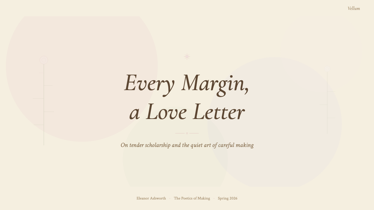
The palette is built from muted, powdery hues: dusty rose, warm lavender, sage green, and the off-white of aged letter paper, with ink-dark type anchoring the composition. Color is never saturated to the point of boldness — it is always a little faded, a little dream-worn, as if seen through gauze or recalled from memory. Texture is implicit rather than literal: the suggestion of paper grain, the ghost of a watercolor edge, the slight imperfection of hand-lettering.调色板由柔化的粉状色调构成:灰玫瑰、暖薰衣草紫、鼠尾草绿,以及泛黄信笺的米白色,以墨水深色字体为构图注入锚点。色彩从不饱和至大胆——它永远带着一丝褪色感,一丝梦境的磨损,仿佛透过纱布观看,或从记忆深处召回。质感是暗示而非实写:纸张纹理的隐约,水彩边缘的幽灵,手写体那不经意的轻微不规则。
Typography in this system leans toward serif letterforms with calligraphic character — the kind that recalls copperplate correspondence or the title pages of nineteenth-century poetry collections. Layouts favor narrow columns with generous margins, the proportions of a slim volume of verse rather than a reference book. White space is used emotionally as well as structurally: it is the pause before the next stanza, the breath between lines.这套体系中的字体排印偏向具有书法气质的衬线字形——令人联想到铜版笔书信体,或十九世纪诗集的扉页题字。版面构成偏爱窄栏配宽边距,比例接近一册薄薄的诗集而非工具书。留白在情感层面与结构层面同等重要:它是下一诗节前的停顿,是行与行之间的呼吸。
See the Romantic Academia design system查看 Romantic Academia 完整设计系统
Where does Romantic Academia come from?Romantic Academia 从何而来?
Romantic Academia was named and disseminated primarily through Tumblr and TikTok's aesthetic-classification movement, reaching its peak cultural visibility between 2021 and 2024. Unlike design movements born in studios or schools, it emerged from the practice of internet users curating mood boards — gathering images of handwritten letters, botanical prints, Pre-Raphaelite portraits, and lakeside landscapes into visual collections that expressed a longing for a particular quality of feeling: scholarly yet tender, introspective yet romantic.浪漫学院风的命名与传播,主要经由 Tumblr 和 TikTok 的美学分类运动完成,在2021年至2024年间达到文化关注度的顶峰。与诞生于工作室或学校的设计运动不同,它萌生于互联网用户策展情绪板的实践——将手写信件、植物学版画、前拉斐尔派肖像与湖边风景汇聚成视觉集合,表达对某种特定情感质量的渴望:博学而温柔,内省而浪漫。
The deeper historical roots reach back to the English Romantic movement of 1798 to 1830. The poets of this era — Keats, Shelley, Byron, Wordsworth, and Coleridge — established a sensibility in which learning and feeling were not opposites but inseparable companions. Keats wrote about reading Homer with the same emotional register as writing about a nightingale. Byron wandered the Swiss Alps and the Greek ruins, treating landscape as a philosophical text. The Romantics believed that beauty, scholarship, and emotion were facets of a single human capacity, and this conviction is legible in every element of the aesthetic that now bears their name.更深的历史根源延伸至1798年至1830年的英国浪漫主义运动。这一时代的诗人——济慈、雪莱、拜伦、华兹华斯与柯勒律治——确立了一种感知方式:学问与情感不是对立物,而是不可分割的伴侣。济慈写读荷马的感受与写夜莺的感受出于同一情感频道;拜伦游历瑞士阿尔卑斯山与希腊废墟,将风景当作哲学文本。浪漫主义者相信,美、学识与情感是人类同一种能力的不同面向,这一信念在如今以他们命名的美学的每个元素中清晰可辨。
The Pre-Raphaelite Brotherhood, founded in London in 1848, provided the visual register. Dante Gabriel Rossetti, John Everett Millais, and their circle rejected the conventions of academic painting in favor of intense color, elaborate detail, and subjects drawn from medieval legend and Romantic poetry. Their canvases — rich with botanical specificity, melancholy women in elaborate dress, and the luminous surfaces of objects given loving attention — became a primary image bank for the aesthetic. Pre-Raphaelite painting is characterized by a quality of heightened seeing: ordinary things — a strand of hair, a petal, a reflection in water — rendered with the care usually reserved for sacred subjects.前拉斐尔派兄弟会于1848年在伦敦成立,为这一风格提供了视觉语域。但丁·加百利·罗塞蒂、约翰·埃弗里特·米莱斯与同仁们拒绝学院派绘画的惯例,转而采用强烈的色彩、精细的细节,以及取自中世纪传说与浪漫主义诗歌的题材。他们的画布——充满精确的植物学细节、忧郁的华美女子、以及被爱意凝视的物体那闪光的表面——成为这一美学的主要图像库。前拉斐尔派绘画的特征是一种被强化的观看质量:平凡之物——一缕发丝、一片花瓣、水中的倒影——以通常只留给圣物的专注加以描绘。
The third tributary is Edwardian botanical illustration: the tradition of scientific plant drawing at its most exquisite, where accuracy and beauty were considered the same virtue. Illustrators working for botanical journals and natural history societies produced drawings of extraordinary delicacy — watercolor washes over precise pencil lines, color notes in the margins, pressed specimens mounted beside their painted counterparts. This combination of scientific rigor and artistic tenderness is precisely the quality that Romantic Academia aspires to: knowledge expressed with care, scholarship rendered beautiful.第三条支流是爱德华时代的植物学插图:科学植物绘图传统在其最精美的时刻,将精确与美视为同一种美德。为植物学期刊和自然史学会工作的插图师创作出极具纤细感的画作——在精确铅笔线稿上施以水彩晕染,页边写有色彩注记,压制标本与彩绘对应物并排装裱。这种科学严谨与艺术柔情的结合,正是浪漫学院风所追求的气质:以关怀表达知识,以美来呈现学术。
What defines the Romantic Academia look?Romantic Academia 的视觉特征是什么?
Palette色彩调性
The color palette is built from powdery, desaturated hues that feel faded and soft rather than vivid: dusty rose, warm lavender, sage green, muted gold, and the off-white of aged letter paper. These are colors that seem to have absorbed a century of light — tender, slightly melancholy, never aggressive. Ink dark (close to black but warmer) anchors text and structural elements. The overall effect is of a color world that has been gently washed, like a watercolor left in afternoon sun.调色板由粉状、去饱和的色调构成,给人褪色而柔软而非鲜艳的感受:灰玫瑰、暖薰衣草紫、鼠尾草绿、柔金,以及泛黄信纸的米白色。这些颜色仿佛吸收了百年光阴——温柔,略带忧郁,从不攻击性。墨水深色(接近黑色但更暖)用于锚定文字与结构元素。整体效果如同一个被轻柔洗涤的色彩世界,像一幅在午后阳光下放置过久的水彩画。
Typography字体排印
Letterforms carry calligraphic memory — serifs with bracketed curves and slight variation in stroke width, the kind that recalls copperplate correspondence, poetry collections, and nineteenth-century title pages. Display type is used with restraint: a single headline in an elegant weight, set with loose letter-spacing so the words breathe. Body text is set at a comfortable measure, in a column width that recalls a page of prose poetry rather than a reference document. Decorative initials, poetic line-breaks, and small typographic ornaments such as fleurons or asterisms appear sparingly as accent punctuation.字形携带书法记忆——具有弧形括号衬线和笔画粗细轻微变化的字体,令人联想到铜版笔书信体、诗集与十九世纪扉页题字。展示型字体使用克制:单一标题,以优雅字重排设,字间距略宽以使文字得以呼吸。正文行宽舒适,栏宽比例接近一页散文诗而非工具书。装饰性首字母、诗歌式换行,以及花饰或星号等小型排印装饰符号作为点缀性标点,偶尔出现。
Botanical Motifs植物学母题
Pressed flowers, botanical line drawings, and watercolor plant studies are the signature decorative vocabulary of the style. They appear as background washes, as marginal ornaments, or as stand-alone compositional anchors. The botanical motif carries layers of meaning: scientific curiosity, Victorian feminine craft, the transience of natural things, and the tenderness of preservation. Even when reduced to a simple outline, a sprig of lavender or a few pressed petals transforms a composition from generic to atmospheric.压花标本、植物学线描图与水彩植物写生,是这一风格的标志性装饰语汇。它们作为背景晕染、页边装饰或独立的构图锚点而出现。植物学母题承载多层含义:科学的好奇心、维多利亚时代的女性工艺、自然之物的短暂易逝,以及保存行为本身的温情。即便简化为单纯轮廓,一枝薰衣草或几片压制花瓣,也能将一个构图从普通变为充满氛围感。
Layout and Proportion版面与比例
Layouts favor the proportions of handwritten correspondence and slim poetry volumes: tall formats, narrow text columns, wide margins used for annotations or decorative elements. Composition is gentle and centered rather than bold and asymmetric — poetry tends toward the middle of the page, margins breathe equally on both sides. Horizontal space is treated as a medium for meaning: a wide blank margin is not wasted space but contemplative space, the visual equivalent of the pause before the final line of a poem.版面偏爱手写书信与薄诗集的比例:纵长格式、窄文字栏、宽边距供注释或装饰元素使用。构图柔和而居中,而非大胆的非对称——诗歌倾向于置于页面中央,左右边距均等呼吸。横向空间被视为意义的媒介:宽阔的空白边距不是浪费的空间,而是沉思的空间,是一首诗最后一行之前停顿的视觉等价物。
Texture and Surface质感与表面
Surface quality is central to the aesthetic. Paper grain, watercolor blooms, the slight roughness of hand-pressed botanical specimens, the faint foxing on old pages — these textures are evoked rather than reproduced literally. In digital and print applications, texture is suggested through slightly irregular elements, soft-edged shapes, gentle tonal variations within flat areas, and the deliberate avoidance of the perfectly sharp, perfectly clean surfaces that signal digital production. The goal is warmth and handmadeness, the sense that a human hand was involved.表面质感是这一美学的核心。纸张纹理、水彩晕染、手工压制植物标本的轻微粗粝、旧页泛黄的斑点——这些质感是被唤起而非被字面复现的。在数字与印刷应用中,质感通过轻微不规则的元素、软边形状、平面色块内的温和色调变化,以及刻意回避那种标志着数字制作的完全锐利、完全洁净的表面来传达。目标是温度感与手工感——那种有人的手参与其中的感觉。
Emotional Register情感语调
Unlike many design styles, Romantic Academia makes emotional atmosphere a deliberate design value rather than a byproduct. The mood target is scholarly tenderness — the feeling of reading a beloved book on a rainy afternoon, or of finding a pressed flower tucked into correspondence from someone who cared. Melancholy and longing are present but not heavy; the dominant note is wistful rather than sad, romantic rather than mournful. This emotional precision distinguishes the style from generic 'vintage' aesthetics: it is aiming at a specific feeling, not a historical period.与许多设计风格不同,浪漫学院风将情感氛围作为刻意的设计价值,而非副产品。情绪目标是学术的温柔——雨天午后阅读一本心爱之书的感受,或在书信中发现一片夹藏的压花,知道有人曾以深情书写。忧郁与渴望在场,但并不沉重;主导音符是惆怅而非哀伤,浪漫而非悲悼。这种情感精准度将这一风格与泛泛的「复古」美学区分开来:它瞄准一种特定的感受,而非一个历史时期。
Ornament and Restraint装饰与克制
Romantic Academia permits — even requires — decorative elements, but governs them by the same logic as the overall aesthetic: restraint in quantity, intentionality in placement. A single pressed-flower motif in a corner, a thin ruled line beneath a heading, a small calligraphic ornament at the end of a section — these are used with the precision of a poet choosing a single word over several. Decoration is not absent but it is never excessive; it is always in service of the atmospheric whole rather than competing for attention. Over-ornamentation is the style's most common failure mode.浪漫学院风允许——甚至需要——装饰性元素,但以与整体美学相同的逻辑加以约束:数量克制,位置刻意。角落里的单一压花母题、标题下的细线、章节末尾的小型书法装饰——这些元素以诗人在数词中择一的精准度使用。装饰并非缺席,但绝不过度;它始终服务于整体氛围,而非争夺注意力。过度装饰是这一风格最常见的失败模式。
See the Romantic Academia design system查看 Romantic Academia 完整设计系统
Who shaped Romantic Academia?谁塑造了 Romantic Academia?
Keats is the presiding spirit of Romantic Academia. His odes — particularly 'Ode to a Nightingale,' 'Ode on a Grecian Urn,' and 'To Autumn' — established the template of beauty observed with scholarly attention and emotional depth. His letters, which blend literary criticism, personal confession, and philosophical musing with extraordinary fluency, model precisely the aesthetic the style aspires to: learning as an act of feeling. His early death from tuberculosis, his handwritten manuscripts, his friendship with Shelley, and his request to be buried in Rome under an unmarked stone all contributed to a biographical mythology that the aesthetic feeds on.济慈是浪漫学院风的主宰精神。他的颂歌——尤其是《夜莺颂》《希腊古瓮颂》与《秋颂》——确立了以学术注意力与情感深度观照美的模板。他的书信以非凡的流畅将文学批评、个人告白与哲学沉思融为一体,精确地示范了这一风格所追求的美学:学问作为一种情感行为。他因肺结核英年早逝、他手写的诗稿、与雪莱的友谊、以及要求葬于罗马无名石板之下的遗愿——这一切构成了这一美学赖以滋养的传记神话。
Co-founder of the Pre-Raphaelite Brotherhood, Rossetti was both a painter and a poet — a combination that made him central to the visual vocabulary of Romantic Academia. His paintings of women with abundant copper hair, heavy-lidded eyes, and elaborate botanical detail established a chromatic and compositional register that the aesthetic directly inherits. Works such as 'Proserpine,' 'Lady Lilith,' and 'Beata Beatrix' display the characteristic combination of scholarly attention to botanical and textile detail and an overwhelming emotional atmosphere. His translation work on Dante and the Italian sonnet tradition also contributed to the style's sense of scholarship as a form of devotion.前拉斐尔派兄弟会的联合创始人,罗塞蒂既是画家也是诗人——这一身份的双重性使他成为浪漫学院风视觉语汇的核心人物。他笔下丰盈铜色长发、半垂眼帘、置于精细植物学背景中的女性肖像,确立了这一美学直接继承的色彩与构图语域。《普洛塞尔皮娜》《莉莉丝夫人》与《贝阿塔·贝雅特丽斯》等作品展示了对植物与织物细节的学术性关注与压倒性情感氛围的特征性结合。他对但丁与意大利十四行诗传统的翻译工作,也为这一风格注入了将学术视为虔诚形式的气质。
Byron contributes the wandering, world-bearing dimension of Romantic Academia — the sensibility that treats landscape, ruin, and exile as philosophical material. His life, as much as his writing, shaped the image: the self-imposed exile from England, the pilgrimages to Greece and the Alps, the death fighting for Greek independence. His long poems — 'Childe Harold's Pilgrimage' and 'Don Juan' — brought an ironic wit to Romantic feeling that prevents the aesthetic from collapsing into pure sentiment. In design terms, Byron is the source of the style's preference for melancholy grandeur over cloying sweetness.拜伦为浪漫学院风贡献了游历的、负荷世界的维度——将风景、废墟与流亡视为哲学材料的感性。他的生平与他的写作同等地塑造了这一形象:自我放逐英国,朝圣希腊与阿尔卑斯山,为希腊独立而战死。他的长诗——《恰尔德·哈罗德游记》与《唐璜》——以反讽的机智介入浪漫主义情感,防止这一美学坠入纯粹的感伤主义。在设计语言上,拜伦是这一风格偏向忧郁的壮阔而非甜腻的伤感的源头。
The anonymous and semi-anonymous curators who built Romantic Academia as an internet aesthetic deserve recognition as genuine creative contributors. Working through Tumblr's reblogging infrastructure, they assembled the mood boards that defined the style — drawing connections between Keats letters, Pre-Raphaelite paintings, vintage botanical illustrations, and contemporary creative writing, all unified by a consistent emotional register. These curators established the style's characteristic combination of sources across centuries and disciplines, creating the synthetic aesthetic sensibility that TikTok then named and disseminated to a mass audience after 2020.那些在互联网上构建浪漫学院风美学的匿名与半匿名策展人,理应被认可为真正的创意贡献者。他们借助 Tumblr 的转发基础设施,汇集出定义这一风格的情绪板——在济慈书信、前拉斐尔派绘画、古典植物学插图与当代创意写作之间建立联结,以一致的情感语调将一切统一起来。这些策展人确立了这一风格跨越世纪与学科的特征性材料组合,创造出那套合成的美学感性——TikTok 在2020年后将其命名并传播给大众受众。
Botanical illustration as practiced in the nineteenth and early twentieth centuries — by figures including Priscilla Susan Bury, whose 'A Selection of Hexandrian Plants' (1831–1834) remains a landmark of the form, and the illustrators working for institutions such as Kew Gardens — established the visual grammar that Romantic Academia borrows most directly. Their work combined scientific precision with artistic beauty: a watercolor technique that rendered translucency and texture with extraordinary fidelity, a compositional sensibility that treated each plant as both specimen and subject. The tradition is not merely decorative but carries epistemological weight: it represents knowledge made visible through the patient attention of a skilled hand.十九世纪至二十世纪初实践的植物学插图——由普里西拉·苏珊·伯里等人(其《六雄蕊植物精选》,1831—1834年,仍是该形式的里程碑)以及为邱园等机构工作的插图师所创作——确立了浪漫学院风最直接借鉴的视觉语法。他们的作品将科学精准与艺术美感相结合:一种以非凡真实度呈现透明质感的水彩技法,以及将每株植物同时视为标本与主体的构图感性。这一传统不仅仅是装饰性的,它还承载着认识论重量:它代表着经由技艺之手的耐心关注而使知识得以可见。
How do you use Romantic Academia today?今天怎么用 Romantic Academia?
Romantic Academia is most effective when the emotional register of the design needs to communicate warmth, intellectual depth, and a sense of care — when the product or content wants to feel like something made by a person who genuinely loves the subject. It is well-suited to editorial contexts, educational platforms, book-adjacent brands, wellness applications with a literary sensibility, and any presentation or marketing material where the goal is to inspire trust through beauty and attentiveness rather than through efficiency and authority.浪漫学院风在设计的情感语调需要传递温度、知识深度与关怀感时最为有效——当产品或内容想要呈现出一种出自真正热爱这一主题之人的质感时。它非常适合编辑类场景、教育平台、与书籍相关的品牌、具有文学气质的健康应用,以及任何目标是通过美与用心而非效率与权威来建立信任的演示或营销材料。
For presentation slides, the style rewards a careful approach to both cover and content pages. A cover page works best with a centered or near-centered composition: a botanical watercolor element occupying one quadrant, a title in an elegant serif typeface with generous letter-spacing, and a muted background in one of the palette's softer tones. Content slides should resist the urge to fill space — narrow the text column, allow wide margins, and let the proportions of the slide breathe like a page in a poetry collection. Data slides are the style's most challenging territory: charts should be rendered in the desaturated palette, with delicate line weights and subdued fills, and accompanied by enough white space that the data reads as considered rather than dense. A small botanical ornament in the corner of a data slide can anchor the aesthetic without undermining legibility.对于演示文稿,这一风格在封面页与内容页的处理上都值得仔细推敲。封面页最适合居中或近居中的构图:植物水彩元素占据某一象限,标题以优雅衬线字体设置、字间距宽松,背景为调色板中较柔和的某一色调。内容页应抵抗填满空间的冲动——收窄文字栏,保留宽边距,让幻灯片的比例像一页诗集般呼吸。数据页是这一风格最具挑战性的领域:图表应以去饱和的调色板渲染,线条纤细,填色内敛,并留有足够的留白使数据读起来像经过深思而非密集堆砌。数据页角落里的一个小植物装饰可以锚定美学,同时不损害可读性。
For web interfaces, Romantic Academia suits editorial-forward experiences: literary journals, independent publishing platforms, portfolio sites for artists and writers, course landing pages for humanities subjects, and wellness or journaling applications. Dashboard and pricing applications can work, but require discipline — the palette's softness can undermine hierarchy if not offset by clear typographic scale. The approach for web: use a warm off-white as the primary background, reserve the dusty rose and lavender for accent states and hover interactions, maintain a clear typographic hierarchy with a calligraphic display face at large scale and a more neutral serif for body text, and use botanical motifs sparingly as section dividers or background watermarks rather than foreground elements.对于网页界面,浪漫学院风适合以编辑内容为核心的体验:文学期刊、独立出版平台、艺术家与作家的作品集网站、人文学科课程的落地页,以及健康或日记类应用。仪表板和定价页面也可以运用这一风格,但需要严格的纪律——调色板的柔软感若不以清晰的字体层级加以平衡,可能会削弱信息层级。网页应用的方法:以暖米白色作为主背景,将灰玫瑰与薰衣草紫保留给强调状态与悬停交互,以大尺寸书法展示字体与正文用中性衬线字体维持清晰的排印层级,并将植物学母题作为分区分隔符或背景水印而非前景元素谨慎使用。
For editorial and marketing work — social cards, campaign visuals, event materials, newsletters — the style is particularly powerful when it can occupy the full frame with a single atmospheric image. A social card might be a cream ground with a single ink-dark title in an elegant typeface, a pressed-botanical element in one corner, and nothing else: all meaning concentrated in the restraint. Campaign visuals benefit from consistency in palette and motif across the series, because the style's emotional effect accumulates with repetition. Marketing copy in this aesthetic should avoid the language of efficiency and performance in favor of warmth, invitation, and sensory description — the words should feel as considered as the images.对于编辑与营销工作——社交卡片、活动视觉、活动物料、新闻信件——当风格能够以单一氛围图像占满整个画面时尤为有力。一张社交卡片可以是:米白底,一个墨水深色的优雅字体标题,一角的压花元素,别无其他:所有意义浓缩于克制之中。系列活动视觉在调色板和母题上保持一致性将非常有益,因为这一风格的情感效果随重复而积累。这一美学下的营销文案应回避效率与业绩的语言,转而拥抱温度、邀请与感官描述——文字应与图像同样经过深思熟虑。
The most common mistake in applying Romantic Academia is mistaking sentimentality for romance. The style is not about being sweet or soft-focus in an undiscriminating way — it is about achieving a specific emotional precision. Over-saturating the palette removes the faded, memory-worn quality that gives the style its atmosphere. Overcrowding with botanical motifs undermines the restraint that makes each element meaningful. Using a generic sans-serif typeface in a layout that otherwise attempts the style produces an immediate tonal inconsistency. And applying the aesthetic to contexts that require directness, urgency, or functional clarity — error states, transaction confirmations, navigation systems — will produce designs that feel precious and hard to use. The style's power comes from its emotional focus; that focus becomes a liability the moment the user needs information fast.应用浪漫学院风时最常见的错误,是将矫情误认为浪漫。这一风格并不是以不加分辨的方式追求甜蜜或柔焦——它是关于实现特定的情感精准度。过度饱和调色板会消除赋予这一风格氛围感的那种褪色、经过记忆磨损的质量。堆砌植物学母题会破坏使每个元素都有意义的克制感。在一个试图呈现这一风格的版面中使用通用无衬线字体,会立即产生音调上的不一致。而将这一美学应用于需要直接性、紧迫性或功能清晰度的场景——错误提示、交易确认、导航系统——将产生感觉精致却难以使用的设计。这一风格的力量来自其情感焦点;一旦用户需要快速获取信息,这种焦点便成为负担。
See the Romantic Academia design system查看 Romantic Academia 完整设计系统
Romantic Academia — FAQRomantic Academia · 常见问题
What distinguishes Romantic Academia from Dark Academia visually?浪漫学院风与暗黑学院风在视觉上有何区别?
The most immediate difference is the palette. Dark Academia operates in ambers, deep browns, forest greens, and near-blacks — colors associated with candlelight, leather-bound books, and Oxford stone. Romantic Academia works in dusty rose, lavender, sage, and aged cream — colors associated with pressed flowers, watercolor paper, and handwritten correspondence. The emotional register shifts accordingly: Dark Academia carries a quality of gothic intensity and mortal weight, while Romantic Academia carries tenderness, longing, and the gentle melancholy of beautiful, transient things. Typographically, Dark Academia tends toward heavier, more authoritative letterforms; Romantic Academia prefers more delicate, calligraphic serifs. Both draw on nineteenth-century visual culture, but from different chambers of it.最直接的区别在于调色板。暗黑学院风在琥珀色、深棕、森林绿与近乎黑色的色调中运作——这些颜色让人联想到烛光、皮面精装书与牛津石砌建筑。浪漫学院风则使用灰玫瑰、薰衣草紫、鼠尾草绿与陈年米白——令人联想到压花标本、水彩纸与手写书信的颜色。情感语调随之转变:暗黑学院风携带哥特式强度与死亡的重量,浪漫学院风则携带温柔、渴望,以及对美丽而短暂之物的温和忧郁。在排印上,暗黑学院风偏向更厚重、更具权威感的字形;浪漫学院风偏好更纤细、更具书法气质的衬线字体。两者都借鉴十九世纪视觉文化,但来自其不同的房间。
Can this style work for digital products, or is it only suited to print and editorial?这一风格适用于数字产品,还是只适合印刷与编辑类场景?
It can absolutely work for digital products, but it requires translation rather than direct application. The style's origins are in physical materials — watercolor, paper, pressed botanicals — and the challenge in digital contexts is to evoke those qualities without over-literalizing them. Heavy use of texture overlays, for instance, can make a UI feel muddy and slow; the better approach is to imply texture through slight tonal variation, soft-edged shapes, and generous spacing rather than applying a literal paper grain to every surface. The style works best for digital products where the experience is meant to be unhurried — journaling apps, reading platforms, creative portfolios, wellness applications — and struggles in contexts requiring rapid scanning, dense information, or high interaction throughput.这一风格完全可以用于数字产品,但需要翻译而非直接套用。这一风格的起源在于实体材料——水彩、纸张、压花植物——在数字场景中的挑战是唤起这些品质而不过于字面化地复现它们。例如,大量使用纹理叠加会使界面显得混浊而沉重;更好的方式是通过轻微的色调变化、软边形状与充足的间距来暗示质感,而非在每个表面都贴上字面意义的纸张纹理。这一风格最适合那些体验本应是从容不迫的数字产品——日记应用、阅读平台、创意作品集、健康应用——而在需要快速扫视、密集信息或高频交互的场景中则力不从心。
How do I use botanical motifs without making the design look cluttered?如何使用植物学母题而不使设计显得杂乱?
The principle is one prominent botanical element per composition, not several competing for attention. A single pressed-flower illustration in a corner, a delicate botanical line drawing as a section divider, or a faint watercolor plant wash as a background — any one of these works; all three simultaneously will almost always produce visual noise. The botanical element should be chosen for scale and value relationships: it should sit in dialogue with the surrounding space rather than demanding attention. Light-valued elements on light grounds, positioned in corners or edges rather than centers, tend to integrate without dominating. If the composition already carries expressive typographic weight — a large display heading, a decorative initial — the botanical element should be smaller and quieter than you instinctively want it to be.原则是每个构图中只有一个突出的植物学元素,而非几个相互竞争注意力。角落里的单一压花插图、作为章节分隔符的纤细植物线描图、或作为背景的隐约水彩植物晕染——任何一种单独使用都有效;三者同时使用几乎总会产生视觉噪音。植物学元素的选择应考虑尺度与明度关系:它应与周围空间形成对话,而非强行要求注意力。在浅色底面上使用浅明度元素,置于角落或边缘而非中心,往往能融入整体而不喧宾夺主。如果构图已承载了有表现力的排印重量——大尺寸展示标题、装饰性首字母——植物学元素应当比你本能希望的更小、更安静。
Is there a risk that this style reads as feminine or niche in a way that limits its professional applicability?这一风格是否有被解读为女性化或小众的风险,从而限制其专业场景的适用性?
The risk is real and worth understanding clearly. The style's palette and motifs are culturally coded in ways that many audiences will immediately associate with a specific gender and sensibility. Whether this is a limitation or an asset depends entirely on the product and audience. For brands and products whose audience and values genuinely align with the aesthetic — literary, creative, humanistic, care-oriented — the style can be exactly the right signal of intent. For products where the audience skews toward contexts that reward visual authority, technical rigor, or competitive edge, the style is likely to underperform regardless of execution quality. The answer is not to avoid the style when it fits, but to be clear-eyed about when it fits and when another approach better serves the communication goal.这一风险是真实存在的,值得清晰地认识。这一风格的调色板与母题在文化编码上会使许多受众立即联想到特定的性别与感性气质。这究竟是局限还是优势,完全取决于产品与受众。对于受众与价值观真正与这一美学契合的品牌和产品——文学类、创意类、人文类、关怀导向类——这一风格可以恰恰是意图的正确信号。对于受众更倾向于奖励视觉权威性、技术严谨性或竞争优势感的产品,这一风格无论执行质量如何可能都会表现欠佳。答案不是在它合适的时候回避这一风格,而是清醒地判断它何时合适,以及何时另一种方式更好地服务于传达目标。
How does Romantic Academia handle photography and imagery?浪漫学院风如何处理摄影与图像?
Photography in this style is almost always treated with a warm, slightly muted processing that removes digital crispness and introduces a quality of gentle age. Subjects lean toward the still and contemplative: a stack of handwritten letters, a windowsill with an open book and a cup of tea, hands holding botanical specimens, close details of paper and ink and pressed flowers. Portraits, when used, tend toward soft natural light and downward or middle-distance gazes rather than direct confrontation with the camera. In terms of processing, photographs are often desaturated slightly, shifted toward warm amber or rose tones, and vignette-softened at edges. Contemporary photographs that appear too sharp and too vividly colored undermine the atmospheric distance the style depends on — the image should feel like a memory, not a product shot.这一风格中的摄影几乎总是以温暖、略去饱和度的方式处理,去除数字锐利感,引入一种温和的岁月质感。拍摄对象偏向静止而沉思的:一叠手写信件、窗台上摊开的书与一杯茶、捧着植物标本的双手、纸张与墨水和压花的特写细节。当使用人物肖像时,倾向于柔和自然光与向下或中距视线,而非直视镜头。在后期处理上,照片通常略作去饱和处理,色调偏向暖琥珀或玫瑰色,边缘以暗角柔化。过于锐利、色彩过于鲜艳的当代照片会破坏这一风格所依赖的氛围距离感——图像应当感觉像是一段记忆,而非一张产品图。
Related design styles相关设计风格
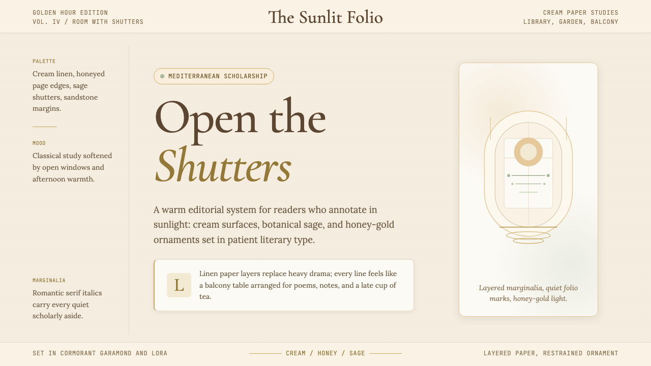 Light AcademiaScholarship turns sunlit. Cream linen, honey gold, sage botanicals, and roman…学术被阳光照亮:奶油亚麻、蜂蜜金、鼠尾草植物与浪漫斜体。
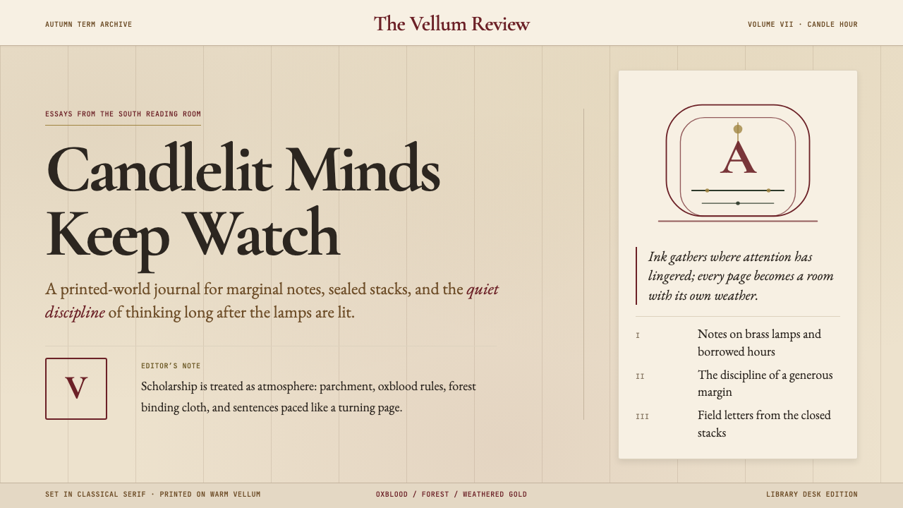 Dark AcademiaCandlelit nostalgia for old books. Parchment grounds, oxblood accents, classi…西方古典教育的浪漫想象:羊皮纸底色、牛血红点缀、古典衬线——一本被翻阅无数次的…
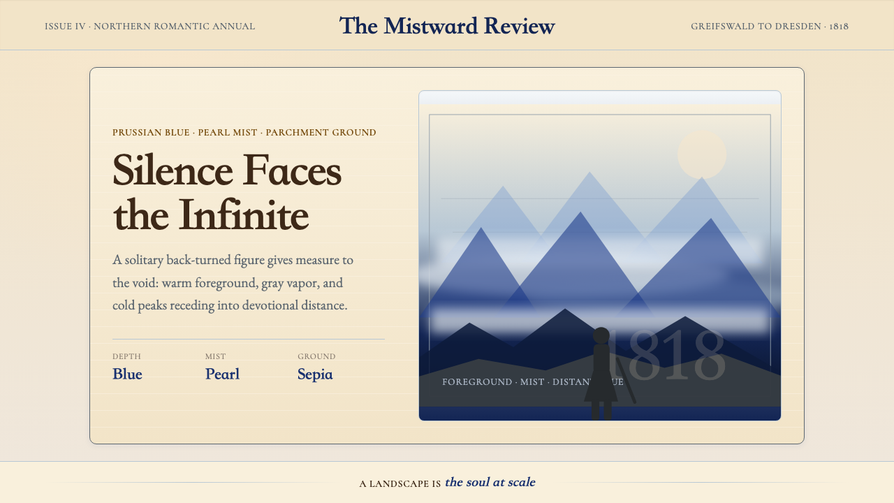 Caspar David FriedrichSilence becomes vast. Prussian blue depth, pearl mist, and parchment framing…寂静变得辽阔:普鲁士蓝纵深、珍珠雾与羊皮纸框层层后退。
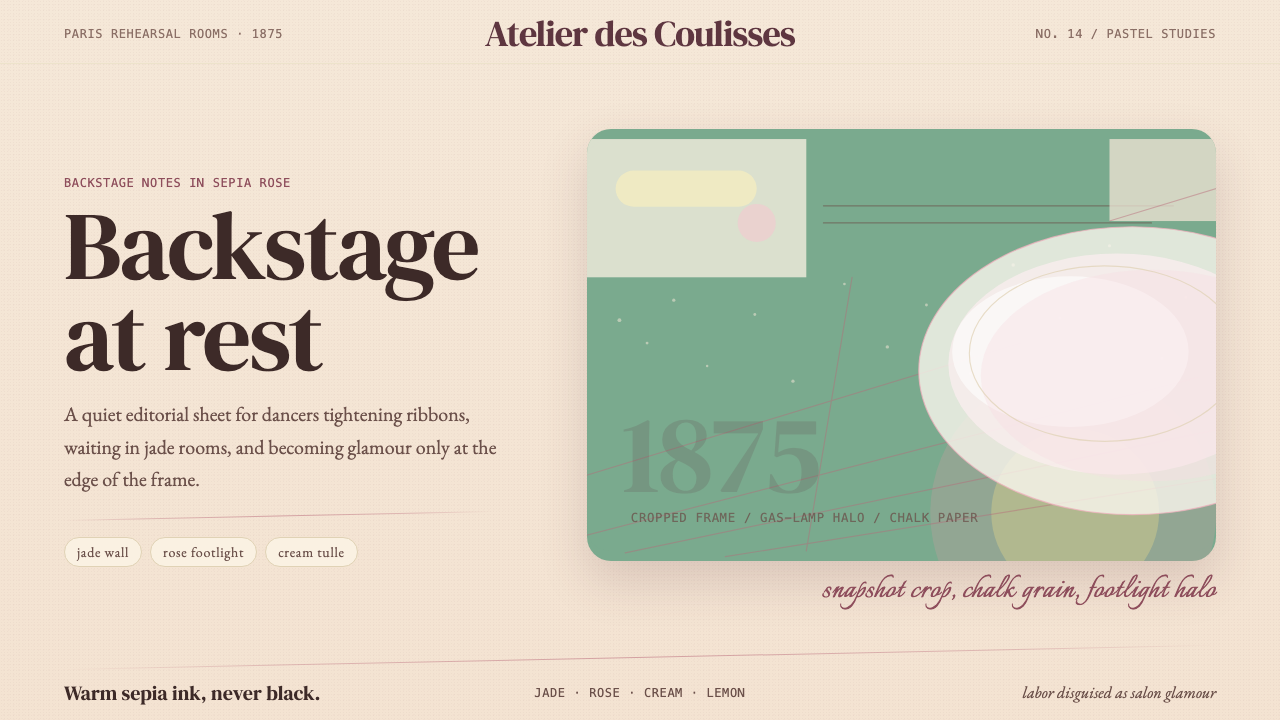 Degas Ballet PastelsBackstage glamour is labor. Jade walls, rose footlights, cropped serifs on cr…后台华丽即劳动。玉墙、玫瑰脚灯与裁切衬线落在奶油纸上。
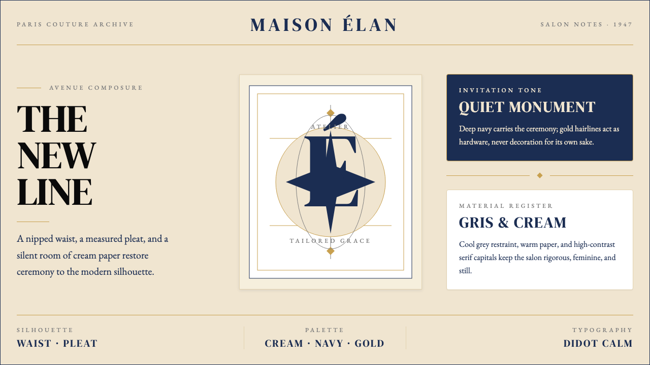 Dior New Look (1947)Couture speaks softly. Cream ground, navy Didot capitals, and gold hairlines…高级订制低声发言:米白底、海军蓝Didot大写与金色发丝线稳住全场。
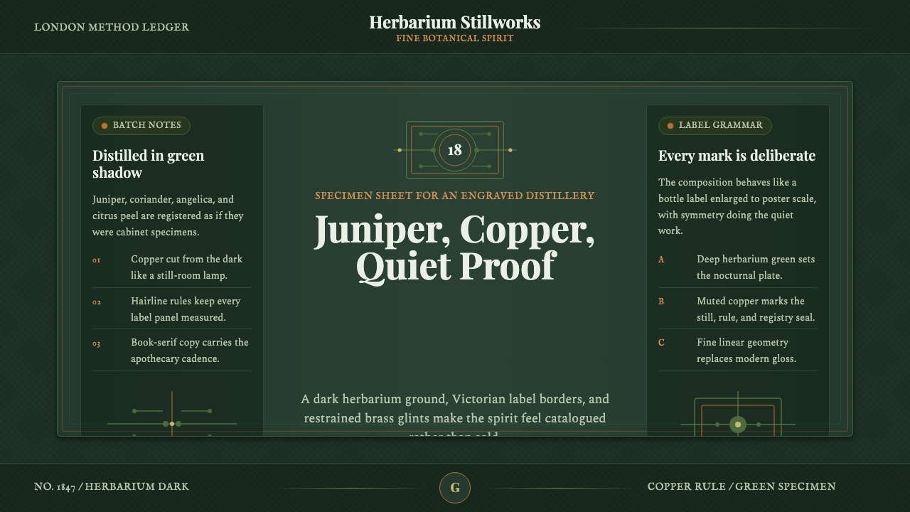 Gin BotanicalHerbarium precision. Dark green frames, Playfair serif, and copper rules hold…标本册般精确。深绿框线、Playfair 衬线与铜色细则定住画面。