What is Costa Rica Pura Vida Eco?什么是 Costa Rica Pura Vida Eco?
Costa Rica Pura Vida Eco translates the world's most successful small-nation sustainability brand into a design language as alive as the cloud forest it comes from.「纯粹生活」生态设计系统将世界上最成功的小国可持续品牌,转化为一套如其所源的云雾森林般生机勃勃的视觉语言。
Costa Rica Pura Vida Eco in briefCosta Rica Pura Vida Eco 速览
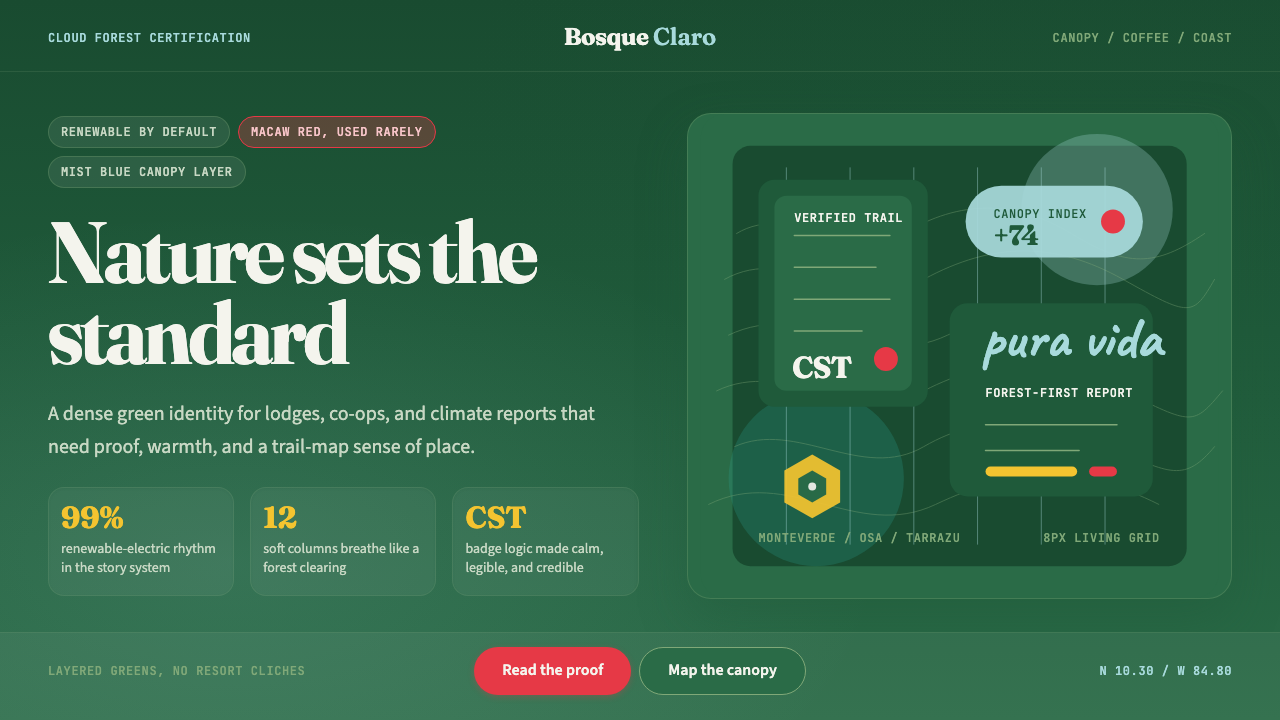
Costa Rica Pura Vida Eco is a design system rooted in the visual identity of a country that abolished its military in 1948, runs on nearly all renewable electricity, and has made ecological stewardship the cornerstone of its national brand. The aesthetic draws on the country's Esencial Costa Rica program, the eco-lodge culture of Monteverde and the Osa Peninsula, and the visual grammar of Certificación para la Sostenibilidad Turística — a national certification system that set the global template for measurable tourism sustainability. The result is a palette and typographic sensibility that feels simultaneously lush and restrained: deep cloud-forest greens anchoring a composition, scarlet-macaw red used sparingly for urgency and delight, and Caribbean mist blue offering contrast and openness.「纯粹生活」生态设计系统根植于哥斯达黎加这个国家的视觉身份——1948年废除军队、电力几乎全部来自可再生能源、以生态管理为国家品牌基石的国家。这套美学汲取自「本质哥斯达黎加」(Esencial Costa Rica)国家品牌项目、蒙特维多与奥萨半岛的生态旅馆文化,以及可持续旅游认证(CST)的视觉语法——后者为全球可量化旅游可持续认证树立了范本。最终呈现的色板与字体气质,同时兼具茂盛与克制:深邃的云雾森林绿锚定构图,金刚鹦鹉猩红点缀紧迫感与愉悦,加勒比海雾蓝提供对比与开阔感。
Where many sustainability-themed design systems tip into what critics call greenwash — soft pastels, vague leaf motifs, and sentimental textures that signal ecological concern without earning it — Pura Vida Eco insists on specificity. The greens are not generic; they carry the density of a highland canopy where over half a million species coexist in roughly the size of West Virginia. The typography favors warmth and organic character without sacrificing legibility. Negative space is used generously, not to project luxury, but to let the eye rest — mirroring the unhurried quality embedded in the phrase 'pura vida' itself, which Costa Ricans deploy as greeting, farewell, affirmation, and philosophy simultaneously.许多以可持续为主题的设计系统往往滑入所谓「漂绿」的陷阱——柔和粉彩、模糊叶片母题、多愁善感的质感,以生态关怀的姿态示人却缺乏真正的支撑。「纯粹生活」生态设计系统则坚持具体性。其中的绿色并非通用色彩,而承载着高地树冠的密度——在约等于西弗吉尼亚州面积的土地上,超过五十万个物种共存。字体选择倾向温暖与有机气质,同时不牺牲可读性。留白使用慷慨,不为投射奢华,而是让视线得以歇息——映照着「pura vida」这个短语内嵌的从容品质:哥斯达黎加人将它同时用作问候、告别、肯定与人生哲学。
The system is light-ground by nature: backgrounds tend toward warm off-whites and natural cream tones, honoring the bright equatorial light of the Central Valley and the open sky over the Pacific coast. This lightness allows the deep greens and red accents to carry their full weight without appearing oppressive. The overall effect is one of abundance held in balance — not the cultivated serenity of a spa brand, but the living, breathing complexity of an actual ecosystem in which color, form, and negative space each occupy their ecological niche.这套系统天然以浅色为底:背景倾向温暖的近白色与自然奶油色调,致敬中央谷地明亮的赤道光线与太平洋沿岸的开阔天空。这种明亮感使深绿与红色点缀能以完整重量存在,而不显压迫。整体效果是一种保持平衡的丰盛——不是温泉品牌刻意营造的宁静,而是真实生态系统的活态呼吸复杂性,其中色彩、形态与负空间各自占据它们的生态位。
See the Costa Rica Pura Vida Eco design system查看 Costa Rica Pura Vida Eco 完整设计系统
Where does Costa Rica Pura Vida Eco come from?Costa Rica Pura Vida Eco 从何而来?
Costa Rica's reputation as an ecological exemplar did not emerge spontaneously. It was the product of deliberate policy choices stretching across several decades, beginning with the abolition of the military under President José Figueres Ferrer in 1948, which redirected defense spending into education and health infrastructure. The conservation turn came in the 1970s and 1980s, when the government began aggressively acquiring land for national parks and protected areas — today more than a quarter of Costa Rica's territory is formally protected, an extraordinary proportion for any nation. This conservation commitment created the environmental conditions that would later make the country a global destination for nature tourism and, by extension, a laboratory for sustainable design communication.哥斯达黎加作为生态典范的声誉并非自然天成,而是数十年政策选择的产物。1948年,总统何塞·菲格雷斯·费雷尔宣布废除军队,将国防开支转向教育与医疗基础设施。保护转向发生在1970至80年代:政府开始积极购置土地用于国家公园与保护区——今天,哥斯达黎加逾四分之一的领土受到正式保护,这对任何国家而言都是极为罕见的比例。这一保护承诺创造了环境条件,使这个国家后来成为全球自然旅游目的地,进而成为可持续设计传播的实验室。
The Certificación para la Sostenibilidad Turística program, launched in 1997 by the Costa Rican Tourism Board (ICT), formalized the connection between environmental performance and visual identity in the tourism sector. Lodges, tour operators, and hotels that met rigorous criteria in areas including waste management, energy use, water conservation, and community engagement earned CST certification and the right to display its leaf-level rating — a system of one to five leaves indicating depth of compliance. The CST graphic language — organic form, clear hierarchy, forest-referenced color — became the first codified layer of what would eventually coalesce into a broader national design sensibility.1997年由哥斯达黎加旅游局(ICT)推出的可持续旅游认证(CST)项目,在旅游行业正式确立了环境表现与视觉身份之间的联结。在废物管理、能源使用、水资源保护与社区参与等领域达到严格标准的旅馆、旅行社与酒店,可获得CST认证及其「叶级评级」展示权——一至五片叶子的体系标示合规深度。CST的图形语言——有机形态、清晰层级、森林参照的色彩——成为后来逐渐凝聚成更广泛国家设计感性的第一层被编码的视觉语法。
The Esencial Costa Rica country brand, developed with support from PROCOMER (the trade promotion agency) and international consultancy Hill+Knowlton Strategies and formally launched in the 2013–2016 period, elevated these visual principles to a national strategic level. The brand sought to unify the country's export identity across coffee, tourism, medical devices, and technology sectors under a single visual and values framework. The design language that emerged — warm serif typography, deep greens and earthy tones, references to biodiversity and authentic artisanship — was intended to be simultaneously premium and grounded, distinguishing Costa Rican products from lower-cost regional competitors by anchoring them in a credible sustainability narrative.「本质哥斯达黎加」国家品牌在贸易推广机构PROCOMER与国际咨询公司Hill+Knowlton Strategies的支持下推进开发,于2013至2016年间正式发布,将上述视觉原则提升至国家战略层面。该品牌试图在咖啡、旅游、医疗器械与技术等出口领域,将这个国家的身份统一于单一视觉与价值框架之下。由此呈现的设计语言——温暖衬线字体、深绿与大地色调、对生物多样性与真实工艺的指涉——旨在同时具备高端感与脚踏实地感,通过将哥斯达黎加产品锚定于可信的可持续叙事,使其从低成本区域竞争者中脱颖而出。
Carlos Manuel Rodríguez, who served as Minister of Environment and Energy (MINAE) and later as President of the Global Environment Facility (GEF), represents the policy and governance thread running through this design story. Rodríguez oversaw landmark payment-for-ecosystem-services programs that compensated landowners for keeping forests standing — effectively creating the economic infrastructure that made the biodiversity visual language financially viable as a brand asset. The Tarrazú coffee cooperatives of the Central Highlands, meanwhile, became early adopters of the fair-trade single-origin visual vocabulary: the emphasis on provenance, small-batch craft, and named-farm traceability that has since become standard in premium food and beverage branding worldwide. Together, these institutional and commercial actors created not a designed style imposed from outside, but one grown from the actual economic and ecological conditions of the country.时任环境与能源部长(后任全球环境基金主席)的卡洛斯·曼努埃尔·罗德里格斯,代表了贯穿这段设计史的政策与治理线索。他主导了里程碑式的生态系统服务付费项目,补偿保留森林的土地所有者——实际上为生物多样性视觉语言作为品牌资产提供了经济基础设施。与此同时,中央高地塔拉苏的咖啡合作社成为公平贸易单一产地视觉词汇的早期实践者:对产地溯源、小批量手工与可具名农场的强调,已成为全球优质食品饮料品牌的通行标准。这些机构与商业行为者共同塑造的,不是从外部强加的设计风格,而是从这个国家真实的经济与生态条件中生长而来的视觉语言。
What defines the Costa Rica Pura Vida Eco look?Costa Rica Pura Vida Eco 的视觉特征是什么?
Color色彩
The palette centers on deep, saturated greens that read more forest than mint — a darkness that evokes canopy rather than lawn. Against this foundation, scarlet-macaw red appears as a precision accent: never dominating, always purposeful, carrying the energy of a bird sighted through leaves. Caribbean mist blue — softer and more recessive — serves as the system's breathing room, appearing in backgrounds, data elements, and secondary information. Warm off-whites and natural cream tones provide the ground; pure white feels too clinical and is used only where maximum contrast is required. The palette avoids the pale, desaturated greens common in generic eco design, which risk reading as faded or unambitious.色板以深邃、高饱和度的绿色为中心,更接近森林而非薄荷——这种深度唤起的是树冠而非草坪。在此基础上,金刚鹦鹉猩红作为精准点缀出现:从不主导,永远有目的,携带着透过叶片一瞥见鸟羽的能量感。加勒比海雾蓝——更柔和、更内敛——充当系统的呼吸空间,出现于背景、数据元素与次要信息中。温暖的近白色与自然奶油色调提供底面;纯白过于临床感,仅在需要最大对比度时使用。整套色板刻意回避通用生态设计中常见的浅淡、低饱和绿色,那类色彩容易传递出褪色或缺乏抱负的印象。
Typography字体排印
The typographic character is warm and organic rather than geometric or mechanical. Serif choices carry a humanist quality — letterforms with the slight irregularity that recalls hand-drawn origins rather than the precision of drafting tools. This warmth distinguishes the system from sustainability aesthetics that default to cold sans-serif rationalism. Display type is used with restraint and generous leading; body text prioritizes readability over typographic drama. A secondary sans-serif — clean but not sterile — handles data labels, captions, and interface elements. The pairing between the warm serif and the functional sans-serif is the typographic equivalent of the palette's contrast between deep green and open sky.字体气质温暖而有机,而非几何或机械感。衬线字体选择承载人文主义品质——字形带有微妙的不规则感,令人联想到手绘起源而非制图工具的精确。这种温度使系统有别于那些默认采用冷峻无衬线理性主义的可持续美学。展示字体使用克制,行距慷慨;正文字体以可读性为先,而非追求排印戏剧感。辅助无衬线字体——简洁而不冷漠——处理数据标签、图注与界面元素。温暖衬线与功能性无衬线的搭配,是深绿与开阔天空之间色彩对比关系的字体等价物。
Texture and Surface质感与表面
Unlike purely flat design systems, Pura Vida Eco permits subtle organic texture — the slight grain of uncoated paper, the fibrous quality of handmade materials, the soft irregularity of natural surfaces — applied with genuine restraint. Texture here is not decorative appliqué; it is a reference to the material reality of the country it represents: the rough bark of a fig tree, the woven weft of an artisan textile, the matte finish of unglazed ceramics from Guaitil. The critical discipline is knowing when to use none at all: data-heavy slides and interface elements remain flat, reserving texture for editorial and brand contexts where it adds meaning rather than noise.与纯粹的平面设计系统不同,「纯粹生活」生态设计允许微妙的有机质感——未涂布纸张的细微颗粒感、手工材料的纤维质感、自然表面的轻柔不规则——但使用极为克制。这里的质感不是装饰性贴附,而是对它所代表的国家物质现实的指涉:无花果树粗糙的树皮、工匠织物的经纬、瓜伊蒂尔无釉陶瓷的哑光表面。关键的自律在于知道何时完全不用:数据密集的幻灯片与界面元素保持平面,将质感保留给编辑与品牌语境——在那里,质感增添意义而非噪音。
Imagery and Photography图像与摄影
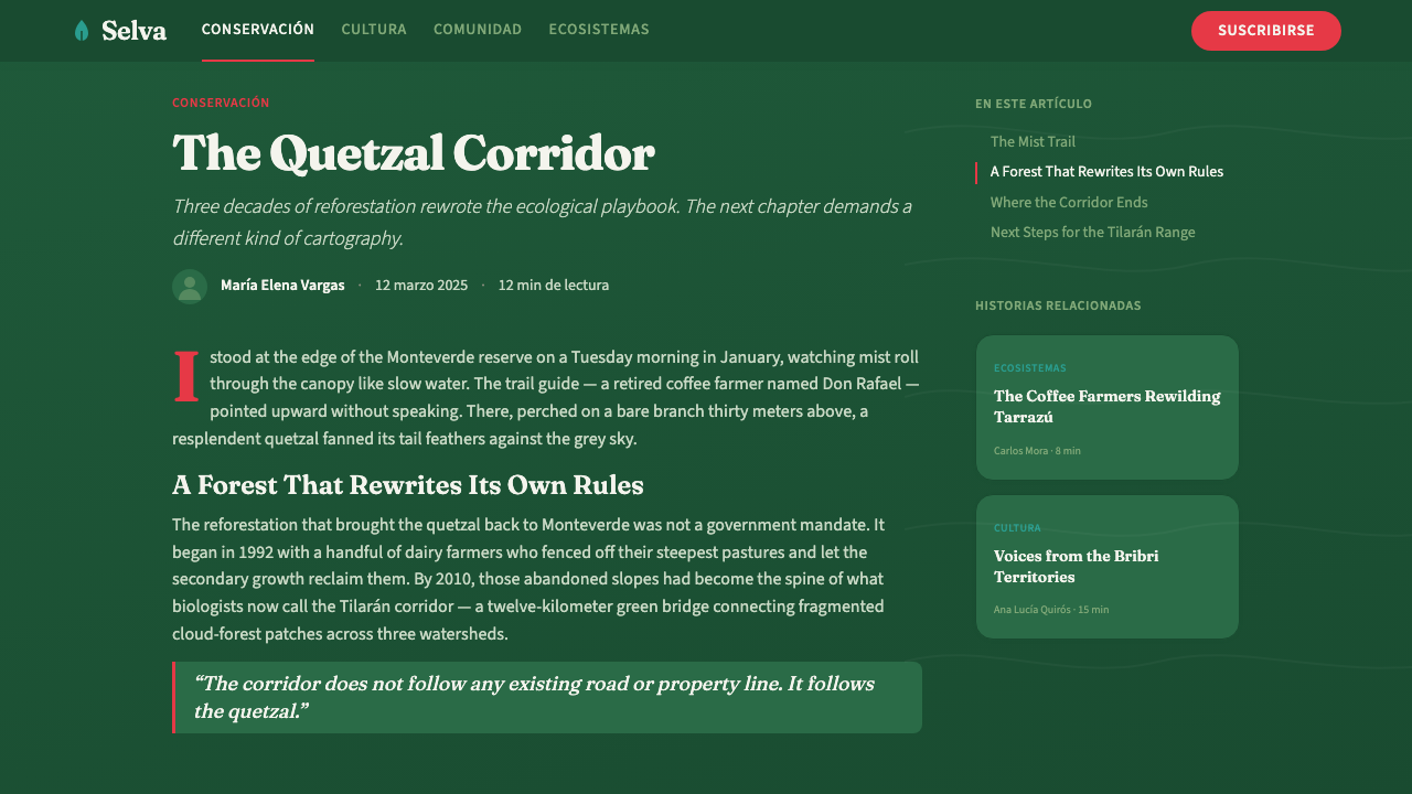
Photography within this system earns its place through specificity rather than generic aspiration. A hummingbird hovering over a heliconia spike, condensation on shade-grown coffee leaves at dawn, the hands of a farmer sorting red coffee cherries — these images work because they are irreducibly particular. The processing style favors rich saturation and natural contrast rather than the faded, filmic treatment common in lifestyle photography. Green tones are allowed to be genuinely green. Wildlife and landscape subjects are preferred over curated human scenes, though portraiture — when it appears — shows work and hands rather than idealized leisure.这套系统中的摄影以具体性而非通用愿景赢得其位置。悬停于赫蕉花穗上的蜂鸟、黎明时分遮阴种植咖啡叶上的水珠、农民双手分选红色咖啡果——这些图像之所以有效,是因为它们具有不可化约的特殊性。处理风格倾向丰富饱和度与自然对比,而非生活方式摄影中常见的褪色胶片效果。绿色被允许真正地呈现为绿色。野生动物与风景题材优先于精心编排的人物场景;当人像出现时,展示的是劳动与双手,而非理想化的休闲。
Layout and Space版式与空间
Compositions are asymmetric but unhurried — there is more breathing room here than in a high-density urban design system, reflecting the biological diversity principle that abundance does not require crowding. Margins are wide relative to content area. Image and text often share a page at roughly equal weight rather than text dominating a narrow column. Grid structures are present but organic in feel: columns can be unequal, and the placement of accent elements follows the compositional logic of natural asymmetry rather than strict mathematical division. This spaciousness is not an artifact of content scarcity; it is a deliberate signal of unhurried confidence.构图非对称却不急促——这里的呼吸空间比高密度城市设计系统更为宽裕,映照着生物多样性的原则:丰盛不需要拥挤。相对于内容区域,页边距宽阔。图像与文字常以大致相当的重量共处一页,而非文字主导窄栏。网格结构存在但感觉有机:栏宽可以不等,点缀元素的放置遵循自然非对称的构图逻辑,而非严格的数学分割。这种宽裕不是内容匮乏的产物,而是从容自信的刻意信号。
Icon and Illustration Language图标与插画语言
Where icons appear, they draw from the natural world — leaf forms, bird silhouettes, coffee cherries, water drops — but rendered with geometric confidence rather than naive charm. They are not cute; they are clear. Illustrative elements, when used, favor a line-weight that suggests craft: heavier than a thin digital line, lighter than a bold graphic mark. Color within illustrations follows the main palette strictly, with the same restraint applied to accent colors. Decorative motifs reference Boruca woven textile patterns and pre-Columbian stonework from the Diquís Delta — historical visual languages that predate the nation-state and give the system cultural depth without appropriation.图标出现时,取材自自然世界——叶片形态、鸟类剪影、咖啡果、水滴——但以几何自信而非天真可爱感呈现。它们不是可爱的,而是清晰的。插画元素使用时,倾向一种暗示手工的线条粗细:比细腻的数字线条更重,比粗犷的图形标记更轻。插画内部的色彩严格遵循主色板,点缀色的克制程度与整套系统一致。装饰性母题参照博鲁卡编织纺织纹样与迪基斯三角洲前哥伦布时期石雕艺术——这些历史视觉语言早于民族国家的存在,赋予系统文化深度而不落入挪用。
Tone and Anti-Greenwash Discipline基调与反漂绿自律
The most distinctive design principle in this system is the rejection of vagueness. Every visual choice should be traceable to a specific Costa Rican reality: a named species, a documented certification, a real region, a verifiable claim. This principle manifests as a preference for specificity in labeling, for photographs with identifiable subjects, for data presented with sources. Decorative ecological motifs — the floating leaf, the rippling water reflection, the generic mountain silhouette — are treated as design failures rather than safe defaults. The system's credibility depends on it earning every green it uses.这套系统最具特色的设计原则是对模糊性的拒绝。每一个视觉选择都应能溯源至哥斯达黎加的某一具体现实:一个有名称的物种、一项有记录的认证、一个真实的地区、一个可核实的主张。这一原则在视觉上体现为:标注时倾向具体性,摄影时选用有可辨识主体的图像,数据呈现时附带来源。漂浮的叶片、涟漪水面倒影、通用山脉剪影等装饰性生态母题,被视为设计失败而非安全默认选项。这套系统的可信度,取决于它赢得它所使用的每一抹绿色。

See the Costa Rica Pura Vida Eco design system查看 Costa Rica Pura Vida Eco 完整设计系统
Who shaped Costa Rica Pura Vida Eco?谁塑造了 Costa Rica Pura Vida Eco?
Costa Rica's foreign trade promotion agency and the institutional steward of the Esencial Costa Rica country brand. PROCOMER coordinated the multi-sector design strategy that brought coffee cooperatives, medical device exporters, and tourism operators under a unified visual identity, making Costa Rica's sustainability reputation a tangible commercial asset. Its work established the principle that a country's ecological track record can function as a design brief — and that design, in turn, can reinforce policy credibility.哥斯达黎加外贸推广机构,也是「本质哥斯达黎加」国家品牌的制度守护者。PROCOMER协调了跨部门设计战略,将咖啡合作社、医疗器械出口商与旅游运营商整合于统一视觉身份之下,使哥斯达黎加的可持续声誉转化为可触碰的商业资产。其工作确立了一项原则:一个国家的生态实绩可以充当设计简报——而设计反过来能够强化政策可信度。
The international communications consultancy that partnered with PROCOMER to develop and position the Esencial Costa Rica brand for global audiences. Hill+Knowlton's involvement brought export-market sophistication to what might otherwise have remained a domestic tourism campaign: the brand was designed from the outset to be legible to buyers and travelers in Europe, North America, and Asia, not only to domestic audiences. Their work on tone — premium but not exclusionary, ecological without being preachy — shaped the visual register that practitioners now recognize as characteristic of the style.与PROCOMER合作、为全球受众开发和定位「本质哥斯达黎加」品牌的国际传播咨询机构。Hill+Knowlton的参与为这一本可能停留于国内旅游推广的项目注入了出口市场的成熟度:该品牌从一开始就被设计为能够被欧洲、北美与亚洲的买家和旅行者读懂,而不仅仅面向国内受众。他们在基调上的工作——高端而不排他,生态而不说教——塑造了从业者如今所认知的这种风格的视觉格调。
As Minister of Environment and Energy (MINAE), Rodríguez oversaw Costa Rica's payment-for-ecosystem-services programs, which compensated private landowners for maintaining forest cover — turning ecological conservation into a formal economic transaction. This policy innovation had an indirect but decisive effect on design culture: it created a landscape worth photographing, a biodiversity worth naming, and a sustainability story that designers could illustrate with confidence rather than approximation. His later role as President of the Global Environment Facility extended Costa Rica's influence over international conservation finance and the visual standards that accompany it.作为环境与能源部长,罗德里格斯主导了哥斯达黎加的生态系统服务付费项目,向维持森林覆盖的私有土地所有者给予补偿——将生态保护转化为正式的经济交易。这一政策创新对设计文化产生了间接但决定性的影响:它创造了一片值得拍摄的风景、一种值得命名的生物多样性,以及一个设计师能以自信而非近似感加以图解的可持续故事。他后来出任全球环境基金主席,进一步扩展了哥斯达黎加对国际保护融资及其伴随视觉标准的影响力。
The fair-trade single-origin coffee cooperatives of the Tarrazú region — particularly CoopeTarrazú — were among the earliest commercial actors to translate Costa Rica's ecological credentials into a design language that international buyers could read. The emphasis on altitude, microclimate, processing method, and named farm originated in Tarrazú cooperative marketing in the 1990s and 2000s, predating the country brand and helping establish the visual grammar of provenance-as-identity that Esencial Costa Rica later codified at national scale. In design terms, the cooperatives pioneered the pairing of documentary specificity with premium sensory aesthetics that defines the Pura Vida Eco system at its best.塔拉苏地区的公平贸易单一产地咖啡合作社——尤其是CoopeTarrazú——是最早将哥斯达黎加生态资质转化为国际买家可以读懂的设计语言的商业主体之一。对海拔、微气候、处理方式与具名农场的强调,起源于1990至2000年代塔拉苏合作社的市场推广,早于国家品牌建立,并帮助确立了「产地即身份」的视觉语法——这套语法后来被「本质哥斯达黎加」在国家层面系统化编码。在设计层面,这些合作社率先探索了记录性具体感与高端感官美学的结合——这正是「纯粹生活」生态设计系统在最佳状态下的定义性特质。
The Costa Rican Tourism Board created and administers the Certificación para la Sostenibilidad Turística, the five-leaf sustainability rating system that became the design language's first institutional visual layer. ICT's decision to make the certification rating visible and graphic — rather than purely regulatory — established the precedent for translating policy compliance into brand signal. The leaf motif and its graduated rating logic have been referenced by sustainability certification programs in at least a dozen other countries, making ICT's visual governance work one of the most widely replicated design contributions in contemporary eco-branding.哥斯达黎加旅游局创建并管理可持续旅游认证(CST)——这套五叶可持续评级系统成为这套设计语言的第一个制度性视觉层。ICT将认证评级做成可见、可视化呈现而非纯粹法规文件的决定,为将政策合规转化为品牌信号树立了先例。叶片母题及其渐进评级逻辑已被至少十几个国家的可持续认证项目所参照,使ICT的视觉治理工作成为当代生态品牌领域被复制最广泛的设计贡献之一。
How do you use Costa Rica Pura Vida Eco today?今天怎么用 Costa Rica Pura Vida Eco?
Costa Rica Pura Vida Eco is among the most contextually specific design systems available for contemporary work, and that specificity is precisely its strength and its discipline. Applying it correctly requires understanding that its ecological references are not decorative metaphors but verified realities — which means the more precisely you align your content to the actual values the system embodies, the more powerful the visual output becomes. A sustainability report for a company with genuine environmental credentials will carry more authority in this style than a marketing brochure for a product whose green claims are aspirational at best.「纯粹生活」生态设计系统是当代实践中具有情境特殊性的设计体系,而这种特殊性恰恰是它的力量与自律所在。正确应用它,需要理解其生态指涉不是装饰性隐喻,而是经过验证的现实——这意味着你的内容越精准地与这套系统所体现的真实价值对齐,视觉输出的力量就越强。一份具有真实环境资质的企业可持续报告,在这种风格下比一本以生态主张为营销口号的产品手册更有说服力。
For presentation slides, the system works strongly on both cover and content pages. A cover benefits from a full-bleed photograph treated with rich natural color — a cloud forest, a coffee farm at harvest, a scarlet macaw in canopy — with the title set in warm serif type on a semi-transparent cream or deep-green overlay. The overlay should feel like mist, not a solid block: translucent enough that the image breathes through. Content slides should honor the system's spaciousness: resist the temptation to fill every column, let text sit with generous leading, and use the forest green only for primary headings or key data callouts. Data slides — charts, graphs, comparisons — benefit from the palette's natural hierarchy: the deep green for primary series, the mist blue for secondary context, the scarlet only for alerts or peak values worth specific attention.对于演示文稿,这套系统在封面与内容页上都表现出色。封面适合以满版出血摄影为底——云雾森林、丰收季的咖啡农场、树冠中的金刚鹦鹉——处理为浓郁自然色彩,标题以温暖衬线字体置于半透明奶油色或深绿色叠加层之上。叠加层应有薄雾感而非实心色块:透明度足以让图像在其中呼吸。内容页应尊重系统的宽裕感:抵制填满每一栏的冲动,让文字以慷慨行距安坐,森林绿只用于主标题或关键数据标注。数据页——图表、对比——受益于色板的自然层级:深绿用于主数据系列,雾蓝用于次要背景,猩红仅用于值得特别关注的警示或峰值。
For web interfaces, dashboards, and pricing pages, the system's strength is in creating trust without sacrificing warmth. The approach: a cream or warm off-white background prevents the clinical quality of pure white; the deep green anchors the navigation bar and primary calls to action; card components use a soft natural-paper texture only when the context justifies it (editorial cards yes, data tables no). Interactive states use the scarlet accent precisely — hover and selected states, not decorative borders. Typography on web should maintain the warmth of the editorial register: the humanist serif for marketing headers, the clean sans-serif for interface labels and data fields. Avoid generic san-serif system fonts; they undercut the carefully established organic character of the palette.对于网页界面、仪表板与定价页面,这套系统的优势在于在不牺牲温度的前提下建立信任。方法如下:奶油色或温暖近白色背景避免纯白的临床感;深绿锚定导航栏与主要行动号召;卡片组件仅在情境允许时使用柔和自然纸张质感(编辑卡片适合,数据表格不适合)。交互状态精准使用猩红点缀——悬停与选中状态,而非装饰性边框。网页字体应保持编辑基调的温度:人文主义衬线用于营销标题,清洁无衬线用于界面标签与数据字段。避免通用无衬线系统字体,它们会削弱色板精心建立的有机气质。
For editorial, marketing, and brand identity work, the system's power comes from documentary specificity. The layout logic favors a wide-measure body text column with a generous outer margin reserved for call-outs, certifications, source citations, and pull quotes — a structure that signals accountability alongside beauty. Section breaks should use ruled lines in forest green rather than decorative ornament. Photography should always be specific: name the species, name the farm, name the community. If you cannot be specific, choose a layout that does not depend on photographic credibility. Marketing pages work well with alternating full-width blocks: cream-ground sections for narrative text, deep-green-ground sections for featured credentials or testimonials, with the scarlet reserved for a single primary call to action per page.对于编辑、营销与品牌识别工作,这套系统的力量来自记录性的具体感。版面逻辑倾向宽行正文栏与充裕外页边距,后者专用于引言、认证、来源引注与摘录引语——一种在美感旁边同时传递责任感的结构。段落分隔应使用森林绿直线而非装饰性元素。摄影永远要具体:命名物种、命名农场、命名社区。若无法具体,则选择一种不依赖摄影可信度的版面。营销页面适合交替全宽色块:奶油底色区块承载叙事文字,深绿底色区块呈现关键资质或推荐语,猩红仅保留给每页唯一的主要行动号召。
The most common mistake when applying this system is mistaking lushness for density. The system's greens are rich and saturated, but the layouts must remain generous with space. Filling a composition to its edges with layered textures, multiple photography crops, gradient overlays, and competing accent colors produces the visual equivalent of greenwash — impressive surface, no clear signal. A second common error is using the ecological motifs (leaves, birds, water) as decorative filler rather than as specific references. A hummingbird illustration that appears because it feels tropical, rather than because it is a resplendent quetzal connected to a named conservation program, undermines the system's foundational discipline. Every visual element should be able to answer the question: why this, specifically?应用这套系统最常见的错误,是将茂盛感误解为密度感。系统的绿色浓郁而高饱和,但版面必须保持宽裕的空间。将层叠质感、多张摄影裁切、渐变叠加与竞争性点缀色填满一个构图至边缘,产生的是视觉层面的漂绿——印象深刻的表面,没有清晰的信号。第二个常见错误是将生态母题(叶片、鸟类、水体)作为装饰性填充,而非具体指涉。一幅蜂鸟插画如果出现的原因仅是「感觉热带」,而非因为它是一只与具名保护项目相关联的格查尔鸟,就动摇了这套系统的根基性自律。每个视觉元素都应能回答这个问题:为什么是这个,具体是这个?
See the Costa Rica Pura Vida Eco design system查看 Costa Rica Pura Vida Eco 完整设计系统
Costa Rica Pura Vida Eco — FAQCosta Rica Pura Vida Eco · 常见问题
How is Pura Vida Eco different from generic eco-design or greenwash aesthetics?「纯粹生活」生态设计与通用生态设计或漂绿美学有何不同?
The distinction is specificity versus aspiration. Generic eco-design reaches for soft pastels, vague leaf forms, and filmic washes because those signals feel ecologically sympathetic without requiring any particular claim to be true. Pura Vida Eco draws from a documented country brand, a measurable certification system, a named set of regions, and a verifiable conservation track record. The visual choices — the depth of the greens, the precision of the accent colors, the insistence on named subjects in photography — are all downstream of that specificity. A designer working in this system who cannot identify why a given visual choice connects to the system's source reality should treat that as a warning signal, not a stylistic preference.区别在于具体性与愿景性之间的差异。通用生态设计倾向柔和粉彩、模糊叶片形态与胶片质感叠加,因为这些信号在不需要任何特定主张为真的前提下,就能传递生态亲和感。「纯粹生活」生态设计则源自一个有文献记录的国家品牌、一套可量化的认证体系、一组具名地区,以及一段可核实的保护历史。视觉选择——绿色的深度、点缀色的精准、对摄影中具名主体的坚持——都是这种具体性的下游产物。在这套系统中工作的设计师,若无法说明某个视觉选择为何与系统的源头现实相连,应将其视为警告信号,而非风格偏好。
Can this style work for brands or products that are not based in Costa Rica?这种风格适用于不位于哥斯达黎加的品牌或产品吗?
Yes, with an important caveat. The style is a design system that can be appropriately applied to any brand whose values and claims are genuinely aligned with what it represents: rigorous sustainability, biodiversity respect, provenance transparency, and ecological accountability. A fair-trade coffee brand from another origin, a certified B-Corp consumer goods company, or a conservation NGO working in any tropical region can use this visual language credibly — if the underlying substance is present. What the style cannot do is import credibility that the product or organization has not earned. The palette, the typography, and the composition can all be executed correctly; the moment they are applied to a brand making unverified environmental claims, the visual language collapses into the greenwash it was designed to refuse.可以,但有一个重要前提。这套风格是一个设计系统,可以恰当地应用于任何品牌,前提是其价值观与主张真正对齐它所代表的内容:严格的可持续标准、对生物多样性的尊重、产地透明度,以及生态可问责性。来自其他产地的公平贸易咖啡品牌、获得认证的共益企业消费品公司,或在任何热带地区开展工作的保护类非政府组织,只要具备实质性基础,都可以可信地使用这套视觉语言。这套风格所无法做到的,是为产品或组织引入它尚未赢得的可信度。色板、字体与构图都可以被完美执行;一旦被应用于提出未经验证环境主张的品牌,这套视觉语言就崩塌成为它被设计来拒绝的漂绿。
How should data visualization be handled within this design system?在这套设计系统中,数据可视化应该如何处理?
Data visualization is one of the system's stronger applications, precisely because ecological sustainability is a data-rich domain. The approach is to treat charts and graphs as natural objects in the compositional landscape: bars become columns of varying forest density, line charts trace altitude profiles, pie segments read like a cross-section of strata. The palette's inherent hierarchy — deep green for primary data, mist blue for secondary or comparative series, scarlet as a precision alert for thresholds or outliers — maps naturally onto the visual hierarchy of a well-structured chart. What to avoid: rainbow palettes that borrow random accent colors from outside the system, gradient fills on chart elements, decorative leaf or wave patterns as chart backgrounds, and the use of high-saturation scarlet across an entire data series rather than reserving it for exception values.数据可视化是这套系统表现更强的应用场景之一,恰恰是因为生态可持续是一个数据丰富的领域。方法是将图表视为构图景观中的自然对象:柱状图变为密度各异的林木列柱,折线图描绘海拔剖面,饼图扇区读来如同地层横截面。色板固有的层级——深绿用于主数据,雾蓝用于次要或对比系列,猩红作为阈值或离群值的精准警示——自然映射到结构良好图表的视觉层级上。应避免的做法:借用系统外随机点缀色的彩虹色板、图表元素上的渐变填充、以叶片或波浪图案作为图表背景,以及将高饱和猩红用于整个数据系列而非保留给异常值。
What is the right way to use texture in this system without it feeling like decorative padding?在这套系统中,如何正确使用质感而不令其沦为装饰性填充?
The test is purpose: texture should be present because it references a material reality relevant to the content, not because the layout feels empty. Paper grain on a printed coffee bag label connects to the physical artifact of the product; the same grain applied to a software pricing page connects to nothing and reads as noise. In practice, limit texture to contexts where the system's organic character needs reinforcement — editorial photography treatments, packaging, printed brand materials, and key brand-expression moments in web design (a hero section, an about-page background). Every interface element involved in task completion — forms, tables, buttons, navigation — should be kept flat and clean. When in doubt, remove the texture; the palette and typography carry the system's identity without it.判断标准是目的性:质感的存在应是因为它指涉与内容相关的物质现实,而非因为版面感觉空旷。印刷咖啡袋标签上的纸张颗粒感,与产品的物质存在相连;同样的颗粒感应用于软件定价页面则与任何东西都不相连,只会读来像噪音。实践中,将质感限定于系统有机气质需要强化的情境——编辑摄影处理、包装、印刷品牌材料,以及网页设计中的关键品牌表达时刻(主视觉区域、关于我们页面背景)。所有涉及任务完成的界面元素——表单、数据表、按钮、导航——应保持平面与简洁。如有疑虑,移除质感;色板与字体已能承载系统的身份认同,无需质感辅助。
How does this system handle dark-mode or dark-background layouts?这套系统如何处理深色模式或深色背景版面?
Dark-ground applications are possible but require a different compositional logic. On a very dark ground — deep forest green or near-black — the cream and warm off-white tones move into the foreground as the primary typography color, and the Caribbean mist blue becomes an effective secondary tone for metadata and supporting text. The scarlet accent retains its function as a precision signal. The critical adjustment: in light-ground configurations, the deep greens carry the system's ecological weight; in dark-ground configurations, the greens used as background must be allowed to recede fully, and the composition must find its balance through the warm typography and the restrained accent palette. High-saturation greens used simultaneously as background and as accent color on dark layouts will produce visual confusion. A dark Pura Vida Eco layout works best when it commits to one role for each color and does not attempt to replicate the light-ground composition in reverse.深色底面的应用是可行的,但需要不同的构图逻辑。在非常深的底面——深邃森林绿或接近黑色——奶油色与温暖近白色调升至前景,成为主要字体颜色,加勒比海雾蓝成为元数据与辅助文字的有效次要色调。猩红点缀保留其精准信号的功能。关键调整:在浅色底面配置中,深绿承载系统的生态重量;在深色底面配置中,用作背景的绿色必须被充分允许退至后方,构图须通过温暖的字体与克制的点缀色板寻得平衡。在深色版面中同时将高饱和绿色用作背景与点缀色,将产生视觉混乱。深色「纯粹生活」生态设计版面最有效的做法是:为每种颜色指定单一角色,不尝试将浅色底面的构图逻辑翻转复制。
Related design styles相关设计风格
 Calm App Purple MeditationWhispers at bedtime. Dusk-purple gradients, cream serif type, and dawn-pink w…睡前低语。暮紫渐变、奶油衬线与黎明粉暖意。
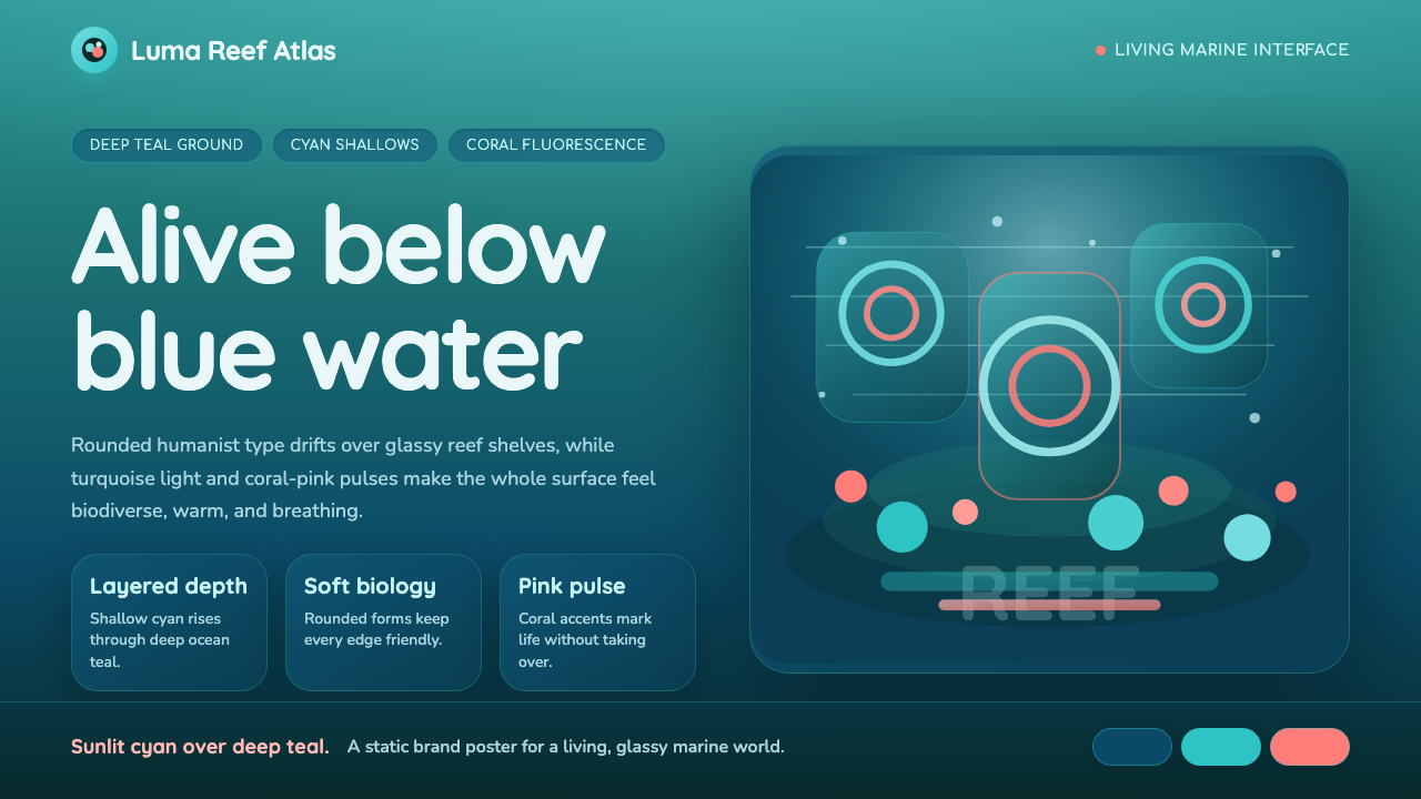 Great Barrier ReefAlive under deep teal. Quicksand curves, cyan glow, and coral-pink pulses bui…深海蓝绿中有生命:圆润字形、青蓝光晕与珊瑚粉脉冲层叠成礁。
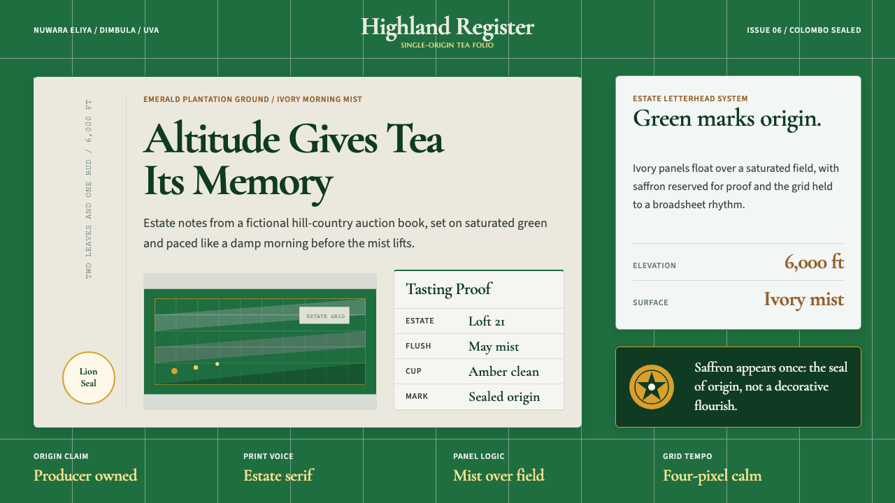 Sri Lanka Ceylon Tea ModernProvenance is emerald. Ivory mist panels and one saffron seal make origin fee…产地感是翡翠绿。象牙雾面板与一枚藏红花印章确认证明感。
 Lo-fi Hip Hop / ChillhopCozy focus at 2am. Night purple, Quicksand type, and sunset-orange lamp glow.凌晨两点的安心感:夜紫底、Quicksand 圆字与夕橙灯光。
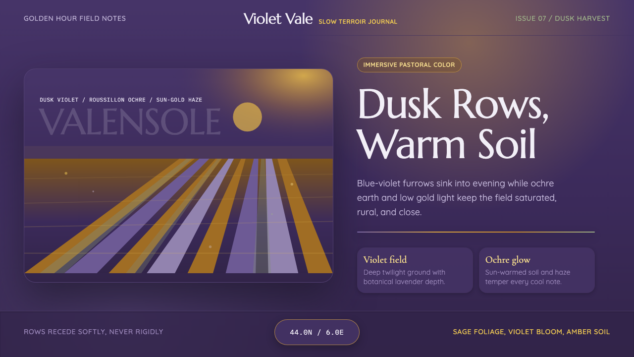 Provence LavenderSaturated pastoral dusk. Violet rows, ochre soil, and sun-gold haze build the…饱和的田园黄昏:紫色花垄、赭土与金色暮霭定调。
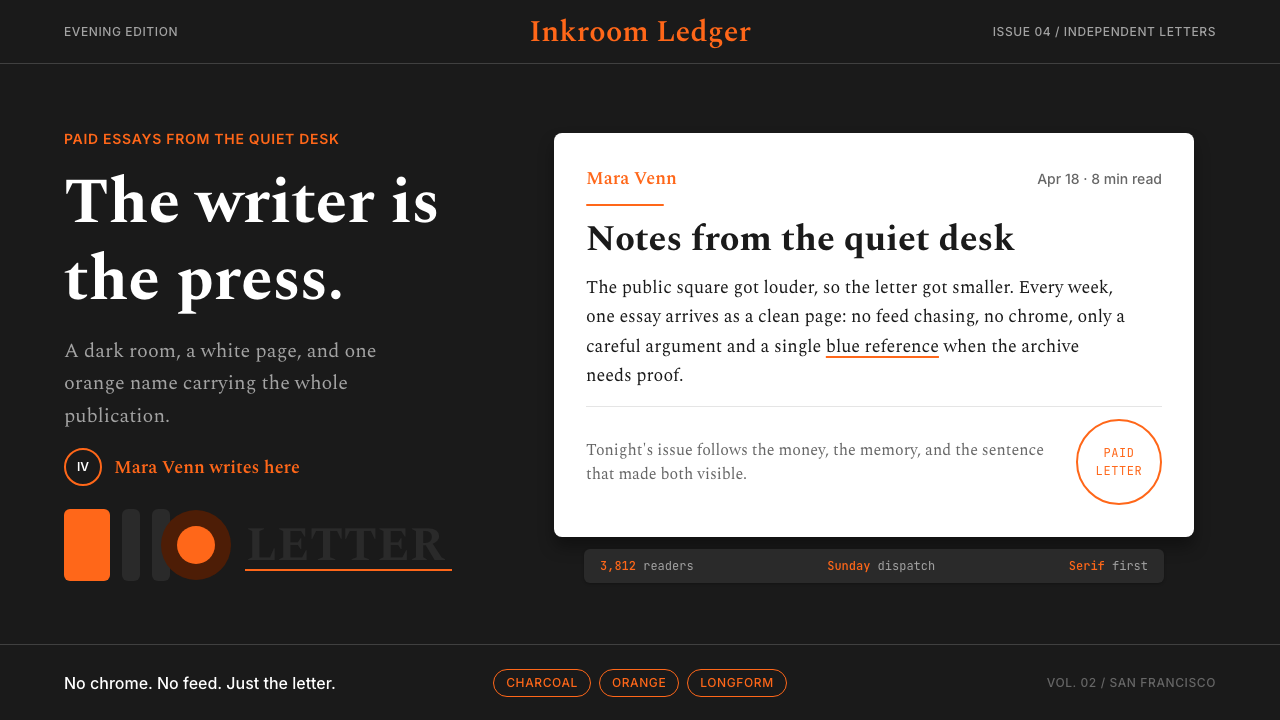 Substack Orange NewsletterLit page, dark room. Orange serif bylines ignite white cards on charcoal.暗室里的亮页。橙色衬线署名点燃炭黑上的白卡。