What is Lo-fi Hip Hop / Chillhop?什么是 Lo-fi Hip Hop / Chillhop?
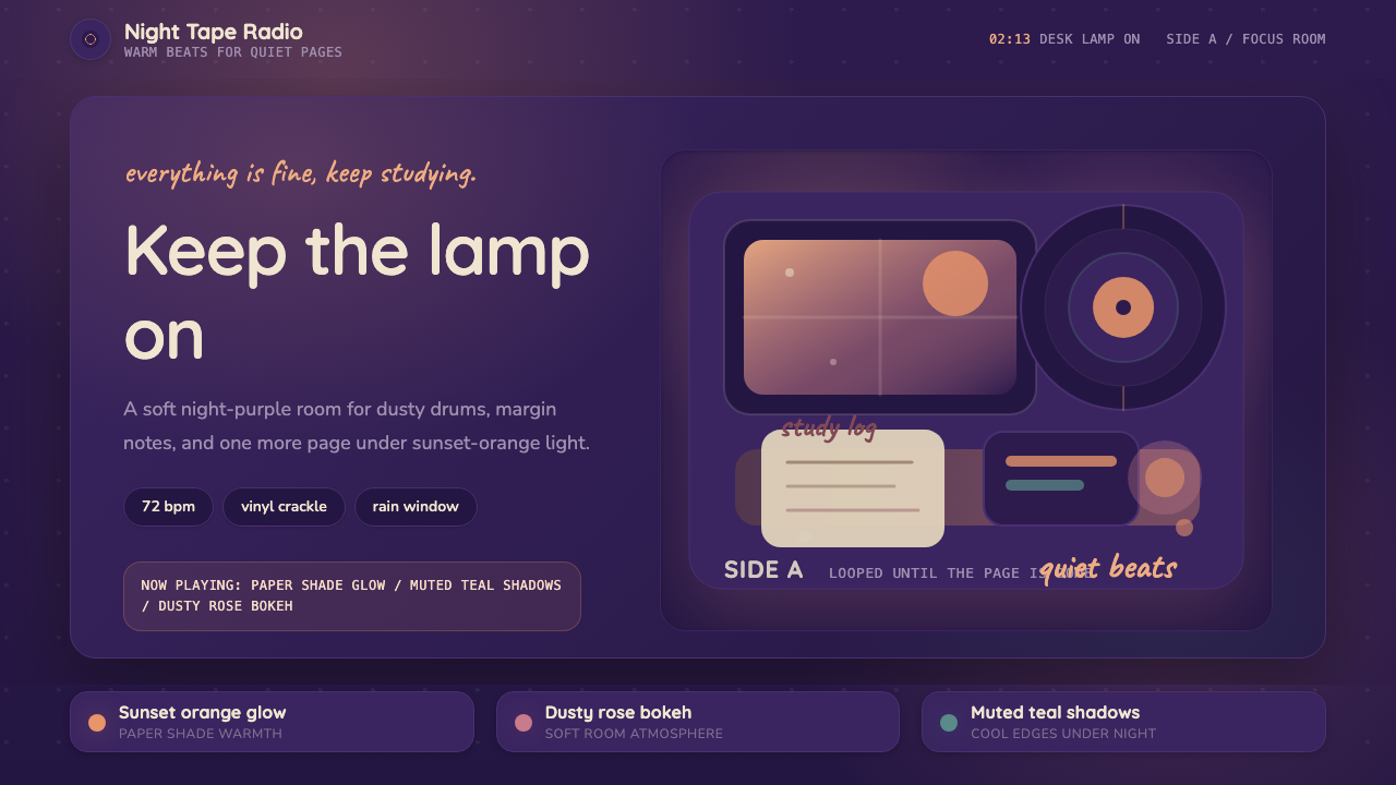
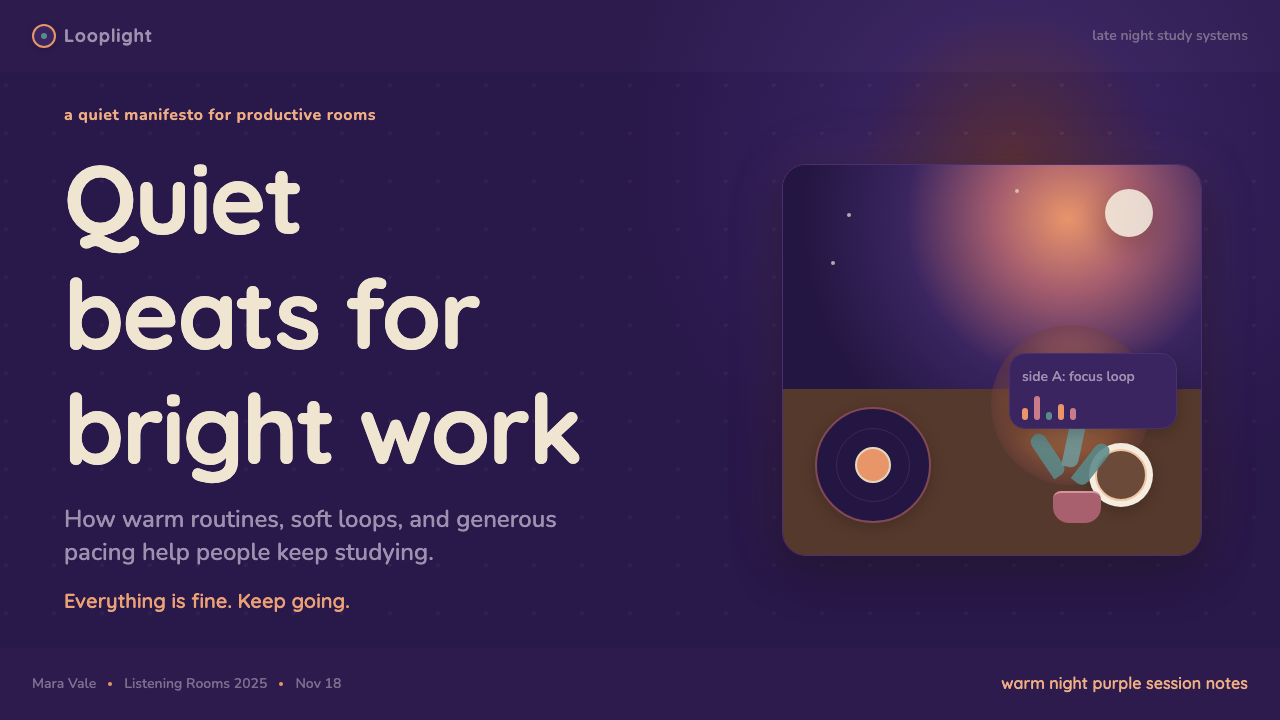
Lo-fi Hip Hop is the visual language of late-night studying — warm lamp glow, night-purple skies, and an animated girl at her desk who never seems to sleep.Lofi Hip Hop 是深夜学习的视觉语言——暖黄台灯、夜紫天空,以及那个似乎永不入睡的动画女孩。
Lo-fi Hip Hop / Chillhop in briefLo-fi Hip Hop / Chillhop 速览
Lo-fi Hip Hop is a visual aesthetic born from the internet's most beloved study soundtrack. It translates the musical warmth of slow, jazzy, vinyl-crackle beats into a cohesive visual system: deep purple and indigo night skies, pools of amber lamplight, houseplants casting soft shadows on wooden desks, steaming mugs of tea or coffee, open notebooks, and headphones resting near a rain-streaked window. Every surface carries a sense of hand-crafted imperfection — slightly painterly, slightly nostalgic, never clinical.Lofi Hip Hop 是从互联网最受欢迎的学习配乐中诞生的视觉美学。它将缓慢爵士风、带黑胶沙沙声的节拍所携带的音乐温度,翻译成一套完整的视觉体系:深紫与靛蓝的夜空、琥珀色台灯的光晕、绿植在木质书桌上投下的柔和阴影、冒着热气的茶杯或咖啡、翻开的笔记本、窗边雨痕旁搁置的耳机。每一个表面都带着手工绘制的不完美感——略显水彩笔触,略带怀旧气息,从不显得冷硬。
The aesthetic's emotional register is deliberately narrow and deliberately comforting. It does not aspire to excitement or surprise. It says: the world is still moving outside, but here in this circle of lamplight, everything is manageable. That quality — cozy focus, productive calm — is what distinguishes Lo-fi Hip Hop from other warm or retro aesthetics. Where vintage aesthetics reach backward with longing, Lo-fi Hip Hop situates itself in an eternal present-tense evening, one that could be tonight for anyone anywhere.这套美学的情绪刻度刻意收窄、刻意令人安心。它不追求兴奋或惊喜,而是在说:外面的世界仍在运转,但在这一圈灯光之内,一切都是可以掌控的。这种品质——温馨的专注、富有生产力的平静——正是 Lofi Hip Hop 区别于其他温暖或复古美学的核心所在。复古美学带着渴望回望过去,而 Lofi Hip Hop 将自身置于一个永恒的现在时黄昏——那个夜晚可以是任何人、任何地方的今晚。
Typographically, the aesthetic favors rounded, soft letterforms that match its painterly warmth. Headlines carry a friendly approachability; margin annotations feel like handwritten notes left by a fellow student. Body text is never severe. Color is restrained and emotionally legible: the palette is built from the natural colors of a cozy room after dark — warm amber, dusty rose, muted sage, deep violet — rather than from any purely abstract color theory.在字体排印上,这套美学偏爱圆润柔软的字形,与其水彩般的温度相匹配。标题传递友善的亲切感,页边批注像是同学留下的手写笔记,正文从不显得严肃。色彩克制而情绪可读:色板来自深夜温馨房间的自然色彩——暖琥珀、粉灰玫瑰、静谧鼠尾草绿、深沉紫罗兰——而非任何纯粹抽象的色彩理论。
See the Lo-fi Hip Hop / Chillhop design system查看 Lo-fi Hip Hop / Chillhop 完整设计系统
Where does Lo-fi Hip Hop / Chillhop come from?Lo-fi Hip Hop / Chillhop 从何而来?
The aesthetic has two distinct roots that converged in the mid-2010s. The musical foundation stretches back to Japanese producer Nujabes, whose 2000s instrumental hip-hop albums fused jazz samples, melancholic chord progressions, and unhurried tempos into something intimate and studious. American producer J Dilla, working in Detroit across the 1990s and 2000s, contributed a similar vocabulary of dusty samples and imperfect drum timing that gave lo-fi music its characteristic sense of warm human imprecision. Both producers are now considered founding figures of the genre's soul, even though neither explicitly branded their work as lo-fi.这套美学有两条在2010年代中期交汇的独立根源。音乐基础可追溯至日本制作人 Nujabes——他在2000年代的器乐嘻哈专辑中将爵士采样、忧郁和弦进行与从容节拍融为一体,创造出一种私密而沉思的音乐。底特律制作人 J Dilla 在整个1990至2000年代构建了相似的词汇库——带灰尘感的采样与不精确的鼓点时值,赋予 Lofi 音乐那种标志性的、温暖而人性化的不完美感。两位制作人如今都被视为这一流派精神上的奠基人,尽管他们生前都未曾将自己的作品明确标榜为 Lo-fi。
The visual identity crystallized around a single YouTube stream. In 2017, a channel then called ChilledCow — later renamed Lofi Girl — launched a 24-hour live stream featuring a looping anime-style animation of a girl studying at her desk. The stream, pairing the visual with a continuous lo-fi playlist, ran uninterrupted for years and accumulated hundreds of millions of views. The image of the studying girl became the genre's iconic mascot: she defined what lo-fi should look like — warm interior light, Japanese anime line-quality, an implied rainy night outside, books and a cat. The visual template she established influenced countless artists, album covers, and eventually UI designers.视觉身份围绕一条单一的 YouTube 直播流而凝结成形。2017年,当时名为 ChilledCow 的频道(后更名为 Lofi Girl)开启了一条24小时不间断直播,画面是一段循环的动画风格短片——一个女孩坐在书桌前学习。这条直播将视觉与持续的 Lo-fi 播放列表相配对,不间断运行多年,积累了数亿次播放。这位学习中的女孩形象成为这一流派的标志性吉祥物:暖色室内光、日系动画线条质感、窗外隐含的雨夜、书本与猫——她所确立的视觉模板影响了无数艺术家、专辑封面,并最终影响了 UI 设计师。
Parallel to the Lofi Girl stream, the Dutch label and media brand Chillhop Music built an entire visual ecosystem around the genre. Founded in 2013, Chillhop released compilation albums with illustrated covers depicting raccoons, bears, and foxes working at desks and coffee shops — the same cozy, anthropomorphized-animal imagery that became synonymous with chillhop's visual identity. These covers, by artists including Juan Pablo Machado, set a visual standard for the genre: muted, painterly, character-driven illustration with a strong emphasis on soft light and natural textures.与 Lofi Girl 直播并行,荷兰厂牌与媒体品牌 Chillhop Music 为这一流派构建了完整的视觉生态系统。Chillhop Music 创立于2013年,发行了一系列插画封面合辑,描绘在书桌和咖啡馆工作的浣熊、熊和狐狸——这种温馨的拟人化动物形象成为 Chillhop 视觉身份的同义词。这些封面——包括艺术家 Juan Pablo Machado 的作品——为这一流派树立了视觉标准:柔和的、绘画风格的、角色驱动的插画,着重强调柔光与自然质感。
The visual origins also draw deeply from Japanese anime aesthetics, particularly the atmosphere of studio Ghibli films and slice-of-life genres. The soft, ambient quality of a Ghibli background painting — late afternoon light on tatami mats, a cat in a window, rain on a quiet street — maps almost perfectly onto the lo-fi visual register. This cultural cross-pollination is explicit: many lo-fi artists and channels directly reference anime as a visual source, and the loop format of the original Lofi Girl stream was itself borrowed from the aesthetic of anime background loops.这套视觉的根源同样深度汲取自日本动画美学,尤其是吉卜力工作室电影与日常生活向动画的氛围。吉卜力背景绘画的那种柔和环境感——午后阳光照在榻榻米上、猫坐在窗台边、安静街道上的雨——几乎完美地映射到 Lofi 视觉的情绪刻度上。这种文化交叉传播是显而易见的:许多 Lofi 艺术家与频道直接引用动画作为视觉来源,而最初 Lofi Girl 直播的循环格式本身就借鉴了动画背景循环的美学传统。
What defines the Lo-fi Hip Hop / Chillhop look?Lo-fi Hip Hop / Chillhop 的视觉特征是什么?
Color Palette色彩体系
The palette is drawn from the natural colors of a cozy interior at night. Deep violet and indigo anchor the backgrounds and sky areas, suggesting late evening rather than absolute darkness. Warm amber and golden tones describe lamplight, candlelight, or the reflected glow of a screen. Dusty rose and terracotta appear as mid-tones in character design and decorative accents. Muted sage or olive greens represent houseplants. Everything is desaturated just enough to feel soft — high-saturation colors are conspicuously absent, because the aesthetic is built around comfort rather than stimulation.色板来自深夜温馨室内的自然色彩。深紫与靛蓝锚定背景和天空区域,暗示深夜而非绝对黑暗。暖琥珀与金色调描述台灯、烛光或屏幕的反射光晕。粉灰玫瑰与赭陶色作为角色设计与装饰性细节的中间调出现。静谧鼠尾草绿或橄榄绿代表室内绿植。所有色彩都经过恰到好处的去饱和处理以呈现柔和感——高饱和色彩明显缺席,因为这套美学建立在舒适感而非刺激感之上。
Texture and Grain质感与颗粒
Texture is one of the defining characteristics that separates Lo-fi Hip Hop from other warm aesthetics. Subtle film grain or paper texture is layered over the entire composition, softening edges and giving even digital illustrations the tactile quality of a physical medium. Brush strokes remain visible in painted areas. Color transitions are not hard edges or smooth gradients but soft, imprecise washes — the kind that suggest watercolor or gouache applied by hand. This deliberate imperfection signals authenticity and warmth, countering any sense of digital sterility.质感是将 Lofi Hip Hop 与其他温暖美学区分开来的决定性特征之一。细腻的胶片颗粒或纸张纹理叠加在整个画面之上,柔化边缘,赋予即便是数字插画也具有实体媒介的触觉质感。笔触在着色区域保持可见。色彩过渡不是硬边或平滑渐变,而是柔和、不精确的晕染——那种暗示着手工施涂水彩或不透明水彩的质感。这种刻意的不完美传递真实感与温度,消解任何数字无菌感。
Typography字体排印
Rounded sans-serif typefaces are the dominant choice for headlines and UI labels, their soft terminals echoing the overall softness of the visual system. Handwritten or casual script typefaces appear frequently in supporting roles — margin annotations, captions, small labels — reinforcing the sense of something personally crafted rather than mass-produced. Body text is set generously, with comfortable spacing between lines, never dense or intimidating. Type color is typically warm rather than pure white or pure black: cream on deep violet, warm brown or amber on pale backgrounds.圆润的无衬线字体是标题和界面标签的主导选择,其柔和的笔画末端呼应了整体视觉系统的柔软感。手写或随意风格的草书字体频繁出现在辅助角色中——页边批注、图注、小标签——强化了某种亲手制作而非量产的感觉。正文排版慷慨,行间距舒适,从不显得密集或令人生畏。字体颜色通常是温暖的而非纯白或纯黑:深紫底上的奶油色,浅色背景上的暖棕或琥珀色。
Illustration Style插画风格
Character and scene illustration draws explicitly from Japanese anime aesthetics, particularly the background painting tradition of slice-of-life genres. Characters are drawn with simplified features and expressive silhouettes; environments are rendered with more detail and painterly depth than the figures inhabiting them — a technique common in anime production. Objects within scenes carry careful emotional weight: a stack of books, a houseplant, a vinyl record, a sleeping cat. Each object is chosen for its associative warmth rather than its functional necessity.角色与场景插画明确汲取自日本动画美学,尤其是日常生活向动画的背景绘画传统。角色以简化的面部特征和富有表现力的轮廓绘制;环境渲染比其中的人物更具细节和绘画深度——这是动画制作中常见的技法。场景中的物件承载着细心安排的情感重量:一叠书、一株绿植、一张黑胶唱片、一只熟睡的猫。每件物品的选择基于其联想性温度,而非功能上的必要性。
Light and Atmosphere光线与氛围
Light in Lo-fi Hip Hop compositions is always warm, always localized, and always domestic. The primary light source is almost always a desk lamp or window — never overhead fluorescents or cold blue daylight. Lamplight creates a pool of amber warmth that defines the foreground while the rest of the scene recedes into cooler violet tones. This contrast — warm foreground against cool background — is perhaps the single most recognizable compositional signature of the aesthetic. Steam rising from a mug, condensation on a window, the ambient glow of a monitor in a dark room: all of these reinforce the sense of a protected interior space.Lofi Hip Hop 构图中的光线永远是温暖的、局部化的、家居化的。主要光源几乎总是台灯或窗户——从不是头顶荧光灯或冷蓝色日光。灯光创造出一片琥珀色温暖光晕,界定前景,而场景其余部分则退入更冷的紫色调中。这种对比——暖色前景对抗冷色背景——或许是这套美学最具辨识度的单一构图特征。杯中升腾的水蒸气、窗玻璃上的水汽、暗室里显示器的环境光晕:所有这些都强化了受保护的室内空间感。
Symbolic Objects符号化物件
The Lo-fi aesthetic has developed a consistent vocabulary of symbolic objects that function almost like a shared visual language. Vinyl records and turntables signal the genre's musical roots. Houseplants in terracotta pots evoke organic life in a digital world. Open books and scattered stationery mark the studying scenario. A cat — sleeping, watching, or curled at the edge of a desk — appears so frequently it has become near-mandatory. Rain on windows signals contemplation and comfortable isolation. Used in combination, these objects quickly communicate the entire emotional register of the aesthetic without requiring any text.Lofi 美学发展出了一套一致的符号化物件词汇,其功能几乎相当于共享的视觉语言。黑胶唱片与转盘标志着这一流派的音乐根源。赭陶色花盆中的绿植在数字世界中唤起有机生命感。翻开的书本与散落的文具标记学习场景。猫——熟睡的、凝视的或蜷缩在书桌边缘的——出现频率之高几乎已成必备元素。窗上的雨痕暗示沉思与舒适的孤独感。这些物件组合使用时,无需任何文字便能迅速传递这套美学的全部情绪刻度。
Dark Mode by Default默认深色模式
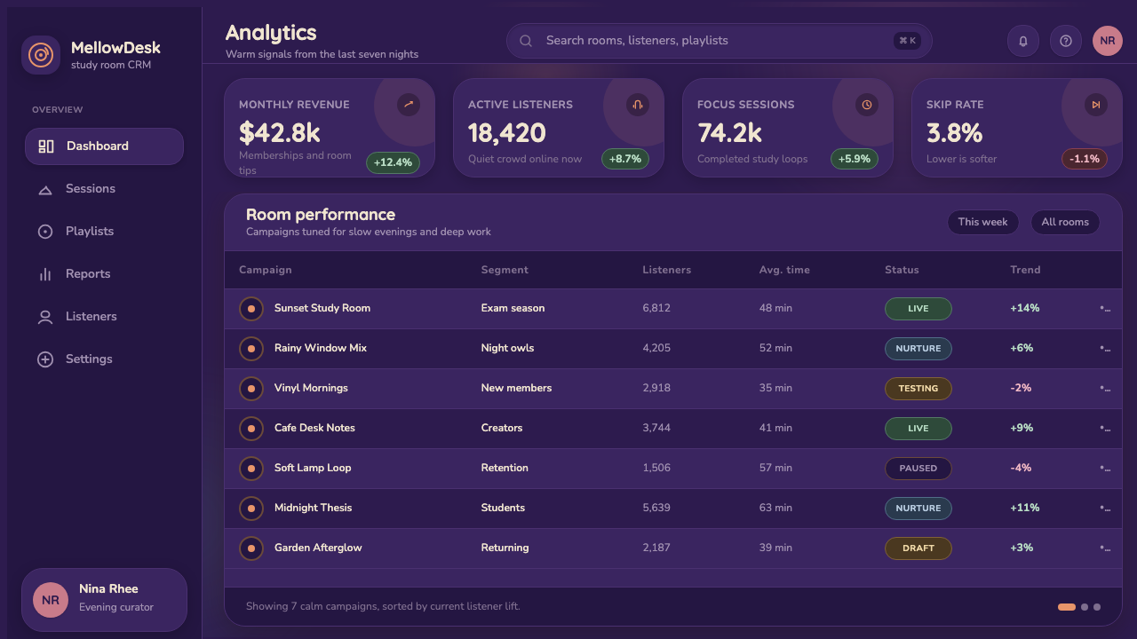
Unlike most design aesthetics that consider dark mode a secondary variant, Lo-fi Hip Hop is fundamentally dark-mode native. The night setting is not optional — it is the premise. Deep violet or near-black backgrounds are the canonical ground, with warmth introduced through controlled pools of lamplight rather than through a light background. This dark foundation gives the aesthetic its emotional quality of intimate enclosure; a light-background version of the same elements would feel categorically different — more cheerful, less nocturnal, and considerably less characteristic.与大多数将深色模式视为次要变体的设计美学不同,Lofi Hip Hop 从根本上是深色模式原生的。夜间场景并非可选——它是前提条件。深紫或近黑的背景是规范底色,温度通过受控的台灯光晕而非浅色背景引入。这一深色基底赋予这套美学以私密围合的情绪品质;同样的元素在浅色背景下会产生截然不同的感受——更欢快、更少夜晚感,也大幅削减了其标志性气质。
See the Lo-fi Hip Hop / Chillhop design system查看 Lo-fi Hip Hop / Chillhop 完整设计系统
Who shaped Lo-fi Hip Hop / Chillhop?谁塑造了 Lo-fi Hip Hop / Chillhop?
Japanese producer Jun Seba, known professionally as Nujabes, is widely regarded as the spiritual godfather of lo-fi hip-hop music and by extension its visual culture. Working in Tokyo across the late 1990s and early 2000s, he fused jazz harmony, melancholic chord progressions, and hip-hop drum patterns into a sound that felt simultaneously urban and contemplative. His soundtracks for the anime series Samurai Champloo brought his aesthetic to a global audience and cemented the link between lo-fi music and Japanese visual culture. Nujabes died in 2010, but his catalog remains the genre's most referenced touchstone, and his image — headphones, quiet focus, jazz records — is directly embedded in the aesthetic's symbolic vocabulary.日本制作人 Seba Jun,艺名 Nujabes,被广泛视为 Lofi Hip Hop 音乐及其视觉文化的精神教父。他在整个1990年代末至2000年代初于东京工作,将爵士和声、忧郁和弦进行与嘻哈鼓型融合为一种既都市又沉思的声音。他为动画《混沌武士》创作的配乐将其美学带向全球观众,巩固了 Lofi 音乐与日本视觉文化之间的联结。Nujabes 于2010年辞世,但他的音乐目录至今仍是这一流派被引用最多的基准,他的形象——耳机、安静的专注、爵士唱片——直接内嵌于这套美学的符号词汇之中。
The YouTube channel originally known as ChilledCow, now called Lofi Girl, is responsible more than any other single entity for establishing Lo-fi Hip Hop as a distinct visual aesthetic. The channel's 24-hour live stream, launched in 2017 featuring a looping animation of a girl studying at her desk — drawn in anime style, sitting before a warm lamp with rain on the window and a cat nearby — created the canonical image that defined the genre visually. The stream ran continuously for years, accumulating hundreds of millions of hours watched, and the studying girl became one of the most recognized figures in internet culture. Lofi Girl's aesthetic choices — the color palette, the object vocabulary, the atmospheric mood — became the template that artists, album designers, and app creators worldwide consciously referenced and built upon.最初名为 ChilledCow、现更名为 Lofi Girl 的 YouTube 频道,比任何其他单一实体都更多地奠定了 Lofi Hip Hop 作为一套独特视觉美学的地位。该频道于2017年开启的24小时直播——画面是一段循环动画:一个以动画风格绘制的女孩坐在温暖台灯前学习,窗外有雨,旁边有猫——创造了视觉上定义这一流派的规范形象。这条直播连续运行多年,累计数亿小时的观看时长,学习中的女孩成为互联网文化中最具辨识度的形象之一。Lofi Girl 的美学选择——色板、物件词汇、氛围情绪——成为全球艺术家、专辑设计师与应用创作者有意识参照和在此基础上构建的模板。
Colombian illustrator Juan Pablo Machado is among the most visible visual artists in the lo-fi and chillhop ecosystem, known primarily for his ongoing work with Chillhop Music. His illustrations — featuring animal characters such as raccoons and bears engaged in cozy domestic activities, rendered in a soft painterly style with warm interior lighting and natural textures — defined the visual language of the Chillhop brand and influenced the broader genre's illustration conventions. Machado's work demonstrates how the aesthetic can carry emotional weight through character design and environmental storytelling without relying on any human figure, expanding the genre's visual possibilities beyond the Lofi Girl archetype.哥伦比亚插画家 Juan Pablo Machado 是 Lofi 与 Chillhop 生态系统中最具影响力的视觉艺术家之一,主要以其与 Chillhop Music 的持续合作而知名。他的插画——以浣熊、熊等动物角色进行温馨家居活动为主题,以柔和绘画风格、温暖室内光线与自然质感呈现——定义了 Chillhop 品牌的视觉语言,并影响了这一流派更广泛的插画惯例。Machado 的作品展示了这套美学如何通过角色设计与环境叙事承载情感重量,无需依赖任何人类形象,将这一流派的视觉可能性扩展至 Lofi Girl 原型之外。
Founded in the Netherlands in 2013, Chillhop Music is both a record label and a media brand that played a foundational role in establishing Lo-fi Hip Hop as a genre with a coherent visual identity. Through its album art, social media presence, animated music videos, and YouTube compilations, Chillhop built an illustration-based visual ecosystem that paired the genre's music with a consistent aesthetic: animal characters in cozy environments, muted warm palettes, handcrafted textures, and an emphasis on quiet industriousness. The brand demonstrated that lo-fi visual aesthetics could translate successfully to merchandise, digital branding, and community identity — a model that countless creators and platforms subsequently adopted.Chillhop Music 于2013年在荷兰创立,既是一家唱片公司也是一个媒体品牌,在将 Lofi Hip Hop 确立为具有连贯视觉身份的流派方面发挥了奠基性作用。通过专辑封面艺术、社交媒体存在、动画音乐视频与 YouTube 合辑,Chillhop 构建了一套以插画为基础的视觉生态系统,将这一流派的音乐与一致的美学相配对:温馨环境中的动物角色、低饱和暖色调、手工质感,以及对安静勤奋氛围的强调。这一品牌证明了 Lofi 视觉美学可以成功转化为周边产品、数字品牌与社群身份认同——无数创作者与平台随后采纳了这一模式。
Detroit producer James Yancey, known as J Dilla, is one of the two foundational musical figures whose work gave lo-fi hip-hop its defining sonic character. Working across the 1990s and 2000s with artists including A Tribe Called Quest and Common, Dilla developed a production style characterized by deliberately imprecise drum timing, heavy use of vinyl samples, and a warmth that came from the inherent imperfection of the source material. It is this quality of warm, human imprecision — the sense that the music was made by hand rather than by algorithm — that lo-fi visual aesthetics attempt to replicate in the visual domain: the grain, the soft edges, the visible brush strokes, the sense of something touched and lived-in.底特律制作人 James Yancey,艺名 J Dilla,是赋予 Lofi Hip Hop 决定性音色特征的两位奠基性音乐人之一。他在整个1990至2000年代与 A Tribe Called Quest、Common 等艺术家合作,发展出一种以刻意不精确的鼓点时值、大量使用黑胶采样为特征的制作风格,其温度来自源素材本身固有的不完美。正是这种温暖而人性化的不完美品质——音乐像是由手工而非算法制作的感觉——Lofi 视觉美学试图在视觉领域中复制:颗粒感、柔化的边缘、可见的笔触、某种被触摸过与被生活过的感觉。
How do you use Lo-fi Hip Hop / Chillhop today?今天怎么用 Lo-fi Hip Hop / Chillhop?
Lo-fi Hip Hop translates into designed artifacts most naturally when the product's emotional goal aligns with the aesthetic's core promise: comfort, focus, and the sense of being in a protected, productive space. Study apps, note-taking tools, ambient productivity platforms, music streaming interfaces, and meditation or sleep applications are all contexts where the aesthetic lands with genuine resonance rather than decorative incongruity. When the product context matches, designers do not need to fight the aesthetic's associations — those associations do the emotional communication work automatically.当产品的情绪目标与这套美学的核心承诺相契合时——舒适、专注、以及身处受保护的高效空间的感觉——Lofi Hip Hop 才能最自然地转化为设计物。学习应用、笔记工具、环境氛围生产力平台、音乐流媒体界面、冥想或睡眠应用,都是这套美学能产生真实共鸣而非装饰性违和的场景。当产品语境匹配时,设计师无需对抗这套美学的联想意涵——那些联想自动完成了情绪传达工作。
For presentation slides, the aesthetic works exceptionally well for covers and scene-setting opening sequences. A cover slide benefits from the compositional logic of a lo-fi illustration: a warm lamplight pool centered in a deep violet or indigo field, with rounded headline type set in cream or warm white. Section divider slides can use symbolic object silhouettes — a coffee mug, an open book, a vinyl record — as compositional anchors. Content slides should maintain the warm dark background with generous type spacing; resist the temptation to brighten the palette for legibility, since the contrast between warm amber type and deep violet grounds is inherently readable. Data slides work best when charts are given soft, muted color fills drawn from the palette rather than the sharp primaries of more clinical visualization styles.在演示文稿中,这套美学在封面和场景建立型开场幻灯片上表现尤为出色。封面幻灯片受益于 Lofi 插画的构图逻辑:一片温暖的台灯光晕居于深紫或靛蓝底面中央,配以奶油色或暖白色的圆润标题字体。章节分隔幻灯片可以使用符号性物件剪影——咖啡杯、翻开的书、黑胶唱片——作为构图锚点。内容幻灯片应保持温暖深色背景与充裕的排版间距;抵制为了可读性而提亮色调的诱惑,因为暖琥珀色文字与深紫底面之间的对比本身具有良好的可读性。数据幻灯片在图表采用来自色板的柔和低饱和色填充时效果最佳,而非更临床化的可视化风格所用的鲜明主色。
For web interfaces, dashboards and focus-oriented productivity tools are the strongest application contexts. The approach: establish a deep violet or near-black background as the primary ground, introduce warmth through amber or golden accent tones for interactive elements and calls to action, and use cream or soft warm white for body text. Card components should carry subtle grain or soft inner glow rather than hard drop shadows; borders, where used, should be low-contrast and slightly warm rather than neutral grey. Navigation and typographic hierarchy rely on size and weight contrast within a single rounded typeface family; avoid introducing additional typeface personalities that pull against the cohesive warmth. Pricing pages and feature comparison layouts can adapt the aesthetic by keeping backgrounds dark and using amber or dusty rose as tier-differentiating accent colors.在网页界面中,仪表板与专注导向的生产力工具是最强的应用场景。方法如下:以深紫或近黑为主要背景底色,通过琥珀或金色调的强调色引入温度感用于交互元素与行动号召,正文文字采用奶油色或柔和暖白色。卡片组件应带有细腻颗粒感或柔和内发光而非硬投影;边框(如使用)应是低对比度且略带暖意的,而非中性灰色。导航与字体层级依赖单一圆润字体家族内的尺寸与字重对比;避免引入与整体温暖感相悖的额外字体个性。定价页面与功能对比版面可以通过保持深色背景并使用琥珀或粉灰玫瑰作为等级区分强调色来适配这套美学。
For editorial and marketing applications, the aesthetic communicates particularly well in contexts associated with wellbeing, creative practice, learning, or music culture. An editorial layout built on this aesthetic uses a deep violet or warm near-black as the page ground, with a wide margin reserved for handwritten-style annotations or pull quotes set in a casual script face. Feature illustrations or header imagery should follow the painterly, soft-textured style with warm interior lighting. Marketing pages are most effective when they commit fully to the night-time atmosphere rather than trying to mix the aesthetic with bright, energetic tones — the aesthetic's power comes from its consistency and its clear emotional positioning.在编辑与营销应用中,这套美学在与健康、创意实践、学习或音乐文化相关的场景中传播效果尤为突出。基于此美学的编辑版面以深紫或暖近黑作为页面底色,保留宽阔留白用于手写风格的批注或以随意草书字体排印的引语。特色插画或头图应遵循具有绘画感、柔软质感、温暖室内光线的风格。营销页面在完全沉浸于夜间氛围而非尝试将这套美学与明亮、充满活力的色调混合时最为有效——这套美学的力量来自其一致性与清晰的情绪定位。
A common mistake when applying Lo-fi Hip Hop aesthetics is treating the warmth as permission for visual busyness. The original aesthetic is actually quite spare: one or two characters, a small selection of meaningful objects, and a great deal of atmospheric negative space. When designers add too many textures, too many symbolic objects, or too many competing warm tones simultaneously, the result loses the quality of focused calm and begins to read as cluttered nostalgia. Similarly, using bright, fully saturated warm tones in place of the muted, desaturated palette destroys the cozy intimacy the style depends on — the amber of lamplight is never the same as a vivid orange brand color. Restraint in color intensity is as important here as the color choice itself.应用 Lofi Hip Hop 美学时最常见的错误,是将温暖感理解为视觉繁复的许可。原始的这套美学实际上相当简练:一到两个角色、少量精选的有意义物件,以及大量营造氛围的留白空间。当设计师叠加过多质感、过多符号性物件或过多相互竞争的暖色调时,结果会失去专注平静的品质,开始被解读为凌乱的怀旧感。同样,用明亮的高饱和暖色替代低饱和色板会破坏这种风格所依赖的温馨私密感——台灯的琥珀光永远不等同于鲜艳的品牌橙色。色彩强度上的克制与色彩选择本身同等重要。
See the Lo-fi Hip Hop / Chillhop design system查看 Lo-fi Hip Hop / Chillhop 完整设计系统
Lo-fi Hip Hop / Chillhop — FAQLo-fi Hip Hop / Chillhop · 常见问题
Is Lo-fi Hip Hop appropriate for professional or corporate contexts?Lofi Hip Hop 适合专业或企业场景吗?
It depends heavily on what kind of professional context. The aesthetic is well-suited to creative studios, music platforms, wellness companies, educational technology, and individual freelancer portfolios where warmth and approachability are assets. It tends to work against the aesthetic expectations of financial services, legal platforms, enterprise software, or any context where authority and institutional credibility are primary signals. The key diagnostic question is whether the product wants users to feel comforted or to feel confident in the institution's power and reliability — those are different emotional targets that require different visual strategies.这在很大程度上取决于专业场景的类型。这套美学适合创意工作室、音乐平台、健康wellness公司、教育科技,以及温度感与亲切感是资产的个人自由职业者作品集。它往往与金融服务、法律平台、企业软件,或任何以权威性与机构可信度为主要信号的场景的美学期望相悖。关键的诊断性问题是:这个产品希望用户感到被安慰,还是对机构的权力与可靠性感到有信心——这两者是需要不同视觉策略的不同情绪目标。
How do I avoid Lo-fi Hip Hop looking generic or derivative?如何避免 Lofi Hip Hop 看起来千篇一律或缺乏原创?
The most common path to generic lo-fi is assembling the symbolic objects — the girl, the desk lamp, the cat, the plants — without genuine scene design or compositional intention. The original Lofi Girl stream worked because every element was considered in relation to every other; the composition was not a checklist but an atmosphere. To avoid derivativeness, choose a specific time of night, a specific quality of light, and a specific mood — then use only the objects that support that specific version of the aesthetic. The genre is also more expandable than its canonical images suggest: outdoor night scenes, morning transitions, different cultural contexts for the domestic interior, different character types. Working from the emotional premise rather than the object vocabulary opens more original territory.走向千篇一律的 Lofi 最常见的路径,是在没有真正场景设计或构图意图的情况下拼凑那些符号性物件——女孩、台灯、猫、植物。原始的 Lofi Girl 直播之所以有效,是因为每个元素都在与其他元素的关系中被考量;构图不是一份核查清单,而是一种氛围。要避免衍生感,请选择夜晚的具体时刻、具体的光线质感和具体的情绪——然后只使用支撑这个特定版本美学的物件。这一流派也比其规范形象所暗示的更具可扩展性:户外夜景、清晨转换、不同文化语境下的家居室内、不同的角色类型。从情绪前提而非物件词汇出发,能开辟出更多原创领域。
Can this aesthetic work for light-mode interfaces?这套美学能用于浅色模式界面吗?
A light-mode variant is possible but requires reconceptualizing the aesthetic rather than simply inverting the colors. The night setting is so fundamental to the aesthetic's emotional identity that removing it changes the register entirely — a daylight lo-fi interface will feel like a related but distinct thing, closer to a general cozy-illustrated style than to lo-fi proper. If light mode is required, the most successful approach shifts the time to early morning rather than late night: pale blue-grey skies, warm cream surfaces, soft morning light rather than lamplight. The object vocabulary and illustration style can remain consistent; it is the color temperature of the light source that shifts. Accepting that this produces a softer, less characteristic version of the aesthetic is important — do not attempt to preserve the nighttime emotional intensity in a light-mode rendering.浅色模式的变体是可能的,但需要重新概念化这套美学,而非简单地反转颜色。夜间场景对于这套美学的情绪身份如此基础,以至于移除它会彻底改变其情绪刻度——一个日光下的 Lofi 界面会产生相关但截然不同的感受,更接近于一般的温馨插画风格,而非严格意义上的 Lofi。如果必须使用浅色模式,最成功的方法是将时间转移至清晨而非深夜:苍白的蓝灰天空、温暖的奶油表面、柔和的晨光而非台灯光。物件词汇与插画风格可以保持一致;改变的是光源的色温。接受这种做法会产生一个更柔和、特征性更弱的版本——不要试图在浅色模式的渲染中保留夜间的情绪强度,这一点很重要。
How does Lo-fi Hip Hop relate to other cozy or nostalgic aesthetics like cottagecore or vaporwave?Lofi Hip Hop 与 cottagecore 或 vaporwave 等其他温馨或怀旧美学有什么关系?
All three are internet-native aesthetic movements that use visual nostalgia as an emotional strategy, but they draw on completely different source material and produce very different atmospheres. Cottagecore references pastoral European imagery — botanical illustration, linen textures, soft natural daylight — and carries connotations of retreat from technology. Vaporwave uses ironic distance and surrealism, saturated pinks and purples, retro computer aesthetics, and corporate imagery fragmented into something uncanny. Lo-fi Hip Hop is neither pastoral nor ironic — it is earnestly urban, contemporary, and productive. The cozy-ness is set against a background of actual work and focused effort, not escape. Mixing these aesthetics tends to undermine each of them; they occupy adjacent but distinct emotional territories.三者都是以视觉怀旧作为情绪策略的互联网原生美学运动,但它们汲取的源素材完全不同,产生的氛围也大相径庭。Cottagecore 参照欧洲田园意象——植物插画、亚麻质感、柔和自然日光——并带有从技术中退隐的内涵。Vaporwave 使用讽刺性距离与超现实主义、饱和的粉色与紫色、复古电脑美学,以及被碎片化为某种诡异感的企业形象。Lofi Hip Hop 既不是田园的也不是讽刺的——它是真诚的都市风格、当代的、充满生产力的。温馨感被设置在真实工作与专注努力的背景下,而非逃避。混合这些美学往往会削弱其中每一种;它们占据相邻但截然不同的情绪领域。
What are the biggest risks of getting Lo-fi Hip Hop wrong in a UI context?在界面设计中运用 Lofi Hip Hop 最大的风险是什么?
The primary risk is a readability and accessibility failure. The deep violet and near-black backgrounds, combined with warm amber or cream text, can produce sufficient contrast when the tones are well-chosen — but the temptation to use very low-contrast combinations for aesthetic reasons is significant and frequently produces text that is difficult to read for users with visual sensitivities. Grain textures layered over text compound this problem. The second significant risk is tonal mismatch: if the product being designed involves financial transactions, medical information, legal documents, or any high-stakes decision, the cozy-comforting tone of the aesthetic will work against the user's need to feel alert, careful, and competent. The aesthetic is not tonally neutral — it is specifically calibrated toward relaxed focus, and that calibration is a liability in contexts that require vigilance.首要风险是可读性与无障碍性失败。深紫与近黑背景结合暖琥珀或奶油色文字,在色调选择得当时可以产生足够的对比度——但出于美学考量使用极低对比度组合的诱惑是巨大的,且经常产生对视觉敏感用户而言难以阅读的文字。文字上叠加的颗粒纹理会加剧这一问题。第二个显著风险是语调错配:如果被设计的产品涉及金融交易、医疗信息、法律文件或任何高风险决策,这套美学的温馨-安慰性语调会对抗用户需要感到警觉、谨慎与有能力的需求。这套美学在语调上并非中性——它被专门校准为放松的专注状态,而这种校准在需要保持警惕的场景中是一种负担。
Related design styles相关设计风格
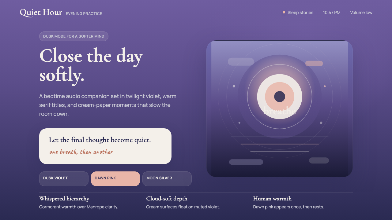 Calm App Purple MeditationWhispers at bedtime. Dusk-purple gradients, cream serif type, and dawn-pink w…睡前低语。暮紫渐变、奶油衬线与黎明粉暖意。
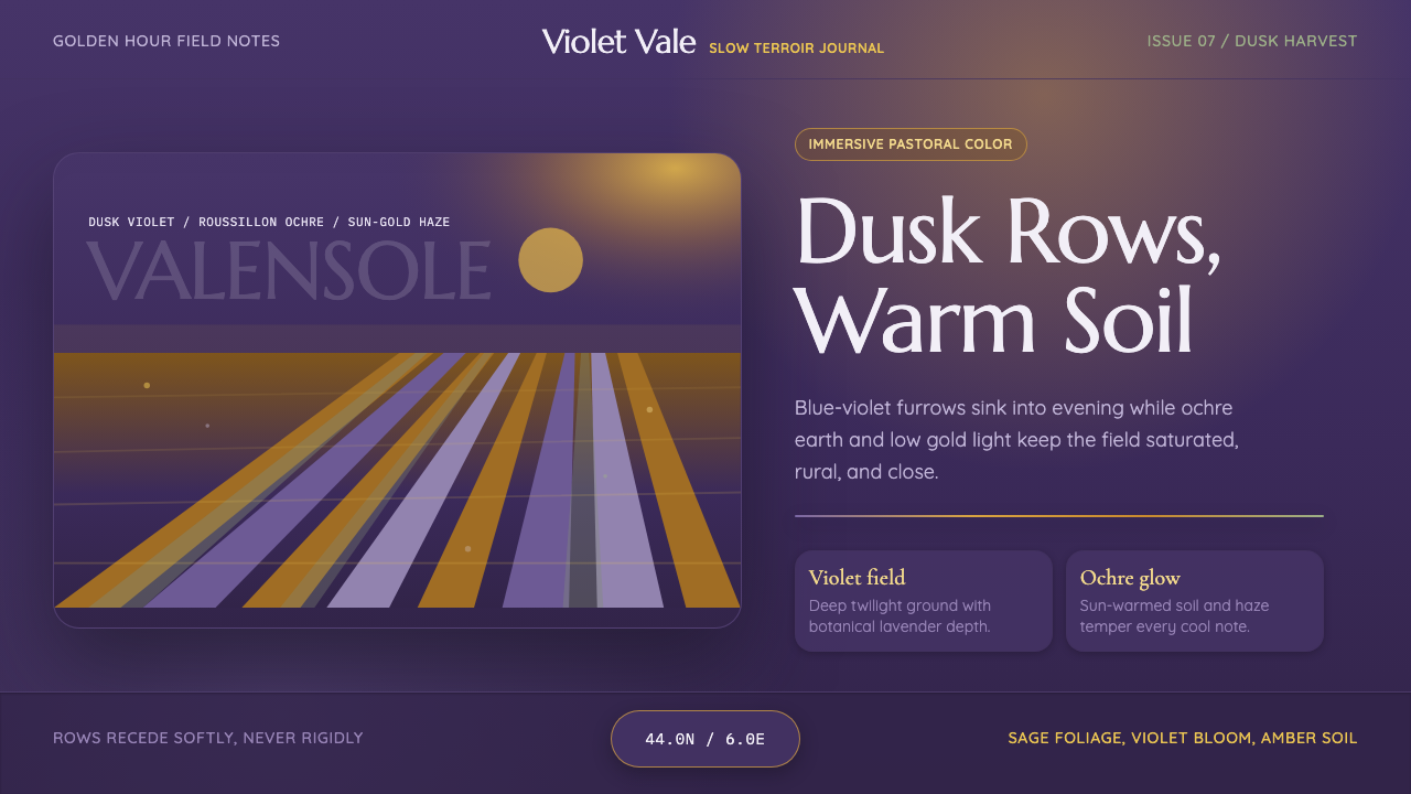 Provence LavenderSaturated pastoral dusk. Violet rows, ochre soil, and sun-gold haze build the…饱和的田园黄昏:紫色花垄、赭土与金色暮霭定调。
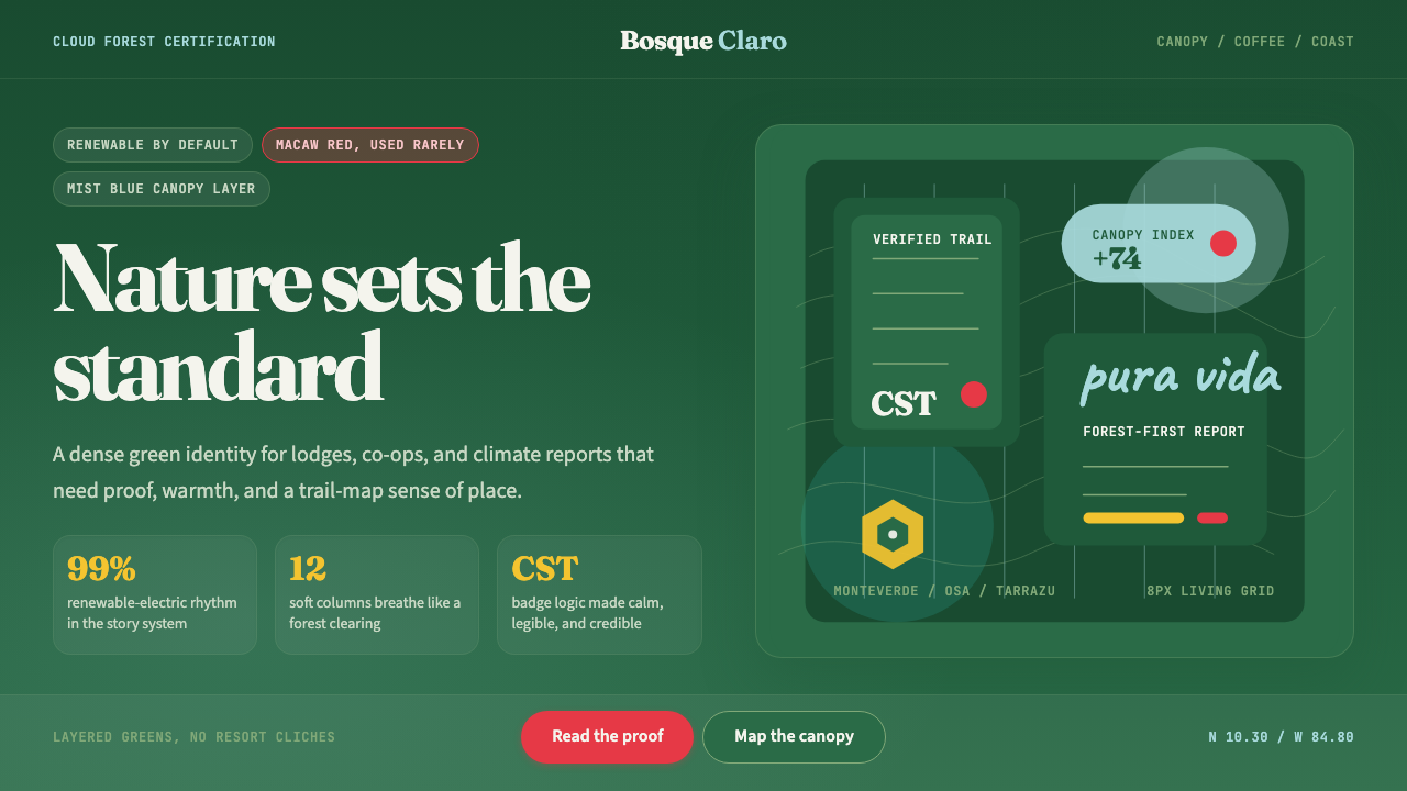 Costa Rica Pura Vida EcoAlive without greenwash. Cloud-forest green, Fraunces serif, and scarlet acce…拒绝漂绿:云雾森林绿、Fraunces衬线与猩红点缀撑起生机。
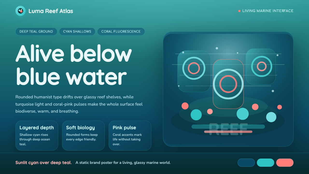 Great Barrier ReefAlive under deep teal. Quicksand curves, cyan glow, and coral-pink pulses bui…深海蓝绿中有生命:圆润字形、青蓝光晕与珊瑚粉脉冲层叠成礁。
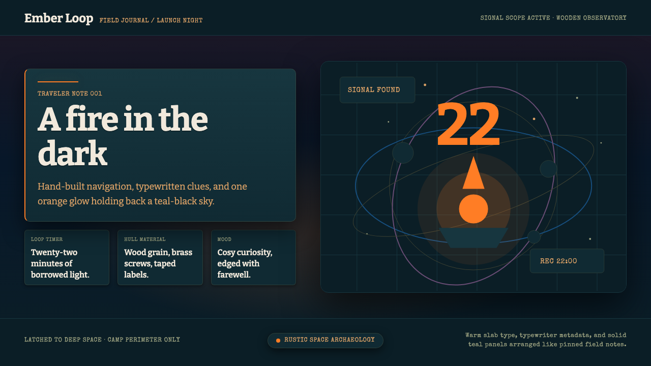 Outer WildsCosy cosmic melancholy. Campfire orange glows through typewritten teal field…温暖又怅然:篝火橙照亮深青色打字田野札记。
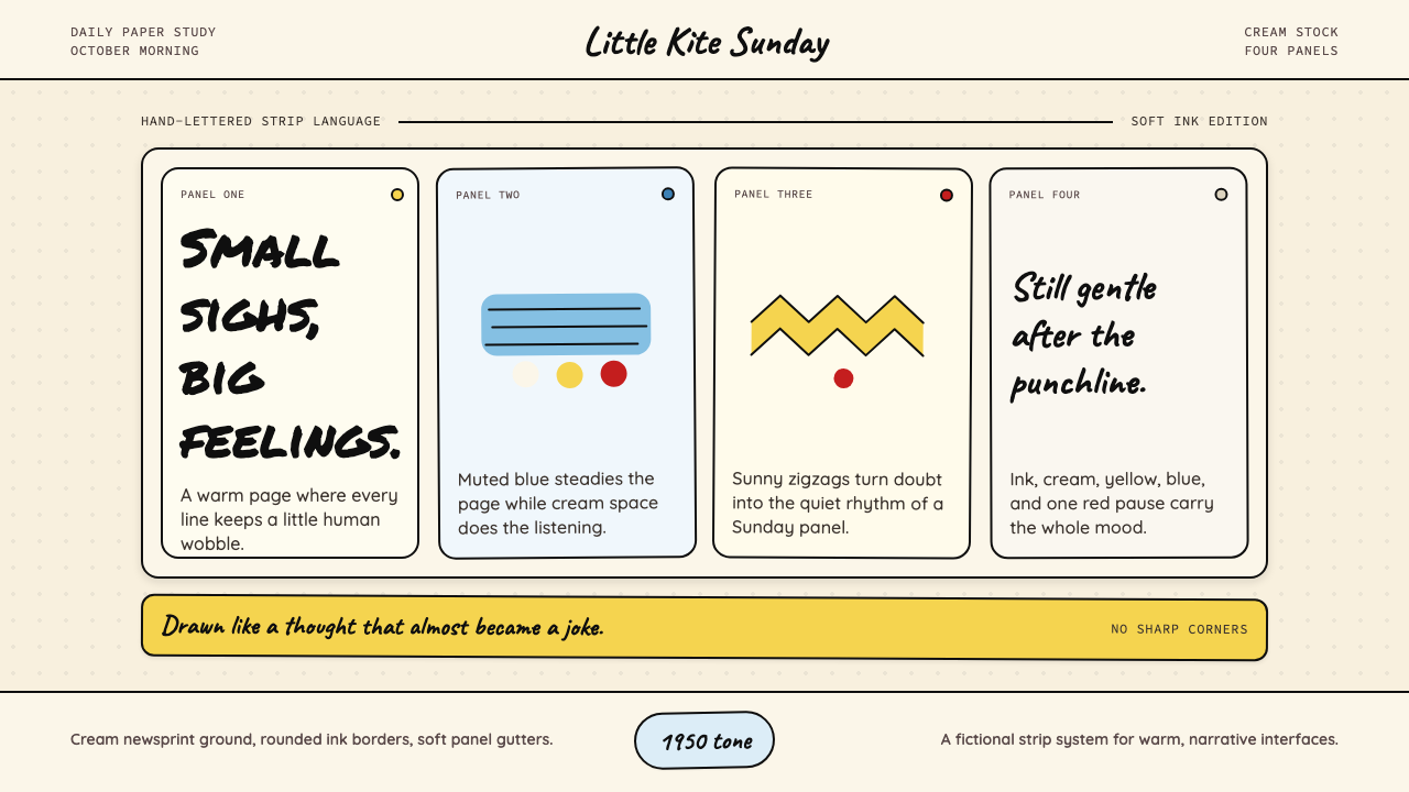 Peanuts Comic Schulz (1950)Gentle melancholy on newsprint. Caveat lettering, cream panels, yellow and bl…温柔忧郁的新闻纸感:Caveat 手写字、奶油格框、黄蓝点色。