What is Calm App Purple Meditation?
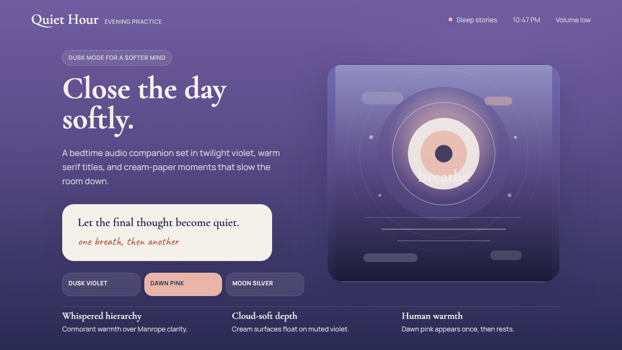
Calm's dusk-purple gradient — the exact hue of the sky the moment you set your phone down for the night — turned mindfulness into a visual language that the entire wellness industry is still learning to speak.
Calm App Purple Meditation in brief
Calm App Purple Meditation is the visual design language pioneered by the Calm mindfulness application, built around a signature palette of deep violet-purple twilight gradients, warm cream type, and soft dawn-pink accents. Together these elements create what the brand calls a 'friendly luxury' register — aspirational but never cold, sophisticated but never clinical. The aesthetic is explicitly nocturnal: it belongs to the hour between wakefulness and sleep, and every design decision is calibrated to lower arousal rather than raise it.
At its core, the style treats color as emotional temperature. The deep violet-to-indigo gradient field functions as an enveloping atmosphere — a sky rather than a background. Cream-tinted editorial serif type floats within this atmosphere with deliberate softness, its warmth contrasting the coolness of the purple field. Dawn-pink accent elements — buttons, highlights, decorative motifs — introduce human warmth and guide attention without creating visual urgency. The system rejects both the clinical white of medical or productivity software and the aggressive saturation of consumer entertainment. It occupies a carefully maintained middle register: calm confidence.
The style is also defined by what it withholds. Hard edges, high contrast, primary colors, geometric severity, and the rational grid discipline of corporate software are all absent. Instead, shapes blend at their borders, type weights remain moderate, and all visual tension is resolved before it can register as stress. This is not accidental restraint — it is the aesthetic equivalent of lowering one's voice in a quiet room.

Where does Calm App Purple Meditation come from?
Calm was founded in 2012 in San Francisco by Michael Acton Smith and Alex Tew, initially as a browser-based relaxation tool. The company's early visual identity was unremarkable by the standards of the emerging consumer wellness space — pleasant but generic. The aesthetic transformation that would define the brand came gradually through the years 2018 to 2024, as Calm repositioned itself from a meditation app into what its founders described as a 'mental health brand,' raising significant investment and hiring designers with backgrounds in editorial publishing and luxury consumer goods rather than conventional technology product design.
The cultural context for the style's emergence was the post-2015 wellness-technology wave — a period when mindfulness moved from fringe spiritual practice to mainstream consumer category, driven partly by clinical research validating meditation's effects on stress and sleep, and partly by a broader cultural reckoning with the costs of always-on digital life. The first generation of meditation apps, including Calm's early competitors, had borrowed their visual language from either clinical health software (white, sterile, reassuring) or New Age imagery (mandalas, lotus flowers, earth tones). Calm's designers rejected both inheritances and looked instead to the visual culture of high-end hospitality, premium editorial publishing, and the emotional register of dusk — a time of day with no strong commercial visual tradition to borrow from or fight against.
Tamara Levitt, who joined Calm as head of mindfulness and became the voice of many of its most popular programs, shaped the brand's human and editorial warmth alongside the design team. Her influence helped ensure that the visual language was not merely aesthetically pleasing but emotionally coherent with the spoken content it accompanied: gentle, unhurried, and genuinely interested in the listener. Mo Gawdat, author of the widely read work on engineering happiness, later became associated with Calm's content and mission, reinforcing the brand's positioning at the intersection of scientific credibility and personal warmth.
The sleep-stories genre, which Calm helped pioneer and popularize, exerted significant influence on the visual direction. Sleep stories — audio narratives designed to lull listeners to sleep — required a visual identity that could represent the threshold state between consciousness and dreaming. The dusk gradient became the natural answer: neither full daylight nor true darkness, it captures a transitional moment that is inherently associated with the lowering of vigilance and the softening of mental focus. This functional logic — the design serving the psychophysiological purpose of the product — is what distinguishes Calm's visual language from imitation wellness aesthetics that borrow the purple palette without understanding why it was chosen.
What defines the Calm App Purple Meditation look?
Dusk Gradient Field
The defining visual signature is a gradient that moves from deep violet or indigo through softer lavender toward the edges, suggesting the sky in the minutes after sunset. This gradient functions not as a decorative background but as the primary atmospheric element — it establishes mood before any other element is read. The gradient is luminous rather than flat, suggesting depth and soft light without simulating any specific light source. Its movement is always vertical or gently diagonal, never horizontal, which reinforces the association with sky and with the downward pull of sleep.
Editorial Serif Warmth
Typography is built around editorial-weight serif letterforms that carry the visual warmth of printed publishing — the kind of type found in long-form cultural magazines or well-designed hardcover books. These serifs stand in deliberate contrast to the geometric sans-serifs of productivity software. Set in cream rather than pure white, the type reads as warm rather than clinical. The serif choice signals that the brand sees itself as part of a literary and reflective tradition, not a technological one. Headlines are set with generous letter-spacing; body text breathes with ample line height.
Dawn-Pink Accent
A soft warm pink — the color of the sky just before sunrise or just after — serves as the system's primary accent. It appears on interactive elements, highlights, and occasional decorative touches. This color is chosen for its psychological warmth: it reads as human and gentle rather than urgent or alert. In a palette otherwise built around twilight and cool luminosity, the dawn pink functions as a reminder of human presence and warmth. It is used sparingly, which preserves its emotional effect — overuse would collapse the contrast between the atmospheric field and the personal accent.
Soft Edge and Atmospheric Blur
Where Bauhaus or Swiss design would insist on hard edges and deliberate geometric forms, Calm's visual language embraces softness at boundaries. Shapes dissolve into the gradient field rather than asserting themselves against it. Illustrative elements — abstract botanical forms, soft circular motifs — have feathered rather than sharp edges. This atmospheric quality is not vagueness; it is a precise visual representation of the state the product is designed to induce: the softening of focus that precedes sleep, the dissolving of sharp cognitive boundaries that marks the onset of relaxation.
Restrained Luminosity
The palette operates at a consistent mid-range luminosity — never fully saturated, never fully muted. The violets and purples are deep but not harsh; the creams are warm but not beige; the pinks are present but not vivid. This controlled luminous range is what distinguishes the style from dark-mode interfaces (which tend toward pure black grounds) and from standard purple consumer palettes (which tend toward higher saturation). The goal is a palette that feels lit from within — glowing rather than illuminated — which is a precise perceptual quality associated with the liminal hour between day and night.
Nature-Derived Organic Motifs
Calm's visual identity incorporates abstract botanical and landscape imagery — moonlit water, soft foliage, gentle mountain silhouettes, and flowing organic curves — rendered in the same muted, gradient-blended palette as the primary atmosphere. These motifs serve a different purpose than illustration: they evoke place rather than describe it. A suggestion of water or forest is enough to activate associations with stillness and naturalness without requiring the viewer to process a detailed scene. The imagery is always impressionistic and never diagrammatic, preferring feeling over information.
Generous Negative Space
Layouts in this style refuse density. Every content element — a headline, an illustration, a navigation item — is surrounded by more breathing room than functionality strictly requires. This negative space is not waste; it is a pacing mechanism. The eye is given time to settle between elements, which mirrors the slowing-down experience the product delivers. Crowded layouts and tight information density would contradict the brand's fundamental promise. The space itself is part of the message: there is no hurry here.

Who shaped Calm App Purple Meditation?
Co-founder and co-CEO of Calm, Acton Smith brought a background in consumer gaming and entertainment — he previously built the digital toy and entertainment company Mind Candy — to the wellness space. His instinct for consumer product storytelling helped position Calm not as a self-help utility but as a premium lifestyle brand. Under his leadership, Calm pursued a content-first strategy (sleep stories, music, masterclasses) that gave the visual identity a rich body of material to serve, shaping the editorial warmth and narrative depth that distinguishes Calm's design from pure-utility wellness apps.
Co-founder and co-CEO, Tew is known for earlier internet ventures including the Million Dollar Homepage — a landmark in web culture — and Woah.com, a calming browser experience that preceded Calm. Tew's interest in using digital interfaces to modulate emotional state predates the mindfulness category itself. His technical and creative intuition about how interface design affects psychological state was foundational to Calm's visual logic: the idea that color, pacing, and the absence of urgency are not merely aesthetic choices but functional tools for managing arousal.
Head of mindfulness and principal voice talent at Calm, Levitt brought a background in meditation teaching and storytelling rather than design. Her influence on the brand's visual language was indirect but substantial: as the author and narrator of many of Calm's most popular programs, she established the tonal register — unhurried, warm, attentive, never clinical — that the visual design team was required to match. The coherence between Calm's spoken voice and its visual language is in large part a reflection of Levitt's presence in defining what the brand actually feels like.
Former Chief Business Officer at Google X and author of 'Solve for Happy,' Gawdat became associated with Calm's content ecosystem as an advocate for applying engineering and systems thinking to personal wellbeing. His association with the brand reinforced Calm's positioning at the junction of scientific credibility and accessible warmth — a positioning that the visual identity must also maintain. The style's refusal to tip into either cold clinical design or fuzzy spiritual aesthetics reflects the same calibration that Gawdat represents intellectually.
How do you use Calm App Purple Meditation today?
The Calm meditation aesthetic translates well into presentation decks when the subject matter calls for reflection, attention, or the careful consideration of something important — mental health topics, employee wellbeing programs, therapeutic or counseling services, premium product launches, and any context where the audience needs to be emotionally present rather than informationally processed. Cover slides work best with a single strong vertical gradient occupying the full bleed, a cream or pale serif headline centered with generous vertical whitespace above and below, and one small dawn-pink accent element — a thin rule, a soft circular motif — rather than a logo lockup. The atmosphere does the work; the text only confirms it.
Content slides in this style require discipline. The temptation is to fill the violet field with content, but the aesthetic's power comes from restraint. A single idea per slide, presented in large editorial serif type against the gradient, with a supporting sentence or two in a lighter weight below, is far more effective than a bulleted list. If data must appear, treat charts as atmospheric objects: use gradient-toned bars or soft filled areas rather than hard primary colors, and surround the chart with enough negative space that it reads as a considered object rather than a data dump. The numbers should feel inevitable, not urgent.
For web interfaces, this style is most effective on pages designed to slow the user down: onboarding flows, subscription landing pages, features overviews for wellness or therapeutic products, and meditation or sleep program catalogs. Apply the gradient as a full-viewport hero background and layer cream type and soft botanical illustrations over it. Navigation should be minimal — a wordmark and two or three text links — because visual complexity contradicts the atmospheric intention. Pricing pages work in this style when tiers are differentiated by the intensity of the gradient (darker and deeper for the premium tier) rather than by color-coding with disruptive primaries. Dashboard interiors, however, are a poor fit: the atmospheric style conflicts with the scannability requirements of data-heavy environments.
For editorial and marketing contexts, the style excels at email campaigns, social cards, and print pieces aimed at acquisition or brand-building rather than conversion. An email header built on the dusk gradient with a single cream headline and one dawn-pink call-to-action button outperforms busier layouts because it creates an immediate emotional shift — the reader's pace slows upon opening. Social cards work best in a square or tall format with the gradient as full bleed, a single short statement in large serif type, and no other visual competition. Print pieces — program guides, welcome booklets, event programs — benefit from the style's willingness to leave large areas of the page empty; the negative space feels like an invitation rather than a failure to fill.
A common mistake when applying this style is importing elements of other purple palettes — particularly the saturated blue-purples of tech or the chalky lavenders of generic wellness — and assuming they will integrate naturally. The Calm palette is specifically calibrated to suggest dusk rather than digital, organic luminosity rather than screen glow. A second frequent error is adding sans-serif type in the belief that it will modernize the look; this breaks the editorial warmth that the serif face provides and tips the aesthetic toward generic dark-mode UI. The serif choice is not a concession to tradition — it is a functional decision that keeps the visual register in the human and literary domain where the style's emotional logic lives.

Calm App Purple Meditation — FAQ
How is this style different from generic purple wellness aesthetics?
The key distinction is the specific quality of the purple. Generic wellness purple tends to be either saturated and digital-looking — borrowing from tech brand palettes — or chalky and muted in a way that reads as spa or yoga studio rather than dusk. Calm's palette is specifically tuned to the luminosity of twilight: deep but not harsh, glowing but not neon, cool but warmed by the cream and pink companions. The second distinction is the editorial serif typography, which anchors the design in a literary and reflective tradition. Imitators typically substitute geometric sans-serifs, which shifts the register from contemplative to merely modern. The third is intentional negative space: the Calm aesthetic refuses density, and imitations that crowd the violet field with content destroy the pacing logic on which the style depends.
Can this style work for products outside of sleep and meditation?
Yes, but with attention to the emotional associations it carries. The style works well for any product or service where the desired user emotional state is relaxed attentiveness — therapy and counseling platforms, premium journaling apps, grief or bereavement support services, fertility and pregnancy products, and high-end hospitality. It struggles in contexts requiring urgency, sharp decision-making, or cognitive activation: financial trading platforms, logistics tools, emergency response applications, or any environment where the user must be alert rather than settled. It also tends to conflict with brand voices that are energetic, playful, or ironic — the twilight aesthetic carries a seriousness of register that resists tonal whiplash.
Why does the style rely so heavily on gradients when flat design has been dominant?
The Calm gradient is not the gradient that flat design movements reacted against in the early 2010s — the skeuomorphic radial gradients that simulated plastic or chrome surfaces. It is an atmospheric gradient, drawing on the visual tradition of landscape painting and the particular visual culture of dusk, which humans are evolutionarily and aesthetically conditioned to find beautiful and relaxing. Flat design eliminated gradients that were mimicking physical surfaces; Calm's gradients are mimicking sky, which is a different visual category entirely. The gradient is not decoration; it is content — it carries the emotional argument of the entire design system.
How should imagery and illustration be handled in this style?
Photography, if used at all, should be processed to align with the palette: desaturated toward the purple-blue range, with highlights shifted warm and a soft luminous quality rather than crisp digital sharpness. Overly realistic photography — a person's face in full detail, a product shot against a white ground — will conflict with the atmospheric intention. Illustration is generally more compatible: abstract botanical forms, softly rendered landscape elements, gentle organic curves are all appropriate. The guiding principle is that imagery should evoke rather than depict. A suggestion of water is better than a photograph of a lake; an impression of trees is better than a forest illustration with visible leaf detail. The viewer's imagination, given a starting point, will complete the picture in a way that is more personally resonant than any literal image.
Does this style work in light mode, or is it inherently a dark design?
The style is inherently crepuscular — belonging to the transitional light of dusk — which means it resists both a pure dark-mode treatment and a pure light-mode one. Strict dark mode (black backgrounds, white type) strips away the atmospheric warmth and produces a clinical or dramatic result that contradicts the style's emotional logic. Strict light mode (white backgrounds, dark type) loses the atmospheric enveloping quality that the gradient provides. The solution, for interfaces that must accommodate user preference, is to define a 'soft dark' and 'soft light' variant: the soft dark replaces pure black with deep violet-tinged dark tones; the soft light replaces white with warm cream grounds. Both variants should retain at least one atmospheric gradient surface — even if just in a header or hero element — because without the gradient, the style's signature quality does not read.
Related design styles
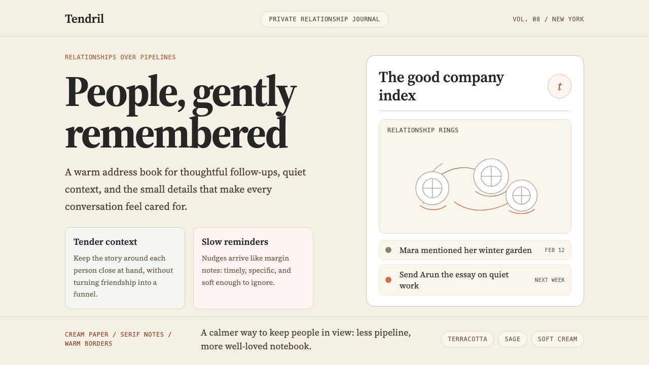 Clay 2024CRM as a sketchbook, not a sales pipeline. Cream backgrounds, terracotta, han…
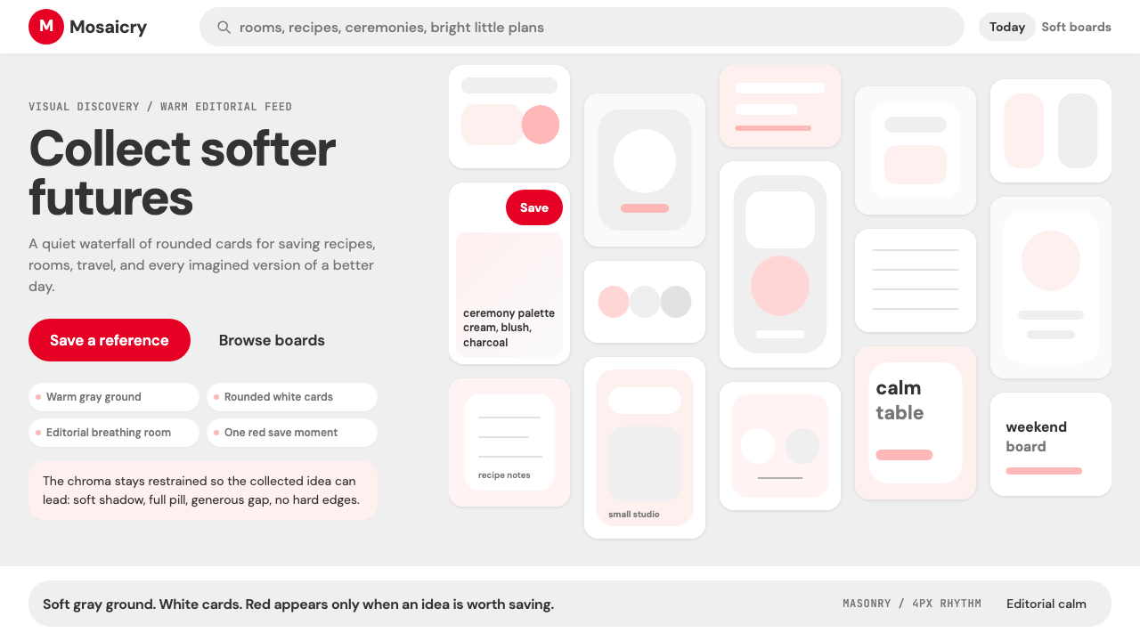 Pinterest 2024Aspirational calm. Warm gray masonry, rounded white pins, one surgical red sa…
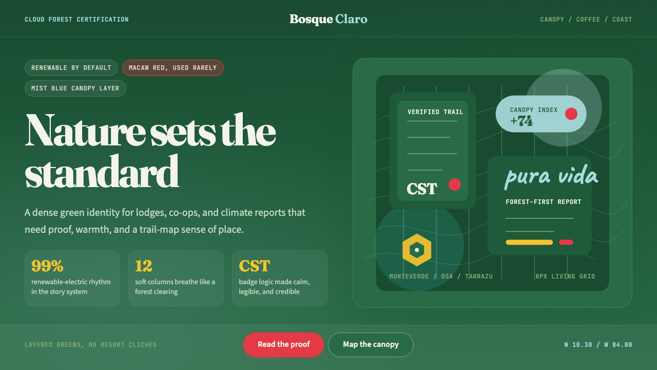 Costa Rica Pura Vida EcoAlive without greenwash. Cloud-forest green, Fraunces serif, and scarlet acce…
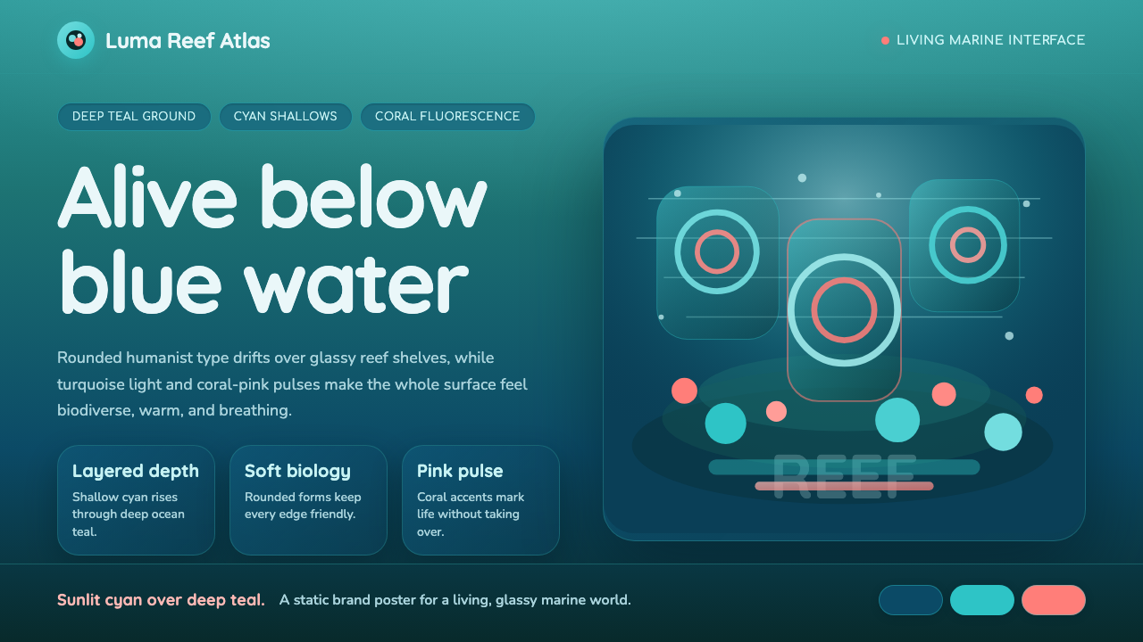 Great Barrier ReefAlive under deep teal. Quicksand curves, cyan glow, and coral-pink pulses bui…
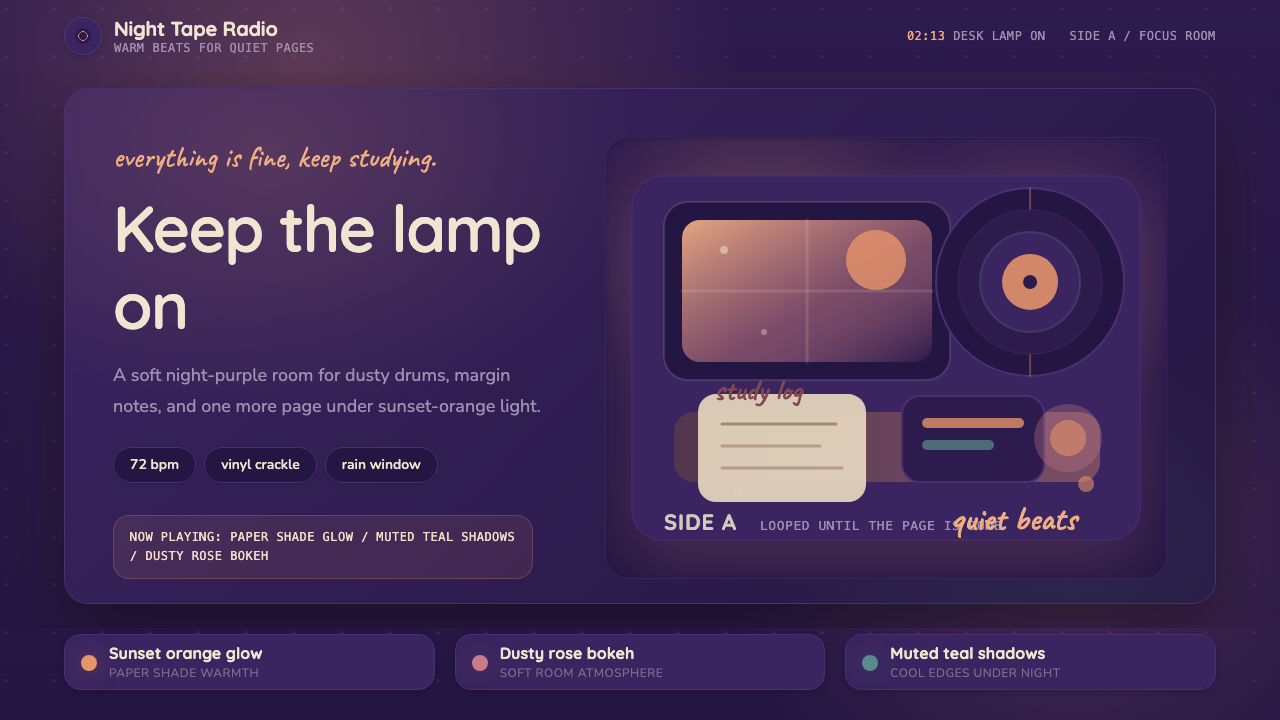 Lo-fi Hip Hop / ChillhopCozy focus at 2am. Night purple, Quicksand type, and sunset-orange lamp glow.
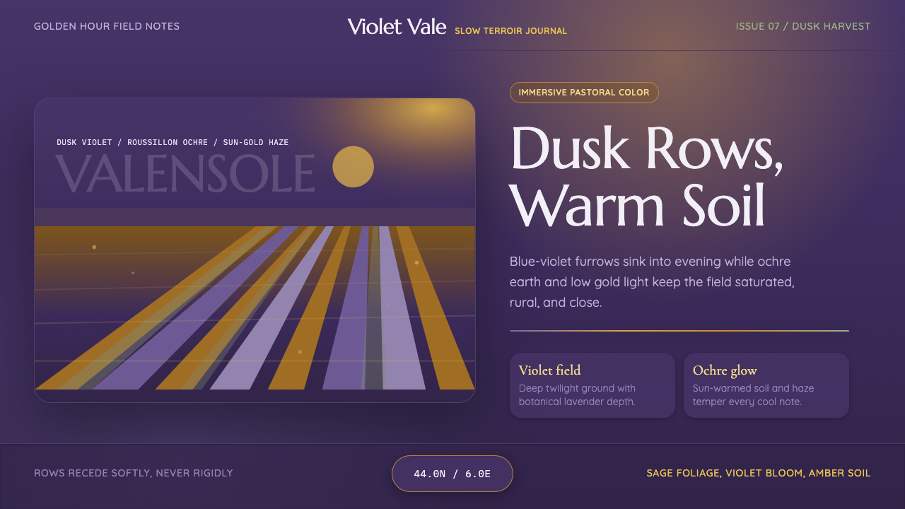 Provence LavenderSaturated pastoral dusk. Violet rows, ochre soil, and sun-gold haze build the…