About Calm App Purple Meditation
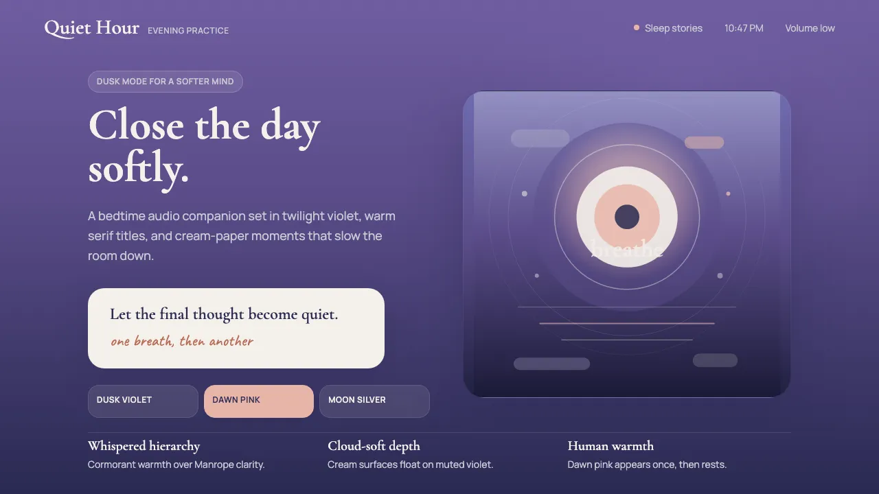
Calm's visual identity lives at the threshold between day and night — a dusk-purple gradient that evokes the exact moment you set your phone on the nightstand and close your eyes. Editorial serif warmth (Cormorant Garamond) pairs with matte cream type on atmospheric violet, creating a "friendly luxury" register that whispers rather than shouts. Dawn-pink accents provide human warmth without breaking the twilight spell.
- Origin
- San Francisco / London
- Era
- 2012 founded; current visual language ~2018–2024
- Key figures
- Michael Acton Smith · Alex Tew · Tamara Levitt · Mo Gawdat
- Movements
- mindfulness consumer-app wave · sleep-stories audio-content genre · post-2015 wellness-tech
Calm App Purple Meditation design spec
Colors
Background
Surface
Primary
Secondary
Accent
Text
Typography
Cormorant GaramondHeadings
ManropeBody
JetBrains MonoMono
Unlock for 1 credit
The other 11 sections — buttons, cards, spacing, motion, techniques and more — open once you unlock. Download the DESIGN.md or send it to your AI in one click. Unlock once, yours forever.
Sign up nowHave an account? Sign in
Styles similar to Calm App Purple Meditation
Also inspired by brands & products, with a close feel.
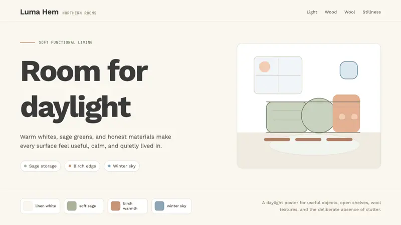 Scandi Hygge (IKEA)Warmth from restraint. Sage, linen white, Work Sans, and wide breathing room.
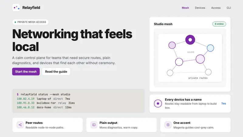 Tailscale Mesh VPN 2024Friendly infrastructure. Cool grey cards, magenta mesh nodes, and mono CLI blocks.
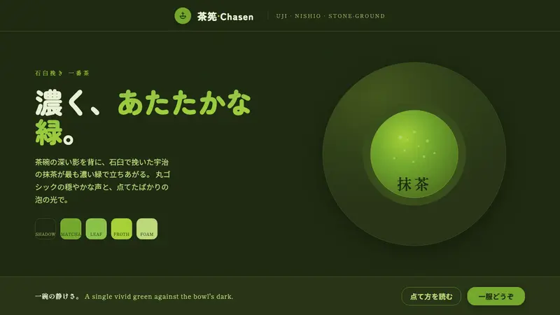 Matcha Latte Powder GreenA single vivid green at full strength. Stone-ground matcha on a dark tea-bowl shadow, rounded type.
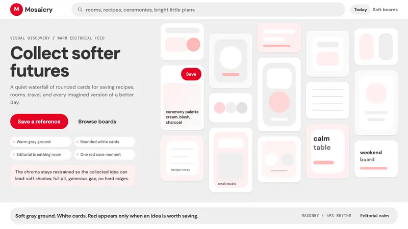 Pinterest 2024Aspirational calm. Warm gray masonry, rounded white pins, one surgical red save pill.