What is Outer Wilds?
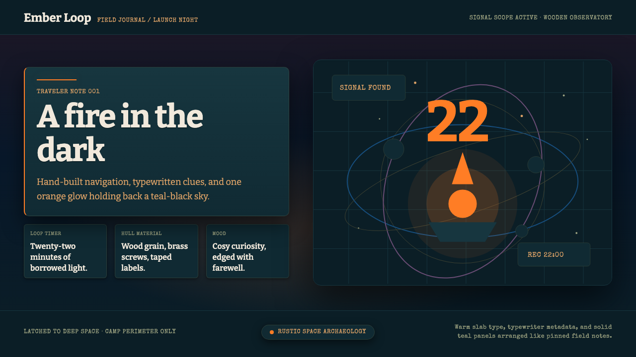
Outer Wilds lives inside one image — a marshmallow roasting under an exploding sun — and builds a whole visual language of homemade wonder and quiet grief around it.
Outer Wilds in brief
Outer Wilds is a style drawn from a single independent video game: a solar-system-scale exploration adventure where the whole identity condenses into one founding image — a small campfire, a marshmallow on a stick, and a sun about to go supernova in the sky above. Around that image, the aesthetic builds outward from cosy firelight into a vast, cool, star-filled dark.
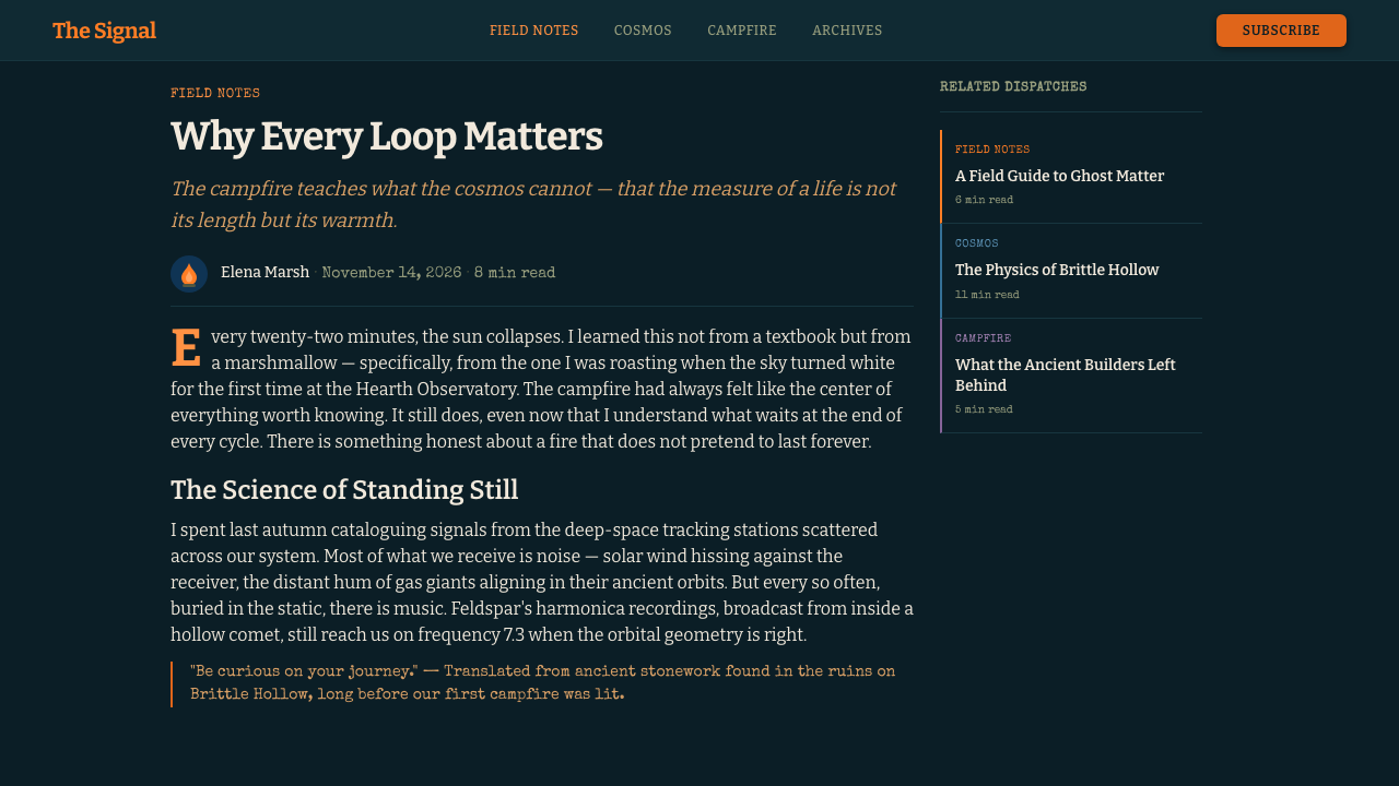
The visual world is deliberately homemade rather than polished. Where most space fiction reaches for sleek chrome and clean corporate surfaces, this style insists on wood grain, hand-tied knots, jury-rigged instruments, and visible seams — spacecraft that feel built in someone's shed rather than manufactured on an assembly line. Text and interface elements read as if typed on an actual typewriter: uneven, slightly imperfect, and personal, like a field researcher's notebook rather than a corporate manual.
Emotionally, the style sits in an unusual register: cosy and curious on one hand, elegiac and wistful on the other. Warm orange firelight — the one recurring point of comfort — is always surrounded by cool blues and dusky purples that suggest the scale and coldness of deep space. The effect is a kind of gentle melancholy that never tips into despair; it is the feeling of sitting somewhere small and warm while looking out at something vast, mysterious, and slightly sad.
Where does Outer Wilds come from?
Outer Wilds was created by Mobius Digital, an independent studio based in Los Angeles, and released in 2019 after originating as a student project by designer Alex Beachum at the University of Southern California's Interactive Media program. Beachum's early prototype already contained the game's central conceit: a small solar system caught in a repeating time loop, ending every twenty-two minutes when its sun goes supernova, with the player waking back at the campfire to begin again with only their memories intact.
The game belongs to a small, distinctive lineage sometimes called 'space archaeology' — games less concerned with combat or conquest than with patient observation, reading, and piecing together the history of vanished civilizations from physical and textual clues scattered across a world. Rather than granting new abilities or gear as rewards, Outer Wilds rewards the player purely with knowledge: understanding gained about the solar system's mysteries is the only form of progress the game tracks, an unusual design choice that reinforced the studio's commitment to curiosity as the core emotional driver rather than power or accumulation.
Visually and tonally, the game deliberately rejected the sleek, high-tech look common to space fiction. The player's home planet, Timber Hearth, is a woodsy, low-technology settlement where spacecraft are built by hand from wood, rope, and salvaged parts rather than manufactured in gleaming factories — a choice the developers described as wanting technology to feel handmade and approachable, something a curious person built in their backyard, rather than an intimidating product of a faceless corporation. This 'rustic NASA' sensibility extended to the game's writing, delivered largely through in-world field notes and translated alien text presented in a typewriter-style font, giving the whole experience the feel of an amateur expedition's journal rather than a slick sci-fi franchise.
The game's framing device — a ghost story told around a campfire, complete with a marshmallow roasting as the sun above literally explodes — set the emotional key for everything that followed: cosy intimacy pressed right up against cosmic scale and inevitable ending. Composer Andrew Prahlow's score, built heavily around a single recurring banjo-and-flute campfire theme that reappears, transformed, throughout the game's most pivotal moments, reinforced this pairing of the homely and the vast. Outer Wilds went on to receive significant critical recognition, including major game-of-the-year awards, and is frequently cited as a landmark example of using restraint, mystery, and emotional tone — rather than spectacle — to create a distinctive identity.
What defines the Outer Wilds look?
Campfire Orange
A warm, glowing orange marks the single point of comfort and safety in the composition — literally the campfire, and figuratively any moment of rest, arrival, or human connection. It is used sparingly, as a beacon rather than a background, so its warmth stays meaningful against the surrounding cool.
Cosmic Teal-Black
The dominant field is not pure black but a deep, cool teal-black night sky — vast, dark, and quietly beautiful rather than menacing. This teal undertone keeps the darkness from feeling flat or cold in an unwelcoming way; it reads as a night worth looking up into.
Dusky Purple
A secondary cool tone, softer and dustier than the teal-black, appears at transitions and horizons — the color of a sky between day and night, or a distant nebula. It bridges the campfire's warmth and the cold of deep space, softening what would otherwise be a stark contrast.
Typewritten Voice
Text reads as though produced on an actual typewriter — slightly uneven, personal, unpolished in a deliberate and charming way, like a field researcher's notebook rather than a corporate document. This applies as much to tone of voice as to letterform: sentences feel handwritten in spirit even when set in type.
Hand-Built Materiality
Objects and surfaces suggest wood grain, tied rope, and jury-rigged assembly rather than sleek manufactured chrome. Seams and joints are visible rather than hidden, giving everything the feel of something built by a curious individual rather than mass-produced by an anonymous industry.
Small Warm Point, Vast Cool Field
Compositions consistently pair one small area of warm orange light against a very large surrounding area of cool dark — the campfire in the night, the porch light against the sky. This scale contrast is the style's core emotional engine: intimacy made more poignant by immensity.
Gentle Melancholy
The overall mood sits between cosy and wistful — curiosity and comfort are always tinged with an awareness of impermanence, echoing a story built around a recurring, inevitable ending. This is never bleak; it is the specific, bittersweet tone of looking at something beautiful while knowing it will not last.
Who shaped Outer Wilds?
Beachum originated Outer Wilds as a student project at the University of Southern California before co-founding Mobius Digital to develop it into a full release. His early prototype already contained the game's defining conceit — a small solar system caught in a repeating time loop ending in supernova — establishing the emotional and structural DNA that the finished visual style grew from.
The Los Angeles-based independent studio that developed and released Outer Wilds in 2019. Working with a small team and independent budget, the studio made a deliberate choice to reject sleek, high-tech space-fiction visuals in favor of a homemade, wood-and-rope aesthetic, prioritizing emotional tone and curiosity-driven design over spectacle.
Prahlow composed the game's score, built around a recurring campfire theme played on banjo and flute that reappears, transformed, at the game's most emotionally significant moments. His music is widely credited with cementing the pairing of homely warmth and cosmic scale that defines the style's emotional register.
How do you use Outer Wilds today?
Outer Wilds suits products that want to feel curious, warm, and a little wistful rather than slick or corporate — anything positioned around exploration, discovery, personal projects, or storytelling that benefits from an intimate, handmade tone rather than polished professionalism.
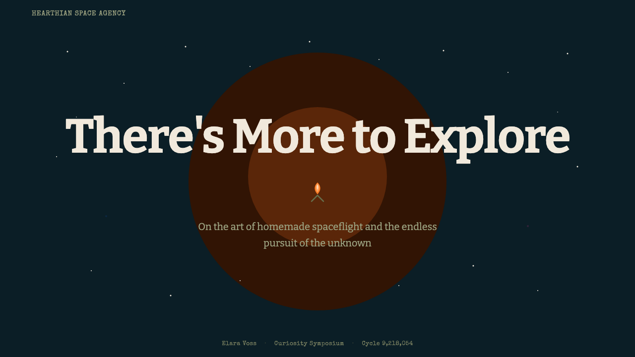
For presentation slides, a cover page works well built around a single warm point of light against a large cool dark field — a small illustrated glow in one corner, the rest of the slide given over to a deep teal-black expanse. Content slides should keep supporting text feeling typewritten and personal rather than corporate, using generous space so each idea feels like a small warm discovery rather than a dense report. Data on this style's slides works best presented sparingly and narratively, framed as 'things we learned' rather than raw metrics tables.
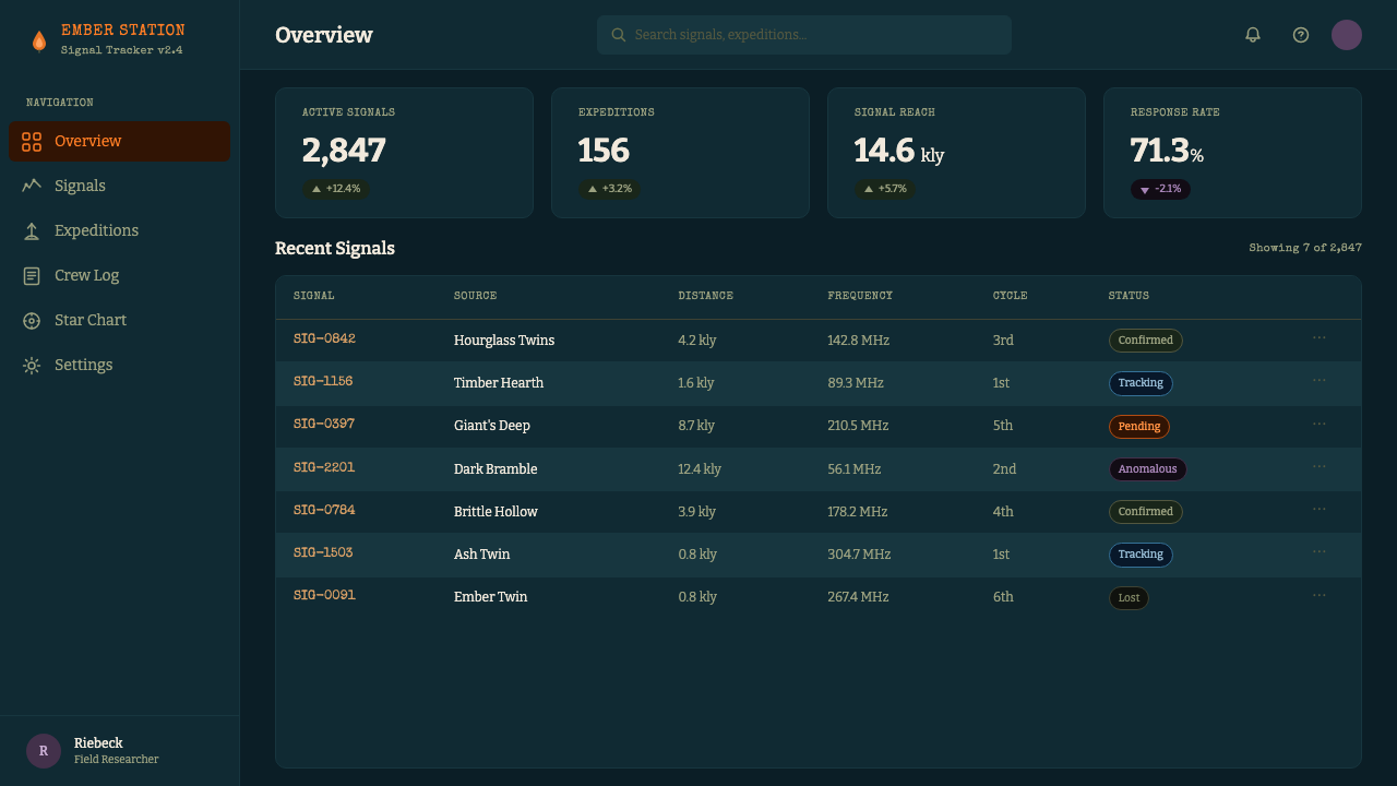
For web interfaces, the style suits personal projects, indie creative tools, storytelling platforms, and educational products where curiosity and discovery are core to the experience. Dashboards benefit from treating each metric or notification as a small warm point against a calm dark field, avoiding the temptation to light up every element — restraint keeps the warmth meaningful. Pricing pages can lean into the wistful, honest tone of the voice: plain, typewriter-style language explaining what each tier offers works better here than glossy marketing copy.
For editorial and marketing content, the style is a strong match for long-form narrative writing, travel and exploration content, and anything framed as a personal journal or field log. A campfire-lit opening image or anecdote, followed by a gradual expansion into a cooler, larger visual field, mirrors the game's own structure and creates an effective emotional arc for an article or landing page.
A common mistake is making the aesthetic too clean or too saturated — glossy, sleek surfaces or bright, uniform lighting undo the handmade, lived-in quality that gives the style its warmth. Another is losing the scale contrast: if warm and cool tones are used in roughly equal measure across a composition, the emotional effect of 'small comfort against vast mystery' disappears, and the result reads as generic space-themed decoration rather than this specific, wistful style.
Outer Wilds — FAQ
Why does this style pair cosiness with melancholy instead of pure wonder or pure comfort?
Because its source material is built around a repeating ending — every cycle in the originating game concludes with the sun exploding, and the player's only comfort is the campfire and the people gathered around it before that happens. That structure makes warmth and loss inseparable: the campfire matters precisely because the sky above it is not permanent. Reproducing only the cosiness or only the cosmic scale, without holding both at once, loses what makes the style distinctive.
Can this style work with a bright, cheerful color scheme instead of a dark night palette?
Not comfortably, because the dark, cool field is what gives the campfire orange its meaning — a small warm point matters only against a vast surrounding cool. A bright, uniformly cheerful palette removes that scale contrast entirely, and with it the specific bittersweet emotional effect the style depends on. Warmth needs somewhere dark and vast to glow against.
How 'rough' or unpolished should hand-built elements actually look?
Rough enough to feel personal and built by hand, but not so rough that it reads as neglected or low-quality. The reference point is a well-made, well-loved object built by someone skilled but working with limited resources — visible joints and honest materials, not sloppy construction. The goal is warmth and approachability, not disrepair.
Does this style suit corporate or enterprise-facing products?
Rarely. Its core appeal is intimacy, curiosity, and a handmade, personal voice — qualities that sit uneasily with an enterprise context that typically wants to project scale, authority, and polish. It is a much stronger fit for indie creative tools, personal projects, educational or storytelling products, and anything that benefits from feeling like it was made by a small, curious team rather than a large organization.
What is the significance of the campfire and marshmallow motif specifically?
It comes directly from the opening moments of the game the style is drawn from, where the player sits at a campfire roasting a marshmallow while a ghost story is told about the sun exploding overhead — which then actually happens. That single image compresses the entire emotional thesis of the style: an ordinary, comforting ritual continuing calmly even as something vast and irreversible unfolds above it. It functions less as a literal decorative element to reproduce everywhere and more as the emotional key that everything else in the style is tuned to.
Related design styles
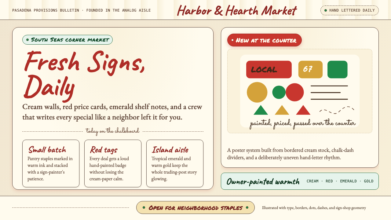 Trader Joe's Hand-LetteredHandmade grocery warmth. Cream chalkboards, red price tags, emerald accents.
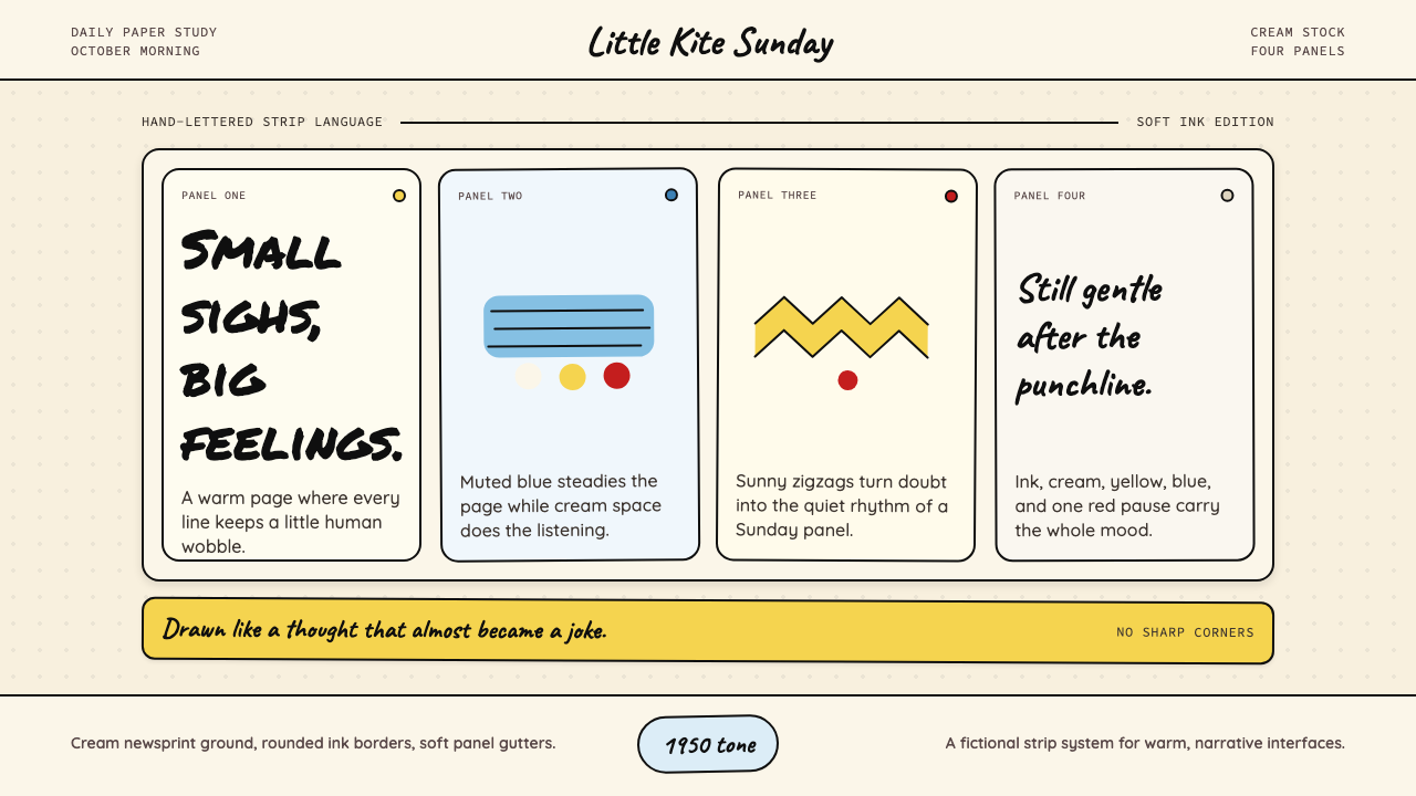 Peanuts Comic Schulz (1950)Gentle melancholy on newsprint. Caveat lettering, cream panels, yellow and bl…
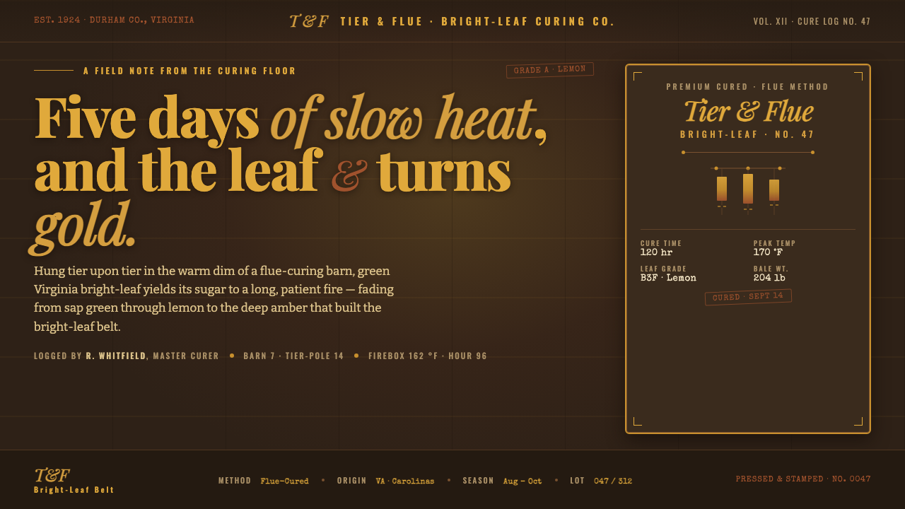 Tobacco Curing BarnSlow heat turns leaf to gold. Amber and sienna glowing on dark timber, label-…
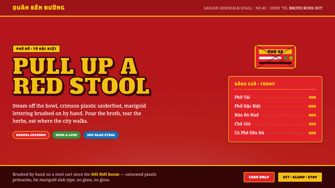 Vietnamese Pho Street CartEat where the city walks. Crimson enamel ground, fat marigold slab signage, b…
 Aardman ClaymationHandmade warmth, visibly touched. Clay-orange panels, Caveat notes, thumbprin…
 Hershey's Chocolate Brown (1894)Plain, enduring, warm. Cocoa brown meets silver foil on cream paper.