What is Hershey's Chocolate Brown (1894)?什么是 Hershey's Chocolate Brown (1894)?
Since 1894, a single warm cocoa brown — paired with silver foil and cream paper — has made Hershey's the most recognizable chocolate brand in American history.自1894年起,一抹温暖的可可棕,搭配银箔与奶油纸面,让好时成为美国历史上辨识度最高的巧克力品牌。
Hershey's Chocolate Brown (1894) in briefHershey's Chocolate Brown (1894) 速览
Hershey's Chocolate Brown is the warm, slightly red-shifted cocoa tone that has anchored American milk chocolate packaging for well over a century. The visual identity pairs this deep, matte brown with silver-foil accents and cream-tinted paper surfaces, producing a palette that feels simultaneously rustic and refined — substantive without being luxurious, familiar without being cheap.好时巧克力棕是一种温暖、略带红调的可可色,百余年来始终是美国牛奶巧克力包装的视觉锚点。整套视觉体系将这种深沉而哑光的棕色与银箔装饰及奶油色纸面搭配,呈现出一种既质朴又精炼的色彩关系——有分量却不奢华,亲切却不廉价。
The design language is built on rectilinear geometry — the rectangular chocolate bar itself becomes the organizing metaphor — combined with condensed serif wordmarks that convey solidity and permanence. The iconic silver-wrapped Kiss silhouette adds a sculptural, three-dimensional counterpoint to an otherwise flat compositional system. Everything in the system is load-bearing: the brown signals authenticity and the earth, the silver signals care and craft, the cream signals wholesomeness.设计语言建立在矩形几何之上——巧克力块本身即成为构图的组织隐喻——配合紧凑的衬线字标,传递出稳固与恒久感。标志性的银色Kisses轮廓为整体上趋于平面的构图系统增添了雕塑般的三维对位。这套系统中的每个元素都承担着叙事重量:棕色代表真实与土地,银色代表用心与工艺,奶油色代表纯朴与滋养。
What distinguishes this palette from generic 'chocolate brown' branding is its specific warmth and saturation. The tone is rich enough to feel indulgent yet matte enough to feel honest. It does not chase the glossy darkness of premium European chocolate branding, nor does it reach for the light, caramel warmth of artisan confections. It occupies a deliberate middle register — democratic, enduring, and distinctly American.这套色板之所以有别于泛泛的「」克力棕「」牌形象,在于它特定的温度与饱和度。这个色调足够丰盈以令人感受到愉悦,又足够哑光以显得诚实。它既不追求欧洲高端巧克力品牌的光泽深邃,也不向往手工甜品的浅浅焦糖暖意,而是刻意占据了一个居中的音域——大众化、持久、且具有鲜明的美国气质。
See the Hershey's Chocolate Brown (1894) design system查看 Hershey's Chocolate Brown (1894) 完整设计系统
Where does Hershey's Chocolate Brown (1894) come from?Hershey's Chocolate Brown (1894) 从何而来?
Milton Snavely Hershey did not begin as a chocolatier. He spent much of his early career failing at candy businesses in Philadelphia, New York, and Chicago before returning to his native Lancaster County, Pennsylvania, where he finally found commercial traction with caramels. In 1893, attending the World's Columbian Exposition in Chicago, Hershey encountered German chocolate-making machinery on display and became convinced that milk chocolate — then an expensive European luxury — could be manufactured at mass scale for ordinary American consumers. He sold his Lancaster Caramel Company in 1900 for one million dollars and turned the proceeds toward building a factory and a town.米尔顿·斯内夫利·好时并非从一开始就是巧克力匠人。他早年在费城、纽约和芝加哥经营糖果生意屡遭失败,最终回到故乡宾夕法尼亚州兰开斯特郡,靠牛奶糖找到了商业支点。1893年,好时在参观芝加哥世界哥伦布博览会时,与展出的德国巧克力制造机械相遇,由此确信:牛奶巧克力——当时仍是价格不菲的欧洲奢侈品——完全可以大规模制造,让普通美国消费者负担得起。1900年,他以一百万美元出售了兰开斯特牛奶糖公司,将所得用于建造一座工厂和一座城镇。
The community Hershey built — literally named Hershey, Pennsylvania, incorporated in 1906 — was a company town in the most complete sense: streets named Cocoa Avenue and Chocolate Avenue, a trolley system, housing for workers, schools, a department store, and eventually an amusement park. The branding that emerged from this environment was inseparable from its geography. The visual system was not the product of a design agency or a deliberate brand strategy session; it grew organically from the materials and methods of the factory itself. Brown was the color of the product. Silver was the color of the foil that preserved it. Cream was the color of the paper that wrapped it.好时建立的社区——字面意义上命名为宾夕法尼亚州好时镇,于1906年正式设立——是最彻底意义上的公司城镇:街道以可可大道和巧克力大道命名,配有有轨电车系统、工人住房、学校、百货商店,以及后来的游乐园。在这一环境中生长出来的品牌形象,与其地理根基不可分割。这套视觉系统并非出自设计机构或刻意的品牌战略会议,而是从工厂本身的材料与工艺中有机生长而来。棕色是产品的颜色,银色是保存它的锡箔的颜色,奶油色是包裹它的纸张的颜色。
The wordmark — with its condensed, high-contrast serif letterforms — reflected the commercial printing conventions of the late nineteenth century, when bold condensed type was the standard language of American trade cards, labels, and newspaper advertising. Hershey was not making an aesthetic statement so much as speaking the visual vernacular of his era. The durability of that vernacular choice is what became remarkable: most contemporaneous packaging aesthetics have been updated repeatedly, while Hershey's has remained essentially legible across more than a century of media change.那款字标——以紧凑、高对比度的衬线字形构成——反映了十九世纪末商业印刷的惯例。在那个年代,粗重紧凑的字体是美国商业卡片、标签和报纸广告的标准视觉语言。好时并非在做美学宣言,他只是在使用那个时代的视觉白话。这一白话选择所展现出的持久力,才是真正令人瞩目之处:同时代的大多数包装美学都经历了反复更新,而好时的视觉面貌在超过百年的媒介变迁中基本保持清晰可辨。
William F. R. Murrie, who served as president of Hershey Chocolate Company from 1908 to 1947, helped stabilize and institutionalize the brand during its critical growth decades. The Hershey Trust, established by Milton Hershey in 1909 to benefit the Milton Hershey School, became the controlling institutional entity whose conservatism reinforced brand continuity. Each generation of custodians faced market pressure to modernize the visual system and, in each generation, made only the minimum necessary adjustments — gradual refinements of proportion and printing technique without rupturing the core palette. The result is one of the longest unbroken runs of brand consistency in American consumer goods history.威廉·F·R·穆里在1908年至1947年间担任好时巧克力公司总裁,在品牌关键成长的数十年里帮助其走向稳定与制度化。米尔顿·好时于1909年为资助米尔顿好时学校而创立的好时信托,成为掌控该品牌的机构实体,其保守主义进一步强化了品牌延续性。每一代的品牌守护者都面临着将视觉系统现代化的市场压力,而每一代人的应对都只是做最低限度的必要调整——对比例与印刷工艺的渐进式精炼,而不触动核心色板。其结果,是美国消费品史上持续时间最长的品牌一致性之一。
What defines the Hershey's Chocolate Brown (1894) look?Hershey's Chocolate Brown (1894) 的视觉特征是什么?
Signature Brown标志性棕色
The defining tone is a deep, warm cocoa brown with a perceptible red undertone — neither the cool darkness of unsweetened baking chocolate nor the golden warmth of caramel. It reads as substantive and grounded in all lighting conditions, holding its character whether printed on matte paper, embossed on foil, or rendered on a backlit screen. The warmth is essential: it signals the actual sensory experience of milk chocolate, not an abstracted or aspirational version of it.核心色调是一种深沉、温暖的可可棕,带有可感知的红色底调——既非无糖烘焙巧克力的冷暗,亦非焦糖的金黄暖意。在任何光线条件下,它都显得厚重而踏实,无论印在哑光纸上、压印在铝箔上,还是在背光屏幕上渲染,都保持着自身的性格。这份温度至关重要:它传递的是牛奶巧克力真实的感官体验,而非某种抽象化或理想化的版本。
Silver Foil Accent银箔点缀
Silver is the system's contrast agent and its link to craft. Originally a functional material — the aluminum foil that kept milk chocolate fresh — the silver accent became an integral visual element that lifts the palette out of pure earthiness into something more considered. Where the brown is warm and opaque, the silver is cool and reflective, creating a complementary tension. In print and packaging, this relationship is physical; in digital or presentation work, a cool neutral or metallic tone carries the same structural role.银色是整套系统的对比介质,也是与工艺感的连接。银箔最初是功能性材料——保持牛奶巧克力新鲜的铝箔——后来成为不可或缺的视觉元素,将色板从纯粹的土地感提升至更具思量的层次。棕色温暖而不透明,银色清冷而有反光,两者形成互补的张力。在印刷与包装中,这种关系是物质性的;在数字或演示作品中,一种清冷中性或金属调色调承担着相同的结构角色。
Cream Ground奶油底面
Pure white is conspicuously absent from the authentic Hershey palette. The ground is consistently cream — slightly warm, slightly aged — which softens the contrast between brown and silver and gives the overall system an approachable, handcrafted quality. Cream also links the visual identity to the dairy origin of milk chocolate: the palette literally evokes cacao, foil, and fresh cream. This warmth distinguishes the system from colder, more clinical brand palettes.纯白色在正宗好时色板中显著缺席。底面始终是奶油色——略带暖意、略有岁月感——它柔化了棕色与银色之间的对比,赋予整套系统亲切、手工感的气质。奶油色也将视觉识别与牛奶巧克力的乳品来源联系起来:这套色板在字面上唤起可可豆、铝箔与新鲜奶油的意象。这份温度使这套系统有别于更清冷、更临床感的品牌色板。
Condensed Serif Wordmark紧凑衬线字标
The lettering style is emphatically condensed — tall, narrow, and high-contrast in stroke weight — which gives the wordmark physical presence without requiring large point sizes. The serifs anchor each letter firmly to its baseline, conveying stability and a sense of institutional permanence. This is not the playful rounded lettering of modern snack branding, nor the geometric precision of contemporary wordmarks; it belongs to a tradition of American commercial signage and trade typography that reads as both historical and authoritative.字体风格明显紧凑——高挑、窄细、笔画粗细对比强烈——使字标在不需要大尺寸的情况下具有视觉存在感。衬线将每个字母牢牢锚定在基线上,传递出稳定感与机构恒久性。这不是当代零食品牌常见的圆润活泼字体,也不是当代字标惯用的几何精准感;它属于美国商业招牌与商贸排印的传统,兼具历史感与权威感。
Rectilinear Block Geometry矩形块体几何
The rectangular chocolate bar — segmented into a grid of identical blocks — is both product and compositional logic. Layouts derived from this system favor strong horizontal and vertical axes, clear contained sections, and deliberate use of repetition. There are no organic shapes, flowing curves, or decorative roundels; even the Kiss silhouette, though conical, is a precise geometric form. The geometry communicates consistency, precision, and the reassurance that what you see is exactly what you get.切分为整齐方格的矩形巧克力块,既是产品本身,也是构图逻辑。由此衍生的版面偏好强烈的水平与垂直轴线、清晰的封闭区块,以及刻意运用的重复性。没有有机形态、流动曲线或装饰性圆形徽章;即便是Kisses的轮廓,虽呈锥形,也是精确的几何形。这种几何语言传递出一致性、精准感,以及「」见即所得「」踏实保证。
Restrained Decoration克制的装饰
The system is not undecorated — there are rules, borders, and embellishments that frame the wordmark — but every decorative element is subordinate and modest. Borders are thin and rectilinear; no flourishes escape the discipline of the overall system. This restraint is historically grounded: late nineteenth-century commercial printing conventions demanded that labels be legible at small scale and reproducible on industrial presses with limited colors. The resulting economy became a virtue that the brand has never abandoned.这套系统并非没有装饰——字标周围有规则线、边框和细微点缀——但每一个装饰元素都处于从属、低调的位置。边框细而方正,没有任何花饰逃脱整体系统的约束。这种克制有其历史根基:十九世纪末的商业印刷惯例要求标签在小尺寸下清晰可辨,且能以有限色数在工业印刷机上复制。由此形成的经济性成为一种美德,而好时从未放弃这一美德。
Cross-Media Stability跨媒介稳定性
One of the system's remarkable properties is how well it migrates across radically different media. The same palette that reads as warm and trustworthy on a foil-wrapped candy bar also functions on a billboard, a television commercial, a digital banner, a glass storefront, and a slide deck. The depth of the brown provides enough contrast on both light and dark backgrounds; the silver accent adapts from physical metallic surfaces to digital highlights without losing its relational logic. This media-agnosticism was not designed in — it was an accidental property of choosing materials honestly.这套系统的一个显著特质,是它在截然不同的媒介之间迁移的能力。在铝箔包装糖果上显得温暖可信的色板,在广告牌、电视广告、数字横幅、玻璃橱窗和幻灯片中同样有效。棕色的深度在浅色和深色背景上都提供了足够的对比度;银色点缀从物质性金属表面转化为数字高光时,也不失其关系逻辑。这种媒介无关性并非刻意设计而来——它是诚实选用材料的一个意外属性。
See the Hershey's Chocolate Brown (1894) design system查看 Hershey's Chocolate Brown (1894) 完整设计系统
Who shaped Hershey's Chocolate Brown (1894)?谁塑造了 Hershey's Chocolate Brown (1894)?
Milton Hershey (1857–1945) is the origin point of the entire visual system, not because he was a designer but because he made the foundational material decisions — brown foil over cream paper — that became the brand. His instinct was practical rather than aesthetic: he used what the factory produced and what the market supplied. That practicality, applied consistently over decades, created one of the most durable brand identities in American commercial history. His philanthropic vision — the Milton Hershey School, funded by the Hershey Trust — also shaped the institutional conservatism that has kept the visual system intact across ownership changes and market pressures.米尔顿·好时(1857—1945年)是整套视觉系统的原点,并非因为他是设计师,而是因为他做出了奠基性的材料决策——奶油纸面上的棕色锡箔——这些决策成为了这个品牌。他的直觉是务实而非美学的:他使用工厂出产的、市场供应的材料。这种务实性持续数十年的一贯运用,创造了美国商业史上最为持久的品牌形象之一。他的慈善愿景——由好时信托资助的米尔顿好时学校——也塑造了一种机构保守主义,使这套视觉系统在所有权更迭与市场压力下保持完整。
Murrie served as president of Hershey Chocolate Company from 1908 to 1947, stewarding the brand through two world wars, the Great Depression, and the company's dramatic expansion. His tenure corresponds precisely to the period in which the visual identity solidified from a provisional commercial label into an institutionalized brand standard. Murrie's son Bruce would later co-found M&M's with Forrest Mars — a fact that underscores how central the Hershey operation was to the entire landscape of American confectionery branding in the mid-twentieth century.穆里在1908年至1947年间担任好时巧克力公司总裁,带领品牌跨越两次世界大战、大萧条,以及公司的急剧扩张期。他的任期恰好对应视觉识别从临时商业标签固化为制度化品牌标准的时期。穆里的儿子布鲁斯后来与福瑞斯特·马士联合创立了M&M's——这一事实突显了好时在二十世纪中叶整个美国糖果品牌格局中的核心地位。
Established by Milton Hershey in 1909 to benefit the Milton Hershey School for orphaned and underprivileged children, the Hershey Trust has controlled a majority stake in the Hershey Company for over a century. As the ultimate governing body, it has consistently prioritized brand stability and long-term institutional integrity over short-term market trends. Each time professional marketers or outside consultants proposed aggressive visual modernization, the Trust's conservatism acted as a counterweight. This institutional structure — unusual in consumer goods — is a principal reason the brand's visual identity has survived essentially intact.好时信托由米尔顿·好时于1909年创立,旨在资助米尔顿好时孤儿与贫困儿童学校,并由此控制好时公司逾百年。作为最终治理机构,它一贯将品牌稳定性和长期机构完整性置于短期市场趋势之上。每当专业营销人员或外部顾问提出激进的视觉现代化方案时,信托的保守主义都充当了平衡力量。这种机构结构——在消费品行业颇为罕见——是品牌视觉形象基本完好延续至今的主要原因。
The standardization of Hershey's silver-foil-over-brown-paper wrapping in the early twentieth century involved a generation of anonymous production engineers and packaging suppliers whose decisions — about foil gauge, paper grade, and print color consistency — quietly fixed the palette in its final form. D. L. Miller and contemporaries in Hershey's manufacturing operations represent this often-overlooked dimension: brand identity is not only the product of designers but of material supply chains. The specific quality of Hershey's brown is partly a function of the inks and papers available to Pennsylvania commercial printers in the 1900s and 1910s.二十世纪初好时银箔加棕色纸张包装的标准化,涉及一代无名的生产工程师与包装供应商,他们关于箔材厚度、纸张规格与印刷色彩一致性的决策,悄然将这套色板固定在最终形态。D·L·米勒及好时制造运营部门的同代人,代表了这一被忽视的维度:品牌形象不仅是设计师的产物,也是材料供应链的产物。好时棕色的特定质感,部分取决于1900至1910年代宾夕法尼亚州商业印刷商所能获得的油墨与纸张。
Harry Burnett Reese, a former Hershey employee, founded the H. B. Reese Candy Company in 1923 and began marketing Reese's Peanut Butter Cups — eventually acquired by Hershey in 1963. The Reese's visual identity, while distinct in its use of orange, operates within the same warm-brown gravitational field established by the parent company. The relationship between the two palettes demonstrates how Hershey's core brown functions as a brand ecosystem anchor: sub-brands can introduce new accent colors while remaining tonally coherent with the master palette.好时前员工哈里·伯内特·里斯于1923年创立H·B·里斯糖果公司,开始销售里斯花生酱杯——该公司于1963年被好时收购。里斯的视觉形象虽以橙色为区分色,却在母公司确立的温棕引力场内运作。两套色板之间的关系揭示了好时核心棕色作为品牌生态系统锚点的功能:子品牌可以引入新的强调色,同时在色调上与主色板保持连贯。
How do you use Hershey's Chocolate Brown (1894) today?今天怎么用 Hershey's Chocolate Brown (1894)?
Hershey's Chocolate Brown is one of the most instructive historical palettes for designers working on brands, presentations, or editorial projects that need to communicate warmth, heritage, and democratic accessibility. Applying it correctly requires understanding what the system is actually doing: it uses deep warm brown as a structural anchor, silver as a precision accent, and cream as a breath-giving ground. The mistake most designers make is substituting pure white for cream — which immediately shifts the system from its characteristically warm, approachable register into something colder and more clinical.好时巧克力棕是设计师处理需要传递温暖感、历史感与大众亲切感的品牌、演示或编辑项目时,最具参考价值的历史色板之一。正确应用它,需要理解这套系统实际在做什么:它用深暖棕作为结构锚点,用银色作为精准点缀,用奶油色作为给画面以呼吸空间的底面。大多数设计师最常犯的错误,是用纯白替代奶油色——这会立即将系统从其特有的温暖亲切基调推向更清冷、更临床的感觉。
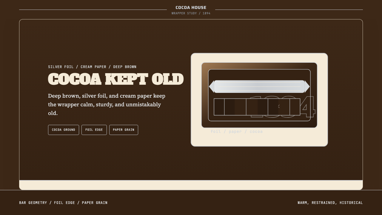
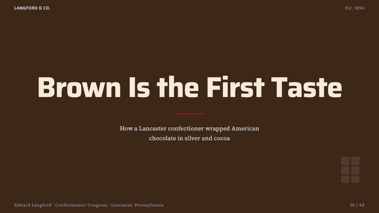
For presentation decks, the palette works exceptionally well across cover, section divider, and content slides. A cover built from this system places the title in cream or silver type against a full-bleed brown field — bold, immediate, and visually warm. Section dividers can echo the chocolate-bar metaphor by using a grid of brown rectangles with one highlighted block to signal position. Content slides benefit from a cream or off-white ground with brown used only for headers and structural rules; silver or a desaturated warm tone serves supporting text. Data visualizations should follow the palette's hierarchy: primary series in brown, secondary in silver, tertiary in cream — creating charts that read as designed objects rather than software defaults.在演示文稿中,这套色板在封面、章节分隔页与内容页上都表现出色。以这套系统构建的封面,将标题以奶油色或银色文字置于满铺棕色底面之上——大胆、直接、视觉温暖。章节分隔页可以呼应巧克力块的隐喻,以棕色矩形方格构成网格,并高亮其中一个方格标示当前位置。内容页适合以奶油色或近白色作底,棕色仅用于标题与结构线;银色或低饱和度暖色调用于辅助文字。数据可视化应遵循色板的层级:主系列用棕色,次系列用银色,第三层级用奶油色——创造出有设计感的图表,而非软件默认样式。
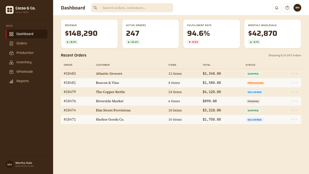
For web dashboards and pricing pages, the Hershey palette maps well onto interfaces where trust, stability, and clarity are design priorities. A dashboard using this system keeps its background in cream or a very light warm neutral, uses deep brown for navigation elements and primary data labels, and reserves silver for metadata, secondary values, and borders. Pricing tiers benefit from the brown-to-silver range as a natural low-to-high or standard-to-premium signal. Interactive states — hover, selected, active — can shift the brown deeper or introduce a warm highlight, staying within the palette's tonal logic. Avoid the temptation to introduce pure white, cool gray, or blue-tinted neutrals, which immediately break the system's warmth.对于网页仪表板和定价页面,好时色板适合信任感、稳定性与清晰度是设计优先级的界面。使用这套系统的仪表板将背景保持在奶油色或极浅的暖中性调,用深棕色处理导航元素与主要数据标签,将银色留给元数据、次要数值与边框线。定价等级受益于棕色到银色的自然过渡,可作为标准到高级的视觉信号。交互状态——悬停、选中、激活——可以让棕色加深或引入暖色高光,始终在色板的色调逻辑之内。避免引入纯白、冷灰或带蓝调的中性色,它们会立即打破系统的温度。
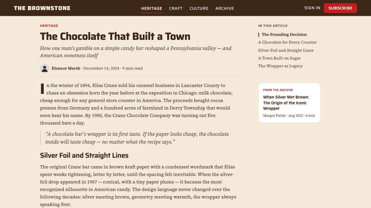
For editorial and marketing materials, the palette supports a poster-like boldness that reflects its confectionery origins. Feature spreads work well with brown as a full-bleed section background, cream body text, and silver pull-quotes or subheadings. Marketing pages aimed at heritage positioning — anniversary campaigns, product-origin storytelling, institutional credibility — fit naturally within this system because the palette already reads as historical and authentic. The cream ground, in particular, carries connotations of aged paper and handcraft that modern pure-white backgrounds lack. Packaging mockups, editorial features, and brand history timelines are natural applications.对于编辑和营销材料,这套色板支持一种海报式的大胆感,反映其糖果业的起源。特写版面适合以棕色铺满区块背景、奶油色正文、银色引用语或小标题。面向历史定位的营销页面——周年纪念活动、产品溯源叙事、机构公信力——与这套系统天然契合,因为这套色板本身已经读来像历史的、真实的。奶油色底面尤其承载着旧纸张与手工制作的意涵,这是当代纯白背景所不具备的。包装效果图、编辑专题和品牌历史时间轴都是这套色板的自然应用场景。
A common mistake when applying this palette is treating the brown as a neutral and building a full-saturation color system on top of it. Brown is not a neutral here — it is a primary actor, carrying emotional weight and brand authority. Introducing competing warm colors (orange, amber, gold at high saturation) fights with the brown rather than supporting it. A second common error is over-relying on silver as a decorative element; silver earns its place in this system through restraint. Use it for one or two elements per composition — a border, a headline, a key data point — and let brown do the majority of the structural work. When both errors are avoided, the palette rewards designers with a system that ages gracefully and reads as trustworthy across nearly every medium.应用这套色板时最常见的错误,是将棕色当作中性色,在其上方构建一套全饱和度的色彩系统。在这套系统中,棕色不是中性色——它是主要角色,承载着情感重量与品牌权威。引入竞争性暖色(高饱和度的橙色、琥珀色、金色)会与棕色产生冲突而非支持。另一个常见错误是过度依赖银色作为装饰元素;银色在这套系统中靠克制赢得其位置。每个构图中,银色只用于一到两个元素——边框、标题、关键数据点——让棕色承担大部分结构性工作。当两个错误都得到避免时,这套色板将回馈设计师一套能够优雅经受时间检验、在几乎所有媒介中都显得可信的视觉系统。
See the Hershey's Chocolate Brown (1894) design system查看 Hershey's Chocolate Brown (1894) 完整设计系统
Hershey's Chocolate Brown (1894) — FAQHershey's Chocolate Brown (1894) · 常见问题
Is Hershey's brown a seasonal or evergreen palette?好时棕色是季节性还是常青色板?
Evergreen, by design and by track record. The palette was never tied to a seasonal color trend and has never required a trend-driven refresh because it is anchored in product reality — the color of cacao — rather than fashion. This is precisely what makes it instructive for designers: a palette grounded in material truth tends to outlast palettes grounded in aesthetic fashions. The system does adapt seasonally through accent elements — red and green foil wrapping at Christmas, pastel foil for Easter — but the core brown remains constant and serves as the stable reference against which seasonal variations read.常青色板——无论从设计初衷还是历史记录来看。这套色板从未与季节性色彩趋势挂钩,也从未需要以趋势为驱动的更新,因为它锚定于产品现实——可可豆的颜色——而非时尚。这正是它对设计师最具启发性的地方:根植于材料真实的色板往往比根植于美学时尚的色板更为持久。这套系统确实会通过强调元素做季节性适应——圣诞节的红绿银箔包装、复活节的粉彩银箔——但核心棕色始终不变,是季节性变化赖以参照的稳定基准。
How does this palette differ from premium chocolate branding like Lindt or Godiva?这套色板与瑞士莲或歌帝梵等高端巧克力品牌有何不同?
Premium European chocolate brands typically use a darker, cooler brown — approaching near-black — combined with gold rather than silver, and pure white rather than cream. The gold-white-dark combination reads as luxurious and exclusive. Hershey's system uses a warmer, lighter brown, silver instead of gold, and cream instead of white — a combination that reads as dependable, familial, and democratic. The distinction is not merely tonal; it reflects genuinely different brand propositions. Applying Hershey's palette to a premium-positioning product will undercut the luxury signal; applying a premium palette to a mass-market product will feel aspirational in a way that alienates the core audience.欧洲高端巧克力品牌通常使用更深、更冷的棕色——趋近近黑色——搭配金色而非银色,以及纯白而非奶油色。金色加白色加深棕的组合传递出奢华与排他感。好时的系统则使用更温暖、更浅的棕色,银色代替金色,奶油色代替纯白——这种组合传递出可靠、家庭化与大众亲切感。这种区别不仅仅是色调上的,它反映了真实不同的品牌定位。将好时色板应用于定位高端的产品会削弱奢华信号;将高端色板应用于大众市场产品则会产生疏离核心受众的距离感。
Can this palette work for a digital-native brand without any physical product?这套色板能用于没有实体产品的纯数字品牌吗?
Yes, but with deliberate intent. The palette's warmth and heritage associations are assets in digital contexts where most competitors default to cool, minimal, or hyper-saturated aesthetics. A fintech, legal, or institutional platform that reaches for warm brown and cream signals trustworthiness and longevity rather than novelty — which can be a meaningful differentiator. The key constraint is that the palette's heritage connotations need to serve the brand narrative: a startup positioning itself as 'the future of X' will find the historical warmth working against its messaging, while a platform emphasizing reliability, craft, or generational continuity will find it working with the message.可以,但需要有意识的考量。在大多数竞争对手默认采用清冷、极简或高饱和度美学的数字语境中,这套色板的温度感与历史联想是有价值的资产。选用温暖棕色与奶油色的金融科技、法律或机构平台,传递的是可信赖与历久弥坚,而非标榜新颖——这可以成为有意义的差异化因素。关键约束在于:这套色板的历史联想需要服务于品牌叙事。将自身定位为「」领域未来「」初创公司会发现历史温度感在对抗其信息传递,而强调可靠性、工艺感或跨代延续性的平台则会发现它在配合信息传递。
How do you handle dark-mode or inverted layouts with this palette?如何用这套色板处理深色模式或反转版面?
The Hershey palette is a light-ground system — cream and warm paper are canonical. A full dark-mode inversion is possible but requires caution. On a very dark, near-black background, the core brown can lose its warmth and read as simply dark, reducing the palette to a near-monochrome. The most effective dark-mode adaptation maintains the cream and silver as foreground type and accent elements against a deep brown background — rather than against black. This keeps the palette's relational logic intact: brown is still the primary ground, cream is still the readable surface, silver is still the precision accent. Introducing true black as the background typically pushes the system out of its tonal register and into something more generic.好时色板是浅色底面的系统——奶油色与暖色纸面是经典形态。完全的深色模式反转是可行的,但需要谨慎。在极深的近黑色背景上,核心棕色可能失去温度感,读来只是一种深色,将色板简化为近单色效果。最有效的深色模式适配方案,是将奶油色与银色保留为前景文字和强调元素,并将其置于深棕色背景之上——而非黑色背景。这样可以维持色板的关系逻辑:棕色仍是主要底面,奶油色仍是可读表面,银色仍是精准点缀。引入真正的黑色作为背景,通常会将这套系统推离其色调音域,进入更为通用的领域。
Why has the visual identity stayed so stable when most consumer brands refresh every decade?为何大多数消费品牌每十年都会焕新,好时的视觉形象却如此稳定?
Three factors account for the exceptional continuity. First, the palette is anchored in material reality rather than aesthetic fashion — brown, silver, and cream are what the product literally looks like, which means no trend cycle threatens their relevance. Second, the Hershey Trust's institutional conservatism has consistently prioritized brand heritage over marketing novelty; the Trust's century-long majority ownership is structurally unusual in consumer goods. Third, the palette achieved such broad cultural penetration — across generations and demographic groups — that the cost of change became effectively prohibitive. Hershey's brown is not just a brand color; it is part of the collective sensory memory of American childhood. That depth of association is almost impossible to rebuild if abandoned.三个因素解释了这种罕见的延续性。其一,这套色板锚定于材料现实而非美学时尚——棕色、银色与奶油色字面上就是这个产品的样子,任何流行趋势都无法威胁其相关性。其二,好时信托的机构保守主义一贯将品牌遗产置于营销新颖性之上;信托百年的多数所有权在消费品行业中是结构性的异例。其三,这套色板已经实现了如此广泛的文化渗透——跨越世代与人口群体——以至于变革的成本实际上变得令人望而却步。好时棕不仅仅是一个品牌颜色,它是美国童年集体感官记忆的一部分。这种深度的情感联结,一旦放弃几乎不可能重建。
Related design styles相关设计风格
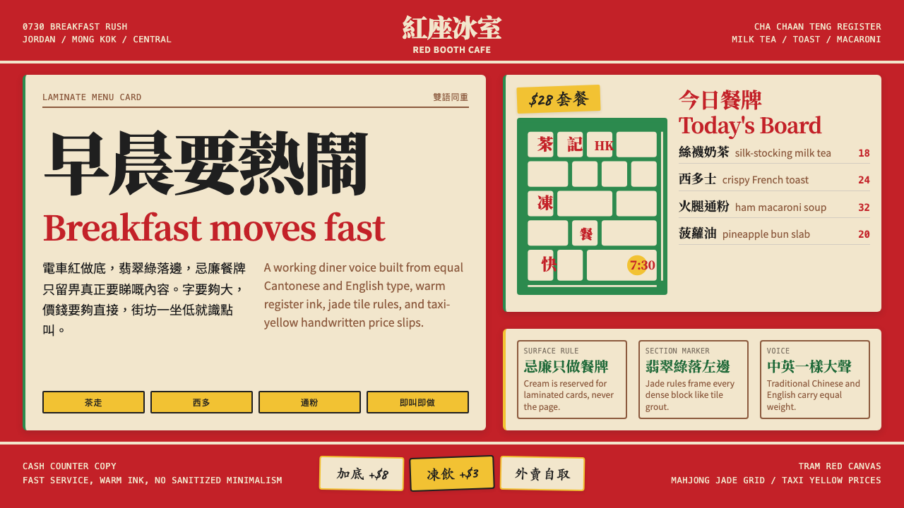 Hong Kong Cha Chaan TengDemocratic diner warmth. Tram red, jade rules, cream menu cards, equal Canton…街坊飯堂的熱度:電車紅、翡翠綠線、忌廉餐牌,中英並重。
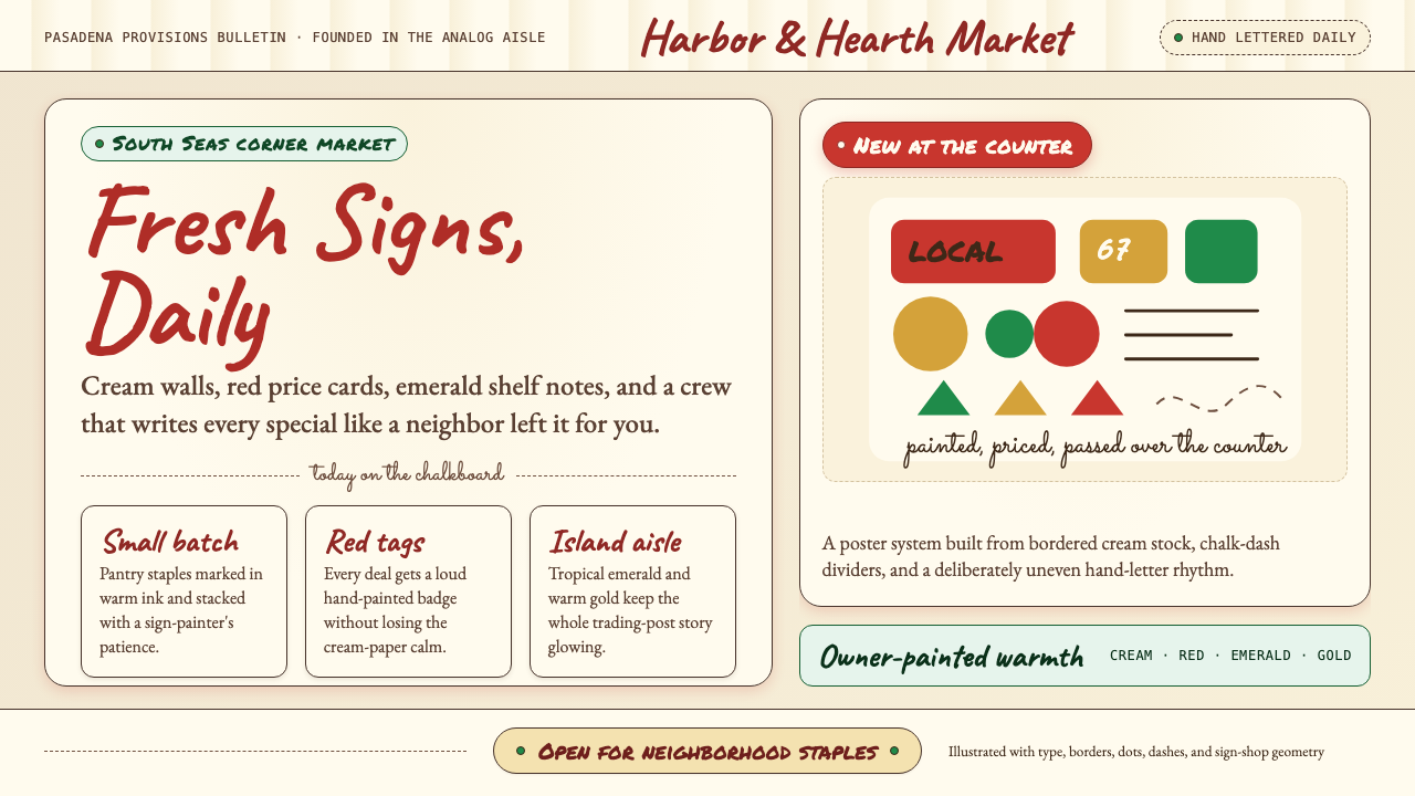 Trader Joe's Hand-LetteredHandmade grocery warmth. Cream chalkboards, red price tags, emerald accents.手写杂货温度:奶油黑板、红色价签、翠绿点缀。
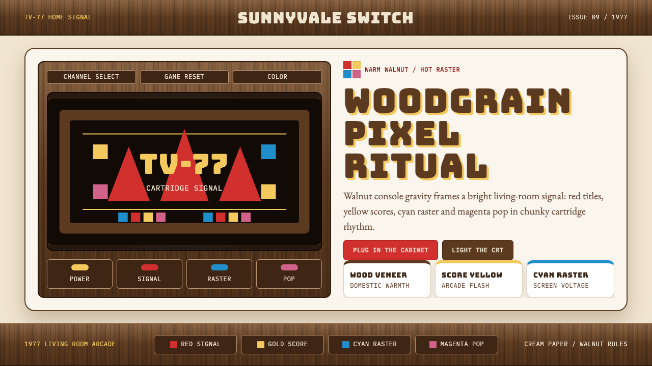 Atari 2600 (Woodgrain)Woodgrain meets raw pixels. Walnut panels frame Bungee type and CMYK raster b…木纹遇上生猛像素:胡桃木面板包裹Bungee字与CMYK色块。
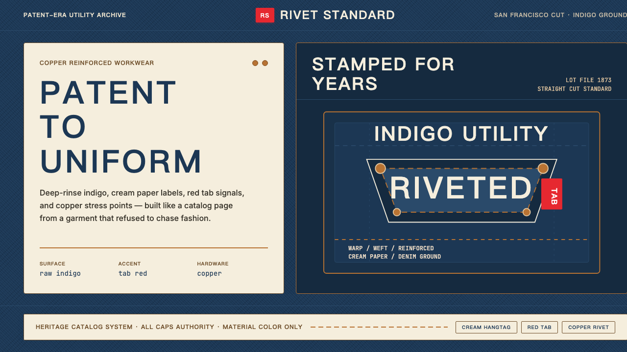 Levi's 501Utility becomes permanent. Indigo ground, cream hangtag panels, red tab and c…实用成为恒久。靛蓝底、奶油吊牌、红标与铜铆钉。
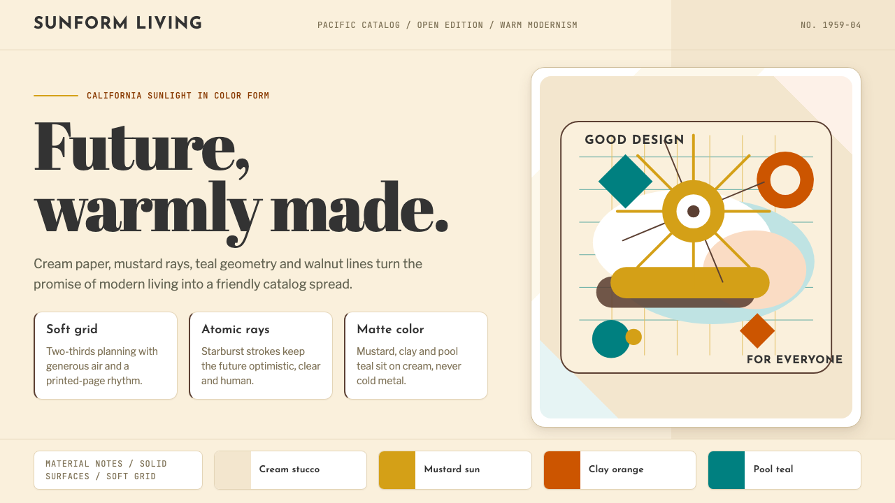 Mid-Century Modern (Eames)Optimistic, not austere. Cream canvas, mustard starburst, teal geometry and w…乐观而不冷峻:奶油底、芥末星芒、水鸭青几何与胡桃线条。