What is Mid-Century Modern (Eames)?什么是 Mid-Century Modern (Eames)?
Mid-Century Modern is the conviction that good design belongs to everyone — warm wood, sunlit color, and atomic-age optimism shaped into chairs, posters, and a visual language that still feels like the future done right.中世纪现代主义相信好的设计属于每一个人——温润木纹、阳光色彩与原子时代的乐观精神,凝结成椅子、海报与一套至今仍像是对未来的正确诠释的视觉语言。
Mid-Century Modern (Eames) in briefMid-Century Modern (Eames) 速览
Mid-Century Modern is the American design movement of the 1950s and 1960s that fused European modernist principles with post-war optimism, industrial ingenuity, and a distinctly Californian warmth. Where the Bauhaus had stripped design to its coldest rational skeleton, Mid-Century Modern clothed that skeleton in organic curves, warm earth tones, and the genuine conviction that mass production could make well-designed things accessible to ordinary households.中世纪现代主义是1950至60年代的美国设计运动,将欧洲现代主义原则与战后乐观主义、工业创造力以及加州特有的温暖气质融为一体。包豪斯曾将设计剥离至最冷峻的理性骨架,而中世纪现代主义则为这副骨架穿上了有机曲线、温暖大地色调与真诚信念——工业化大生产能让设计精良的物品进入普通家庭。
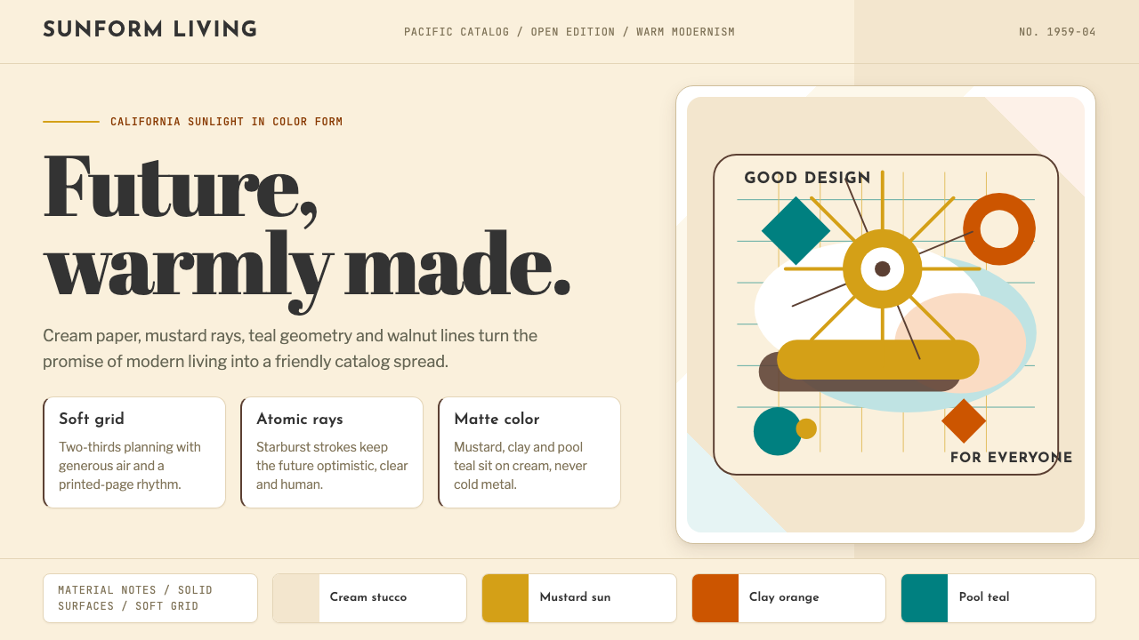
The movement's visual vocabulary is built from apparent contradictions that somehow resolve. Furniture legs taper to fine points while seat shells billow into generous curves. Color palettes combine warm cream and mustard with cooler teal and olive — sunlight and shadow coexisting. Atomic-age starburst motifs and boomerang shapes reference science and space exploration, yet they are rendered in materials — molded plywood, spun fiberglass, bent aluminum — that feel tactile and approachable rather than industrial and cold.这一运动的视觉词汇建立在表面上相互矛盾却奇妙和谐的元素之上:椅腿收细至尖端,座椅壳体却鼓胀成饱满曲线;色板将奶油、芥末黄与较冷的水鸭青、橄榄绿并置——阳光与阴影共处。原子时代的星芒纹与回旋镖造型指涉科学与太空探索,却以压制胶合板、成型玻璃纤维、弯折铝材等触感真实、亲切可感的材料呈现,而非冷峻工业化的金属感。
As a design system, Mid-Century Modern excels at communicating friendliness without sacrificing sophistication. It is the rare historical style that manages to feel both confident and welcoming — neither the severity of Bauhaus nor the excess of Art Deco, but a third way that treats delight as a legitimate design goal alongside function.作为一套设计系统,中世纪现代主义擅长在不牺牲精致感的前提下传递亲切感。它是极少数既能令人感到自信又让人感到欢迎的历史风格——既无包豪斯的严峻,也无装饰艺术的繁复,而是走出了第三条路:将愉悦视为与功能同等正当的设计目标。
See the Mid-Century Modern (Eames) design system查看 Mid-Century Modern (Eames) 完整设计系统
Where does Mid-Century Modern (Eames) come from?Mid-Century Modern (Eames) 从何而来?
The roots of Mid-Century Modern lie in the interwar years, when European modernism — Bauhaus, De Stijl, the International Style — began emigrating to the United States as political conditions in Europe deteriorated. Architects and designers such as Walter Gropius, Mies van der Rohe, and László Moholy-Nagy brought the formal discipline of European modernism to American schools and studios. But the transplant did not reproduce unchanged. American culture, material abundance, and a native craft tradition tempered the European austerity into something warmer and more humanistic.中世纪现代主义的根源可追溯至两次世界大战之间的岁月。随着欧洲政治环境的恶化,包豪斯、风格派与国际主义风格等欧洲现代主义思潮开始向美国迁移。瓦尔特·格罗皮乌斯、密斯·凡德罗、拉兹洛·莫霍利-纳吉等建筑师与设计师将欧洲现代主义的形式纪律带入美国的学校与工作室。但这场移植并未原样复制——美国文化、物质丰富性与本土工艺传统,将欧洲的严峻气质软化为更温暖、更人文主义的形态。
The decisive catalyst was the Second World War, which transformed American manufacturing. Military contracts drove investment in new materials — fiberglass, molded plywood, lightweight aluminum alloys — and new forming techniques developed for aircraft fuselages and military equipment. Charles and Ray Eames were among the designers who recognized that these wartime technologies could be redirected toward domestic furniture. Their molded plywood splints and stretchers for the Navy became the direct technological ancestors of the Eames molded plywood chairs produced from 1946 onward. The war had funded the tooling; the peace provided the market.决定性的催化剂是第二次世界大战。战争彻底改造了美国制造业:军事合同推动了对新材料——玻璃纤维、压制胶合板、轻质铝合金——与新成型技术的大规模投资,这些技术原本服务于飞机机身与军用装备。Charles 与 Ray Eames 是最早意识到战时技术可以转用于家居家具的设计师之一。他们为海军设计的压制胶合板夹板与担架,成为1946年起生产的伊姆斯压制胶合板椅的直接技术前身。战争为模具提供了资金,和平则提供了市场。
The institutional home of the movement was not a school but a competition. In 1948, the Museum of Modern Art in New York launched its International Competition for Low-Cost Furniture Design, which produced entries that defined the era's ambitions: seating that could be manufactured industrially, priced for middle-class households, and designed with the same formal care as fine art. The Eames Office, Herman Miller, and Knoll — the three organizational pillars of American mid-century design — built their most significant work in this period, each operating from the conviction that industrial production and good design were not in tension but were natural allies.这一运动的制度性家园不是一所学校,而是一场竞赛。1948年,纽约现代艺术博物馆发起「低成本家具设计国际竞赛」,参赛方案定义了那个时代的雄心:能够工业化生产、价格面向中产阶级家庭、同时具备精良形式的座椅。伊姆斯工作室、Herman Miller 与 Knoll——美国中世纪设计的三大机构支柱——在这一时期完成了各自最重要的作品,共同秉持工业生产与好设计并非矛盾而是天然盟友的信念。
Geographically, the movement was centered in Los Angeles and New York, with significant production hubs in Grand Rapids, Michigan. The Case Study Houses program in California, sponsored by Arts and Architecture magazine from 1945 through 1966, commissioned modernist residential architecture from the leading designers of the era — including Charles and Ray Eames, whose own Pacific Palisades home became an iconic demonstration that prefabricated steel components could produce a space of extraordinary warmth and livability. This geographic and cultural context — California light, post-war prosperity, space-age optimism — gave the movement its characteristic tone, distinct from the more austere modernisms that had preceded it.从地理上看,这一运动以洛杉矶与纽约为中心,并在密歇根州大急流城设有重要的生产基地。1945至1966年间,加利福尼亚州由《艺术与建筑》杂志赞助的「案例研究住宅」项目,委托该时代领先的设计师建造现代主义住宅——包括 Charles 与 Ray Eames,他们位于太平洋帕利塞兹的自宅成为一次标志性的证明:预制钢结构构件同样能够营造出非凡温暖与宜居的生活空间。这种地理与文化语境——加州光线、战后繁荣、太空时代乐观主义——赋予了这一运动其独特的气质,使其有别于此前更为严峻的现代主义形态。
What defines the Mid-Century Modern (Eames) look?Mid-Century Modern (Eames) 的视觉特征是什么?
Color Palette色彩体系
The Mid-Century Modern palette draws from California sunlight and the American landscape: warm cream and off-white grounds, mustard yellow, burnt orange, olive green, teal, and a muted terracotta. These are not primaries deployed symbolically in the Bauhaus manner but naturalistic hues — the colors of sun-dried grass, sage, desert clay, and Pacific water. Black appears sparingly, typically confined to fine structural lines, type, or graphic accents. The overall effect is warmth without sweetness, confidence without coldness.中世纪现代主义的色板汲取自加州阳光与美国大地:温暖的奶油与米白底色,芥末黄、烧橙、橄榄绿、水鸭青与柔和的赤陶色。这些并非像包豪斯那样用于象征意义的三原色,而是自然色调——晒干草地、鼠尾草、沙漠黏土与太平洋海水的颜色。黑色只是点缀,通常仅限于细结构线条、文字或图形强调。整体效果是温暖而不甜腻,自信而不冷峻。
Organic Curves有机曲线
Where Bauhaus geometry is angular and mathematically precise, Mid-Century Modern form is biomorphic — curves that mimic kidney shapes, leaf silhouettes, amoeba outlines, and the natural ergonomic contour of the seated human body. These curves are not arbitrary; they follow the logic of materials under stress (a fiberglass shell distributes load most efficiently through a compound curve) and the logic of the human form. In two-dimensional work, this translates to layouts where shapes breathe and edges soften, and where straight horizontal rules coexist with irregular organic blobs.包豪斯几何是棱角分明、数学精确的,而中世纪现代主义的形态则是仿生的——曲线模仿肾形、叶片轮廓、变形虫外形,以及人体坐姿的自然人体工学曲线。这些曲线并非任意为之:它们遵循受力材料的逻辑(玻璃纤维壳体通过复合曲面最有效地分散荷载)以及人体形态的逻辑。在二维设计中,这转化为形状能够呼吸、边缘柔和的版面,直线水平规则与不规则有机色块共处。
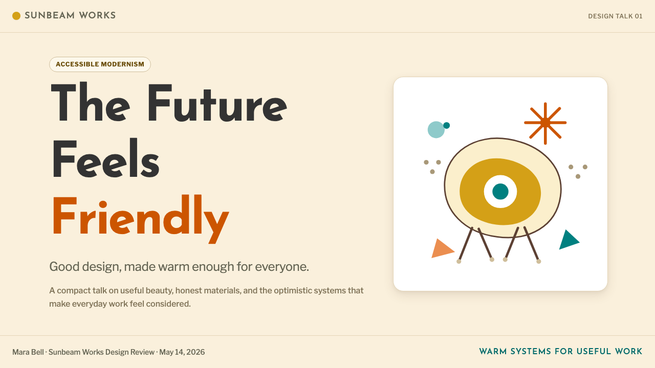
Atomic-Age Motifs原子时代图案
Starbursts, boomerangs, orbiting ellipses, snowflake crystals, and amoeba forms are the signature decorative vocabulary of the era, all drawing from atomic physics, space exploration, and molecular biology — the sciences that captured the postwar imagination. These motifs appear on wallpaper, textiles, ceramic surfaces, and in graphic work as background ornament or focal decorative elements. They carry optimism and scientific curiosity without technical literalism — a starburst clock is not a diagram of fission but a celebration of energy.星芒、回旋镖、环绕椭圆、雪花晶体与变形虫图形,是这一时代标志性的装饰词汇,均源自原子物理、太空探索与分子生物学——那些捕获了战后想象力的科学领域。这些母题出现在墙纸、纺织品、陶瓷表面以及平面作品中,作为背景装饰或焦点装饰性元素。它们传递乐观主义与科学好奇心,却并不拘泥于技术字面意义——星芒挂钟不是裂变示意图,而是对能量的颂扬。
Warm Natural Materials温润天然材质
Walnut and teak wood — dark, fine-grained, with visible natural figuring — provide the movement's characteristic material warmth. In graphic and digital contexts, this translates to wood-grain textures used as background accents, warm brown tones that suggest natural surfaces, and a general preference for matte over glossy finishes. The material vocabulary extends to natural fibers, woven textures, and the slightly imperfect surfaces of hand-craft — all of which signal authenticity and human presence in contrast to the purely industrial.胡桃木与柚木——纹理细密、深沉,带有可见的天然木纹——提供了这一运动特有的材质温度。在平面与数字语境中,这转化为用作背景点缀的木纹肌理、暗示自然表面的暖棕色调,以及对哑光而非光面质感的普遍偏好。材质词汇还延伸至天然纤维、编织纹理以及手工艺品略显不完美的表面——这一切都与纯粹工业感形成对比,传递出真实性与人的温度。
Restrained Playfulness克制的趣味性
Mid-Century Modern permits decorative pleasure in a way Bauhaus strictly forbids, but that pleasure is always disciplined. Pattern and ornament appear as considered graphic decisions — Alexander Girard's textiles are exuberant but formally tight, each motif rendered in clear flat color with precise edges. The style does not chase whimsy for its own sake; it uses pattern, color variety, and organic form to create warmth and human connection while maintaining an overall compositional coherence that keeps the work from tipping into decoration without structure.中世纪现代主义允许装饰性愉悦——这是包豪斯严格禁止的——但这种愉悦始终受到约束。图案与装饰作为经过深思熟虑的图形决策出现:Alexander Girard 的纺织品奔放而形式紧绷,每个母题以清晰的平面色彩和精确的边缘呈现。这种风格并不为奇思妙想而奇思妙想;它使用图案、色彩变化与有机形态来营造温度与人文联结,同时保持整体构图的连贯性,使作品不至于滑向没有结构的纯粹装饰。
Typographic Friendliness字体的亲和力
Mid-Century Modern typography leans toward humanist sans-serif and slab-serif letterforms — faces with slightly irregular optical corrections, moderate stroke contrast, and the suggestion of a hand behind the drawing. This is a meaningful distinction from Bauhaus geometric sans-serifs, which are mechanically constructed and deliberately impersonal. The Mid-Century typographic register is legible, confident, and approachable — optimized for the American magazine page, the advertising spread, and the trade show exhibition panel, all of which needed to capture attention while remaining welcoming.中世纪现代主义的字体倾向于人文主义无衬线与衬板衬线字体——字形带有略微不规则的光学修正、适中的笔画对比,以及设计者手迹的隐约痕迹。这与包豪斯几何无衬线体形成有意义的区分——后者是机械构建、刻意非个人化的。中世纪的字体语调清晰易读、自信而亲切,针对美国杂志版面、广告跨页与展览展板进行了优化——这些场合都需要在吸引注意的同时保持开放包容的姿态。
Compositional Balance Through Asymmetry非对称的构图平衡
Like Bauhaus, Mid-Century Modern avoids rigid bilateral symmetry, but its asymmetric balance is softer and more intuitive — achieved through the interplay of organic shapes, color weight, and directional flow rather than through strict mathematical tension. A composition might anchor a bold typographic block in one corner, balance it with a floating starburst motif in the opposite zone, and connect the two through a field of warm ground color. The result feels naturally balanced rather than calculated, which is the style's compositional signature.与包豪斯一样,中世纪现代主义回避严格的双侧对称,但其非对称平衡更为柔和与直觉性——通过有机形态、色彩重量与方向流动的相互作用来实现,而非依赖严格的数学张力。一个构图可能在某个角落锚定一个粗重的字体块,在对角区域以漂浮的星芒母题平衡,并通过一片温暖的底色场域连接两者。结果感觉是自然平衡而非精密计算,这是这种风格的构图标志。
See the Mid-Century Modern (Eames) design system查看 Mid-Century Modern (Eames) 完整设计系统
Who shaped Mid-Century Modern (Eames)?谁塑造了 Mid-Century Modern (Eames)?
Charles Eames (1907–1978) and Ray Kaiser Eames (1912–1988) formed one of the most productive design partnerships of the twentieth century, working from their Venice, California studio from 1941 onward. Their experiments with molded plywood — initially funded by the Navy's need for lightweight splints and stretchers — produced a body of seating that remains in continuous production today. Beyond furniture, the Eames Office produced films, exhibitions, toys, and graphic work that established the visual grammar of American mid-century design. Their 1977 film Powers of Ten, a meditation on scale from the galactic to the subatomic, exemplifies the breadth of a practice that understood design as a way of seeing the world.Charles Eames(1907—1978年)与 Ray Kaiser Eames(1912—1988年)组成了二十世纪最富创造力的设计搭档之一,自1941年起从加利福尼亚州威尼斯的工作室持续工作。他们对压制胶合板的实验——最初由海军对轻质夹板与担架的需求所资助——产生了一批至今仍在持续生产的座椅作品。伊姆斯工作室的创作远不止于家具,还包括影片、展览、玩具与平面设计,共同确立了美国中世纪设计的视觉语法。他们1977年的影片《十的次方》——一部从星系尺度到亚原子尺度的沉思——体现了一种将设计理解为观看世界方式的实践的广度。
George Nelson (1908–1986) served as design director of Herman Miller from 1945 to 1972, and in that role shaped the company's identity as the preeminent American design brand of the era. His own design contributions — the Marshmallow sofa, the Ball clock, the Bubble lamp series — became defining icons of the movement's playful-yet-rigorous character. Nelson was equally significant as a talent recruiter and intellectual catalyst: he was instrumental in bringing Charles Eames and Alexander Girard to Herman Miller, effectively assembling the team that made the company's mid-century output so remarkable.George Nelson(1908—1986年)自1945至1972年担任 Herman Miller 设计总监,以这一角色塑造了该公司作为那个时代首屈一指的美国设计品牌的身份。他自身的设计贡献——棉花糖沙发、Ball 时钟、Bubble 灯系列——成为这一运动兼具趣味性与严谨性的标志性图标。Nelson 作为人才招募者与知识催化剂同样意义重大:他是将 Charles Eames 与 Alexander Girard 引入 Herman Miller 的关键人物,实际上组建了使该公司中世纪产出如此卓越的团队。
Alexander Girard (1907–1993) served as director of the Herman Miller Textile Division from 1952 and, in that capacity, designed over three hundred fabric and wallcovering patterns that became the color and surface dimension of Mid-Century Modern interiors. Where furniture designers worked in three dimensions and graphic designers in two, Girard operated in the dimension of pattern and color field, producing bold, flat, folklorically influenced textiles that brought warmth and visual richness to modernist interiors without reintroducing historicist decoration. His 1961 La Fonda del Sol restaurant commission in New York integrated graphic design, interior design, and textile design into a total environment — a vision that anticipates much of what contemporary brand design aspires to.Alexander Girard(1907—1993年)自1952年起担任 Herman Miller 纺织品部门总监,以这一身份设计了逾三百款布料与墙面覆盖图案,构成了中世纪现代主义室内设计的色彩与表面维度。家具设计师在三维空间工作,平面设计师在二维空间工作,而 Girard 则在图案与色彩场域的维度中工作,创作出大胆、平面、具有民间艺术色彩的纺织品,为现代主义室内空间带来温度与视觉丰富性,却并未重新引入历史主义装饰。他1961年在纽约为 La Fonda del Sol 餐厅所做的委托设计,将平面设计、室内设计与纺织设计整合为一个整体环境——这一愿景预见了当代品牌设计所追求的许多目标。
Eero Saarinen (1910–1961), the Finnish-American architect and designer, pursued the elimination of what he called 'the slum of legs' — the visual clutter created by four-legged furniture on a floor. His response was the Tulip chair and table (1955–1956), produced for Knoll, in which a single pedestal base supports a generous curved shell. The sculptural clarity of the Tulip series — one continuous form, no joint exposed — represents the movement's aspiration to integrate engineering and aesthetics into an inseparable whole. Saarinen's architectural projects, including the TWA Flight Center at JFK and the Gateway Arch in St. Louis, extended the same biomorphic formalism to the scale of public infrastructure.芬兰裔美国建筑师与设计师 Eero Saarinen(1910—1961年)致力于消除他所称的「椅腿贫民窟」——四腿家具在地板上造成的视觉杂乱。他的回应是为 Knoll 设计的郁金香椅与郁金香桌(1955—1956年):单一底座支撑一个宽阔的曲线壳体。郁金香系列雕塑般的纯净——一个连续形态、无外露接缝——代表了这一运动将工程与美学整合为不可分割整体的渴望。Saarinen 的建筑项目——包括肯尼迪机场的 TWA 候机楼与圣路易斯的拱门——将同样的仿生形式主义延伸至公共基础设施的尺度。
Florence Knoll (1917–2019) was the architectural backbone of Knoll Associates and the figure most responsible for bringing Mid-Century Modern design into the American corporate office. As head of the Knoll Planning Unit, she developed the concept of total interior design — treating a workplace as a single designed environment in which furniture, surface, lighting, and graphic identity were integrated rather than assembled from separate catalogs. Her own furniture designs are characteristically rectilinear and architecturally rigorous, providing the structural counterpoint to the more sculptural work of Saarinen and others in the Knoll stable. She is also credited with establishing the model of the design firm as a curator-editor, selecting and commissioning work from leading designers rather than producing everything internally.Florence Knoll(1917—2019年)是 Knoll Associates 的建筑骨干,也是将中世纪现代主义设计引入美国企业办公室最重要的人物。作为 Knoll 规划部门负责人,她发展出整体室内设计的概念——将工作场所视为单一的设计环境,家具、表面、照明与视觉识别相互整合而非从各自目录中拼凑。她自身的家具设计以其典型的直线性与建筑严谨性著称,为 Knoll 阵容中 Saarinen 等人更具雕塑感的作品提供了结构性的对位。她还被认为确立了设计公司作为策展人-编辑的模式,从领先设计师处甄选与委托作品,而非将所有工作内部完成。
How do you use Mid-Century Modern (Eames) today?今天怎么用 Mid-Century Modern (Eames)?
Mid-Century Modern translates with unusual naturalness into contemporary digital and print design, because its core principles — organic warmth, optimistic color, disciplined composition — remain visually fresh without requiring literal period reproduction. The key is understanding that this is not a nostalgic style but an optimistic one: applying it should make work feel welcoming and confident, never retro for its own sake.中世纪现代主义以异乎寻常的自然度转化为当代数字与印刷设计,因为它的核心原则——有机温度、乐观色彩、有节制的构图——保持着视觉上的新鲜感,而不需要字面复刻历史风貌。关键在于理解:这不是一种怀旧风格,而是一种乐观风格——应用它应当让作品感觉亲切自信,而绝非为了复古而复古。
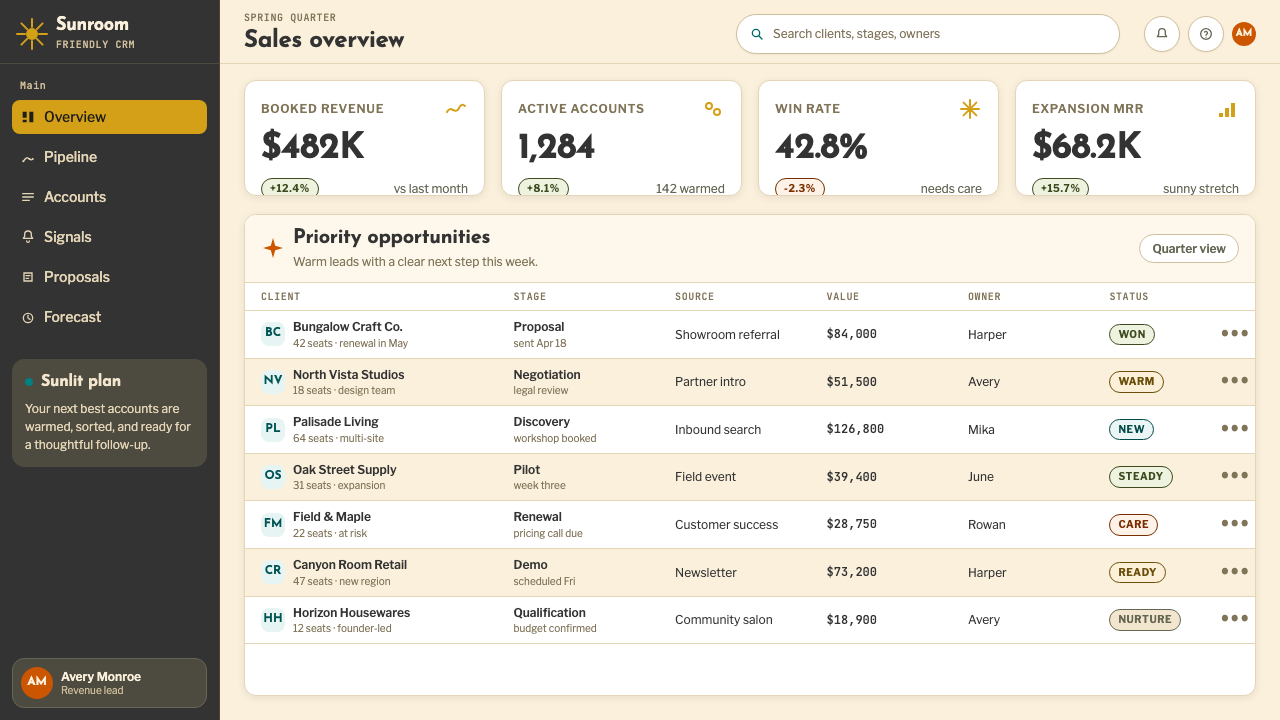
For presentation slides, the style excels at both cover and content work. A cover benefits from the bold compositional approach: position a large organic shape or starburst motif in warm mustard or teal against a cream ground, with the title in a sturdy humanist sans-serif at generous scale. Content slides should use the palette's warmth to differentiate sections — section breaks marked with a color band rather than a thin rule, callout boxes tinted in a muted mid-century hue. Data slides come alive when charts are treated as graphic objects: bars and segments colored in the warm palette, with generous whitespace around them so the data reads as information, not noise.在演示文稿中,这种风格在封面页与内容页上均表现出色。封面适合大胆的构图方式:在奶油底色上,以芥末黄或水鸭青放置一个大型有机形或星芒图案,标题以饱满的人文主义无衬线字体大尺寸呈现。内容页应利用色板的温度感区分章节——以色彩带而非细线条标记段落分隔,以中世纪哑光色调为引用框着色。数据页在将图表视为图形对象时焕发生机:条形与扇区以温暖色板着色,四周保留充裕留白,使数据清晰读作信息而非视觉噪声。
For web interfaces, Mid-Century Modern suits dashboards, pricing pages, and brand marketing sites where friendliness and confidence are both required. Structure the page on a clean grid with a cream or warm off-white background; use walnut-toned brown or dark olive for typographic hierarchy rather than defaulting to pure black. Reserve the brighter hues — mustard, teal, burnt orange — for interactive states, featured pricing tiers, and calls to action. Card components work well with a slight warm tint and a subtle offset shadow rather than the stark hard-edged shadow of Bauhaus work. Navigation should feel typographic and spacious, with room for each element to be itself.对于网页界面,中世纪现代主义适合仪表板、定价页面与品牌营销网站——这些场景同时需要亲切感与自信感。以干净网格构建页面,背景使用奶油或温暖的米白色;用胡桃棕或深橄榄绿建立字体层级,而非默认纯黑色。将更明亮的色调——芥末黄、水鸭青、烧橙——保留给交互状态、特色定价档次与行动号召。卡片组件适合搭配轻微暖色调与柔和偏移阴影,而非包豪斯式的硬边强对比阴影。导航应当感觉字体性而宽松,每个元素都有充分的呼吸空间。
For editorial and marketing applications, the style supports rich visual storytelling. A Mid-Century editorial spread works with large organic shapes as section dividers, period-appropriate geometric texture patterns as background elements in feature boxes, and pull quotes set in a warm accent color at expressive scale. Marketing pages benefit from the contrast between cream and dark sections — alternating between a warm ground with dark type and a deep teal or charcoal ground with cream type — with starburst or boomerang graphic accents appearing at key transitions to add visual energy without breaking the compositional order.对于编辑与营销应用,这种风格支持丰富的视觉叙事。中世纪编辑排版以大型有机形作为分节分隔,以带有年代感的几何纹理图案作为特色框的背景元素,以大尺寸、暖调强调色呈现引用语。营销页面受益于奶油色与深色区块的交替对比——在暖底深字与深水鸭青或炭灰底奶油字之间切换——以星芒或回旋镖图形强调在关键过渡处增添视觉活力,同时不打破构图秩序。
The most common mistake when applying Mid-Century Modern is mistaking warmth for sweetness and over-saturating the palette. Authentic mid-century color is sophisticated — mustard is never neon yellow, teal is never turquoise, and cream is never white. A second common error is decorating without composing: placing starburst motifs and atomic age ornaments as fill rather than as purposeful compositional anchors. Every decorative element should occupy a specific structural role in the layout. A third mistake is mixing too many hues simultaneously — the palette offers many colors, but successful work typically selects two or three for any single composition and treats the rest as background texture.应用中世纪现代主义时最常见的错误,是将温度误解为甜腻并使色板过度饱和。真实的中世纪色彩是精致的——芥末黄绝非霓虹黄,水鸭青绝非松石蓝,奶油绝非纯白。第二个常见错误是在没有构图的情况下装饰:把星芒图案与原子时代纹样作为填充物随意放置,而非作为有目的性的构图锚点。每个装饰元素都应在版面中占据特定的结构角色。第三个错误是同时混用过多色相——色板提供了丰富的颜色,但成功的作品通常在单一构图中只选用两到三种,其余作为背景纹理处理。
See the Mid-Century Modern (Eames) design system查看 Mid-Century Modern (Eames) 完整设计系统
Mid-Century Modern (Eames) — FAQMid-Century Modern (Eames) · 常见问题
How does Mid-Century Modern differ from Bauhaus?中世纪现代主义与包豪斯有何不同?
Both movements share a commitment to functional design and the elimination of gratuitous ornament, but their emotional registers are opposite. Bauhaus is severe, rational, and rooted in the idea that beauty and function are identical — decoration that serves no structural purpose should not exist. Mid-Century Modern treats delight as a legitimate design goal in its own right. Organic curves, warm color, and playful motifs are not decoration for the sake of decoration but are understood as genuine functional contributions to human comfort and emotional wellbeing. Bauhaus design makes you feel that everything unnecessary has been removed; mid-century design makes you feel welcomed.两种运动都致力于功能性设计并排除无谓装饰,但它们的情感语调截然相反。包豪斯严峻、理性,根植于美与功能同一的理念——不服务于结构目的的装饰不应存在。中世纪现代主义则将愉悦本身视为正当的设计目标。有机曲线、温暖色彩与趣味图案,不是为装饰而装饰,而是被理解为对人类舒适感与情感健康的真实功能性贡献。包豪斯设计让你感觉一切多余之物已被去除;中世纪设计让你感觉受到欢迎。
Can Mid-Century Modern work in dark-mode or dark-background layouts?中世纪现代主义能用于深色模式或深色背景版面吗?
It can, but the inversion requires care. The style's characteristic warmth comes largely from its cream and warm-white grounds, which the palette is calibrated against. On a dark background — deep charcoal, very dark teal, or near-black — the warm hues need to be shifted slightly to maintain their character: mustard can remain, but it should be treated as a single accent rather than a dominant field; teal works well as a mid-tone accent. The key risk in dark inversion is that the organic shapes and starburst motifs, which have a sunny quality on light grounds, can feel ominous on very dark backgrounds. A dark mid-century palette works best when it commits to warmth in the dark — using a dark warm brown or very dark olive as the ground rather than a neutral black.可以,但反转需要谨慎处理。这种风格的温度感很大程度上来自奶油与暖白色的底面,整个色板正是据此校准的。在深色背景上——深炭灰、极深的水鸭青或近黑色——温暖色调需要略微调整以保持其特质:芥末黄可以保留,但应作为单一强调而非主导色域;水鸭青作为中间调强调效果良好。深色反转的主要风险在于,有机形与星芒图案在浅底上带有阳光般的品质,在极深背景上则可能产生阴郁感。深色中世纪色板最有效的做法是在黑暗中坚持温度——以深暖棕或极深橄榄绿作为底色,而非中性黑色。
Is Mid-Century Modern appropriate for data-heavy technical products?中世纪现代主义适合数据密集型技术产品吗?
Yes, more than its reputation might suggest. The style's organic warmth and non-threatening color palette make it an effective antidote to the cold, sterile aesthetic that data tools often adopt by default. A dashboard built in mid-century palette — cream ground, warm brown type hierarchy, teal and mustard as data category colors — reads as authoritative without being intimidating. The key is not to fight the data with decoration: keep the chart areas clean and spare, use the decorative vocabulary (starburst, organic shapes) only in empty states, headers, and section breaks, never inside the data visualization itself. The style handles moderate data density well; for extremely dense analytical interfaces, a cleaner, more neutral approach may serve better.是的,超出它的声誉所暗示的程度。这种风格的有机温度与无威胁感的色板,是对数据工具经常默认采用的冷峻、无菌美学的有效解药。以中世纪色板构建的仪表板——奶油底色、暖棕字体层级、水鸭青与芥末黄作为数据类别色——读来权威而不令人生畏。关键是不要用装饰对抗数据:保持图表区域干净简洁,将装饰性词汇(星芒、有机形)仅用于空状态、标题与段落分隔,绝不进入数据可视化内部。这种风格能够良好处理中等数据密度;对于极度密集的分析界面,更简洁、更中性的方法可能更为适用。
What makes a Mid-Century Modern application look authentic versus kitsch?什么让中世纪现代主义的应用看起来真实而非庸俗?
The line between authentic and kitsch in mid-century work comes down to compositional discipline versus decorative accumulation. Kitsch mid-century piles up starbursts, atomic motifs, and warm colors until every surface is covered — the equivalent of a restaurant that has used all the props from the era without understanding the underlying formal logic. Authentic mid-century work is selective: one or two signature motifs, deployed at specific structural roles in the composition, against grounds that have room to breathe. The other test is color sophistication: if the mustard reads as yellow, the cream reads as white, and the teal reads as turquoise, the palette has been pushed too far toward modern bright versions of the hues. True mid-century color is muted and sun-aged, not fresh off the color wheel.中世纪现代主义应用中真实与庸俗之间的界限,在于构图纪律与装饰堆积的对比。庸俗的中世纪风格将星芒、原子图案与暖色调叠加直至每个表面都被覆盖——如同一家餐厅使用了那个时代所有道具,却未理解底层的形式逻辑。真实的中世纪风格是选择性的:一到两个标志性母题,部署在构图中特定的结构角色上,依托有呼吸空间的底面。另一个检验是色彩精致度:如果芥末黄读起来像黄色,奶油读起来像白色,水鸭青读起来像松石蓝,那么色板已经被推得过于接近色相的现代明亮版本。真正的中世纪色彩是柔和而经阳光洗礼的,而非刚从色轮上取下的新鲜颜色。
Which contemporary industries and product types are best suited to Mid-Century Modern?哪些当代行业与产品类型最适合中世纪现代主义?
The style is particularly well-suited to lifestyle brands, home and furniture retail, boutique hospitality (hotels, cafes, co-working spaces), premium food and beverage products, and creative professional services (architecture firms, interior design studios, editorial agencies). It also works for technology companies that want to project warmth and approachability alongside competence — the style signals that the company values human experience, not just efficiency. It struggles where cold precision is the desired signal: high-frequency trading platforms, medical device interfaces, aerospace and defense documentation. The simplest test is to ask whether the product's core promise is warmth, craftsmanship, or optimism — if yes, mid-century is a natural fit; if the promise is clinical precision or raw power, look elsewhere.这种风格特别适合生活方式品牌、家居与家具零售、精品酒店业(酒店、咖啡馆、联合办公空间)、优质食品与饮料产品,以及创意专业服务(建筑事务所、室内设计工作室、编辑机构)。它同样适用于希望在能力之外传递温度与亲切感的科技公司——这种风格表明该公司重视人的体验,而不仅仅是效率。它在冷峻精准是期望信号的场景中表现欠佳:高频交易平台、医疗设备界面、航空航天与国防文档。最简单的检验是问:产品的核心承诺是温度、工艺还是乐观主义?如果是,中世纪现代主义是天然的契合;如果承诺是临床精准或原始力量,则应另寻他径。
Related design styles相关设计风格
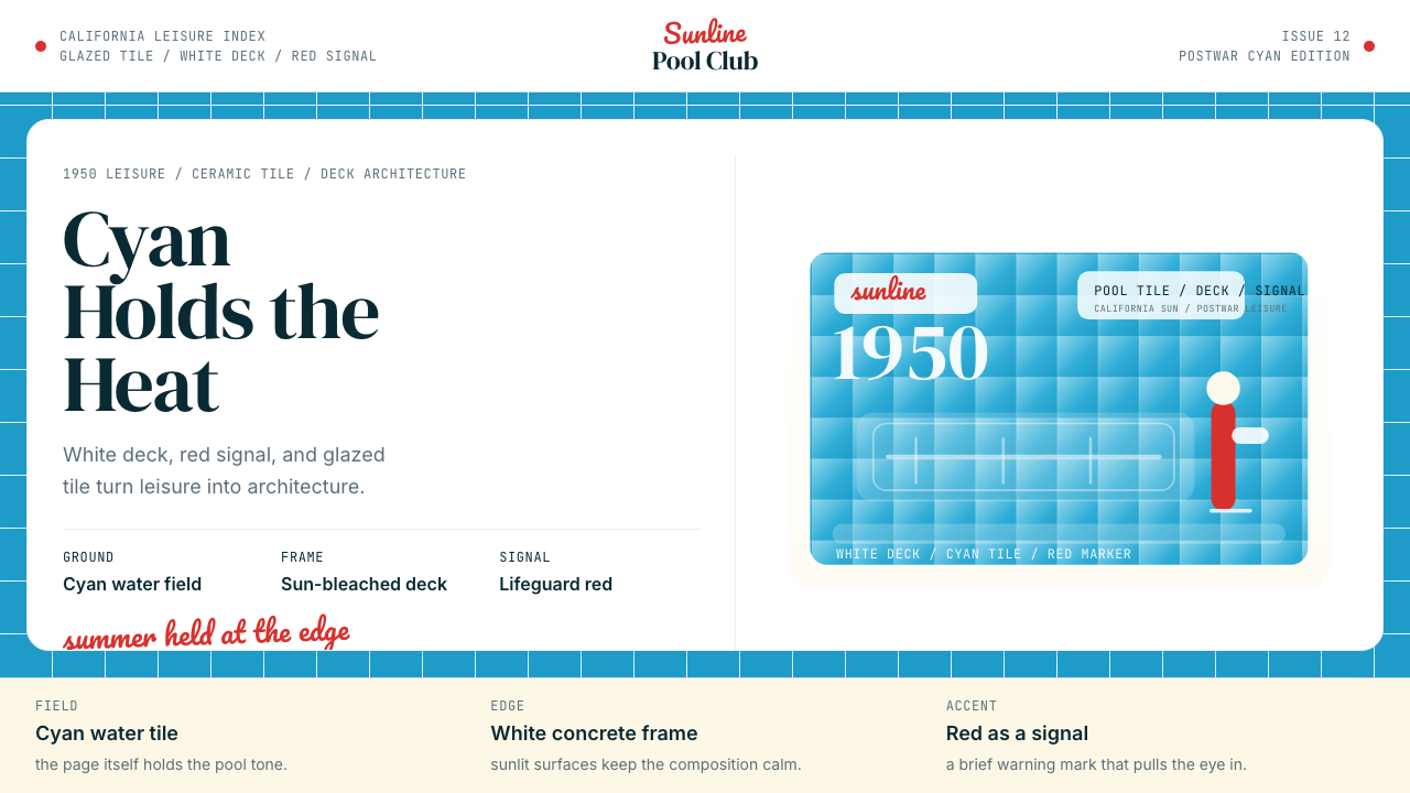 Swimming Pool Vintage Cyan Tile (1950)Leisure turned architectural. Cyan tile, white deck, and red accents set the…把悠闲做成建筑感。青瓷砖、白池边与红色点睛。
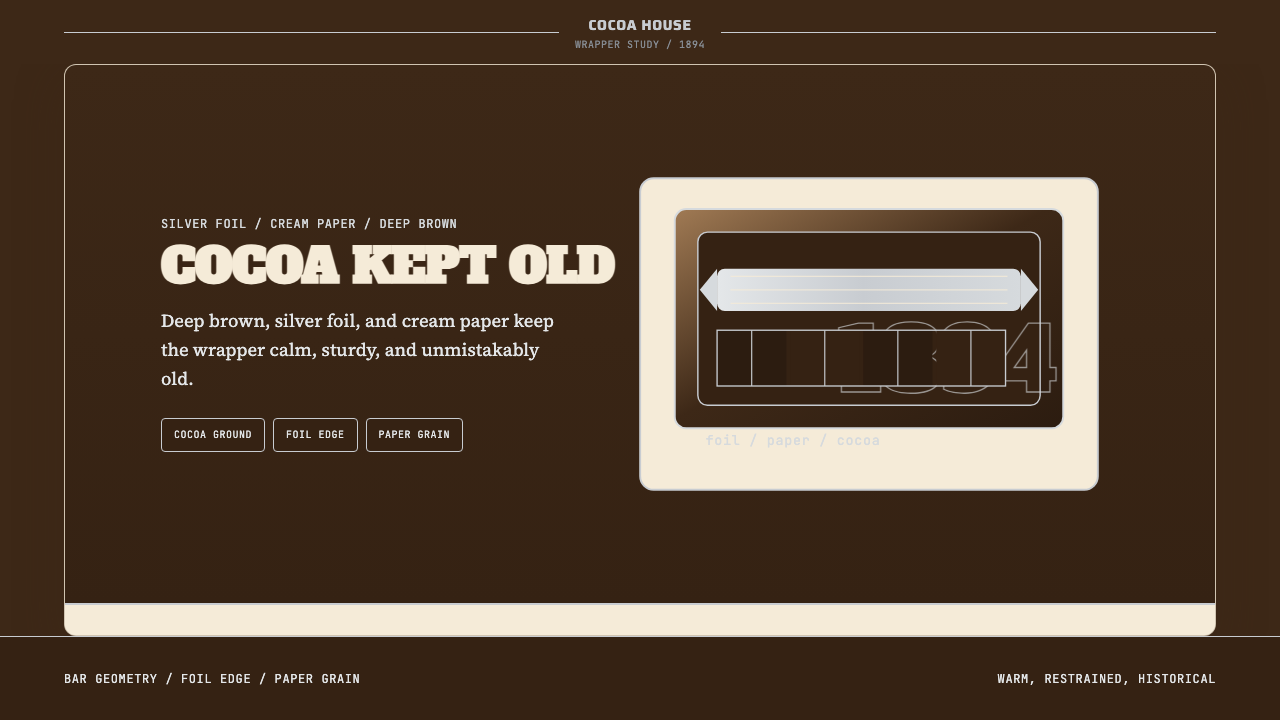 Hershey's Chocolate Brown (1894)Plain, enduring, warm. Cocoa brown meets silver foil on cream paper.朴素而耐久:可可棕配银箔与奶油纸面,克制百年不变。
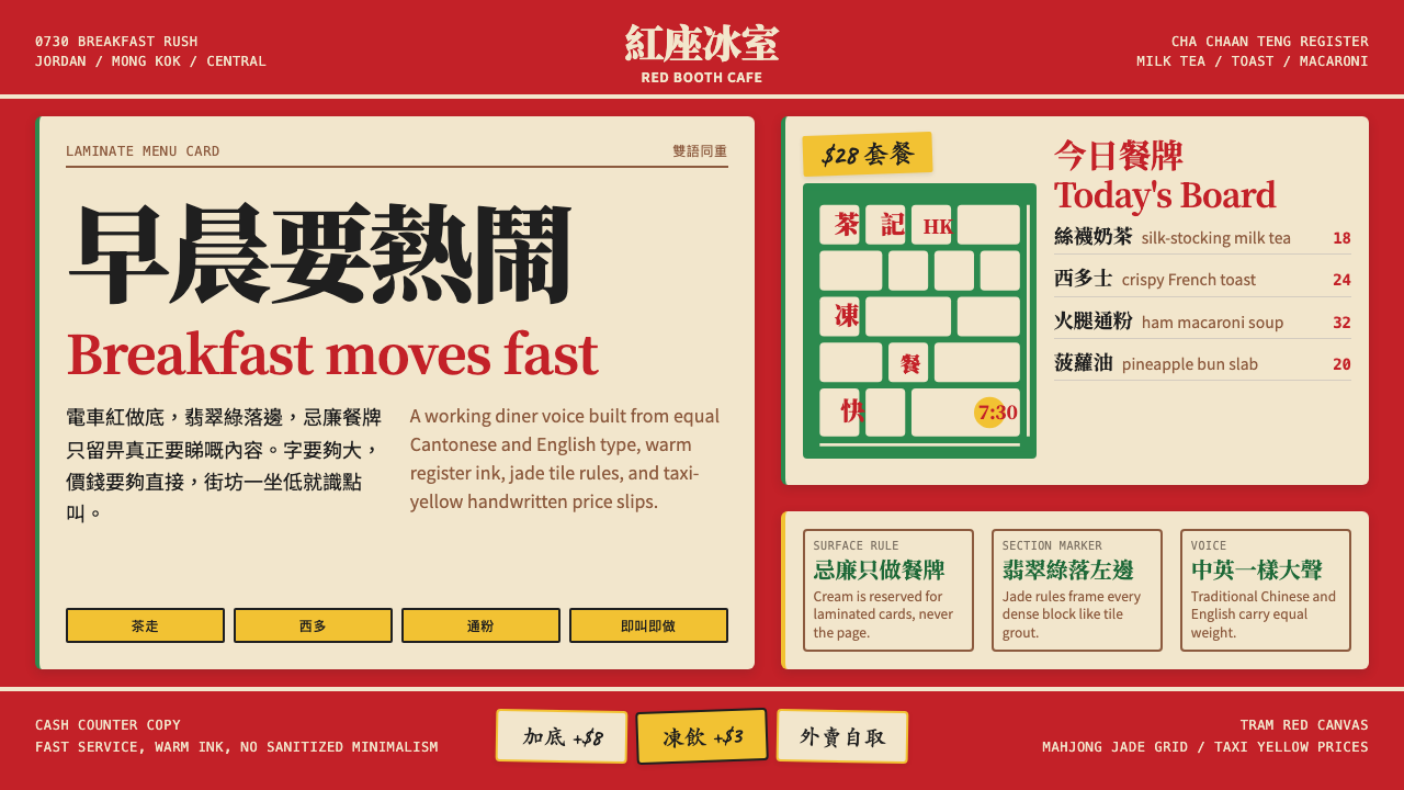 Hong Kong Cha Chaan TengDemocratic diner warmth. Tram red, jade rules, cream menu cards, equal Canton…街坊飯堂的熱度:電車紅、翡翠綠線、忌廉餐牌,中英並重。
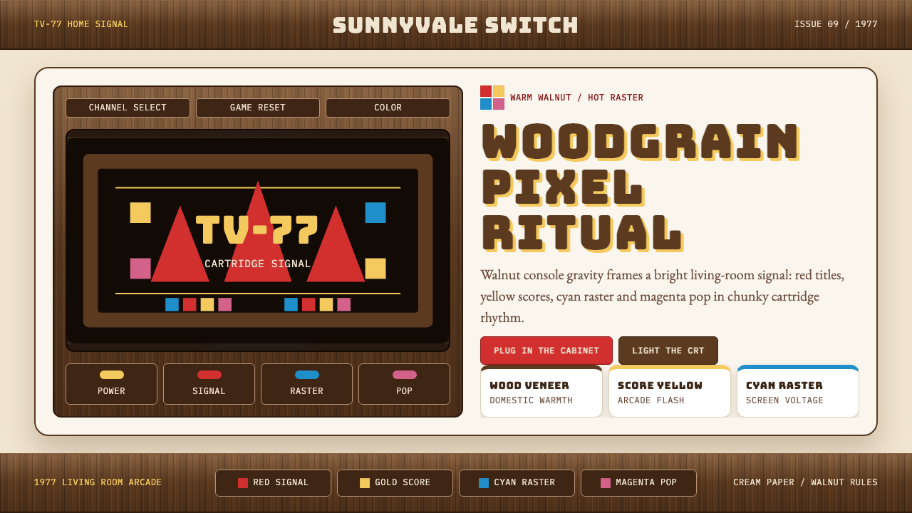 Atari 2600 (Woodgrain)Woodgrain meets raw pixels. Walnut panels frame Bungee type and CMYK raster b…木纹遇上生猛像素:胡桃木面板包裹Bungee字与CMYK色块。
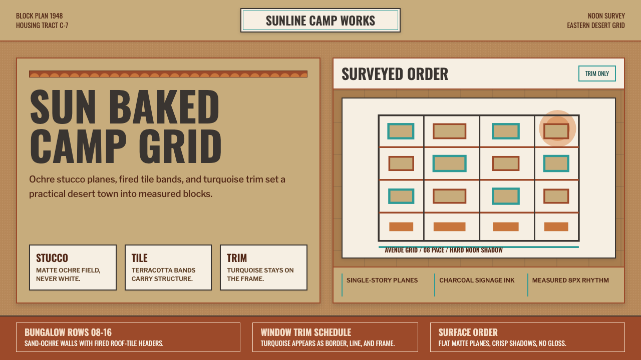 Dhahran Aramco Camp ModernismDesert order, sun-baked. Ochre stucco fields, terracotta bands, turquoise tri…沙漠秩序,被日光烤白。砂赭底、赤陶带、绿松石边框成形。
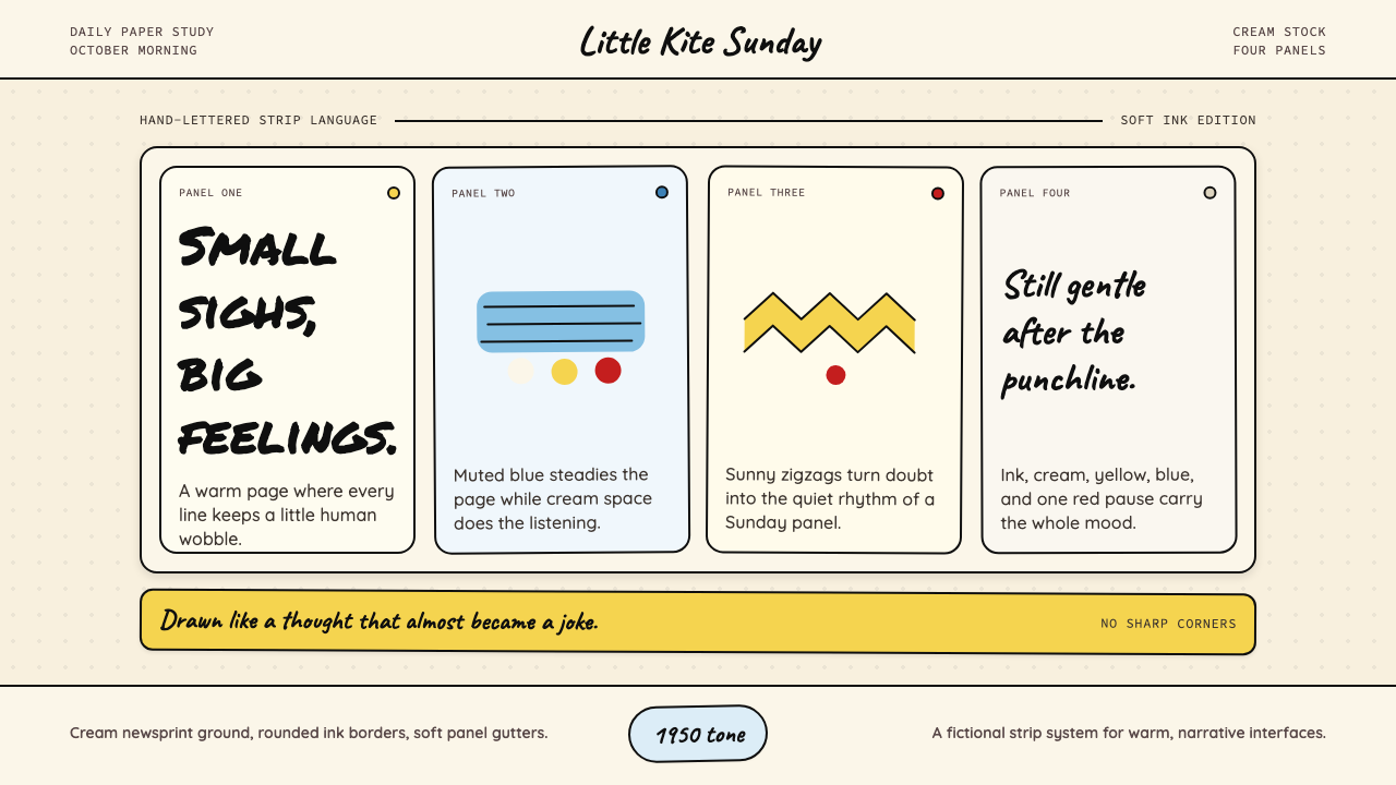 Peanuts Comic Schulz (1950)Gentle melancholy on newsprint. Caveat lettering, cream panels, yellow and bl…温柔忧郁的新闻纸感:Caveat 手写字、奶油格框、黄蓝点色。