What is Dhahran Aramco Camp Modernism?
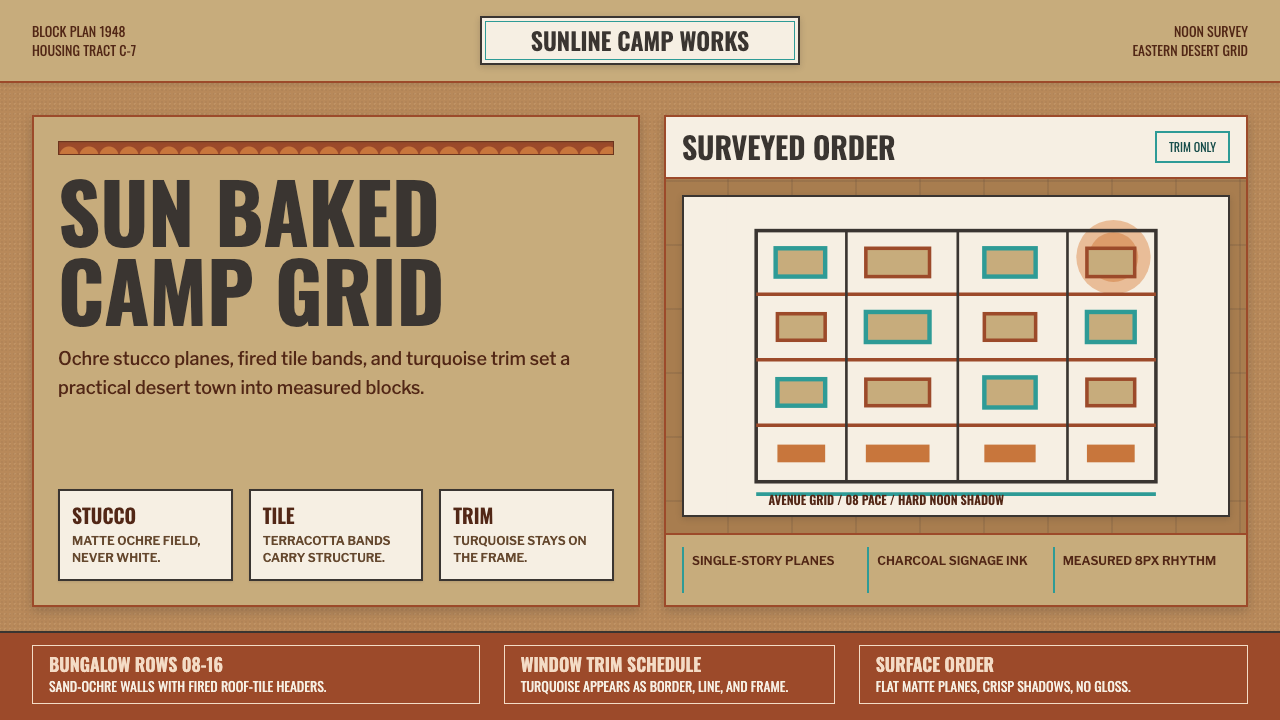
American suburbia was shipped to the Arabian desert in the 1940s, and the sun baked it into a design language of its own.
Dhahran Aramco Camp Modernism in brief
Dhahran Aramco Camp Modernism reconstructs the visual world of the residential company town the Arabian American Oil Company built in eastern Saudi Arabia — a planned American-style suburb of bungalows, straight streets, and company signage transplanted wholesale into a desert climate it was never originally designed for.
The system is warm, matte, and plain rather than glossy or ornamental. Its grounds are sand-ochre stucco, its accents are terracotta roof-tile red, and turquoise appears only as trim — never as a dominant field. Signage borrows the plain, legible sans-serif conventions of mid-century American corporate lettering, while hand-stencilled derrick logos supply the system's one nod to industry rather than domesticity.
Nothing in this language is polished or reflective. Every surface reads as sun-bleached and slightly matte, as if it had spent decades under a hard desert noon — the visual signature of a company town built for function and durability rather than display.

Where does Dhahran Aramco Camp Modernism come from?
In the early twentieth century, oil exploration brought American engineers, geologists, and their families to the eastern coast of Saudi Arabia in numbers large enough to require permanent housing. The Arabian American Oil Company — the joint venture that would eventually become Saudi Aramco — chose not to build barracks or temporary camps but full residential neighborhoods, modeled directly on the American suburbs many of its employees had left behind.
The Dhahran camp, built out through the late 1930s and 1940s, imported the entire vocabulary of American company-town planning: rectilinear street grids, single-family bungalows with front yards, communal recreational facilities, and company-branded signage in a plain, legible style descended from American telephone and utility corporate lettering. This was suburbia as infrastructure — a deliberate strategy to make expatriate life recognizable and livable in an unfamiliar climate, thousands of miles from home.
But the desert reshaped what it received. Stucco replaced clapboard as the practical building material for a climate with almost no rainfall and extreme heat. Roofs were finished in terracotta tile, both for heat management and because it was a material readily sourced and understood in the region's broader building tradition. Turquoise trim on windows and doors — a color choice with roots in broader Middle Eastern decorative practice — softened what would otherwise have been a purely American visual transplant, producing a hybrid: American town planning logic, executed in desert-appropriate materials and colors.
The result was a company town that looked, at a glance, like small-town America — but rendered in ochre, terracotta, and sun-bleached surfaces that only a desert climate could produce. Company signage, hand-stencilled derrick logos marking oil infrastructure, and the plain rectilinear grid of the camp itself all carried the era's functional, unpretentious design sensibility: nothing built for display, everything built to work and to last under a punishing sun.
What defines the Dhahran Aramco Camp Modernism look?
Color
The base tone is sand-ochre, a warm neutral drawn directly from stucco under desert light. Terracotta — the color of the roof tile — serves as the primary accent, appearing on structural elements and headline treatments. Turquoise is used sparingly, confined to trim and small decorative details rather than large fields, functioning as a cooling counterpoint to the ochre and terracotta warmth.
Typography
Lettering follows the plain, legible sans-serif conventions of mid-century American corporate and utility signage — the kind of type built for clarity at a distance rather than for expressive character. It is functional rather than decorative, matching the system's overall unpretentious tone, and generally avoids ornamental serifs or script letterforms entirely.
Surface Texture
Every surface reads as matte and sun-bleached, never glossy or reflective. This texture is the system's most consistent visual cue — stucco walls, painted signage, and printed materials all share the same slightly worn, heat-faded quality that suggests years of exposure to a hard desert sun.
Grid and Planning
Layout follows a rectilinear, company-town logic: straight lines, right-angle organization, and a plain functional order rather than an organic or ornamental composition. This mirrors the literal street grid of the camp itself, in which structure exists to organize efficiently rather than to impress.
Signage Voice
Company and street signage carries a specifically corporate-utility character — the same design sensibility applied to telephone and power company branding of the same era. It is plain, direction-giving, and built for durability under sun exposure rather than for visual flourish.
Hand-Stencilled Marks
Derrick logos and other industrial markings appear as hand-stencilled forms rather than precision-printed graphics, giving the system a small trace of manual, on-site craft within an otherwise rigidly planned environment. These marks are the system's clearest link to the oil industry underlying the residential facade.
Restraint and Plainness
The system as a whole avoids ornament of any kind. Its visual interest comes from color relationships and material texture rather than pattern, illustration, or decorative typography — a plainness inherited directly from the practical, function-first mindset of a mid-century company town.

Who shaped Dhahran Aramco Camp Modernism?
The planning teams behind the Aramco residential camps applied American suburban planning conventions — rectilinear grids, single-family housing, communal facilities — directly onto a desert site, then adapted materials and finishes to the climate. Their work established the hybrid visual language this design system distills.
The architects responsible for individual bungalows and communal buildings chose stucco and terracotta tile as climate-appropriate substitutes for the wood-frame construction typical of American suburbs, giving the camp its distinctive sun-baked material palette while retaining its American planning logic.
How do you use Dhahran Aramco Camp Modernism today?
This system carries a specific, load-bearing warmth: applying it well means treating ochre, terracotta, and turquoise as a hierarchy rather than an equal palette, with turquoise always kept in a supporting, trim-only role.
For presentation slides, the style is well suited to heritage, travel, and regional-history content. Cover slides benefit from a large ochre or stucco-textured field with a terracotta headline treatment, while content slides can use plain, signage-style typography for section labels — echoing the camp's own functional lettering rather than a decorative editorial hand.
For web interfaces, the palette works especially well for hospitality, regional-heritage, or cultural-archive products where warmth and place-specificity matter more than technical precision. Backgrounds should stay in the sand-ochre range rather than shifting to neutral white or grey; terracotta suits primary buttons and headers; turquoise should be reserved for small interactive accents or trim details only.
For editorial and marketing work, the style supports narrative content about mid-century company towns, oil-industry history, or desert architecture particularly well. A magazine spread can lean into the matte, sun-bleached surface quality by keeping photography and illustration desaturated and warm rather than crisp and high-contrast.
A common mistake when applying this system is treating turquoise as a primary color rather than a trim accent, or making the palette too saturated and glossy — both choices undercut the specific sun-bleached, matte quality that gives this style its authenticity and distinguish it from generic 'desert' color schemes.

Dhahran Aramco Camp Modernism — FAQ
Why does this style pair American suburban planning with desert materials?
Because that is literally what happened historically: American oil companies transplanted suburban town planning to the Arabian desert to make expatriate life familiar, but the climate forced substitutions — stucco for wood, terracotta for shingle — that produced a hybrid look neither purely American nor purely regional. The system preserves that specific historical collision rather than choosing one influence over the other.
Why is turquoise used so sparingly compared to ochre and terracotta?
In the original camp, turquoise appears as window and door trim — a decorative accent, not a structural material. Stucco and roof tile, by contrast, cover entire buildings. The system's color hierarchy simply mirrors this physical reality: ochre and terracotta are the substance of the built environment, turquoise is a detail applied on top of it.
Does this style suit high-tech or futuristic product content?
Not naturally. Its warmth, matte texture, and mid-century company-town origin communicate history, place, and human-scale planning rather than technological advancement. It reads best on content with a heritage, regional, or narrative dimension; a purely futuristic product would need a different design language to match its positioning.
How does this style differ from a generic 'desert' color scheme?
A generic desert palette is often just warm neutrals with no specific narrative behind them. This system is anchored to a documented, specific place and era — an American company town in eastern Saudi Arabia in the 1940s — and its color choices (ochre stucco, terracotta tile, turquoise trim) trace directly back to real building materials rather than an abstract mood board.
Related design styles
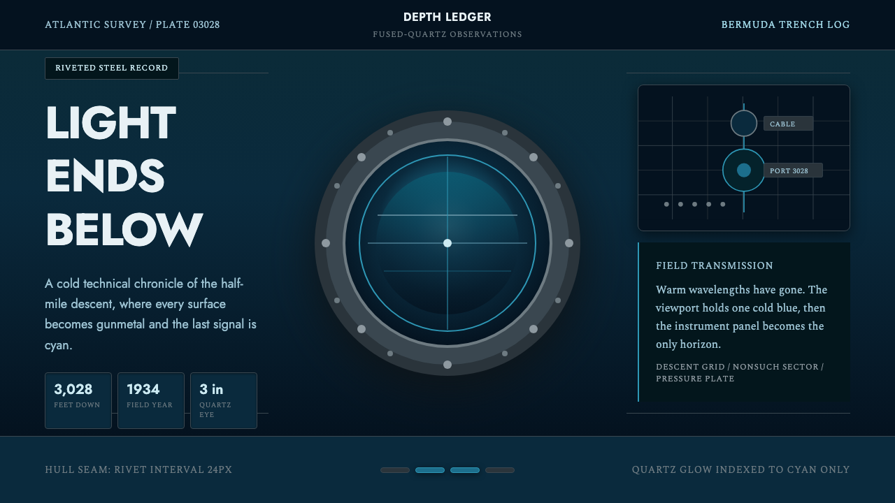 BathyspherePressure turns precise. Cyan porthole light cuts gunmetal grids and rivet row…
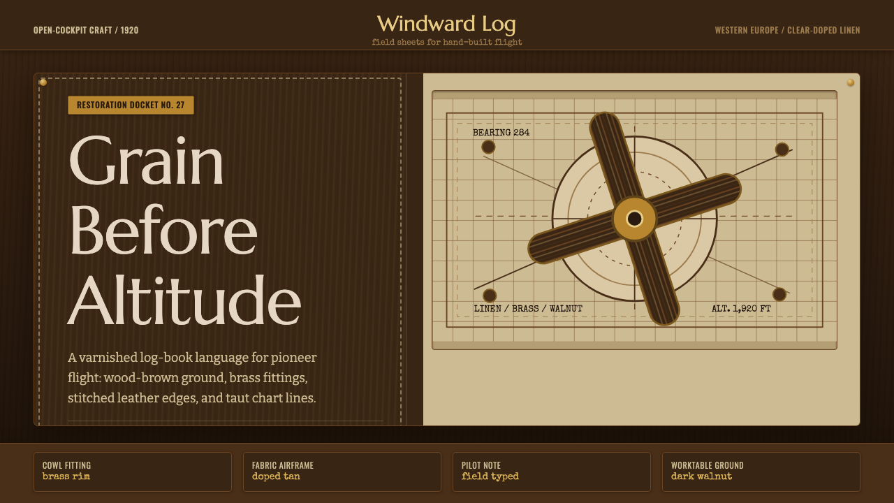 Biplane AviationPioneer flight feels hand-built. Dark walnut, brass, stitched edges, and char…
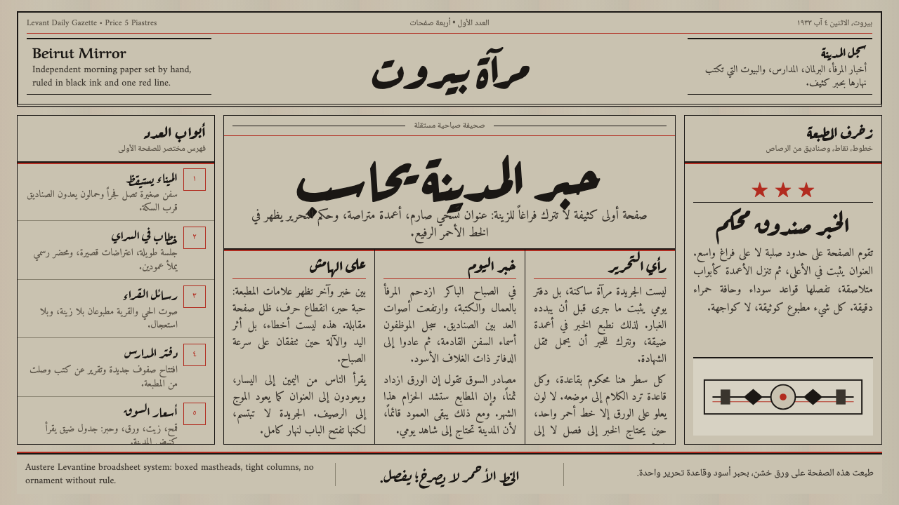 An-Nahar Beirut PressDense authority. Aged newsprint, black naskh columns, and one red rule hold t…
 Steam LocomotiveWorking iron, not parlour car. Soot-black cast iron, polished brass gauges, o…
 Czech Cubist Decorative ArtsGlazed geometry feels carved. Umber ground, ochre facets, and cream chevrons…
 Eritrean Asmara Italian ModernismHuman modernism, not cold monumentality. Sandstone panels, sky-blue cantileve…