What is Steam Locomotive?
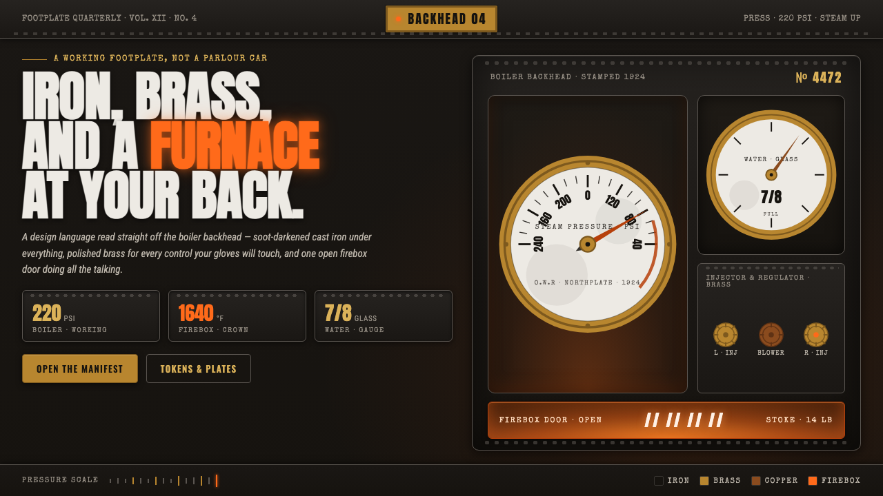
Steam Locomotive turns the cab into a working instrument: soot-black iron, bright brass controls, and a furnace-orange glow that makes heat and labor visible.
Steam Locomotive in brief
Steam Locomotive is a design language drawn from the interior of a working footplate cab during the mainline steam railway era. Its world is built from soot-darkened cast iron, polished brass valves and pressure gauges, and the steady orange light of an open firebox door. The result is dark, mechanical, and intensely tactile. Surfaces appear to have weight. Controls appear to have a purpose. Light is not decoration but evidence of heat inside the machine.
The style rejects the fantasy of railway luxury. It is not an Orient-Express parlour car, a nostalgic travel poster, or a collection of decorative gears. Its authority comes from working hardware: gauges that suggest pressure, valves that imply control, iron that carries structure, and fire that signals labor. Every bright element should feel earned by use. Brass catches the eye because it has been polished against a dark, dirty field; orange commands attention because it comes from the furnace.
Visually, the system is severe but not sterile. Black cast iron establishes the environment, brass supplies precise highlights, and furnace orange creates a concentrated point of warmth. Typography and layout should behave like cab equipment: compact, legible, labeled, and arranged around clear function. Depth comes from contrast between heavy metal, reflective fittings, and the distant glow of fire, never from ornamental clutter.
Where does Steam Locomotive come from?
The source is the footplate cab of the industrial railway era, especially the working steam atmosphere associated with Western Europe and the wider age of mainline steam. The period named for this design language is 1900–1950, when the locomotive interior is understood not as a showroom but as a place where machine, operator, fuel, heat, and pressure meet. The visual system begins with that interior condition: dark iron surrounding a small number of highly legible instruments and a visible furnace glow.
Its historical character comes from industrial railway engineering rather than from a single decorative movement. Engineering determines the visual hierarchy. Cast iron forms the dark structural field; valves and gauges become the brightest functional markers; the firebox supplies the only strong warmth. This relationship gives the style its discipline. The palette is not selected for mood alone. Each material has a job, and each contrast helps the working cab remain readable.
The people at the center of this world are footplate drivers, firemen, and locomotive engineers. Their presence is implied through the arrangement of controls, the polished faces of instruments, and the soot that gathers around working surfaces. They are not presented as heroic portraits or ornamental figures. Instead, the design honors their attention and expertise by making the equipment they operate clear, substantial, and central to the composition.
The result is the working steam aesthetic: grimy iron with islands of maintenance, darkness interrupted by brass, and a furnace glow that gives the entire system a physical center. It is a design language of duty, endurance, and controlled force. Its strongest expressions preserve the tension between dirt and care, mass and precision, and industrial darkness and concentrated heat.
What defines the Steam Locomotive look?
Soot-Black Iron
The foundation is a near-black field with the visual weight of cast iron rather than the flatness of a generic dark background. It should feel dense, worn, and capable of carrying pressure. Subtle variation may suggest grime or age, but the surface remains restrained and structural. Black is not an empty canvas here; it is the cab wall, the machine body, and the atmosphere surrounding every instrument.
Polished Brass
Brass is the system's precise reflective note. It belongs to valves, rims, labels, gauges, and other functional fittings, not to broad decorative ornament. Against black iron, even a small brass detail can establish hierarchy and draw the eye toward an action or reading. Its finish should feel maintained rather than luxurious: bright enough to catch light, controlled enough to remain part of the working machine.
Furnace Orange
Furnace orange is a concentrated signal of heat, energy, and active labor. It works best as a localized glow behind an opening, within a status indicator, or at the center of a critical focal area. The color should not become a general accent scattered across the interface. Its power depends on scarcity and contrast: a small warm source feels physically hotter when surrounded by soot-black iron.
Instrument Hierarchy
Gauges and valves organize the composition through functional priority. A primary reading should have a clear face, strong contrast, and enough surrounding quiet to be recognized immediately. Secondary controls may recede into the iron field, while brass edges and small marks distinguish active areas. The arrangement should resemble a cab panel: dense where operations gather, open where the eye needs to verify a reading.
Working Wear
The style depends on the tension between soot and maintenance. Surfaces may be darkened, scuffed, or visually heavy, but controls and gauges are kept legible and selectively polished. Wear should communicate use, not neglect. Avoid theatrical rust, ornamental distress, or texture applied everywhere. The most convincing surface is one where dirt gathers around the work while the instrument face remains cared for.
Functional Hardware
Every visible mechanical element should imply a real task. A circular form reads as a gauge, a lever suggests control, and a line of brass marks can indicate a boundary or measurement. Decorative gears weaken the language because they announce machinery without explaining its purpose. The system is strongest when hardware is treated as information architecture: shape, material, and placement all help the user understand what can be read or changed.
Who shaped Steam Locomotive?
Footplate drivers represent sustained attention at the controls. In this design language, their role is expressed through clear instrument grouping, readable labels, and a visual path from status to action. The driver is not a decorative protagonist; the cab itself becomes a portrait of disciplined observation and controlled response.
Firemen are represented by the furnace-orange center of the system: heat that must be watched, fed, and contained. Orange should therefore mark active energy rather than generic emphasis. When used sparingly, it gives the dark cab a human scale, reminding the viewer that the machine depends on ongoing labor.
Locomotive engineers stand for the broader engineering logic behind the cab. Their presence is visible in the material hierarchy, the substantial iron field, and the insistence that every valve, gauge, and marking support a function. The design honors engineering by making complexity legible rather than hiding it beneath ornament.
How do you use Steam Locomotive today?
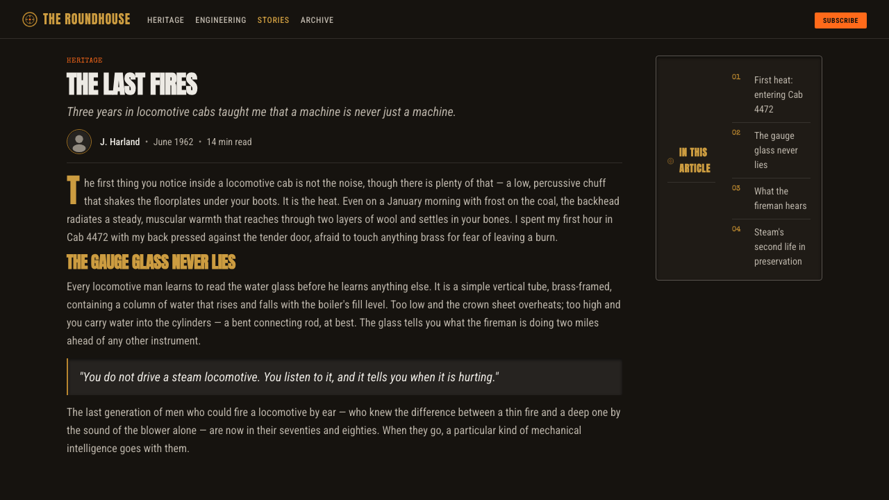
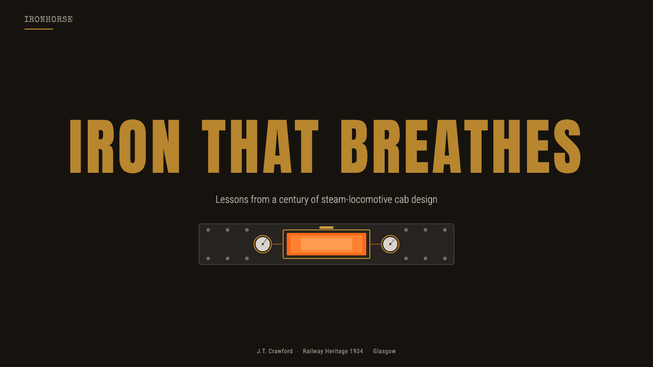
For presentation slides, use the Steam Locomotive language to make the cover feel like an instrument panel seen in low light. Let a deep iron field carry the title, place a restrained brass marker near the main message, and reserve furnace orange for the single idea that must feel active. Content slides should organize information through labeled blocks, gauge-like indicators, and strong contrast between primary readings and secondary notes. Data slides can treat charts as instruments: a dominant reading, a few carefully ranked measures, and no decorative machinery added merely to suggest a technical mood.
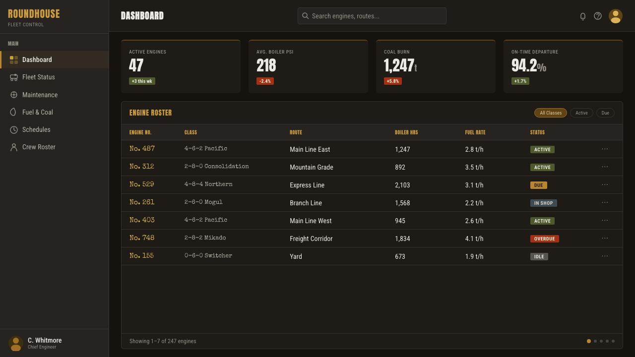
For web interfaces, the style is especially effective for operational dashboards, monitoring tools, engineering products, and pricing pages that need to feel capable and serious. Use the dark iron surface as the environment, brass for controls and selected borders, and orange for active states, warnings, or the most consequential action. Cards should feel like mounted panels with clear labels rather than floating ornaments. Pricing tiers can be differentiated through instrument hierarchy and restrained brass treatment, while the strongest call to action receives the concentrated warmth of the firebox.
For editorial and marketing work, build a narrow, deliberate reading path through the darkness. Headings can behave like stamped panel labels, metadata can sit beside small brass rules, and pull quotes can be framed as operational notices rather than ornamental call-outs. Photography or illustration should favor close views of iron, gauges, valves, and furnace light, with cropping that makes material and function immediate. Marketing pages benefit from the contrast between hard-working credibility and the small emotional warmth of fire.
For data storytelling, avoid turning every measure into a different color or decorative dial. Establish one dominant instrument, several supporting readings, and a clear relationship between label, value, and action. Brass can separate measurement from background; orange can identify heat, urgency, or movement; iron can hold everything else in place. The effect should feel like a cab being read by an experienced operator, not a novelty interface covered in arbitrary controls.
The common mistake is confusing industrial character with visual clutter. Adding random gears, excessive scratches, fake rivets, multiple glowing accents, or luxury brass surfaces turns working hardware into theatrical steampunk. Another mistake is allowing the dark background to swallow labels and readings. Steam Locomotive works when dirt is controlled, brass is functional, orange is scarce, and every visible element helps the user read the machine.
Steam Locomotive — FAQ
Is Steam Locomotive the same as steampunk?
No. They share an interest in steam-era machinery, but Steam Locomotive is grounded in the working footplate cab: soot-black iron, functional gauges, polished valves, and a controlled furnace glow. Steampunk often adds fantasy, ornament, exposed gears, and theatrical invention. This system should feel maintained, purposeful, and physically believable rather than ornate or escapist.
Can this style work without literal locomotive imagery?
Yes. The essential structure is material and functional hierarchy, not a literal train illustration. A dark iron field, brass control accents, clear instrument-like labeling, and a scarce furnace-orange signal can establish the language on their own. Literal locomotive imagery should be added only when it helps explain the subject or deepen the working context.
Why is the orange glow used so sparingly?
Its meaning depends on concentration. Orange represents the active furnace, heat, energy, and labor, so spreading it across every control turns a specific signal into ordinary decoration. Against soot-black iron, a limited orange area feels warmer and more consequential. Scarcity also preserves a clear hierarchy between the environment, the instruments, and the active source of heat.
How should brass be used without making the interface luxurious?
Keep brass attached to function. Use it for gauge rims, valve marks, labels, selected controls, or boundaries that help the user read the system. Avoid broad brass surfaces, ornamental frames, and decorative shine without an operational reason. The desired feeling is polished through maintenance, not expensive through display.
What products suit Steam Locomotive best?
It suits products that benefit from a sense of operation, pressure, expertise, and durable machinery: dashboards, monitoring tools, engineering interfaces, technical education, and serious pricing or service pages. It is less suitable when the central promise depends on softness, luxury, playful ornament, or organic warmth. The choice should follow the product's values, because this style communicates work before comfort.
Related design styles
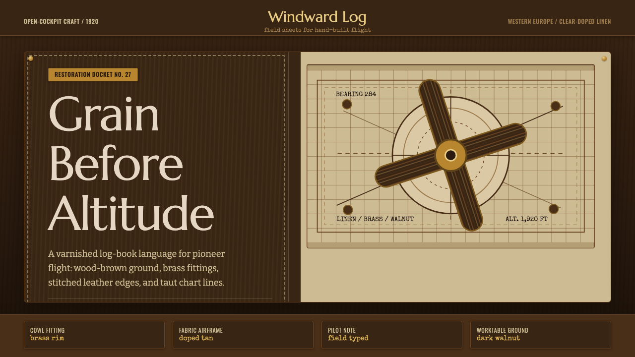 Biplane AviationPioneer flight feels hand-built. Dark walnut, brass, stitched edges, and char…
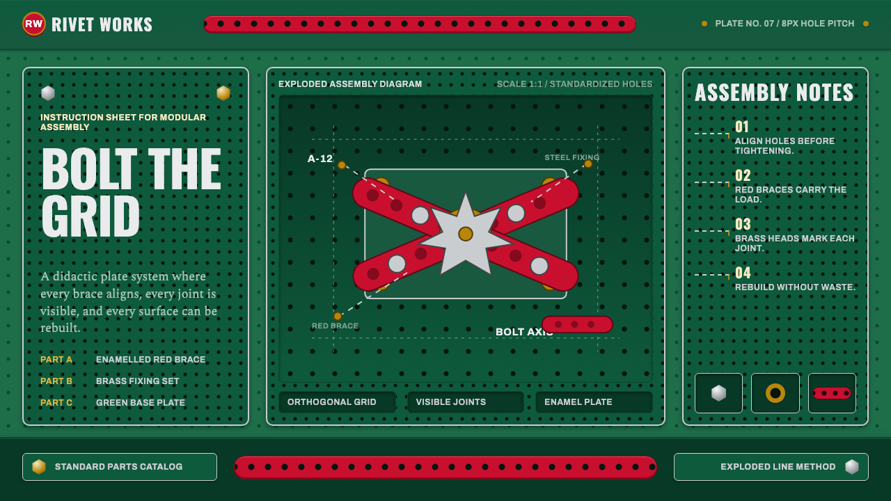 Meccano Erector SetEngineering becomes tactile. Red perforations and brass bolts lock to a green…
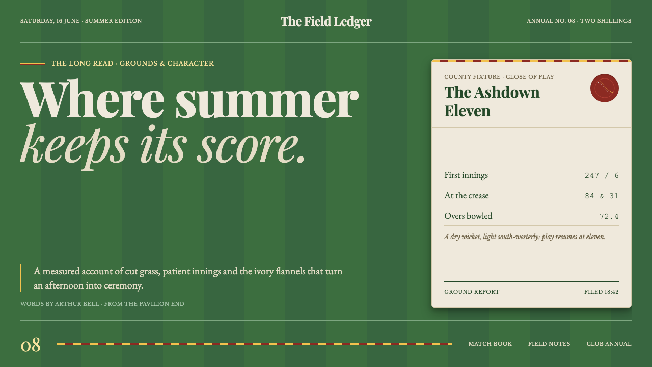 Cricket Whites FlannelsSummer, kept in good order. Ecru serif and fine club trim cross a dark mown g…
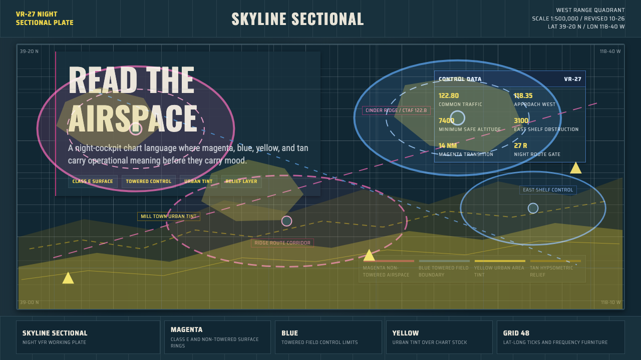 Aeronautical ChartReads like cockpit data. Magenta-blue airspace rings cut through dense dark-c…
 An-Nahar Beirut PressDense authority. Aged newsprint, black naskh columns, and one red rule hold t…
 Carhartt Work Jacket Brown (1889)Built like work. Hamilton brown, orange diamond, and condensed type carry can…