What is Ordnance Survey One-Inch?
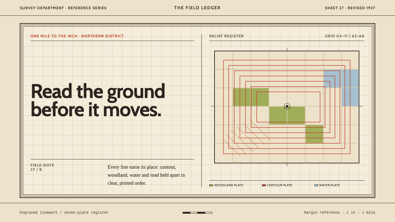
The Ordnance Survey one-inch sheet is a seven-colour lithograph on warm buff paper, where every tint is a printing plate, every plate carries information, and the slight misregistration between them is honest evidence of how it was made.
Ordnance Survey One-Inch in brief
Ordnance Survey One-Inch is a design style drawn from the national topographic map of Britain at its most characteristic: the one-inch sheet of the early twentieth century. It is a seven-colour lithograph printed on warm buff wove paper, with water blue, woodland green, burnt-sienna roads, brown hachures and red contours laid over black engraved linework. Nothing in it is decorative. Every tint is a plate, and every plate carries information.
The slight misregistration between plates, where a colour sits a hair off its outline, is not a flaw to be hidden. It is the honest evidence of how the sheet was made, and it gives the map a human, tactile presence. The system takes this attitude into interface work: a precise tool that is open about its materials and its method.
In practice, the style has a clear grammar. A wide paper margin frames the content the way the neatline frames the map face. Type alternates between a Times-style serif and a Gill-style sans according to the class of feature being named. Relief is ruled, never photographic: contour lines and directional hachure strokes, not soft shadow. The style suits content that needs precision, a legend and a hierarchy the reader can grasp at once.
Where does Ordnance Survey One-Inch come from?
The Ordnance Survey is Britain's national mapping agency, and its one-inch maps, at a scale of one inch to one mile, were for generations the standard way for ordinary people to read the country. The period behind this system runs from 1900 to 1950 and includes the Third Edition, the Popular Edition, the Fifth (Relief) Edition and the Tourist sheets. The Survey's work was centred on Southampton, and the sheets from this era show a mapmaking culture that combined engraving, lithography and a very high standard of draughtsmanship.
The map was printed from separate plates, one for each colour. That is the logic behind the seven-colour look. Black linework carried the engraved detail of outlines, buildings and boundaries; separate plates carried water, woodland, roads and the relief, and the result was a layered picture in which each tint had one job. Because the plates were printed one after another, tiny shifts in alignment were inevitable. Those shifts are the misregistration the style preserves: a trace of the printing process that proves the colours are real layers, not effects.
From 1919, folded sheets were issued in covers designed by Ellis Martin: buff card printed with black hand-drawn decoration. About half a year later a coloured border was added, because it was less easily soiled. The cover shows how the Survey thought about the whole object, from the face of the map to the card that protected it in a pocket. These covers belonged to a wider culture of interwar rambling and motoring, in which the paper map became the companion of a Sunday walk or a day out in the car.
The names in this system's reference set — Ellis Martin, Arthur Palmer and Charles Close — stand for different sides of that culture: the illustrator, the cartographic draughtsman and the institutional leadership that kept the standard consistent. The typography of the sheets also drew on the new humanist sans-serif, Gill Sans, which entered state cartography in this period alongside a Times-style serif. Combining the two by feature class, rather than by taste, is the origin of the style's typographic logic.
What defines the Ordnance Survey One-Inch look?
Buff Paper Ground
The ground is warm buff wove paper, a soft, slightly yellow-brown neutral that is neither white nor beige by accident. It is the colour of the sheet itself, and everything else is printed on it. In an interface, this gives pages a tactile, archival warmth, and it makes the other inks read as ink on paper rather than light on a screen.
One Plate, One Job
Each of the seven colours belongs to one class of information: blue for water, green for woodland, burnt sienna for roads, brown for hachures, red for contours, black for engraved linework. Colours are not shuffled between roles. A reader who has learned the key once can read any sheet, which is the strongest argument for fixed colour roles in a design system.
Black Engraved Linework
Black linework carries the fine structure: outlines, boundaries, buildings and lettering. The lines are thin, crisp and consistent, with a hand-engraved quality that feels exact without being mechanical. Colour tints sit under this skeleton, so the page always has a legible armature even where the colours are pale.
Ruled Relief
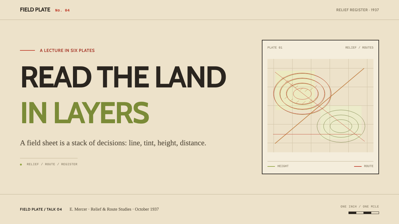
Height is shown by red contour lines and brown hachure strokes that point downslope, not by soft shadows or photographic shading. Relief is therefore drawn, measured and countable. For interfaces, this is a principle: depth should be expressed by lines and structure, not by blurred drop shadows.
Serif and Sans by Feature Class
Type alternates between a Times-style serif and a Gill-style sans, and the choice follows the class of feature being named, not the designer's mood. One family might name settlements and landmarks, and the other might name physical and administrative features. Pairing becomes a classification system, and the reader learns to read the type like a legend.
Wide Margin and Neatline
A wide paper margin surrounds the content, and a double-line border, the neatline, frames the map face. The margin holds titles, scale statements and keys, so the face itself stays uncluttered. In a layout, this means generous outer space, an inner frame and a clear separation between the content and its apparatus.
Visible Misregistration
The slight offset between a colour plate and its outline is kept as a mark of authenticity. It tells the reader that the colours are layers and that a human process produced them. Used with restraint, as a small deliberate offset between a fill and its border, it adds warmth and honesty without becoming a gimmick.
Who shaped Ordnance Survey One-Inch?
Martin designed the covers that, from 1919, housed the folded one-inch sheets: buff card with black hand-drawn decoration, later joined by a coloured border to resist soiling. His covers show that the Survey cared about the entire object, and they helped fix the public image of the Ordnance Survey map as something that belongs in a rambler's pocket.
Close led the Ordnance Survey in the years around the First World War. His name stands for the institutional side of the style: a national agency that held its maps to a consistent standard of accuracy and appearance. The discipline of the sheets, with their fixed colour roles and orderly margins, reflects an organisation that treated cartography as public infrastructure.
Palmer is named in this system's reference set among the people associated with the map styling of the period. He represents the draughtsmen and cartographic designers whose individual names rarely appear on a sheet, but whose hands produced the engraved linework, the lettering and the careful balance of colour plates.
How do you use Ordnance Survey One-Inch today?
Ordnance Survey One-Inch is the right choice when information needs to be both precise and welcoming. It is a style for content with categories, hierarchies and keys, and it works because it makes the logic of classification visible and pleasant. Use it for interfaces and documents that benefit from clear, patient structure.
On presentation slides, covers can echo the sheet cover: warm buff card, black linework, a thin coloured border and a restrained title. Content slides use the wide margin and a double-line frame, with the title and key set in the margin and the main content inside. Data slides become map-like plates: charts with fine black axes, each series given one fixed colour role, a legend in a ruled box, and annotation set in the serif or sans according to its type.
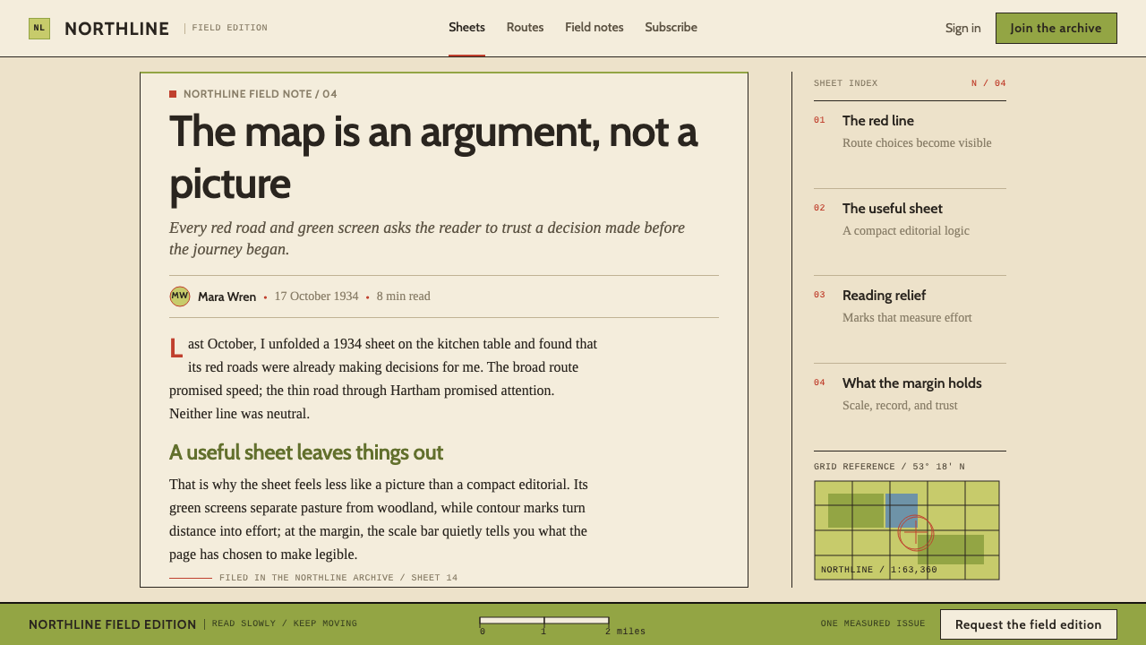
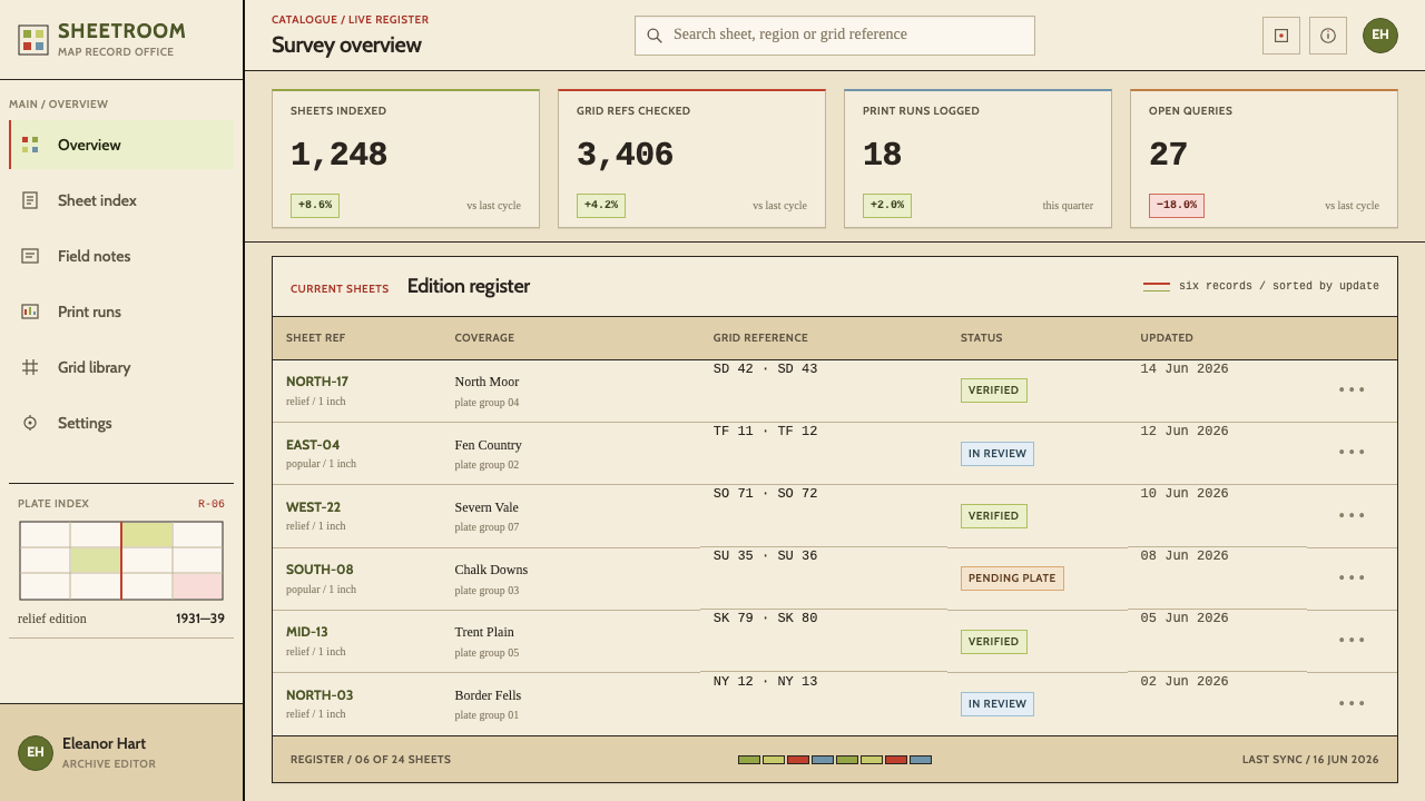
In web interfaces, the style suits documentation, data portals, route and travel planners, outdoor and field-guide products, archives and any dashboard where a reader must learn a key and then scan quickly. Keep the buff ground, use black for structure, assign colours to functions and keep them there, and replace drop shadows with rules, hatching or contour-like lines. Cards become framed plates; panels get a neatline; empty states look like blank map sheets.
For editorial and marketing work, the style gives travel writing, local history, guidebooks, atlases and heritage brands a trustworthy, well-travelled tone. Long-form pages can adopt the margin-and-face layout, with notes and captions in the margin. Packaging and printed material can borrow the folded-sheet cover. Photography works best in a restrained, slightly warm treatment, and maps and diagrams should be treated as the main illustration.
The common mistake is to use the palette as a rainbow. In the original, each colour belongs to a class of information, and using blue or red for decoration destroys the key. Other errors include relying on soft shadow or photographic relief instead of ruled lines, adding fake coffee stains or torn edges that turn precision into costume, and mixing the serif and sans according to taste instead of by feature class. Keep the roles fixed and the margins generous.
Ordnance Survey One-Inch — FAQ
Is this just a vintage or retro map style?
No. Retro map styles usually borrow surface effects such as aged paper, stains and compass roses. This system borrows the discipline underneath: fixed colour roles, ruled relief, a margin that carries the apparatus, and type chosen by feature class. The paper tone gives warmth, but the real contribution is the logic that makes information easy to read.
Why alternate a serif and a sans-serif?
On the original sheets the two faces were not a matter of taste. A Times-style serif and a Gill-style sans each took on a class of features, so the lettering itself told the reader what kind of thing was being named. In a design system, this makes typography a layer of meaning. Choose the rule once, such as one family for places and another for physical features, and apply it consistently.
How should I use the red contour colour in an interface?
Give it a fixed job, as the original did. Red could mark elevation-like or scale-like information, such as a threshold, a gradient or a measured level, but not general emphasis. If red also appears as an error colour, the key becomes ambiguous. Decide the role of every colour first, write it into a legend, and hold to it.
Does the style have to look like a map?
No. The map is the source, but the principles transfer: an outer margin, an inner frame, a legend, fixed colour roles, and relief or depth shown with lines. A documentation page, a pricing table or a report can use all of them without drawing a single contour. Use maps themselves where they serve the content, and let the structure do the work elsewhere.
Can the style work in a dark theme?
It is a light-ground system, because its identity comes from ink on buff paper. A dark theme would lose the print logic. If you need a dark mode, treat the buff paper as a plate that remains light within the page, or invert only the surrounding application chrome, and keep the map-like content itself on the warm light ground.
Related design styles
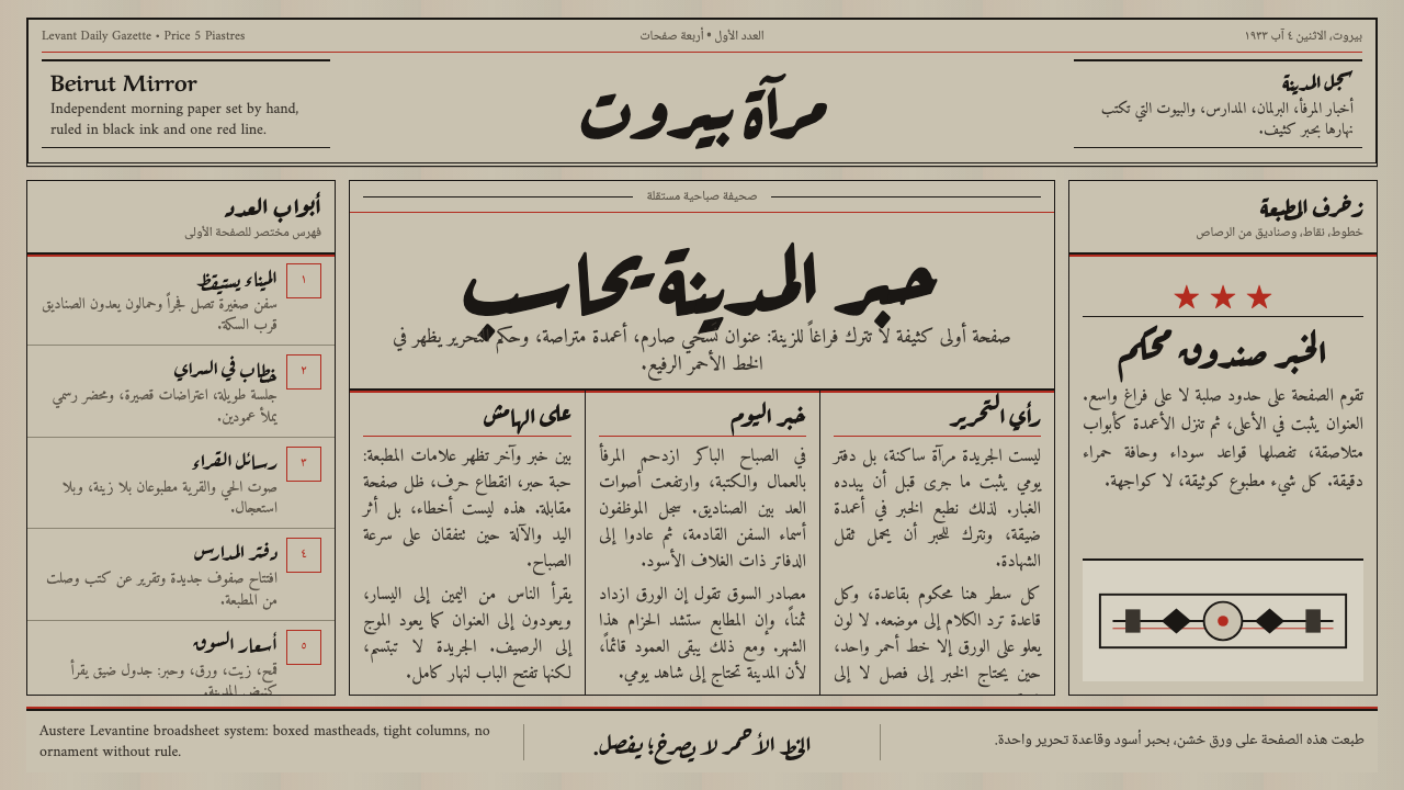 An-Nahar Beirut PressDense authority. Aged newsprint, black naskh columns, and one red rule hold t…
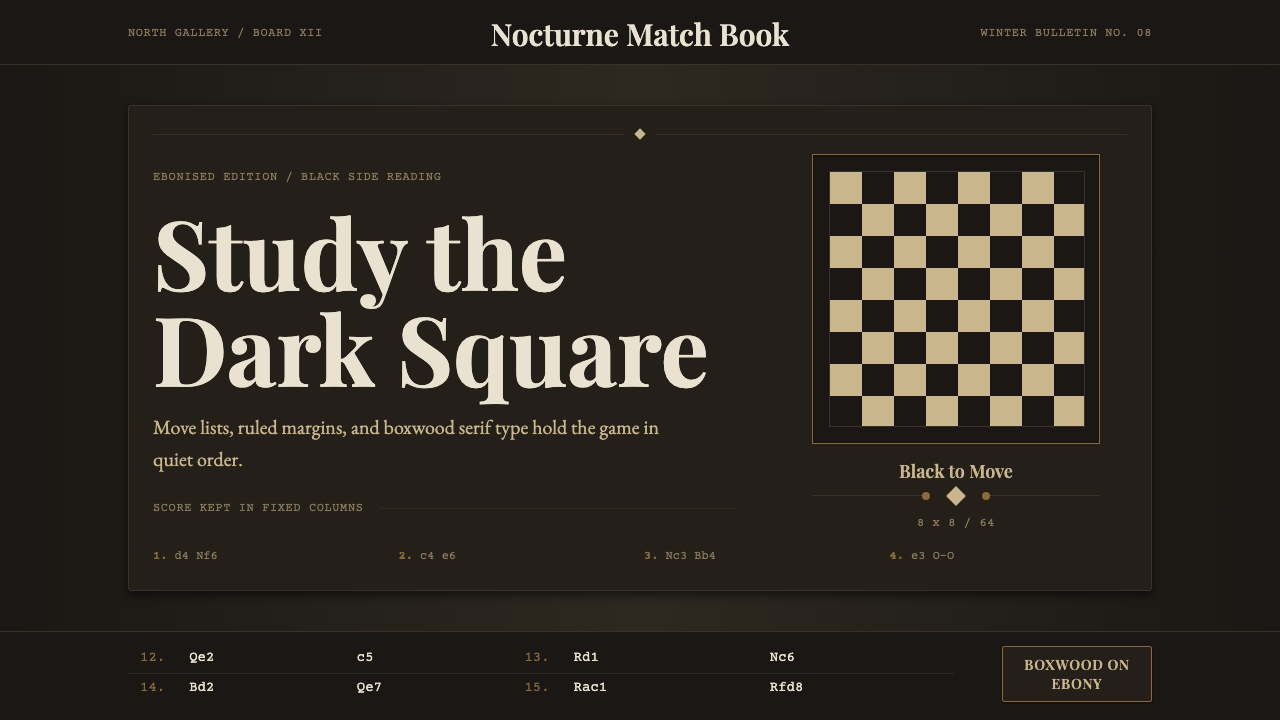 Chess TournamentQuiet intellect. Cream Playfair type, walnut rules, and notation glow on ebon…
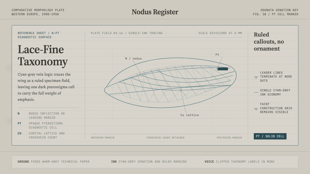 Dragonfly Wing VenationPrecision, nearly weightless. Cyan-grey veins rule a foxed paper taxonomy pla…
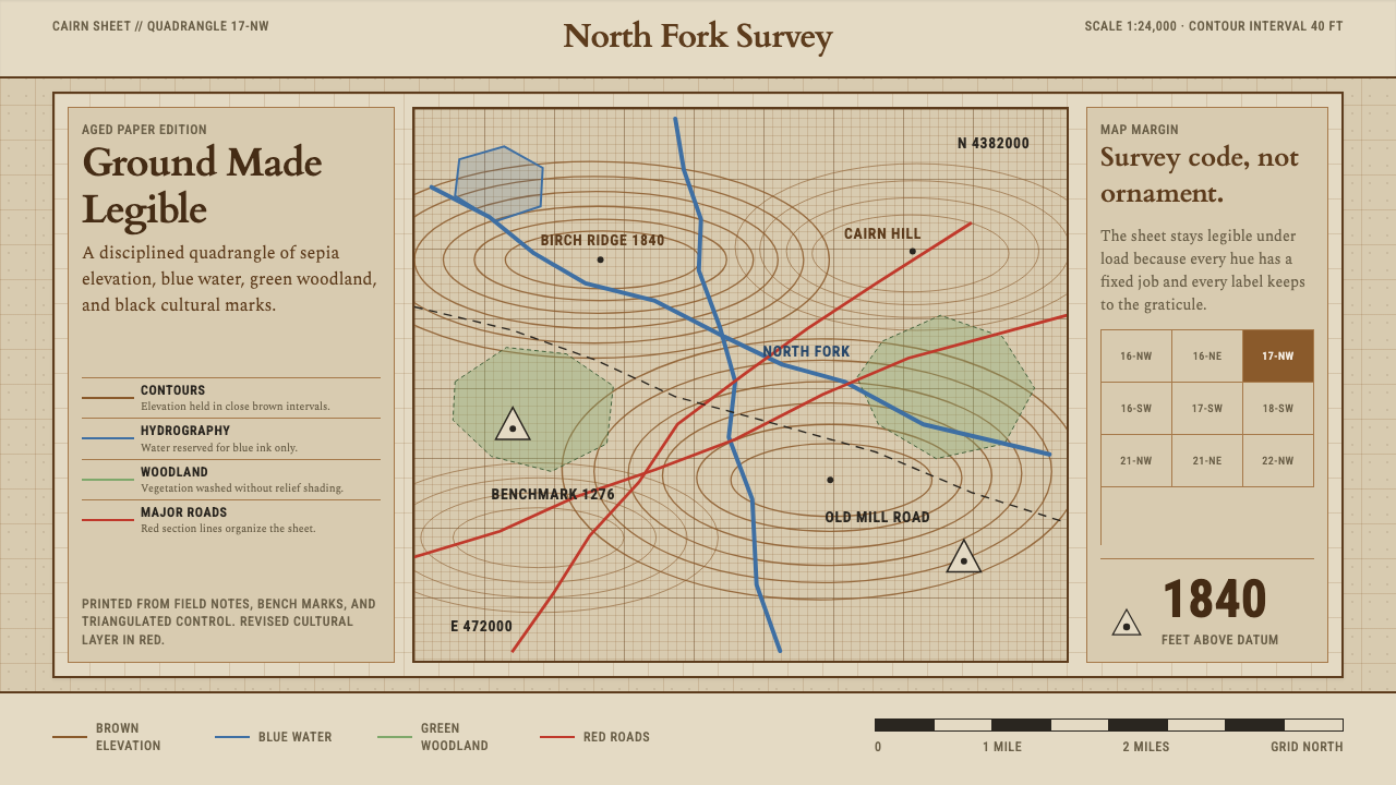 Topographic Survey MapMeasurement becomes beauty. Sepia contours and blue hydrography sit on aged m…
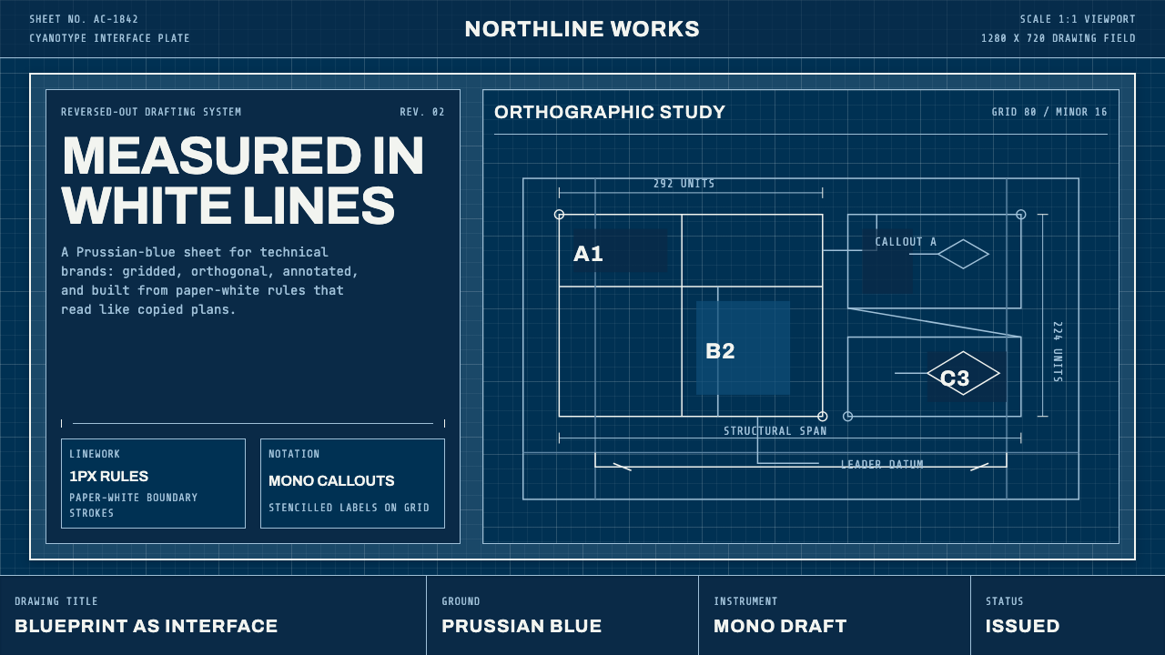 Architect CyanotypePrecision in negative. Prussian blue ground, paper-white grid, mono dimension…
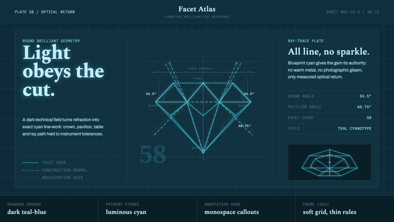 Brilliant Cut Facet DiagramOptics becomes blueprint. Cyan facet lines and ray paths glow on dark teal.