What is Dragonfly Wing Venation?
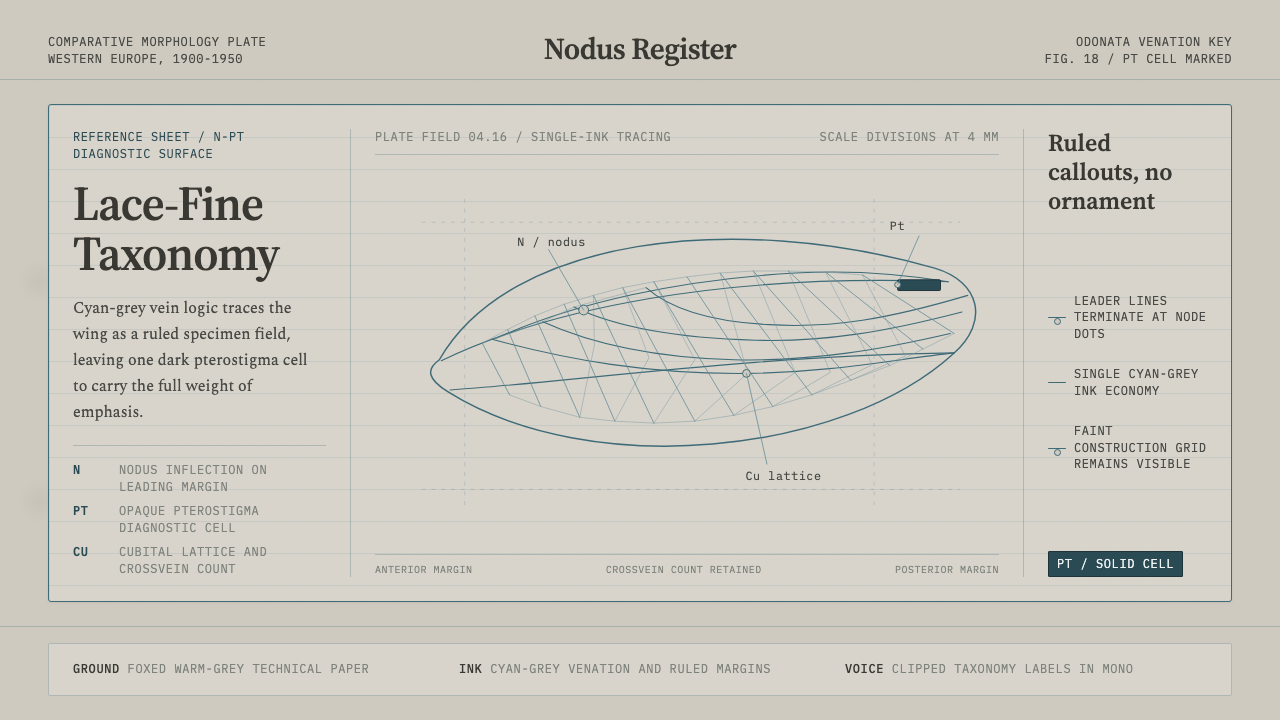
Dragonfly Wing Venation turns the nearly weightless precision of an entomological diagram into a visual system of cyan-grey lattices, ruled paper, and one dark, decisive wing cell.
Dragonfly Wing Venation in brief
Dragonfly Wing Venation is a design style derived from Western European Odonata taxonomy keys and comparative-morphology illustrations produced between 1900 and 1950. Those technical sheets recorded the structure of dragonfly wings as lace-fine networks, tracing the nodus, pterostigma, and surrounding veins with disciplined line work. Their visual character comes from a striking contrast: extremely delicate cyan-grey marks spread across foxed warm-grey paper, while a single dark, opaque pterostigma cell interrupts the transparency of the lattice.
The style is diagrammatic rather than pictorial. It does not attempt to recreate the sheen, color, or movement of a living dragonfly. Instead, it isolates relationships: where one vein branches, where another terminates, which cell receives emphasis, and how a label connects to a structure without obscuring it. Ruled margins, compact labels, and leader-line callouts make the page behave like a taxonomy key whose purpose is comparison and identification.
As an interface language, Dragonfly Wing Venation replaces decorative mass with organized traces. Lines define regions, connect evidence, and guide attention; labels remain small but legible; empty paper is treated as working space rather than unused space. The result feels archival, analytical, and unusually light. Its beauty arises from the economy of scientific draughtsmanship: almost everything is line, and the rare filled shape carries exceptional authority.
Where does Dragonfly Wing Venation come from?
The style originates in the Western European convention of entomological line diagrams during the first half of the twentieth century. Odonata systematists needed to compare wing structures whose diagnostic differences could be minute. A general illustration of a dragonfly was not enough: identification depended on clearly recording the arrangement of veins, cells, junctions, and landmarks such as the nodus and pterostigma. The taxonomy key therefore favored selective precision over naturalistic completeness.
Entomological draughtsmen translated specimens and morphological observations into stable printed evidence. Their task required judgment as much as manual control. A line had to remain fine enough to preserve the wing's apparent lightness, yet distinct enough to survive reproduction on technical reference paper. Intersections needed to be unambiguous, labels had to sit outside crowded structures, and leader lines had to reach their targets without becoming confused with the anatomy itself. This practical discipline produced the characteristic combination of airy latticework and controlled annotation.
Comparative-morphology illustrators supplied the broader intellectual framework. Their images were organized not as isolated portraits but as instruments for examining structural variation. Repeated diagrams, ruled divisions, abbreviated labels, and restrained ink helped readers move between specimens without being distracted by changing pictorial effects. The warm-grey, foxed surface of an aged sheet now contributes historical atmosphere, but the underlying composition was functional: a quiet ground allowed the vein network to remain visible while avoiding the glare and theatrical contrast of a pristine display surface.
Between 1900 and 1950, this convergence of Odonata systematics, comparative morphology, and scientific line-diagram convention established a recognizable visual grammar. It had no need for expressive brushwork, abundant color, or decorative illustration. Authority came from consistency, legibility, and the belief that a carefully chosen line could make a biological relationship intelligible. Dragonfly Wing Venation preserves that grammar while detaching it from the literal specimen plate, allowing margins, cells, labels, and branching paths to organize contemporary information.
What defines the Dragonfly Wing Venation look?
Cyan-Grey Ink
The primary ink is a cool, subdued cyan-grey rather than vivid blue or neutral black. It gives the vein network enough separation from the warm paper while preserving a faded technical character. Most lines, rules, labels, and secondary annotations remain within this single-color economy. Darker ink is reserved for decisive information, so ordinary structure never competes with the principal landmark.
Foxed Paper Ground
The ground resembles an aged technical reference sheet: warm grey, softly uneven, and marked by restrained foxing. Its wear should remain atmospheric rather than picturesque. The paper supports the historical taxonomy character and softens contrast, but it must never become so mottled that fine lines disappear. Age is treated as context for evidence, not as decorative distress.
Venation Lattice
Branching lines form elongated, irregular cells that recall the internal structure of a dragonfly wing. The network is neither an ornamental lace pattern nor a conventional rectangular grid. It combines repetition with biological variation: some paths run almost parallel, others converge, divide, or terminate. This controlled irregularity gives the system motion without relying on animation or pictorial depth.
Pterostigma Emphasis
One compact, dark, opaque cell acts as the visual pterostigma. Against a field composed almost entirely of fine strokes and open paper, this filled mark becomes the strongest point of orientation. In applied layouts it may identify a selected state, critical datum, category anchor, or primary action. Its power depends on rarity; multiplying filled cells dissolves the analogy and flattens the hierarchy.
Ruled Margins
Margins are visibly constructed through fine rules rather than left as anonymous empty borders. These lines frame the sheet, establish reading zones, and provide attachment points for labels or references. They should feel like part of a working scientific plate, not like a decorative picture frame. Their quiet continuity gives the composition discipline without adding visual weight.
Leader-Line Annotation
Labels sit outside dense structures and connect to their subjects through spare leader lines. The relationship between note and target must be immediately traceable, with minimal crossing and no ambiguity about endpoints. Annotation is part of the composition rather than an afterthought: it creates rhythm along the margins and turns explanatory text into a visible layer of evidence.
Weightless Hierarchy
Hierarchy is created through density, placement, line continuity, and the contrast between open and filled cells. Large blocks, heavy decoration, and abundant color are unnecessary. A darker landmark can dominate a broad field of delicate information, while generous open paper keeps complex networks readable. The system feels precise because every increase in visual weight is deliberate and scarce.
Who shaped Dragonfly Wing Venation?
Odonata systematists supplied the classificatory purpose behind the imagery. By comparing the nodus, pterostigma, vein paths, and enclosed cells, they treated wing structure as evidence for identification rather than as incidental surface detail. Their need for consistent comparison shaped the plate's restrained color, repeated diagram formats, and emphasis on landmarks that could be located quickly across multiple specimens.
Entomological draughtsmen converted observation into reproducible line diagrams. They balanced anatomical fidelity with the limits of technical printing, deciding which traces needed continuity, where labels could be placed, and how a crowded lattice might remain legible. The visual elegance associated with the style is inseparable from this editorial labor: clarity emerged through selection, spacing, and controlled omission.
Comparative-morphology illustrators organized biological form for side-by-side study. Their contribution was not merely accurate drawing but the construction of comparable visual conditions: stable viewpoints, consistent line treatment, restrained grounds, and annotations that exposed structural differences. This method underlies the style's usefulness for modern information design, where relationships matter more than isolated spectacle.
How do you use Dragonfly Wing Venation today?
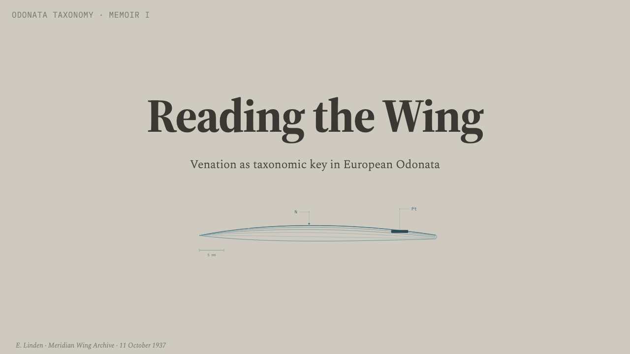
For presentation slides, Dragonfly Wing Venation works best when the entire deck behaves like a sequence of reference plates. A cover can place the title within a broad field of warm paper, crossed by a partial cyan-grey vein network and anchored by one dark pterostigma-like cell. Content slides should retain ruled margins and attach short explanatory notes to headings, quotations, or diagrams through leader lines. The lattice should organize the composition without running behind every sentence; open areas are essential to the style's apparent weightlessness.
Data slides can translate values into cells, branches, and points of convergence without pretending that every chart is a literal insect wing. A branching diagram suits processes or taxonomies, while repeated open cells can hold comparable categories. One filled cell may identify the selected series or decisive finding. Conventional charts can also remain intact if their axes and guides adopt the fine cyan-grey line language. The objective is analytical continuity: data, annotation, and frame should appear to belong to the same technical sheet.
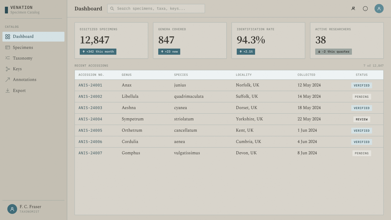
In web interfaces, the style is particularly effective for dashboards and pricing pages that need calm differentiation rather than colorful spectacle. Dashboard regions can be bounded by fine rules, with status notes connected to values through short leaders and one dark cell marking the active view or urgent condition. Pricing tiers may appear as adjacent compartments within a larger venation-like framework. Interactive emphasis should be rare and unmistakable; if every control is filled or strongly contrasted, the interface loses the single landmark that makes navigation intuitive.
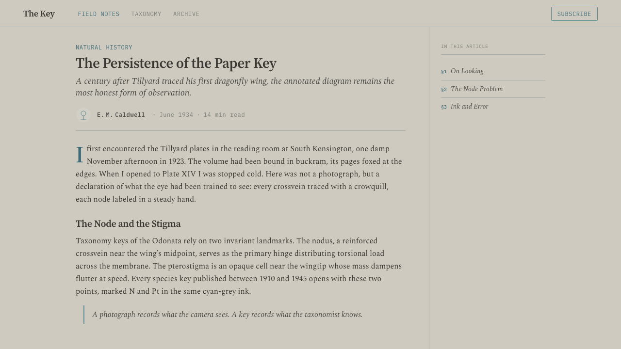
Editorial and marketing layouts benefit from the style's capacity to turn explanation into atmosphere. An article can use a ruled outer margin, narrow annotations, and occasional branching diagrams to connect claims with definitions or evidence. A marketing page can present features as labeled structures within one continuous network, allowing the visitor to follow relationships instead of encountering disconnected promotional cards. The historical paper character should support credibility and curiosity, while copy remains direct, factual, and spacious enough to avoid becoming a specimen-label parody.
The most common mistake is to treat wing venation as a decorative pattern and cover every surface with dense branching lines. That reverses the logic of the source material. Scientific draughtsmanship uses detail selectively so that relationships can be read, and its dark pterostigma works only because the surrounding field is open and lightly marked. Excessive foxing, ornamental insects, multiple saturated colors, or numerous opaque cells turn the system into themed illustration. Authentic application begins with information, then draws only the lines needed to reveal its structure.
Dragonfly Wing Venation — FAQ
Is Dragonfly Wing Venation simply a nature-inspired pattern?
No. Its source is not the decorative appearance of a dragonfly alone but the scientific convention used to analyze and compare wing morphology. The branching lattice matters because it records relationships among veins, cells, and landmarks. A nature pattern may repeat forms for visual pleasure; this style uses lines to classify, connect, and explain. Its most convincing applications preserve that informational purpose even when no literal wing is shown.
Why is the pterostigma represented as a single dark cell?
In the source diagrams, the pterostigma is a distinct, opaque landmark within a largely transparent network of veins and cells. Translating that contrast into design creates an efficient focal device. The dark cell can mark selection, priority, or orientation without requiring additional color. It should normally remain singular or exceptionally rare, because repetition would turn a landmark into a texture and weaken the hierarchy.
How much paper aging should the style include?
Only enough to establish the atmosphere of an aged technical reference sheet. Warmth, faint unevenness, and restrained foxing can soften the field and distinguish it from a sterile modern canvas. Heavy stains, torn edges, or theatrical distress compete with the fine venation and make the page feel like a nostalgic prop. The paper must remain quieter than the information printed upon it.
Can the style support dense information without becoming unreadable?
Yes, provided density is localized and the margins remain active. Complex vein networks can occupy selected regions while labels move outward and connect through clear leader lines. Repeated line treatment, open cells, and generous paper around important text help readers separate structure from annotation. Uniform density across the whole composition is the real danger; contrast between intricate and quiet zones is what makes a technical plate navigable.
When is Dragonfly Wing Venation a poor fit?
It is a poor fit when a product depends on exuberant color, immediate emotional warmth, or large pictorial storytelling. The style's authority comes from restraint, analysis, and archival distance, so it can feel overly clinical when the message requires intimacy or spontaneity. It is strongest for educational, scientific, editorial, and information-rich contexts where comparison and explanation are central. The subject need not involve biology, but the content should reward careful looking.
Related design styles
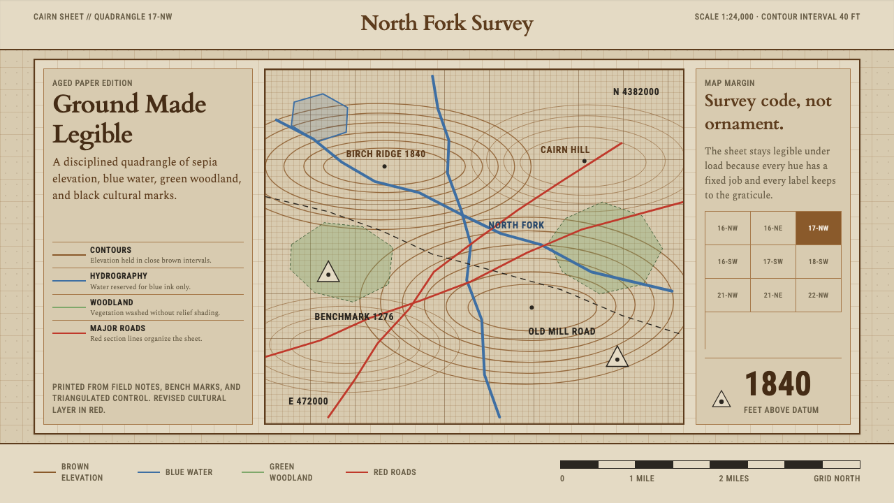 Topographic Survey MapMeasurement becomes beauty. Sepia contours and blue hydrography sit on aged m…
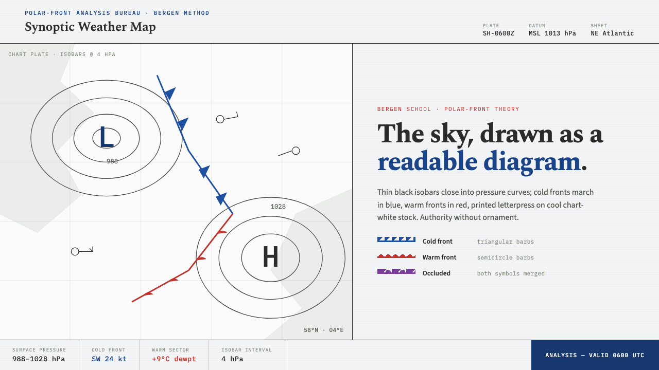 Synoptic Weather MapThe sky as a readable diagram. Black isobars, blue cold fronts, red warm fron…
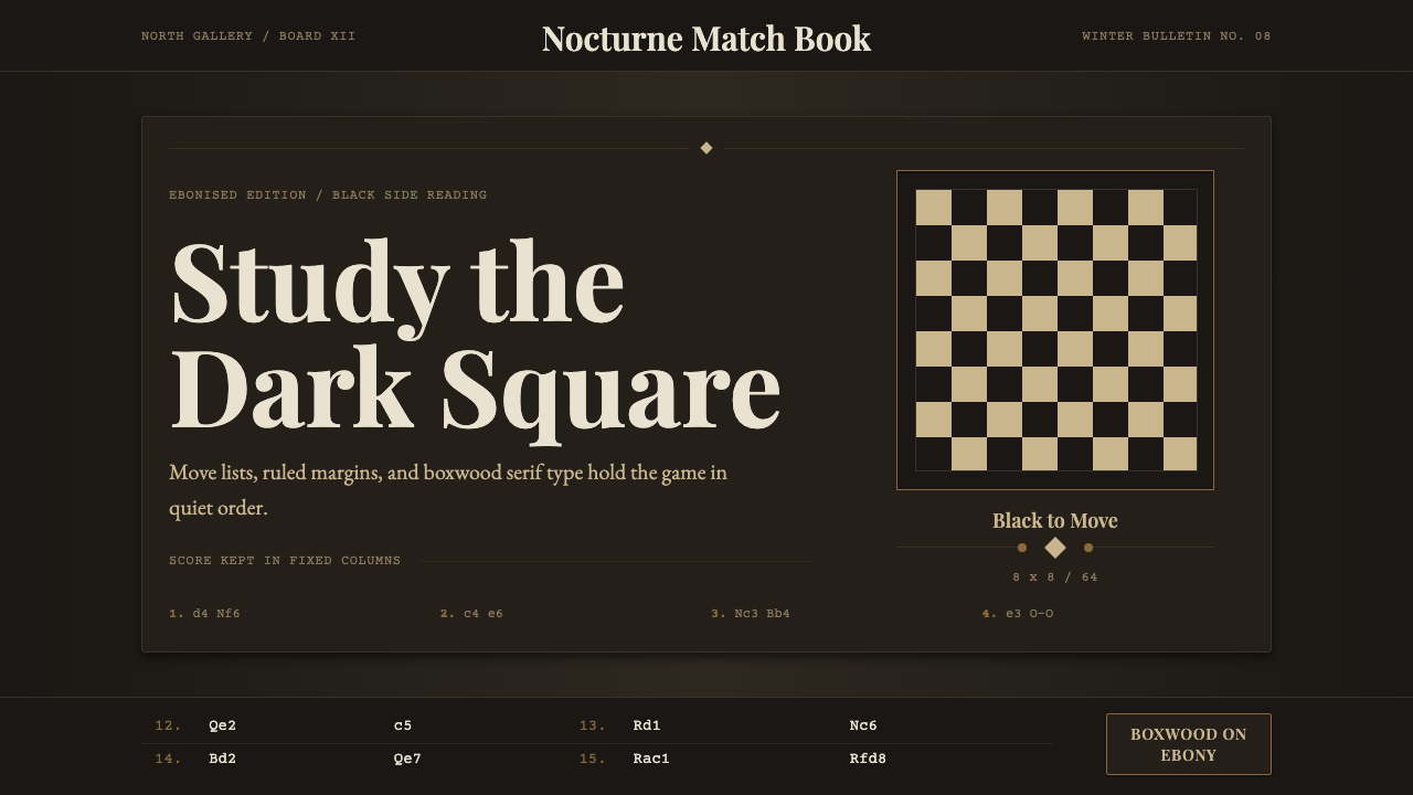 Chess TournamentQuiet intellect. Cream Playfair type, walnut rules, and notation glow on ebon…
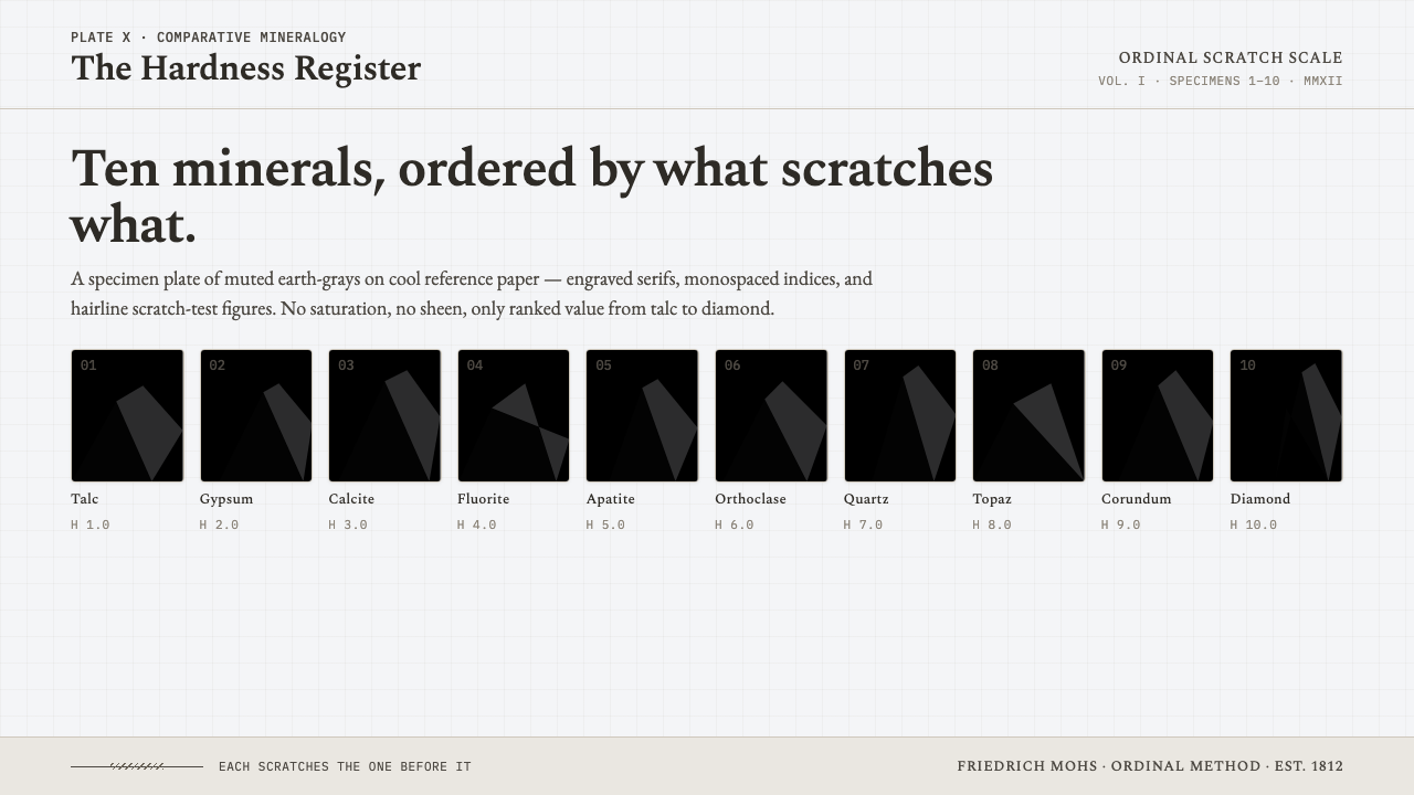 Mohs Hardness ScaleRanked by what scratches what. Ten mineral-gray chips on cool chart-white, en…
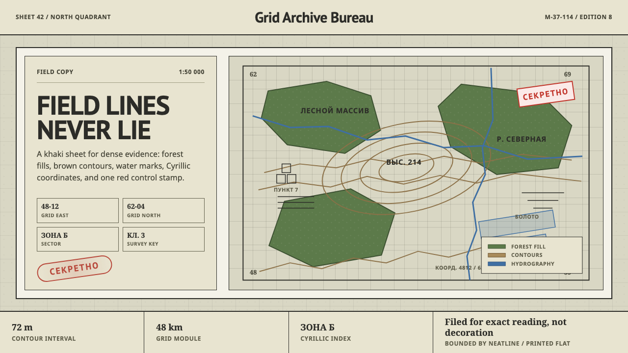 Soviet Classified MapAustere field intelligence. Khaki grid, forest green fills, brown contours, r…
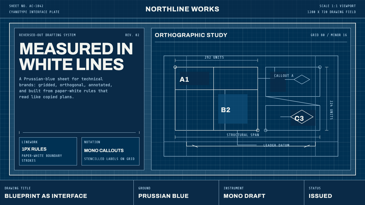 Architect CyanotypePrecision in negative. Prussian blue ground, paper-white grid, mono dimension…