What is Alpine Funicular Ticket?
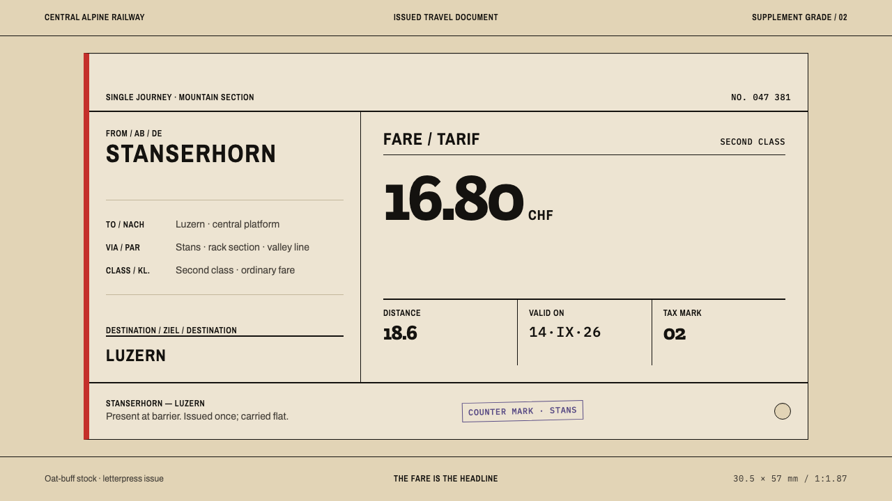
The Alpine funicular ticket is printing reduced to information: a small buff card on which every mark exists because the railway needed it, and nothing exists because anyone wanted it pretty.
Alpine Funicular Ticket in brief
Alpine Funicular Ticket is a design style drawn from the Edmondson card, the small pasteboard ticket issued on the funiculars and rack railways of central Switzerland. The card was at its fullest spread between 1900 and 1950, and the Swiss issue did not stop until December 2007; the Stanserhorn funicular is described in the source material as still handing one to passengers today. A format that outlasted its own era by that margin is worth studying for what it never contained.
An Edmondson card is unbleached pasteboard, set in metal type at a small jobbing print shop, stamped with the date at the ticket counter and punched through at the barrier. Nothing on it is decorative. The pair of stations is printed twice, the fare and the distance in kilometres share one line, a serial number is struck by a numbering machine, and a narrow coloured stripe runs down the long axis of the card. Even the stripe reads as a signal rather than a flourish.
As a visual system, the style takes the card itself as a layout instrument. Information stacks flush left in parallel language blocks; hairline rules divide fields where a modern interface would draw boxes; slab-serif figures sit against grotesque station names; the ink looks pressed into oat-buff stock rather than laid on top of it. Corners are square, as if cut by a guillotine, and everything lies flat, with no elevation, no floating layers and no rounding. The effect is administrative and trustworthy, quietly regional and entirely tactile: a page that feels issued rather than designed.
Where does Alpine Funicular Ticket come from?
The card carries the name of Thomas Edmondson, whose system of pre-printed, serially numbered pasteboard tickets, dated in a press at the point of sale, became the model for railway ticketing across Europe. Its logic was accounting as much as travel. A numbered ticket can be reconciled against the clerk's stock, a dated ticket cannot be reused on another day, and a punched ticket has been consumed. The source material lists European railway ticketing standardisation among the movements behind the style, and that is the right context: the Edmondson card spread because it made a railway's paperwork legible to every clerk on the line, whatever station they worked at.
In Switzerland the format settled onto the mountain lines: the central Alpine funiculars and rack railways, short, steep and busy with locals and visitors alike. These were small operators, and their tickets were not produced by a national security printer but by jobbing shops, the ordinary commercial printers who turned out forms, notices and invoices from the same cases of type. One such house, Druckerei Aeschbacher in Worb, is named in the style's reference record. The jobbing trade explains the typography. A shop works with the type it owns, so period grotesques turn up beside slab-serif numerals, set in a handful of sizes and locked into a frame with metal rules cut to length. The look is that of a clever, constrained compositor rather than a designer with unlimited options.
A finished ticket carries marks made by three different hands. The printer sets the permanent text: station names in two languages, the fare, the kilometre figure and the coloured stripe. A numbering machine strikes a serial into each card. At the counter, the clerk presses the date. At the barrier, a gatekeeper punches the card to cancel it. The source material points to an Edmondson press numbered 736, an individual dating press of the Rhaetian Railway, as one of its reference artefacts, and the number matters: each press was a distinct machine with its own wear, its own slightly uneven impression and its own history. The style inherits the sense that a ticket is finished by use, not by design.
Chronologically the card sits on a long plateau. It was already established when the style's reference period opens, it was everywhere on the mountain lines between 1900 and 1950, and it remained in Swiss issue until December 2007. It never modernised because it never tried to be modern; it kept doing one narrow job. That endurance is what makes the aesthetic stable enough to borrow. It carries no fashion of its own decade, only the settled habits of a trade: flush-left text, rules instead of boxes, ink with weight, edges cut true.
What defines the Alpine Funicular Ticket look?
Stock and Ink
The ground is unbleached pasteboard in an oat-buff tone, never white and never glossy. Text is printed in a single dark ink that bites into the surface the way letterpress does, leaving edges slightly soft and slightly dense. The result has the quiet warmth of paper that has been handled, and it sets the tone for everything laid on top: contrast is real but never harsh, and the page feels like a material rather than a screen.
The Red Stripe
A single narrow stripe runs down the long axis of the card, and in this system it is red. It is the only strong colour and the only graphic gesture that is not text. Because it appears once, it behaves as a signal, marking class, direction or category. Used sparingly it organises the whole composition; repeated or multiplied it turns into decoration, which is exactly what the card refuses to be.
Slab and Grotesque
Station names are set in a grotesque, the plain early sans-serif of commercial printing, while figures such as fares and kilometres are set in a slab serif with sturdy, even strokes. The pairing is functional: names are read, figures are checked, and a slab numeral is hard to misread at a glance across a counter. Hierarchy comes from size and position within a small number of sizes, not from a long ladder of weights.
Parallel Language Blocks
Text is stacked flush left in parallel blocks, one per language, with the same order and the same structure in each; the Swiss original pairs German and French. There is no centred headline and no decorative alignment. The reader's eye finds the same field in the same place, and either language can be skipped without losing the structure. The principle transfers directly to any bilingual or multi-purpose interface.
Hairline Rules, Not Boxes
Fields are divided by thin rules cut to length rather than enclosed in outlined boxes or filled panels. A rule separates without containing, so information sits directly on the stock. This keeps the layout light and dense at once, and it makes the card read as a table of facts rather than a collection of widgets.
Doubled Facts and Serial Marks
The station pair appears twice, fare and kilometres share a single line, and a serial number is struck by a numbering machine. Repetition is a feature: it lets a clerk and a gatekeeper confirm the same facts independently. The marks of use, the pressed date and the punched hole, complete the surface. The style treats these index marks as the only ornament it needs.
Flat and Square
Corners are cut square by a guillotine. There is no elevation, no float, no rounding, no shadow and no gradient. Every element lies in the same plane and is held in place by alignment alone. Depth, where it exists at all, is the slight physical impression of type in card, never a simulated lift.
Who shaped Alpine Funicular Ticket?
The Edmondson card is named for him: a pre-printed, numbered pasteboard ticket, dated in a press at the counter. His system turned a railway's tickets into a stock that could be counted and tracked, and it became the template for ticketing across European railways. For design purposes his legacy is a constraint: a format small enough to hold between two fingers and strict enough that every field must justify its place.
A printing house in Worb, cited in the source material as a representative of the Swiss jobbing trade behind these cards. It stands for the ordinary commercial printer, working in letterpress with the type on hand and producing funicular tickets alongside other everyday commercial work. The style's slab-and-grotesque pairing and its tightly locked-up layouts are that trade's inheritance.
An individually numbered Edmondson dating press associated with the Rhaetian Railway, listed in the reference record as an anchor for how the dated impression looks and behaves. It is a reminder that the date on an Edmondson ticket is struck by a machine at the counter, not printed in advance, and that machine-made imperfection belongs to the style.
How do you use Alpine Funicular Ticket today?
Alpine Funicular Ticket suits work that wants to feel issued, official and legible without looking corporate. It is a light, warm, paper-based style, so it is strongest where information is dense, factual and meant to be checked: schedules, fares, passes, reports, and anything with a clerk's seriousness about it.
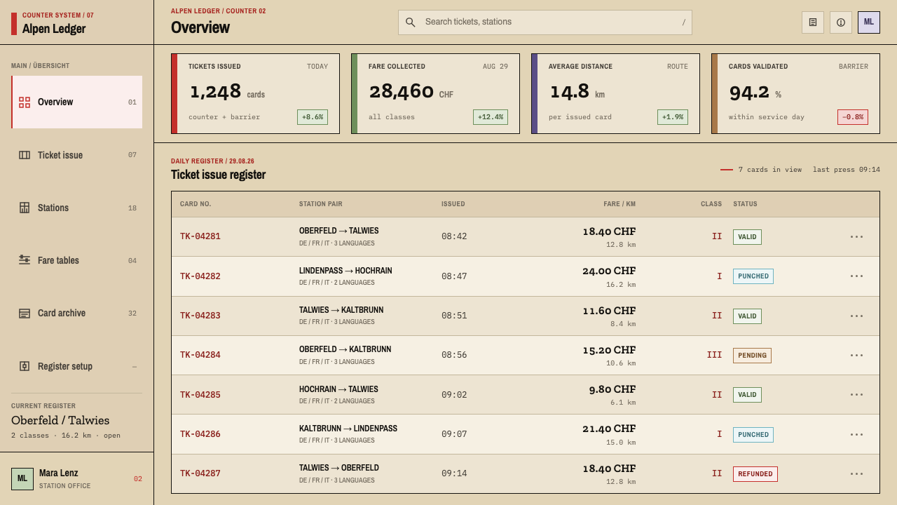
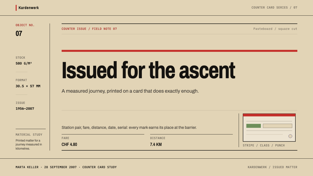
For presentation slides, a cover can echo the card: an oat-buff ground, the title set flush left in the grotesque, the key terms repeated beneath it the way a station pair is printed twice, and the single red stripe running down the long edge. Content slides work as parallel blocks, a statement and its plain-language gloss stacked flush left and separated by hairline rules. Data slides are the style's home territory. Treat a table as a fare table: slab figures aligned in a single column, labels in grotesque, rules rather than gridlines, and the red stripe or one red figure marking the single number the audience should remember.
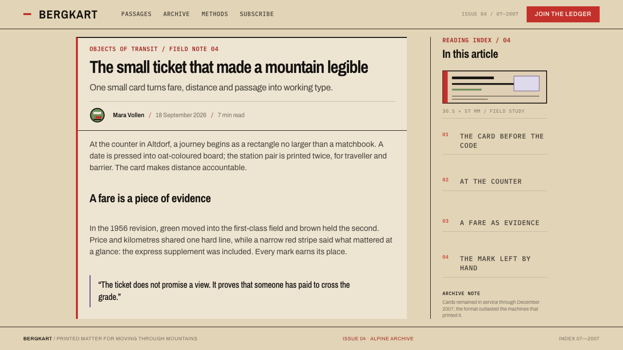
On the web, dashboards and admin tools benefit from the card's discipline. Rows are divided by hairlines, tabular figures are set in the slab face, status is expressed by a punched-hole or stamped mark rather than a coloured badge, and panels sit on the stock without shadows. Pricing pages translate almost literally. A plan becomes a ticket: the tier name and its unit on one line, the price in slab figures, the validity or limits in a parallel block below, and the red stripe on the recommended plan only.
In editorial and marketing work, the card suits timetables, itineraries, programme listings, specification sheets and bilingual layouts. Serial numbers make good folios and issue marks, and an impressed date makes a credible publication stamp. Marketing pages should keep copy short and factual and let the paper tone do the warming. A hero can be a single ticket-like block with the destination named twice; that restraint is more persuasive here than any illustration.
The common mistake is to treat the ticket as nostalgia. Adding perforated edges, torn corners, rounded corners, drop shadows or a sepia filter turns a flat, square, honest object into a vintage prop. Equally damaging is using the red stripe as a repeated decorative device or switching to a bright white ground; the card works because the stock is warm, the ink is dark and the colour appears once. Keep the corners square, the surface flat and the information true.
Alpine Funicular Ticket — FAQ
What exactly is an Edmondson ticket?
It is a small pre-printed pasteboard railway ticket carrying a serial number, dated in a press at the counter and punched at the barrier. It is named for Thomas Edmondson and became a standard across European railways. In Switzerland it was issued on mountain lines until December 2007, and at least one funicular is described as still handing it out.
Is this the same as a vintage or retro ticket look?
No. A retro ticket look usually adds ornament: perforated edges, torn paper, sepia tint, rounded corners. This style does the opposite. It treats the card as a working instrument and keeps only what the railway needed, so the surface is flat, the corners are square and the single colour is a signal. If a layout looks like a prop, it has drifted away from the source.
Can it work on a dark background?
The reference object is a light card with dark ink pressed into it, and the style's logic depends on that relationship. Inverting it loses the sense of ink biting into stock. If a dark surface is unavoidable, keep the ticket-like content itself light, like a card laid on a dark desk, and let the surrounding field be quiet. For fully dark interfaces a style designed around dark materials will serve better.
Why pair a slab serif with a grotesque?
Two reasons, one practical and one functional. Practically, a jobbing print shop works with whatever type it owns, and period grotesques and slab faces were the common stock. Functionally, names are read and figures are checked: the plain grotesque keeps place names calm, and the sturdy slab keeps fares and distances from being misread across a counter.
Is it only useful for travel and transport brands?
No. It suits anything about issuing, entitlement or record: passes, receipts, permits, archives, civic services, statements and fare-like pricing. It struggles where the product wants playfulness, luxury or intense emotional warmth, because the style's whole character is administrative sobriety. Match it to products that want to be trusted rather than admired.
Related design styles
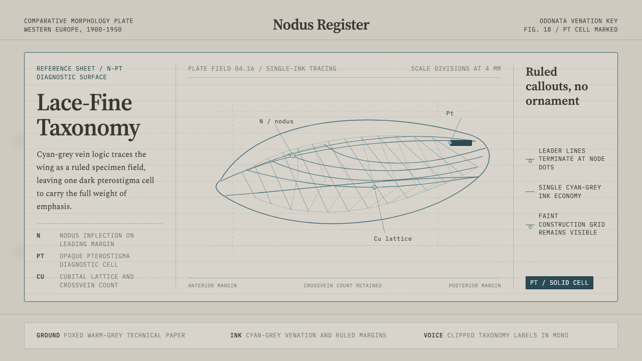 Dragonfly Wing VenationPrecision, nearly weightless. Cyan-grey veins rule a foxed paper taxonomy pla…
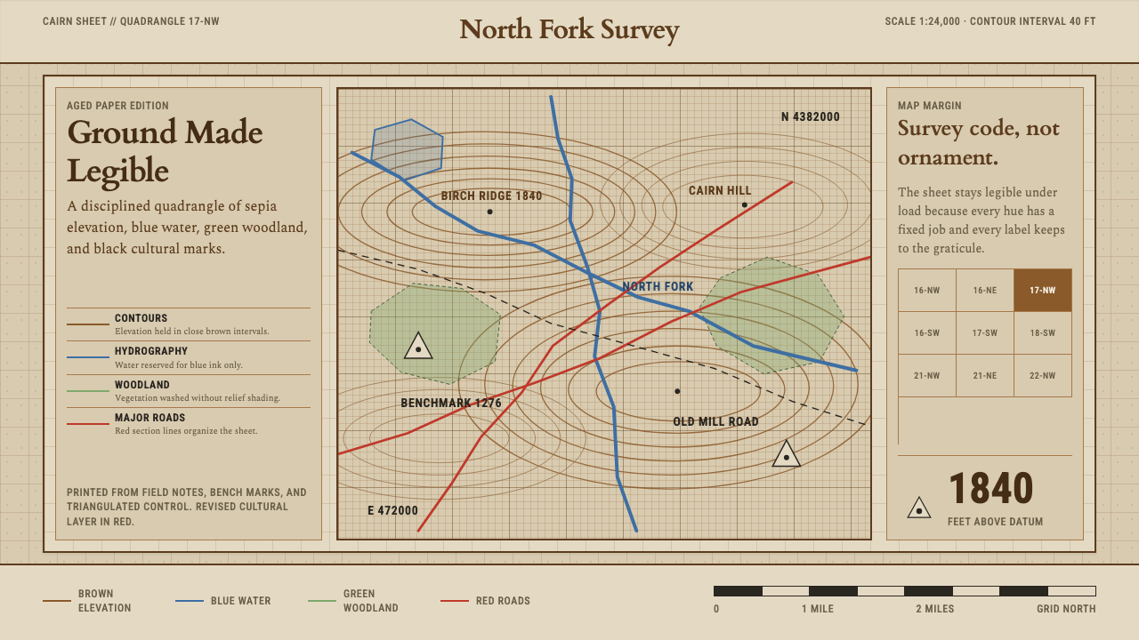 Topographic Survey MapMeasurement becomes beauty. Sepia contours and blue hydrography sit on aged m…
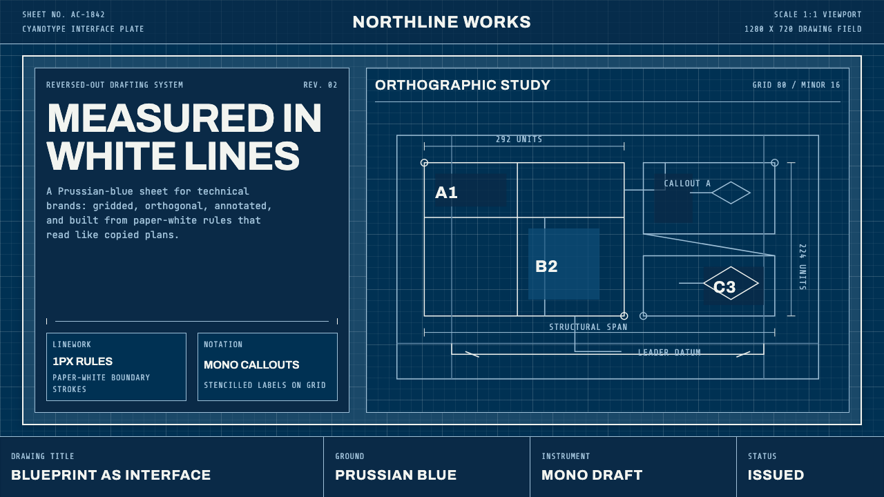 Architect CyanotypePrecision in negative. Prussian blue ground, paper-white grid, mono dimension…
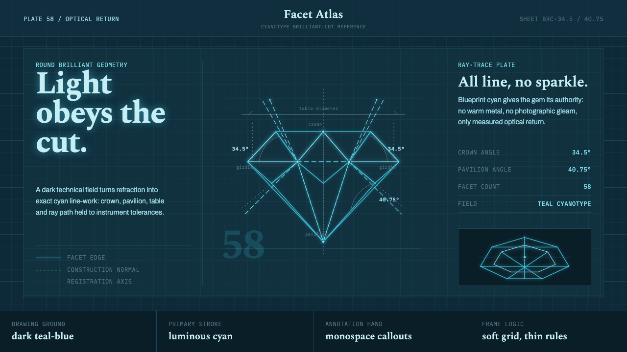 Brilliant Cut Facet DiagramOptics becomes blueprint. Cyan facet lines and ray paths glow on dark teal.
 Cyanotype BlueprintPrecision is the ornament. Prussian blue grid, paper-white hairlines, and tit…
 DIN 1451 SignageAuthorless and exact. Enamel gray grid, traffic-white DIN type, and RAL signa…