What is Topographic Survey Map?
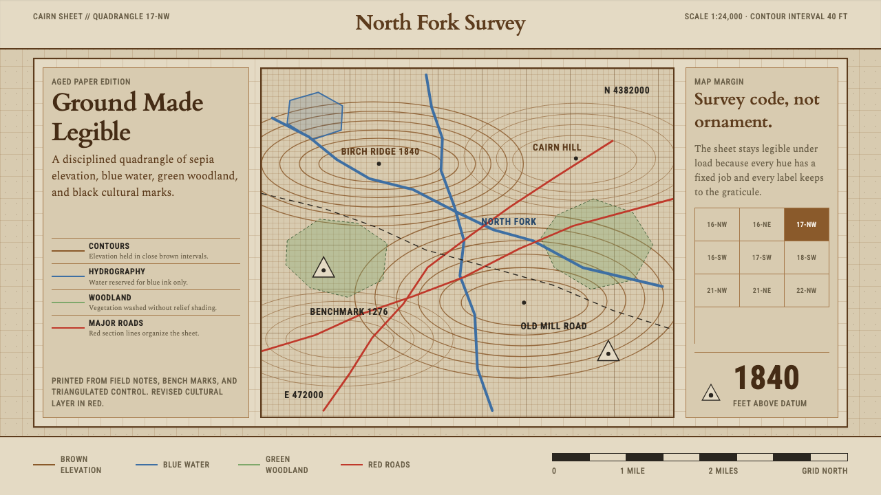
The topographic quadrangle turns measurement into a visual discipline — sepia contours, blue hydrography, and a fixed color code where every mark on the page is a fact about the ground.
Topographic Survey Map in brief
Topographic Survey Map style is drawn from the national topographic quadrangle: the standardized sheet that agencies such as the United States Geological Survey and Britain's Ordnance Survey produced to record elevation, water, vegetation, and human infrastructure on a single page. Its visual identity is built entirely from convention rather than taste. Every color has one and only one meaning. Sepia-brown lines trace contours of equal elevation. Blue ink, always blue, carries rivers, lakes, and every other body of water. A pale green wash indicates wooded ground. Black is reserved for the human record — roads, railways, buildings, and place names printed in a compact technical hand.
Because the system was designed to be read under field conditions, by surveyors and hikers squinting at a folded sheet in changing light, nothing on it is arbitrary. Line weight signals importance: a index contour, drawn heavier and usually numbered, appears every several intervals to let the eye recover its place quickly; the finer contours between them are left unlabeled, trusted to the reader's ability to count. Text is set small, condensed, and upright, oriented to follow the terrain feature it names rather than the page's horizontal grid.
The paper itself carries meaning too. Decades of storage, folding, and handling left topographic sheets warmed and slightly yellowed, and that patina has become inseparable from the aesthetic. A crisp white ground with the same sepia and blue would read as a modern reprint; the warmth of aged paper is what signals authenticity and age. The overall effect is austere, information-dense, and quietly beautiful — beauty as a side effect of legibility rather than an aim in itself.

Where does Topographic Survey Map come from?
Systematic topographic mapping matured between roughly 1900 and 1950, when national surveying bodies across Western Europe and the United States standardized how a piece of ground could be represented on paper so that any trained reader, in any country using the convention, could interpret it without a legend the size of the map. The push came from practical needs that had nothing to do with visual design: artillery placement, railway grading, dam siting, and land taxation all demanded a single, unambiguous way to record elevation and drainage.
The United States Geological Survey, founded in 1879, became the American standard-bearer for this work, publishing the 7.5-minute quadrangle series that eventually covered the entire country sheet by sheet. Britain's Ordnance Survey, whose own history stretches back to military mapping of the Scottish Highlands in the eighteenth century, performed the equivalent role in the United Kingdom, refining a symbol language — contour intervals, hachures, conventional signs for churches, mines, and marshland — that other national surveys frequently borrowed or adapted wholesale.
What made the convention durable was its refusal to encode anything beyond fact. A topographic sheet does not editorialize; it does not use color to create mood or hierarchy for its own sake. Blue means water because water needed a color and blue was legible against the sepia contour work, not because blue was thought beautiful. This anti-decorative discipline, arrived at independently by surveying bureaucracies with no aesthetic mandate, produced a visual system that later designers would come to recognize as strikingly modern: total palette restraint, total functional purpose for every mark.
By the mid-twentieth century the standardized quadrangle had become so pervasive — hanging in classrooms, folded in glove compartments, pinned to expedition tent walls — that its visual grammar entered the general public imagination as the look of careful, trustworthy knowledge. That association, of sepia line and blue ink meaning precision rather than nostalgia, is what a contemporary design system borrowing this style is really invoking.
What defines the Topographic Survey Map look?
Color Coding
The palette is not decorative — it is a legend. Sepia-brown is reserved exclusively for elevation contours, blue exclusively for hydrography, a muted green wash for woodland, and black for the human-built record of roads and place names. No hue is ever repurposed; a designer working in this style must resist the urge to introduce color for emphasis, because introducing a new color implies a new category of fact.
Contour Hierarchy
Not all sepia lines carry equal weight. A heavier index line, periodically labeled with its elevation, breaks up the finer unlabeled contours between it, giving the eye a place to recover scale and position. This hierarchy is achieved through line weight and selective labeling alone — never through color change — and it is the single most transferable device from the style: use a heavier stroke or rule to mark every nth item in a repeating sequence.
Coordinate Graticule
A fine grid of latitude and longitude reference lines sits beneath everything, quiet enough not to compete with the contour work but present enough to make the sheet feel measured rather than illustrated. In interface terms this becomes a faint background grid that never intrudes on content but constantly signals precision.
Condensed Technical Labeling
Place names and feature labels use a narrow, upright, technical letterform set small enough to pack dense information onto a single sheet without crowding the drawn terrain. Labels are oriented to follow the feature they describe — a river name curves with the river — rather than sitting rigidly horizontal, a discipline that separates authentic survey-style typography from a generic condensed sans applied without thought.
Aged Paper Ground
The warm, faintly yellowed tone of decades-old sheet paper is treated as a foundational color, not an afterthought filter. A crisp white ground with identical sepia and blue ink would read as a modern reprint rather than a working field document; the patina is what signals that the sheet has been folded, carried, and consulted.
Zero Ornament
Every mark answers to measurement. There are no decorative borders, no illustrative flourishes, no gradients used for visual richness. Where a boundary is drawn, it is drawn because a boundary exists on the ground; where a symbol appears, it stands for a specific surveyed feature such as a church, mine, or marsh, from a fixed conventional-sign vocabulary rather than an invented one.
Compact Legend Logic
Because the color and symbol system is entirely conventional and shared across an entire national survey, the legend needed on any single sheet can stay small — a handful of lines in a corner box. This compactness, born of a shared vocabulary, is what allows the sheet to devote nearly all its surface to the terrain itself rather than to explaining itself.

Who shaped Topographic Survey Map?
Founded in 1879, the USGS became the national authority for American topographic mapping, publishing the 7.5-minute quadrangle series that eventually covered the entire country. Its house style — sepia contours, blue hydrography, condensed labeling — became the default visual grammar that most American designers instinctively recognize as "a topo map," even without formal cartographic training.
Britain's Ordnance Survey traces its origins to eighteenth-century military mapping of the Scottish Highlands and became the definitive civilian mapping authority for the United Kingdom. Its symbol conventions for churches, mines, and marshland, and its own contour and hydrography color logic, were widely studied and adapted by other national surveys, making it one of the two most influential reference systems behind this style.
The broader early-twentieth-century push to standardize national topographic practice — driven by military, engineering, and taxation needs rather than aesthetics — is what produced the strict, non-negotiable color-to-meaning logic this style depends on. It is less a single figure than an institutional consensus, but its fingerprints are on every element of the visual system.
How do you use Topographic Survey Map today?
Topographic Survey Map style is a natural fit for anything that needs to feel measured, authoritative, and quietly historic rather than decorative. Applying it well means treating color as a legend, not a palette — the moment a hue is used for two different purposes, the system's internal logic collapses.
For presentation slides, a cover slide can use a large expanse of aged-paper ground with a few contour lines drifting across it and the title set in condensed technical type, as if labeling a terrain feature. Content slides benefit from the coordinate graticule idea: a faint background grid that never competes with text but signals rigor. Data slides are a strong match — bar and line charts read naturally as elevation profiles, and a heavier index line convention (bolding every fifth gridline or bar) borrows directly from contour hierarchy.
For web interfaces, the style suits dashboards, reporting tools, and any product whose value proposition is precision or trustworthiness of data — scientific tools, land and property platforms, outdoor and expedition products. Sepia and blue can be reserved for distinct data categories exactly as they are on a real quadrangle, with black held back for structural chrome and labels. Card borders should read as drawn lines rather than soft shadows; the aged-paper ground works especially well as a background for a settings or archive section, subtly distinct from a crisper working area.
For editorial and marketing work, the register suits travel, outdoor, heritage, and science-adjacent brands. A magazine-style layout can use contour-line rules as section dividers and condensed labels as running heads, echoing a map's marginal notation. Marketing pages benefit from committing fully to the aged-paper ground for hero sections, letting a single sepia or blue accent carry all emphasis rather than introducing new colors for calls to action.
The most common mistake is treating this as a generic "vintage map" filter — adding brown tones and a grid without preserving the strict one-hue-one-meaning discipline that gives the original its authority. A second frequent error is over-labeling: real topographic sheets are sparing with text, trusting line weight and position to carry information, whereas a careless adaptation crowds the page with captions that undermine the calm, load-bearing legibility the style is meant to project.

Topographic Survey Map — FAQ
Why does this style use only sepia, blue, green, and black?
Because those four colors are the entire conventional vocabulary of the national topographic quadrangle it draws from. Sepia was chosen for contours because it stayed legible against the paper without visually competing with black cultural features; blue was reserved for water because the association was immediate and unambiguous; green marked vegetation without needing further explanation. Adding a fifth color breaks the closed system — there is no unused category left for it to represent.
Is this the same as a generic "vintage map" or treasure-map aesthetic?
No. A treasure-map aesthetic borrows aged paper and decorative flourishes — compass roses, sea monsters, calligraphic borders — purely for atmosphere. Topographic Survey Map style has the opposite intent: every mark is a working fact recorded by a surveyor, and the aged paper is a byproduct of decades of handling rather than a deliberate decorative choice. The discipline is closer to an engineering drawing than an illustration.
How should I handle dark-mode or inverted layouts in this style?
The style is inherently light-ground; the aged-paper warmth is central to its identity and does not invert cleanly to a dark background. A dark variant is possible but should treat the contour lines and hydrography as luminous marks on a near-black field rather than simply flipping the paper tone to black, preserving the one-hue-one-meaning discipline even as the ground color changes.
What kind of typography pairs best with this style?
Narrow, upright, technical letterforms with restrained character — the kind historically used for cartographic labeling rather than display advertising. Labels should feel set by a draftsman, not a graphic designer: consistent, compact, and oriented to serve the content rather than to express personality. Anything ornate, script-like, or heavily stylized undermines the survey-document illusion immediately.
Where does this style struggle?
It struggles anywhere a product needs to feel warm, playful, or emotionally expressive — consumer entertainment, children's products, or brands built on personality rather than precision. Its restraint can also read as cold or overly technical in contexts where users expect reassurance rather than data. It performs best when the product's actual value is accuracy, measurement, or trustworthy record-keeping, and worst when that isn't true and the style is applied purely for its visual novelty.
Related design styles
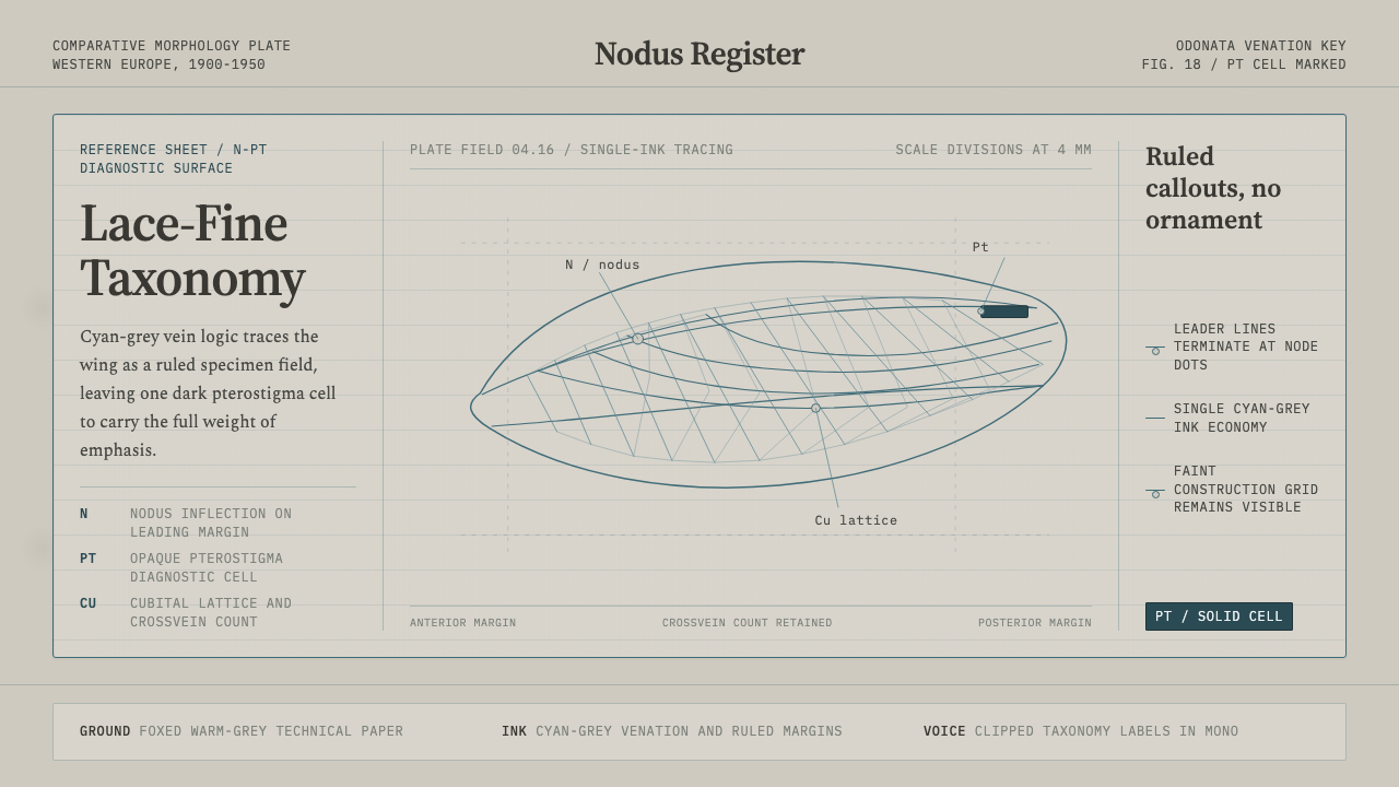 Dragonfly Wing VenationPrecision, nearly weightless. Cyan-grey veins rule a foxed paper taxonomy pla…
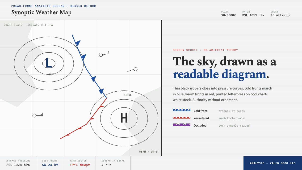 Synoptic Weather MapThe sky as a readable diagram. Black isobars, blue cold fronts, red warm fron…
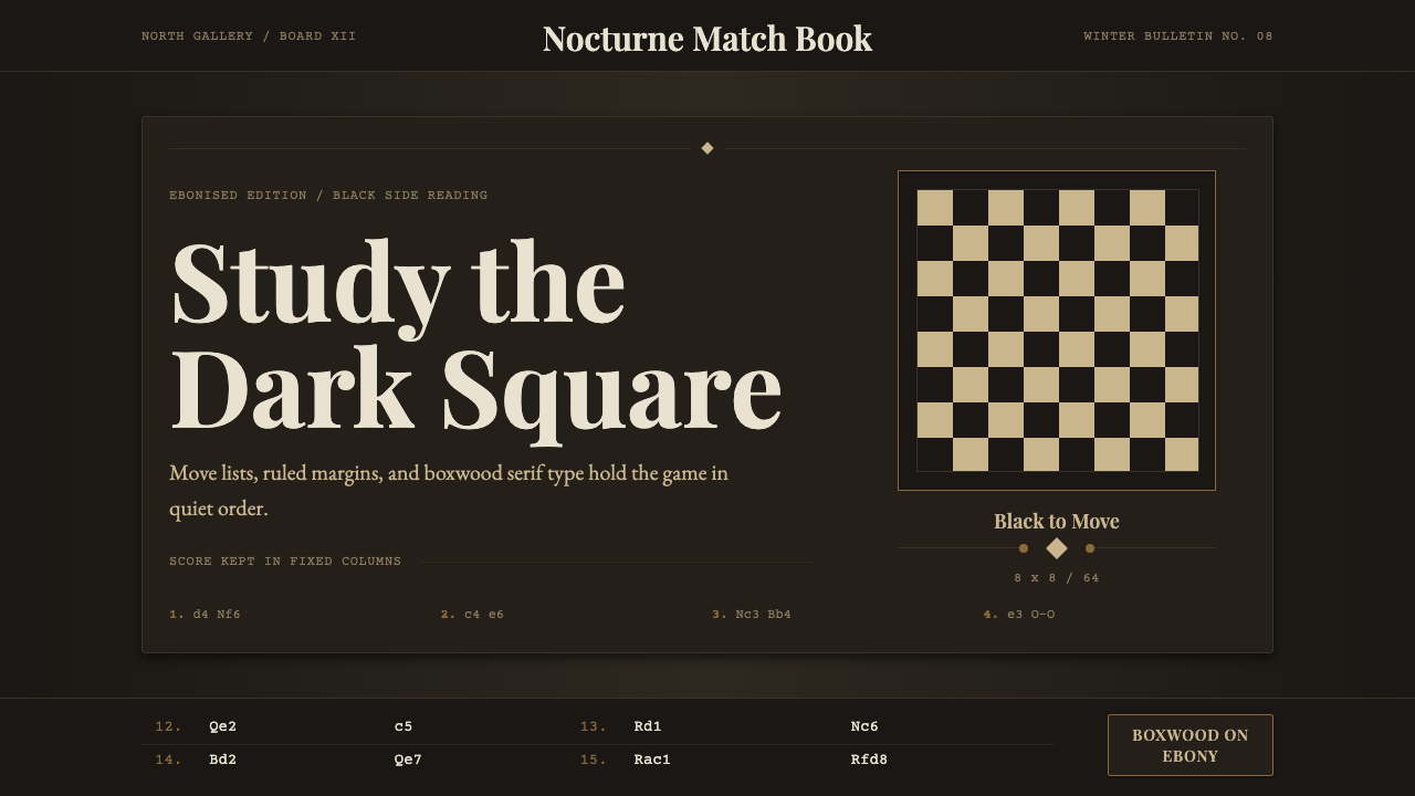 Chess TournamentQuiet intellect. Cream Playfair type, walnut rules, and notation glow on ebon…
 Alpine Funicular TicketIssued, not decorated. Oat-buff stock, slab fares and one longitudinal red st…
 Mohs Hardness ScaleRanked by what scratches what. Ten mineral-gray chips on cool chart-white, en…
 Soviet Classified MapAustere field intelligence. Khaki grid, forest green fills, brown contours, r…