What is Mohs Hardness Scale?
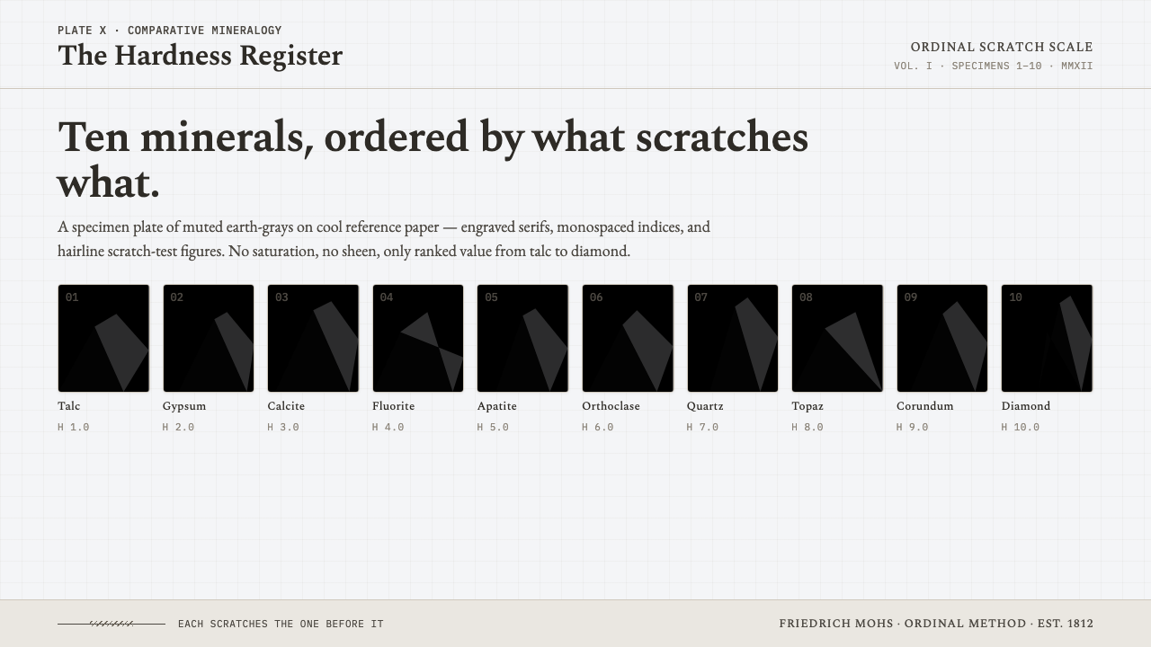
Mohs Hardness Scale turns a simple question — what scratches what — into a mineralogical reference plate: ten quiet specimens, one ascending order, and no visual noise between observation and conclusion.
Mohs Hardness Scale in brief
Mohs Hardness Scale is a design system derived from Friedrich Mohs’s 1812 comparative hardness reference. Its organizing fact is ordinal rather than decorative: ten mineral specimens are arranged in sequence, beginning with talc at 1 and ending with diamond at 10. The interface or page behaves like a numbered specimen plate, where every chip, label, scratch mark, and interval exists to make comparison immediate. It does not attempt to dramatize geology. It makes the act of ranking visible.
The visual language is built from mineral-gray fragments on a cool chart-white ground. Each specimen reads as a printed sample rather than a polished jewel: muted, dry, and slightly particulate in character. Engraved serif letterforms establish the tone of a field guide or laboratory archive, while monospaced numerals make the sequence feel measured, repeatable, and easy to scan. Monochrome scratch-test diagrams act as evidence marks, not illustrations added for atmosphere.
Its authority comes from restraint. There is no saturated color, metallic shine, warmth, or theatrical contrast competing with the ordered scale. The system uses low-contrast earth-gray tones to distinguish materials without turning them into brands. This makes Mohs Hardness Scale especially suited to work that needs to feel comparative, empirical, archival, and calmly exact: a visual environment where the viewer is invited to inspect, classify, and return to the evidence.
Where does Mohs Hardness Scale come from?
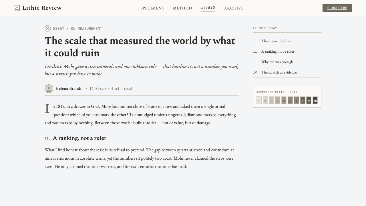
The origin of this style is Friedrich Mohs’s comparative hardness scale of 1812, developed within German and Austrian mineralogy in Western Europe. The scale established hardness as a practical sequence of relative resistance: a material’s position is understood through what it can scratch and what can scratch it. That comparative logic is the design system’s deepest source. The page is not a gallery of minerals; it is an instrument for making relations legible.
Its historical setting is nineteenth-century systematic mineralogy, a period defined in the supplied material by the desire to organize mineral knowledge into stable reference forms. The Mohs scale gives that ambition a particularly clear visual structure because it is finite, numbered, and cumulative. Moving from talc through diamond is not merely moving across labels. It is following an ordered chain in which each specimen gains meaning through its place beside the others.
The specimen-reference plate convention supplies the system’s presentation model. A plate asks the reader to compare examples side by side, to trust captions and numbering, and to see material variation without unnecessary narrative framing. In Mohs Hardness Scale, ten mineral chips form the central field. Their subdued rendering keeps attention on differences of rank, while the cold paper-like ground makes the composition feel like a durable reference artifact rather than a promotional image.
Comparative hardness testing also determines the role of diagram and typography. Scratch-test lines translate an action into a compact visual record, and numbered labels turn that record into a navigable sequence. Engraved serifs suggest cataloguing, observation, and print permanence; monospaced numerals reinforce regular intervals and controlled comparison. Together, these choices make the design feel less like a historical costume and more like a contemporary continuation of a disciplined reference method.
What defines the Mohs Hardness Scale look?
Ordinal Sequence
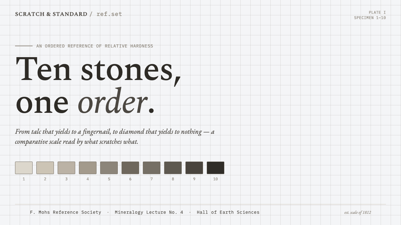
The primary composition is a single ascending run of ten specimens, from talc to diamond. Order is visible before any explanatory paragraph is read. Labels should never float independently from their chip, and the sequence should not be broken into decorative clusters. The point is comparative continuity: each position is understood through the positions immediately before and after it.
Mineral Palette
Color remains chalky, desaturated, and earth-gray, placed against a cool chart-white field. Differences between chips are gentle enough to preserve the feeling of one reference set, yet distinct enough to prevent the specimens from collapsing into a single mass. Avoid rich saturation, warm creaminess, glossy black, metallic effects, or gemstone-like brilliance. The palette should feel printed, dry, and trustworthy.
Specimen Chips
Each mineral is represented as a small, irregular chip rather than a smooth icon or polished product image. The irregularity suggests fracture, matter, and collected evidence, but it must remain controlled enough for the series to read as a plate. Chips should be treated as specimens with equal documentary status, not as expressive illustrations competing for personality.
Engraved Typography
Serif typography carries the authority of printed scientific reference material. It should appear deliberate and slightly formal, with enough contrast to distinguish titles, mineral names, and explanatory notes without becoming ornamental. The type is not nostalgic decoration. It acts as a cataloguing voice, giving names and observations the stable presence of entries in a specimen record.
Monospaced Numbers
Numbers are structural marks, not decorative badges. A monospaced treatment gives every rank an even spatial claim and makes the movement from 1 to 10 feel measured. The numerals should be quiet but unmistakable, aligned with the chips and repeated consistently wherever hardness is referenced. Their regularity provides a counterpoint to the natural irregularity of the mineral fragments.
Scratch-Test Diagrams
Monochrome scratch lines provide the system’s most direct visual evidence. They should read as diagrams of contact and comparison, never as decorative hatching or texture. Used sparingly, a line can clarify direction, test relationship, or explanatory sequence. Because the method behind the scale is comparative scratching, these marks connect the finished composition back to the physical action that gives the ranking meaning.
Who shaped Mohs Hardness Scale?
Friedrich Mohs is the key figure behind the 1812 comparative hardness scale from which this design system takes both its name and its governing structure. His contribution, as represented here, is the decision to make hardness legible through rank and direct comparison. The visual system honors that method by keeping sequence, specimen identity, and test evidence more prominent than stylistic display.
Comparative hardness testing is the operative figure of the system: the method that turns an abstract label into a relationship between materials. Scratch-test diagrams and ordered numerals are visual translations of this process. They remind the viewer that the scale does not describe isolated objects by mood or appearance; it records a practical comparison among specimens.
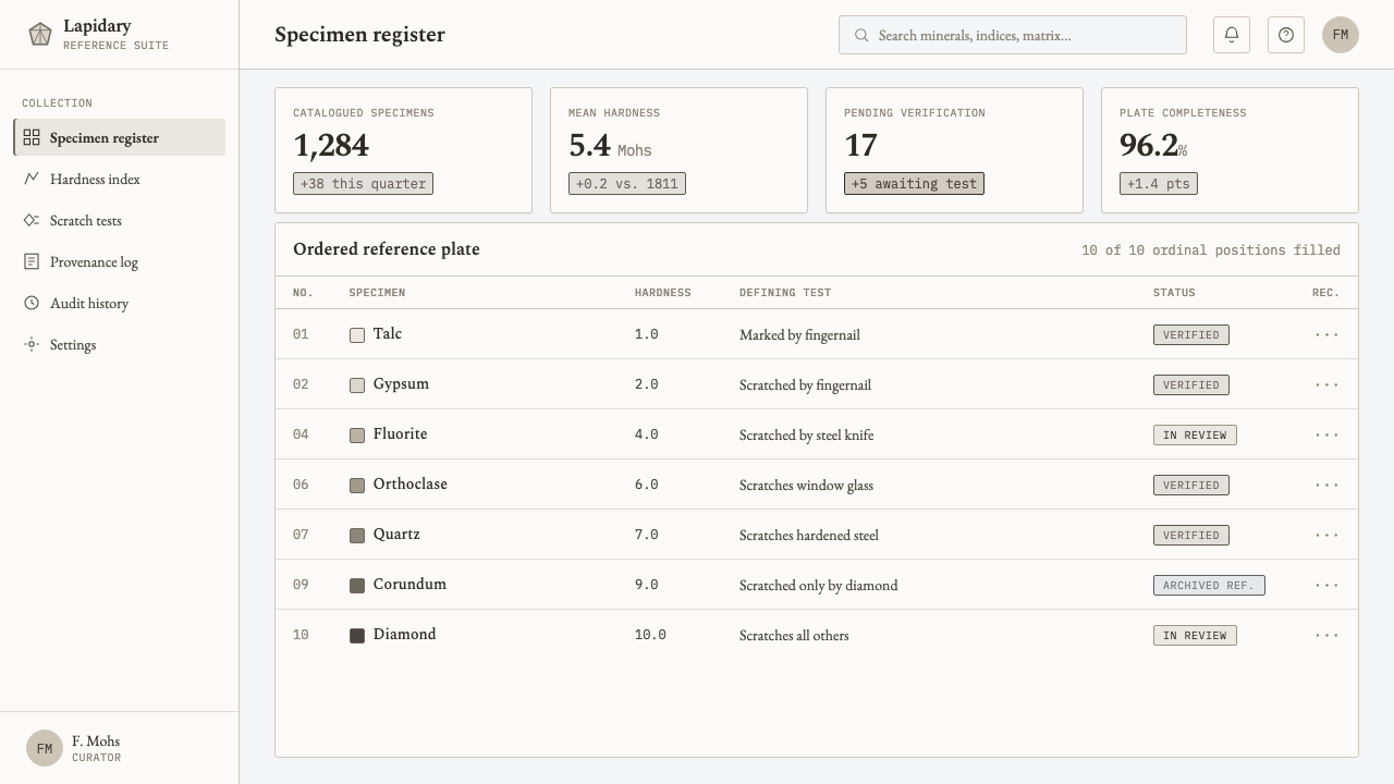
The specimen-reference plate is the system’s editorial model. It brings samples into a common field, assigns them stable labels, and makes side-by-side inspection the central experience. Its influence explains the cool ground, restrained material rendering, and calm typographic hierarchy. The result is designed to be consulted repeatedly, not consumed in a single glance.
How do you use Mohs Hardness Scale today?
For presentation covers, Mohs Hardness Scale works best when the scale itself carries the composition. Place a restrained row or partial sequence of mineral chips on a cool chart-white field, then let an engraved serif title establish the subject. The cover should suggest that the presentation will sort evidence rather than sell excitement. On content slides, preserve the plate logic: give each idea a numbered position, use monospaced numerals for navigation, and let thin scratch-test diagrams indicate relationships or progression. Do not replace the system’s quiet hierarchy with ornamental separators.
Data slides are a natural fit because the style already understands rank, interval, and side-by-side comparison. Treat charts as extensions of the specimen plate: categories can become aligned chips, ordered markers, or restrained monochrome lines. A data point should feel recorded rather than advertised. Keep explanatory notes concise and catalog-like, allowing the viewer to compare values or categories without high-saturation emphasis, glossy visual effects, or decorative dimensionality.
For web interfaces, the system is particularly effective in dashboards, documentation hubs, technical catalogs, and pricing pages where users need to compare a finite set of options. A dashboard can use a numbered specimen rail as its primary navigation model, with muted chips identifying categories and scratch lines indicating state or dependency. A pricing page can borrow the same discipline by presenting plans as comparable specimens: equal visual weight, stable labels, and a clear ascending order. The interface should feel measured, not luxurious.
Editorial and marketing work benefits from the system when the subject concerns materials, methods, classification, research, verification, or product tiers. An article can use the left or right margin as a field-note zone for rank, specimen name, or test mark. A campaign can frame a collection as a reference set rather than a lifestyle collage. The visual restraint makes claims feel more inspectable, but it also demands honest content: empty slogans look especially exposed against a reference-plate structure.
The common mistake is to turn the style into generic industrial luxury: dark polished stones, metallic highlights, dramatic geological photography, and overly elaborate scientific decoration. Those choices contradict the supplied system’s essential character, which is muted mineral gray on cool white, printed rather than polished, and comparative rather than theatrical. Another mistake is treating the numbers as a cosmetic countdown. If the sequence does not clarify a real ordering, use another structure; Mohs Hardness Scale depends on rank having meaning.
Mohs Hardness Scale — FAQ
Is Mohs Hardness Scale a geology-themed luxury style?
No. Its reference point is comparative mineralogy, not gemstone display. The supplied visual language deliberately avoids metallic sheen, saturation, warmth, and polished spectacle. It should feel like a calm scientific reference set: mineral-gray chips, cool chart-white paper, engraved serif labels, monospaced ranks, and evidence-like scratch diagrams. If the result feels expensive because it is glossy, dramatic, or jewel-like, it has moved away from the system.
Why are the numbers so important to the style?
The Mohs scale is ordinal. The number attached to a specimen is not a decorative identifier; it is the position that makes the specimen comparable to all the others. Monospaced numerals give that ranking a stable visual rhythm and prevent labels from becoming merely expressive. Removing or obscuring the sequence weakens the design because it removes the comparative method that gives the plate its purpose.
Can the system use photographs of minerals?
It can, but photographs should behave like specimens on a reference plate rather than like atmospheric landscape imagery. Keep them subdued, isolated, and consistent with the muted mineral-gray world. The image must support identification and comparison, not introduce warmth, glamour, or geological drama. A simplified printed chip is often more faithful to the system than a highly detailed, glossy photograph.
Does the style work when there are not exactly ten items?
Yes, provided the content has a real, intelligible order. Ten specimens are central when directly representing the Mohs reference, but the broader design logic can organize another finite sequence through aligned samples, stable numbering, and comparative diagrams. Do not imitate the row merely for appearance. The style remains convincing when its visual order corresponds to an actual hierarchy, progression, or testable relationship.
What most quickly makes an application feel inauthentic?
Adding visual excitement where the system calls for evidence is the fastest way to lose its character. Saturated accent fields, metallic effects, warm paper tones, ornamental scientific motifs, and unevenly emphasized specimens all disrupt the calm comparative field. A more faithful application asks a simpler question: can the viewer identify the specimen, read its rank, and understand its relation to the others without being distracted?
Related design styles
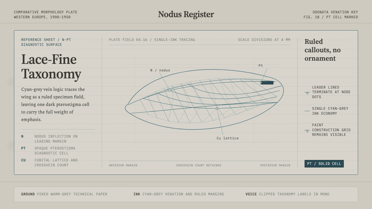 Dragonfly Wing VenationPrecision, nearly weightless. Cyan-grey veins rule a foxed paper taxonomy pla…
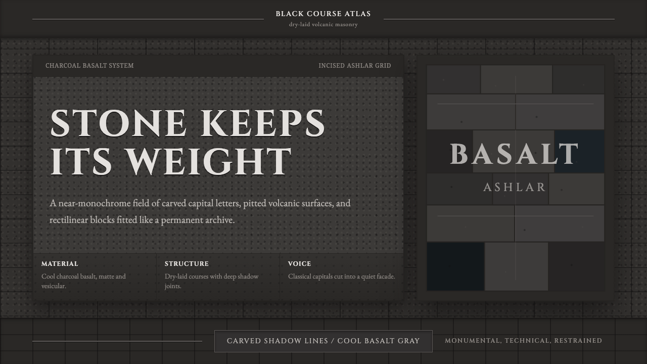 Hauran Basalt StoneMonolith refuses shine. Charcoal Cinzel capitals lock into dry-laid basalt gr…
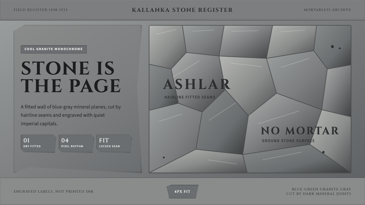 Inca Ashlar StoneworkStone becomes the page. Granite-gray planes lock into hairline ashlar seams.
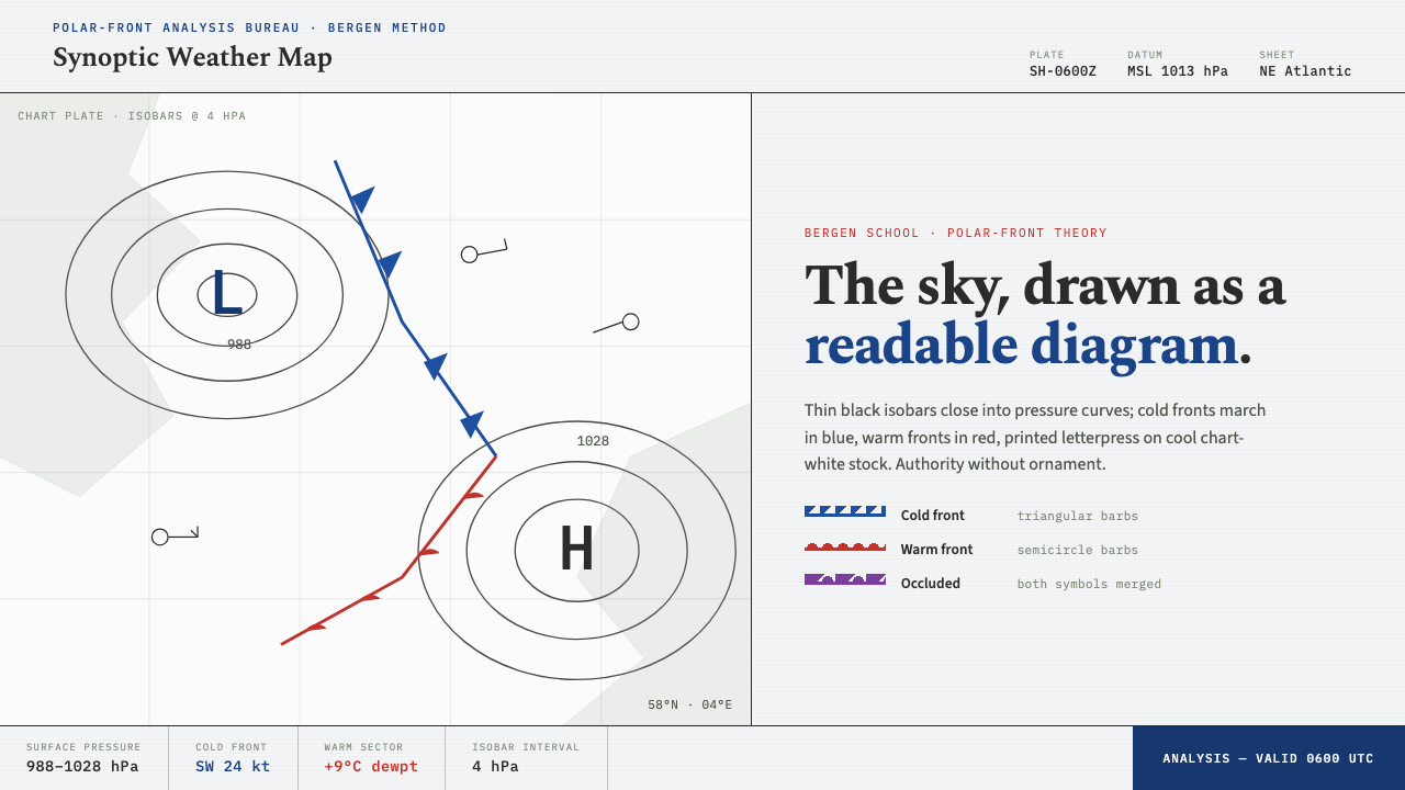 Synoptic Weather MapThe sky as a readable diagram. Black isobars, blue cold fronts, red warm fron…
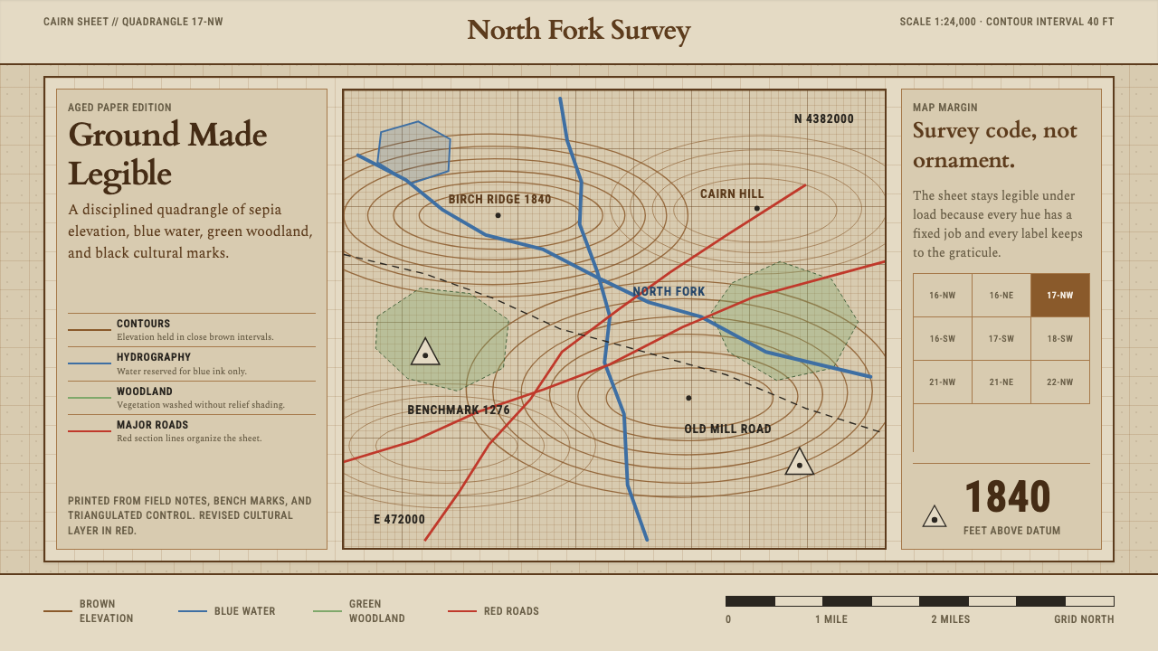 Topographic Survey MapMeasurement becomes beauty. Sepia contours and blue hydrography sit on aged m…
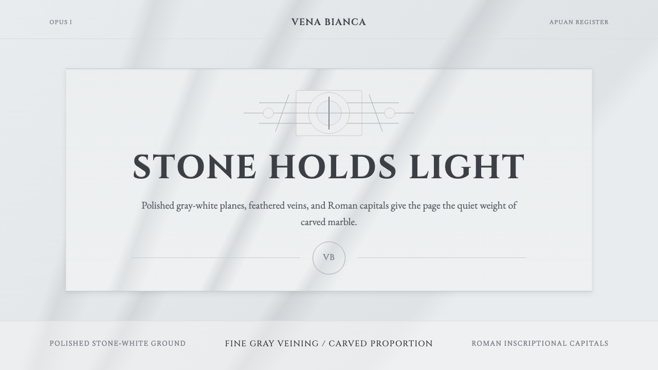 Carrara MarbleLuxury in restraint. Cool stone-white fields, feathery gray veins, and Cinzel…