What is Inca Ashlar Stonework?
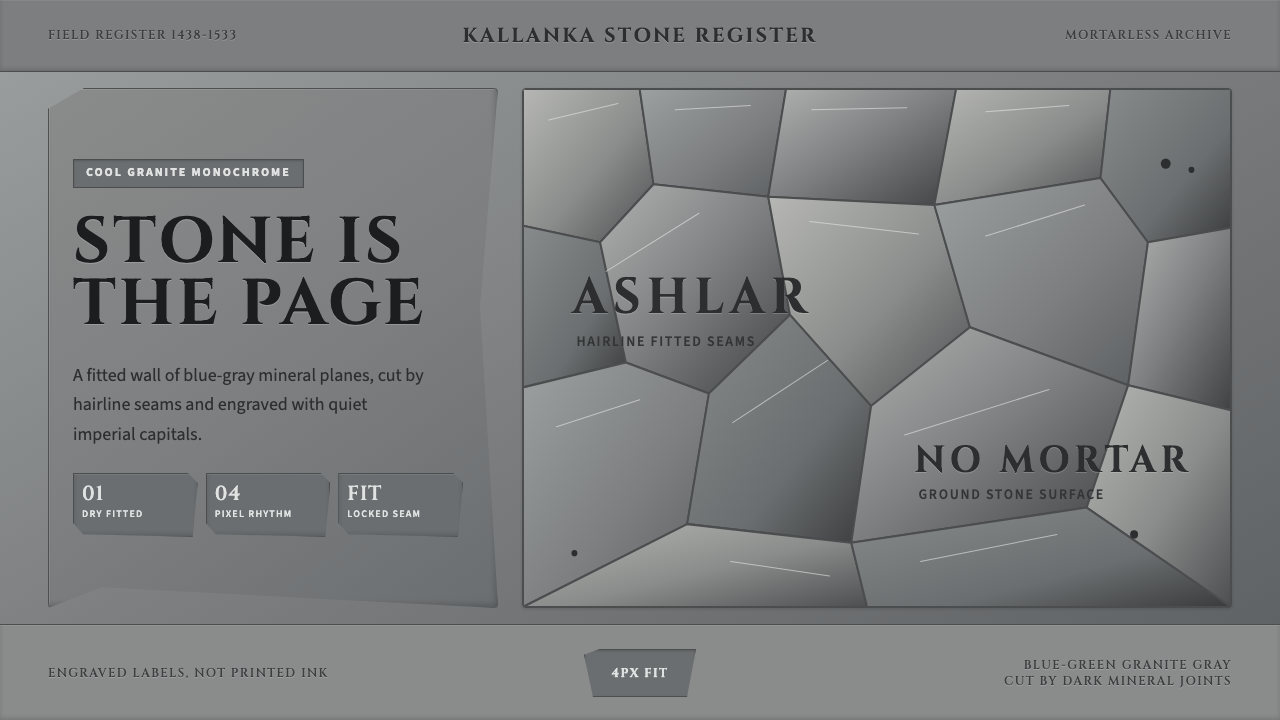
Inca masons ground granite blocks so precisely that no mortar was needed — this style treats the interface itself as that wall, seamless stone instead of paper.
Inca Ashlar Stonework in brief
Inca Ashlar Stonework is a design system built from the dry-fitted polygonal masonry of the Andean empire — the cyclopean walls at Sacsayhuamán and the terraced ramparts of Machu Picchu, where enormous granite and andesite blocks were ground down until their irregular faces locked against one another without any binding mortar. The design system treats the wall itself, not a printed page, as the visual surface.
Everything reads as stone rather than paper: a low-chroma granite gray ground carrying a faint cool, mineral cast, divided only by fine shadow seams where one block meets the next. There is no white anywhere in the system and no paper-like lightness — the base plane is always a solid, weighty gray, and what would be borders or dividers in a conventional layout are instead treated as the dark hairline gaps between fitted stones.
The overall effect is one of engineered permanence. Nothing in the system suggests fragility or lightness; every panel, label, and division reads as though it were quarried and set in place rather than printed or rendered. Labels feel carved rather than typed, dividers feel like geological seams rather than drawn lines, and the whole composition carries the cold, settled quiet of stone that has held its position for centuries.

Where does Inca Ashlar Stonework come from?
Inca ashlar masonry reached its most refined expression under Pachacuti, the ninth Sapa Inca, whose reign beginning around 1438 CE transformed the Inca state from a regional Cusco polity into an empire — Tawantinsuyu — that stretched along the Andes from present-day Ecuador to Chile. Monumental construction was central to that imperial project: fortresses, temples, and administrative centers were built to project the state's permanence and authority across a vast and geographically extreme territory of high mountains, deserts, and earthquake-prone terrain.
The signature technique — cutting and grinding stone blocks, some weighing many tons, until their irregular polygonal faces interlocked so precisely that not even a knife blade could be inserted between them — served a function beyond aesthetics. The Andes sit on an active seismic zone, and mortared masonry tends to crack and separate catastrophically in earthquakes. Dry-fitted polygonal joints, by contrast, allow individual stones to shift slightly and resettle during seismic activity without the wall collapsing outright, which is part of why so much Inca stonework survives intact centuries later while colonial mortared construction built atop it has often crumbled.
This engineering achievement was accomplished without iron tools, wheeled transport, or a written language to record technical instructions. Imperial state builders organized enormous labor forces through the mit'a system, a rotational labor tax, moving multi-ton blocks using ramps, log rollers, ropes, and immense coordinated human effort. Master masons developed the grinding and test-fitting techniques — repeatedly lifting a stone into place, marking high spots, and grinding them down — through iterative craft knowledge passed among specialists rather than codified written engineering.
Sites like Sacsayhuamán, the massive fortress-temple complex overlooking Cusco, and Ollantaytambo and Machu Picchu display the technique at its most refined, with wall courses that shift from massive foundational polygonal blocks to more regular coursed masonry higher up. Spanish chroniclers arriving after the conquest in the 1530s recorded astonishment at the fit and scale of the stonework, and the walls' resistance to earthquakes that damaged colonial buildings became a lasting testament to the sophistication of pre-Columbian Andean engineering.
What defines the Inca Ashlar Stonework look?
Ground as Stone
There is no page in the conventional sense — the base plane itself is rendered as a granite surface, low in chroma with a faint cool, blue-green mineral undertone. This ground never lightens to white; even the most 'open' areas of a composition remain within the stone's tonal range, reinforcing the sense that the interface is carved from a single continuous material rather than printed on a substrate.
Hairline Seams
What conventional design calls a divider or border becomes, here, the shadow gap between two precisely fitted stones — a fine, dark line that reads as recessed rather than drawn on top. Seams follow the irregular polygonal logic of real ashlar joints rather than a rigid rectangular grid, giving the layout an organic, hand-fitted quality even within an otherwise ordered structure.
Weight and Mass
Every element is designed to feel heavy and load-bearing rather than light or floating. Panels read as slabs set into position, not cards hovering above a background with a drop shadow. This is achieved by avoiding any glow, lift, or soft blur effect — the only depth cue is the hard, precise seam between adjacent stones.
Restrained Cool Palette
Color variation across the system is minimal and stays within a narrow band of gray with a faint blue-green mineral cast — never warming toward beige or browning toward earth tones. Any accent color, when used at all, is applied sparingly and reads as an inlay rather than a dominant hue, preserving the sense that stone, not pigment, is the primary material.
Carved Typography
Labels and headings favor solid, geometric letterforms that suggest inscription rather than print — the kind of lettering one might imagine chiseled into a stone lintel rather than set in movable type. Type sits recessed or subtly embossed into its panel rather than floating above it as an independent layer.
Polygonal Grid Logic
Where conventional layouts rely on strict rectangular grids, this system permits irregular polygonal divisions among major structural blocks, mirroring the way real Inca courses shift from massive irregular foundational stones to more regular coursing higher up a wall. The irregularity is controlled, not chaotic — every seam still meets its neighbors cleanly.
Absence of Ornament
There are no applied decorative flourishes, no patterned textures layered on top of the stone, and no illustrative imagery competing with the surface. The stone's own irregular seams and subtle tonal variation are the only visual interest permitted — a discipline that mirrors the Inca builders' own reliance on precision of fit rather than surface decoration to achieve visual impact.

Who shaped Inca Ashlar Stonework?
The ninth Sapa Inca, Pachacuti transformed the Inca state into the empire Tawantinsuyu beginning around 1438 CE. Monumental stone construction — fortresses, temples, terraces — was central to his imperial program, projecting state permanence and authority across a vast and geographically extreme territory.
The specialist craftsmen who developed the iterative grinding and test-fitting techniques — lifting a multi-ton block into place, marking high spots, grinding them down, repeating — that produced joints so precise no blade could pass between them. Their knowledge was transmitted through craft practice rather than written engineering texts.
The administrators who organized the mit'a rotational labor tax, mobilizing enormous coordinated workforces to quarry, transport, and set multi-ton blocks without iron tools or wheeled vehicles — a logistical achievement as significant as the stonework itself.
How do you use Inca Ashlar Stonework today?
This style is best deployed where an interface needs to communicate permanence, engineered precision, and quiet institutional weight rather than warmth, speed, or approachability. It reads as ancient, deliberate, and unshakeable — qualities well suited to products that want to project trust through solidity rather than friendliness.
For presentation slides, the system works powerfully on a cover page that wants to open with monumental gravity: a large polygonal panel arrangement filling the frame, title lettering treated as carved inscription. Content slides should organize information into irregular but precisely fitted blocks rather than a uniform grid, using seam lines instead of dividers. Reserve the palette's cool undertone consistently — introducing warmer accent colors breaks the illusion of a single continuous material.
For web interfaces, this aesthetic suits dashboards and account pages that want to feel unshakeably stable and engineered — financial products, infrastructure monitoring tools, or any platform whose core promise is durability and precision. Panels should sit flush against each other with seam-line dividers rather than gaps and shadows; buttons and cards should read as inset or carved rather than raised and floating, which runs counter to most contemporary flat-elevation conventions but reinforces the stone metaphor.
For editorial and marketing content, the style works well for brand narratives built around craftsmanship, longevity, or engineering heritage — a company history section, a materials or manufacturing story, or any content that wants to borrow the credibility of something built to outlast its makers. Large blocks of body text should sit within clearly seamed panels rather than floating freely on an open page.
A common mistake is applying the gray palette as a flat, uniform background without the seam-line structure that gives it meaning — a plain gray page is simply muted, not stone. The system depends on the interplay between mass (large, weighty panels) and precision (fine seams between them); removing either element collapses the metaphor into generic minimalism.

Inca Ashlar Stonework — FAQ
Why is there no white anywhere in this system?
White signals paper, and this system is deliberately not paper — it is stone. Introducing white anywhere would break the illusion that the interface is a single continuous granite surface and would reintroduce the conventional page-and-ink metaphor the style is specifically built to avoid. Even the lightest tone in the palette stays within the stone's cool gray range.
Can this style support a data-heavy dashboard with lots of numbers and charts?
Yes, provided the charts and numeric readouts are treated as inlaid elements within the stone panels rather than floating overlays. Numbers should sit inset into their panel like carved figures; charts work best as simple, geometric forms consistent with the polygonal seam logic rather than soft gradient visualizations, which would clash with the material's hard-edged character.
Does this style work for a warm, consumer-facing brand?
Not naturally. The palette is deliberately cool and restrained, and the overall mood is one of monumental gravity rather than warmth or playfulness. It suits products built around durability, precision engineering, financial trust, or heritage craftsmanship far better than it suits anything aiming for approachability or fun.
How irregular should the polygonal panel divisions be?
Irregular enough to feel hand-fitted rather than mechanically repeated, but controlled enough that every seam meets its neighbors cleanly with no gaps or overlaps — mirroring real ashlar construction, where each stone's irregular face is precisely ground to match its specific neighbors rather than following a repeatable template.
Related design styles
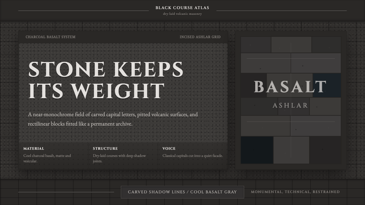 Hauran Basalt StoneMonolith refuses shine. Charcoal Cinzel capitals lock into dry-laid basalt gr…
 Chess TournamentQuiet intellect. Cream Playfair type, walnut rules, and notation glow on ebon…
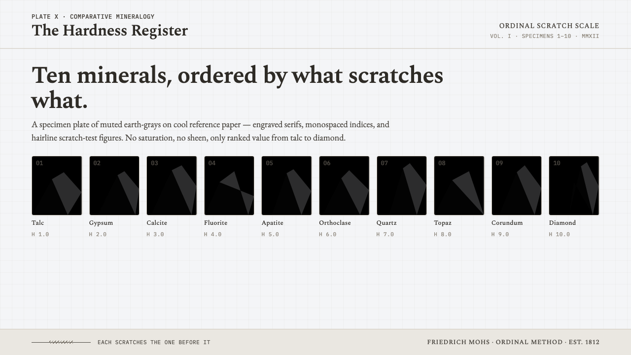 Mohs Hardness ScaleRanked by what scratches what. Ten mineral-gray chips on cool chart-white, en…
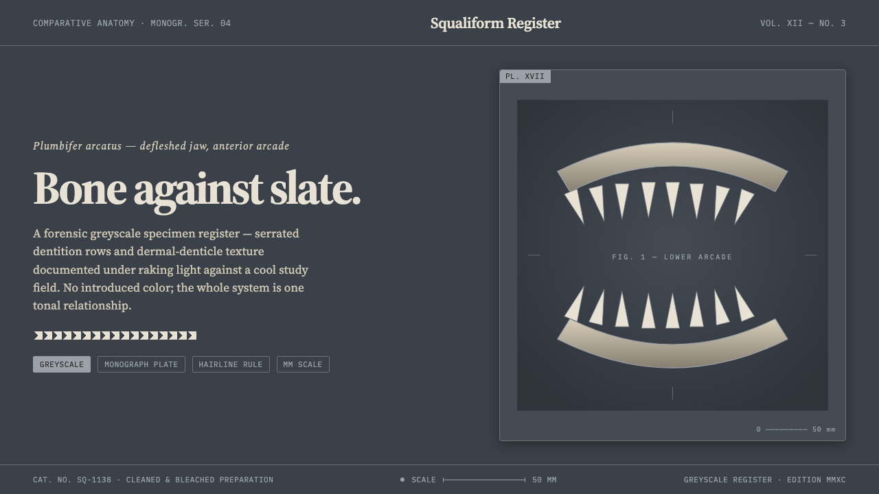 Shark Jaw & DentitionForensic and strictly greyscale. Bone-white serrated dentition floats on a co…
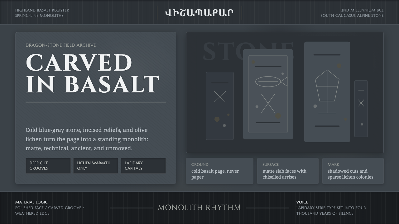 Armenian Vishapakar Dragon StoneAncient, cold, unmoved. Basalt gray slabs, incised grooves, sparse olive lich…
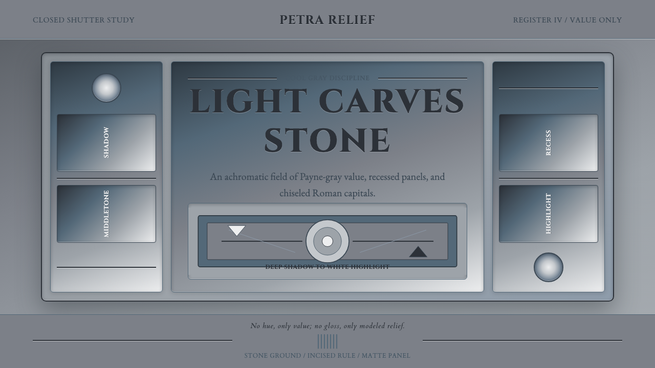 Grisaille PaintingStone without color. Payne-gray relief, Cinzel capitals, and recessed panels…