What is Grisaille Painting?
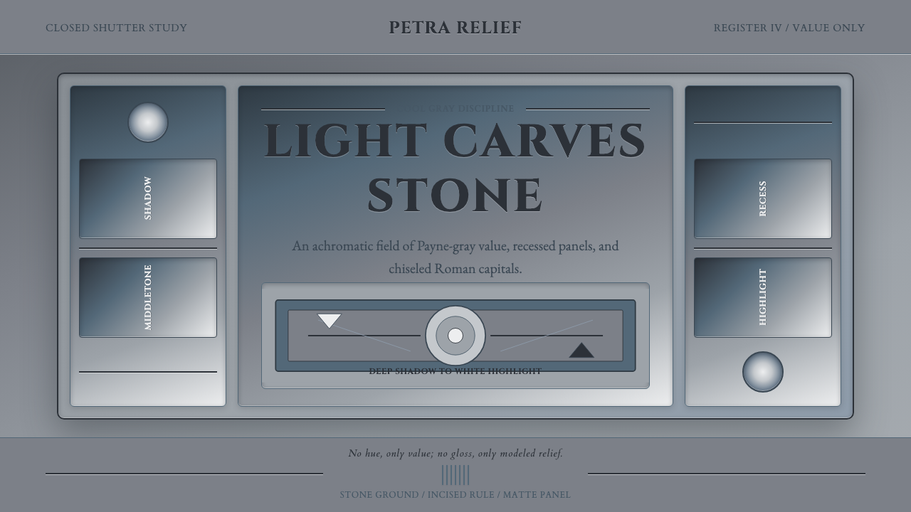
Grisaille turns the absence of color into an illusion of substance, building painted stone from cool gray, disciplined light, and shadow.
Grisaille Painting in brief
Grisaille is a painting tradition in which an image is modeled almost entirely through neutral gray values. Instead of using hue to separate objects or create atmosphere, the painter moves from deep shadow through cool midtones to pale highlights. The result can resemble carved stone, architectural relief, or sculpture set into a shallow recess rather than a conventionally colored picture.
The tradition is closely associated with Western European art from the fourteenth through the nineteenth century, reaching particular prominence in Early Netherlandish and Renaissance altarpiece work. Its most canonical example appears on the exterior shutters of the Ghent Altarpiece, where Jan van Eyck rendered standing saints as if they were hewn from stone. Painting does not merely depict sculpture there; it competes with sculpture by imitating weight, projection, and reflected light.
As a contemporary design language, Grisaille depends on an achromatic value system: a middle stone-gray field, deep cool shadows, bright highlights, and a characteristic Payne's-gray middle register. Chiaroscuro supplies volume while recessed panels, restrained inscriptions, and relief-like edges organize the surface. Warm browns, cream tones, and decorative color accents weaken the central illusion, because the style's authority comes from making light carry every descriptive burden.
Where does Grisaille Painting come from?
Grisaille developed across Western Europe, particularly in Flanders, the Low Countries, France, and Italy. Its long historical span reaches from the fourteenth to the nineteenth century, but its defining period lies in Early Netherlandish and Renaissance altarpiece production. In that setting, monochrome painting was not an isolated exercise in restraint. It belonged to an architectural object whose wings, frames, recesses, and painted surfaces changed the viewer's experience as the altarpiece was opened or closed.
The exterior decoration of an altarpiece gave sculpture imitation a persuasive role. Figures painted in cool grays could appear to occupy niches or stand upon ledges, allowing a flat shutter to behave visually like carved stonework. This trompe-l'œil effect depended on a complete value ladder rather than local color. Deep tones established cavities and cast shadow; middle grays described turning planes; pale highlights suggested the points where stone caught the strongest light.
Jan van Eyck made the language canonical on the exterior shutters of the Ghent Altarpiece. The saints there stand with the solemn presence of sculpture, even though their substance is paint. The achievement is central to Grisaille because it demonstrates that an achromatic image need not feel incomplete. By controlling value, edge, and modeled light, the painter can imply material density, spatial recession, and carved projection without relying on color.
Hubert van Eyck is also identified among the key figures associated with this historical setting. Together, the names of Jan and Hubert van Eyck locate Grisaille within the culture of Early Netherlandish altarpiece making, where pictorial illusion and devotional structure met. Over its later European life, the technique remained intelligible because its premise was durable: remove hue, observe how light describes form, and make a painted surface behave like another material.
What defines the Grisaille Painting look?
Achromatic Value
The palette is built from cool neutral grays rather than color. A middle stone-gray acts as the ground, Payne's gray supplies a recognizable cool middle register, and the image extends toward deep shadow and white highlight. Differences in value must remain clearly legible because they perform the separating, grouping, and emphasizing work that hue would ordinarily provide.
Chiaroscuro Modeling
Volume comes from the controlled passage between light and dark. Highlights identify projecting planes, middle values describe gradual turns, and concentrated shadow opens apparent cavities. The aim is not theatrical illumination for its own sake but an intelligible account of form, as though light were moving across a carved surface.
Stone Illusion
Grisaille makes paint behave like stone. Figures and ornaments appear weighty, cool, and fixed within an architectural setting. Relief is suggested by carefully related edges and shadows: some contours seem to rise toward the viewer, while others dissolve into the recessed ground. The success of the style is measured by material conviction rather than chromatic richness.
Recessed Panels
Panels are treated as shallow architectural compartments rather than floating cards. Darker inner edges imply recession, while pale rims catch imaginary light and suggest carved borders. Content therefore feels installed within a wall, shutter, or stone tablet. The panel structure should remain quiet enough to support the relief illusion instead of becoming ornamental framing.
Inscriptional Type
Cinzel capitals give headings the character of an inscription cut into a formal surface. Their role is ceremonial and architectural, suited to titles, labels, and brief declarations. Longer reading text should remain restrained and highly legible, allowing the capitals to establish gravity without making every paragraph feel monumental.
Cool Restraint
The system remains firmly within cool gray. Warm brown, beige, and cream introduce associations with parchment, dust, or aged plaster and shift the work away from stone-like Grisaille. Restraint also applies to embellishment: every border, shadow, and highlight should contribute to modeled structure rather than merely making the surface look luxurious.
Who shaped Grisaille Painting?
Jan van Eyck made Grisaille canonical on the exterior shutters of the Ghent Altarpiece. His painted saints appear to possess the weight and projection of carved stone, demonstrating how a complete hierarchy of gray values can substitute for hue. For designers, this example remains the clearest statement of the style's governing idea: monochrome is not a reduction of form but a more concentrated study of it.
Hubert van Eyck is named among the key figures connected with the Early Netherlandish setting in which Grisaille altarpiece work reached a defining prominence. His place in the source tradition helps frame the technique not as a detached modern monochrome effect, but as part of a larger practice joining painted illusion, sacred figures, hinged shutters, and architectural presentation.
Considered together, Jan and Hubert van Eyck represent the altarpiece culture through which Grisaille acquired its strongest historical identity. Their association with the Ghent Altarpiece places the technique within a work that alternates between exterior restraint and a more expansive interior experience. That relationship makes the monochrome shutters feel purposeful: their apparent stone stillness prepares the eye for transformation.
How do you use Grisaille Painting today?
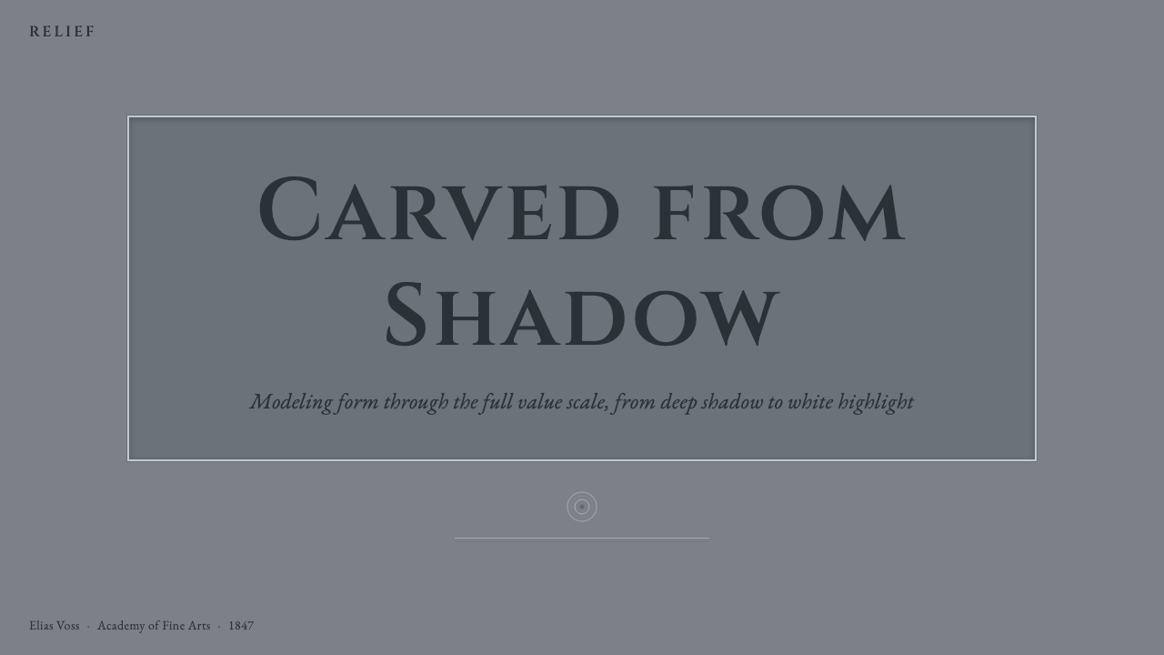
For presentation covers, Grisaille creates an atmosphere of scholarship, permanence, and ceremonial weight. Set the title like an inscription within a broad field of middle gray, then use a modeled relief form or recessed frame as the principal image. On content slides, preserve generous empty areas and let headings, body text, and captions occupy distinct planes rather than competing through color.
Data slides should translate quantities into changes of value, depth, and emphasis. The darkest marks can identify critical findings, middle grays can carry comparison, and pale regions can recede into context. Because nearby grays may become difficult to distinguish, charts need clear ordering, direct labels, and strong silhouettes. Decorative shading that does not encode information should be removed.
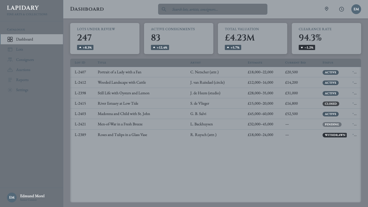
For web dashboards and pricing pages, use the style to create calm hierarchy rather than a continuous imitation of antique stone. Navigation and primary controls should remain immediately readable, while selected states can appear brighter, darker, raised, or recessed. Pricing tiers work well as adjacent architectural panels, but the recommended option should be distinguished by contrast and prominence, not by introducing an unrelated accent color.
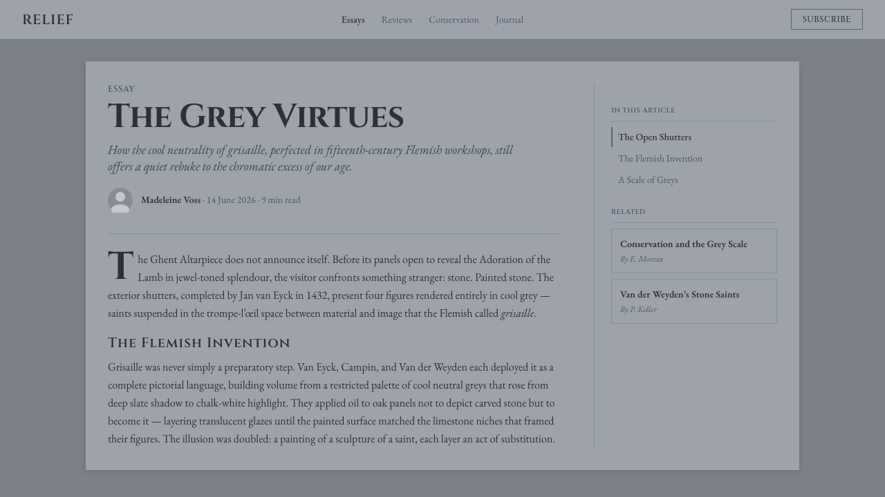
Editorial and marketing layouts benefit from Grisaille when the subject calls for historical authority, craft, reflection, or material seriousness. A feature article can combine inscriptional headings, narrow text columns, relief-like image treatment, and pale marginal notes. Marketing pages should alternate dense modeled sections with quieter gray fields so that the stone illusion has rhythm and does not turn the entire page into an undifferentiated monument.
The common mistake is to confuse monochrome with merely desaturating an ordinary design. Authentic Grisaille requires deliberate modeling: a coherent imagined light source, a readable progression from cavity to highlight, and edges that explain which forms project or recede. Another mistake is warming the palette with beige or cream to make it feel historic. That produces an aged-paper mood, while Grisaille depends on cool stone.
Grisaille Painting — FAQ
Is Grisaille simply a black-and-white version of a colored design?
No. Simple desaturation preserves decisions originally made through hue, so forms may collapse once their colors disappear. Grisaille is conceived in value from the beginning. Every plane must be separated by light or shadow, and every highlight must describe projection, material, or focus. The absence of hue is therefore an organizing discipline rather than a finishing effect.
Why is the Ghent Altarpiece important to Grisaille?
Its exterior shutters provide the canonical example named in the source tradition. Jan van Eyck painted saints so that they appear carved from stone, joining figure painting to the architectural logic of the closed altarpiece. The work shows the technique at full strength: gray value, modeled light, and controlled edges create a convincing sculptural presence without color.
Can a Grisaille interface still communicate interactive states clearly?
Yes, provided that value and depth are reserved systematically. A selected element may become brighter or darker, a pressed control may appear recessed, and a primary action may receive the strongest local contrast. Shape, placement, labeling, and apparent depth should reinforce one another. If every component uses the full range from shadow to highlight, the hierarchy will disappear.
Must every Grisaille design imitate literal carved figures?
No. Stone imitation is the tradition's central visual logic, but the subject can be typographic, diagrammatic, or interface-based. What matters is that form is explained through cool value, chiaroscuro, and credible recession or projection. A chart panel or title block can carry Grisaille character without depicting a saint, provided it behaves like a deliberately modeled surface.
Why should warm beige and cream be avoided?
They shift the material association away from cool stone. Beige and cream tend to suggest paper, parchment, dust, or aged plaster, while this Grisaille system is anchored by neutral stone gray and cool Payne's-gray midtones. A restrained cool palette also makes the value structure easier to judge because warmth is not competing with lightness as a separate signal.
Related design styles
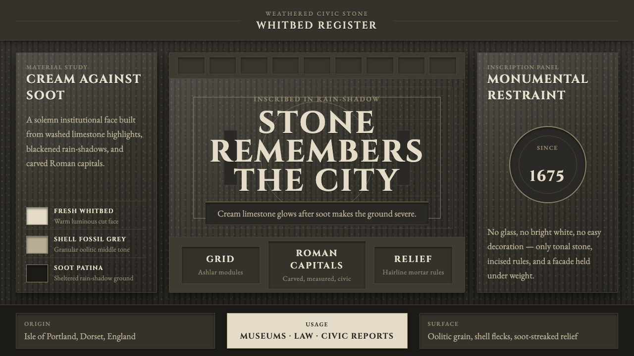 Portland Whitbed StoneCivic stone in shadow. Cream Cinzel capitals glow over soot-black ashlar grai…
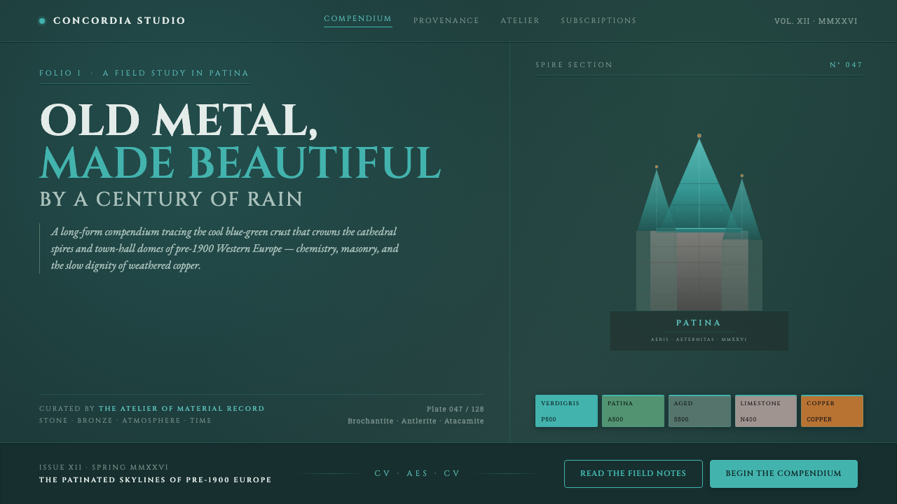 Verdigris Copper RoofOld metal made beautiful by decay. Cool cyan-green patina on dark teal, with…
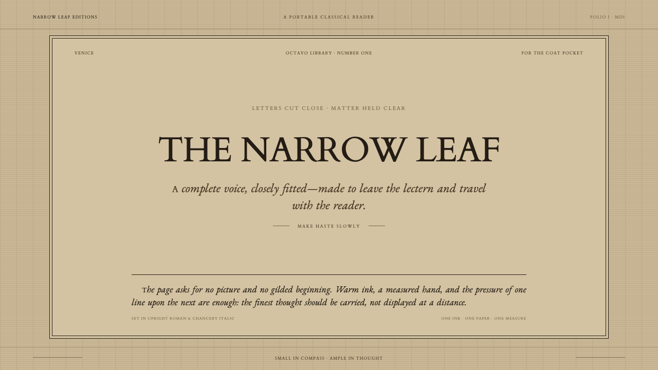 Aldine Press ItalicText needs nothing added. Tight chancery italic meets upright roman caps on m…
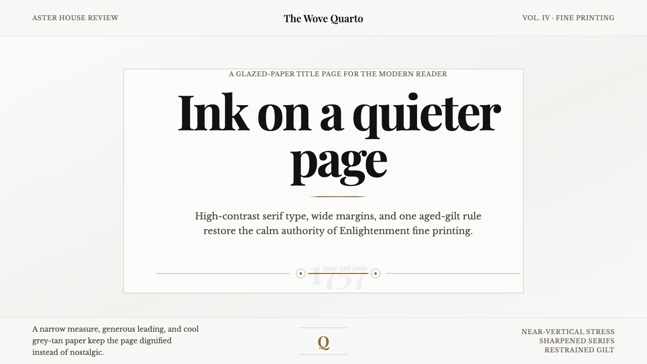 Baskerville Transitional SerifCalm authority in print. Glazed grey-tan paper, sharp serif contrast, one age…
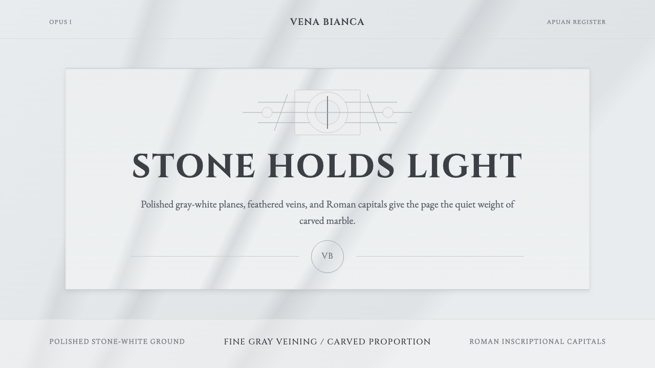 Carrara MarbleLuxury in restraint. Cool stone-white fields, feathery gray veins, and Cinzel…
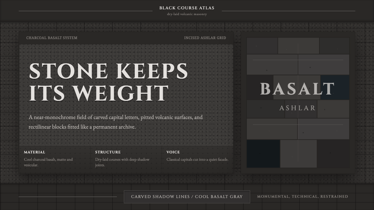 Hauran Basalt StoneMonolith refuses shine. Charcoal Cinzel capitals lock into dry-laid basalt gr…