What is Aldine Press Italic?
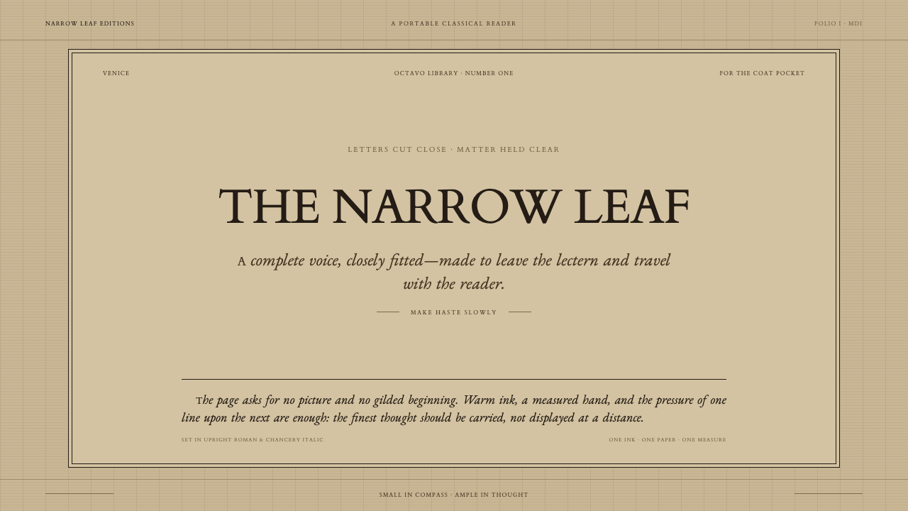
In 1501 Venice, a narrow chancery italic proved that a good text needs nothing added to it — not illustration, not ornament, not even much space.
Aldine Press Italic in brief
This style is built around the first italic type ever cut for printing, set against upright roman capitals on plain, warm-toned rag paper. The italic is narrow and close-fitting, its letters sloped and slightly condensed, designed for one purpose above all others: fitting as much classical text as possible into as little space as possible. Capitals stay upright and roman even where the lowercase leans, and that small, deliberate mismatch between the two is the style's most immediately recognizable signature.
The page itself carries almost nothing beyond text. There is no illustration, no decorated initial letter, no ornamental border — the paper is a plain, mid-tan laid rag stock, the kind made from cloth fiber rather than wood pulp, and margins are modest rather than generous. Where color appears at all, it is a single spot of red on a title page, used once, sparingly, never as a running accent throughout the book.
Every decision here traces back to economy rather than decoration. A tighter letterform meant more words per line, more lines per page, and ultimately a book small enough to leave the lectern and travel in a coat pocket. The visual argument is austere but confident: a text that is genuinely worth reading does not need to be dressed up to earn attention.
Where does Aldine Press Italic come from?
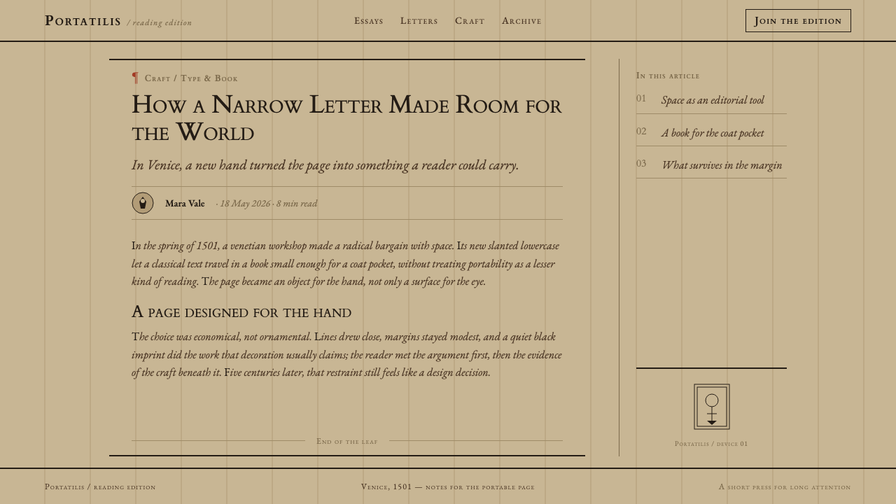
In 1501, the Venetian printer and scholar Aldus Manutius produced an edition of Virgil set in a letter no reader had ever seen in print before: a narrow chancery italic, lowercase only, cut by the punchcutter Francesco Griffo and paired with upright roman capitals borrowed from Aldus's existing roman type. It was the first book ever printed in italic, and it marked the beginning of a whole line of small-format classical texts that Aldus's press, the Aldine Press, became famous for producing.
The letterform itself was modeled on the cursive handwriting used by humanist scribes and chancery officials of the period — a quick, compact, sloped hand meant for everyday writing rather than ceremonial display. Griffo's genius was translating that living, handwritten quality into metal type without losing its intimacy, producing a letterform that felt personal and legible at once, radically different from the heavier, more formal roman and blackletter types that dominated printing up to that point.
The motive behind the whole design was economy, not beauty for its own sake. Aldus wanted to print the classics — Virgil, and later many other Latin and Greek authors — in a format small and affordable enough for a wide readership of scholars and educated readers, rather than the large, expensive folio volumes that had defined earlier printing. A narrower, close-fitting italic let more text fit on a page, and Aldus paired it with a small octavo format — roughly the size of a modern paperback — that could be carried and read anywhere rather than chained to a lectern.
Aldus worked closely with the scholar Pietro Bembo, whose own texts were among the first set in the Aldine roman type that preceded the italic, and whose editorial standards for accurate classical texts shaped the intellectual seriousness behind the whole Aldine program. The plain, undecorated page — no illustration, no ornamented initials, modest margins — was itself an editorial statement: these were working texts for serious readers, not luxury objects for display.
What defines the Aldine Press Italic look?
Color
The palette is almost entirely the natural color of materials: mid-tan rag paper and black ink for text. Red appears only rarely, typically as a single accent on a title page, and never becomes a running decorative color throughout the body of a book. Gold, where it exists at all in Aldine-era books, belongs to goat-leather bindings rather than to the printed page itself.
Typography
A narrow, close-fitting chancery italic carries the lowercase, modeled on humanist handwriting rather than formal display lettering. Capitals remain upright roman even within italic text — a deliberate, unresolved contrast between the two letterforms that later type traditions would eventually smooth over by designing matching italic capitals, but which the Aldine originals never attempted to hide.
Compression for Economy
Every letterform is tighter and narrower than the roman type that preceded it, a direct response to the practical goal of fitting a full classical text into a small, portable volume. The compression is functional rather than a stylistic flourish — it exists because paper and binding cost money, and a shorter book was a cheaper, more portable one.
Plain Laid Paper
The page surface is unbleached rag paper, made from cloth fiber and carrying the faint ribbed texture of the laid mold it was formed on. Its warm, mid-tan tone and visible texture are part of the aesthetic rather than a flaw to disguise — nothing on the page tries to look whiter or smoother than the material actually is.
Absence of Illustration
No decorative initials, no woodcut illustrations, no ornamental borders appear anywhere on the page. This absence is total and deliberate, standing in sharp contrast to the heavily illustrated books common at the time, and it is the clearest visual statement of the style's core belief that the text itself is sufficient.
Modest Margins
Margins are noticeably tighter than the generous, almost decorative margins common in luxury manuscripts and early printed books. This restraint is again economic rather than aesthetic in origin, but it produces a visual density — text filling most of the page — that reads as purposeful and serious rather than cramped.
Roman-Italic Contrast
The small friction of an upright roman capital sitting beside a sloped italic lowercase is not a flaw to be resolved but the style's signature texture. It reads as a document mid-transition — an old letterform and a new one occupying the same word without yet having agreed on a common angle.
Who shaped Aldine Press Italic?
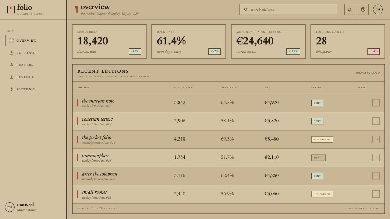
A Venetian scholar-printer, Aldus founded the Aldine Press with the ambition of making the classics widely available in accurate, affordable, portable editions. His commercial and scholarly instincts together produced the italic-and-octavo format, and his press's output over the following decades established Venice as a center of humanist printing.
The punchcutter who physically cut the italic type for Aldus, Griffo translated the fluid, sloped hand of humanist scribes into a working metal letterform — the technical and artistic achievement that made the entire style possible. His earlier roman types for Aldus, and later his own independent work, place him among the most consequential type designers of the early printing era.
A humanist scholar whose own writings were among the first set in Aldus's preceding roman type, Bembo's editorial rigor around accurate classical texts shaped the intellectual seriousness of the entire Aldine program, of which the 1501 italic Virgil was a direct continuation.
How do you use Aldine Press Italic today?
This style suits any context that wants to project quiet scholarly authority through restraint — the conviction that a good text, argument, or product does not need visual noise to be taken seriously. Applying it well means resisting decoration at every turn, letting typography and material texture carry the entire weight of the design.
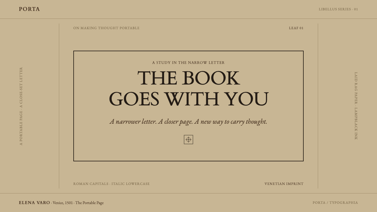
For presentation slides, a cover can pair a sloped, condensed italic title with upright roman capitals in the same line, set against a warm, paper-toned background rather than stark white — a small typographic gesture that signals rigor without a single decorative element. Content slides should favor dense, well-set text blocks over illustrated bullet points, letting compression and legibility do the work that icons or graphics usually do.
For web interfaces, the aesthetic fits long-form reading products, scholarly or archival platforms, and premium editorial tools where credibility matters more than visual excitement. A warm off-white background standing in for rag paper, tight but legible line spacing, and sparing use of a single accent color echo the Aldine restraint without needing an actual italic typeface throughout.
For editorial and marketing work, this style supports content that wants to read as serious, literary, and unhurried — book-adjacent publishing, archival or historical content, and premium print-inspired digital publications. A single red accent used once, on a masthead or a pull quote, mirrors the Aldine convention of using color as a rare event rather than a running theme.
The most common mistake is adding illustration or ornament to 'warm up' what feels like an austere page. The entire authority of this style comes from its refusal to add anything beyond text and material texture — introducing a decorative border or an illustrated initial undoes the specific historical argument the design is making.
Aldine Press Italic — FAQ
Is this the same as generic 'old book' or vintage design?
No. Generic vintage design often leans on distressed textures, ornate flourishes, and antiqued color effects to signal age. This style does the opposite — it is defined by restraint and precision, not decay or ornament. Its authority comes from a specific, documented typographic innovation (the first italic in print) rather than a generalized impression of oldness.
Can this style work with a dark background?
It resists inversion, because the warm, mid-tan paper tone is not incidental — it is the actual color of the rag paper the original books were printed on, and the whole palette is built around black ink reading against that warm ground. A dark variant would need to replace paper-tone with something equally warm and matte rather than a cool black, or the material honesty the style depends on is lost.
Why don't the italic and roman letterforms match in angle?
Because in 1501, italic and roman capitals had not yet been designed as a matched family — the italic lowercase was a genuinely new invention, cut separately from an existing roman capital set that was never intended to lean. That small mismatch is historically accurate and part of the style's texture, not an error to correct by tilting the capitals to match.
How dense should text be set to match this style?
Dense enough that the page reads as economical rather than airy — modest margins, tight but legible line spacing, and a narrow, close-fitting letterform. The goal is not cramped illegibility but the specific density of a book built to say as much as possible in as little space as possible, while remaining comfortably readable.
Does this style suit playful, consumer-facing products?
Rarely. Its entire appeal rests on scholarly seriousness and material restraint, which reads as dry or overly formal in a context built for delight or casual browsing. It suits reading, publishing, archival, and premium editorial products far more naturally than anything designed to feel fun, fast, or lighthearted.
Related design styles
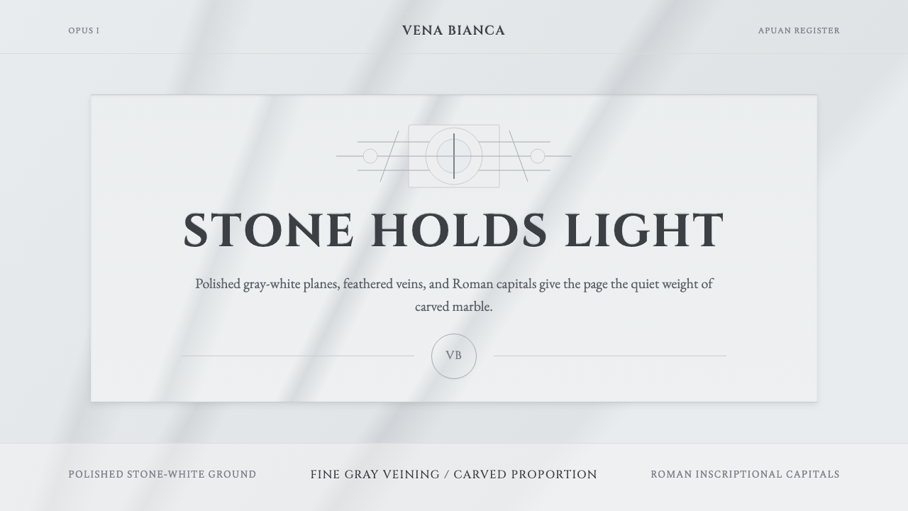 Carrara MarbleLuxury in restraint. Cool stone-white fields, feathery gray veins, and Cinzel…
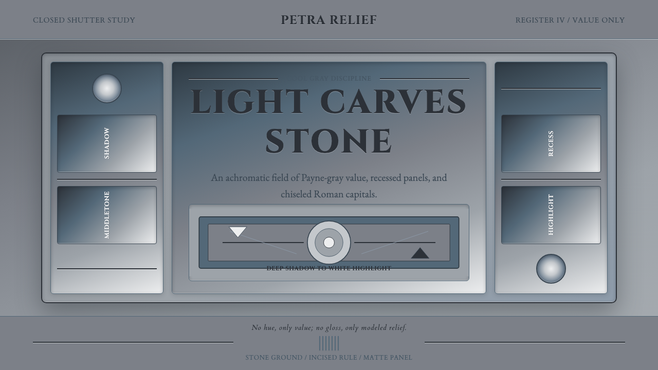 Grisaille PaintingStone without color. Payne-gray relief, Cinzel capitals, and recessed panels…
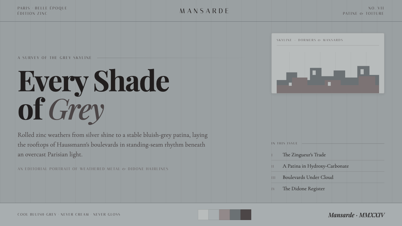 Paris Zinc RooftopsEvery shade of grey. One weathered zinc palette, set in high-contrast Playfai…
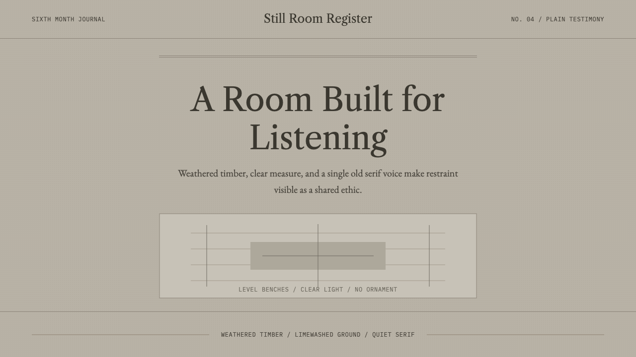 Quaker Plain StyleSilence made visible. Timber gray, Caslon serif, and bench-rule spacing leave…
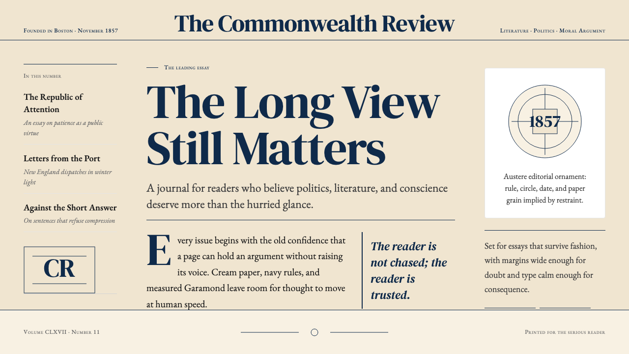 The Atlantic MonthlyAuthority slows down. Navy Garamond on warm cream, ruled like an essay page.
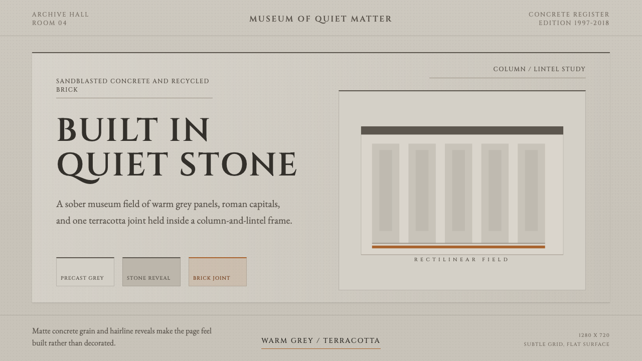 Chipperfield Museum GrayMuseum gravity, rendered quietly. Warm concrete grey, roman capitals, one ter…