What is Paris Zinc Rooftops?
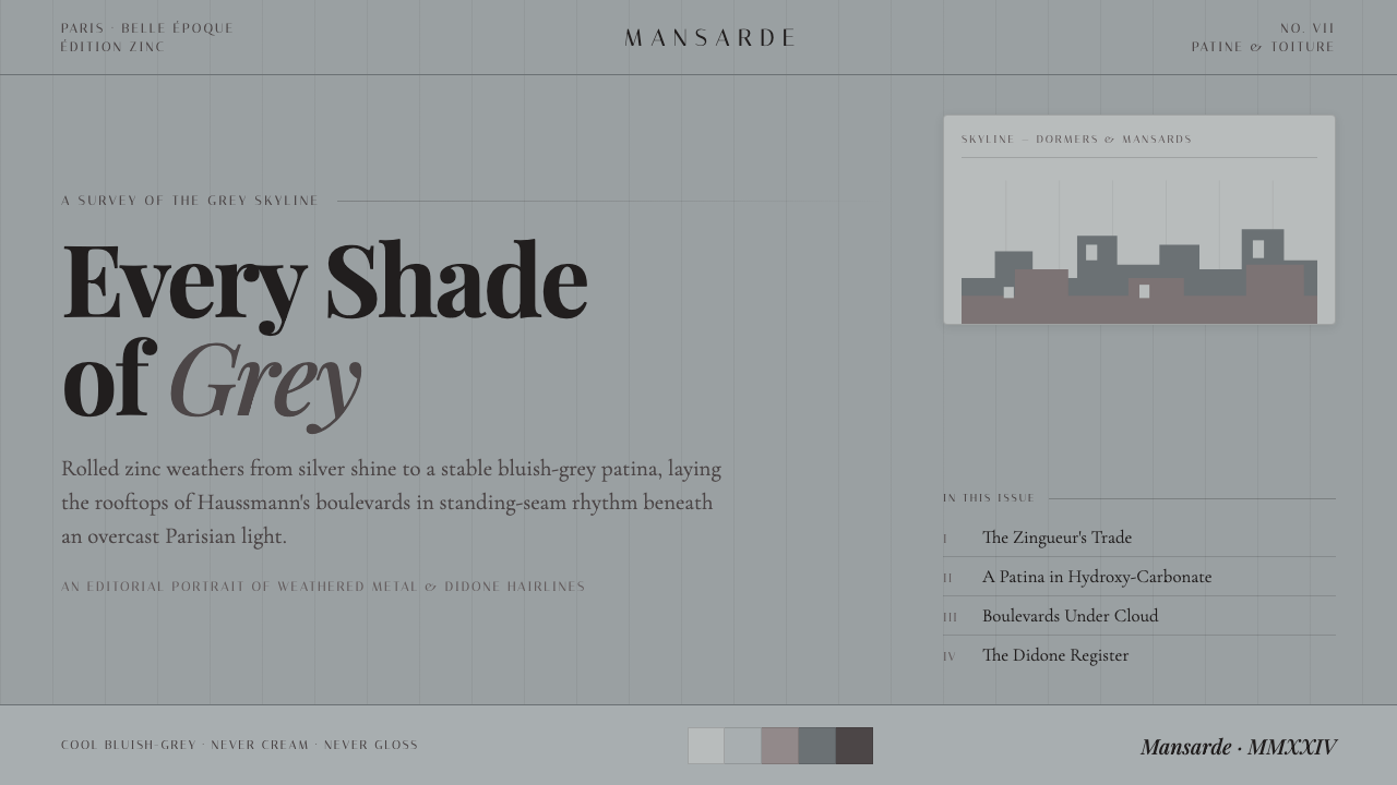
Paris Zinc Rooftops turns a weathered silver-gray skyline into an editorial system of cool restraint, hairline contrast, and quietly repeated architectural rhythm.
Paris Zinc Rooftops in brief
Paris Zinc Rooftops is a design style drawn from the metal roofs that define much of the Haussmann-era Paris skyline. Its central image is not polished chrome or neutral office gray, but zinc exposed to weather: a surface that begins bright and silvery, then settles into a matte, cool, bluish-gray patina. Under overcast light, those roofs create a cityscape of closely related grays, with subtle shifts in temperature and reflectivity rather than dramatic color contrast.
The visual language translates that rooftop atmosphere into a refined screen system. Cool blue-gray grounds replace cream, pure white, and warm paper tones. Fine rules, narrow separations, and restrained tonal changes suggest standing seams in sheet metal. The composition should feel layered without becoming decorative, like rows of dormers and mansards stepping across a distant horizon: repeated, slightly varied, and held together by a strong architectural cadence.
Typography supplies the Belle Époque register. High-contrast Didone-influenced serif families such as Playfair Display, Cormorant Garamond, and Italiana bring sharp hairlines, sculptural verticals, and an editorial sense of ceremony. Small uppercase labels, delicate dividers, and generous quiet areas keep that elegance precise. The style is not nostalgia rendered as ornament; it is a controlled meeting of weathered material, Parisian urban geometry, and typographic poise.
Where does Paris Zinc Rooftops come from?
The style begins with Paris rather than with a graphic manifesto. During the Haussmann renovation of Paris from 1853 to 1870 and onward, the nineteenth-century city acquired a highly recognizable roofscape above its reordered streets and facades. Zinc became one of the visual constants of that upper city. Its roofs formed a broad, cool field over masonry architecture, making the skyline read as a continuous material landscape rather than a collection of isolated buildings.
Time is essential to the image. Fresh zinc can appear bright and silver, but exposure changes it into a stable matte bluish-gray patina. That weathering gives Paris Zinc Rooftops its defining tension: the style is elegant, yet never pristine; monochrome, yet never flat; disciplined, yet visibly shaped by atmosphere. Overcast light reinforces the effect, softening obvious glare and allowing the many close shades of gray to carry the visual experience.
Dormers, mansards, and standing seams give the material its rhythm. The roofscape is neither a smooth plane nor an ornamental pattern. It is a repeated construction system, seen at urban scale. This is why the design style benefits from recurring horizontal bands, fine vertical interruptions, stepped modules, and carefully paced text blocks. These gestures do not imitate a roof literally; they borrow its way of organizing variation within a unified field.
Its typographic counterpart belongs to Belle Époque Paris and the Didone tradition. Playfair Display, Cormorant Garamond, and Italiana are used here for their high-contrast serif character: substantial strokes are paired with exceptionally fine hairlines, producing an image that feels both formal and fragile. Set against weathered zinc grays, those letterforms establish the style's central contrast between hard urban material and cultivated editorial elegance.
What defines the Paris Zinc Rooftops look?
Weathered Zinc Palette
The palette stays within cool silver, slate, bluish-gray, and deep gray relationships. Its richness comes from adjacency rather than from color variety: one surface may appear dull and settled while another feels faintly reflective or atmospheric. Warm ivory, bright white, and vivid accent colors disrupt the rooftop illusion because they pull the eye away from weathered metal and toward a more conventional luxury palette.
Matte Atmospheric Light
The preferred light is diffuse and overcast. Surfaces should feel softened by cloud cover, not polished under theatrical illumination. Contrast can still be clear, especially between type and ground, but it should arrive through tonal placement and sharp serif structure rather than through gloss, glow, or dramatic simulated reflections.
Didone Hairlines
High-contrast serif typography is the principal expression of refinement. The strongest vertical strokes provide composure; the fine hairlines introduce delicacy and tension. Playfair Display, Cormorant Garamond, and Italiana are especially effective when allowed room around their forms. Dense, cramped setting weakens the intended sense of air, precision, and editorial authority.
Fine Structural Rules
Hairline dividers echo the standing seams of zinc roofing. They are not borders added to make a page look ornate; they establish cadence, align labels, and separate information with almost architectural restraint. Their force depends on consistency and scarcity. When every component is framed, the page stops feeling like a roofscape and begins to feel merely boxed in.
Stepped Roofline Rhythm
Dormers and mansards suggest a sequence of stepped silhouettes rather than a single uninterrupted horizon. In layouts, this becomes staggered blocks, measured shifts in alignment, and repeating modules with room for variation. The rhythm should remain calm and urban. Random angles, exuberant overlaps, or aggressively jagged shapes confuse architectural repetition with visual noise.
Small-Caps Editorial Detail
Small uppercase labels work as restrained metadata: dates, categories, section markers, and navigational cues. They should support rather than challenge the main serif voice. Combined with controlled spacing and fine rules, they create the feeling of a composed Parisian editorial page, where hierarchy is visible but never shouted.
Who shaped Paris Zinc Rooftops?
Haussmann is the central urban figure in the style's origin because the Haussmann renovation of Paris, from 1853 to 1870 and onward, established the nineteenth-century cityscape from which the zinc roof horizon is read. The style does not treat him as a decorative reference. It uses the resulting relationship between street, facade, roofline, and repeated urban structure as its spatial foundation.
Les zingueurs, the Parisian zinc-roofers, represent the material intelligence behind the image. Their work is embedded in the standing-seam rhythm, dormers, and mansard roofs that make zinc legible across the skyline. In this design system, their presence is carried by construction-like repetition, fine joins, and the acceptance of patina as an earned surface rather than an imperfection to erase.
These typefaces are the style's named typographic references. Their high-contrast Didone serif qualities bring Belle Époque elegance to a palette that could otherwise become merely industrial or austere. They make the system editorial: a weathered urban material field becomes a page with ceremony, hierarchy, and carefully held tension between broad forms and hairline detail.
How do you use Paris Zinc Rooftops today?
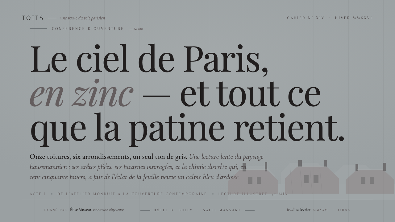
For presentation covers, use the roofscape as a compositional discipline rather than as a literal image treatment. Set a large Didone title against a deep or mid cool-gray field, then let a small uppercase line carry the supporting information. A faint horizontal division, a narrow vertical seam, or a stepped edge can suggest the skyline without turning the cover into an illustration. Content slides should become quiet editorial pages: clear title, restrained section label, one or two text groupings, and generous empty ground around the type.
Data and explanatory slides benefit from the style when charts are treated as part of the same tonal architecture. Keep the main series within related zinc grays, using differences in value and texture-like rhythm to distinguish information. Fine rules can establish baselines and reading order, while the Didone face is reserved for titles, summaries, or a significant figure. Avoid brightly differentiated categories and inflated graphic effects; the goal is a measured city horizon, not a dashboard built from competing signals.
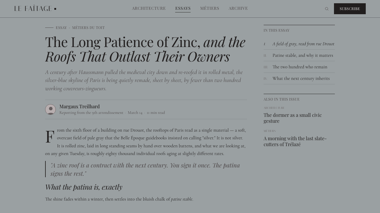
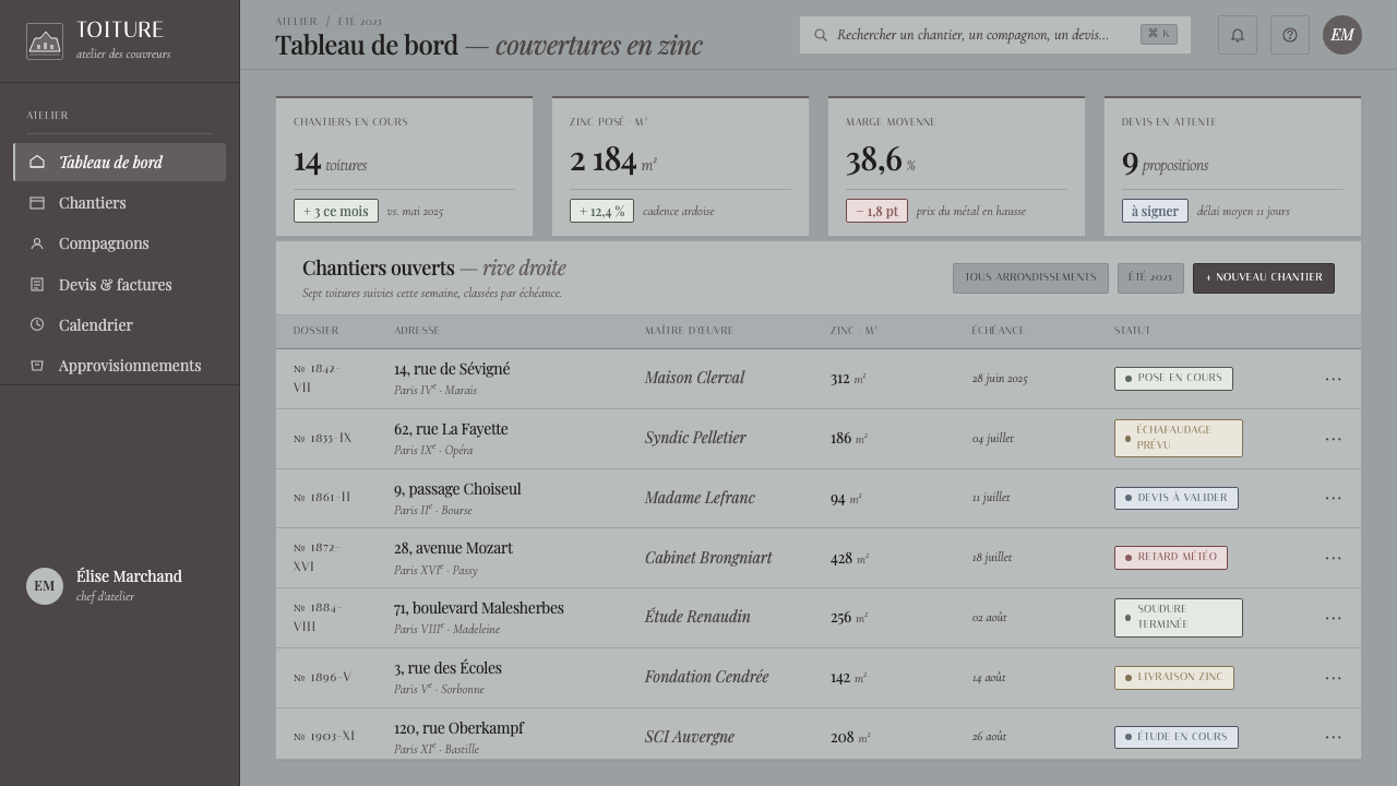
For web interfaces, Paris Zinc Rooftops works especially well for dashboards, journals, portfolios, cultural platforms, and pricing pages that need calm authority. Use cool blue-gray as the prevailing field and make panels feel like adjacent sheets of material rather than floating cards. Navigation can rely on refined text labels and small uppercase cues. Pricing tiers or dashboard states should differ through tonal hierarchy, placement, and restrained dividing lines, preserving the sense that every area belongs to one continuous roofscape.
Editorial and marketing pages can use the style to make long-form material feel composed and ceremonial. Pair a high-contrast serif headline with a quieter supporting voice, keep metadata discreet, and let the page breathe between sections. Feature areas can alternate among nearby gray conditions rather than switching to unrelated colors. The common mistake is to interpret Parisian elegance as a reason for excessive luxury decoration: glossy metallic effects, warm white grounds, ornamental frames, and many competing serif treatments all weaken the central idea. The style succeeds when it remains cool, weathered, architectural, and typographically exact.
Paris Zinc Rooftops — FAQ
Is Paris Zinc Rooftops simply a grayscale style?
No. Its defining quality is not the absence of color but the presence of a specific cool material range. The grays should suggest silver zinc weathering toward bluish matte patina under overcast Paris light. Neutral charcoal, warm gray, and plain monochrome can look superficially similar, but they lack the atmospheric and material direction that makes the style recognizable.
Why are pure white and cream backgrounds a poor fit?
The source image is a cool zinc skyline beneath overcast light, not paper, plaster, or a sunlit salon. White and cream shift the atmosphere toward other historical editorial styles and reduce the coherence between background, typography, and rooftop material. A cool gray ground lets the full system begin from the patina rather than placing the patina as a decorative accent on top of an unrelated surface.
Can sans-serif type be used in this style?
Yes, but it should remain subordinate. A restrained sans-serif can handle utility text, navigation, dense interface labels, or supporting information, especially when small uppercase treatment is useful. The stylistic identity, however, comes from the high-contrast Didone serif voice. If the serif disappears from headings and key editorial moments, the result may retain the gray palette but lose its Belle Époque character.
Should the design include photographs of Paris rooftops?
No. Photography can be used when it serves the content, but the system should work without literal rooftop imagery. Its transferable elements are the weathered zinc palette, standing-seam-like division, stepped rhythm, and high-contrast editorial typography. Using those principles allows a product, report, or interface to evoke the source material without reducing it to a travel image treatment.
Related design styles
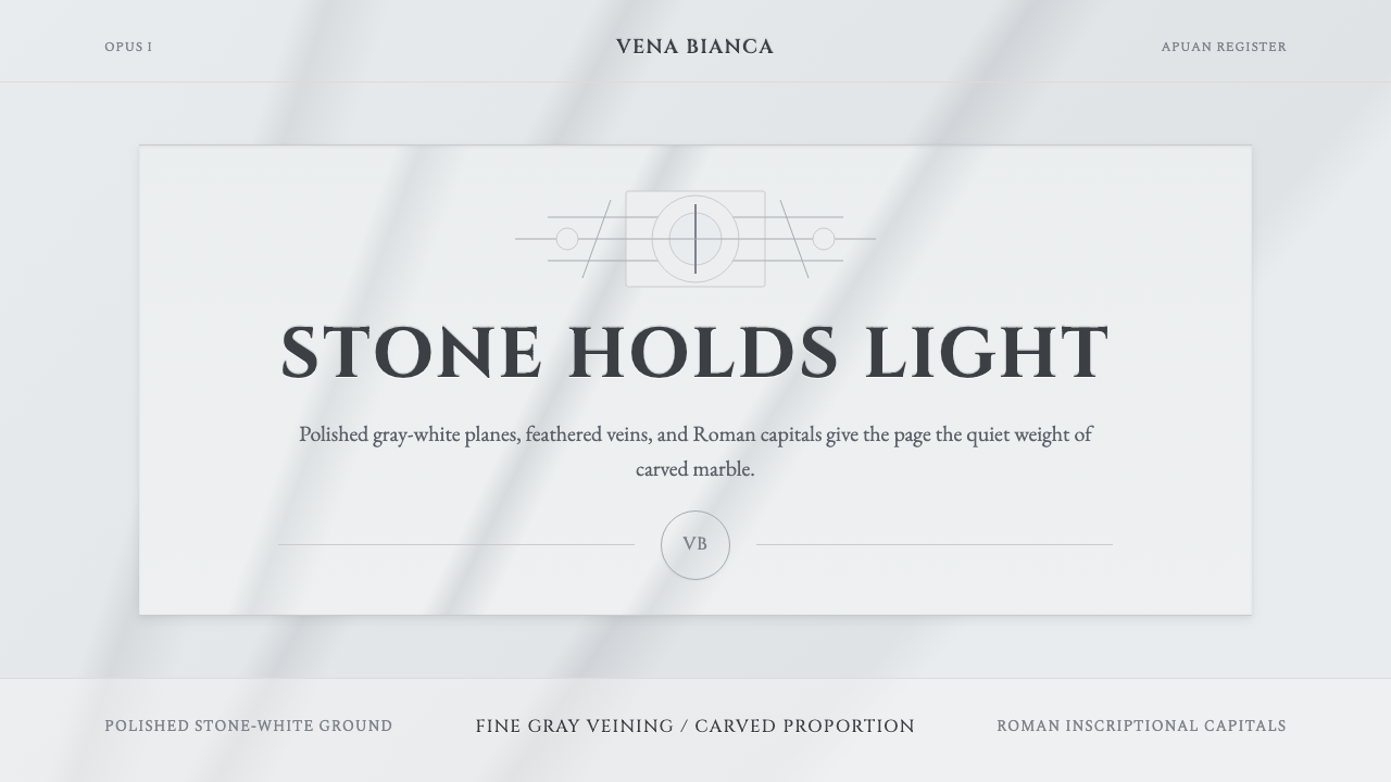 Carrara MarbleLuxury in restraint. Cool stone-white fields, feathery gray veins, and Cinzel…
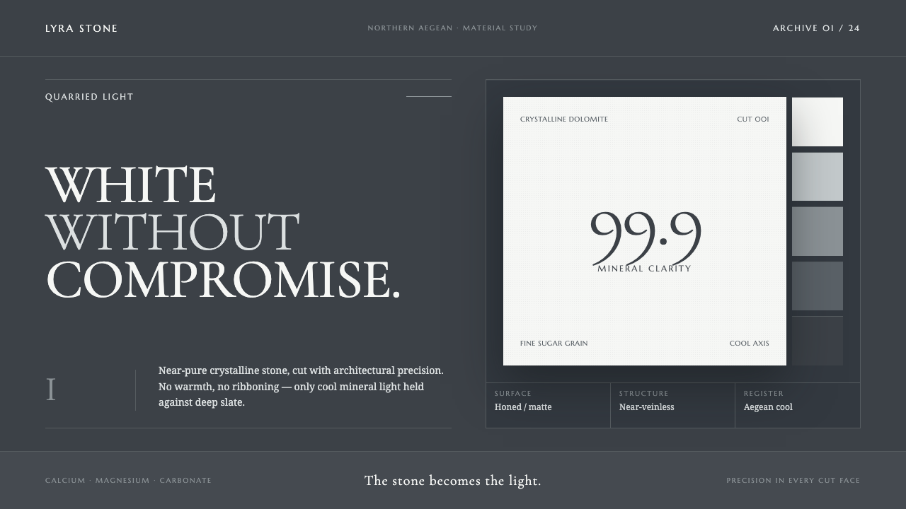 Thassos White MarbleWhite becomes material. Crystalline serif forms float on deep, cool Aegean sl…
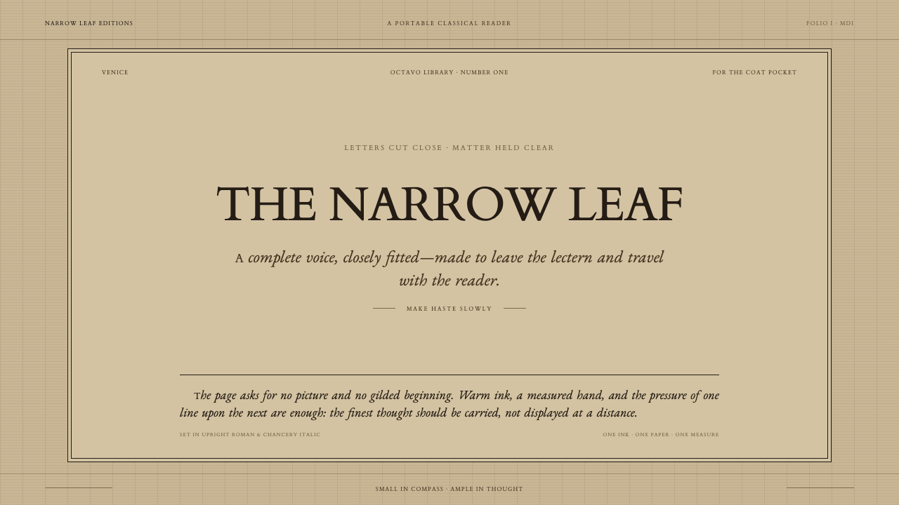 Aldine Press ItalicText needs nothing added. Tight chancery italic meets upright roman caps on m…
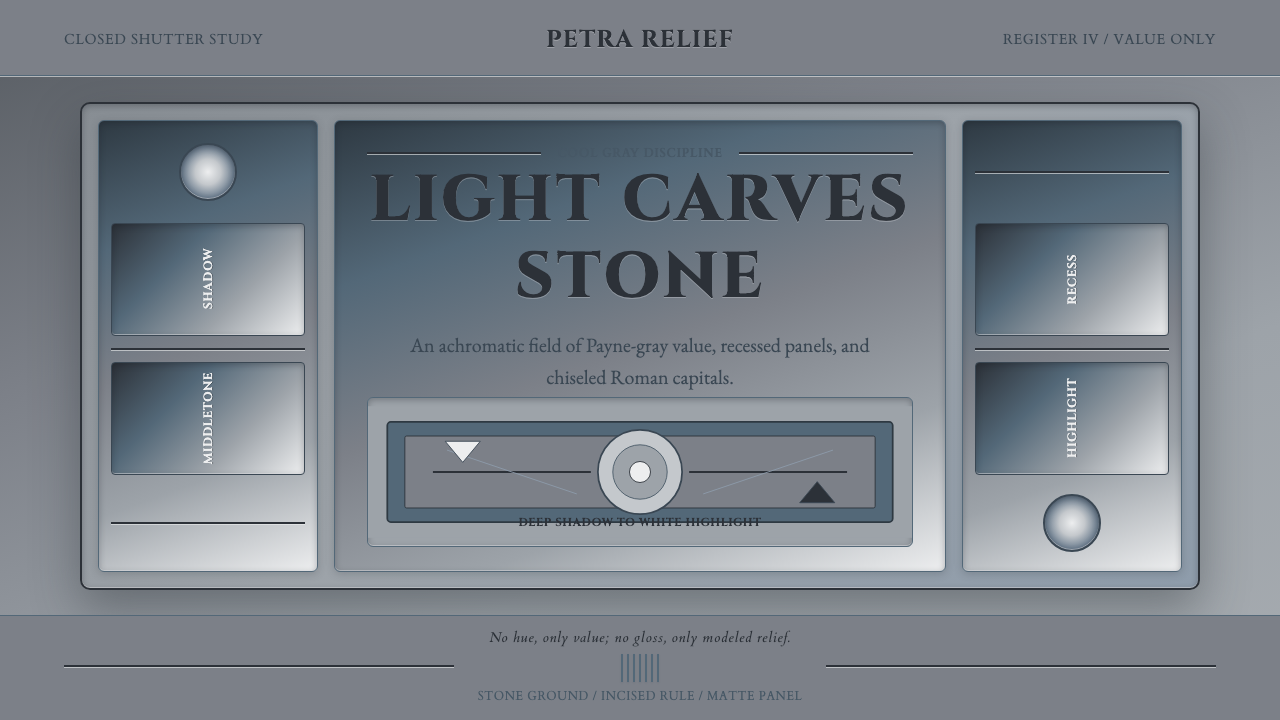 Grisaille PaintingStone without color. Payne-gray relief, Cinzel capitals, and recessed panels…
 HermèsTwo centuries of restraint in orange. Brown serif on cream, gallery-quiet, ne…
 Milk Glass OpalineCool opacity holds one warm secret. Bluish milk-white relief catches a red-or…