What is Thassos White Marble?
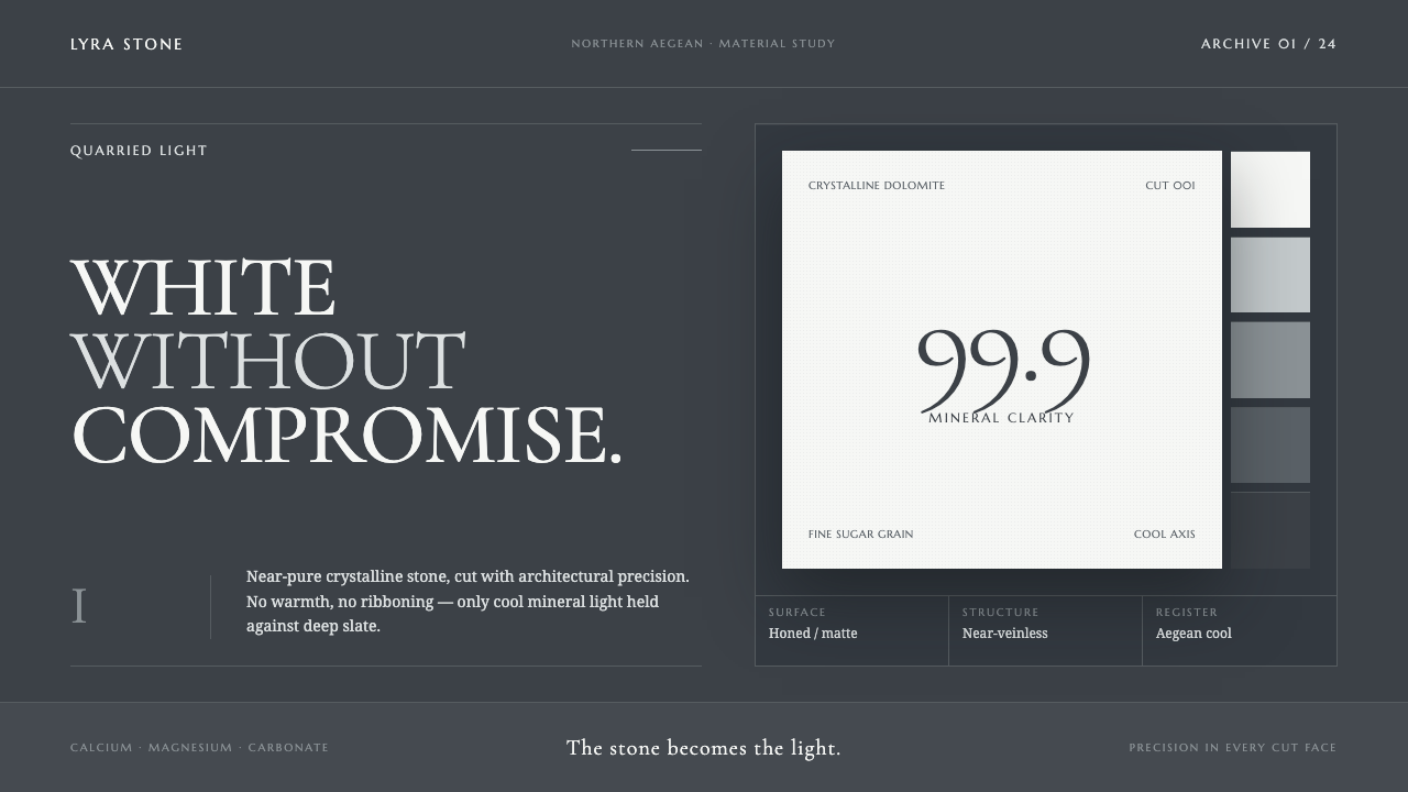
Thassos White Marble makes white feel excavated rather than applied — crystalline serif forms suspended over the cool, immense quiet of Aegean slate.
Thassos White Marble in brief
Thassos White Marble is a dark editorial and architectural visual system derived from an unusually pure white stone from Thassos island in the northern Aegean. The marble is defined by its near-pure crystalline dolomitic character, with almost no iron, clay, graphite, or visible veining. That material fact determines the system’s central contrast: an intensely cool white is never merely a background or neutral field. It is the brightest, most deliberate object in the composition, held against a deep slate ground that makes its crystalline clarity feel physical.
The style does not treat marble as a generic signifier of luxury. It avoids warm ivory, ornamental gold, beige interiors, theatrical veins, and the soft romance often attached to stone imagery. Instead, it reads marble through cut faces, precise slab edges, faint seams, restrained grey transitions, and the cool shadow found within crystalline material. Its luxury comes from rarity, finish, weight, and control rather than abundance. The visual result should feel quiet enough to invite close reading, yet exact enough to suggest that every surface has been measured and cut.
Everything in the system is rectilinear, sharp, and architectural. High-contrast classical serif typography supplies the sensation of inscription, engraving, and chisel work without needing literal carved imagery. Large white type may appear to float, but its placement remains disciplined by clear planes and generous darkness. Thin dividing seams, compact labels, and carefully bounded content areas create the impression of fitted stone slabs. The style is most successful when it feels less like decoration layered over a page than a composition assembled from material surfaces.
Where does Thassos White Marble come from?
The material origin is Thassos island in the northern Aegean, Greece. Thassos White Marble belongs to a long continuum of quarrying that extends from ancient practice through the present day, while the stone itself is geologically Mesozoic. The system begins with this difference between human time and material time: quarrying, cutting, transporting, and building are acts within history, while the crystalline stone precedes those acts by an almost unimaginable span. A visual language based on it should therefore feel composed, enduring, and resistant to passing fashion.
The stone’s visual identity comes from exceptional restraint rather than expressive pattern. Its near-pure crystalline dolomitic structure carries almost no iron, clay, graphite, or veining, so it does not offer the dramatic ribbons or busy mineral narratives associated with more visibly figured marble. Its white remains cool rather than creamy. That coolness is essential: when the stone is translated into a visual system, pale elements should read as cut crystalline planes, while darker elements should suggest the shadowed depth of a slab’s own face rather than a separate decorative color story.
Greek and Aegean architectural marble provides the broader architectural context for the theme. In this interpretation, stone is understood as something built with: a plane, an edge, a seam, a surface with weight. Aegean sculptural stonework provides a parallel idea of disciplined removal, where character emerges through cutting rather than accumulation. The resulting design language borrows neither ornamental historicism nor literal archaeological imagery. It extracts a material grammar of precision, contrast, and quiet permanence.
Aegean quarrymen and the Greek marble-stone industry connect the stone to ongoing human work. Their presence in the theme is not represented through figurative illustration or nostalgic imagery, but through the logic of quarrying and fabrication: clean cuts, controlled surfaces, fitted joins, and respect for the material’s native character. The system’s refusal of gilding, warmth, and exaggerated grain is therefore not a denial of luxury. It is an insistence that the stone’s own cold brilliance is sufficient.
What defines the Thassos White Marble look?
Cool White
White is crystalline, mineral, and sharply luminous rather than creamy, domestic, or paper-like. It should remain the page’s brightest element and appear in concentrated planes, inscription-like type, or tightly controlled details. The effect depends on preserving its cool character: any warmth shifts the system away from Thassos and toward a more generic luxury palette.
Slate Ground
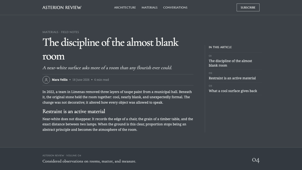
The dark ground is deep, cool, and slate-like, giving the white material a field against which it can float. It is not theatrical blackness and should not create a glossy night-club mood. Its role is architectural: to recede, hold the composition together, and reveal the edges, shadows, and clarity of the marble elements above it.
Inscription Serif
High-contrast classical serif forms carry the theme’s central typographic voice. Their fine joins and decisive contrast suggest inscription, chiseling, and polished stone without becoming ornate. Display type should feel spacious and ceremonial; supporting type should be quieter, more practical, and visibly subordinate. The contrast between ceremonial headlines and restrained information is a primary source of hierarchy.
Cut Planes
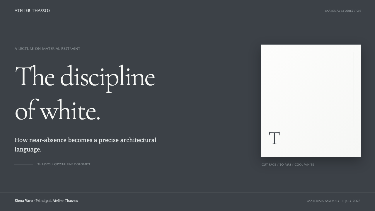
Rectangles, aligned edges, and sharply bounded fields should dominate the geometry. Forms behave as cut slabs rather than cards drifting in space. Use plane changes to establish sections, and let a thin seam or abrupt tonal shift communicate separation. Curves may appear only when they serve the typographic or material idea; they should never soften the system into something plush or organic.
Crystalline Shadow
Shadow is sparse, cool, and structurally tied to a marble plane. It should imply the cut face of stone, a recessed seam, or a crystalline interruption, not ambient atmospheric softness. Grey is used as a material transition between brilliant white and deep slate, so depth remains compact and believable rather than cinematic.
Restrained Luxury
Luxury is expressed through stillness, contrast, surface discipline, and apparent material confidence. Gold, beige, dramatic ribboning, and decorative abundance weaken the style because they compete with the stone’s own distinction. A successful composition feels expensive because it is edited, not because it is embellished.

Who shaped Thassos White Marble?
Aegean quarrymen represent the human continuity behind the material, from ancient quarrying through today. Within the visual system, their relevance is procedural rather than figurative: clean extraction, sharp cutting, and respect for the stone’s inherent character become design principles. The theme honors quarry work by making each edge and seam appear intentional.
The Greek marble-stone industry anchors the theme in an active material culture rather than a purely historical fantasy. It connects geological rarity with quarrying, cutting, architectural use, and contemporary continuity. This is why the system privileges fabricated precision over decorative storytelling: its visual authority comes from treating stone as a real building material with a specific origin and finish.
Thassos island is the singular geographic source of the marble and therefore the theme’s most important point of specificity. Its northern Aegean setting gives the system its cool spatial character, while the stone’s nearly veinless whiteness sets a strict visual limit. The design should retain that specificity instead of turning the material into interchangeable white marble.
How do you use Thassos White Marble today?
For presentation covers, Thassos White Marble works best when a dark slate field is allowed to dominate and a single large white typographic gesture carries the title. Treat the title as an inscription placed on a stone face, not as a decorative logo. A pale rectangular plane, a seam-like divider, or a restrained crystalline shadow can establish depth without crowding the composition. Avoid filling the cover with imagery; the atmosphere should come from material contrast and controlled emptiness.
Content slides should be organized as architectural planes. Use a stable reading field for body copy, keep supporting labels discreet, and create section changes through aligned edges or fine seams rather than ornamental rules. Headings can use the expressive serif voice while dense explanatory text remains quieter and highly legible. The dark ground should provide generous visual rest, allowing pale content blocks to feel placed rather than merely boxed. Each slide should read as a composed surface, not as a collection of floating widgets.
For data slides, use white as the clearest signal, with cool grey transitions for secondary structure and the slate field as the surrounding frame. Charts should feel engraved or laid into the page: axes, labels, and values need precise alignment, while unnecessary visual effects should disappear. The system is especially effective for comparative data, premium reporting, portfolio narratives, and material-sensitive subjects because it makes hierarchy explicit without relying on an expansive color family.
In web interfaces, the style is well suited to editorial homepages, portfolio platforms, premium catalogues, dashboards, and pricing experiences where focus and perceived craft matter. A dashboard can use deep slate as its persistent environment, with bright white information zones appearing as carefully cut surfaces. On pricing pages, plans should be differentiated through typography, placement, and degrees of emphasis rather than warm metallic signals or decorative badges. Navigation should feel typographic and architectural, with clear labels, firm boundaries, and a calm pace.
The common mistake is mistaking this style for generic black-and-white luxury branding. Adding gold accents, creamy neutrals, dramatic marble photography, broad veining, glossy darkness, or abundant ornamental serif flourishes breaks its stone truth. Another mistake is making every element bright white; the material only feels precious when white is reserved for the most important planes, words, and signals. Let slate remain deep, let grey behave like cut-face shadow, and let restraint do the work.
Thassos White Marble — FAQ
Is Thassos White Marble simply a monochrome luxury style?
No. Its identity depends on a specific material relationship: cool crystalline white against deep cool slate, with grey acting as a cut-face or crystalline transition. Generic monochrome luxury often adds warm neutrals, metallic accents, glossy surfaces, or decorative glamour. Thassos White Marble rejects those signals because its luxury comes from stone purity, architectural precision, and the controlled reservation of brightness.
Can the system use marble veins or dramatic stone photography?
It can reference stone, but it should not depend on theatrical veining. Thassos White Marble is defined by having almost no veining, so busy mineral patterns shift the visual story toward a different kind of marble. If imagery is used, favor clean cut faces, pale crystalline surfaces, sharp edges, or tightly cropped architectural material studies. The image should reinforce purity and fabrication, not become a decorative spectacle.
Why are warm gold and beige accents unsuitable here?
They contradict the material’s cool axis. The system moves from brilliant cool white through cut-face grey into deep slate, and this narrow temperature range is what makes the marble feel crystalline rather than creamy. Gold and beige introduce a warmer, more conventional luxury code that competes with the stone instead of clarifying it. Use contrast in lightness, scale, typography, and surface placement before reaching for a new warm accent.
How should typography balance beauty and readability?
Use the high-contrast classical serif as the voice of inscription, especially for titles, statements, and short display passages. Give explanatory text a quieter role with reliable spacing and strong contrast against its field. The system works when expressive type appears intentional and scarce, while information remains easy to scan. If every label uses the ceremonial serif treatment, the page loses both hierarchy and the impression of carved restraint.
Where does Thassos White Marble work less well?
It is less natural for products that need overt warmth, playful abundance, organic softness, or highly varied visual expression. Its cool darkness and precise surfaces can feel formal when a product needs immediate familiarity or a casual, spontaneous voice. The style is strongest when the subject benefits from calm authority, material sensitivity, editorial focus, or architectural order. The question is not whether it can be applied everywhere, but whether its values support the message being communicated.
Related design styles
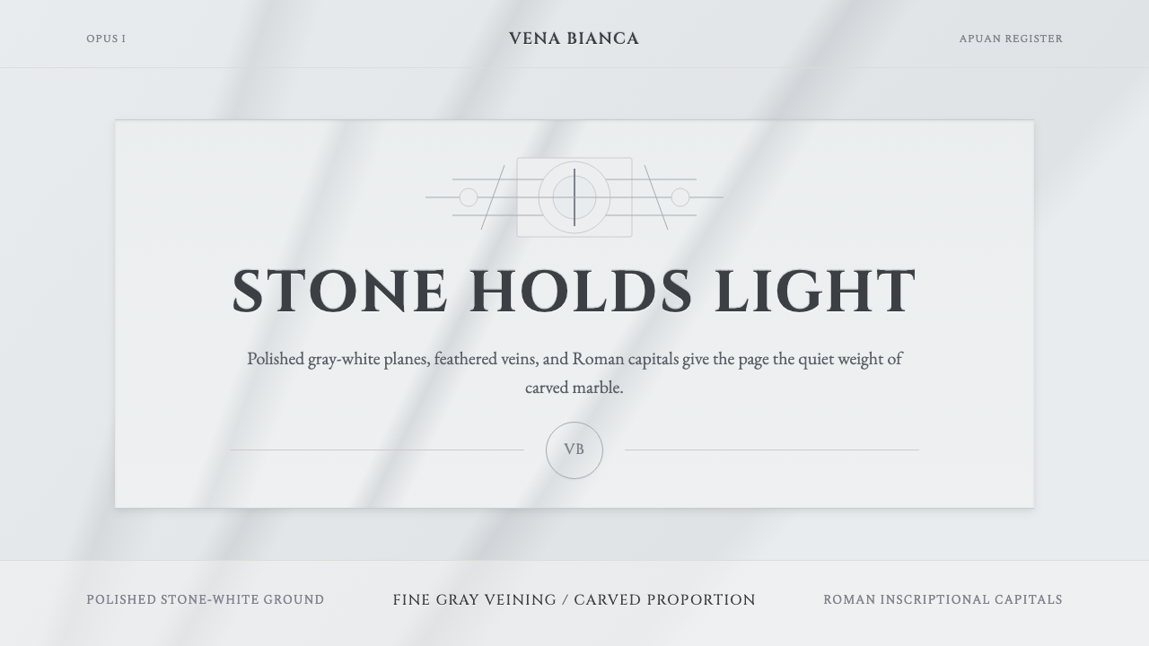 Carrara MarbleLuxury in restraint. Cool stone-white fields, feathery gray veins, and Cinzel…
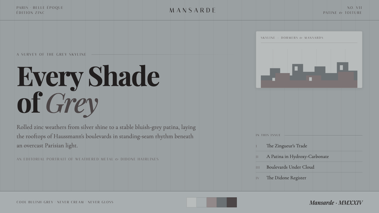 Paris Zinc RooftopsEvery shade of grey. One weathered zinc palette, set in high-contrast Playfai…
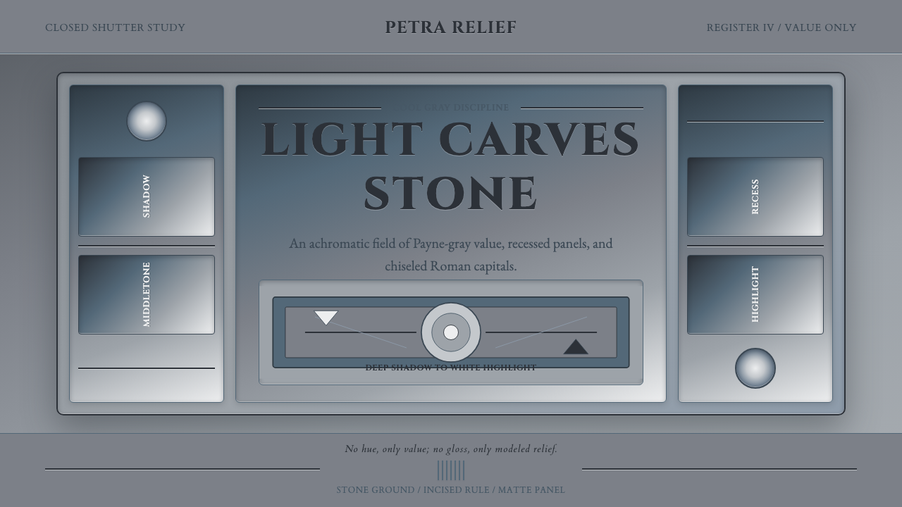 Grisaille PaintingStone without color. Payne-gray relief, Cinzel capitals, and recessed panels…
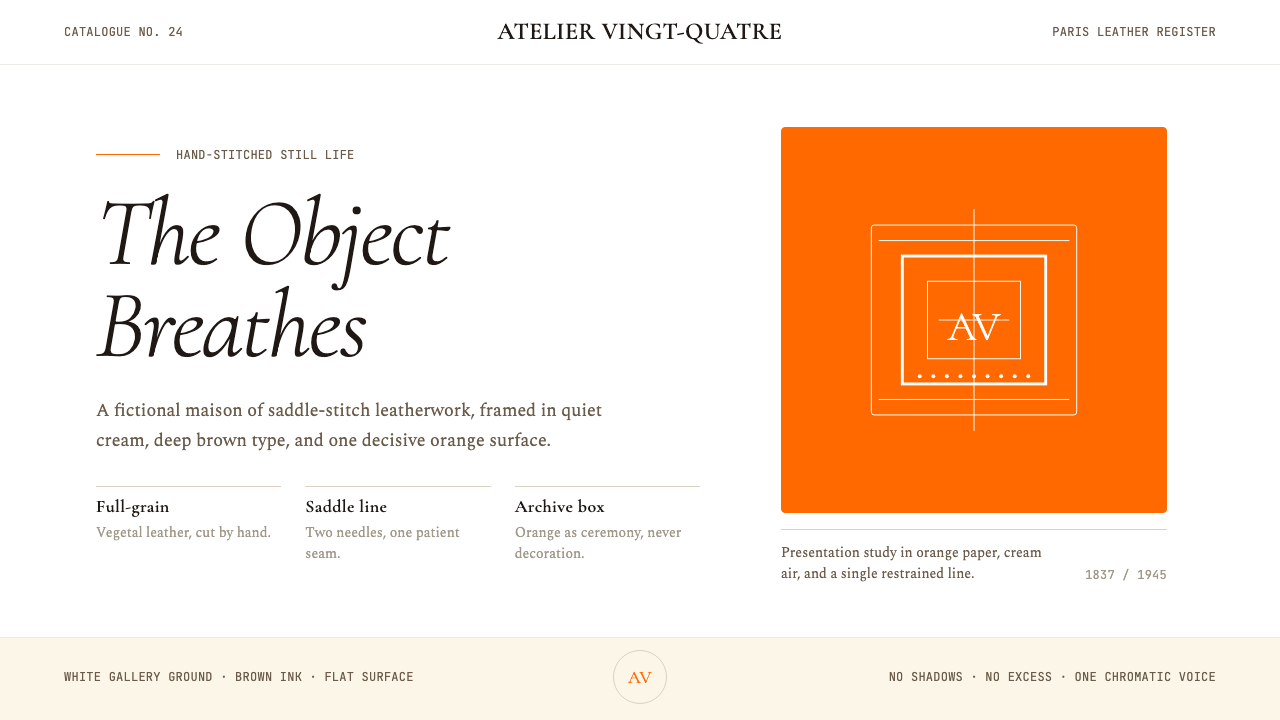 HermèsTwo centuries of restraint in orange. Brown serif on cream, gallery-quiet, ne…
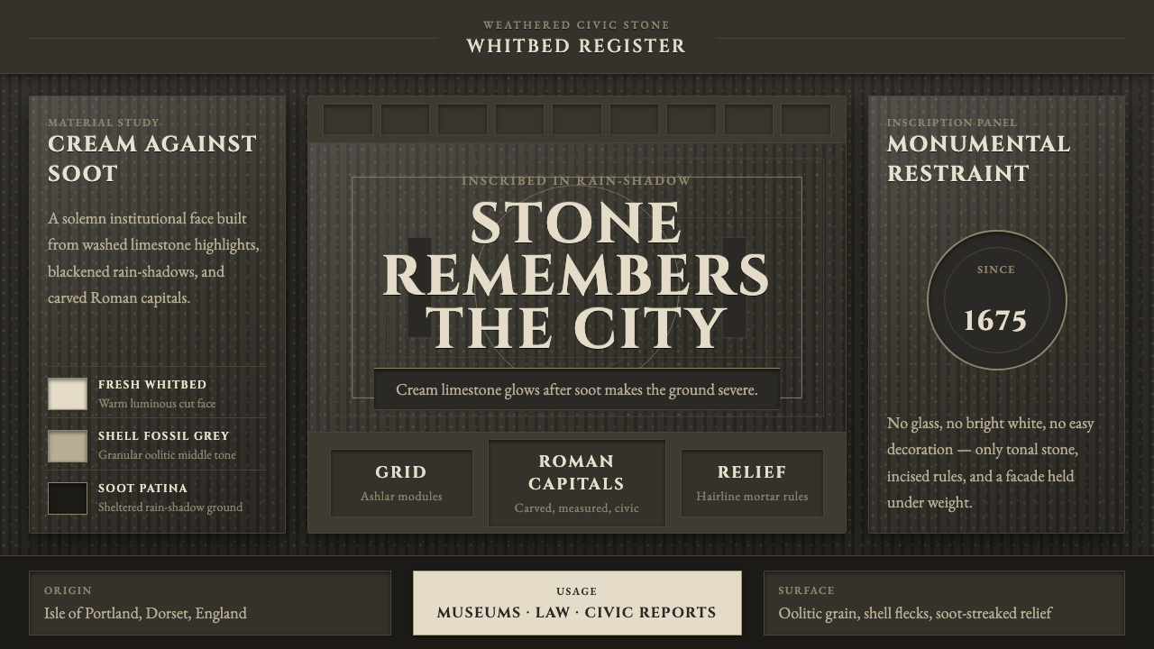 Portland Whitbed StoneCivic stone in shadow. Cream Cinzel capitals glow over soot-black ashlar grai…
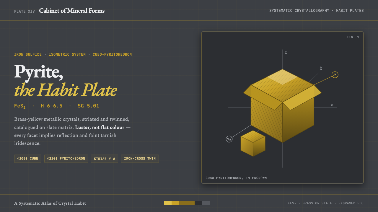 Pyrite Crystal HabitFool's gold under the loupe. Striated brass pyritohedra on slate, serif names…