What is Marine Chronometer?
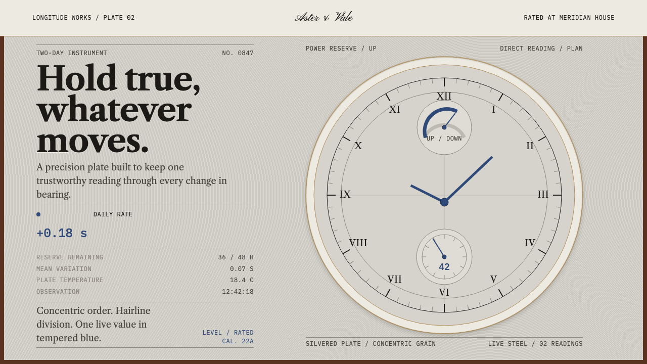
Marine Chronometer takes a silvered dial read from directly above and makes it a design language: concentric hairlines, almost no colour, and one blued-steel hand as the only thing allowed to show that something is alive.
Marine Chronometer in brief
Marine Chronometer is a design style modelled on the face of a two-day box marine chronometer, the precision clock that let ships fix their position at sea. The dial is a silvered brass plate, machine-engraved in fine concentric patterns, with black-filled Roman numerals, a maker's signature, a small seconds dial at the six position and a sector at twelve that shows how much running time is left. The style takes that face as its whole grammar: concentric structure, hairline division and a cool, silvery ground. Because the instrument's job was to be believed, every part of its face is arranged to be read quickly, from a single viewpoint, without ambiguity.
What makes it distinctive is its restraint with colour. Almost the entire surface is neutral metal, ink-black engraving and thin lines. The single saturated tone belongs to the heat-blued steel of the hands, the one deep blue on the instrument, and it is spent only where something is live: a running second, a current reading, a value that is changing. Brass shows up only as fine rings and edges, never as a broad golden gradient, and numerals feel engraved into the surface rather than printed on it.
The mood is calm, exact and slightly austere. Everything is arranged around a centre, divided by lines you have to look closely to see, and kept level, much as the instrument itself is kept level in its gimbals however the ship moves. It is a style that signals trust through accuracy, and it works best when the content really is a measurement.

Where does Marine Chronometer come from?
The marine chronometer exists because of a navigational problem. A ship's latitude can be read from the sun, but longitude depends on knowing what time it is at a reference meridian while the vessel is far from it, and for that a clock has to keep its rate through months of pitching, damp and changing temperature. The Board of Longitude trials were the proving ground for such timekeepers, and the long run of experiment around them is the background to this style: an object designed so that nothing about the sea can change what it reads.
The form settled in the 1780s, when the spring detent escapement fixed the layout of the movement. John Arnold and Thomas Earnshaw are the two names most often attached to that development, and the question of who deserves the credit has been argued over ever since. From then on the instrument was recognisable: a movement hung in brass gimbal rings so that it stays level, set inside a three-tier mahogany box, under a silvered dial read from directly above. London and Liverpool became the centres of the work, and the tradition is catalogued as British precision horology.
Rating became an institution of its own. Observatory trials such as those at Kew Observatory measured how steadily a timekeeper ran and gave the best examples a certified performance that makers could stand behind. In the nineteenth century, makers such as Victor Kullberg and the firm of Parkinson & Frodsham built their reputations on that kind of measured result, and their signatures, engraved in black-filled letters on the dial, became part of the face's design. A rating certificate was not a trophy. It was a statement that one particular instrument could be relied on, and that idea of earned, evidence-backed trust sits at the centre of the style.
The tradition did not stay in Britain. Later work moved to Boston and to Lancaster, Pennsylvania, where the Hamilton Model 22 carried the same dial grammar through the Second World War. The period this style draws on runs to about 1950, but the face lived on as an image of reliability. Curio's system takes it up directly: concentric layout, hairline division, engraved numerals, and a single blued-steel accent saved for whatever is live.
What defines the Marine Chronometer look?
Concentric structure
Every element is organised around a centre. Rings, arcs and sectors define regions, and sub-dials sit on the circle's axes the way the seconds dial and the reserve sector sit on the instrument. Rectangles still appear for practical reasons, but they inherit the same centred logic rather than competing with it.
Hairline division
Dividers are the thinnest line the medium can show. They separate without adding weight, like the engraved minute track on a dial, and a page built from them feels precise rather than boxed in. Heavy borders, thick rules and filled panels are avoided.
Silvered neutral ground
The base is a cool, light, silvery neutral with a faint metallic cast: never a stark white and never a tinted pastel. Contrast is carried by black engraving rather than by shifts of background colour, so the surface looks like a plate that has been cut into. Large flat areas should stay still, with no gradients and no patterns.
Blued-steel accent
A single saturated deep blue, taken from heat-blued steel hands, is the only strong colour in the system. It marks what is live: the running value, the selected item, the current reading. Used everywhere it would be decoration; used only for liveness it becomes information.
Engraved numerals and capitals
Numbers and labels look cut into the plate rather than printed: upright Roman-style numerals and small serif capitals, filled in near-black and spaced as evenly as a dial's hour markers. Aligned, tabular figures matter more here than decorative flourishes.
Subsidiary dials
Secondary information lives in small satellite gauges placed at fixed positions on the main circle, such as a seconds dial low on the face and a reserve sector high on it. This gives the page predictable homes for status and duration without letting auxiliary readouts compete with the main reading.
Brass as line only
Brass appears only as thin rings and edge lines. It is a trim colour, not a surface, so large gold gradients and glossy bevels are left to other styles. The effect is of metal that has been finished by machine and then left alone.

Who shaped Marine Chronometer?
Arnold is one of the two names most closely tied to the spring-detent chronometer that settled the form in the 1780s. His work stands for the point at which the marine chronometer stopped being a one-off experiment and became a recognisable, repeatable instrument, which is the moment this style's dial layout descends from.
Earnshaw is the other name attached to the spring detent, and the question of how much each man contributed was disputed. What matters to the style is the outcome they share: a clear, uncluttered arrangement that makers could copy for generations, with the movement hidden and the dial left to do the talking.
Kullberg was a London chronometer maker of the nineteenth century, whose signature appears on the dials of fine marine instruments. He stands for the mature phase of the trade, when the form was settled and reputation came from steady, measured performance rather than novelty.
A London firm rather than a single maker, Parkinson & Frodsham represents the workshop tradition behind the style: shared dial layouts, signed work and consistent finishing. Its inclusion is a reminder that this aesthetic was a collective craft discipline, not one person's taste. Its name on a dial marks a workshop as much as any individual, and the engraving is treated as part of the face rather than an afterthought.
How do you use Marine Chronometer today?
Marine Chronometer is a strong choice when the content is a measurement, a status or a promise of accuracy. Its principles are structural: everything centred, everything divided by hairlines, one colour reserved for what is live. Apply those rather than simply making things silver. It rewards discipline more than invention: the fewer elements you add, the more authoritative each one looks.
For presentation slides, the cover can carry a large concentric ring or a set of fine circles behind an engraved serif title, with one short blued line standing in for a hand. Content slides are divided by hairlines into calm panels, and each slide may spend its blue on exactly one live number or one key phrase. Data slides are the natural home of the style: gauges, radial charts, sector indicators and timelines drawn as tick marks, all labelled at fixed positions on the ring.
For web interfaces, the style fits dashboards, monitoring and observability tools, finance and logistics products, and anything that reports real time. Status uses the blue and nothing else; auxiliary counters become small subsidiary dials; inputs and tables are drawn with hairlines. A pricing page can present its plans as a quiet table of fine rules, with the blue reserved for the plan the visitor has currently selected. Keep the centre of any layout quiet and let the live value be the only element that draws the eye.
In editorial and marketing work, the style suits technical reports, white papers, horology, maritime and scientific brands, and product pages for instruments and precision services. Captions are set like dial engraving, pull quotes sit between hairlines, and layouts stay centred and symmetrical. Photography works best in neutral, evenly lit crops, because the page has no room for competing colour.
The most common mistake is spreading the blue around: once it marks headings, links, icons and decoration as well, it can no longer say 'this is live'. Other mistakes are thickening the lines until the hairline logic disappears, adding glossy gold gradients, and rendering a literal watch with glass reflections and cast shadows, which turns a grammar into a costume. Roman numerals also belong to ordinal markers and section marks only; real data stays in clear, aligned figures.

Marine Chronometer — FAQ
What is a marine chronometer?
A portable, highly accurate clock built to keep steady time at sea. Navigators compare its time with local solar time to work out longitude. The movement hangs in gimbals inside a protective wooden box so that it stays level as the ship moves, and the dial is read from directly above. This style takes the look of that dial, not the mechanism.
Why is blue the only colour?
Because on the instrument the heat-blued steel hands are the only saturated tone, and the style copies that discipline. Colour is treated as a scarce resource spent only where something is live: a running value, a selection, a current reading. Everything else stays neutral so that the blue keeps its meaning.
Is this a skeuomorphic style?
No. It borrows the grammar of the dial (concentric layout, hairline division, engraved numerals, a restricted palette) without trying to reproduce a photographic watch. Glass reflections, metal bevels and cast shadows are exactly what the style leaves out; the flatness and fineness of line are the point.
How does it differ from a generic luxury-watch look?
Luxury-watch design usually leans on gold, glossy black and drama. The chronometer look is instrument-grade: silvery, near colourless, finely divided and quiet, built for being read accurately rather than admired. Its prestige comes from precision and restraint, not from ornament or richness.
Can it handle dense data?
Yes, and this is where it is strongest. Hairline rules and aligned numerals let a page hold many readings without feeling heavy, and the single accent colour makes the live value findable at a glance. The limit is the circle: very wide tables may need to drop the concentric framing and keep only the rules and the colour discipline.
Related design styles
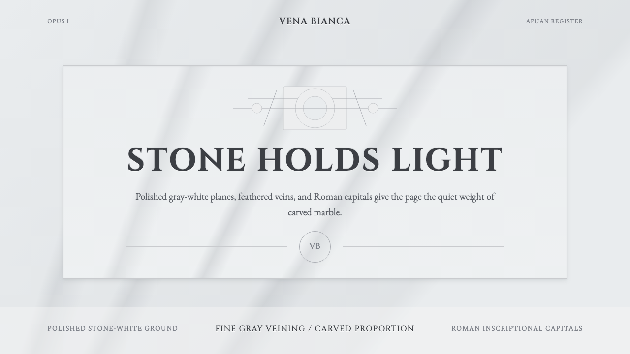 Carrara MarbleLuxury in restraint. Cool stone-white fields, feathery gray veins, and Cinzel…
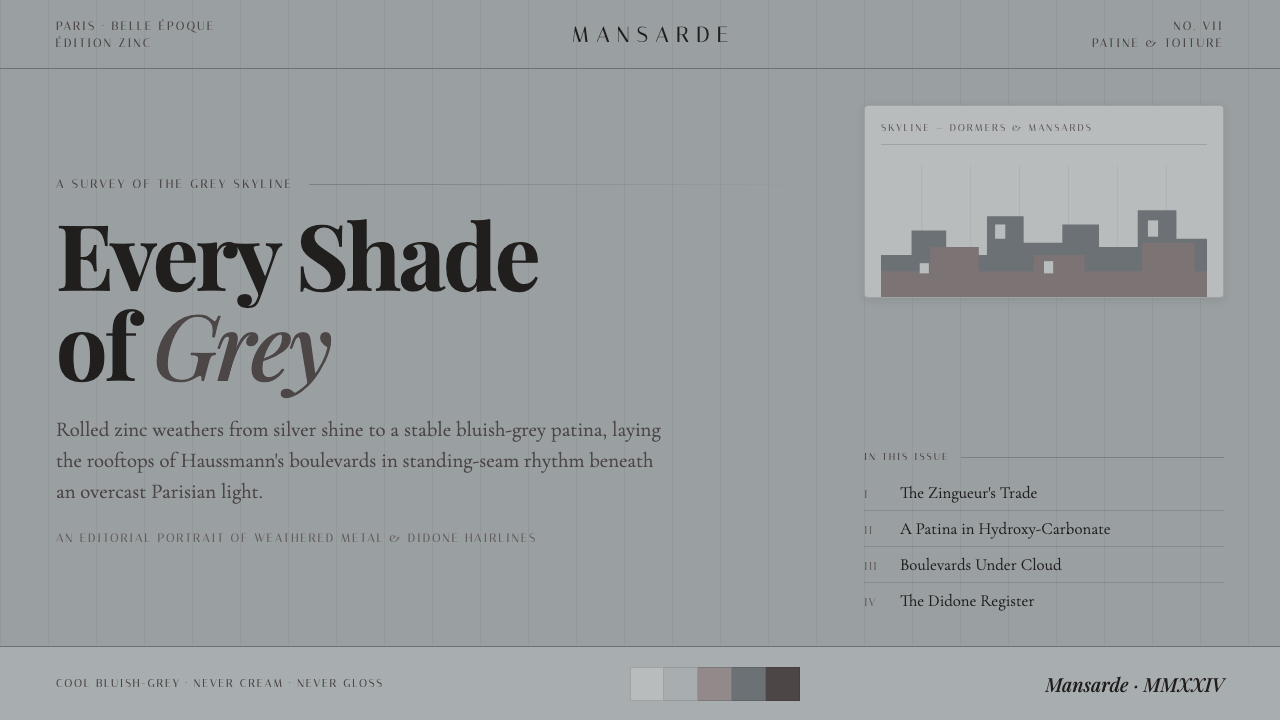 Paris Zinc RooftopsEvery shade of grey. One weathered zinc palette, set in high-contrast Playfai…
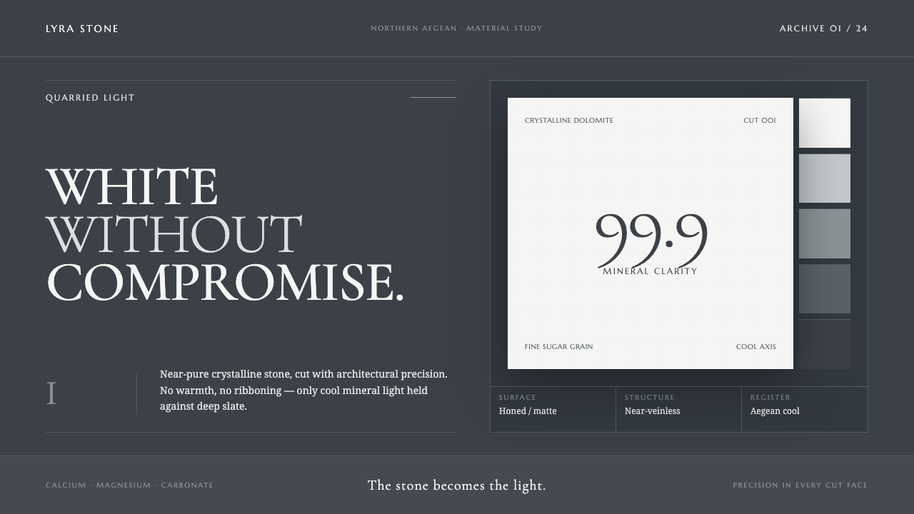 Thassos White MarbleWhite becomes material. Crystalline serif forms float on deep, cool Aegean sl…
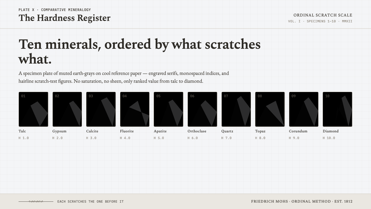 Mohs Hardness ScaleRanked by what scratches what. Ten mineral-gray chips on cool chart-white, en…
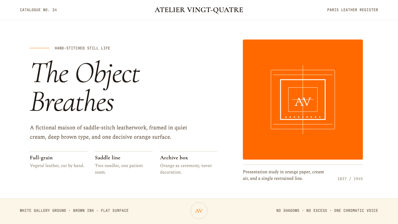 HermèsTwo centuries of restraint in orange. Brown serif on cream, gallery-quiet, ne…
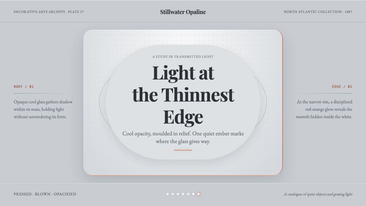 Milk Glass OpalineCool opacity holds one warm secret. Bluish milk-white relief catches a red-or…