What is Milk Glass Opaline?
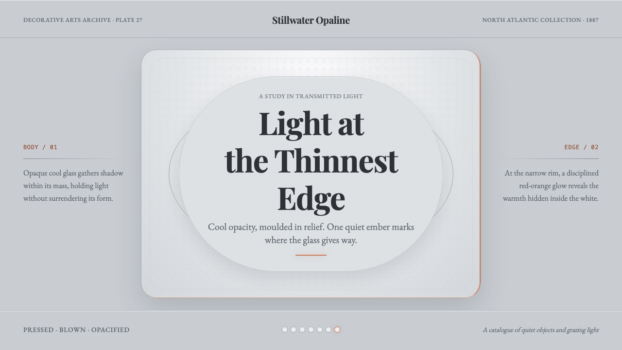
Milk Glass Opaline turns cool opacity into atmosphere: bluish milk-white relief holds the eye in antique stillness while a single red-orange edge glow keeps the vessel quietly alive.
Milk Glass Opaline in brief
Milk Glass Opaline is a visual language derived from Victorian milk and opaline glass: opaque, bluish white, softly shadowed, and shaped by pressed or blown relief. Its defining tension is optical rather than decorative. The body appears cool and subdued, almost grey-white when seen from the side, while the thinnest edges catch a restrained red-orange warmth. The result is not creamy nostalgia or stark modern whiteness, but a quiet surface with depth held inside its opacity.
The system is built around a cool bluish-grey ground, opaline highlights, moulded relief, and scalloped or shell-like edges. These elements should feel related to a vessel rather than pasted onto a flat surface. Forms are symmetrical, rounded, and gently substantial, with raised patterns that become visible through light and shadow. The visual mood is antique without becoming ornate: still, tactile, and composed, with every decorative decision subordinated to the impression of pressed glass.
Warmth is deliberately scarce. The red-orange glow belongs to thin edges, rims, seams, and moments where light appears to pass through a translucent boundary. It should never spread across the whole composition or compete with the cool body of the object. Milk Glass Opaline depends on this imbalance: most of the field remains bluish and opaque, while the edge warmth functions as a small optical secret discovered only after the larger quietness has been established.

Where does Milk Glass Opaline come from?
The source tradition belongs to pre-1900 Victorian pressed and blown milk or opaline glass, with its strongest presence in North America and Western Europe. Milk glass provides the central physical idea: a vessel whose body does not behave like clear glass, but settles into a pale, shadowed opacity. Opaline glass contributes the cooler, more luminous register, allowing white to feel bluish and atmospheric rather than warm or chalky.
The visual system draws from the period when decorative glass was understood through its material body as much as through its ornament. Pressed moulding leaves relief in the surface; blown construction suggests volume and a vessel-like silhouette. Together they establish the grammar used here: raised pattern, rounded mass, quiet symmetry, and edges that become optically important because they are thinner than the body around them.
Its historical identity is therefore not a single motif or isolated object type. It is a meeting point between the opaline and milk-glass tradition and the broader Victorian decorative glass arts. The mood comes from how these traditions handle surface, opacity, and formal repetition: decoration is present, but it is carried by the material and its relief rather than by theatrical color or excessive visual effects.
The named reference points are Fenton Art Glass, Westmoreland Glass Company, and French opaline houses. In this article they function as anchors for the style’s geographic and material range: North American milk-glass practice on one side, Western European and French opaline refinement on the other. The system keeps that range intentionally narrow, preserving the sense of an antique glass vocabulary rather than turning it into a generic vintage theme.
What defines the Milk Glass Opaline look?
Cool Opacity
The dominant field is a bluish milk-white that reads as opaque rather than luminous in a polished, porcelain-like way. It should settle into shadowed grey-white when the form turns away from the light. This coolness is essential: replacing it with cream, beige, or warm ivory changes the entire material impression. The surface should feel quiet, dense, and faintly atmospheric, as if light is held within the body instead of reflected cleanly from it.
Opaline Highlight
Highlights are milky and diffused, never sharp like a mirror or bright like clear crystal. They should appear as soft areas of lifted opacity along rounded surfaces and raised relief. The highlight belongs to the body of the glass, not to a separate glossy coating. Its purpose is to make the material feel gently illuminated while preserving the impression that the object remains substantial, old, and slightly veiled.
Pressed Relief
Pattern should be felt through moulded elevation: ridges, repeated motifs, shallow depressions, and raised borders that catch light differently from the surrounding field. Relief creates the style’s main form of ornament, so it should be legible through shadow and touch rather than through elaborate illustration. The surface must remain composed and vessel-like, with repetition creating calm rhythm instead of visual noise.
Scalloped Edge
The edge is where the material becomes most delicate and expressive. Scalloped, shell-like, or gently repeated contours give the silhouette a Victorian decorative character without requiring lavish ornament. Because the rim is thinner than the body, it can carry a narrow warm glow. The edge should read as a structural termination first and a decorative flourish second, preserving the quiet discipline of the object.
Edge Warmth
Red-orange is the sole warm counterpoint to the cool glass body. It belongs to thin boundaries where transmitted light seems to kindle the material from within. The color should remain narrow, deliberate, and slightly surprising. If it becomes a general accent scattered throughout the composition, the optical story collapses. The viewer should first register the bluish opacity, then notice warmth appearing only where the object grows thin.
Antique Symmetry
Composition favors balance, repetition, and the stable presence of a centered vessel. Symmetry does not mean stiffness; rounded profiles, relief variation, and controlled shadow keep the object from becoming mechanical. The style feels antique because its order is ceremonial and material, not because it is crowded with historical decoration. Every repeated element should reinforce the sense of a carefully made object resting quietly in space.

Who shaped Milk Glass Opaline?
Fenton Art Glass is one of the named reference points for this visual tradition. Within the Milk Glass Opaline system, it represents the North American side of the vocabulary: cool opaque bodies, moulded presence, and decorative glass understood through the relationship between surface and form. Its role here is not a logo or literal historical quotation, but a reminder that the style should feel materially grounded rather than merely tinted with vintage color.
Westmoreland Glass Company anchors another North American reference for the system. It helps define the desired balance between pressed relief and quiet opacity, where pattern is carried by the glass body instead of floating as surface decoration. In practical application, this reference supports repeated contours, substantial silhouettes, and the restrained theatricality of an object whose detail becomes visible gradually through light.
French opaline houses represent the Western European side of the source material and the cooler, more luminous interpretation of white glass. Their reference value lies in the word opaline itself: a pale body that can remain opaque while still suggesting internal light. This helps keep the palette away from cream and toward bluish white, with warmth reserved for the delicate boundary where the material appears thinnest.
How do you use Milk Glass Opaline today?
For presentation slides, use the style as a composed object system. A cover can place a centered vessel-like form or symmetrical relief field against a cool bluish-white ground, with the title treated as a quiet label rather than a loud announcement. Content slides should preserve the same material hierarchy: opaque body for the main field, raised-looking relief for section structure, and warm edge light only at transitions or selected boundaries. Data slides can use repeated moulded forms and scalloped contours to make information feel collected, arranged, and physically present rather than purely digital.
For web interfaces, Milk Glass Opaline suits dashboards, catalogues, and pricing pages that need calm authority without sterile whiteness. Keep the main surface cool and opaque, use milky highlights to separate panels, and let relief-like borders or repeated contours establish grouping. Pricing tiers can be distinguished through silhouette, raised pattern, or edge treatment rather than a rainbow of competing colors. Warm red-orange should mark a selected boundary, active rim, or decisive transition; it should not become the general color of buttons, labels, and alerts.
For editorial and marketing work, the style supports pages that want to feel archival, tactile, and quietly premium. Articles can pair restrained text blocks with centered object studies, symmetrical ornaments, or close views of scalloped edges. Marketing compositions work best when the cool field carries most of the message and the warm edge appears as a reveal: a rim, seam, or narrow contour that rewards attention. The visual language is especially effective when copy describes material, craft, memory, or the contrast between opacity and light.
A common mistake is to treat Milk Glass Opaline as ordinary cream vintage design. Warm ivory backgrounds, beige shadows, abundant sepia, and widespread orange accents erase the defining coolness of the system. Another mistake is to flatten the relief into printed ornament or add glossy highlights that behave like polished plastic. The correct application keeps the body bluish and opaque, gives the pattern physical elevation, preserves antique symmetry, and lets warmth appear only at the thinnest edges.

Milk Glass Opaline — FAQ
Is Milk Glass Opaline a cream or ivory style?
No. Its body reads as a cool bluish white, and from the side it settles toward a shadowed grey-white. Cream, beige, and warm ivory move the material toward a softer domestic warmth that is not part of this system. The only warm note is the restrained red-orange glow at thin edges, where light appears to pass through the glass. That contrast between cool body and warm boundary is the style’s central identity.
Where should the red-orange glow appear?
It should appear only at thin boundaries: rims, scalloped edges, seams, or narrow contours that suggest transmitted light. It is not a general accent color and should not be distributed evenly across the page. The viewer should encounter it as a secondary discovery after registering the larger bluish opacity. When the warmth becomes broad or frequent, it stops reading as light caught by glass and starts reading as ordinary decoration.
How can the style feel antique without becoming ornate?
Let material and structure carry the historical feeling. Use cool opacity, rounded silhouettes, pressed relief, repetition, and antique symmetry instead of filling every surface with decorative motifs. A restrained scalloped edge can communicate more than a crowded ornamental border because it belongs to the vessel’s form. The style becomes convincing when detail emerges through relief and shadow, not when vintage symbols are layered on top of a flat composition.
Can the system be used without literal glass imagery?
Yes, provided the visual logic remains intact. The essential cues are the cool bluish-white body, milky highlights, moulded relief, rounded or scalloped form, antique symmetry, and the narrow warm edge. These can inform slide surfaces, interface panels, editorial frames, charts, or brand compositions without depicting an actual vessel. What must remain is the optical relationship: opacity dominates, relief gives the surface body, and warmth appears only where an edge seems thin enough to transmit light.
Related design styles
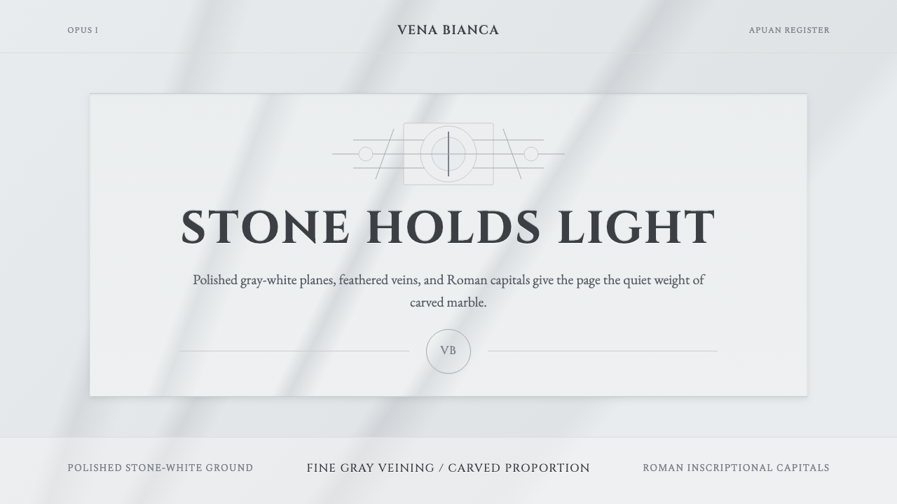 Carrara MarbleLuxury in restraint. Cool stone-white fields, feathery gray veins, and Cinzel…
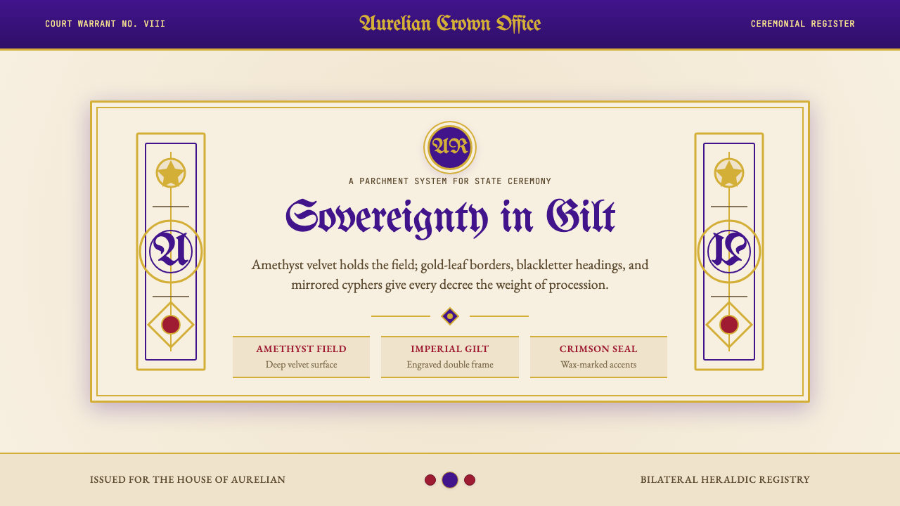 British Royal MonarchyCeremony becomes structure. Amethyst panels, gilt borders, blackletter, mirro…
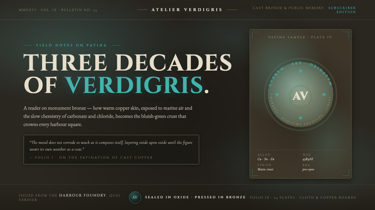 Bronze Patina StatueThree decades of weather, worn as a coat. Verdigris crust on dark bronze, eng…
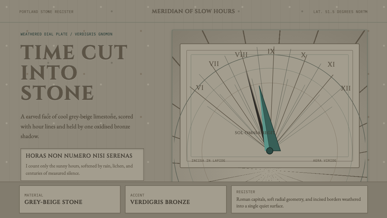 Engraved SundialStone refuses haste. Grey-beige hour lines and verdigris gnomon carve silence.
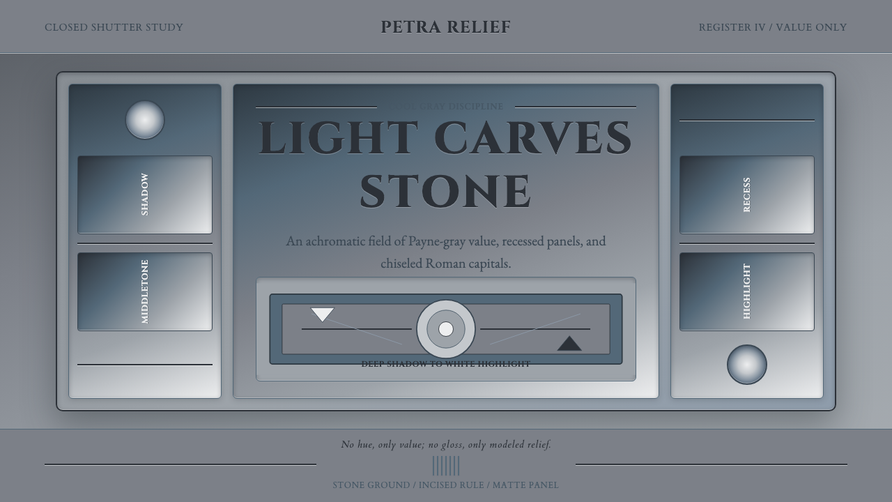 Grisaille PaintingStone without color. Payne-gray relief, Cinzel capitals, and recessed panels…
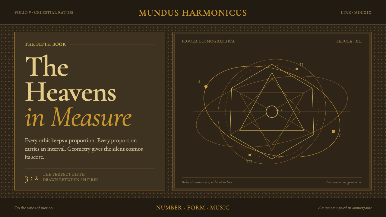 Kepler Harmonices MundiThe cosmos becomes credible geometry. Ocher-gold orbits are engraved on deep…