What is Engraved Sundial?
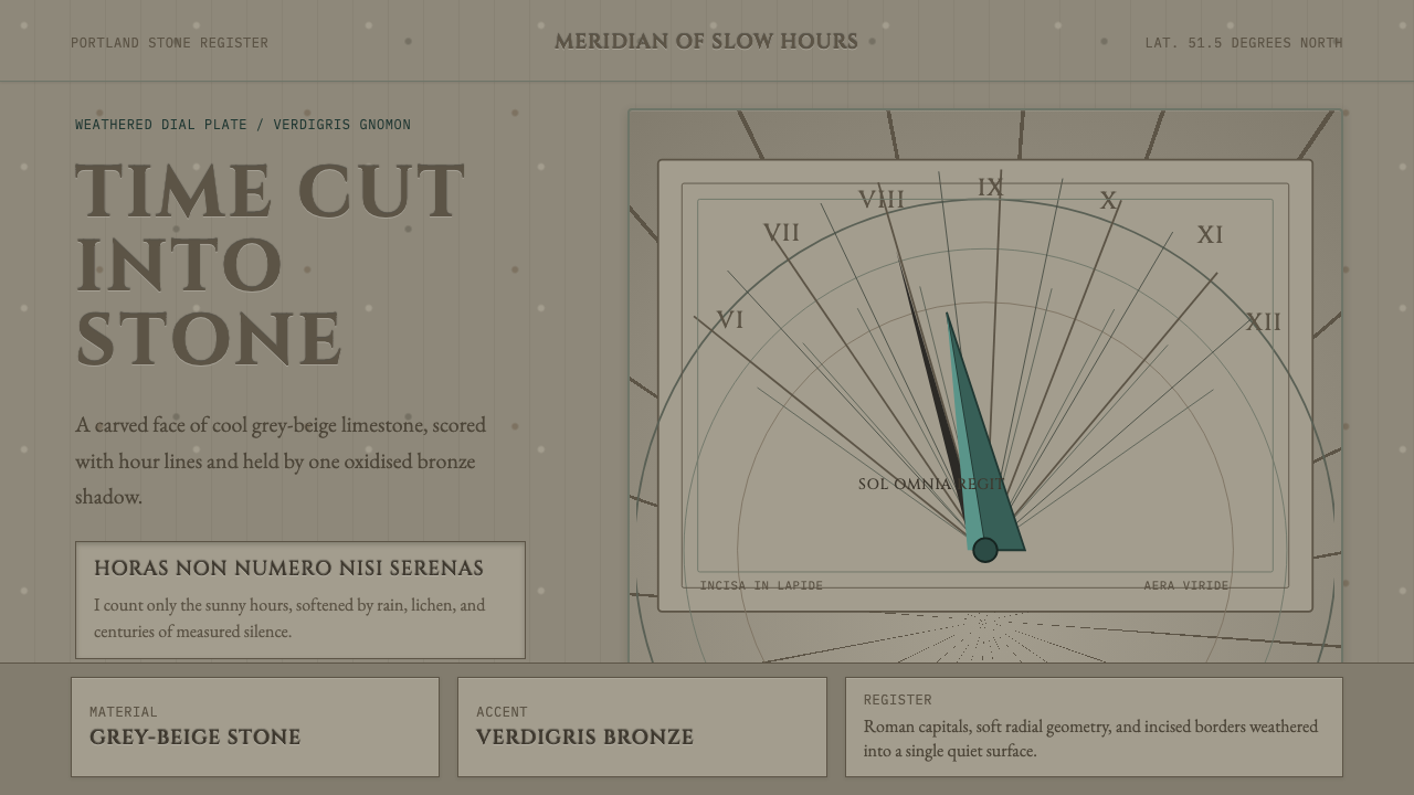
An engraved sundial tells time by carving it into stone that will outlast the person who commissioned it — nothing about this design language hurries.
Engraved Sundial in brief
Engraved Sundial is the design language of the carved garden and architectural dial — a time-telling instrument cut directly into weathered stone, its hour lines radiating outward from a central bronze gnomon that has oxidized to a dull green patina over years of exposure. The palette is deliberately narrow: cool grey-beige stone, deep incised shadow, and one muted metallic green accent, with nothing bright or reflective anywhere in the system.
The style exists because a sundial had to be both an accurate scientific instrument and a permanent architectural object, built to survive centuries of weather rather than a single generation of use. Every mark on its face — hour lines, Roman numerals, a carved Latin motto — is cut into the stone itself rather than painted or applied on the surface, so that the passage of time that erodes the stone is the same force that would eventually erase the very instrument used to measure it.
Visually, the language communicates through depth of carving rather than color or contrast in the conventional sense. Hour lines are incised grooves that catch shadow at different times of day, Roman numerals are cut with the same deliberate, deep strokes, and the single triangular gnomon — the blade that casts the time-telling shadow — is the only three-dimensional, projecting element on an otherwise flat, carved plane.

Where does Engraved Sundial come from?
Gnomonics, the science and craft of sundial design, is one of the oldest continuously practiced technical disciplines in Western history, with roots reaching back to ancient Egyptian and Greek timekeeping instruments. By the time garden and architectural sundials became a fixture of European estates, the underlying mathematics — how a gnomon's angle must be set relative to a location's latitude to cast an accurate shadow — had been refined over many centuries into a precise, teachable science rather than a rough approximation.
The specific carved-stone garden sundial tradition described here reached its fullest expression in the long stretch of Western European garden and architectural design, particularly in English gardens and Continental estates, where a sundial functioned simultaneously as a scientific instrument, a decorative garden centerpiece, and a moral or philosophical statement carved directly into its face. Limestone and Portland stone, both weather-resistant and workable enough for fine incised carving, became the standard materials, chosen for durability over decorative variety.
The bronze gnomon — the triangular blade that casts the time-telling shadow — was cast separately and set into the stone dial plate, and its exposure to weather over years or decades naturally oxidizes its surface from bright metallic bronze to a dulled, greenish verdigris patina. This aging was not considered a flaw to be polished away; a weathered gnomon was understood as evidence of a sundial's genuine age and continued function, adding to rather than detracting from its authority.
The Latin mottoes carved alongside the hour lines were a defining feature of the tradition — phrases like 'Horas non numero nisi serenas' ('I count only the sunny hours') turned a scientific instrument into a philosophical object, reflecting on mortality, the passage of time, and the limits of the instrument itself, since a sundial can only measure time when the sun is out. Instrument makers such as Henry Sutton, working in the mathematical instrument trade of early modern England, represent the broader craft tradition of precision scientific instrument-making from which garden gnomonics drew its techniques and standards.
What defines the Engraved Sundial look?
Color
The palette is monochrome stone — a cool grey-beige — with deep shadow filling incised lines, and a single muted, oxidized metallic green for the gnomon. No bright color, gilding, or painted surface appears anywhere; the entire visual system relies on the natural tone of weathered stone and one aged metal accent.
Incised Hour Lines
The hour lines radiating from the gnomon's base are cut as grooves into the stone rather than painted or inlaid, catching real shadow as the light shifts through the day. This physical depth, rather than printed contrast, is what makes the lines legible — the carving itself is the design element.
Carved Roman Numerals
Hour markings are rendered as Roman numerals cut with the same deliberate, deep-incised strokes as the hour lines themselves, in a classical letterform tradition rather than a modern numeral system. Their weight and depth match the surrounding carving so the numerals read as structural rather than as a later addition.
The Bronze Gnomon
A single triangular bronze blade, set at a precise angle determined by the dial's geographic latitude, is the only three-dimensional, projecting element on an otherwise flat carved surface. Its surface has oxidized over years of weather exposure into a dulled verdigris green — the one accent color permitted in the system, and a mark of genuine age rather than a flaw.
Carved Latin Motto
A short Latin inscription, cut into the stone alongside the numerals, turns the instrument into a philosophical object reflecting on time, mortality, or the sun itself. The motto is always integrated into the carving, sharing the same depth and weight as the rest of the dial rather than standing apart as separate ornament.
Weathered Stone Surface
The stone ground — typically limestone or Portland stone — carries the visible texture of decades or centuries of weather exposure: subtle staining, worn edges, and a matte, non-reflective surface. This weathering is treated as evidence of authenticity and permanence rather than deterioration to be hidden.
Radial, Precision Geometry
The hour lines are laid out with mathematical precision determined by gnomonic calculation rather than aesthetic guesswork — the angles are not evenly spaced in a simple visual sense but calculated to correspond accurately to solar time at the dial's specific latitude. This underlying rigor gives the ornamental carving a genuine scientific structure beneath its decorative surface.

Who shaped Engraved Sundial?
A mathematical instrument maker working in early modern England, Sutton represents the broader craft tradition of precision scientific instrument-making — sundials, compasses, and related devices — from which garden and architectural gnomonics drew its techniques, tools, and standards of accuracy.
The largely unnamed stonemasons and instrument makers who produced carved garden sundials across English and Continental estates established the enduring conventions of the tradition — limestone or Portland stone construction, incised Roman numerals, carved Latin mottoes, and the bronze gnomon set at a latitude-specific angle.
How do you use Engraved Sundial today?
Engraved Sundial transfers well to any context that wants to communicate permanence, gravity, and unhurried authority rather than speed or novelty. Its core discipline is depth over color — meaning is carried by carving, shadow, and material weight rather than bright accents or busy composition.
For presentation slides, a cover page benefits from a large radial motif echoing the sundial's hour-line geometry, rendered in flat grey-beige tones with a single muted green accent line, and a title set in a classical serif that echoes carved Roman letterforms. Content slides should favor a restrained, monochrome-plus-one-accent palette, with section dividers styled as incised rules rather than bright colored bars. Data slides can borrow the radial hour-line geometry directly for circular or dial-style chart formats, which feel native to the source material.
For web interfaces, the aesthetic suits heritage, academic, legal, or precision-instrument-adjacent products particularly well — a pricing page can use stone-grey card surfaces with a single verdigris-green accent reserved for the recommended tier, avoiding bright competing colors entirely. Dashboards should keep data visualization monochrome with sparing use of the green accent for key metrics only, echoing the sundial's own restraint.
For editorial and marketing work, the style suits long-form content about time, legacy, craftsmanship, or philosophy especially well — a pull-quote styled as carved stone lettering, framed by a thin incised-line border, borrows the vocabulary convincingly. Heritage-brand storytelling benefits from the weathered-stone texture and the sense that the design itself is built to last rather than to trend.
The most common mistake is treating this as simply 'grey and green' without the underlying commitment to carved depth and material weight — a flat, glossy grey background with a bright green accent misses the point entirely, since the style's authority comes from the illusion of physical incision and genuine weathering, not from a particular color pairing alone.

Engraved Sundial — FAQ
Why is the gnomon set at a specific angle rather than simply upright?
The gnomon's angle must match the geographic latitude of the sundial's location for the instrument to tell accurate time — this is the core mathematics of gnomonics. A gnomon set at the wrong angle for its location would cast a shadow that drifts from true solar time throughout the year, so the angle is a functional requirement rather than an aesthetic choice, and it is one of the details that distinguishes a genuine working sundial design from a purely decorative one.
Why is the greenish patina on the gnomon considered desirable rather than a flaw?
The patina forms naturally as bronze oxidizes over years or decades of weather exposure, and within this tradition it is read as direct physical evidence of the sundial's genuine age and continued outdoor function. A pristine, unweathered bronze surface would actually undercut the object's implied authority, since the whole design language depends on visible signs that the instrument has survived real time rather than looking freshly made.
What was the purpose of carving a Latin motto onto a scientific instrument?
The motto transformed a purely functional timekeeping device into a philosophical object, typically reflecting on the passage of time, mortality, or the sundial's own limitation of only working when the sun is visible. This tradition treated scientific precision and philosophical reflection as compatible rather than separate concerns — the same carved surface that told accurate time also invited the viewer to reflect on time's passing.
Why does this style rely on carved depth rather than color for its visual information?
Because the original object was a physical stone instrument meant to survive centuries of outdoor weather exposure, where painted color would fade, chip, or wash away long before the stone itself eroded. Carving the hour lines, numerals, and motto directly into the material meant the information would remain legible for as long as the stone survived, which is why the design language translates depth and shadow into its primary visual vocabulary rather than surface color.
Where does this style struggle or feel out of place?
It struggles wherever a product wants to feel fast, playful, colorful, or contemporary — consumer social apps, gaming products, or youth-oriented brands will find the style's monochrome restraint and classical formality work against a lighter, faster desired tone. It also struggles in highly interactive, data-dense interfaces where a single muted accent color is not enough to distinguish many categories, since the palette's narrowness, while appropriate to the source material, limits how many distinct visual states it can comfortably support.
Related design styles
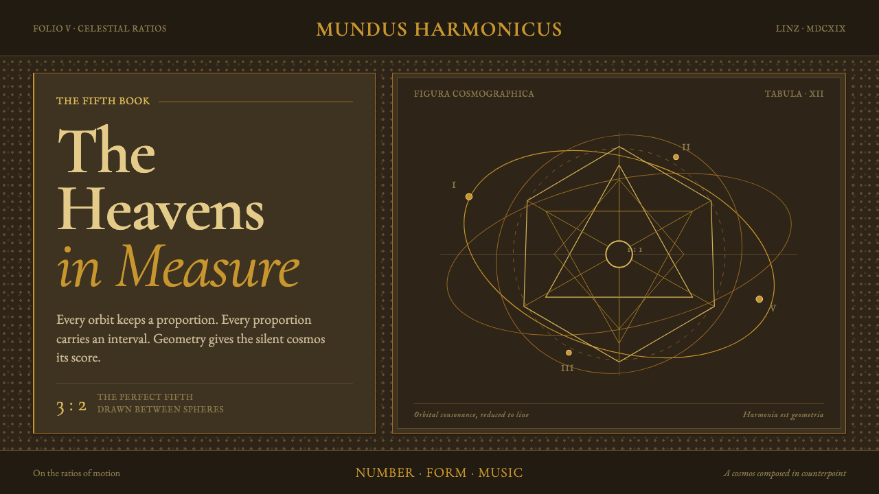 Kepler Harmonices MundiThe cosmos becomes credible geometry. Ocher-gold orbits are engraved on deep…
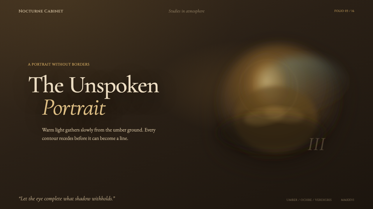 Leonardo — Mona Lisa (1503)Form emerges without edges. Ochre light dissolves into umber shadow and blue-…
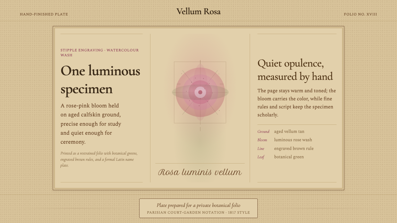 Redouté BotanicalScholarly opulence. Rose wash on aged vellum, framed by engraved brown rules.
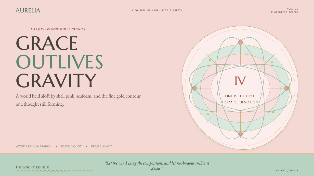 Botticelli Birth of Venus (1486)Grace defeats gravity. Shell pink, seafoam, and fine gilt contours keep every…
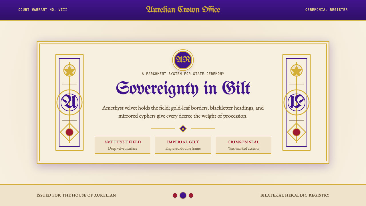 British Royal MonarchyCeremony becomes structure. Amethyst panels, gilt borders, blackletter, mirro…
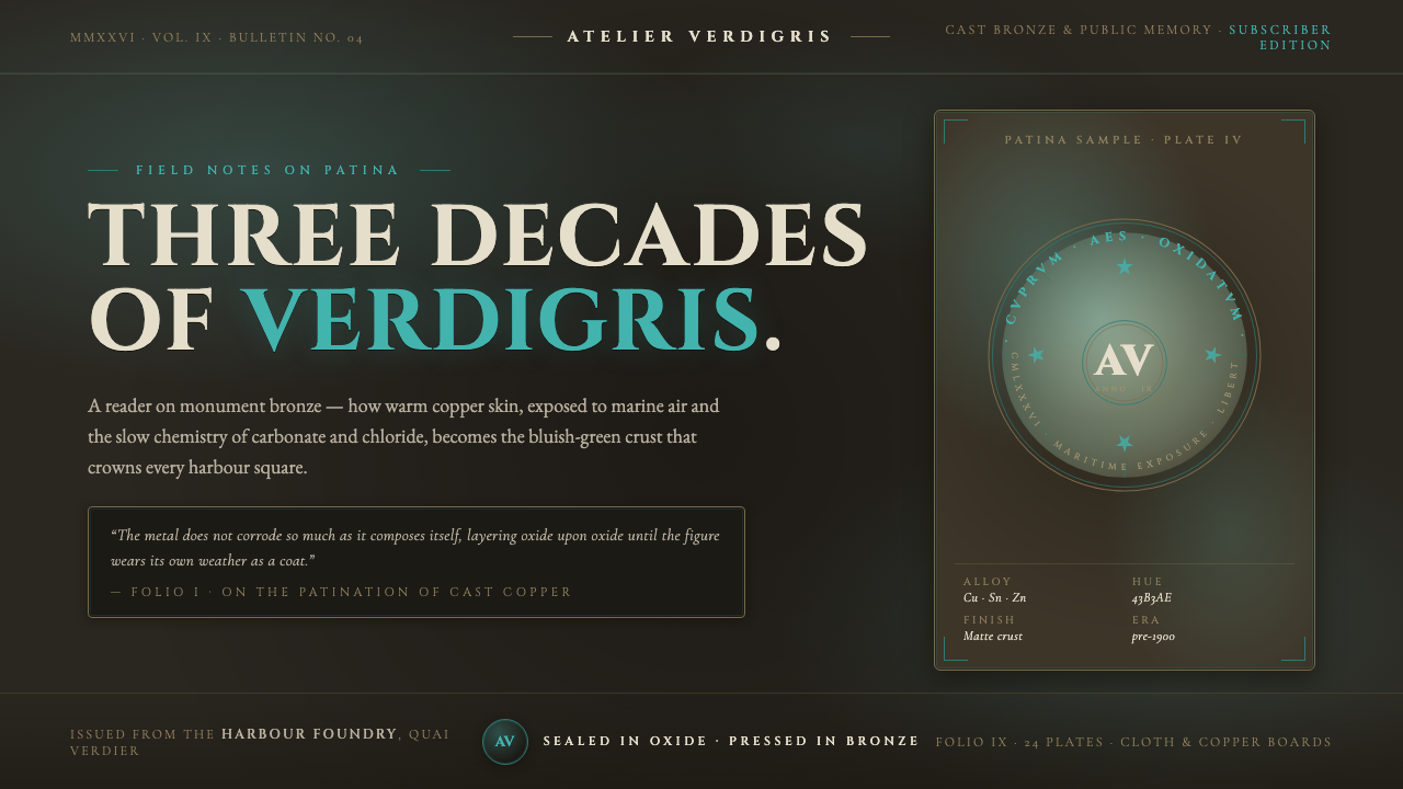 Bronze Patina StatueThree decades of weather, worn as a coat. Verdigris crust on dark bronze, eng…