What is Kepler Harmonices Mundi?
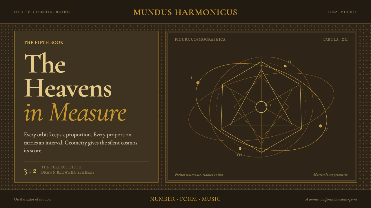
Kepler Harmonices Mundi turns the cosmos into credible geometry: ocher-gold orbits, nested solids, and measured ratios engraved across deep vellum brown.
Kepler Harmonices Mundi in brief
Kepler Harmonices Mundi is a dark, scholarly visual language derived from Johannes Kepler’s 1619 treatise Harmonices Mundi Libri V, printed in Linz. Its imagery joins regular polyhedra, tilings, orbital ellipses, and ratio diagrams on a deep vellum-brown field, with fine ocher-gold lines providing the principal structure.
The style treats geometry as evidence rather than decoration. A circle is not merely an ornament; it suggests an orbit, a measured relation, or a position within a larger order. Nested solids and repeated forms imply that the visible universe can be understood through proportion. The result is mystical without becoming vague: every mark appears to belong to a system.
Its tone is hieratic, symmetrical, and generous in margin. Humanist Latin old-style typography gives the page the authority of an old scholarly volume, while the ocher-gold remains flat and drawn rather than glossy. Nothing needs to glow, sparkle, or imitate polished metal. The beauty comes from disciplined lines, patient spacing, and the sense that the page is revealing an order already present in the cosmos.

Where does Kepler Harmonices Mundi come from?
The historical anchor is 1619, when Johannes Kepler printed Harmonices Mundi Libri V in Linz. The work belongs to the late Renaissance and the early scientific revolution, a period represented here not as a general antique backdrop but as a meeting point between mathematical reasoning, cosmological speculation, and the visual authority of the printed book.
Kepler’s subject was a unified Pythagorean cosmology. Regular polyhedra, tilings, and the musical ratios of planetary orbits were bound together as parts of one harmonic account of the universe. That combination determines the style’s central tension: it must feel intellectually exact while still suggesting that number, shape, and planetary motion participate in a larger metaphysical harmony.
The treatise’s copperplate and woodcut techniques provide the visual grammar. Copperplate implies delicate engraved lines, careful contours, and intricate diagrams; woodcut implies firmer silhouettes and a more physical sense of ink on a page. Together they support a language of nested construction, orbital arcs, brackets, and measured intervals. The image should appear made, printed, and examined rather than digitally illuminated.
The contemporary design system relocates that logic onto aged parchment brown. Deep vellum becomes the ground, ocher-gold becomes the drawn instrument, and typography supplies the scholarly register. The goal is not to imitate an archival page in every detail. It is to preserve the original relationship between geometry, proportion, margin, and authority while making the system usable for modern communication.
What defines the Kepler Harmonices Mundi look?
Vellum Ground
The background is a deep vellum brown, closer to aged parchment than to ordinary black or neutral gray. It creates a quiet field in which diagrams can float without becoming luminous. The darkness should feel archival and tactile, not glossy or theatrical.
Ocher Linework
Ocher-gold is used as a flat drawn line. It traces orbits, solids, brackets, and constructive relationships with restrained authority. The color should read as ink or pigment applied to parchment, never as reflective foil or a metallic shine.
Geometric Cosmology
Regular polyhedra, tilings, and orbital ellipses are the core vocabulary. Forms are arranged to suggest nesting, correspondence, and proportion. Geometry is therefore both image and argument: it gives the composition a visible logic that can be followed.
Engraved Precision
The line should feel deliberate, fine, and materially recorded. Copperplate delicacy can describe contours and orbital paths, while woodcut firmness can anchor larger forms. Variation comes from the character of the mark, not from decorative effects.
Hieratic Symmetry
Composition favors centered order, balanced diagrams, and relationships that can be read across an axis. Symmetry is not ornamental repetition; it expresses a belief that visible form can reflect underlying harmony. Even asymmetrical information should feel governed by an implicit order.
Humanist Register
Humanist Latin old-style typography establishes the voice of the system. Letterforms should feel literary, measured, and historically grounded, with hierarchy created through scale, spacing, and placement. Type supports the diagram without competing with it.
Generous Margin
Open margins are essential because the diagrams need intellectual breathing room. Empty space separates one relation from another and makes the page feel contemplative rather than crowded. The margin is an active part of the cosmology, giving each figure a field in which to be understood.

Who shaped Kepler Harmonices Mundi?
Kepler is the sole named figure in the approved source and the intellectual center of the system. His 1619 publication in Linz supplies the connection between geometry, planetary orbit, musical ratio, and cosmological harmony. In design terms, his role is not represented by portraiture but by diagrams that make ordered relationships visible.
The five-volume treatise is the primary textual and visual source. Its combination of regular polyhedra, tilings, and planetary musical ratios gives the style its unusual ability to hold abstract mathematics and cosmic imagination in one composition.
Harmonic cosmology supplies the style’s atmosphere of rational mysticism. The visual system should imply that the universe is not an arbitrary collection of bodies but a field of relationships, where movement, shape, and proportion belong to a coherent order.
Pythagorean-Platonic geometry provides the constructive discipline behind the imagery. Solids, tessellations, ellipses, and ratio marks should appear related rather than isolated, as though each diagram were one passage in a larger geometric argument.
How do you use Kepler Harmonices Mundi today?
For presentation covers, use the deep vellum field as an immediate atmospheric statement. A single large orbital diagram, nested solid, or carefully centered geometric construction can establish the theme before any explanatory text appears. Keep the title in a humanist Latin old-style register and allow the surrounding margin to remain calm. The cover should feel like the opening plate of a learned volume, not like a generic astronomy poster.
For content slides, let each page behave as a diagram with a clear governing relation. Pair a concise heading with one dominant construction, then place explanatory copy near the relevant line, orbit, or ratio bracket. Data slides can translate comparisons into measured geometric relationships: orbital arcs, aligned marks, nested shapes, or bracketed intervals. The geometry should clarify the information, never become an unrelated illustration layered behind it.
For web interfaces, the style suits dashboards and pricing pages that need authority, structure, and a sense of measured systems. A dark vellum surface can frame panels, while ocher-gold lines distinguish active paths, selected states, and relationships between values. Pricing tiers can be organized as nested forms or balanced fields, but the interface must remain readable. Use typography and spacing to establish hierarchy, reserving diagrammatic linework for meaningful connections.
For editorial and marketing work, Kepler Harmonices Mundi supports long-form explanation, research-led products, educational materials, and launches that want to present knowledge as something discovered and ordered. Use generous margins for notes, definitions, or citations. A campaign can alternate between close views of engraved geometry and quieter vellum fields carrying the central message. The strongest compositions make the audience feel invited into a system rather than confronted by a decorative theme.
The common mistake is to treat the style as an excuse for excessive celestial imagery, glowing gold, or indiscriminate antique texture. Stars, metallic shine, crowded diagrams, and ornamental aging can quickly obscure the central idea. Keep the palette disciplined, keep the linework purposeful, and ensure every geometric form has a readable relationship to the content. The style depends on trust: the viewer should sense that the order on the page is intentional.

Kepler Harmonices Mundi — FAQ
Is Kepler Harmonices Mundi simply an antique astronomy style?
No. Astronomy supplies the subject matter, but the design system is built from a broader relationship between regular solids, tilings, orbital ellipses, musical ratios, and cosmological harmony. Its defining quality is not age or celestial decoration; it is the conviction that geometry can make an underlying order visible.
Why use deep vellum brown instead of a lighter parchment tone?
The dark ground gives the ocher-gold linework authority and preserves the theme’s contemplative, archival mood. It also lets diagrams appear to float without relying on glow. The result should feel like geometry carefully drawn onto aged material, with darkness providing depth through contrast rather than simulated lighting.
How should the ocher-gold lines behave?
They should behave like flat drawn marks: precise, restrained, and materially present. Use them to describe or connect forms, trace orbital movement, and indicate ratios. Avoid turning them into reflective metal, luminous energy, or decorative filigree. Their strength comes from being legible and purposeful.
Can this style support dashboards and pricing interfaces?
Yes, when the interface benefits from measured hierarchy and visible relationships. The vellum ground can organize the overall field, typography can establish information levels, and ocher-gold rules can connect meaningful states or values. It is less effective when every panel becomes a diagram, because the system depends on calm space and selective emphasis.
What separates an authentic interpretation from decorative historicism?
An authentic interpretation preserves the system’s logic: geometry carries meaning, margins create contemplation, typography establishes scholarly authority, and gold remains a flat drawn line. Decorative historicism borrows only the surface signals, adding random astronomical motifs, excessive texture, or metallic effects without building relationships between the elements.
Related design styles
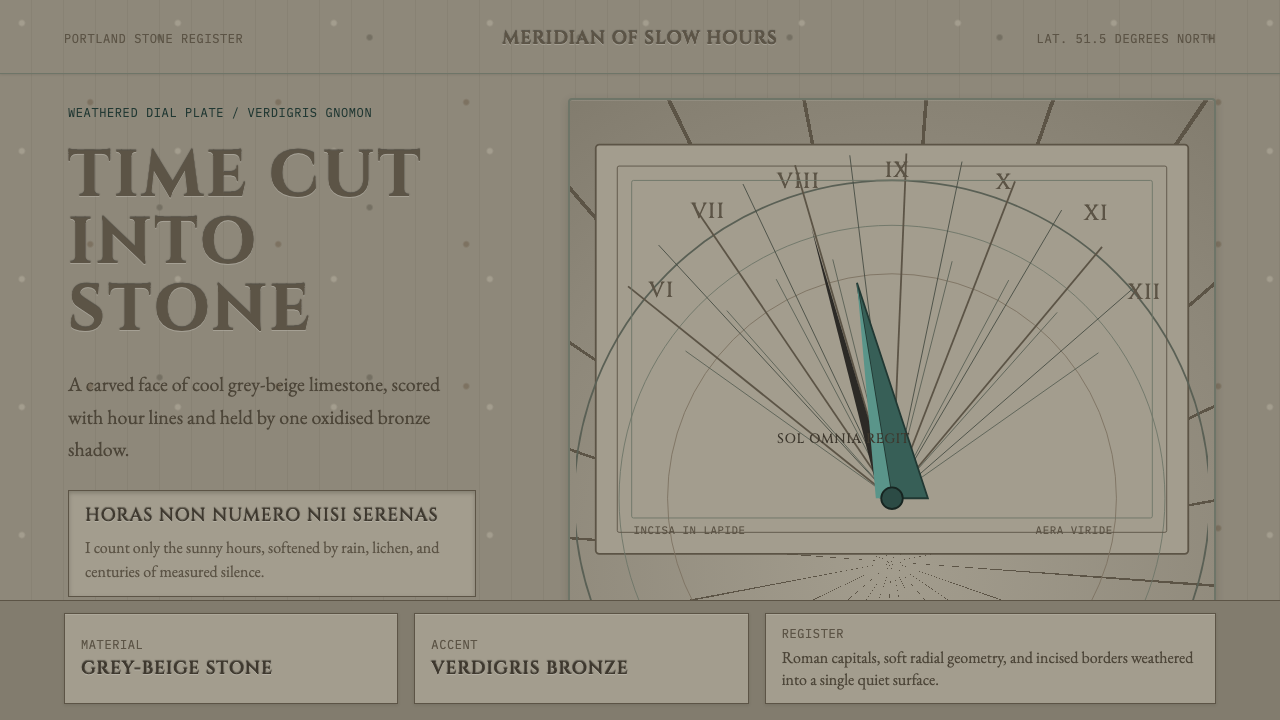 Engraved SundialStone refuses haste. Grey-beige hour lines and verdigris gnomon carve silence.
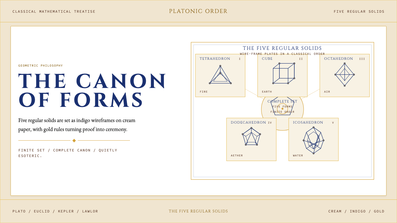 Sacred Geometry Platonic SolidsGeometry feels ritual. Cream paper, indigo wireframes, gold rules stage the f…
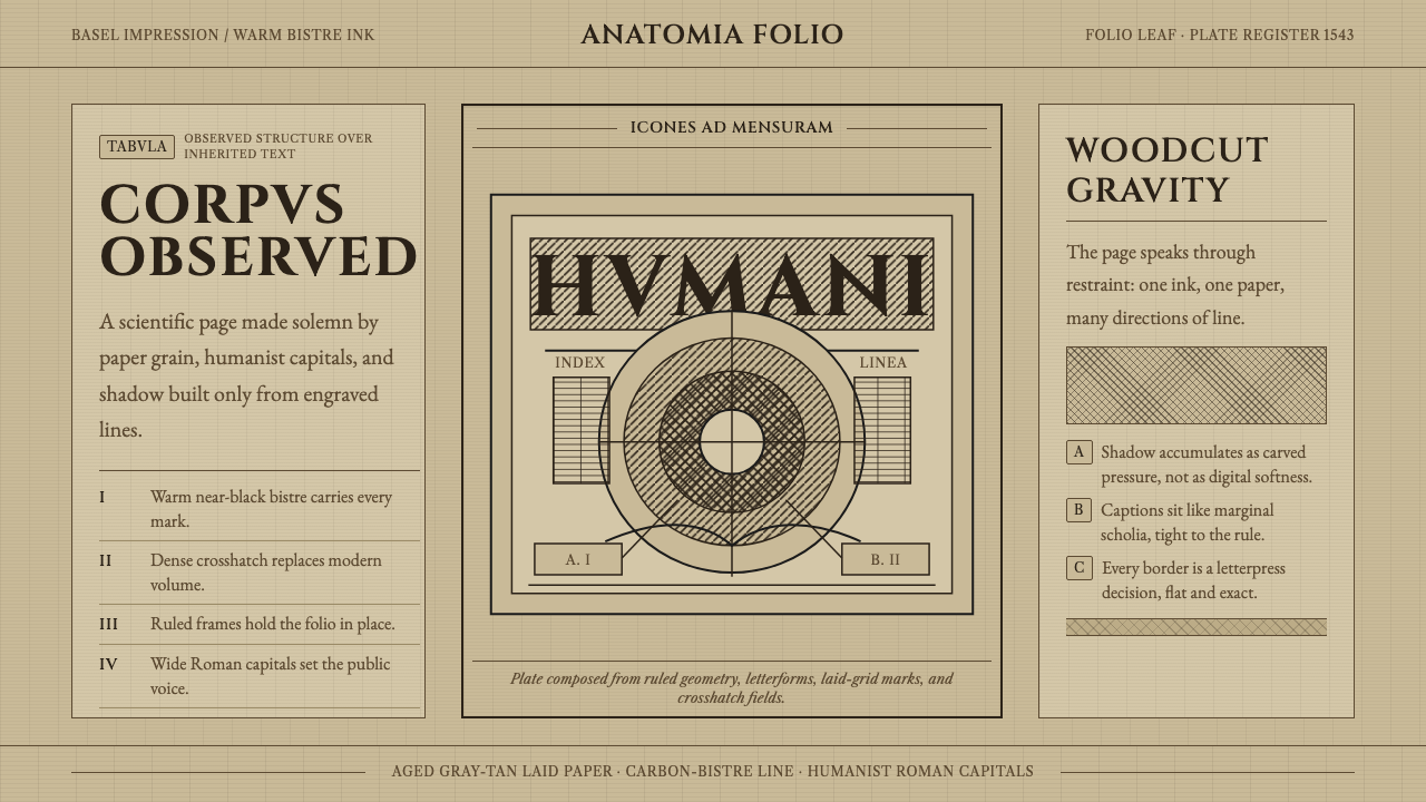 Vesalius AnatomyScience feels hand-pressed. Bistre Cinzel, hatchwork, and warm laid paper hol…
 Bayer UranometriaGrave celestial folio. Olive-slate grid, brass stars, Greek labels, old-style…
 Brass OrreryTurns reason into gold. Brass rings and Caslon type glow over near-black maho…
 British Royal MonarchyCeremony becomes structure. Amethyst panels, gilt borders, blackletter, mirro…