What is Vesalius Anatomy?
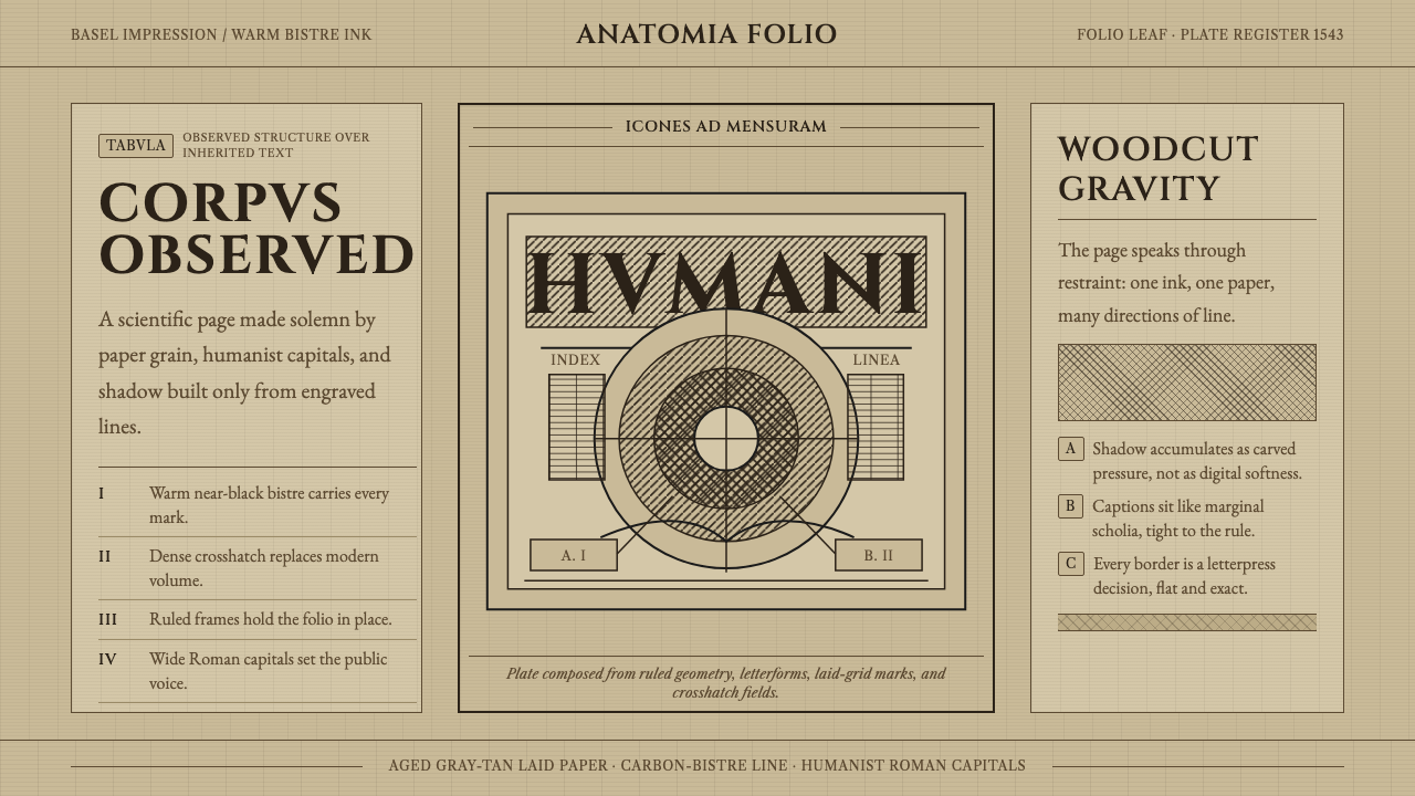
In 1543, a Renaissance anatomist published a book of flayed bodies rendered in woodcut, and in doing so made scientific observation itself into an image people wanted to look at.
Vesalius Anatomy in brief
Vesalius Anatomy is a design system drawn from De humani corporis fabrica, the landmark 1543 anatomical atlas by Andreas Vesalius, which is widely credited with turning the study of the human body from an inherited textual authority into an observed, illustrated science. The book's most famous images are its écorché figures — flayed muscle-men posed in theatrical, almost dancer-like stances against a continuous landscape backdrop — rendered entirely in carbon-black and warm bistre woodcut line rather than color.
The visual character of the style comes from the specific technical constraints and choices of Renaissance woodcut printing. Every form is built from dense, controlled crosshatched lines rather than painted tonal gradation; shading is achieved by varying the density and direction of hatch-work rather than by blending. This produces an image that feels simultaneously precise and hand-cut — every mark on the page was carved into a block of wood by hand, and that physical, laborious origin is visible in the resulting texture.
The overall mood is one of dignified, humanist authority rather than clinical detachment or gothic horror. Despite the subject matter — dissected human bodies — the compositions are calm, classically posed, and set against serene rolling hills, evoking Renaissance ideals of proportion and observation rather than morbid spectacle. The typography draws on humanist Roman capitals, the same lettering tradition associated with classical inscription and early printed scholarship, reinforcing the sense that this is a work of serious learning rather than sensationalism.

Where does Vesalius Anatomy come from?
Andreas Vesalius, born in Brussels in 1514, trained in medicine at Louvain, Paris, and Padua, and became a professor of surgery and anatomy at the University of Padua at the remarkably young age of twenty-three. His central and radical claim was that the anatomical teachings inherited from the ancient Roman physician Galen — which had gone largely unchallenged for over a thousand years and were based on dissections of animals rather than humans — contained substantial errors that could only be corrected through direct human dissection and firsthand observation.
This empirical commitment shaped the book's visual approach as much as its scientific content. Vesalius insisted on illustrations detailed and accurate enough to serve as scientific evidence in their own right, not merely decorative accompaniment to text. The famous écorché figures — posed standing in landscape settings rather than lying on a dissection table — were a deliberate choice to present the dissected body with dignity and even a kind of classical grace, situating the images within a Renaissance humanist visual tradition rather than a purely clinical one.
The illustrations are traditionally attributed to the workshop of Titian, the great Venetian painter, with Jan Stephan van Calcar, a Netherlandish artist working in Titian's studio, often credited as the primary hand behind the woodcuts. The collaboration between a leading Renaissance painting workshop and a working anatomist reflects the broader humanist culture of the period, in which art and empirical science were not yet treated as separate disciplines but as complementary paths toward understanding the natural world.
The book itself was printed in Basel, Switzerland, by Johannes Oporinus, a printer and scholar known for producing scientifically and technically demanding texts. Basel's printing houses were among the most technically capable in Europe at the time, and the fine, dense crosshatching visible in the Fabrica's woodcuts required both skilled block-cutting and careful, high-quality presswork to reproduce legibly at the printed scale — a level of production quality that helped the atlas circulate widely and influence anatomical illustration for centuries afterward.
What defines the Vesalius Anatomy look?
Bistre and Carbon-Black Ink
The line work uses a warm, near-black bistre tone rather than a cold, pure black, giving the images a slightly aged, organic warmth even in their darkest passages. This warm-black quality is central to distinguishing the style from purely modern high-contrast line illustration, which typically uses a colder, flatter black.
Crosshatch Modeling
All tonal variation — from the subtlest shadow to the deepest recess of dissected muscle — is built from dense, directional crosshatched lines rather than continuous tone or gradient fill. The density and angle of the hatching does the work that shading or airbrushing would do in other media, and this is the single most technically demanding and visually distinctive element of the style.
Humanist Roman Capitals
Titling and labels use a classical Roman capital letterform, the same tradition associated with ancient inscription and the earliest humanist printed books. This typography signals scholarly seriousness and connects the visual system to the broader Renaissance revival of classical learning, rather than to a purely decorative or gothic lettering tradition.
Continuous Landscape Backdrop
Figures are set against a rolling hill landscape rather than a blank or clinical ground, a compositional choice that gives even the most anatomically explicit figure a sense of place and classical dignity. This backdrop element distinguishes the style from purely diagrammatic scientific illustration, which typically isolates its subject on an empty field.
Aged Warm-Gray Paper Ground
The ground color is a warm, aged gray-tan reminiscent of laid rag paper that has darkened over centuries, rather than a bright white page. This paper tone sits underneath the crosshatched line work and contributes to the overall sense of a physically old, hand-pressed document rather than a clean modern print.
Anatomical Precision over Decoration
Every line in the system exists to describe an observed structural fact — muscle fiber direction, bone contour, tissue layering — rather than to decorate the page. This scientific-illustration discipline means the style resists purely ornamental flourish; even its most striking compositional choices, like the landscape backdrop, serve to dignify observed fact rather than to embellish it.

Who shaped Vesalius Anatomy?
Vesalius authored De humani corporis fabrica and drove its entire scientific and visual program, insisting on illustrations precise enough to function as evidence rather than mere decoration. His commitment to firsthand human dissection over inherited textual authority makes him the founding figure of modern anatomical science, and his editorial vision — dignified, observational, classically posed — is the reason the style reads as serious scholarship rather than clinical spectacle.
Van Calcar, a Netherlandish painter working within Titian's Venetian workshop, is traditionally credited as the primary artist behind the Fabrica's woodcut illustrations. His training in a leading Renaissance painting studio brought a classical, humanist visual sensibility to the anatomical figures, giving them the posed, almost sculptural quality that distinguishes them from purely diagrammatic medical illustration of earlier eras.
Oporinus was the Basel printer responsible for the Fabrica's actual production, a role that mattered enormously given the technical difficulty of reproducing dense crosshatched woodcuts at high fidelity. His press's reputation for handling scientifically and technically demanding texts was a precondition for the atlas's visual ambitions being realized in print rather than remaining only as artist's drawings.
How do you use Vesalius Anatomy today?
Vesalius Anatomy suits products and brands that want to communicate scholarly authority, precision, and a sense of serious craft rather than clinical coldness or modern sterility — educational platforms, science and history publications, museum or archive digital experiences, or premium products that want to feel like they belong to a tradition of careful observation.
For presentation slides, the style works best in contexts with genuine intellectual or historical content — lecture decks, research presentations, or archival storytelling. A cover slide can use a full landscape-and-figure composition in the aged warm-gray tone; content slides should reduce the crosshatch density considerably, since fully rendered hatchwork at the scale of body text becomes illegible and visually heavy, and instead reserve dense hatching for a single anchoring illustration per slide.
For web interfaces, the style suits archival or reference content — a documentation site, an academic resource, or a history-of-science product — better than a typical consumer dashboard, since dense hand-drawn linework does not scale well to small UI components like buttons or icons. Where it does appear in interface work, it is best used for a hero illustration or section header rather than throughout every element of the page.
For editorial and marketing work, the aesthetic is well suited to long-form articles about science, history, or craft, where a single striking illustration in the crosshatch style can anchor a feature opener while body text sits on a calmer, lighter version of the aged paper tone for readability. Pull-quotes can be set in the humanist capital letterform to maintain scholarly tone without requiring further illustration.
A common mistake is applying the aged-paper color and Roman capital typography without the crosshatch technique itself — the result reads as generic 'old book' styling rather than the specific, technically rigorous woodcut-scientific-illustration tradition this style represents. Another frequent error is over-darkening every element to pure black, which loses the warm bistre quality that keeps the aesthetic feeling humane rather than gothic or macabre.

Vesalius Anatomy — FAQ
Why do the anatomical figures appear standing in landscapes rather than lying on a dissection table?
This was a deliberate compositional and rhetorical choice. Presenting dissected figures upright, posed with classical dignity against a serene landscape, distanced the imagery from the clinical or morbid associations a dissection-table scene would carry, and instead aligned it with Renaissance humanist ideals of the body as a subject worthy of the same careful, dignified observation given to classical sculpture or portraiture.
Why is crosshatching used instead of continuous shading, given that painting techniques existed at the time?
The Fabrica's illustrations were made for the woodcut printing process, which reproduces line rather than continuous painted tone. A woodblock can only print areas of solid ink or bare paper — it cannot render a smooth gradient the way a brush can — so achieving the appearance of shadow and volume required carving fine parallel or crossed lines whose density the eye perceives as tone. This is a technical necessity of the medium as much as an aesthetic choice.
Is this style purely historical, or does it still influence scientific illustration today?
While the specific woodcut technique is a historical artifact of Renaissance printing technology, the Fabrica's broader visual approach — using detailed, accurate illustration as scientific argument rather than decoration, and posing anatomical subjects with dignity — established conventions that influenced medical and scientific illustration for centuries afterward, well into the era of engraving and later photographic and digital medical imaging.
What distinguishes bistre from ordinary black ink in this style?
Bistre is a warm brown-black tone historically derived from wood soot, and it reads as noticeably warmer and softer than a cold, pure black. In this design system, that warmth is essential — it keeps even the densest, darkest crosshatched passages feeling organic and aged rather than harsh or gothic, which is central to the style's dignified, humanist mood rather than a horror or macabre register.
Does this style work well for modern, non-medical products?
Yes, as long as the product context calls for a sense of careful observation, scholarly authority, or historical craft — publishing, education, museum experiences, or premium heritage branding all fit naturally. It is a poor fit for products that want to feel fast, casual, or ultramodern, since the dense hand-cut linework and aged paper tone inherently evoke slowness, patience, and historical depth rather than speed or novelty.
Related design styles
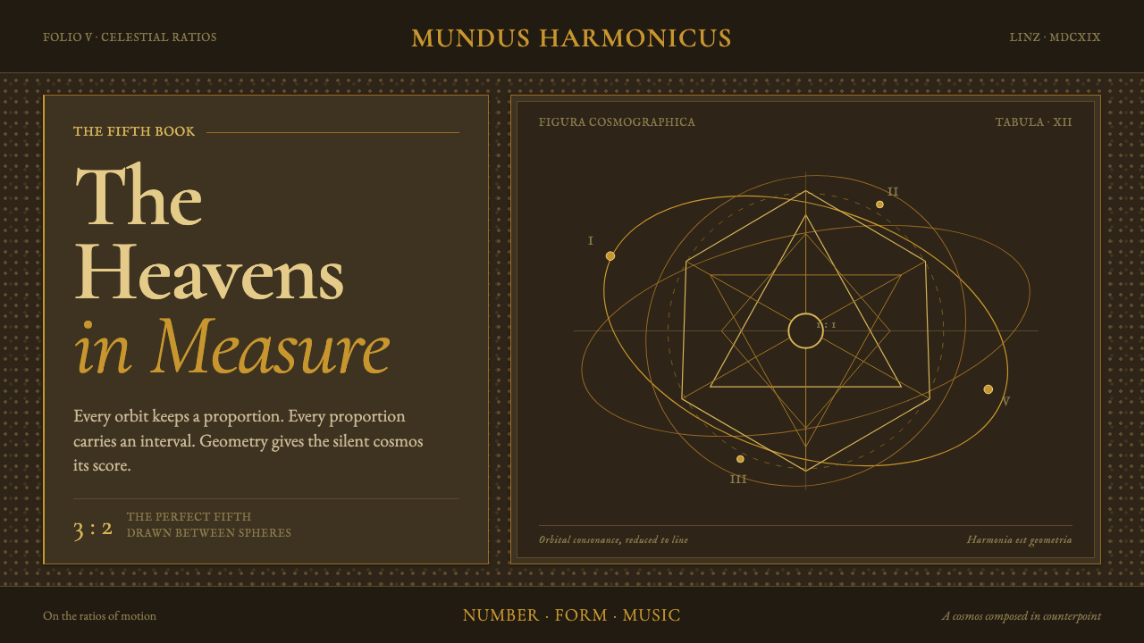 Kepler Harmonices MundiThe cosmos becomes credible geometry. Ocher-gold orbits are engraved on deep…
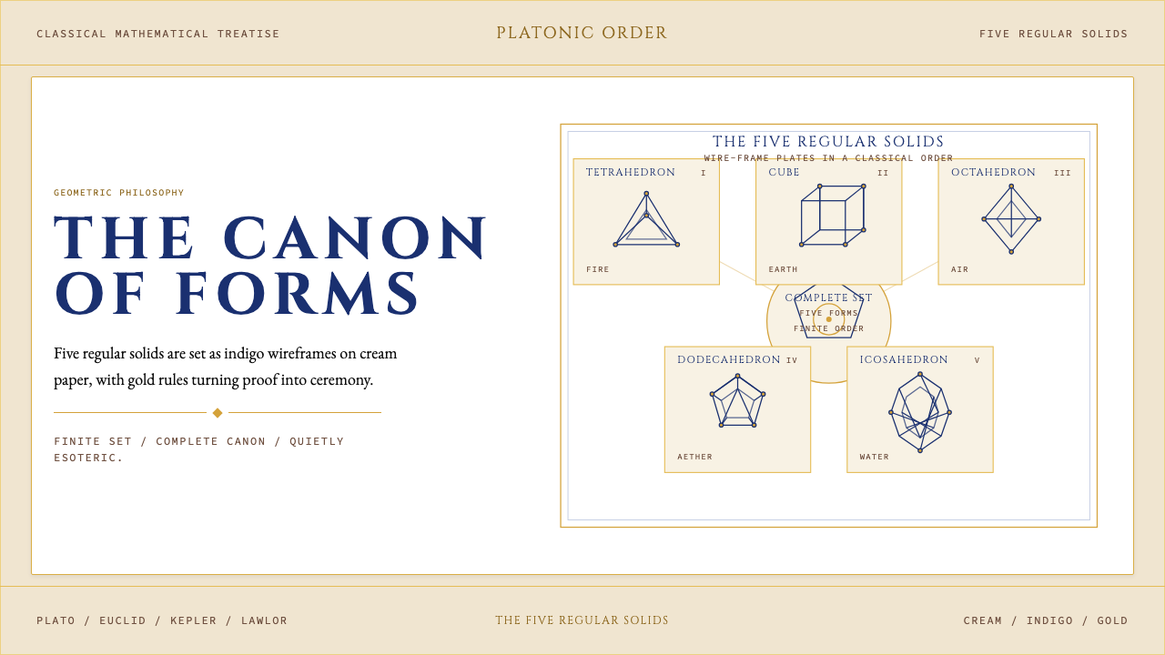 Sacred Geometry Platonic SolidsGeometry feels ritual. Cream paper, indigo wireframes, gold rules stage the f…
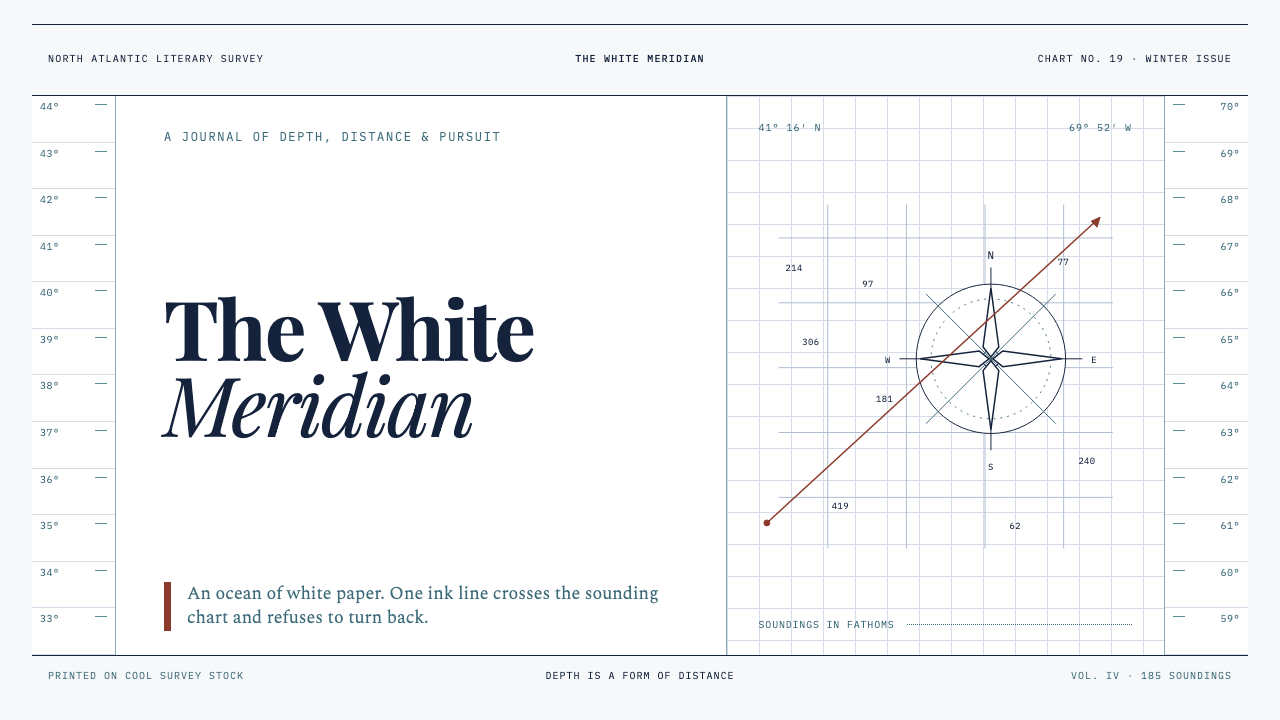 Moby-Dick (1851)White space becomes open sea. Ink-navy rules and oxblood bearings pull across…
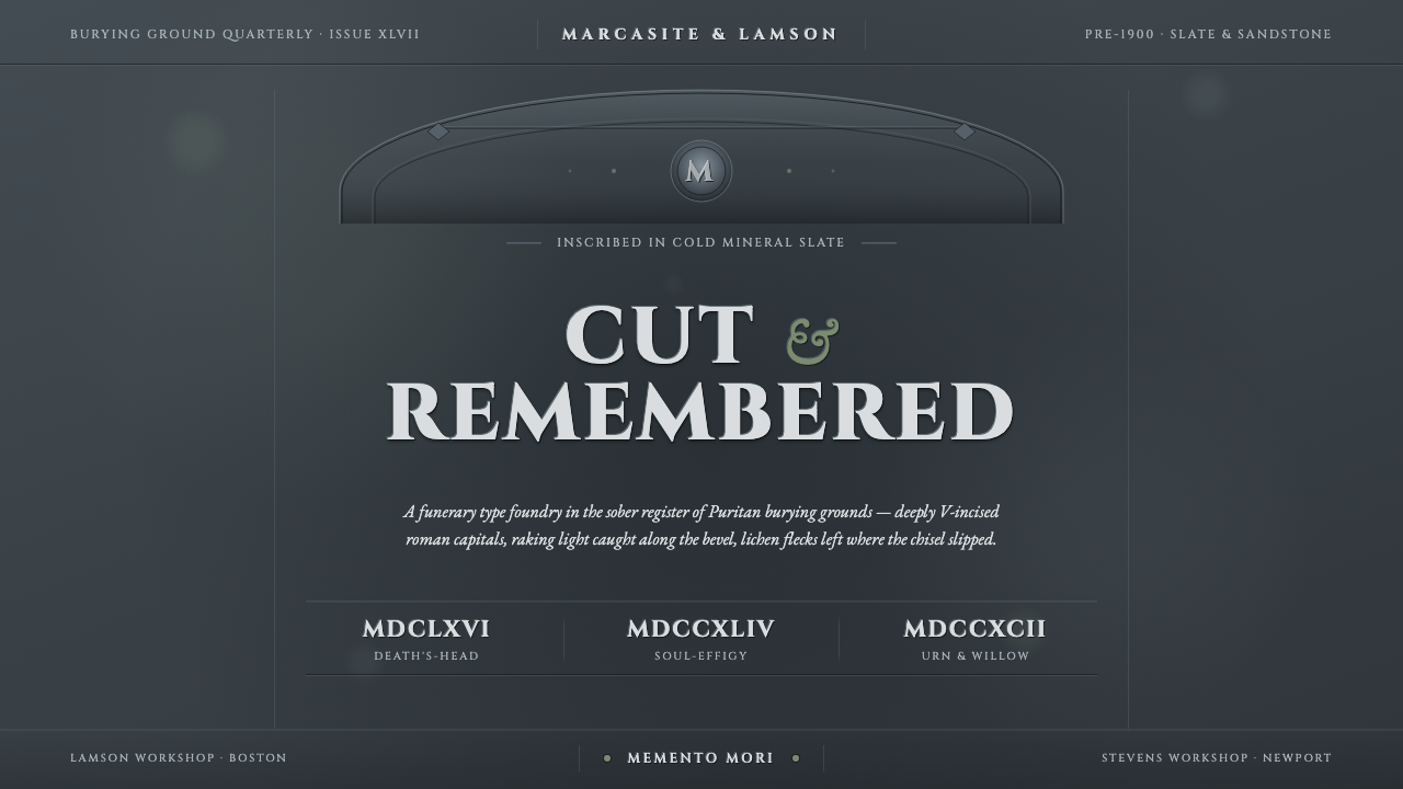 Slate Headstone LettercuttingCold mineral, never paper. V-cut roman capitals catch a thin bevel highlight…
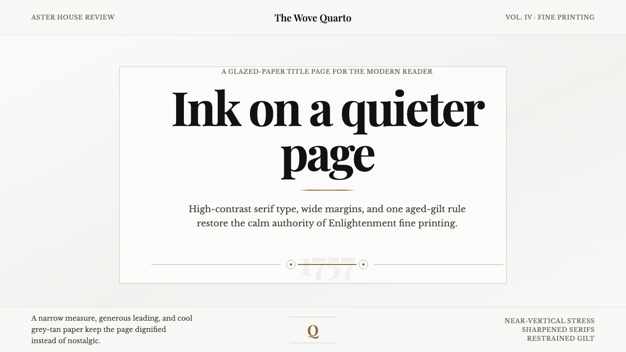 Baskerville Transitional SerifCalm authority in print. Glazed grey-tan paper, sharp serif contrast, one age…
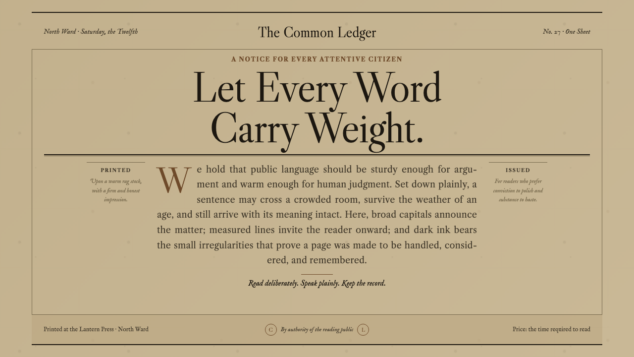 Caslon English Text SerifWarm authority, pressed into paper. Caslon capitals and engraved rules comman…