What is Moby-Dick (1851)?
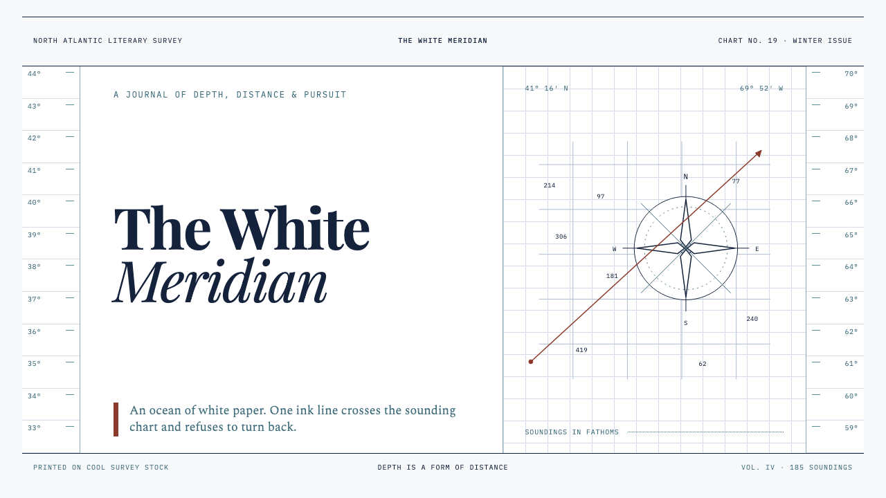
Moby-Dick turns the page into open water: cold white ground, ink-dark bearings, and one taut line leading toward the whale.
Moby-Dick (1851) in brief
Moby-Dick is a maritime editorial style drawn from Herman Melville’s whaling world and imagined through the disciplined visual language of a hydrographic chart. Its field is bone-white and expansive, more sea than paper. Across that quiet ground run hairline rules, route-like bearings, compass roses, depth marks, and narrow engraved figures. The central drama does not come from dense color or theatrical illustration. It comes from the uneasy proportion between tiny marks of human intention and an enormous white expanse that refuses to be controlled.
The style takes its emotional temperature from whaling, navigation, and scrimshaw folk engraving. It treats every rule as an instrument: a harpoon line, a measured route, a charted current, or the edge of a ledger column. Cross-hatching gives images the compressed texture of something patiently scratched into ivory during a dead calm. The result is both literary and technical. A page can feel like a chapter heading, a sailor’s field note, and a fragment of a navigational document at once.
Visually, Moby-Dick is austere without being empty. Most of the surface remains unfilled, allowing white ground to behave like swell, fog, distance, and silence. Ink-navy or near-black marks establish direction and discipline; a restrained oxblood bearing may introduce danger, pursuit, or a decisive point of navigation. Illustration stays subordinate to linework. A whale, ship, compass, or harpoon should appear discovered within the chart rather than placed on top of it.
Where does Moby-Dick (1851) come from?
The style begins with Moby-Dick, Melville’s 1851 novel, and with the maritime world that surrounds its whaling subject. Its geographic imagination belongs to New Bedford and Nantucket in Massachusetts, then extends outward to the Pacific whaling grounds. That movement from a working harbor toward a vast, partly unknown ocean is essential to the visual system. Local marks, measurements, and craft sit at the edge of an enormous field that cannot be fully mapped.
Its material vocabulary draws particularly from the period in which whaling and scrimshaw folk art reached their peak, roughly from 1820 to 1870. Scrimshaw establishes the style’s engraved sensibility: fine cuts, patient repetition, compressed cross-hatching, and modest imagery made meaningful by touch and labor. Rather than imitating ornate maritime nostalgia, the style borrows its economy. A small engraved fragment can carry more force than a fully illustrated scene when it is surrounded by enough white ground.
Maritime cartography supplies the organizing logic. Charts make authority visible through measured intervals, ruled routes, corner instruments, marginal notation, and symbols that imply a world beyond the visible sheet. Moby-Dick adapts this language for contemporary editorial design. The page is not required to function as a literal chart, but it should retain the chart’s ethical posture: marks are purposeful, empty space is information, and every directional cue suggests consequence.
The source material also identifies American Romanticism as part of the theme’s inheritance. That connection explains why the visual language is more than archival navigation. The chart’s calm exterior holds an encounter with scale, uncertainty, obsession, and the limits of human command. Later illustrated editions in 1930 and 1979 form part of the theme’s stated history, while Rockwell Kent, Barry Moser, and Nathaniel Philbrick are named alongside Melville as key figures in its cultural frame.
What defines the Moby-Dick (1851) look?
White Ground
The ground should feel cold, taut, and nearly boundless. White space is not a neutral backdrop or a gap awaiting content; it is the sea itself. Preserve broad quiet areas around text, diagrams, and engravings so that each mark appears exposed to distance. When the page becomes crowded, the style loses its oceanic scale and begins to resemble ordinary vintage decoration.
Linework
Fine rules carry the style’s narrative energy. They may traverse columns like routes, divide evidence like ledger lines, or terminate in a bearing, point, or small engraved form. Their delicacy matters: the line should read as measured and tensile rather than decorative. A single dark line crossing a wide pale field can evoke pursuit more effectively than a dramatic illustration.
Cartographic Instruments
Compass roses, bearings, depth-like marks, marginal ticks, and route fragments should work as navigational evidence rather than as nautical props. Place them where they clarify orientation, introduce a pause, or connect distant parts of a composition. Their authority comes from restraint. A corner compass rose can establish the whole page as a chart; repeating the same symbol everywhere turns it into a pattern.
Engraved Figures
Figures are tightly cross-hatched and materially spare, as if cut into ivory or printed from a worn plate. Whales, ships, harpoons, and human forms should be partial, cropped, or reduced to useful silhouettes. Avoid polished realism and lavish tonal modeling. The image belongs to the same system as the rule and notation: it is another found mark in a field of navigation.
Restrained Color
Color is exceptional, not atmospheric. Ink-dark navy establishes navigation, text, and structural discipline; a small oxblood accent can signal danger, a decisive bearing, or the pressure of pursuit. Large color fields are usually unnecessary because they compete with the white ground. The strongest compositions let darkness and pale space do almost all the work, then use red as a carefully rationed disturbance.
Measured Typography
Typography should feel surveyed rather than performed. Narrow annotations, sober headings, aligned numbers, and disciplined columns create the sense that language is recording a difficult passage. Let hierarchy come from placement, density, and interruption by linework. Overly expressive display type breaks the illusion of an observed document; the words should feel capable of surviving salt, handling, and time.

Who shaped Moby-Dick (1851)?
Melville is the author named by the source material as the origin of the novel’s whaling world. In this design theme, that world supplies the governing tension: a human record of routes, instruments, labor, and pursuit set against an oceanic field too large to master.
Rockwell Kent is identified in the source material as a key figure within the theme’s history, which also includes an illustrated edition from 1930. His presence anchors the style’s stated connection between the novel and later illustrated interpretation.
Barry Moser is named as a key figure in the source material, alongside the later illustrated history that includes a 1979 edition. Within this visual lineage, illustration remains central not as ornament, but as a disciplined means of making the novel’s maritime scale visible on paper.
Nathaniel Philbrick is also listed among the key figures associated with the theme. His inclusion keeps the style’s frame connected to the continuing cultural life of Moby-Dick, rather than reducing it to a fixed nineteenth-century artifact.
How do you use Moby-Dick (1851) today?
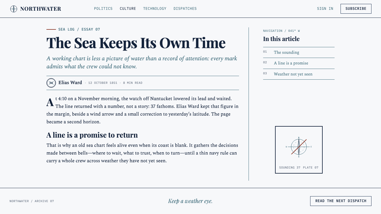
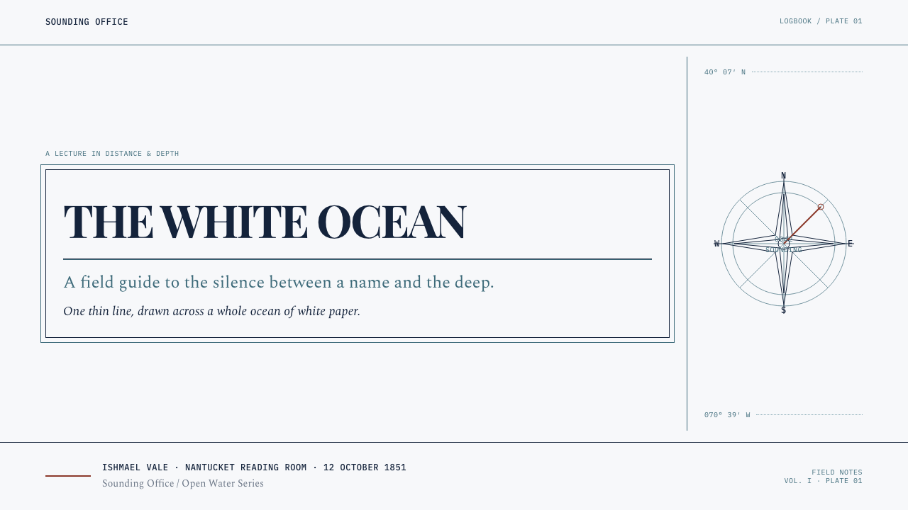
For presentation covers, treat the slide as a sheet of open water. Set a concise title with generous surrounding ground, then introduce one directional line, route fragment, or cropped engraving near an edge. A compass rose or bearing can hold a corner without becoming a logo. Content slides should become disciplined logbooks: short headings, aligned notes, restrained rules, and clear fields of silence between ideas. Do not fill every available area merely because a presentation format permits it.
Data slides work especially well when charts are treated as navigational instruments. Use rules, ticks, plotted paths, and labeled points to make information feel measured rather than decorated. A trend can become a course across open ground; a comparison can use adjacent columns like entries in a ship’s record. Reserve the dark ink treatment for primary evidence, and use the oxblood accent only where attention must land. Decorative waves, anchors, and ship wheels weaken the analytical clarity that gives the style its force.
For web interfaces, the style suits research dashboards, archives, reading tools, observatory-like products, and pricing pages that need seriousness without corporate gloss. Build navigation from clear labels, separators, marginal clues, and a stable field of pale space. Tables, filters, status notes, and account summaries can adopt the visual order of a chart, provided they remain direct and legible. Interactive states should feel like changes in bearing or plotted position, not like bright entertainment effects.
Editorial and marketing pages benefit from the style’s ability to make long-form information feel consequential. Use broad article margins for metadata, short route-like callouts, references, or section coordinates. Let a small engraved image punctuate a chapter rather than serving as a full-bleed spectacle. Marketing can use the same restraint: a product claim set beside an instrument-like rule or a single red bearing can feel more confident than a page crowded with nautical imagery. The white ground must remain spacious enough to carry the atmosphere.
The common mistake is confusing Moby-Dick with generic coastal or pirate-themed design. Rope borders, weathered wood, tourist-map icons, stormy photographic backgrounds, and repeated anchor motifs turn a severe literary-cartographic system into décor. Another mistake is making every line equally prominent. The style depends on a hierarchy between near-invisible measuring marks, decisive dark rules, and the rare red interruption. It should feel like a document under pressure from the sea, not a themed invitation.
Moby-Dick (1851) — FAQ
Is Moby-Dick simply a nautical or vintage style?
No. Nautical props may appear, but they are not the system. The style is built from the relationship between maritime cartography, scrimshaw-like engraving, and a vast unfilled field. Its subject is navigation under uncertainty, not coastal leisure. If removing a ship or compass makes the composition lose all meaning, the layout was probably relying on theme imagery rather than the deeper visual grammar.
Can this style use photography?
It can, but photography should be treated with the same restraint as an engraved figure. Crop it tightly, reduce it toward silhouette or material detail, and place it within the chart rather than allowing it to become a naturalistic scene behind the content. The white field and linework must remain the primary environment. A photograph should feel like evidence recovered from the voyage, not a scenic backdrop.
Why is so much empty space necessary?
Because the empty field carries the theme’s central metaphor. It gives a line the scale of a route, makes a small engraving feel vulnerable, and turns a bearing into an act of decision. Removing that space removes the sense of sea. Dense content can still work, but it should be contained in a logbook-like region and set against a larger calm field.
When should the oxblood accent appear?
Use it only when an element needs narrative pressure: a decisive position, a warning, a selected route, a critical figure, or the point where a reader’s attention must turn. It is not a general-purpose decorative accent. If it appears throughout the interface, it stops reading as danger or pursuit and begins to flatten the composition’s hierarchy.
What kind of content fits Moby-Dick best?
It is strongest when content involves inquiry, distance, evidence, navigation, archives, literature, research, or a difficult journey toward an answer. It can also give pricing and product pages unusual seriousness when the product values clarity and durable records. It is less natural for content that depends on warmth, abundance, speed, or cheerful informality, because its emotional register is watchful, sparse, and cold.
Related design styles
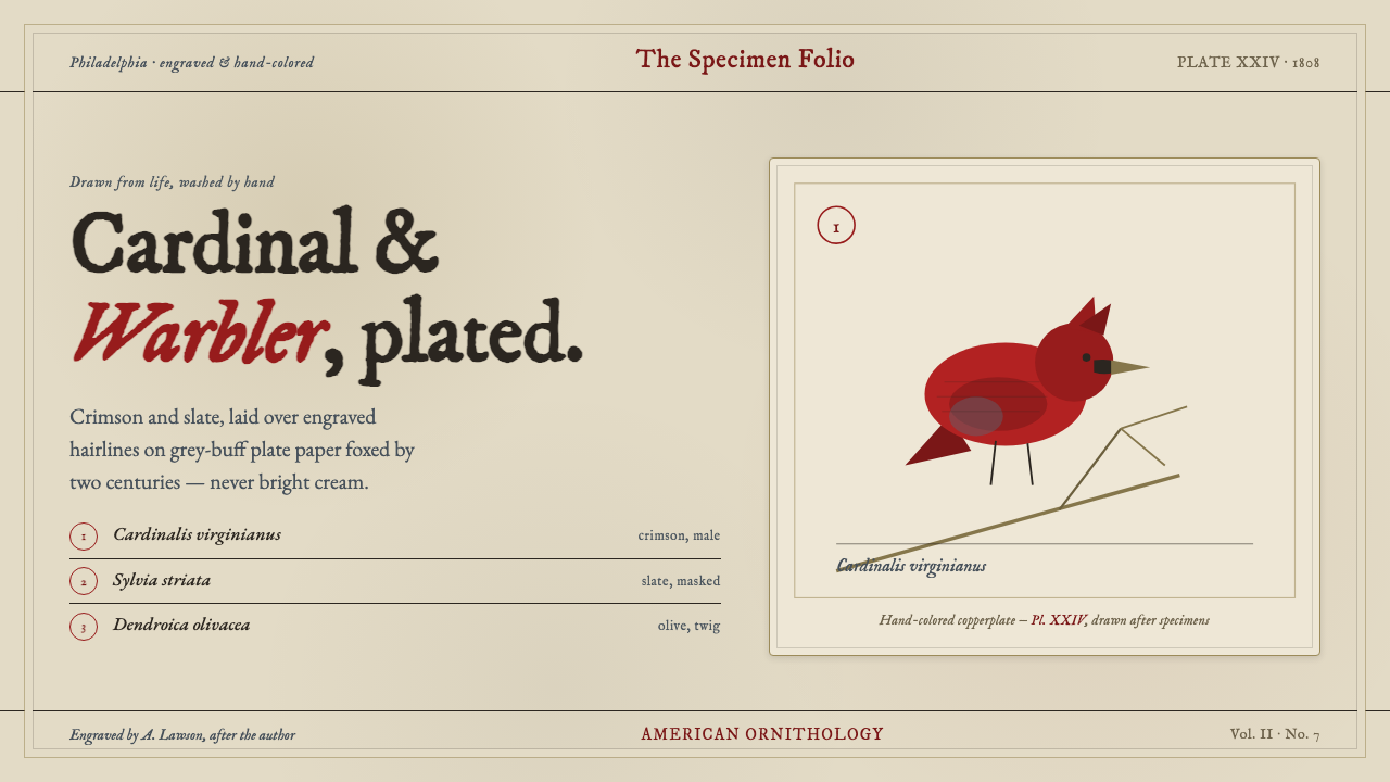 Wilson Ornithology PlateAn 1808 ornithology plate reborn. Cardinal crimson and slate, washed over eng…
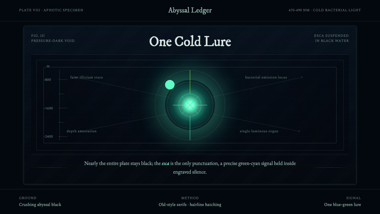 Anglerfish Lure BioluminescenceLight is scarce. Old serifs and hairline rules frame one cold green-cyan lure.
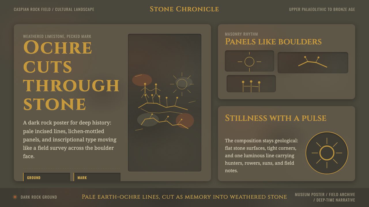 Azerbaijani Gobustan PetroglyphAncient rock speaks. Ochre incisions glow across dark lichen-mottled stone.
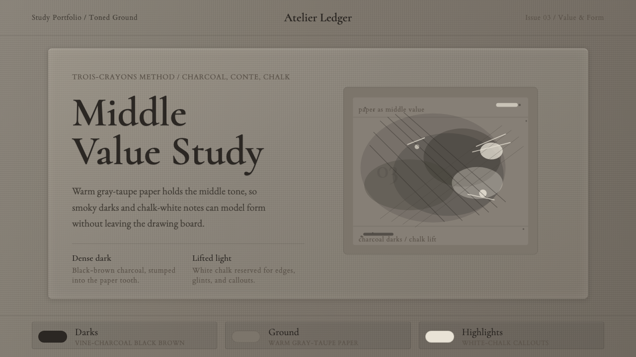 Charcoal & Conté DrawingAtelier calm, in middle value. Gray-taupe tooth, smoky charcoal, and chalk-wh…
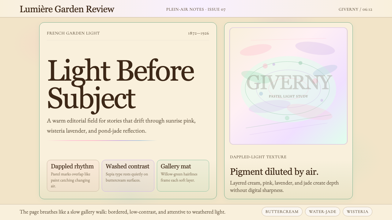 Claude Monet ImpressionistLight becomes the subject. Buttercream, pastel dapples, and Cormorant serif s…
 Don Quixote (1605)Imagination defies the plain. Rust capitals and cross-hatched ink score a dry…