What is Don Quixote (1605)?
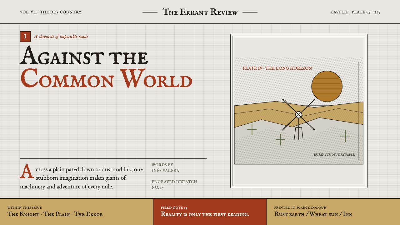
Imagination refuses the plain: rust capitals and cross-hatched ink turn La Mancha into a horizon where windmills can still become giants.
Don Quixote (1605) in brief
Don Quixote is a literary design language drawn from Cervantes’ knight-errant and filtered through Gustave Doré’s steel engravings of 1863. Its visual world is dry, dramatic, and bookish: a gaunt rider crosses an open plain, windmills rise with threatening scale, and dust, thorn, cloud, and shadow are built from dense strokes of ink rather than smooth painted surfaces.
The style treats illustration as an argument between imagination and material reality. The landscape is plain, spare, and sun-struck; the hero’s vision makes it theatrical. A windmill does not need to be literally transformed into a giant for the composition to carry that possibility. Monumental silhouettes, tilted horizons, and encroaching hatching allow the ordinary world to feel unstable under the pressure of belief.
Color is deliberately scarce. A cool gray, like weathered paper, carries most of the page, while rust, terracotta, and wheat-like ochre appear as precious warmth. This restraint gives the typography unusual force: a warm capital or a small earthen accent feels less decorative than excavated from the landscape. The result resembles a Spanish Golden Age chapbook reimagined by a Romantic illustrator.
Where does Don Quixote (1605) come from?
The literary source is Miguel de Cervantes’ Don Quixote, published across 1605 and 1615. Its world joins knight-errant aspiration to the specific ground of La Mancha in Castile: a place of roads, wheat, dust, sparse vegetation, and long distances. That tension between elevated fantasy and stubbornly physical terrain gives the style its central visual drama.
The style belongs to the Spanish Golden Age in subject and atmosphere, while its narrative energy also touches the picaresque. Rather than presenting chivalry as seamless grandeur, it allows grand ambition to meet an unadorned world. This produces a visual language where nobility can be fragile, comedy can carry melancholy, and an empty horizon can feel more consequential than an elaborate court.
Its definitive illustrated vision arrived in 1863 through Gustave Doré’s edition. Doré’s steel engraving method makes ink perform nearly every task: describing light, defining texture, locating figures in space, and loading the sky with emotion. Cross-hatching is not merely a surface effect; it gives the landscape pressure, weather, and memory.
The resulting aesthetic connects La Mancha to nineteenth-century Parisian book ateliers and to Romantic steel engraving, illustrated book art, and the named context of Tony Johannot and Honoré Daumier. It is therefore not a literal reconstruction of an early modern Spanish page. It is a later illustrated interpretation in which Cervantes’ dry landscape becomes monumental, tactile, and psychologically charged.
What defines the Don Quixote (1605) look?
Engraved Ink
Ink does the structural work. Parallel and crossing strokes describe sky, dust, cloth, stone, and distance, producing density without smooth tonal painting. The page should feel cut, scored, and printed rather than digitally airbrushed.
Dry Horizon
Open plains create emotional scale. Large quiet fields, sparse thistles, and low horizons make a lone horseman or windmill feel exposed. Emptiness is not unused space; it is the condition that makes imagination visible.
Withheld Color
Cool dry-paper gray dominates, while rust, terracotta, and ochre arrive as rare warmth. Warm color should feel local and earthly: dust, wheat, worn pigment, or an emphatic capital, never a blanket of decorative saturation.
Romantic Scale
Ordinary objects acquire dramatic size and silhouette. A windmill may loom, a cloud bank may crowd the page, and a rider may appear almost swallowed by the plain. The visual aim is not realism alone, but reality heightened by conviction.
Chapbook Typography
Warm capitals and sturdy editorial type recall a printed literary artifact. Type should feel impressed into paper and tied to the image field, not floated above it as a neutral interface layer. Initial letters can carry the warmth that imagery withholds.
Plate Mark
A framed image area suggests the physical edge of an engraved plate. This boundary gives compositions restraint and artifact value: the scene feels collected from a book rather than expanded into a frictionless full-bleed spectacle.
Who shaped Don Quixote (1605)?
Cervantes is the literary origin of Don Quixote, published across 1605 and 1615. The style takes its essential contrast from his knight-errant: expansive imagination set against the dry, tangible ground of La Mancha.
Doré established the definitive illustrated vision in his 1863 edition. His steel engravings make cross-hatched ink the carrier of atmosphere, terrain, scale, and dramatic uncertainty.
Johannot belongs to the source material’s named context for illustrated book art. His presence locates the theme within a broader nineteenth-century culture in which literary narrative and printed image were designed as one experience.
Daumier is likewise named in the theme’s visual lineage. Alongside Romantic steel engraving and illustrated book art, that lineage keeps the style connected to expressive drawn interpretation rather than polished decorative illustration.
How do you use Don Quixote (1605) today?
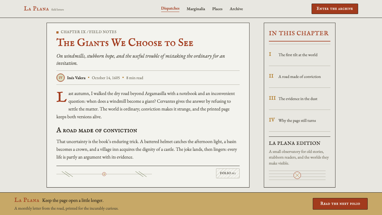
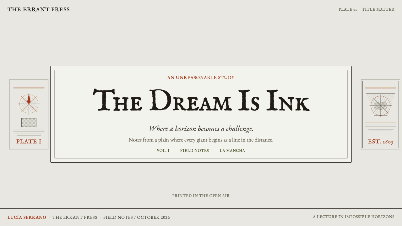
For presentation covers, treat the title as part of an engraved scene. Place a rust or terracotta capital against a dry gray field, let a cross-hatched horizon enter from one side, and reserve the most dramatic silhouette for a windmill, rider, or cloud mass. Content slides should become quiet printed pages: maintain generous unmarked ground, use ruled or engraved separators sparingly, and let each section feel anchored by a tangible page edge.
Data slides work best when charts inherit the language of ink and terrain. Use restrained dark marks for the primary series, then introduce earth-toned warmth only where a comparison or conclusion deserves attention. Cross-hatched fills can distinguish categories when they remain legible at a glance. Avoid glossy chart treatment; the goal is an analytical plate from a literary atlas, not a dashboard borrowed from a financial terminal.
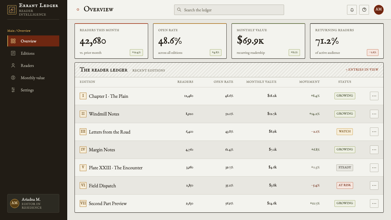
For web interfaces, this style suits editorial dashboards, research tools, reading experiences, and pricing pages that benefit from gravity and narrative context. Keep navigation typographic, frame key panels like printed plates, and use the gray paper field to separate information from distraction. Warm accents should identify action, status, or a decisive editorial moment. Illustration should clarify atmosphere without making routine interaction feel theatrical.
For editorial and marketing pages, use the style to stage a journey across a sparse field. Long-form articles can open with a hatching-rich hero and settle into calmer reading space; campaigns can alternate close ink detail with wide dry horizons. The common mistake is to treat every surface as an engraving. Dense hatching everywhere destroys the essential contrast between silence and pressure. Let texture gather around meaning, then allow the plain to remain plain.
Don Quixote (1605) — FAQ
Is this style simply vintage Spanish design?
No. Its subject belongs to La Mancha and the Spanish Golden Age, but its defining visual form is the later illustrated vision of Doré’s 1863 edition. The result is a meeting of Cervantes’ world with Romantic steel engraving and nineteenth-century book production, not a generic period costume.
Why is the palette so restrained?
The visual system depends on ink carrying the atmosphere. A dry gray ground allows rust, terracotta, and ochre to register as physical warmth from earth and wheat. If warm color is spread everywhere, the page loses the sense of distance and preciousness that makes those accents matter.
Can the style work without literal Don Quixote imagery?
Yes. Its strongest transferable elements are the dry horizon, engraved line work, framed image field, withheld color, and tension between a small human presence and an oversized landscape. These can suggest literary imagination without reproducing a particular rider or windmill.
What makes an application feel inauthentic?
The usual failure is confusing density with engraving. Random distressed texture, ornate antique decoration, and uniform hatching across every surface turn a disciplined printed language into visual noise. The style needs open paper, clear plate boundaries, and selective pressure from ink.
Related design styles
 Amsterdam Canal HouseQuiet luxury in brick and cream. Playfair serif, narrow columns, amber window…
 Balinese Kamasan PaintingAncient cloth, ordered as story. Ochre bands, soot outlines, indigo and gold…
 Caslon English Text SerifWarm authority, pressed into paper. Caslon capitals and engraved rules comman…
 Charcoal & Conté DrawingAtelier calm, in middle value. Gray-taupe tooth, smoky charcoal, and chalk-wh…
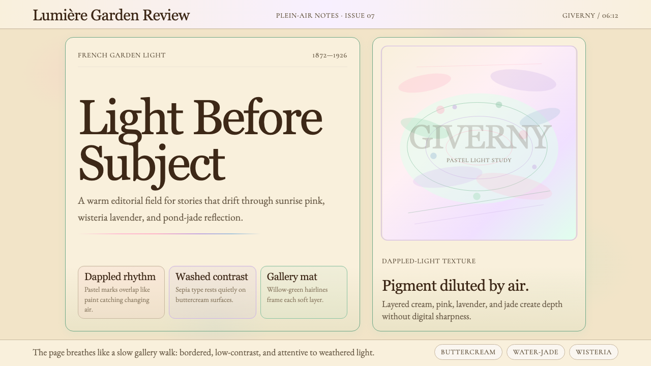 Claude Monet ImpressionistLight becomes the subject. Buttercream, pastel dapples, and Cormorant serif s…
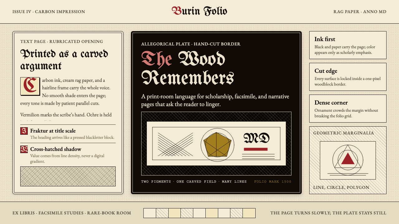 Dürer WoodcutInk remembers everything. Fraktur titles, rag-paper cream, and cross-hatched…