What is Slate Headstone Lettercutting?
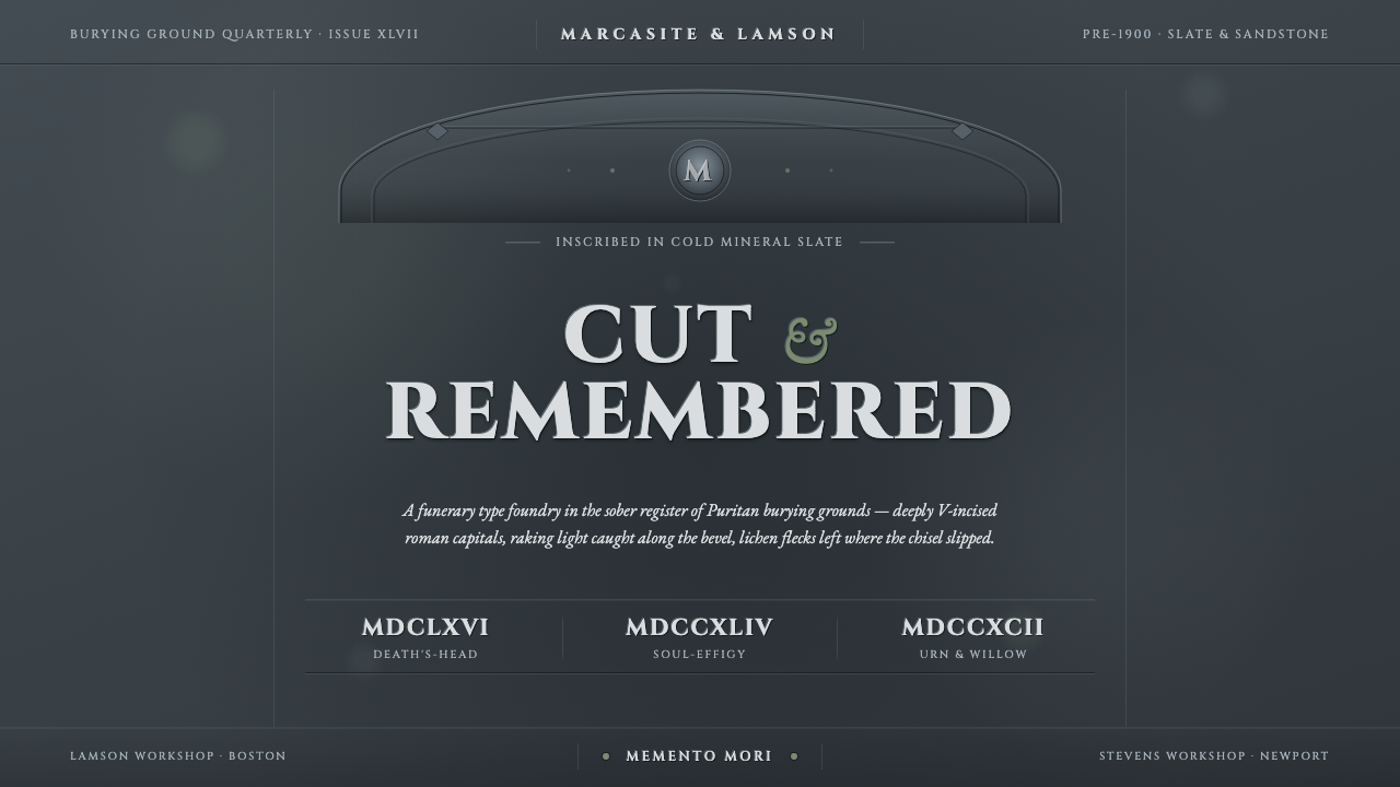
Slate headstone lettercutting turns language into a mineral event — roman capitals cut into dark stone, their V-shaped bevels holding a narrow line of light against the gravity of death.
Slate Headstone Lettercutting in brief
Slate Headstone Lettercutting is the funerary visual language found across colonial New England burying grounds from the seventeenth through the nineteenth century, with its greatest concentration between the 1660s and 1810s. Its defining elements are heavy English slate, deeply V-incised classical roman capitals, and hand-cut mortuary imagery such as the winged death's head. Letter, image, weather, and stone belong to one continuous surface.
The style must be understood as carving rather than printing. A letter is not a dark mark placed on a pale field; it is a cavity opened in dark blue-gray mineral. Its sloping sides alternately catch and lose light, making the inscription legible through restrained differences in depth, edge, and shadow. The apparent brightness belongs only to the bevel, never to a paper-like background.
Its emotional force comes from disciplined material severity. Weathering, lichen, worn edges, and imperfect hand-cut alignment do not function as decorative distress. They testify that the object has stood outdoors as a grave marker. The result is sober rather than theatrical: no warm parchment, ornamental luxury, or sentimental glow, only stone, inscription, mortality, and time.
Where does Slate Headstone Lettercutting come from?
The tradition developed in colonial New England, particularly around Massachusetts Bay, the Connecticut River Valley, Rhode Island, and New Hampshire. In Puritan burying grounds, imported English slate offered a dark, dense face for durable memorial inscriptions. The material's cold blue-gray character became inseparable from the craft: the grave marker was conceived as worked stone, not as a neutral support onto which typography happened to be applied.
Regional stonecutters shaped this material by hand, cutting classical roman capitals as deep V-shaped channels. This method produced the characteristic thin highlight along one bevel and deep shadow along the opposing cut. Variations in pressure, spacing, alignment, and edge sharpness remained visible, preserving the physical intelligence of the carver's hand while sustaining a formal, public voice appropriate to commemoration.
Puritan funerary imagery accompanied the inscriptions. The winged death's head confronted mortality directly, joining a human skull to wings in a compact emblem suited to the upper field of a grave marker. Across the broader tradition, mortuary iconography moved through a death's-head, cherub, and urn-and-willow progression. These changing figures altered the emotional register, but the governing relationship between inscription, carved emblem, and dark stone endured.
The craft was sustained by recognizable workshops and by many carvers whose names were not preserved. The Lamson and Stevens workshops stand among the named regional traditions, alongside carvers working in Boston and Newport and anonymous stonecutters throughout New England. Their collective production created a family resemblance without mechanical uniformity: recurring capitals and symbols were continually reinterpreted through local stone, individual hands, and exposure to weather.
What defines the Slate Headstone Lettercutting look?
Stone Ground
The ground is dark blue-gray slate with a cold mineral presence. It may be weathered, uneven, or touched by lichen, but it must remain recognizably stone. Pale warmth is foreign to the system: parchment, cream paper, and softly illuminated backgrounds replace the essential mortuary weight with nostalgic decoration.
V-Cut Capitals
Classical roman capitals are carved as recessed V-shaped channels rather than drawn outlines. Their authority comes from broad, deliberate proportions and from the interaction of two sloping faces inside each stroke. Slight irregularities should suggest controlled handwork, not casual lettering or synthetic damage.
Bevel Light
Light appears as a narrow mineral highlight caught by a cut edge, while the incision itself remains shadowed. This is not a luminous outline applied around the type. The highlight must feel dependent on carved depth and directional illumination, disappearing where the bevel turns away.
Mortuary Emblems
Winged death's heads, cherubs, and urn-and-willow imagery provide the principal figurative vocabulary. These motifs are compact, frontal, and subordinated to the stone face. They should read as forms released from or sunk into the same material as the inscription, never as separate illustrations pasted onto it.
Sober Hierarchy
Hierarchy is created through inscriptional scale, placement, spacing, and the relative prominence of emblem and text. Large names or opening lines establish memorial authority; smaller lines continue the record without competing effects. Empty stone is active silence, separating statements and preserving the gravity of each carved phrase.
Weathered Integrity
Wear belongs to exposed stone: softened corners, shallow erosion, lichen traces, and letters whose edges have gradually lost sharpness. Authentic weathering is selective and materially plausible. Uniform scratches, theatrical cracks, and repeated distress patterns turn historical duration into a surface filter and weaken the style.
Who shaped Slate Headstone Lettercutting?
The Lamson workshop represents the named workshop tradition within New England slate carving. Its significance lies not in modern authorship as individual self-expression, but in the continuity of a practiced regional vocabulary: roman inscription, mortuary emblem, carved depth, and disciplined adaptation to the stone face.
The Stevens workshop belongs to the group of identifiable makers through whom the funerary craft acquired continuity across grave markers. Workshop practice allowed recurring forms to be retained while every stone remained responsive to hand cutting, material variation, inscription length, and the demands of memorial imagery.
Carvers working in Boston and Newport formed part of the wider New England network that translated imported slate into regional grave markers. Their collective role emphasizes that the style was distributed across centers of settlement and craft rather than produced by a single school or governed by one master.
Anonymous stonecutters are fundamental to the tradition because much of its surviving identity is embedded in objects rather than biographies. Their differences in spacing, letter anatomy, emblem design, and depth of incision made regional practice visible while preserving the shared solemnity of Puritan funerary art.
How do you use Slate Headstone Lettercutting today?
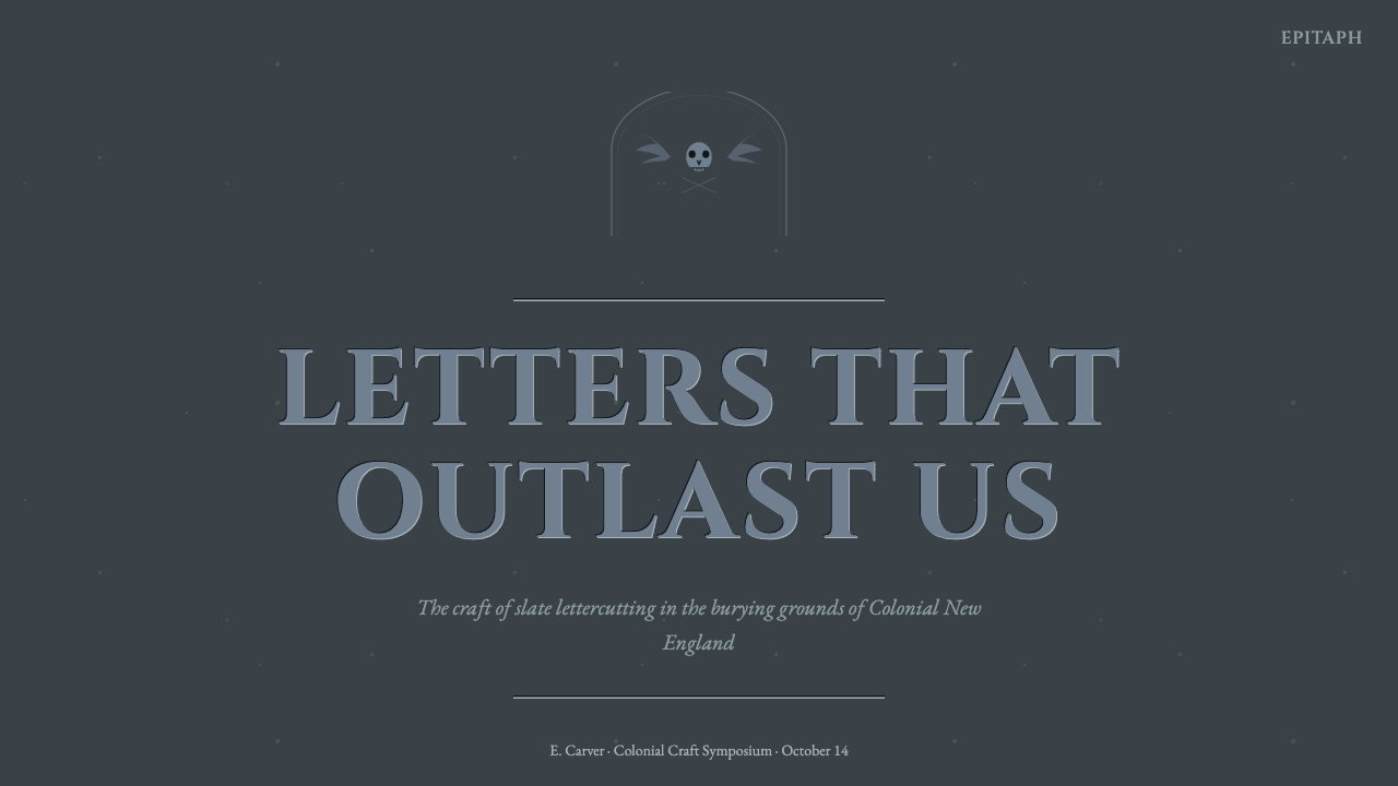
For presentation covers, treat the slide as a single stone face. A restrained winged death's head or carved title can occupy the upper field, while the remaining area stays dark and largely unbroken. Content slides should preserve inscriptional order: strong roman-capital headings, quieter supporting text, deliberate vertical separation, and no floating paper cards that deny the material premise.
Data slides require translation rather than imitation. Use incised-looking labels, pale bevel accents, and subdued divisions that feel scored into slate. Charts should remain highly legible and sparse, with differences carried by form, position, and mineral contrast rather than a cheerful spectrum. The effect should resemble an analytical inscription, not an archaeological prop.
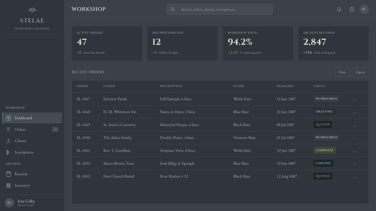
For web dashboards and pricing interfaces, the style works best when stone is a framing atmosphere rather than a texture spread indiscriminately across every control. Major headings and tier names can take on carved authority, while tables, values, and actions remain plain and readable. Recessed sections may echo inscription panels, but interactive states must still be unmistakable.
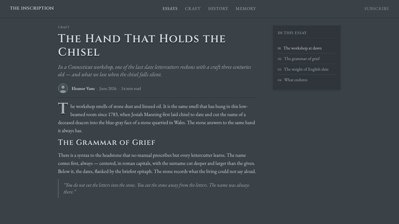
Editorial and marketing applications benefit from the tension between monumental titles and measured explanatory prose. An article opening can pair a carved capital heading with close views of weathering or bevels; subsequent sections should become calmer. Marketing pages should reserve the mortuary register for subjects where endurance, memory, ancestry, ritual, or historical gravity are appropriate.
The common mistake is to confuse the style with generic gothic horror. Black backgrounds, glowing letters, dramatic fog, ornamental scripts, and theatrical cracks replace a specific New England stonecutting tradition with fantasy scenery. Another error is rendering the surface as warm aged paper. The corrective is simple: begin with cold slate, carved roman capitals, plausible bevel light, and disciplined funerary imagery.
Slate Headstone Lettercutting — FAQ
Is Slate Headstone Lettercutting simply a dark typographic style?
No. Darkness alone does not define it. The style depends on a specific material relationship: letters are removed from slate as V-shaped cuts, light catches their bevels, and shadow occupies their depth. Without the stone face, carved construction, and funerary context, dark roman capitals become only an approximation.
Why must the background remain cold slate rather than parchment?
Because the object being referenced is a grave marker, not a manuscript. Parchment makes the letters appear written or printed and introduces warmth, portability, and domestic age. Slate is heavy, exposed, mineral, and fixed in the landscape. Those qualities create the style's mortuary authority before any emblem is added.
How should the hand-carved irregularity be represented?
Use restrained variation in alignment, spacing, stroke junctions, and the sharpness of cut edges. The inscription should still feel intentional and ceremonially composed. Random wobble, damaged letterforms, or heavy distress suggests neglect rather than craft. The goal is evidence of a human tool meeting resistant stone.
Are winged death's heads required in every application?
No. The emblem is a powerful identifier, but the material and lettering system can carry the style independently. When figurative imagery is appropriate, the broader vocabulary also includes cherubs and urn-and-willow motifs. Any emblem should support the memorial hierarchy rather than become a decorative mascot.
Can this style be used for ordinary commercial products?
It can, but its meaning is unusually specific. The visual language naturally communicates permanence, mortality, remembrance, austerity, and historical gravity. It suits archives, heritage narratives, commemorative work, and subjects concerned with endurance. Applied to casual retail or cheerful services, its funerary severity may overwhelm the intended message.
Related design styles
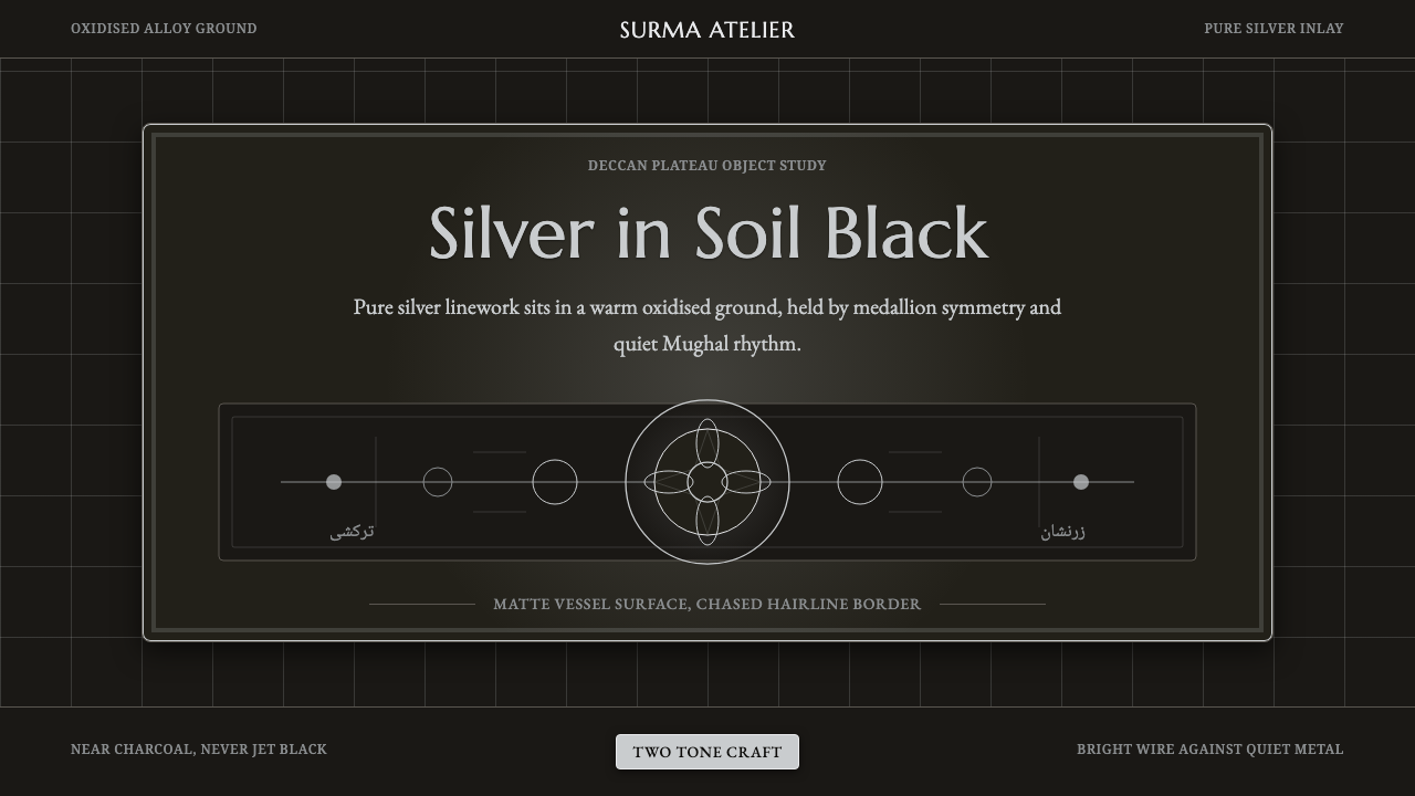 Bidar Bidriware VesselsSoil-black luxury. Crisp silver medallions and hairline borders cut the warm…
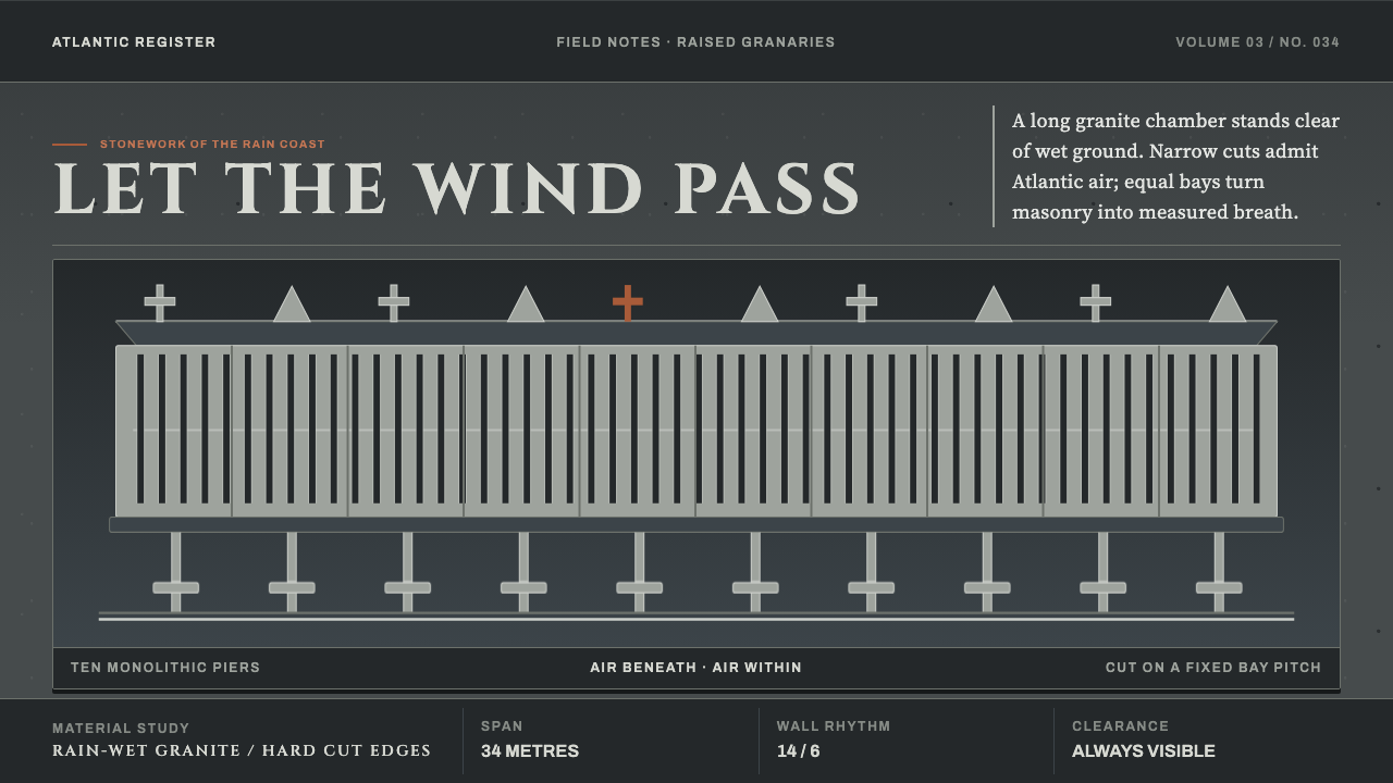 Galician HórreoStone learns to breathe. Wet granite, narrow slits and raised bays conduct At…
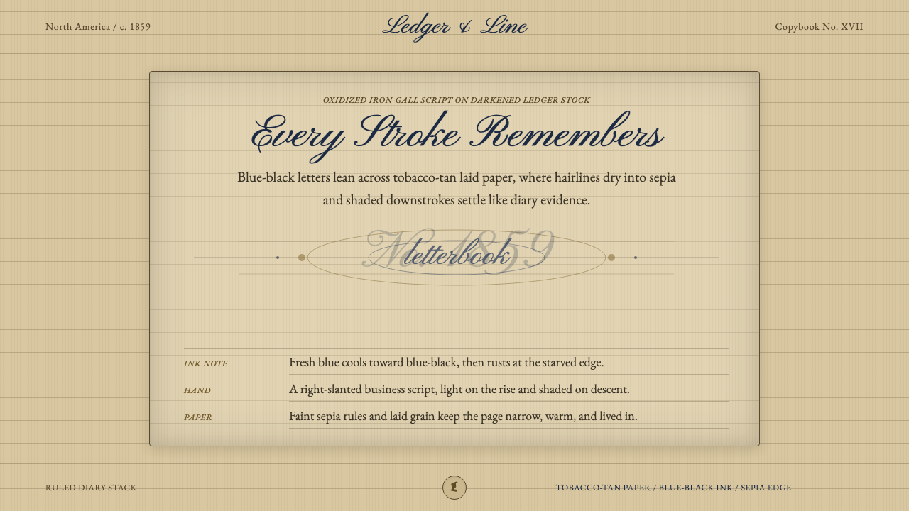 Spencerian PenmanshipLyrical ink, aged by time. Blue-black script rides tobacco-tan ruled paper.
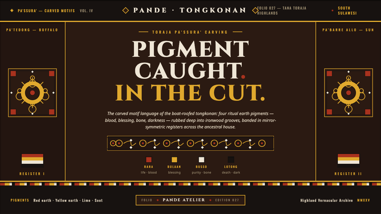 Toraja Pa'ssura CarvingPigment caught in the cut. Red, yellow, lime, soot rubbed into ironwood groov…
 Tula Niello SilverStrict silver-on-shadow monochrome. Burnished line-work cut into a cool blue-…
 Bát Tràng Ceramic BlueCobalt brushed on glaze white. Muted underglaze blue, double-line plate rims,…