What is Tula Niello Silver?
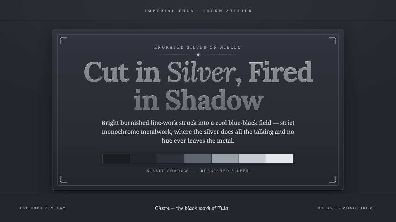
Tula Niello Silver turns darkness into a ground for precision — burnished silver lines cut through a cool blue-black field with the authority of engraved metal.
Tula Niello Silver in brief
Tula Niello Silver is a screen-oriented interpretation of Russian niello, or chern, a pre-1900 craft tradition associated with Tula in Imperial Russia. Its defining image is not black decoration placed on silver, but silver line-work cut into metal and surrounded by a dense sulphide-darkened field. The result is strict, cool, and highly legible: bright engraved marks hold their presence against a matte ground that absorbs visual noise.
The aesthetic depends on a narrow tonal world. Silver may appear polished, pale, or softly burnished, while the surrounding niello field moves through dark grey-black with a faint blue cast. No hue breaks the relationship between metal and shadow. Cards, panels, borders, and interface surfaces should therefore feel like engraved plaques: recessed areas fall into darkness, while edges and important marks catch a restrained metallic light.
Its authority comes from contrast and restraint rather than spectacle. Fine lines, cartouche-like frames, cityscape details, and scrollwork can carry considerable visual richness, but they remain contained within the silver-to-niello range. Tula Niello Silver is ornate in its craft reference yet disciplined in its screen expression; every bright mark should feel cut, polished, or exposed rather than painted on.
Where does Tula Niello Silver come from?
Tula niello belongs to the pre-1900 Russian craft tradition known as chern. The process begins with an engraved silver surface: lines and motifs are cut into the metal, then flooded with a black sulphide alloy. Firing causes the dark material to settle into the incisions, making the engraved drawing permanent within the object rather than treating it as a surface coating. This relationship between cut line and filled recess is the foundation of the visual system.
The tradition is associated with Tula, a city in Eastern Europe within Imperial Russia. It flourished through the eighteenth and nineteenth centuries, during the late-Imperial period of Russian decorative arts. The approved source places Tula niello alongside engraved metalwork and Russian niello silverwork, while also connecting it to the craftsmen of the Imperial armoury. Its identity is therefore both regional and material: a Tula language expressed through the disciplined behavior of silver, incision, alloy, and fire.
The imagery named by the tradition is unusually important to its digital translation. Cityscapes, cartouches, and scrollwork are not incidental motifs; they demonstrate how a dark metal field can hold fine information without losing unity. A cityscape gives the surface narrative density, a cartouche establishes containment and ceremony, and scrollwork introduces rhythm through repeated engraved movement. In each case, the detail remains subordinate to the metal ground and its contrast structure.
Tula Niello Silver distills this historical craft into a visual language for screens rather than attempting to reproduce a physical artifact literally. The screen version preserves the cool blue-black niello field, the bright burnished silver line, the recessed quality of dark areas, and the strict monochrome discipline. It leaves behind any need for literal metal texture or naturalistic lighting. What survives is the essential logic of chern: darkness is not an absence but the material that makes the engraving visible.
What defines the Tula Niello Silver look?
Silver and Niello
The palette is confined to the relationship between bright silver and dark niello. Silver should feel burnished, cool, and reflective without becoming glittering or ornamental. The niello ground is a matte dark grey-black with a restrained blue cast, never a flat theatrical black. Tonal variation comes from the surface behavior of metal and shadow, not from introducing unrelated colors.
Engraved Line
Line-work is the primary expressive instrument. It should be fine, deliberate, and continuous enough to suggest a tool moving through metal. Lines may define borders, lettering, cartouches, cityscape silhouettes, or scrollwork, but they should never feel casually drawn. The most convincing marks appear discovered within the surface, as though the dark field has been cut away to reveal silver beneath.
Matte Recess
Depth is communicated through a clear opposition between raised or exposed silver and recessed darkness. Panels should feel slightly sunken, while their edges and internal marks receive the visual emphasis. The effect is not a glossy three-dimensional interface. It is closer to a plaque, seal, or engraved object whose hollows have been filled with dark alloy and whose bright ridges remain readable.
Ceremonial Framing
Cartouche-like framing gives information a formal enclosure. Borders should be thin, controlled, and materially motivated, as though they were part of an engraved silver plate. Scrollwork can soften the severity of the field, but it must remain rhythmic and contained. Decorative framing is most effective when it establishes hierarchy or marks an object as significant, not when it fills every available edge.
Cool Authority
The mood is authoritative but quiet. Cool silver against blue-black darkness suggests archival value, craftsmanship, and permanence without relying on bright color or dramatic effects. Text should carry the same restraint: crisp, composed, and carefully spaced. The system feels ceremonial because its materials imply care and labor, not because it borrows theatrical luxury cues.
Strict Monochrome
The absence of unrelated color is an active design decision. Status, emphasis, and interaction should be expressed through contrast, line treatment, surface depth, and the degree of silver exposure. Introducing warm accents, saturated highlights, or decorative color weakens the central metaphor. The system remains richest when every distinction appears to come from the same piece of worked metal.

Who shaped Tula Niello Silver?
The master silversmiths of Tula represent the regional craft intelligence behind the style. Their significance is expressed through the controlled relationship between engraved silver and the dark field that surrounds it. In this design language, their collective presence appears as precision, restraint, and respect for the surface: every line must justify its place, and every dark recess must help the silver drawing remain legible.
The engravers of the chern tradition define the essential gesture of the medium: cut the silver, fill the incision with black sulphide alloy, and fire the material into the metal. Their contribution is not a single motif but a complete method of making contrast structural. Tula Niello Silver adapts that method by treating line, recess, and tonal separation as the primary carriers of meaning.
The craftsmen associated with the Imperial armoury place the style within the wider material culture of Imperial Russia. Their role in the source material reinforces the system's sense of authority and durability. In application, that reference should be handled through disciplined construction and engraved clarity rather than military imagery. The desired impression is made, ordered, and enduring.
How do you use Tula Niello Silver today?
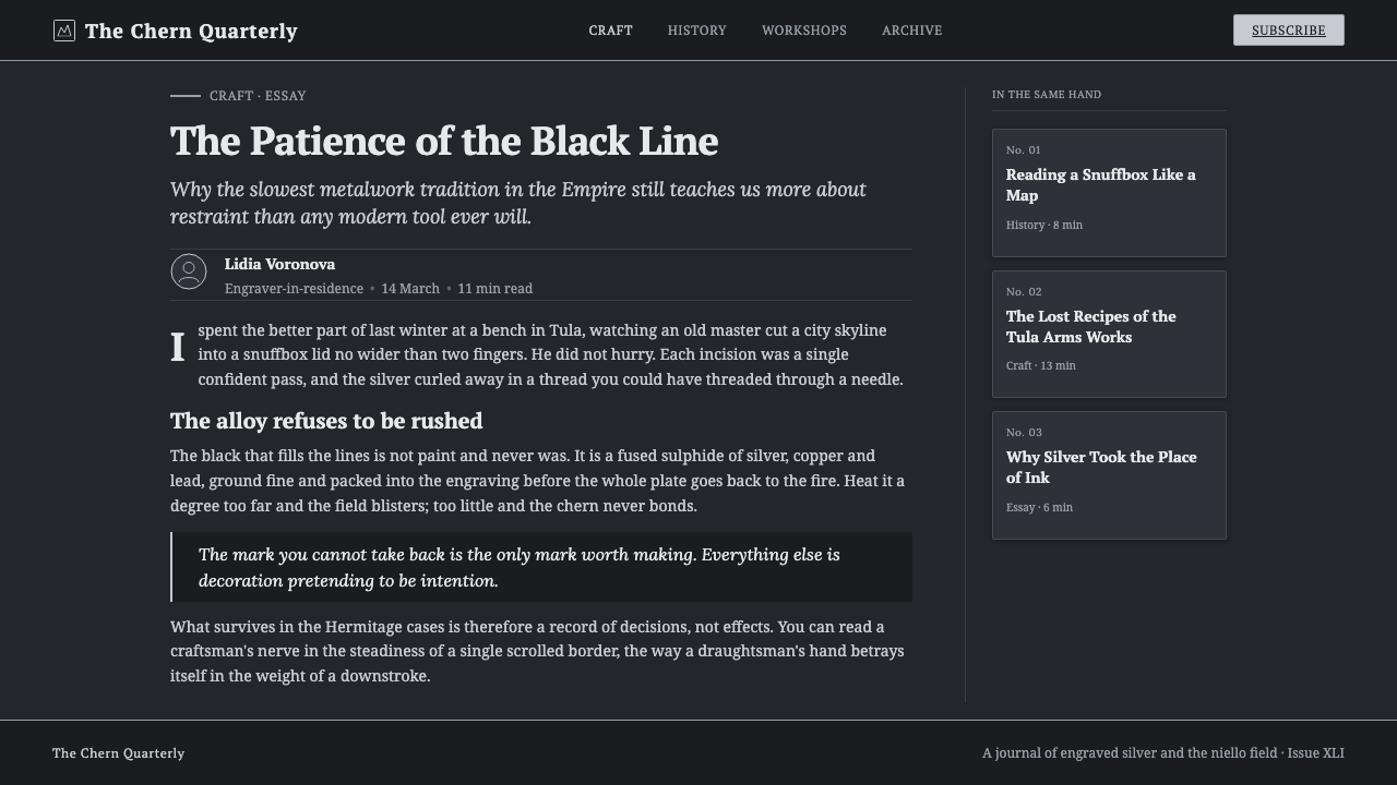
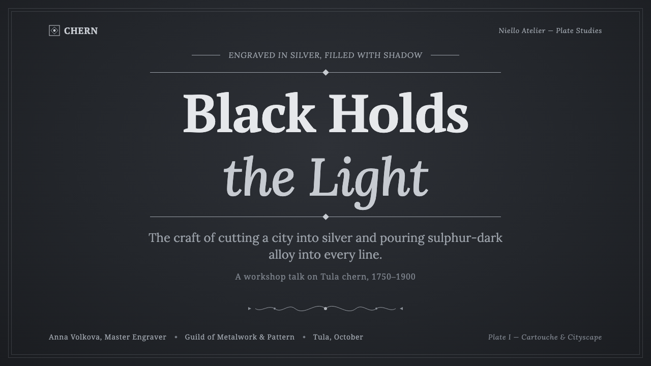
For presentation slides, Tula Niello Silver works best when the cover establishes the material metaphor immediately: a deep blue-black field, a restrained silver title, and a fine engraved frame or line that gives the composition the character of a plaque. Content slides should preserve that quiet hierarchy. Use silver for headings and active structure, let body text recede into softer metallic tones, and keep decorative scrollwork limited to moments that need ceremony. Data slides should treat charts as engraved diagrams, using tonal contrast and silver outlines instead of a multicolored legend.
For web interfaces, the style suits dashboards, catalogues, archival tools, and pricing pages that need authority and concentrated attention. A dark niello surface can hold panels that feel recessed, with silver borders indicating active structure and brighter silver reserved for the most important values or actions. Pricing tiers should be differentiated through depth, framing, and the degree of silver exposure rather than unrelated colors. Controls should feel stamped or engraved, while interaction states can emerge through sharper contrast, exposed edges, or a change from matte darkness to burnished silver.
For editorial and marketing work, the system supports a strong sense of provenance. Article pages can use a broad dark field with narrow, highly legible text areas framed like metal plaques. Section openings may introduce cartouche forms, cityscape silhouettes, or restrained scrollwork, provided these elements support the subject rather than compete with it. Marketing pages benefit from a museum-like confidence: product names appear as inscriptions, feature statements sit within disciplined frames, and calls to action are made visible through silver clarity instead of bright color.
The common mistake is to treat the style as generic luxury: adding gold, warm brown, glossy gradients, soft atmospheric shadows, or excessive ornamental borders. Those choices break the central material relationship between silver and niello. Another mistake is making every surface equally bright or every line equally delicate. Authentic authority depends on hierarchy: the field must remain deep, the engraving must remain selective, and the brightest silver should mark information that deserves attention.
Tula Niello Silver — FAQ
Is Tula Niello Silver simply a black-and-white style?
Not quite. It is monochrome, but its material logic is more specific than ordinary black and white. The dark field is a cool grey-black with a faint blue cast, while the light areas should feel like burnished silver rather than neutral white. The distinction matters because the style depends on the impression of worked metal: matte recesses, polished lines, and a controlled tonal relationship.
Can the style be used on a light background?
It can, but the dark niello field is the stronger and more faithful foundation. On a light background, the relationship between silver and shadow becomes less immediate, and the engraved metaphor can lose its depth. If a lighter application is necessary, preserve the cool metallic range, use dark fields as contained plaques or panels, and ensure that silver remains a structural highlight rather than a generic light color.
How should imagery be handled in a Tula Niello Silver layout?
Imagery should behave like engraved information. Cityscapes, cartouches, and scrollwork are the clearest references, but any image should be simplified into legible silhouettes, line-work, or contained tonal fields. Avoid imagery that introduces a competing palette or a glossy photographic surface. The strongest results make the image feel cut into the same object as the surrounding frame and text.
What makes the style feel authoritative rather than merely decorative?
Authority comes from disciplined material hierarchy. The niello field must provide visual depth, silver must be selective, and framing must clarify rather than crowd the information. The system also gains credibility when every bright line appears to have a structural or communicative role. If ornament is added without regard for the engraved logic, the result becomes generic luxury instead of Tula Niello Silver.
Related design styles
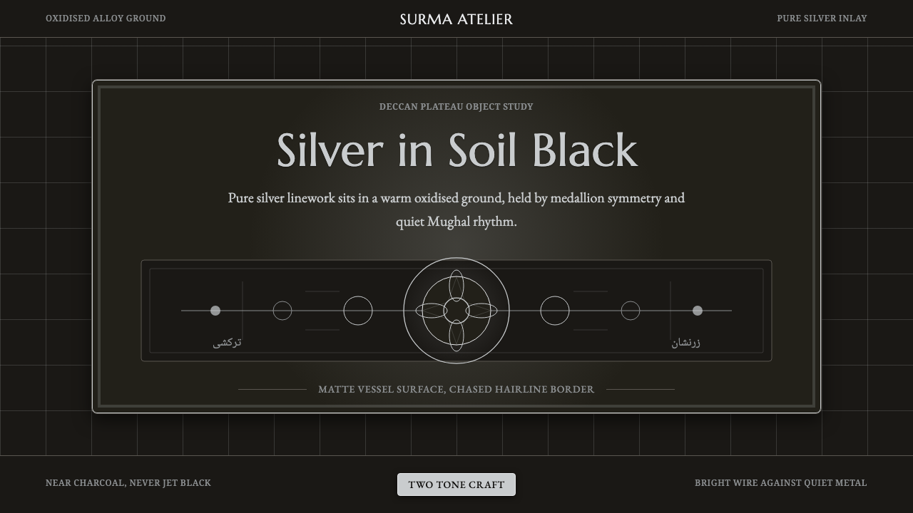 Bidar Bidriware VesselsSoil-black luxury. Crisp silver medallions and hairline borders cut the warm…
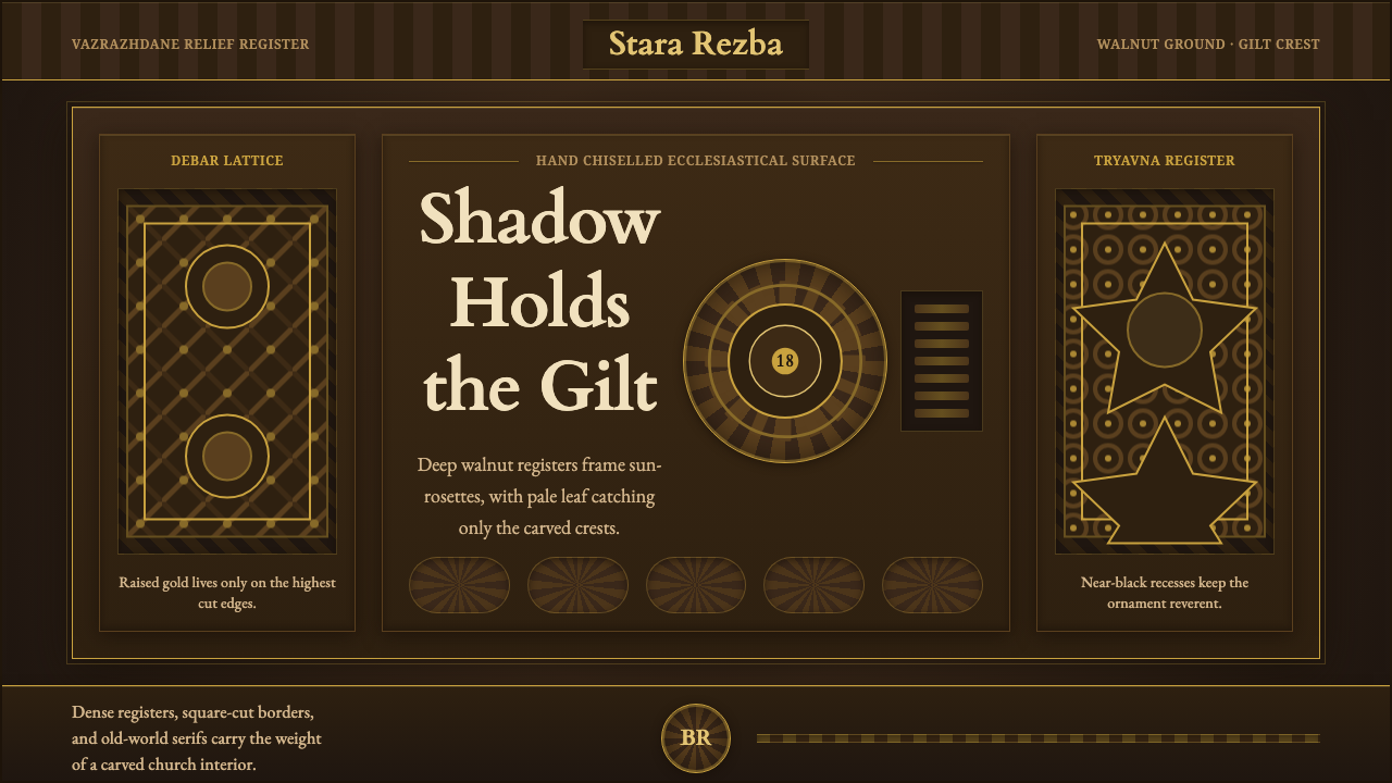 Bulgarian Revival WoodcarvingDark devotion in relief. Walnut panels, Cardo serifs, and gilt rosettes catch…
 Circassian Adyghe Gold BraidCourtly gold on dark wool. Raised braid edges coil over indigo-black panels.
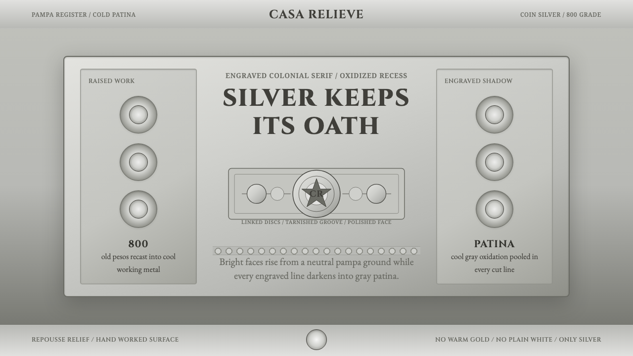 Criollo Silver GrayscaleCold luxury in aged silver. Cinzel capitals, rastra discs, and oxidized gray…
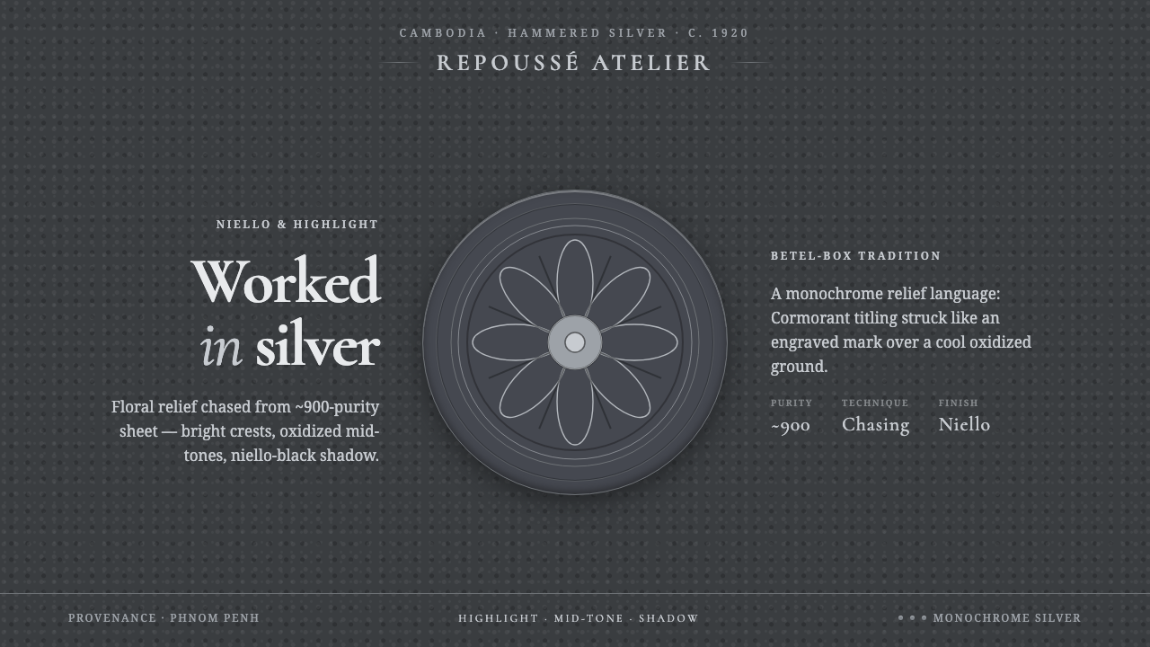 Khmer Silver RepousséHammered silver, on screen. Oxidized ground, bright highlight, niello-black r…
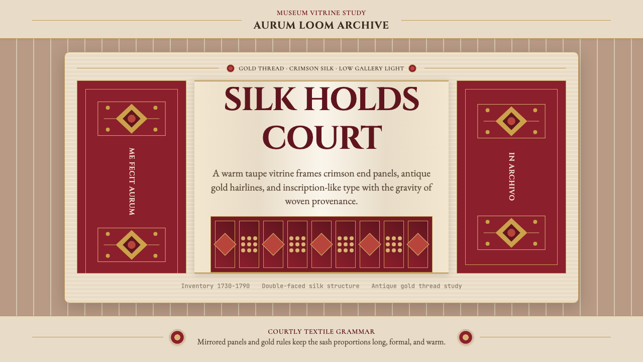 Belarusian Slutsk SashCourtly silk, vitrined. Taupe ground, crimson panels, Cinzel type, antique go…