What is Khmer Silver Repoussé?
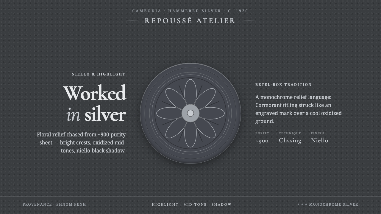
Khmer Silver Repoussé turns hammered metal into a dark, tactile screen language where silver catches the light and every recess becomes shadow.
Khmer Silver Repoussé in brief
Khmer Silver Repoussé draws from early-twentieth-century Cambodian betel boxes and animal-form vessels made from approximately 900-purity silver sheet. Floral, fruit, and animal motifs are raised through repoussé and chasing, creating a surface in which bright metal and dark recesses are inseparable.
On screen, the style becomes a controlled study in contrast. A cool oxidized-gray ground gives motifs the appearance of raised relief, while monochrome silver highlights suggest polished edges catching light. Deep niello-black shadow occupies the recesses, making the surface feel hammered, carved, and materially present.
The system pairs this metal vocabulary with refined serif typography, especially Cormorant, whose elegant forms provide a counterpoint to the physical force of the surface. Display titles should feel monumental and deliberate; supporting text remains restrained, allowing the simulated metalwork to carry the visual drama.
Where does Khmer Silver Repoussé come from?
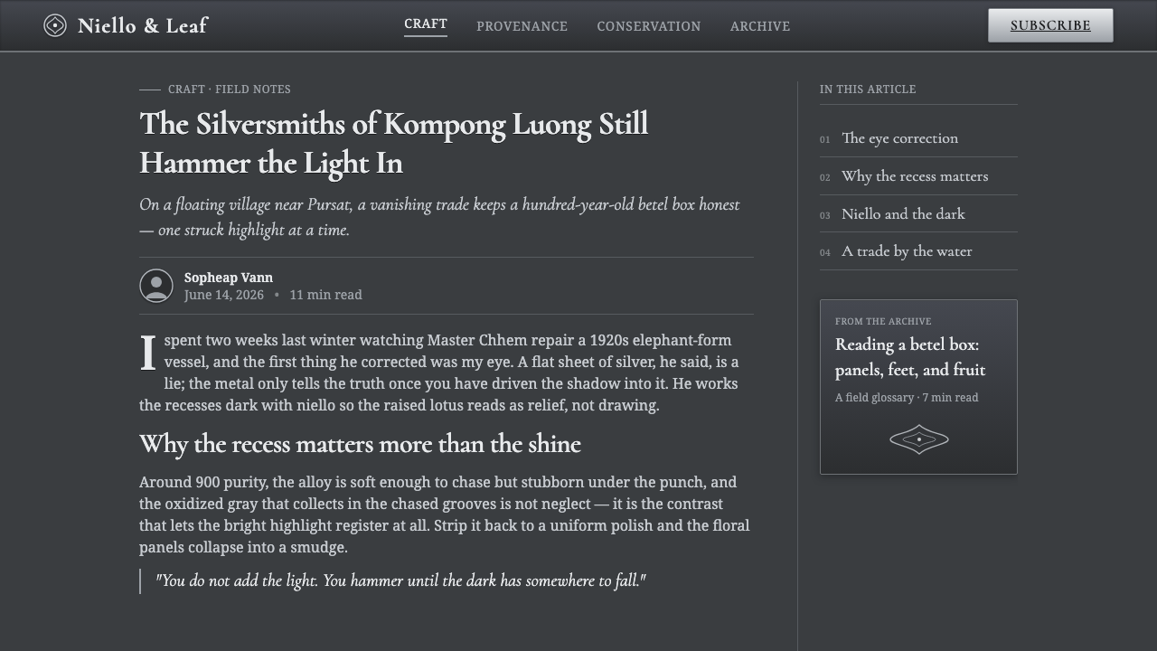
The source tradition belongs to Cambodia in Southeast Asia, with its strongest reference point in the early twentieth century. The visual language is associated with hammered-silver betel boxes and vessels shaped as animals, objects whose practical forms were enriched by floral, fruit, and creature relief.
The material is central to the identity of the work. Master smiths worked silver sheet of approximately 900 purity, using repoussé and chasing to bring motifs into relief. The surface is therefore not merely decorated; it is built through pressure, impact, and the deliberate shaping of metal into raised and recessed zones.
Its characteristic appearance depends on the coexistence of opposing surfaces. Bright silver highlights catch the light across the raised areas, while oxidized gray recesses and deep niello-black shadows settle into the lower parts of the relief. The result is a monochrome field with strong depth and a distinctly tactile presence.
Khmer Silver Repoussé is a digital translation of that object language rather than a literal reconstruction of a single historical artifact. It preserves the material logic — hammered relief, oxidized ground, silver highlight, and blackened depth — then combines it with Cormorant serif typography and monumental display treatment for contemporary screens.
What defines the Khmer Silver Repoussé look?
Oxidized Ground
The foundation is a cool oxidized gray rather than a clean white or warm paper tone. It gives the silver motifs a surrounding atmosphere and allows the raised areas to separate from the field without relying on bright color. The ground should feel aged, mineral, and slightly tarnished, but never dirty or textural for its own sake.
Silver Highlight
Silver is treated as a family of restrained light tones, not as a bright accent competing with the whole composition. Highlights belong on raised edges, ridges, and focal motifs. Their purpose is directional: they tell the eye where the metal turns toward the light and make relief legible through contrast.
Recessed Shadow
Deep niello-black shadow belongs in the recesses, where it reinforces the impression of engraved depth. It should appear dense and deliberate rather than soft or atmospheric. The shadow is part of the relief vocabulary: a dark cavity that gives the bright metal something to press against.
Hammered Relief
Forms should read as raised from a sheet, not placed as flat illustrations above it. Floral, fruit, and animal motifs gain character through changes in contour, pressure, and depth. The visual rhythm comes from the meeting of smooth highlight, compressed edge, and dark recess — a sequence that suggests hand-work without requiring literal texture everywhere.
Serif Monumentality
Cormorant and related refined serif forms give the system its literary and ceremonial register. Display type should be elegant, spacious, and imposing without becoming theatrical. Serif details echo the carved intricacy of the metalwork, while a restrained supporting hierarchy keeps the page usable and prevents the historical reference from becoming costume.
Monochrome Restraint
The palette stays within oxidized gray, silver, and niello black. Contrast comes from reflectivity, depth, and tonal placement rather than unrelated hues. This restraint is essential: the viewer should experience a single metal world with changing surfaces, not a dark interface decorated with metallic effects.
Tactile Stillness
The style is dark and dramatic, but its movement is slow and visual rather than kinetic. Large quiet fields let relief, type, and highlight settle into place. Nothing should feel glossy, synthetic, or aggressively animated. Its authority comes from stillness: the screen behaves like an object worthy of close inspection.

Who shaped Khmer Silver Repoussé?
Khmer silversmiths are the human foundation of the reference tradition. Their work with approximately 900-purity silver sheet produced the betel boxes and animal-form vessels that anchor the style. In the digital system, their presence is honored through the emphasis on formed metal, raised motifs, controlled highlight, and the visible relationship between labor and surface.
The masters of repoussé and chasing define the relief logic of the style. Through these practices, floral, fruit, and animal motifs become raised structures rather than surface marks. Their contribution is translated into digital depth, contour-led emphasis, and a composition that treats every highlight and recess as part of the object’s construction.
Niello metalwork artisans provide the tradition’s deepest visual counterpoint: blackened recess against bright silver. In the system, niello black is not an independent decorative color. It acts as a structural depth cue, concentrating the eye in engraved channels and preserving the solemn, mineral character of the surface.
The animal-form vessel is a defining object reference rather than an individual maker. Its importance lies in the union of body and ornament: the container’s silhouette, the raised animal presence, and the surrounding relief belong to one continuous metal world. This makes it a useful model for screen compositions that need a strong central form.
How do you use Khmer Silver Repoussé today?
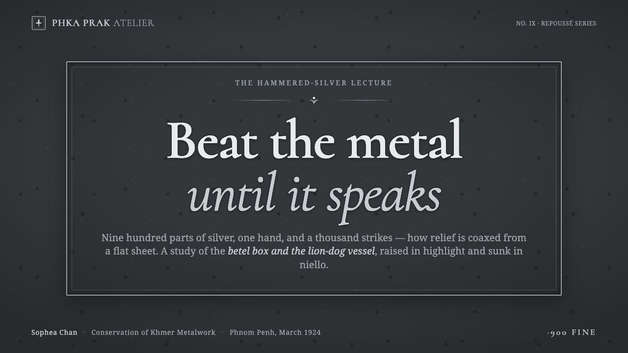
For presentation slides, use the style most strongly on the cover and on moments that need ceremonial emphasis. A dark oxidized-gray field can hold a monumental Cormorant title, with a silver relief motif emerging near the edge or behind the heading. Content slides should quiet the treatment: keep text in clear serif hierarchy, use silver only to mark key terms, and let niello-black recesses or restrained relief lines organize the page. Data slides should feel like engraved plates, with tonal contrast carrying the explanation instead of colorful chart decoration.
For web interfaces, Khmer Silver Repoussé suits dashboards, pricing pages, and product surfaces that want authority, craft, or a premium archival mood. Keep the interface dark and let silver indicate active, elevated, or selected states. Cards can feel like shallow metal plaques when their edges and recesses are clearly articulated, but interaction must remain legible. Pricing tiers should be separated through hierarchy and relief depth before relying on brighter highlight; the result should feel curated and substantial rather than glossy.
For editorial and marketing work, the style supports essays, cultural institutions, luxury objects, heritage storytelling, and campaigns centered on making. Give long-form text a calm measure and a generous dark field, then use relief imagery or a silver title treatment as the visual anchor. Marketing compositions can alternate between quiet oxidized surfaces and concentrated metallic focal points. A single animal, floral, or fruit motif is often more persuasive than a crowded pattern because the style depends on close looking.
For imagery, favor cropped details, raised contours, reflective edges, and the encounter between light silver and blackened recess. The image should behave like an object under inspection, not like a generic luxury backdrop. Pair the visual with concise captions and strong editorial sequencing so the material reference remains understandable. The typography should support the artifact’s dignity, not compete with it through excessive ornament.
The common mistake is treating metallic appearance as a collection of effects: bright gradients, glossy reflections, random bevels, and decorative dark textures. That approach loses the style’s material logic. Another mistake is making every surface equally dramatic, which destroys hierarchy. Start with the oxidized ground, decide where the relief rises, place highlights only where they clarify form, and reserve the deepest black for genuine recess or emphasis.
Khmer Silver Repoussé — FAQ
Is Khmer Silver Repoussé a literal reconstruction of Cambodian silverware?
No. It is a screen translation inspired by early-twentieth-century Cambodian hammered-silver betel boxes and animal-form vessels. It preserves the visual logic of raised relief, oxidized gray, bright silver, and niello-black recesses, then combines that logic with Cormorant serif typography and contemporary interface structure.
Why is the palette almost entirely monochrome?
Because the reference derives its character from metal rather than painted color. Variation comes from the difference between polished highlight, oxidized ground, and blackened recess. Adding unrelated hues weakens the sense that every surface belongs to the same worked sheet of silver.
Can the style use light backgrounds?
It can, but the dark oxidized ground is the stronger and more characteristic choice. A light variation must still preserve the relationship between raised silver and recessed black; otherwise the work may become ordinary engraved ornament. The essential requirement is not darkness alone, but clear relief and material contrast.
What role does Cormorant play in the system?
Cormorant supplies the refined serif voice named in the source material. Its display presence gives the interface a literary, ceremonial, and monumental register, while its supporting text can remain calm and readable. Typography should echo the intricacy of the metalwork without becoming ornamental or difficult to use.
What separates an authentic application from a generic metallic interface?
Authentic application treats relief as structure. Highlights explain raised form, black explains recess, and the oxidized ground gives the whole surface continuity. A generic metallic interface usually applies shine, bevel, and shadow indiscriminately. Khmer Silver Repoussé depends on restraint, hierarchy, and the feeling that every tonal change belongs to a shaped metal object.
Related design styles
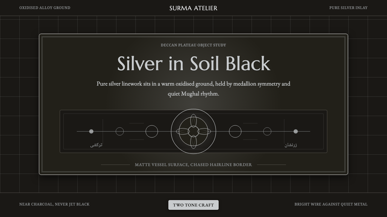 Bidar Bidriware VesselsSoil-black luxury. Crisp silver medallions and hairline borders cut the warm…
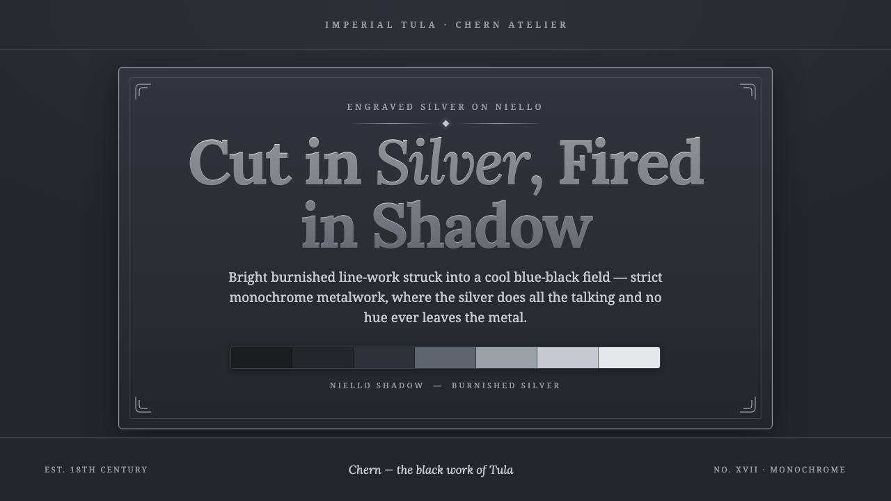 Tula Niello SilverStrict silver-on-shadow monochrome. Burnished line-work cut into a cool blue-…
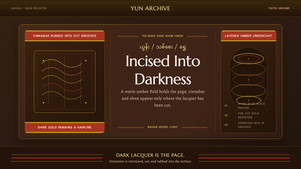 Burmese Shan Lacquer BrownDark lacquer leads. Cinnabar bands and shwe hairlines cut across a warm umber…
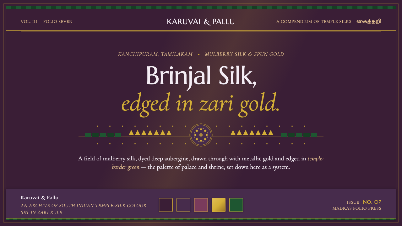 Indian Brinjal Temple TextilePalace silk, systematised. Brinjal violet ground edged in zari gold, korvai g…
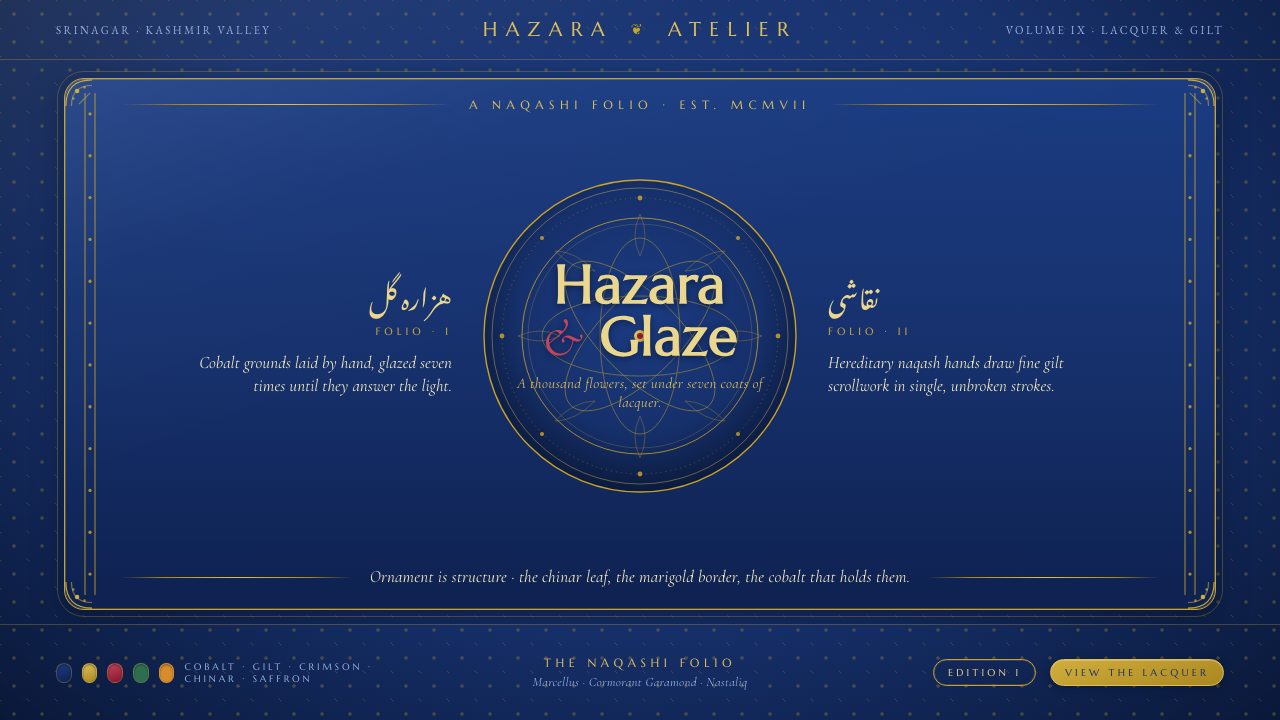 Kashmiri Papier-MâchéOrnament is structure. Cobalt lacquer ground, fine gold hazara scrollwork, gl…
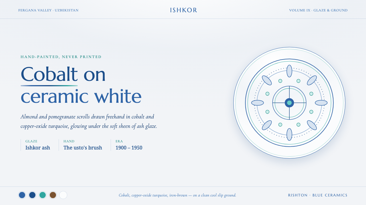 Rishton Blue CeramicsGlaze, not print. Cobalt and copper turquoise florals brushed freehand on coo…