What is Kashmiri Papier-Mâché (Naqashi)?
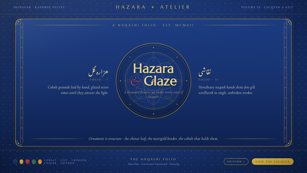
Kashmiri papier-mâché turns ornament into architecture: deep cobalt lacquer, fine gold hazara scrollwork, and a mirror-bright surface where every flourish carries the weight of structure.
Kashmiri Papier-Mâché (Naqashi) in brief
Kashmiri papier-mâché, or naqashi, is the lacquered painting craft of the Kashmir Valley, centered in Srinagar. Moulded paper-pulp objects are covered in a deep cobalt ground, painted with fine gold floral scrollwork, and finished with successive lacquer glazing that produces a glossy, mirror-like surface. The result is not merely a decorated object. Its identity comes from the relationship between dark ground, gilt line, floral density, and reflective finish.
The defining visual language belongs to the Persianate decorative tradition. Hazara, the thousand-flower ornament, creates an abundant field of interlaced blooms and vines, while the single-chinar-leaf motif introduces a recognizable regional accent. These motifs are not incidental illustrations placed on top of a form. They establish rhythm, frame edges, organize panels, and make ornament itself the system through which the object is read.
Translated to the screen, naqashi becomes a dark, ceremonial design language: cobalt grounds carry the page, gold linework defines borders and transitions, and crimson and chinar-green accents punctuate the composition. Serif type with calligraphic DNA completes the translation. Surfaces should feel lacquered rather than matte, and dense rather than empty, but the density must remain governed by recurring motifs and deliberate hierarchy.
Where does Kashmiri Papier-Mâché (Naqashi) come from?
The source tradition places Kashmiri naqashi in the period from 1900 to 1950, when a Persianate craft language was refined into a distinctly twentieth-century visual system. Its home is the Kashmir Valley, with Srinagar identified as the central regional setting. The craft is therefore grounded in both place and continuity: it carries a Persianate ornamental inheritance while remaining legible as a Kashmiri surface tradition.
The physical process explains the style's unusually strong material identity. Paper pulp is moulded into objects before the surface is treated as a field for lacquered painting. Deep cobalt establishes the ground, gold floral scrollwork supplies the visible drawing, and glazing seals the composition beneath a reflective finish. Because the object is built through these connected stages, pattern and surface cannot be separated from the form they cover.
The named human lineages are hereditary naqash families of Srinagar, Sufi-era Persianate painters, and the artisan migrants associated with Mir Sayyid Ali Hamadani. Together, these figures describe a transmission of craft knowledge rather than a style attributed to a single author. The family workshop, the Persianate painterly tradition, and the movement of artisans all belong to the origin story encoded by the name naqashi.
Its associated movements are Kashmiri naqashi lacquerwork, Persianate floral decorative arts, and hazara thousand-flower ornament. The design system draws from all three without collapsing them into a generic floral style. Kashmiri lacquerwork supplies the dark reflective ground; Persianate decorative art supplies the fine, flowing botanical language; and hazara ornament supplies the sense of continuous floral abundance that makes the surface feel architecturally complete.
What defines the Kashmiri Papier-Mâché (Naqashi) look?
Cobalt Lacquer Ground
The ground is the first structural decision. Deep cobalt blue gives the system its darkness, depth, and visual authority, while also creating the necessary contrast for gold linework to remain legible. It should feel like a continuous lacquer field rather than a flat generic background. Large areas of cobalt provide calm between motifs, allowing the ornament to appear embedded in the surface instead of scattered across it.
Hazara Ornament
Hazara means thousand-flower ornament, and its defining quality is continuity. Flowers, leaves, and vines should lead the eye through a connected field, especially along borders, panels, and framing devices. The pattern is dense but not chaotic: repetition creates a visual grammar, while variation keeps the surface alive. Ornament is therefore both decoration and navigation, telling the viewer where one region ends and another begins.
Fine Gilt Linework
Gold is used as drawing rather than as a broad metallic block. Fine gilt lines trace petals, stems, leaves, and scrolls against the cobalt field, producing a sense of patient handwork and controlled intricacy. The line should remain delicate even when the overall composition is rich. This contrast between a dark expansive ground and precise luminous drawing is one of naqashi's most important visual tensions.
Calligraphic Serif Type
Typography should be serif-led, with letterforms that suggest calligraphic inheritance rather than mechanical neutrality. Curved terminals, varied stroke presence, and an editorial sense of rhythm allow type to sit naturally beside floral scrollwork. Headings may feel ceremonial and composed, while body text remains readable and measured. The type should participate in the ornament's rhythm without imitating the pattern literally.
Crimson and Chinar Green Accents
Crimson and chinar green function as accents within the cobalt-and-gold world. Crimson can mark urgency, emphasis, or a point of visual heat; chinar green can bring a leaf-like, regional note that keeps the palette connected to the botanical motifs. Neither should compete with the ground or dissolve the primacy of gold. Their role is punctuation: selective, meaningful, and visually memorable.
Mirror Lacquer Depth
The final surface should read as glazed lacquer: deep, sealed, and reflective. Digital applications can suggest this through restrained highlights, layered tonal depth, and sharp separation between the cobalt field and gilt ornament. The finish is not a soft atmospheric glow. It is a polished surface that catches light while preserving the clarity of every painted line. Gloss belongs to the material identity of the system, not to incidental decoration.
Who shaped Kashmiri Papier-Mâché (Naqashi)?
The hereditary naqash families of Srinagar represent the craft's living line of transmission. Their place in the source tradition reinforces the idea that naqashi is not simply a palette or a floral motif, but a practiced relationship between moulded paper pulp, lacquer ground, fine painting, and reflective finish. In a digital interpretation, this lineage argues for consistency: every decorative gesture should appear deliberate, connected, and made to belong to the surface.
The Sufi-era Persianate painters named in the source represent the painterly inheritance behind naqashi's floral language. Their presence helps explain why the system favors flowing stems, controlled botanical detail, and an ornamental field that feels continuous rather than isolated. The digital lesson is to treat floral drawing as a disciplined vocabulary, not as a collection of decorative stickers.
The artisan migrants associated with Mir Sayyid Ali Hamadani embody the movement of Persianate craft knowledge into the Kashmiri setting. In the source material, they belong to the origin story alongside local hereditary families and Sufi-era painters. Their significance for the design system lies in synthesis: regional cobalt lacquer and chinar imagery meet a broader language of Persianate floral ornament.
How do you use Kashmiri Papier-Mâché (Naqashi) today?
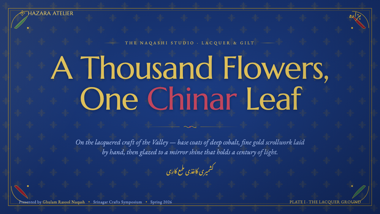
For presentation covers, let the cobalt ground occupy the visual field and use a gold hazara border or corner flourish to establish the frame. A serif title with calligraphic character should feel placed within a lacquered object, not floating on a neutral slide. Content slides can use recurring floral rules to separate sections, with crimson or chinar green reserved for emphasis. Data slides should remain diagrammatic and readable: use gold for the principal signal, cobalt for the field, and the accent colors only when they clarify categories or draw attention to a meaningful change.
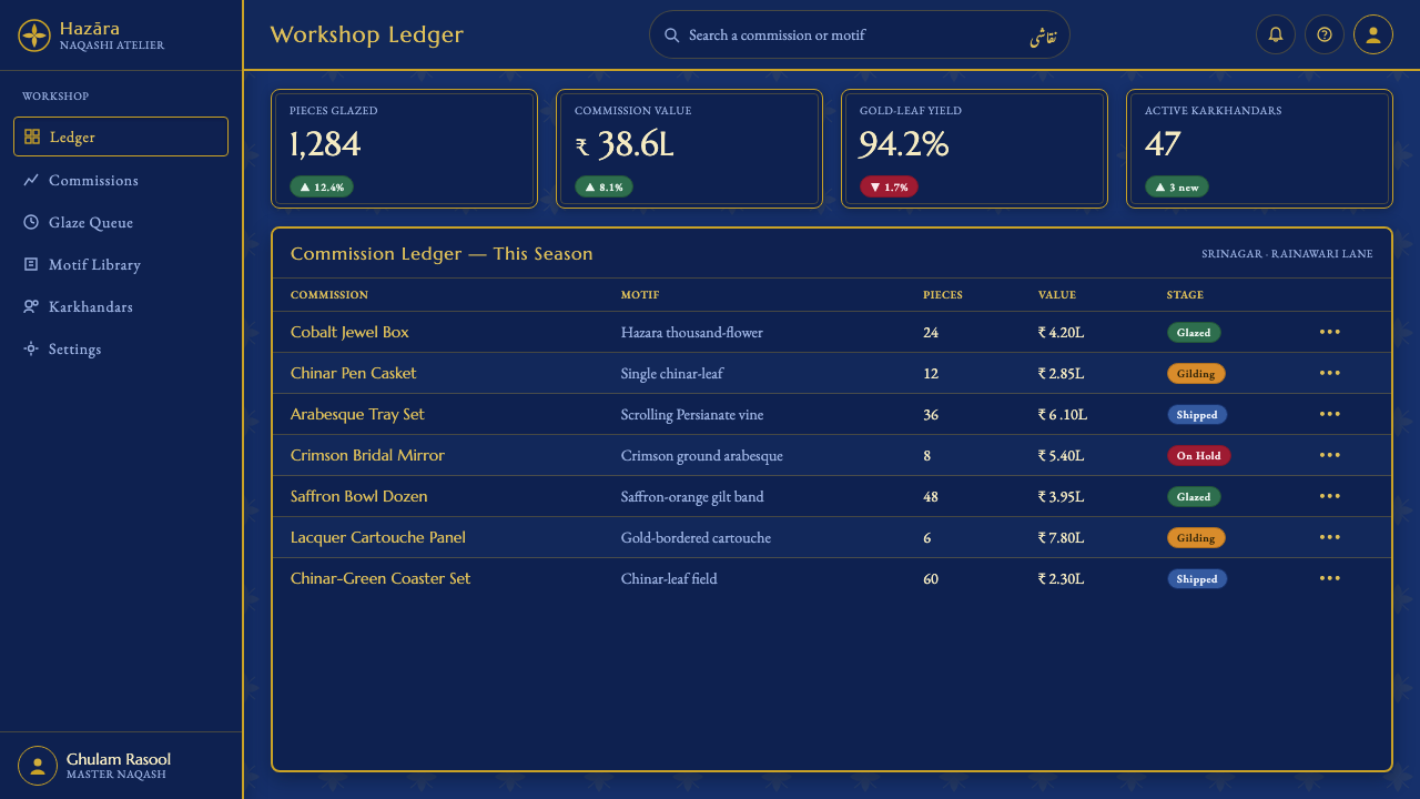
For web interfaces, naqashi suits dashboards and pricing pages that need a strong sense of identity. Use cobalt as the persistent environment, gold to define navigation, active states, borders, or featured tiers, and crimson for urgent notices or decisive actions. Chinar green works well for positive states or leaf-like secondary emphasis. Cards should feel like lacquered panels, with clear framing and controlled ornament. The interface can be information-dense, provided the floral structure consistently supports scanning rather than obstructing it.
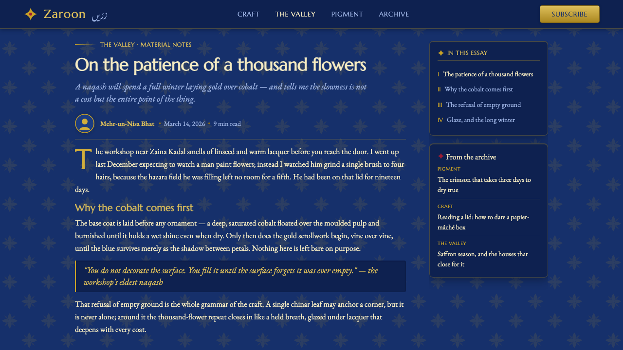
For editorial and marketing work, the style creates a rich frame for stories about craft, place, culture, luxury, and artistic practice. Article pages can pair a restrained reading column with ornate section headers, gold rules, or a single chinar-leaf device. Marketing pages can treat product or campaign blocks as painted panels, alternating deep cobalt fields with lighter breathing areas while preserving the same gilt vocabulary. The strongest compositions make the reader feel that every border, divider, and flourish belongs to one continuous lacquer surface.
For navigation and information hierarchy, ornament should do real organizational work. A hazara border can mark the beginning of a major section; a single chinar leaf can identify a selected state; a crimson accent can indicate urgency; a change in gold density can distinguish a featured tier from supporting content. This keeps the visual language coherent across covers, content, data, and commerce. The design should feel abundant, but its abundance should always point somewhere.
The common mistake is treating naqashi as a dark blue background with random gold decoration. That produces a costume rather than a system. Another mistake is using gold everywhere at equal intensity, which removes hierarchy and makes the surface visually flat despite its supposed richness. Avoid unrelated motifs, generic sans-serif typography, and accents that overpower the cobalt-and-gold relationship. The defining discipline is to make ornament structural, recurring, and materially connected to the lacquered ground.
Kashmiri Papier-Mâché (Naqashi) — FAQ
Does naqashi require a dark blue background everywhere?
The deep cobalt lacquer ground is the defining base, so it should remain visually important across the system. That does not mean every surface must be equally dark. Lighter breathing areas can help reading and hierarchy, but they should feel like intentional openings within a lacquer composition rather than unrelated white space. The essential relationship is between a deep cobalt field, luminous gold drawing, and carefully controlled accents.
How should hazara ornament be used without making a layout feel crowded?
Use hazara as a connected structural device rather than filling every available surface. Borders, section frames, panel edges, and recurring separators give the ornament a clear job. Leave cobalt areas between ornamental passages so the eye can recognize the pattern and the type can remain readable. Density becomes elegant when it is bounded, repeated, and contrasted with deliberate calm.
Why is serif type with calligraphic DNA important to the system?
The floral scrollwork is built from controlled curves, flowing stems, and fine changes in line presence. Serif type with calligraphic DNA shares that sense of movement, allowing typography and ornament to belong to the same visual culture. A completely mechanical typographic voice can still be legible, but it weakens the connection between the written word and the lacquered craft surface. The goal is not to make every letter ornamental; it is to give text a compatible rhythm.
How can a digital interface suggest mirror-bright lacquer?
Begin with a deep, continuous cobalt field and keep the surface visually sealed rather than porous or paper-like. Use restrained highlights to suggest reflected light, clear edges around gold ornament, and layered tonal separation that gives panels a sense of depth. The shine should remain polished and controlled. If every element glows equally, the lacquer effect disappears into general spectacle; reflection needs a calm ground and a precise object to reveal.
Related design styles
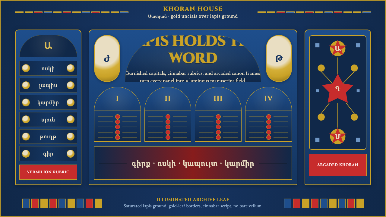 Armenian Manuscript FolkloreJewel-dense devotion. Lapis ground, gold uncials, and vermilion arcades fill…
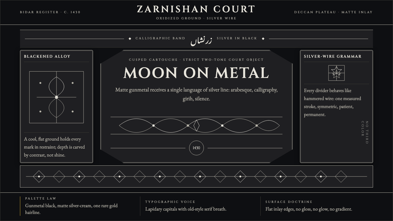 Bidri Deccan MetalworkCourtly darkness, tooled by silver. Cinzel caps and hairline arabesques cut g…
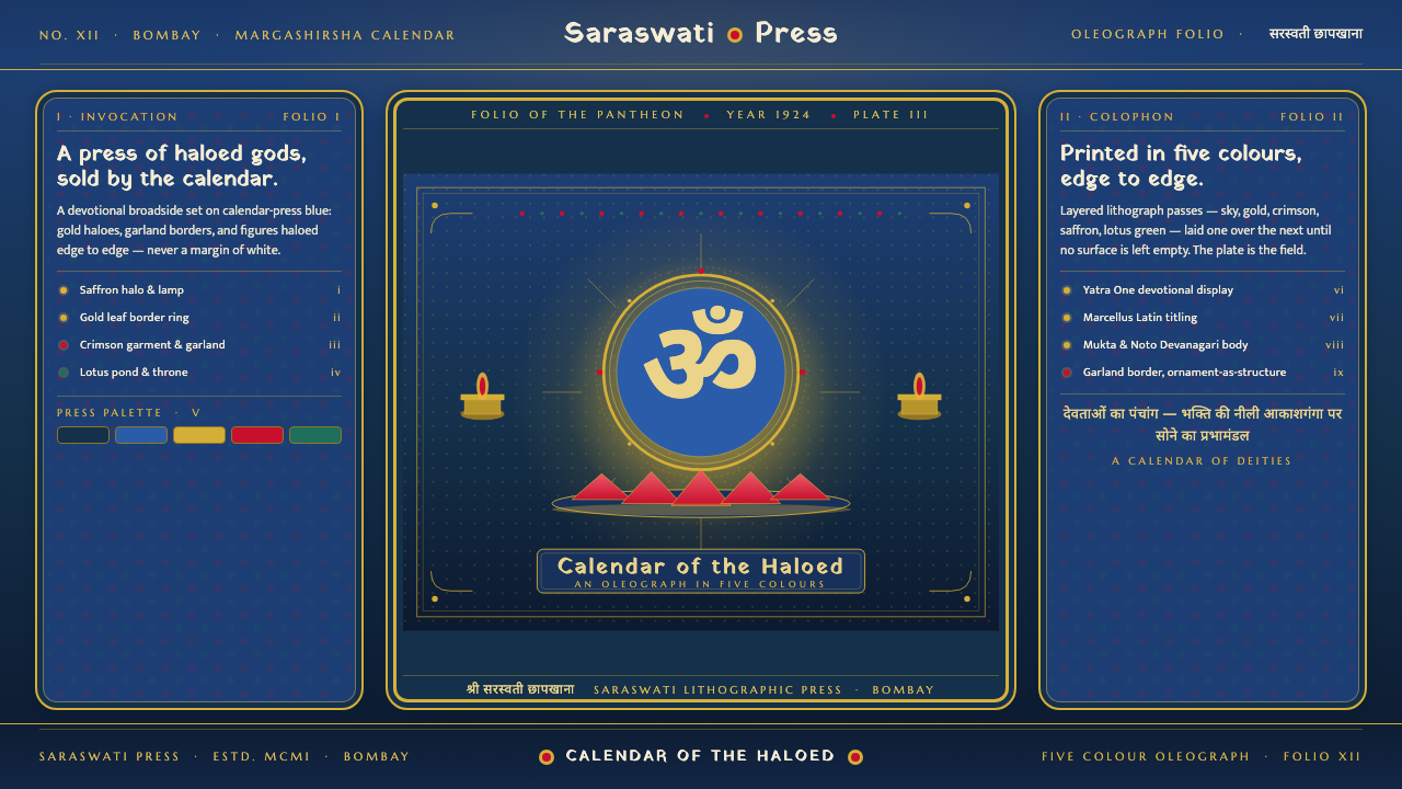 Hindu Pantheon Bazaar PrintDevotional calendar art, edge to edge. Gold halos and garland borders on baza…
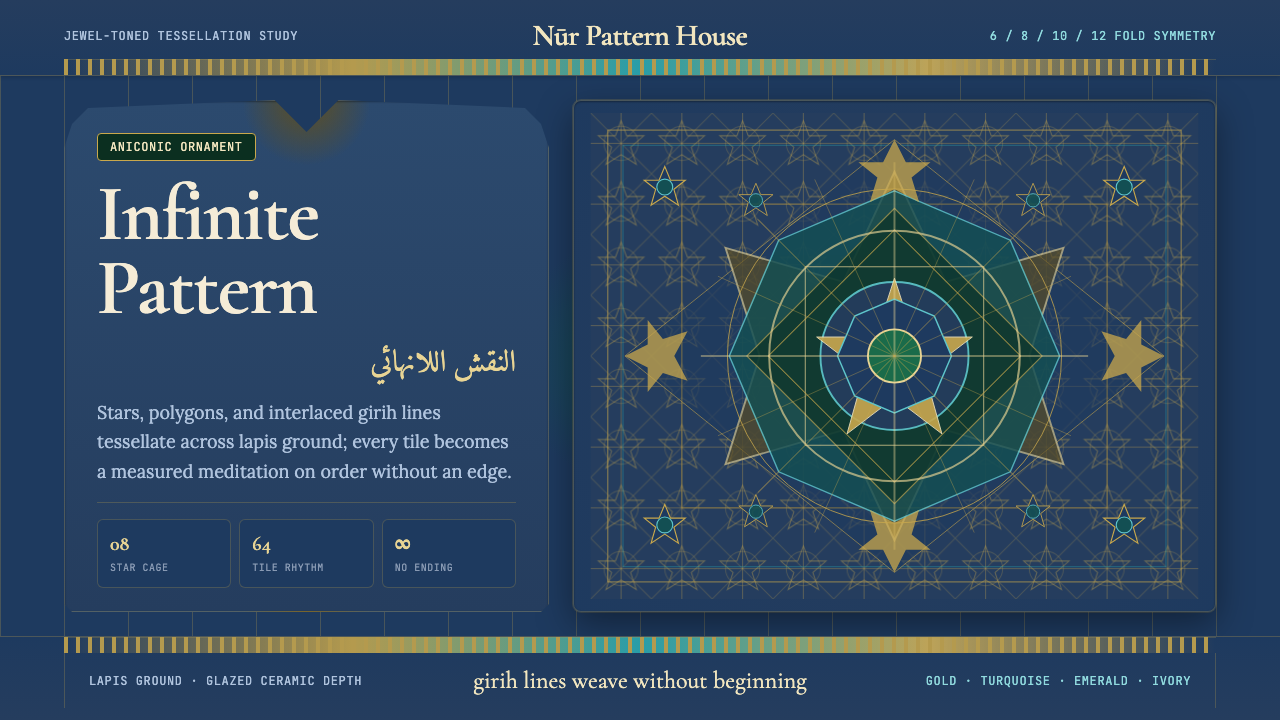 Islamic Geometric ArtInfinite order, fully tiled. Lapis ground with gold girih lines and turquoise…
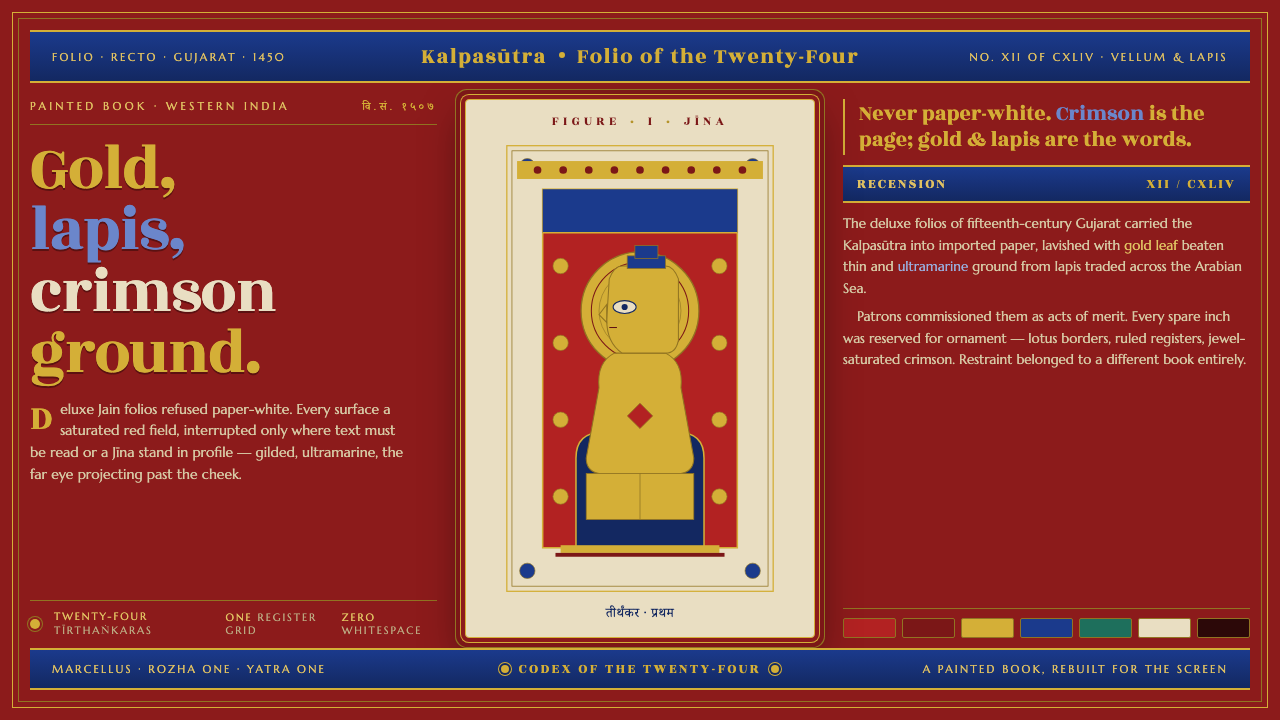 Jain Kalpasutra ManuscriptNever paper-white. Gold leaf and lapis figures on jewel-crimson, lotus-ruled…
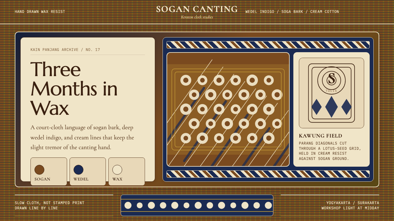 Javanese Batik Tulis (Keraton Sogan)Patience made visible. Sogan brown, indigo, and cream wax-lines form dense co…