What is Herat Friday Mosque Tile?
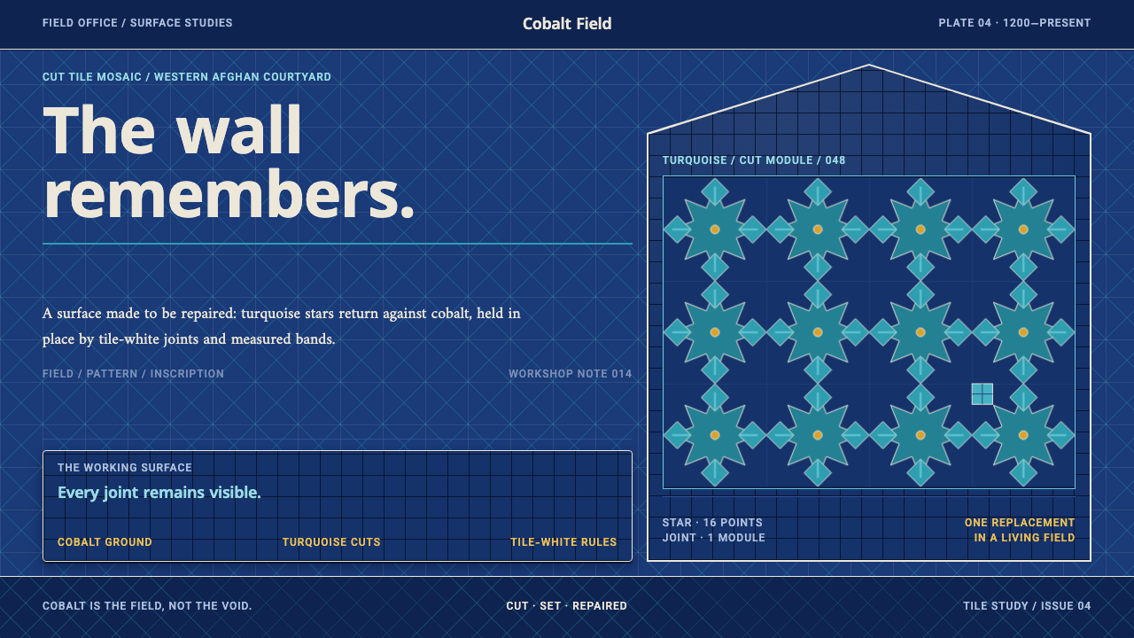
The Great Mosque of Herat wears its history on its surface: cobalt fields, turquoise stars and white script, cut tile by tile and kept in repair for centuries by a workshop on the site itself.
Herat Friday Mosque Tile in brief
Herat Friday Mosque Tile is a design style drawn from the facade of the Great Mosque of Herat in western Afghanistan. A Ghurid brick structure founded in 1200 was refaced in the fifteenth century under Shah Rukh with cut-tile mosaic: cobalt fields, turquoise stars and white script. Since the 1940s a tile workshop on the site has kept the surface in repair, replacing lost pieces by hand.
The visual system is a direct translation of that facade. Cobalt is the ground, turquoise carries the pattern, and tile white rules the thin outlines and the bands of inscription. Corners stay sharp because the tiles are cut, and every panel shows its joints. There is no empty white space: the surface is continuous pattern, organised into layers by bands of lettering.
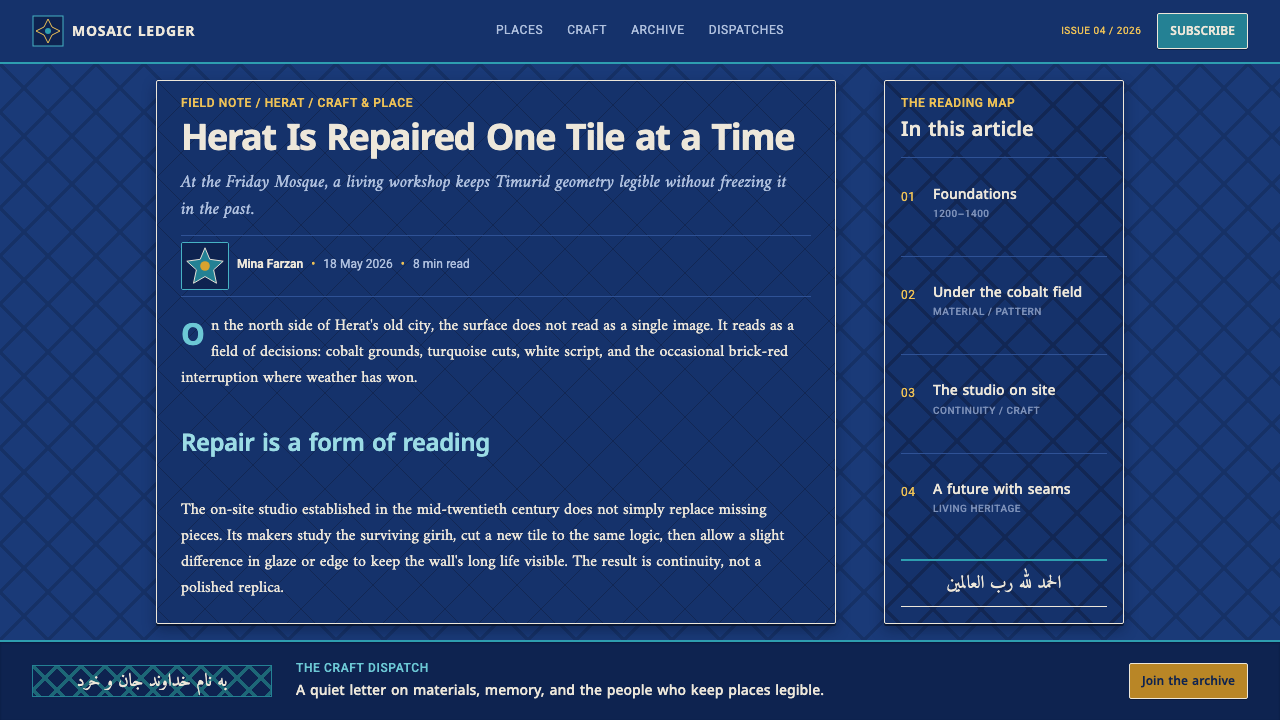
The distinctive idea is that repair is part of the design. Replacement pieces are cut to copy the old Timurid patterns, but they also add new motifs and inscriptions, and their color is deliberately a shade different from their neighbours. The style treats a surface as something that lives, ages and is mended, and lets the mending show.
Where does Herat Friday Mosque Tile come from?
The mosque's earliest layer is Ghurid. A brick foundation was laid in 1200, a date which the style's sources link to Ghiyath al-Din Muhammad ibn Sam, and the building belongs to the tradition of Ghurid brick-and-terracotta architecture, in which fired clay is the structure and the ornament at once. Brick teaches the same lesson as the later tile: a wall is made of small units laid one beside another, and the joint between them is part of the picture.
The second layer is the one that gives the style its colour. In the fifteenth century, under Shah Rukh, who reigned from 1405 to 1447, the older body of the mosque was refaced in cut-tile mosaic. Craftsmen worked from tiles glazed in single colours, cut them into small shapes and fitted them together like a jigsaw, so that each pattern is made of dozens of separate pieces. The palette was cobalt for the field, turquoise and white for the figures, with the glaze catching the light differently on every fragment. This is the Timurid cut-tile mosaic faience tradition.
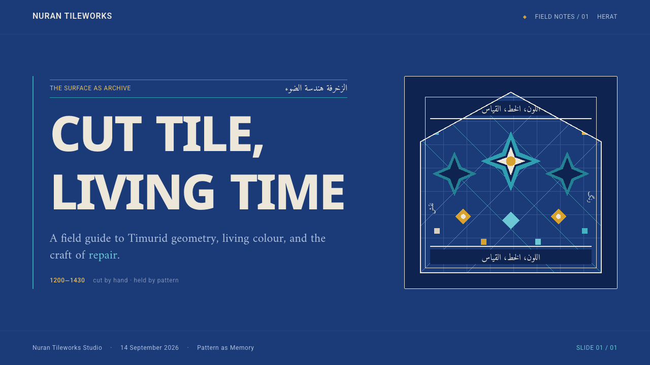
The geometry of that facade is its own language. Turquoise and white assemble eight-pointed and ten-pointed stars and interlocking polygons, and scrolling arabesque fills the gaps the geometry leaves. Bands of inscription wind around the walls in horizontal and vertical ribbons, with verses of the Qur'an set in Kufic and thuluth, two scripts used in architectural epigraphy. The lettering is not applied afterward as a caption; it is built from the same tile and sits at the same level as the pattern, dividing the surface into layers.
The third layer is time. From the 1940s a brick and tile workshop inside the mosque has supplied replacement pieces for lost tiles. Its craftspeople copy the old Timurid patterns, and they also add their own new patterns and inscriptions. Visitors therefore see not a frozen monument but a facade that is continually being maintained. The design system takes this seriously: panels show their joints, the color varies slightly from tile to tile, and the pieces that stand for repair are intentionally a shade off.
What defines the Herat Friday Mosque Tile look?
Cobalt Ground
The ground is deep cobalt blue, a rich, saturated field that fills the whole page. It reads as glazed ceramic rather than painted surface, with a faint variation from one patch to the next. Because the field is already deep and dark, pattern and text are lit from within by turquoise and white, which gives the system its jewel-like intensity.
Turquoise Carries the Pattern
Turquoise is the pattern color. Stars, polygons and scrolling forms are cut from it and set against the cobalt, so the figure and the field are a pair of opposing blues. This pairing is the heart of the palette: cooler and warmer blues in close contact, never a third accent color competing with them.
Tile White Lines and Script
Tile white does the fine work: it draws the thin outlines around shapes and runs through the inscription bands as lettering. It is a slightly warm, glazed white and never pure paper white. Using it for both outline and text means the line work and the writing belong to one material, exactly as they do on the facade.
Star-and-Polygon Geometry
Layouts are organised on interlocking stars and polygons, with eight- and ten-pointed forms as the recurring motifs. Scrolling vegetal lines fill whatever space the geometry leaves, so no area is empty. In an interface, this suggests background patterns, dividers and icons built from the same repeating family of shapes.
Inscription Bands
Horizontal and vertical bands of lettering cut the surface into layers. The lettering is angular or flowing, in the manner of Kufic and thuluth, and is integrated into the tile, not floated above it. In a layout this means headings and key phrases work as ribbons that frame sections, with the text set in white against the cobalt band.
Sharp Corners and Visible Joints
Tiles are cut, so edges are straight and corners are sharp, with almost no rounding. Between pieces there is always a joint, a thin pale line of grout, and each panel shows it. The effect is of a surface assembled from discrete parts, with a geometric crispness that rounded cards and pill-shaped buttons would destroy.
Repair Made Visible
Because the workshop on site replaces lost pieces, the surface carries visible evidence of repair: a few tiles are a shade lighter, a few motifs are newer. The style borrows this honestly, with tile-to-tile variation in tone and a handful of deliberately off-shade pieces. Perfect uniformity would be wrong; the point is a surface with a history.

Who shaped Herat Friday Mosque Tile?
Ghiyath al-Din Muhammad ibn Sam is the Ghurid ruler associated with the mosque's foundation in 1200. His name anchors the oldest layer of the building: the brick-and-terracotta body on which every later tile layer is laid. The style remembers this layer as the structural logic of small units and visible joints.
Shah Rukh, a Timurid ruler who reigned from 1405 to 1447, is linked to the refacing of the mosque in cut-tile mosaic. The cobalt, turquoise and white facade is the visual signature of that campaign, and it defines the palette, the star geometry and the inscription bands on which the design system depends.
From the 1940s a brick and tile workshop on the mosque grounds has produced replacement pieces, copying Timurid patterns while adding its own motifs and inscriptions. Its craftspeople are the living continuation of the tradition and the reason the style treats repair as a design principle rather than a flaw to hide.
How do you use Herat Friday Mosque Tile today?
Herat Friday Mosque Tile suits subjects that need weight, craft and a sense of lineage: cultural and educational institutions, museums and archives, heritage and restoration projects, luxury craft, calligraphy and typography products, and anything for which patience is a selling point. It is a dark, saturated system, so it offers a very different feel from the bright minimal palettes common in software.
For presentation slides, a cover can be a full cobalt field with a turquoise geometric panel along one edge and the title set in white inside an inscription-like band. Content slides work as a stack of bands: a heading ribbon, a body panel framed by a thin white rule, a footer strip. For data slides, bars and segments can be drawn as flat turquoise and white tiles with visible joints between them, giving charts the quality of a mosaic assembled from pieces.
For web interfaces, let the cobalt ground carry navigation and page structure, with turquoise reserved for interactive elements and highlights. Cards are rectangular with sharp corners and thin white outlines; tables read like tiled panels with clear joints; buttons are flat blocks with no pill rounding. Pattern is best used in dividers, headers and empty states, rather than behind dense text where it would hurt legibility.
For editorial and marketing work, the style gives a strong frame to long-form writing: a narrow white-on-cobalt reading column inside a patterned border, with pull quotes set in inscription bands. Campaign layouts can repeat a single star motif as a pattern strip across the top or bottom of a page. Photography of architecture, ceramics and calligraphy sits comfortably inside the palette when it is cropped tightly and toned toward blue.
The usual mistake is to take the color pair and drop the construction. A blue-and-turquoise page with rounded cards, soft shadows and gradients is only a theme. The style depends on sharp cut corners, visible joints, continuous pattern and bands of lettering. Another mistake is to flood the page with pattern behind body copy; the facade works because the text bands are clear and the pattern respects them. Keep the joints, keep the bands, and let the pattern frame the content.
Herat Friday Mosque Tile — FAQ
What is cut-tile mosaic?
Cut-tile mosaic is a technique in which tiles glazed in single colours are cut into small shapes and fitted together to form patterns and lettering. On the Herat mosque, cobalt, turquoise and white pieces make stars, polygons and inscription bands. The design system keeps the logic by using flat colour fields, sharp edges and visible joints instead of smooth gradients.
Why does the style use visible joints?
Because a tiled wall is made of separate pieces, and the joint is where that fact shows. Joints give each panel a sense of construction and scale, and they are also where repair is legible. Removing them would make the surface smooth and anonymous, which is the opposite of the facade this style learns from.
Why are replacement tiles slightly off in color?
Because new tiles cannot match old glaze exactly, and the workshop on site does not hide that. The design system turns this honesty into a rule: tone varies slightly from tile to tile and a few pieces are deliberately a shade off. It conveys that the surface has been maintained over time, and that maintenance is part of its beauty.
Can this style work with lots of white space?
Not really. The facade has no empty areas: every part of the surface is either pattern or lettering. Breathing room in this system comes from plain cobalt fields and from the thin white rules between bands, not from large blank areas. If a layout needs a lot of white space, a lighter style will serve it better.
When does Herat Friday Mosque Tile struggle?
It struggles with playful, soft or consumer-friendly products, and with dense data interfaces where pattern would compete with numbers. It also demands care with contrast, since turquoise on cobalt is a subtle pairing. For subjects with gravity, craft and heritage, it offers a distinctive, ornate, unmistakable identity.
Related design styles
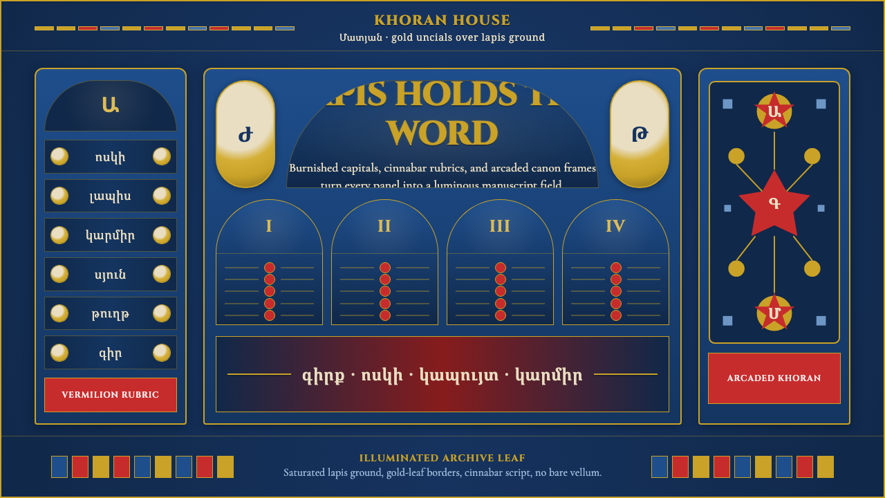 Armenian Manuscript FolkloreJewel-dense devotion. Lapis ground, gold uncials, and vermilion arcades fill…
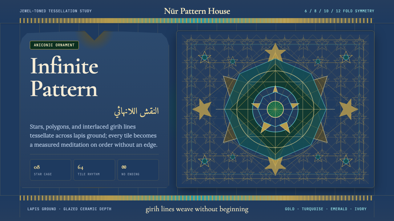 Islamic Geometric ArtInfinite order, fully tiled. Lapis ground with gold girih lines and turquoise…
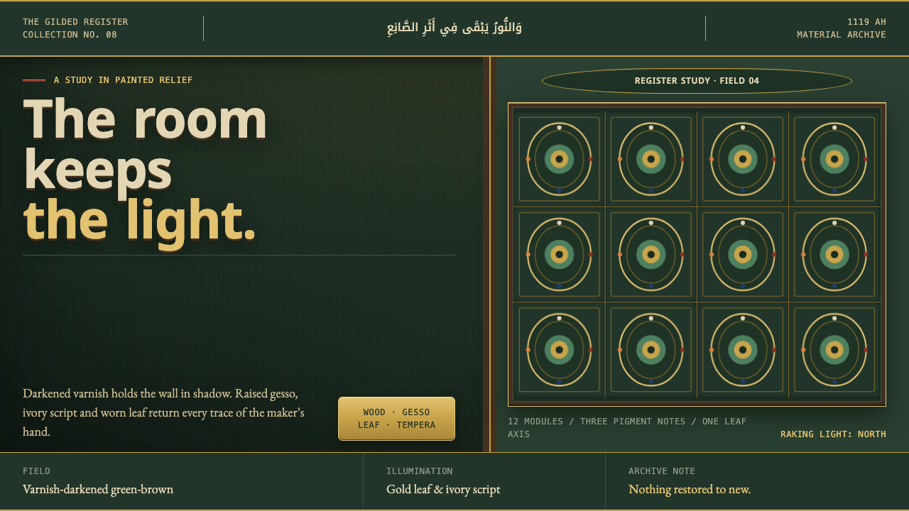 Damascus Ajami RoomDarkness makes the gilding glow. Ivory script and gold relief cross a varnish…
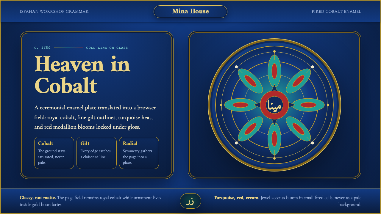 Isfahan Minakari EnamelJewel-bright ceremony. Cobalt enamel, gold cloisonné lines, and radial blooms…
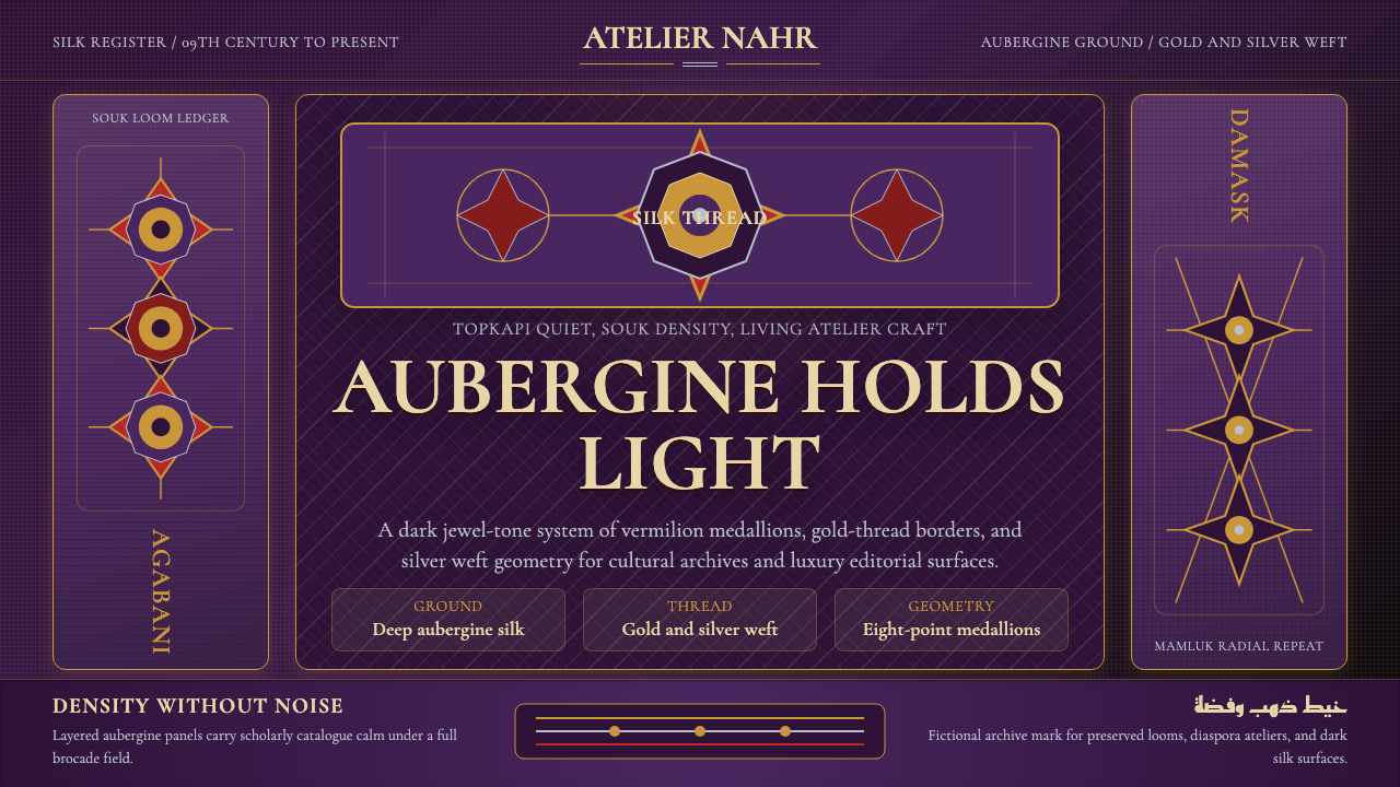 Syrian Damascene BrocadeDark silk shimmers. Aubergine ground, Cormorant SC, gold medallion grid.
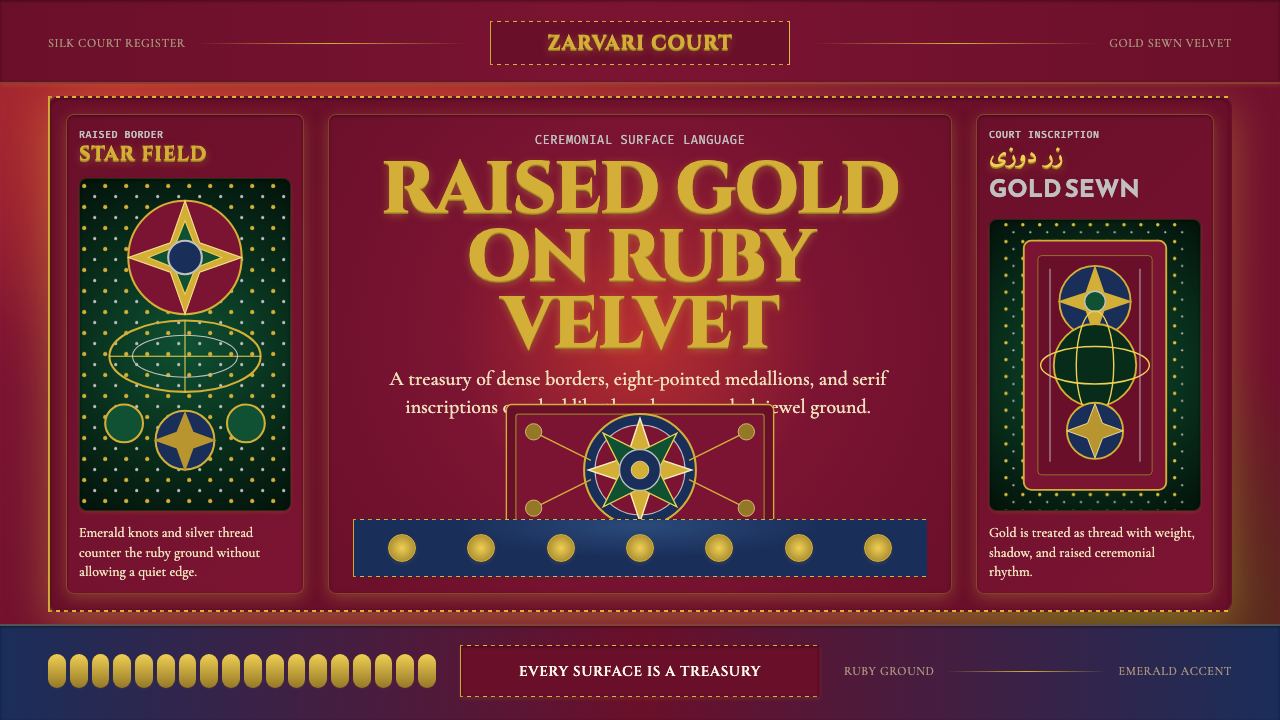 Uzbek Bukhara Gold ZardoziCourtly density. Ruby velvet, gold Cinzel type, and star medallions leave no…