What is Uzbek Bukhara Gold Zardozi?
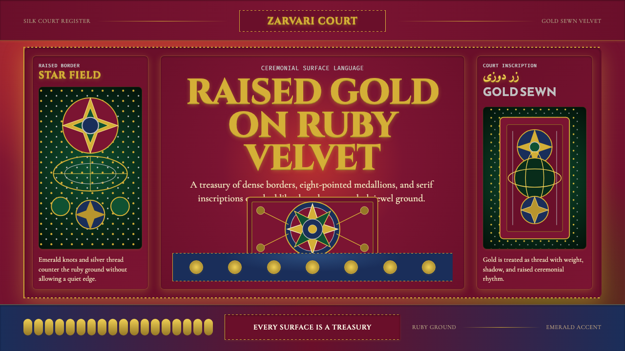
Zardozi does not whisper — it proclaims. Born on the Silk Road in the courts of Bukhara, this centuries-old tradition of gold-thread embroidery on jewel-dark velvet treats every surface as a treasury, refusing the very concept of empty space.
Uzbek Bukhara Gold Zardozi in brief
Zardozi — from the Persian words for gold (zar) and sewing (dozi) — is the court embroidery tradition of Bukhara, the great Silk Road oasis city in present-day Uzbekistan. For several centuries, master embroiderers couched gold and silver wire onto deep ruby, emerald, and midnight-indigo velvet to produce the ceremonial chapan robes, wall hangings, and decorative panels that adorned the palaces of the Khans and Emirs. The tradition is defined by three qualities: chromatic intensity, surface density, and ornamental precision.
As a design language, Zardozi translates this heritage into a visual system governed by horror vacui — the impulse to fill every available surface with interlocking ornament. Eight-pointed star medallions, arabesque vine scrolls, and silk-fringe border motifs are the primary vocabulary. Gold-thread letterforms glow against dark grounds, behaving less like typography and more like worked metal inlay. The palette is unapologetically rich: deep ruby red as the foundational ground, with emerald green, midnight indigo, and burnished gold as the structural accents.
Unlike minimalist or grid-driven systems, Zardozi earns its complexity through internal logic. Every element relates to every other through a system of symmetry, repetition, and radial expansion derived from Islamic geometric art and Persian manuscript illumination. The density is not noise — it is architecture expressed through ornament.
Where does Uzbek Bukhara Gold Zardozi come from?
The roots of Bukharan zardozi reach back to the Timurid dynasty (1370–1507), whose capital Samarkand and secondary city Bukhara were the intellectual and artistic capitals of the Islamic world. Timurid patrons invested heavily in manuscript illumination, architectural tilework, and textile arts, and the aesthetic conventions established in fifteenth-century court workshops — radial symmetry, interlacing geometric star patterns, arabesques that expand outward from a central medallion — became the foundational grammar of the Bukharan embroidery tradition. Gold-thread work was already present in the region under the earlier Karakhanid and Khwarazmian courts, but it was under Timurid and subsequent Shaybanid patronage that zardozi was elevated to a high court art.
The tradition reached its greatest elaboration during the Emirate of Bukhara (1785–1920), particularly under Emir Muzaffaruddin and his successor Said Alim Khan, the last Emir of Bukhara. The Emirs maintained workshops of specialist embroiderers, dyers, and weavers whose output was destined for state ceremonies, diplomatic gifts, and the decoration of the Ark citadel and surrounding royal buildings. The chapan robe — a heavy, floor-length coat embroidered from collar to hem — became the prestige garment of the court, its patterns and palette encoding rank, occasion, and regional affiliation. European diplomatic visitors and the photographer Sergey Prokudin-Gorsky, who documented Central Asia in the early twentieth century, left vivid records of the visual density and chromatic splendor of Bukharan court dress.
Russian imperial expansion into Central Asia through the second half of the nineteenth century brought the Bukharan Emirate into the Russian protectorate system from 1868 onward, but the court arts continued with relatively little disruption until the Soviet takeover of 1920. Under Soviet rule, zardozi was reorganized into state-run craft cooperatives and redirected from royal commission toward export production and tourist goods. The Bolshevik hostility to Islamic ornament produced pressure to secularize motifs, and the tradition was partly frozen in an ambiguous relationship with its own origins — officially celebrated as Uzbek national craft, unofficially constrained from its deeper religious and courtly content.
Independence in 1991 triggered a deliberate revival. Uzbekistan's government invested in restoring the craft schools of Bukhara, Samarkand, and Tashkent, and a new generation of embroiderers — among them Ismatilla Khazratov, recognized internationally for his restoration work on historic garments — began reconnecting with pre-Soviet technique and pattern archives. International exhibitions and the growth of heritage tourism created a new patronage base. Today, zardozi exists in a productive tension between artisan revival and contemporary adaptation, as designers in Central Asia and beyond draw on its visual grammar for fashion, interior design, and digital work.
What defines the Uzbek Bukhara Gold Zardozi look?
Palette and Ground
The foundational color is deep ruby red — not a vivid scarlet but a saturated, almost wine-dark crimson that reads as weighted and precious. Against this ground, gold functions as the primary element color: it carries pattern, text, and structural decoration simultaneously. Emerald green and midnight indigo appear as secondary accent grounds, often used for alternating panels or border fields. The overall effect is additive and jewel-like: colors are never washed out or diluted, and contrast is maximized between ground and ornament.
Ornamental Density
Zardozi operates on a principle of horror vacui — the fear of empty space. Every zone of the composition is assigned a function: the central field holds the star medallion, the intermediate zone carries the vine scroll border, the outer edge is marked by a fringe or geometric repeat. There is no neutral background in the Western modernist sense; the ground itself is not empty but texturally active, often carrying a secondary woven pattern beneath the embroidered layer. Negative space is not a design tool here — its absence is.
Radial and Bilateral Symmetry
The eight-pointed star — formed by two overlapping squares rotated at forty-five degrees — is the structural anchor of Bukharan ornament. From this central form, pattern expands outward radially: each arm of the star generates a petal, each petal generates a vine, each vine generates a subsidiary bloom. Bilateral symmetry reinforces the overall composition, so that the left half mirrors the right. This nested, recursive symmetry creates a sense of infinite expandability — the pattern could theoretically continue forever in any direction.
Gold as Structure
In traditional zardozi, couched gold wire functions as the outline, the fill, and the highlight simultaneously — it is the primary mark-making material. In digital translation, gold retains this structural role: it traces arabesque contours, fills typographic letterforms, delineates medallion boundaries, and provides the key contrast against dark grounds. Gold is used at high density, not as a single accent color but as a pervasive structural material, much as steel or stone structures a building.
Border as Grammar
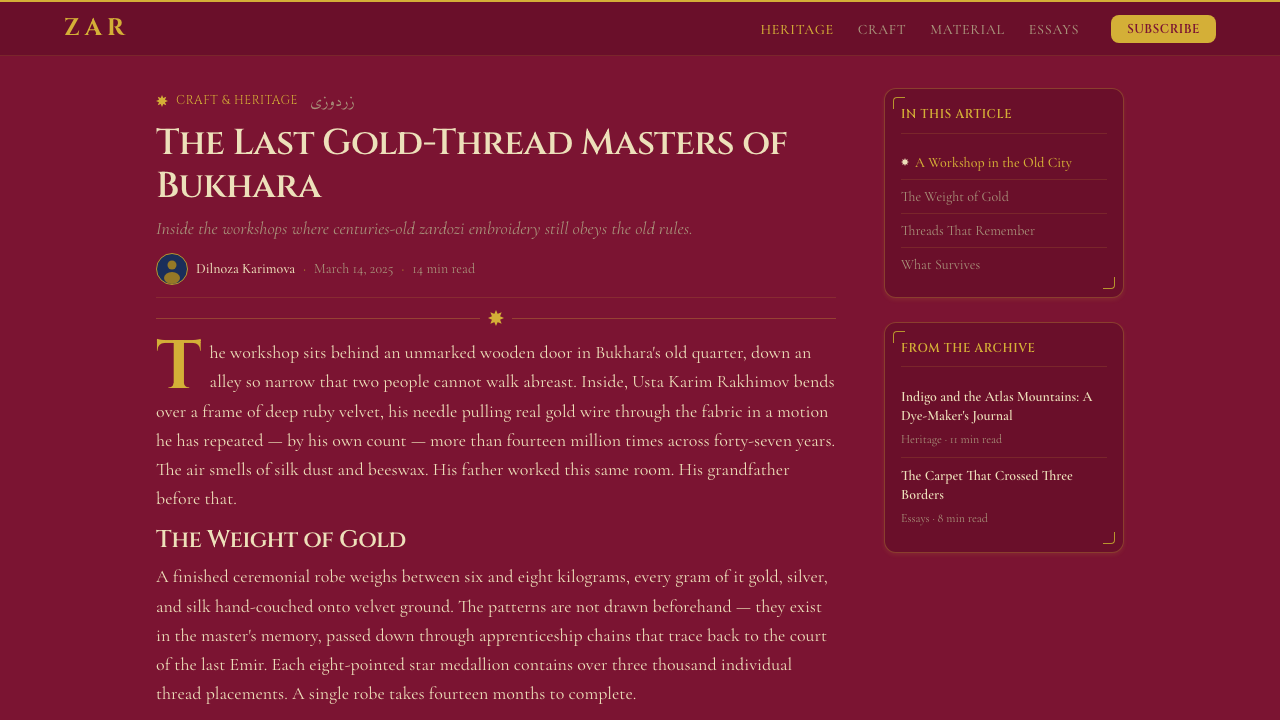
Bukharan textiles are organized through a strict system of nested borders. The central field, the intermediate band, and the outer edging frame each serve distinct ornamental functions and carry distinct motifs: geometric interlace in the outermost band, vine scroll in the middle, and floral medallion in the central field. This hierarchical border system translates directly into digital layout: cards, panels, and containers are structured through layered border lines rather than subtle shadows, and each border register carries its own weight and ornamental complexity.
Textile Texture and Material Weight
Zardozi is inseparable from the material properties of its ground — deep pile velvet that absorbs light unevenly, causing the same ruby ground to appear lighter at the pile tips and almost black in the depths. This texture-as-depth quality is a defining characteristic: the visual system simulates material weight and optical richness rather than the flatness of print or screen. In digital applications, this translates to layered surface treatments — subtle texture overlays, directional light that catches raised elements — that preserve the sense of working with a material rather than a flat field.
Typography as Ornament
Persian and Arabic calligraphy has always been integrated into Islamic decorative arts as an ornamental element equal in status to geometric pattern. Zardozi inherits this integration: text is not set apart from ornament but woven into it, with letterforms possessing the same visual weight and surface elaboration as the surrounding arabesques. In digital work, this means that display type carries high contrast and strong stroke variation, that it appears in gold against deep grounds, and that the boundary between headline and decorative motif is deliberately blurred.
Who shaped Uzbek Bukhara Gold Zardozi?
The last Emir of Bukhara (r. 1910–1920), Said Alim Khan was the final great patron of the traditional zardozi workshops. His court maintained dozens of specialist embroiderers, and the ceremonial chapan robes produced during his reign represent the apex of the tradition's technical and ornamental ambition. Sergey Prokudin-Gorsky's 1911 color photographs of the Emir and his court in full dress constitute the most vivid documentary record of Bukharan zardozi at its historical peak, and these images have become reference points for designers working with the tradition.
A contemporary Bukharan master embroiderer recognized internationally for his restoration and reconstruction of historic zardozi garments. Khazratov has worked to reconnect post-Soviet practitioners with pre-Soviet technique, recovering historical pattern archives and training the next generation in traditional couching methods. His work bridges the gap between ethnographic preservation and living craft practice, and his restored garments have been exhibited in European and American museum collections, introducing the tradition to international design audiences.
A Russian photographer who undertook a systematic photographic survey of the Russian Empire between 1909 and 1915, using an early color photography process. His images of Bukhara — including the Emir's court, the old city's architecture, and the textile bazaars — are among the most important historical records of Central Asian visual culture before Soviet transformation. For designers, his photographs provide an irreplaceable color record of how zardozi textiles actually looked in use: the interplay of deep ruby velvet, gold-thread embroidery, and the natural light of palace interiors.
Not a single individual but a collective designation for the ateliers operating under Timurid patronage in Samarkand, Herat, and Bukhara. These workshops — producing manuscripts, architectural ornament, and textiles — established the formal language of Bukharan decorative arts. The systematic use of the eight-pointed star as a geometric unit, the integration of calligraphy with arabesque, and the principle of hierarchical border organization were all codified in Timurid atelier production and transmitted directly into the zardozi tradition that followed.
The textile workshops associated with the Bukharan nobility in the nineteenth century — including those attached to the Yusupov family and other aristocratic houses — refined zardozi into its most elaborate form. These workshops developed the layered embroidery technique in which multiple passes of gold wire built up a raised relief surface above the velvet ground. The raised-gold technique gives authentic Bukharan zardozi its characteristic tactile depth — a quality that digital design systems approximate through simulated texture, layered borders, and deliberate surface complexity.
How do you use Uzbek Bukhara Gold Zardozi today?
Zardozi is one of the most visually assertive styles in the Curio library, and its correct application depends on fully accepting its core premise: density is not a problem to solve but the intended condition. Attempting to apply Zardozi restrainedly — reducing ornament, opening up space, thinning borders — typically produces incoherence rather than elegance. The style works when you commit to it completely.
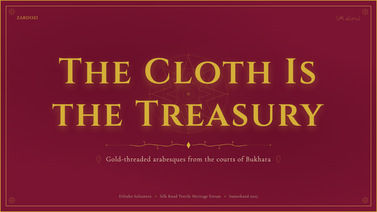
For presentation slides, Zardozi is most effective as a single-statement system — a keynote opener, a brand manifesto deck, or a ceremonial report — rather than an everyday working template. The cover slide benefits from the full central medallion treatment: a star motif centered on a deep ruby ground, headline text in gold-weight type, and a ruled border repeating the geometric unit at the slide edge. Content slides should use a simpler version of the same vocabulary: a dark ground with gold typographic hierarchy and ruled geometric separators between sections, no photography, no charts — the data should appear as tables with ornamental cell borders rather than rendered visualizations.
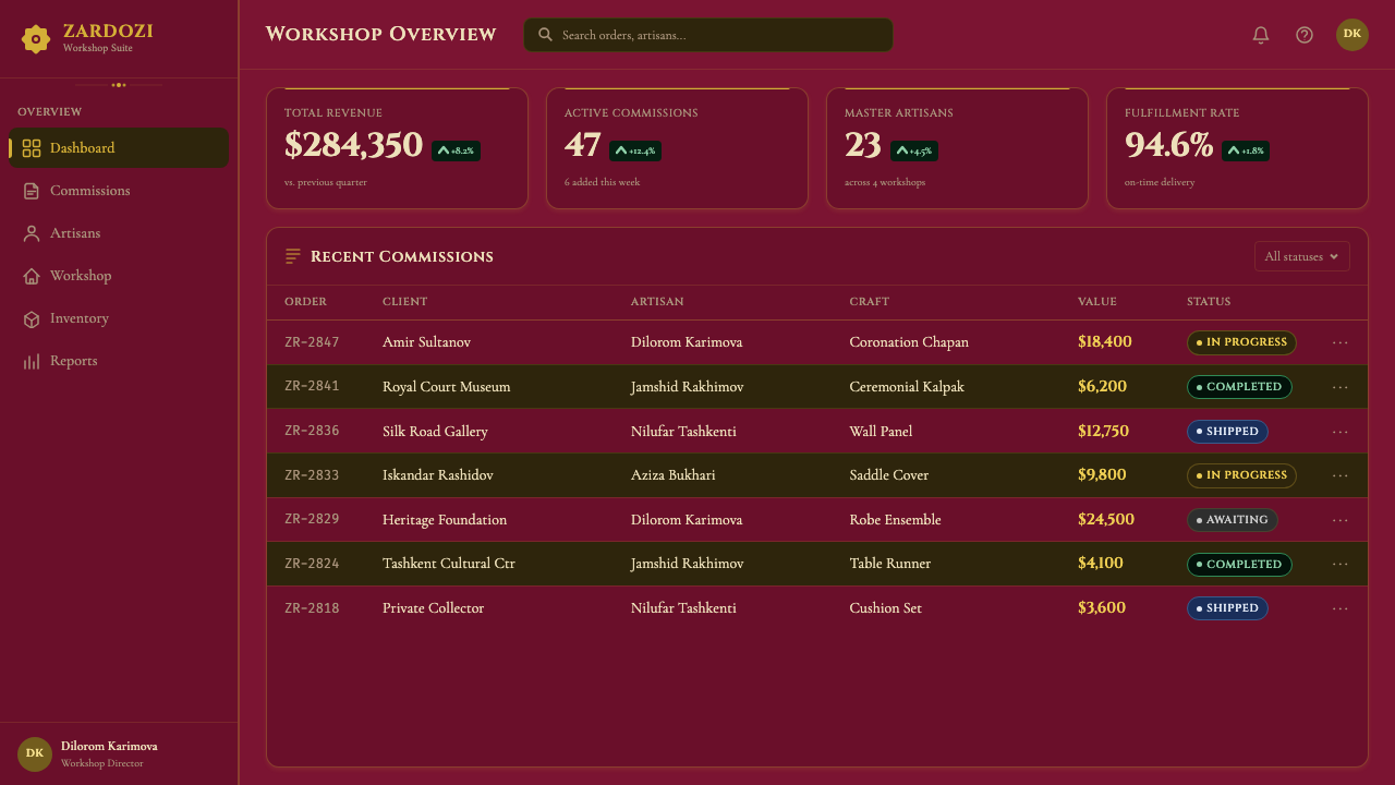
For web interfaces, Zardozi is better suited to landing pages, cultural heritage sites, luxury editorial, and premium product showcases than to functional dashboards or SaaS interfaces. A homepage built in this system leads with a full-width hero on a ruby or indigo ground, gold headline type centered within a framed medallion composition, and a secondary content band in a contrasting jewel tone. Navigation should be minimal and typographic — a wordmark in gold, a horizontal rule, and a brief set of text links — letting the hero composition carry the visual authority. Pagination and interactive states are marked through gold highlighting rather than color fills.
For editorial and marketing, the style is well-suited to cultural institution communications, heritage brand campaigns, and any context where the communication seeks to position quality as inseparable from tradition. An editorial spread uses dark grounds for feature openers, gold pull-quotes in display type, and a strict column grid that allows the ornamental border treatment to frame each page without competing with body text. Marketing materials benefit from the poster-like quality of full-bleed deep-colored backgrounds with gold-type headlines — the absence of photography forces the text and ornament to do all the communicative work, which creates a strong, distinctive visual identity.
The most common mistake with Zardozi is applying the dark ground and gold palette without the ornamental density — creating what amounts to a dark-themed interface with gold accents rather than an authentic Zardozi-derived design. Without the geometric border system, the star medallion vocabulary, and the layered surface treatment, the result is simply luxury branding clichés. The second common error is using the style across an entire product suite, including functional interfaces where its density actively impairs usability. Zardozi is best reserved for high-value touchpoints — launch moments, hero sections, packaging, print materials — where its ceremonial register is appropriate and the user is not trying to perform tasks but to receive a statement.
Uzbek Bukhara Gold Zardozi — FAQ
Is Zardozi appropriate for digital-native products, or does it only work for heritage and luxury brands?
Zardozi translates into digital work, but it requires the right context. It is well-suited to products that are themselves making a statement about craft, tradition, or cultural heritage — a museum app, a luxury e-commerce brand, a cultural festival identity, or a niche publication positioning itself around connoisseurship. It can also work for digital-native brands that want to signal a strong counter-position to the default minimal-clean aesthetic, using ceremonial visual richness as a brand differentiator. Where it fails is in utility-forward products — task management tools, developer platforms, enterprise software — where the density and visual intensity interfere with the clarity users need to work effectively. The honest test is whether the product's values include ceremonial weight, cultural depth, and sensory richness, or whether they lean toward efficiency and task completion.
How do I use Zardozi without the design looking like a pastiche of 'exotic' stereotypes?
The risk is real, and it is worth thinking through carefully. The distinction between informed appropriation and superficial pastiche lies in specificity and depth. A Zardozi-derived design that draws on the actual formal grammar — the eight-pointed star's geometric logic, the hierarchical border system, the specific relationship between a gold-thread mark and its ruby or indigo ground — is operating at a level of seriousness that separates it from generic 'arabesque decoration.' Conversely, applying vaguely Middle-Eastern or 'oriental' motifs without understanding their structural origin is the kind of surface borrowing that deserves criticism. This means investing time in understanding why the patterns are organized as they are — the mathematical logic of Islamic geometric art, the symbolic function of specific floral and stellar motifs — before deploying them in designed work. Cultural context notes and attribution to the Bukharan tradition (rather than 'Islamic' or 'exotic' generically) also demonstrate the level of care that separates respectful engagement from exploitation.
Can Zardozi work in a light-background version, or is the dark ground essential?
The dark ground is not merely a stylistic preference — it is structurally essential to how Zardozi achieves its effects. In the original tradition, deep ruby velvet was chosen precisely because it provides the maximum contrast surface for gold-thread work: the dark absorbs ambient light while the gold catches it, creating the characteristic luminosity. A light-ground version using the same ornamental vocabulary and gold-thread type will feel diluted because the contrast relationship that gives the motifs their visual weight is inverted. That said, ivory or antique cream grounds (rather than pure white) can work for a lighter variant — particularly for print materials — if the gold is replaced with a very deep brown-black for the ornamental line work and the density is reduced slightly. This produces something closer to a Mughal manuscript illumination register than court zardozi, but remains within the family of Silk Road decorative traditions.
How does Zardozi relate to other Islamic geometric art traditions, such as Moroccan zellige or Ottoman Iznik?
All three traditions share a common origin in the Abbasid-era synthesis of Greek geometric mathematics and Persian decorative arts that produced the distinctive language of Islamic ornament. The eight-pointed star, the arabesque vine, and the principle of infinite pattern repeat are shared vocabulary. However, they diverge significantly in medium, palette, and application. Moroccan zellige works in fired ceramic tile, producing a geometric tessellation that is primarily architectural — floor and wall surfaces. Iznik pottery operates through a distinctive palette of cobalt blue, tomato red, and emerald green on a pure white slip ground, with naturalistic tulip and carnation motifs alongside geometric ones. Bukharan zardozi is distinguished by its textile medium, its gold-dominant palette, and its horror-vacui density — a fuller and more hierarchical ornament system than zellige and a more opulent and formally rigid one than Iznik. In design work, the three are not interchangeable: zellige suggests floor-and-wall permanence, Iznik suggests refined table culture, and Zardozi suggests court ceremony and prestige textile.
What is the single most important thing to get right when applying Zardozi to a digital project?
The ground color. Everything else — gold type, geometric borders, star medallion motifs — depends on the foundation being correct. If the ruby red or midnight indigo ground is not deep and saturated enough, the gold loses its luminosity, the ornament loses its presence, and the whole system collapses into the appearance of generic dark-themed luxury branding. The ground needs to be the darkest, most saturated version of its hue — the color of the inside of a gemstone rather than the color of a painted wall. This is the one place where designers most often compromise, either because they are uncertain about readability on very dark grounds or because they are trying to make the style more approachable. Trusting the depth of the ground is the single decision that most determines whether a Zardozi-derived design reads as authentic or as a diluted imitation.
Related design styles
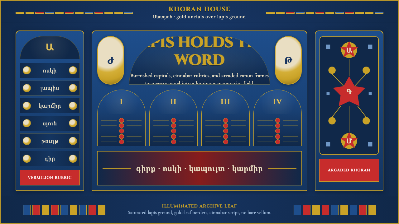 Armenian Manuscript FolkloreJewel-dense devotion. Lapis ground, gold uncials, and vermilion arcades fill…
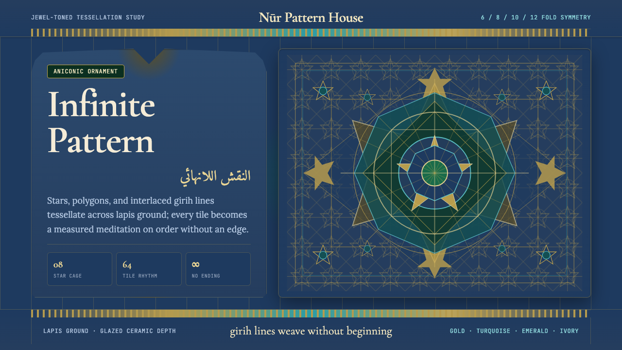 Islamic Geometric ArtInfinite order, fully tiled. Lapis ground with gold girih lines and turquoise…
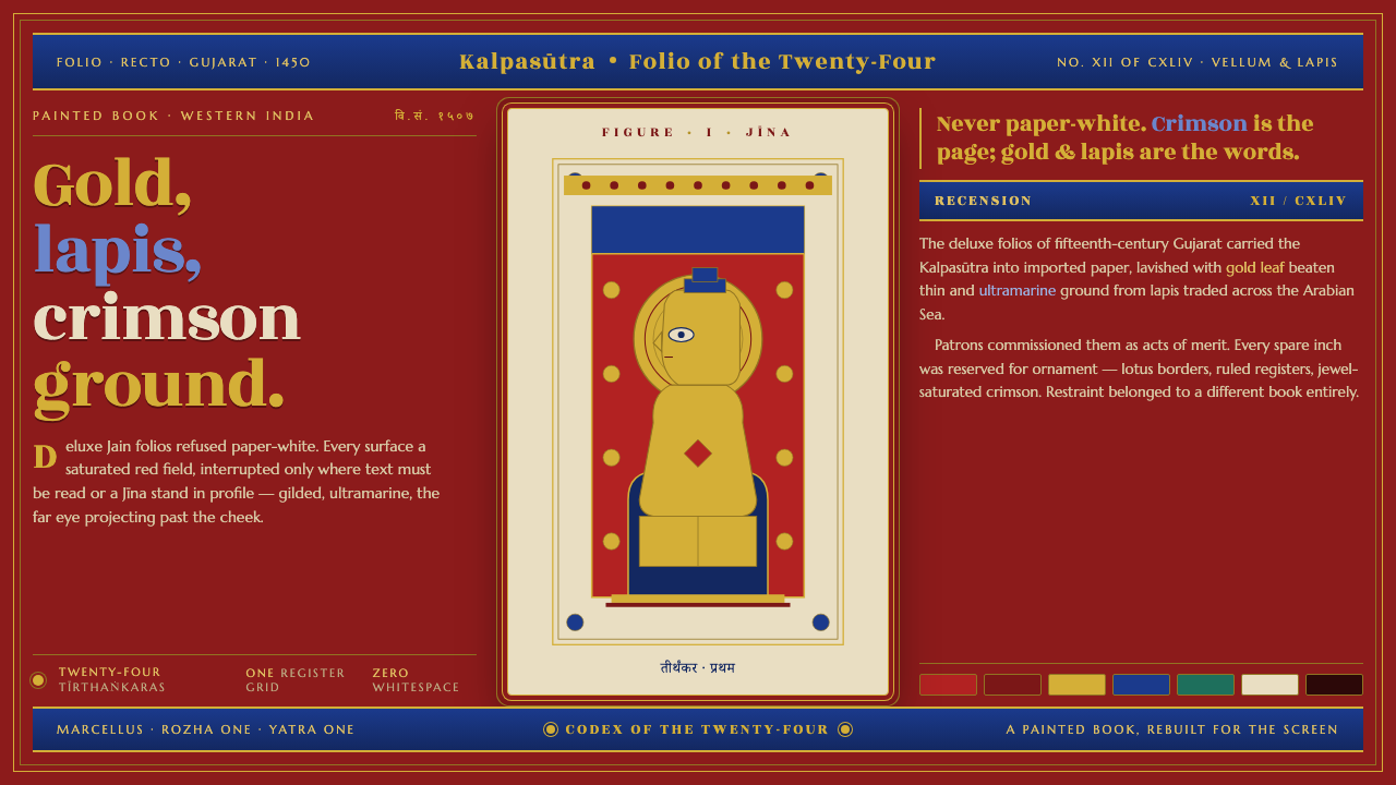 Jain Kalpasutra ManuscriptNever paper-white. Gold leaf and lapis figures on jewel-crimson, lotus-ruled…
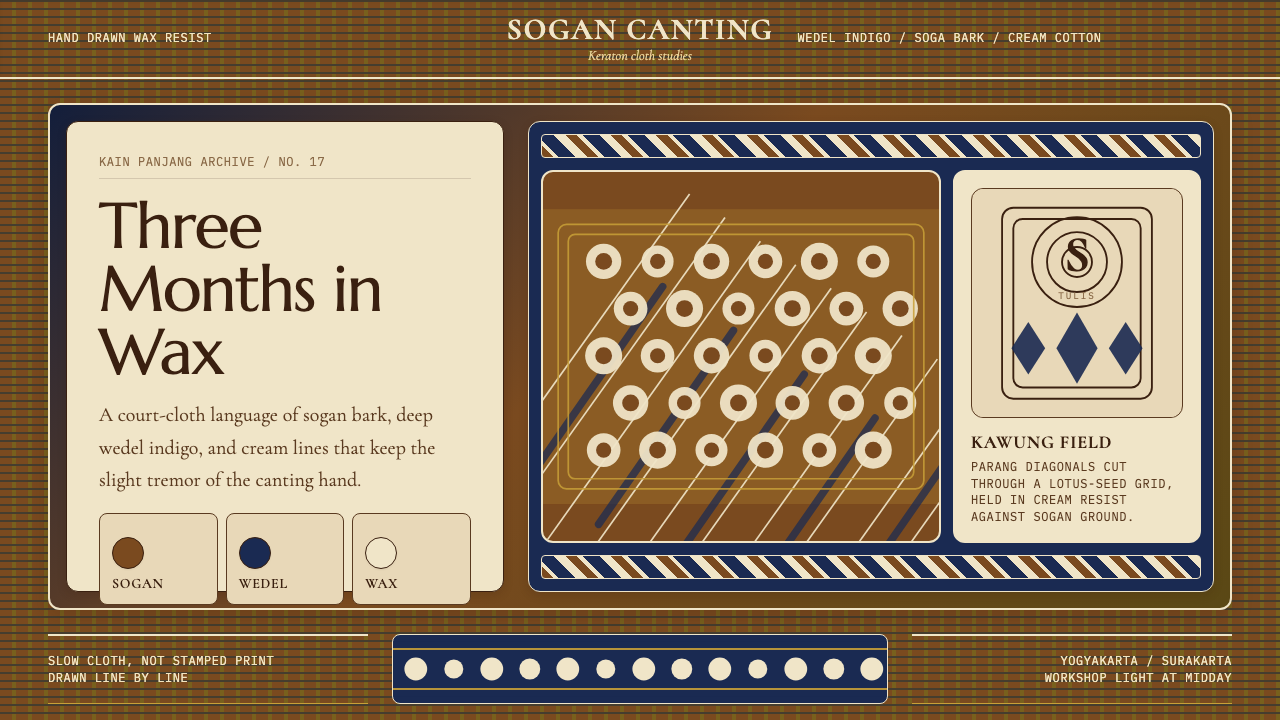 Javanese Batik Tulis (Keraton Sogan)Patience made visible. Sogan brown, indigo, and cream wax-lines form dense co…
 Syrian Damascene BrocadeDark silk shimmers. Aubergine ground, Cormorant SC, gold medallion grid.
 Belarusian Slutsk SashCourtly silk, vitrined. Taupe ground, crimson panels, Cinzel type, antique go…