What is Jain Kalpasutra Manuscript?
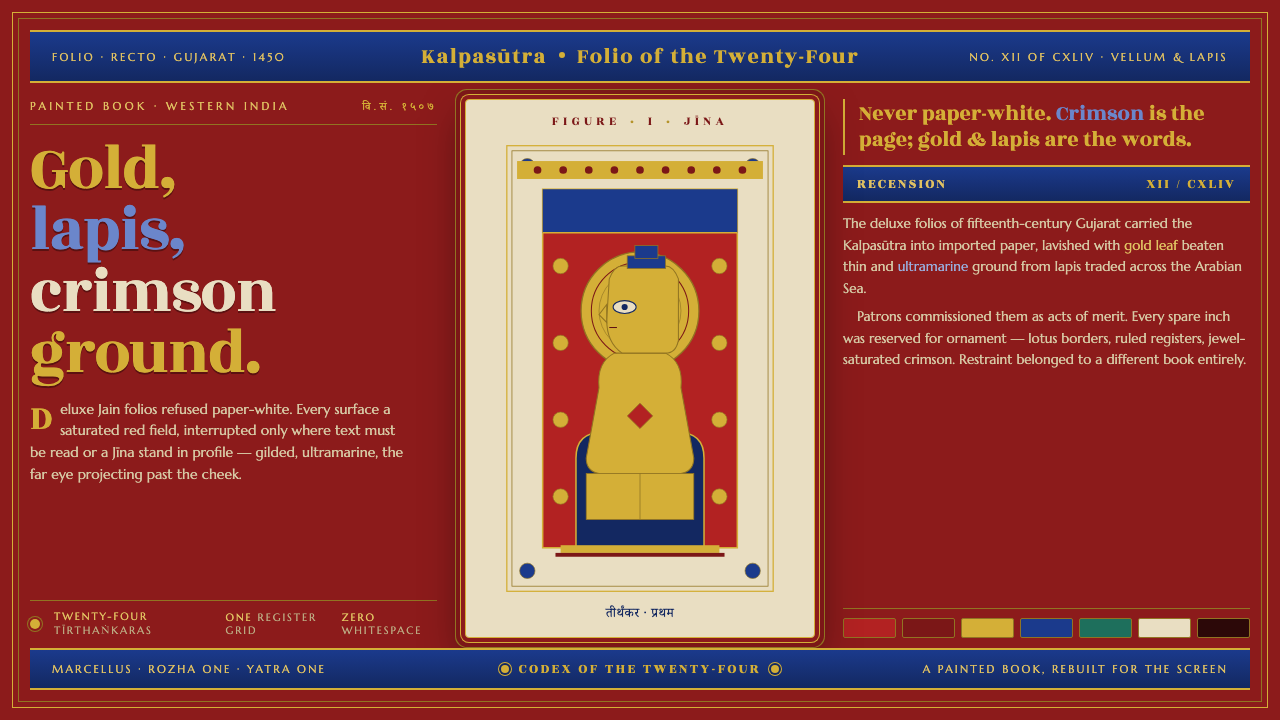
The Jain Kalpasutra manuscript turns the interface into a jewel-box folio — crimson ground, gold leaf, lapis figures, and lotus borders with no room for ordinary emptiness.
Jain Kalpasutra Manuscript in brief
The deluxe Jain Kalpasutra manuscripts of mid-fifteenth-century Gujarat are among the most opulent painted books of South Asia. Their pages organize text bands and miniature panels over an intense crimson ground, with figures rendered in gold leaf and ultramarine made from imported lapis lazuli. The result is not a quiet manuscript surface but a saturated field in which every interruption feels precious.
The visual system carries this material richness into digital design. Crimson becomes the surrounding atmosphere rather than a small accent; gold and lapis become the privileged foreground; off-white is reserved for text fields and figure panels, creating the impression of vellum or painted surfaces set into a jewel-colored page. The interface should feel enclosed, layered, and ceremonial, never like a white page with decorative red trim.
Its most recognizable figure convention is the strict angular profile of the Tirthankara, with the far eye projecting beyond the cheek. Lotus and floral borders frame the image, while text bands and miniature panels establish a rhythm of enclosure. The style is therefore defined as much by framing and density as by its colors: crimson holds the field together, precious hues mark importance, and borders turn content into a contained visual event.
Where does Jain Kalpasutra Manuscript come from?
The Kalpasutra manuscript tradition belongs to Western-Indian Jain manuscript painting, with its deluxe expression associated with mid-fifteenth-century Gujarat and the Gujarati-Sultanate milieu. The setting matters because the style is not an abstract luxury vocabulary assembled later. It comes from a specific painted-book culture in which writing, miniature imagery, pigment, metallic surface, and ornamental framing were conceived as one continuous page.
Jain scribes of Western India shaped the written structure of these folios, while Kalpasutra manuscript painters developed the visual conventions that made the pages immediately legible as Jain devotional books. Lay patrons commissioned deluxe folios, bringing together devotion and material splendor. The manuscript was consequently both a textual object and a carefully authored display of value.
The ground of intense crimson gives the page its first architectural decision. Gold leaf supplies luminous figures and accents, while ultramarine ground from imported lapis lazuli introduces a deep blue counterpart to the red. Off-white surfaces appear selectively in text fields and figure panels, functioning like interruptions of vellum within the painted ground rather than as a universal background.
The tradition is also carried by disciplined repetition. Tirthankaras appear in strict angular profile, with the projecting far eye serving as a signature convention. Lotus and floral borders surround the panels, while text bands and miniature scenes establish a sequence of framed units. Together, these decisions create a manuscript language that is opulent without becoming shapeless: richness is organized through recurring figures, materials, and borders.
What defines the Jain Kalpasutra Manuscript look?
Crimson Ground
The dominant field is an intense, saturated crimson rather than paper-white. It acts as the atmosphere of the page, surrounding text bands and miniature panels with a ceremonial density. Crimson should therefore be treated as the structural ground of the composition, not as an occasional accent. Its strength makes every off-white panel, gold figure, and blue detail feel deliberately placed.
Gold and Lapis
Gold leaf and lapis-derived ultramarine are precious foreground materials. Gold carries light and sanctity, while deep blue gives the composition weight and visual depth against crimson. Neither should be scattered casually across every surface. Their power depends on selective placement, as though each luminous mark or blue figure had been applied by hand and reserved for content that deserves attention.
Vellum Interruptions
Off-white is not the default canvas. It appears inside the crimson field as a reserved surface for text or figures, recalling vellum interrupting a painted ground. These pale panels create relief and readability without dissolving the overall darkness. Their edges should feel intentional and contained, more like inserted folio spaces than modern cards floating on a neutral background.
Angular Sacred Profile
Tirthankara figures stand in a strict angular profile, and the far eye projects visibly beyond the cheek. This is not a realistic rendering but a codified visual statement. The profile should remain composed and frontal in its authority, with geometry carrying the sense of stillness. When adapted into interface imagery, the convention is more valuable than naturalistic portrait detail.
Lotus and Floral Enclosure
Lotus and floral borders frame the page and its miniature panels. The border is not a separate decorative strip; it establishes where an image begins, where it ends, and how one unit relates to the next. Repeated floral framing can organize navigation, section labels, or image captions, provided it remains a boundary-making device rather than a field of unrelated ornament.
Text Bands and Miniatures
Information is arranged as bands of writing and framed miniature scenes rather than as a single uninterrupted reading column. This creates a rhythm of verbal and visual attention: read, pause, look, and return. The composition feels dense because content is layered within a shared field, yet it remains ordered through repeated panel logic and clear separation between text surfaces and painted figures.
Who shaped Jain Kalpasutra Manuscript?
The Jain scribes of Western India shaped the written bands that give the manuscript its textual structure. In this style system, writing is not placed after the image as neutral content; it participates in the page architecture alongside crimson ground, framed panels, and ornamental borders. Their role represents the continuity of devotional text within a materially lavish painted book.
The painters of Kalpasutra manuscripts established the visual grammar of crimson grounds, gold-leaf figures, lapis-derived ultramarine, angular Tirthankara profiles, and lotus borders. Their work turns repeated conventions into a coherent visual world. The projecting far eye and disciplined profile are especially important because they identify the figure through tradition rather than through naturalistic likeness.
Jain lay patrons who commissioned deluxe folios are part of the style's material history. Their commissions brought devotional purpose together with expensive-looking surfaces, precious color, and elaborate framing. In a contemporary adaptation, this relationship suggests that ornament should signal care and significance: lavishness works best when it tells the viewer that the enclosed content matters.
How do you use Jain Kalpasutra Manuscript today?
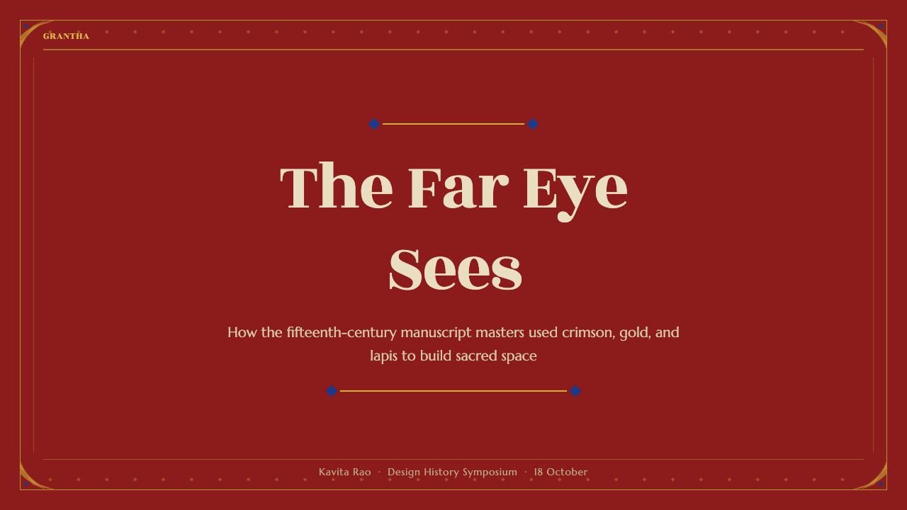
For presentation slides, use crimson as the continuous field of the deck, with the cover introducing a single dominant miniature-like panel or sacred profile framed by lotus forms. Content slides can alternate between text bands and off-white figure panels so that reading and looking become part of the same rhythm. Data slides should treat charts as miniature compositions: gold can mark the principal value, lapis can provide comparison or depth, and off-white can hold labels and explanatory text. The slide should feel like a folio page with hierarchy, not like a modern white canvas decorated with cultural motifs.
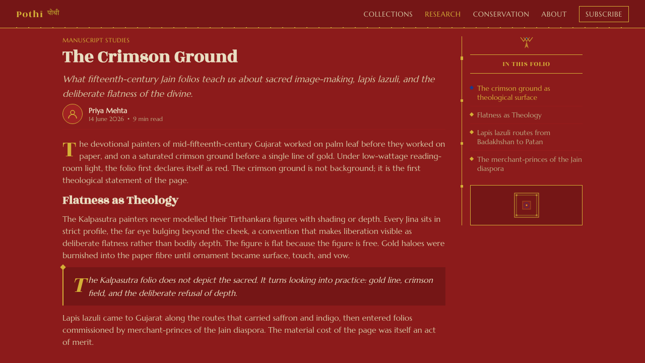
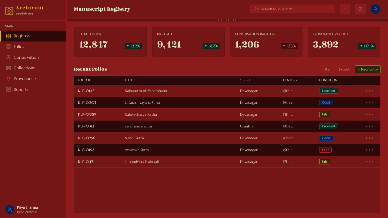
For web interfaces, the style suits dashboards, pricing pages, and other experiences that need to make value feel curated and significant. Keep the surrounding field saturated and dark, reserve off-white for readable content surfaces, and use gold or lapis to distinguish active states, selected tiers, or important metrics. Lotus borders can contain navigation groups or featured modules, while angular figure imagery can give a product area a strong emblematic identity. The interface needs enough pale text surface to remain legible, but the crimson ground should always remain visibly present.
For editorial and marketing work, the manuscript logic supports a page built from framed units rather than one open stream. A feature article can place its introduction in an off-white text field, interrupt the surrounding crimson with a miniature image, and use floral borders to mark transitions between sections. Marketing pages can use gold for calls to attention and lapis for secondary information, while keeping the visual field rich and continuous. The style is especially effective when the product or story should feel collected, ceremonial, crafted, or worth preserving.
A common mistake is to reduce the style to red, gold, and a few ornamental flowers. That combination can become generic luxury branding if the page loses the manuscript's internal structure. Avoid making every surface bright, every panel equally important, or every border purely decorative. The essential discipline is selective preciousness: crimson establishes the world, off-white creates readable interruptions, gold and lapis identify the valued foreground, and borders explain how content belongs together.
Jain Kalpasutra Manuscript — FAQ
Is this simply a red-and-gold luxury style?
No. Red and gold alone are not enough. The Jain Kalpasutra manuscript system depends on the relationship between a saturated crimson ground, precious gold and lapis foregrounds, restrained off-white interruptions, text bands, miniature panels, and lotus framing. Remove the framing and the layered page structure, and the result becomes generic luxury branding rather than a manuscript-derived visual language.
Does this style allow white space?
It does, but not as a universal paper-white canvas. Off-white should appear as a reserved surface inside the crimson field, especially for text fields and figure panels. This makes pale space feel like vellum or a precious interruption in the painted ground. The goal is not to eliminate breathing room, but to make every pale opening belong to the page's material logic.
How should gold and lapis be used in a digital interface?
Use them as precious foregrounds, not as routine decoration. Gold is strongest when it carries light, prominence, or a principal value; lapis can provide contrast, depth, or a secondary visual role against crimson. Their effect depends on scarcity. If every label, border, and control receives the same treatment, neither color will feel precious and the page will lose its hierarchy.
What makes the figure style recognizable?
The defining convention is the Tirthankara in strict angular profile, with the far eye projecting beyond the cheek. This visual decision is deliberately non-naturalistic and works as a symbolic identifier. Lotus and floral borders reinforce the figure's status by enclosing it within a miniature panel. When adapting the style, preserve the composed profile and the framing logic before adding incidental facial detail.
Related design styles
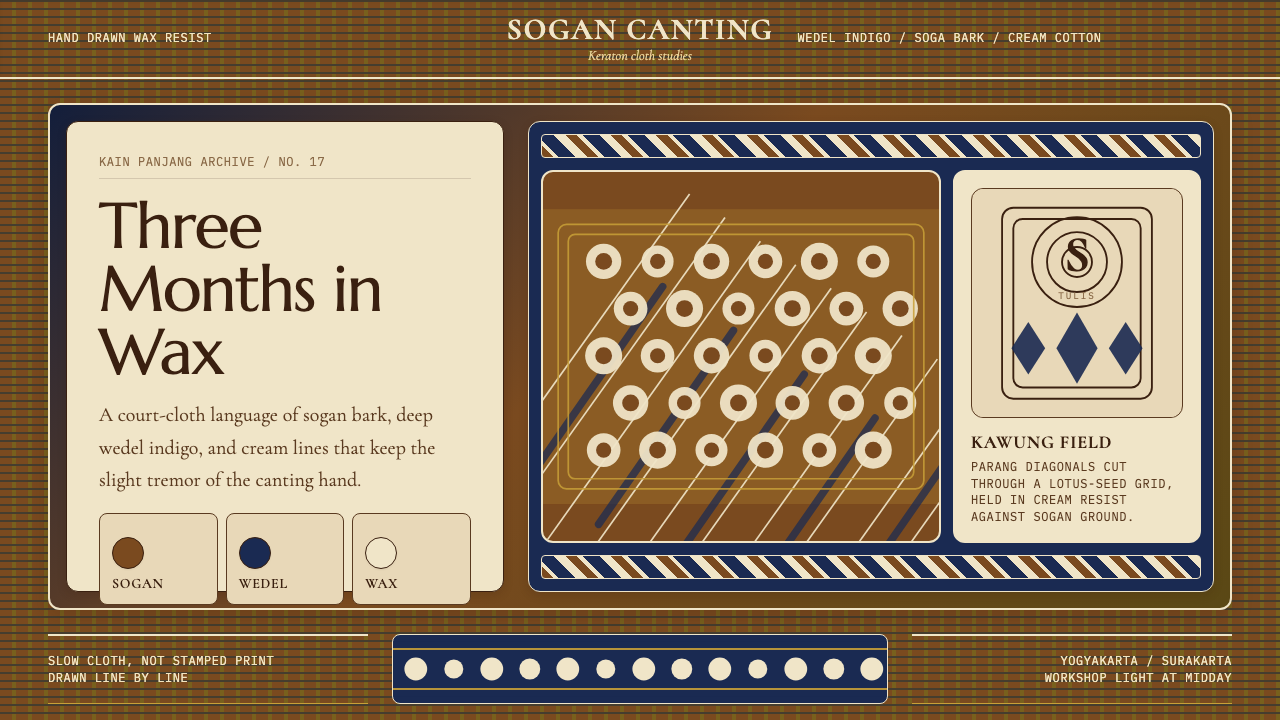 Javanese Batik Tulis (Keraton Sogan)Patience made visible. Sogan brown, indigo, and cream wax-lines form dense co…
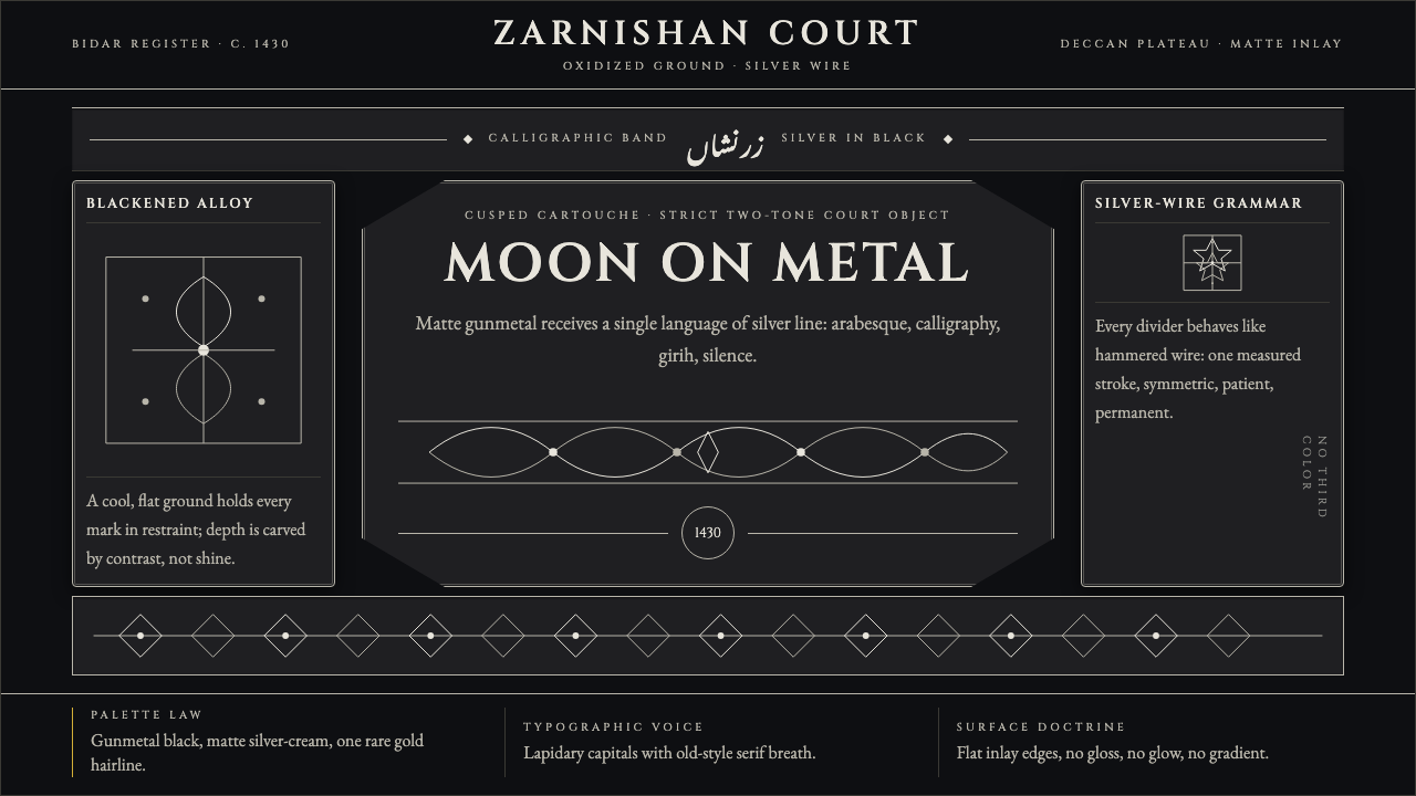 Bidri Deccan MetalworkCourtly darkness, tooled by silver. Cinzel caps and hairline arabesques cut g…
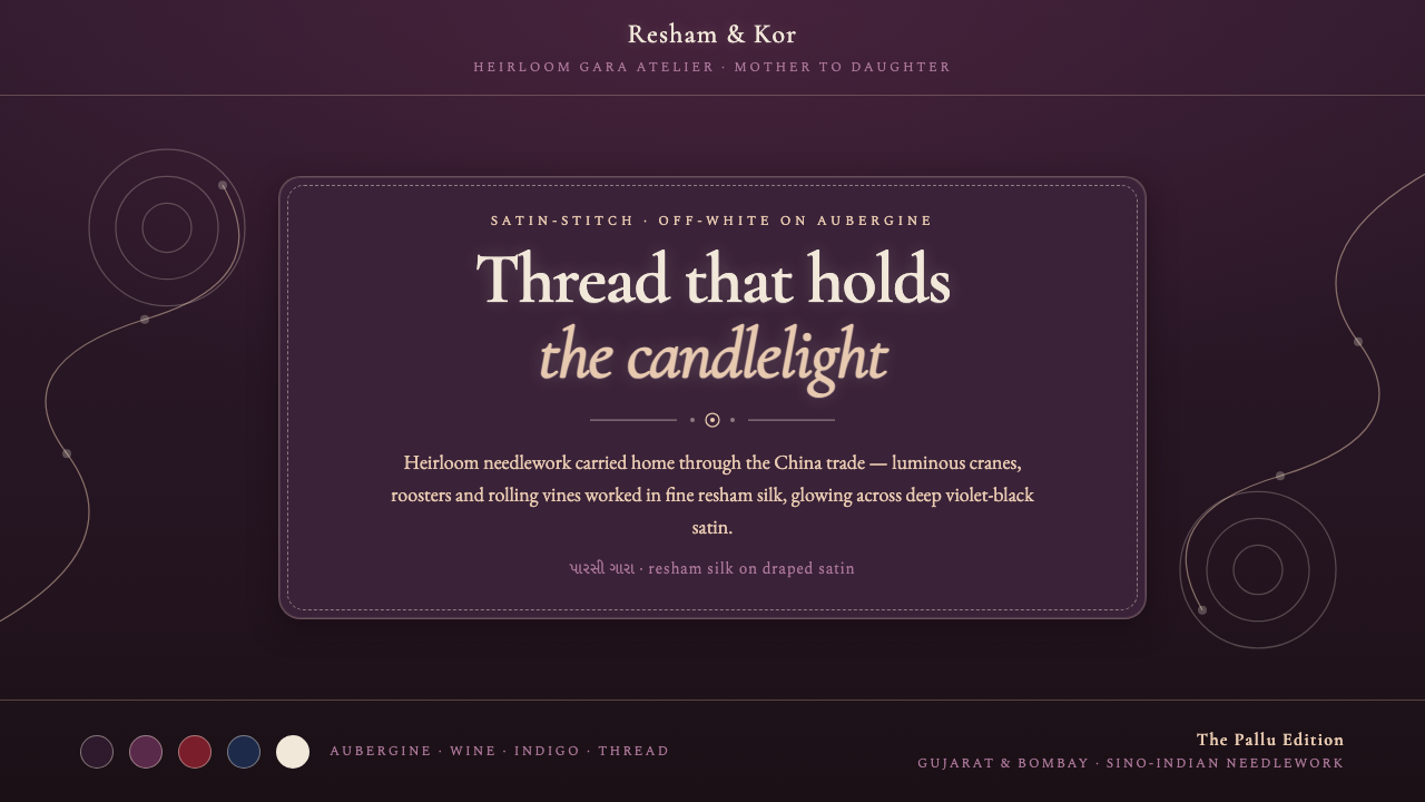 Parsi Gara EmbroideryHeirloom needlework, made digital. Off-white silk vines glow over deep auberg…
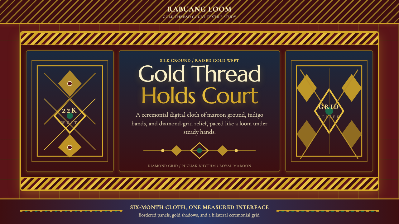 Sumatran Songket (Pandai Sikek)Courtly weight glows. Maroon silk, Cormorant small caps, and gold diamond gri…
 Thai BenjarongRoyal density. Gold-line enamel cells pack green, cobalt, and vermilion on ir…
 Uzbek Bukhara Gold ZardoziCourtly density. Ruby velvet, gold Cinzel type, and star medallions leave no…