What is Thai Benjarong?
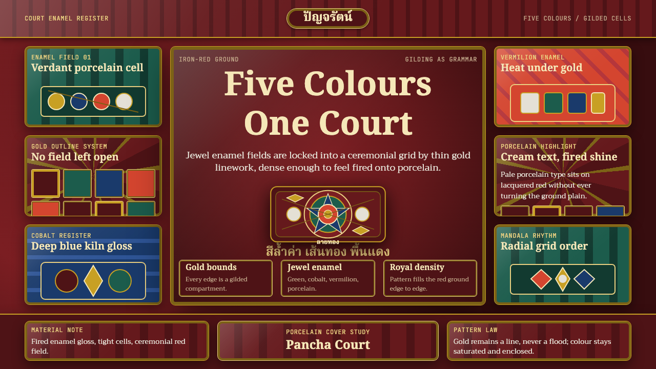
Every jewel-bright enamel cell in Benjarong porcelain is held apart by a line of gold — density made orderly by one unbroken rule.
Thai Benjarong in brief
Benjarong is the royal overglaze enamel porcelain tradition of the Thai court, its name derived from the Sanskrit pañca-ranga, meaning 'five colors,' by way of the Thai benjarong. The style is defined by dense, multicolor enamel painting applied over a fired porcelain glaze, with each individually colored area compartmentalized and unified by a hand-painted outline of gilded gold. The result is a surface with no negative space at all — every square of porcelain is filled with saturated color, organized into a coherent whole entirely through the discipline of gold linework.
The style's most recognizable motifs are the thepanom, stylized praying deity figures shown in a devotional posture with palms pressed together, and the kranok, a flame-like scrollwork pattern that curls and repeats across the surface with rhythmic regularity. These motifs are frequently set against a rich iron-red ground, one of Benjarong's signature background choices, though other deep ground colors also appear depending on the piece and period.
What distinguishes Benjarong from other richly decorated ceramic traditions is the specific role gold plays. It is never a flood of color or a broad decorative field in its own right; it is always and only the separating line — the boundary that keeps the greens, blues, reds, and whites from bleeding into an undifferentiated mass. Understanding this single rule — gold divides, it never fills — is the key to correctly reading and reproducing the style.

Where does Thai Benjarong come from?
Benjarong porcelain developed as a royal Thai enamel tradition spanning the Ayutthaya kingdom through the Rattanakosin period (the present Chakri dynasty era beginning in the late eighteenth century), but its production process reflects an important cross-cultural relationship: the porcelain blanks themselves were typically produced in Chinese kilns, most notably in Jingdezhen, and then shipped to Thailand where royal court enamel painters applied the distinctive Benjarong overglaze decoration. This division of labor — Chinese porcelain body, Thai enamel decoration — is central to understanding the style's identity as a genuinely Thai artistic achievement built on an imported material foundation.
The name's Sanskrit origin, pañca-ranga meaning 'five colors,' reflects the tradition's early convention of using five enamel colors as its core register, though the number was never a strict technical limit and surviving pieces show considerable variation in the exact palette used across different periods and workshops. What remained constant was the underlying logic: dense, saturated color fields, each compartmentalized by a gilded outline, applied entirely by hand by court-trained painters working to serve royal commissions.
As a royal court art form, Benjarong porcelain was produced specifically for use by Thai royalty and high aristocracy — ceremonial dinnerware, decorative vessels, and prestige objects rather than everyday tableware for common use. This royal patronage context shaped every aspect of the style's development: the labor-intensive gold linework and dense multicolor enameling represented a level of craftsmanship and cost that only royal commissions could sustain, reinforcing the tradition's association with courtly prestige and ceremonial display.
The tradition has continued into the modern era as a recognized Thai decorative art form, with contemporary workshops maintaining the historical technique of gilded compartmentalization and dense multicolor enamel even as production has expanded beyond purely royal commission into broader ceremonial and collector markets, preserving Benjarong's identity as Thailand's signature overglaze porcelain art.
What defines the Thai Benjarong look?
Color
Dense, jewel-bright enamel colors — green, cobalt blue, vermilion, and porcelain white among others — fill every compartmentalized area of the surface, frequently set against a rich iron-red ground. Color is applied with maximal saturation and near-total surface coverage; there is no restraint or negative space in this palette's application, distinguishing it sharply from more minimalist ceramic traditions.
Gilded Compartmentalization
Every individually colored area is bounded by a hand-painted gold outline, the structural device that organizes the dense multicolor surface into a legible whole. Gold in this style is never a filled area or a broad decorative field; it exists exclusively as a separating line, and this single rule is the most important technical principle to preserve in any adaptation.
Thepanom Deity Motif
The thepanom is a stylized figure of a deity or celestial being shown in a praying posture with palms pressed together, a recurring devotional motif drawn from Thai Buddhist and courtly iconography. Its presence signals the tradition's royal and religious context, and its rendering follows the same enamel-and-gold-outline logic as every other element on the surface.
Kranok Flame Scrollwork
Kranok is a flame-like scrollwork pattern that curls and repeats with rhythmic regularity across borders and fields, one of the most recognizable decorative motifs in Thai court art broadly. In Benjarong porcelain, kranok patterns are typically rendered in gold or a contrasting enamel color, threading through the composition to unify separate compartments visually.
Iron-Red Ground
A deep, saturated iron-red is one of Benjarong's signature background choices, providing a warm, intense field against which the gilded compartments and jewel-bright enamels read as maximally vivid. Other rich ground colors also appear across the tradition, but the iron-red version is the most immediately associated with the style's royal, ceremonial character.
Edge-to-Edge Density
There is essentially no empty or negative space anywhere on an authentic Benjarong surface — the entire visible area is packed with color and gold linework from edge to edge. This maximal density is a defining structural principle, not a decorative excess to be trimmed back; any adaptation that introduces significant flat, empty ground misrepresents the style's fundamental character.

Who shaped Thai Benjarong?
The royal Thai court oversaw and commissioned Benjarong production as a courtly art form, importing porcelain blanks from Chinese kilns and directing court-trained painters to apply the tradition's distinctive gilded, multicolor enamel decoration for royal and aristocratic use.
The largely anonymous court-trained artisans who hand-painted the dense enamel colors and gilded compartmentalizing lines onto imported porcelain blanks, translating royal aesthetic requirements into the labor-intensive technique that defines Benjarong's visual identity.
How do you use Thai Benjarong today?
For presentation slides, Benjarong suits content about heritage, luxury, ceremony, or maximalist decorative craft — a cover slide can commit to the iron-red ground with a single gilded-outline motif, such as a stylized kranok border, framing the title. Content slides should embrace density rather than minimalism where the brand supports it: information can be organized into compartmentalized blocks separated by a thin gold-toned rule line, echoing the gilded compartmentalization principle directly.
For web interfaces, the style suits luxury, hospitality, cultural heritage, or ceremonial-goods brands where richness and craftsmanship are core to the value proposition. The approach: deep saturated ground colors, content modules bounded by thin gold-toned dividing lines rather than plain borders, and a willingness to use more color density per screen than a minimalist product would typically allow — Benjarong's logic rewards richness as long as gold linework keeps every element legible and organized.
In editorial and marketing work, the style supports long-form writing about Thai royal arts, ceramics, or decorative craft traditions, and works well for premium hospitality or cultural tourism marketing where visual richness signals prestige. A magazine-style layout can use a kranok-style repeating border as a section divider, and treat pull-quotes as their own gilded-outline compartment within the page.
The style is poorly suited to minimalist, high-whitespace product design or contexts where restraint and negative space are core brand values, since Benjarong's entire identity depends on edge-to-edge density rather than breathing room.
The most common mistake when adapting this style is treating gold as a fill color rather than strictly as a separating line — spreading gold across broad areas removes the exact compartmentalizing function that gives the style its order. A second common mistake is thinning out the color density for a cleaner, more contemporary look; doing so undermines the maximal, edge-to-edge richness that is Benjarong's defining structural principle rather than an optional decorative flourish.

Thai Benjarong — FAQ
What does the name Benjarong mean, and does it require exactly five colors?
Benjarong comes from the Sanskrit pañca-ranga, meaning 'five colors,' reflecting the tradition's early convention of a core five-color enamel register. In practice, the number was never a strict technical rule, and surviving pieces across different periods and workshops show meaningful variation in the exact palette used. What matters more than a literal count of five is the underlying principle: dense, saturated enamel colors compartmentalized by gilded outlines.
Why is gold used only as a dividing line rather than a filled decorative area?
This is the structural principle that makes Benjarong's extreme color density legible rather than chaotic. Because the surface is packed edge-to-edge with saturated color, the gold outline's sole job is to hold each color area distinct and organized — if gold were instead used as a broad fill, it would compete with the enamel colors for dominance and the compartmentalizing function that gives the surface its order would be lost entirely.
Is Benjarong a purely Thai artistic tradition, or does it involve other cultures?
Benjarong's overglaze enamel decoration, gilded compartmentalization, and its thepanom and kranok motifs are distinctly Thai courtly artistic contributions, but the porcelain body itself was typically imported from Chinese kilns, most notably Jingdezhen. This division — Chinese porcelain material, Thai decorative artistry — is a genuine and important part of the tradition's history, reflecting a cross-cultural production relationship rather than diminishing the style's identity as a Thai art form.
Can this style work with a lighter, less saturated color scheme?
A significantly lightened palette moves away from Benjarong's defining character, since the style's identity depends on jewel-bright, highly saturated enamel colors and a rich, dense ground. A more restrained adaptation is possible for contexts that cannot support full saturation, but it should still preserve the gilded compartmentalization principle and a reasonably rich ground tone rather than adopting a pastel or washed-out palette that contradicts the tradition's core visual logic.
How does Benjarong differ from other Southeast Asian ceramic decoration traditions?
What sets Benjarong apart is the specific combination of imported Chinese porcelain bodies, court-commissioned Thai overglaze enamel decoration, and the strict gilded-compartmentalization discipline that organizes its extreme color density. Many other regional ceramic traditions favor either underglaze painting with a more limited palette or different structural principles for organizing decoration; Benjarong's edge-to-edge density held together entirely by gold linework is its distinguishing technical signature.
Related design styles
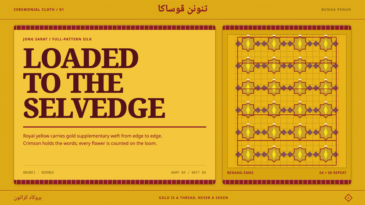 Bruneian Jong SaratNo resting ground. Royal yellow and thread-built gold pack every stepped repe…
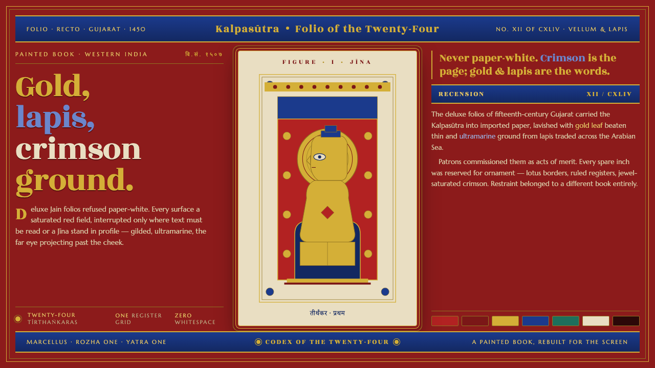 Jain Kalpasutra ManuscriptNever paper-white. Gold leaf and lapis figures on jewel-crimson, lotus-ruled…
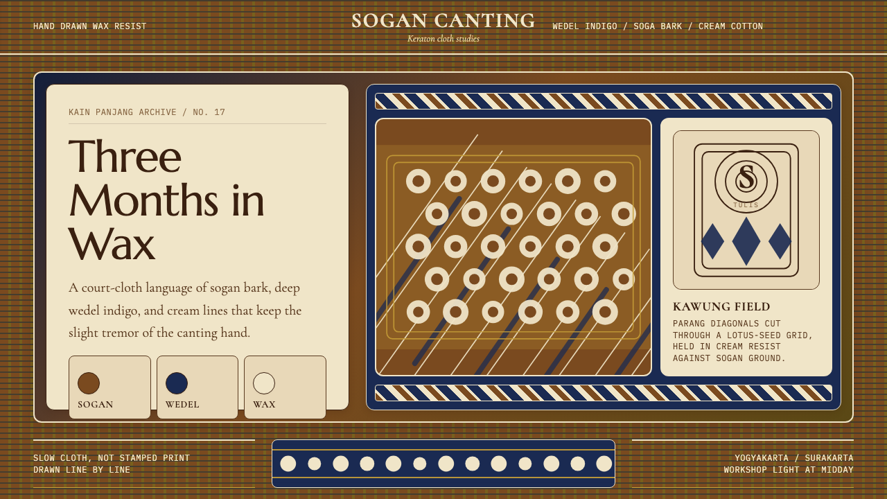 Javanese Batik Tulis (Keraton Sogan)Patience made visible. Sogan brown, indigo, and cream wax-lines form dense co…
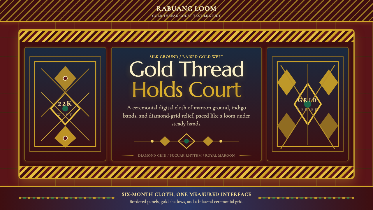 Sumatran Songket (Pandai Sikek)Courtly weight glows. Maroon silk, Cormorant small caps, and gold diamond gri…
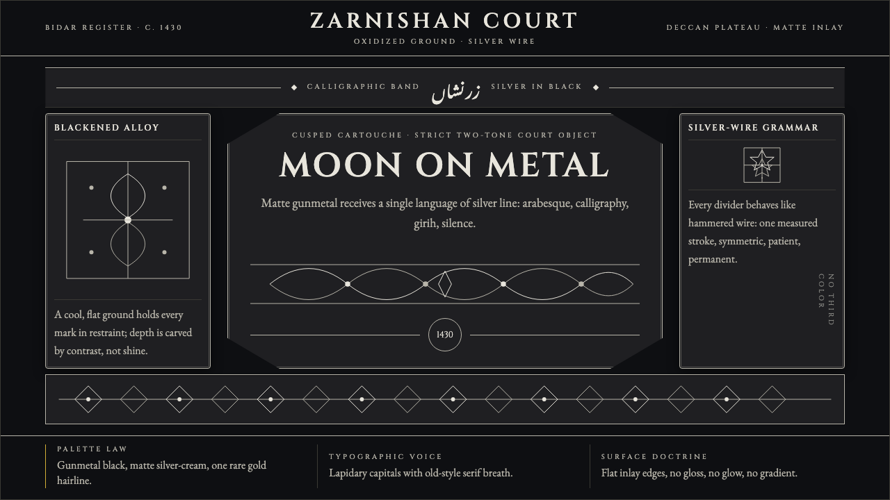 Bidri Deccan MetalworkCourtly darkness, tooled by silver. Cinzel caps and hairline arabesques cut g…
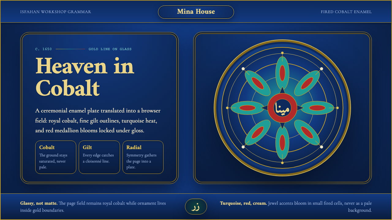 Isfahan Minakari EnamelJewel-bright ceremony. Cobalt enamel, gold cloisonné lines, and radial blooms…