What is Rishton Blue Ceramics?
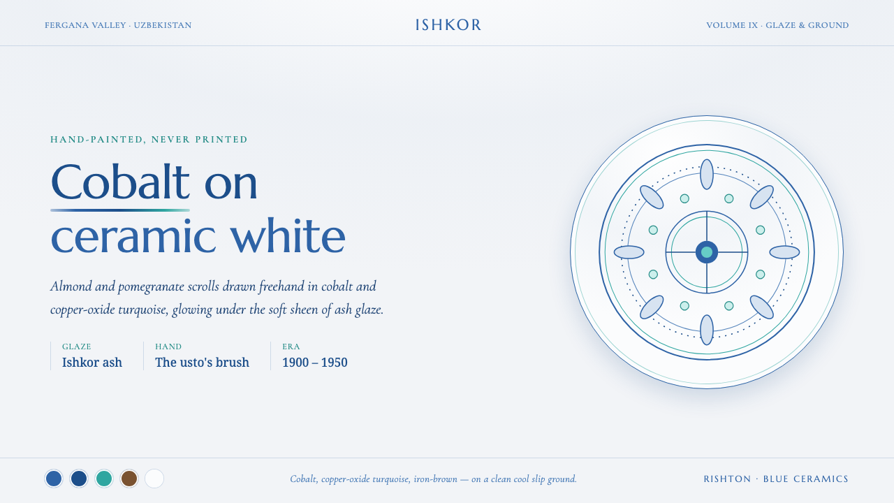
Rishton Blue Ceramics brings the living irregularity of a potter’s brush to the screen — cobalt, turquoise, iron-brown, and floral movement held beneath the quiet glow of ash glaze.
Rishton Blue Ceramics in brief
Rishton Blue Ceramics is a digital interpretation of the ishkor-glazed earthenware associated with Rishton, a town in Uzbekistan’s Fergana Valley. Its visual language begins with a cool ceramic-white ground, then layers cobalt blue, copper-oxide turquoise, and iron-brown brushwork across it. The result should feel painted rather than printed: color sits on the surface with visible variation, and every curve carries the small instability of a hand moving over clay.
The decorative vocabulary is botanical and flowing. Almond and pomegranate motifs become floral scrolls that travel across the surface instead of locking into rigid, repeated units. These are not ornamental stickers placed around empty content. They should behave like a continuous painted rhythm, able to frame an area, turn a corner, or lead the eye toward a title while leaving the central field calm and legible.
Its defining contrast is between restraint and abundance. The ceramic field is clean, pale, and spacious; the painted motifs are saturated, expressive, and concentrated. Soft ash-glaze sheen unifies the composition without making it glossy or digital. A convincing application preserves that balance: the background gives the eye rest, while the ornament delivers gesture, memory, and material presence.
Where does Rishton Blue Ceramics come from?
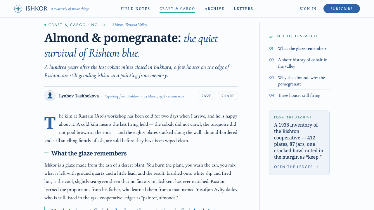
The source tradition belongs to Rishton in the Fergana Valley of Uzbekistan, within the broader history of Central Asian blue-and-white ceramic painting. The approved historical frame is the early twentieth-century ishkor-glaze tradition, spanning 1900–1950. Rishton earthenware is recognized here through the meeting of pale slip, colored painting, and ash glaze: a surface made to receive both ornament and light.
Ishkor glaze is central to the identity of the ceramics, not merely a finishing effect. In this visual system, the glaze explains why the colors should feel integrated rather than mechanically separated. Cobalt and turquoise should seem to settle into a ceramic surface, while the iron-brown brushwork provides a firmer, earthier counterpoint. The visual impression is soft in sheen but never vague in drawing.
The tradition is carried by Rishton master potters, known as usto, and by artisans working with ishkor ash glaze. Their presence matters because it establishes the aesthetic as an authored craft practice rather than an anonymous decorative pattern. The unevenness of brush weight, the changing density of a painted curve, and the slight asymmetry of a floral turn are therefore not defects to correct. They are the evidence of a hand-made system.
When translated into contemporary design, Rishton Blue Ceramics should remain tied to that material logic. It is not a generic blue floral style, and it is not a flat imitation of porcelain decoration. Its character comes from the relationship between white slip, cobalt and turquoise painting, iron-brown linework, botanical motifs, and the softened unity of ash glaze. Remove that relationship, and the reference becomes only a palette.
What defines the Rishton Blue Ceramics look?
Ceramic White Ground
The base is cool, clean ceramic white rather than stark digital blankness. It should suggest white slip beneath glaze: calm enough for reading, but materially softer than ordinary paper white. Large unpainted areas are essential, because the motifs gain their luminosity from surrounding quiet.
Cobalt and Turquoise
Cobalt blue provides the deepest visual anchor, while copper-oxide turquoise introduces cooler movement and lift. They should be used as painted companions, not as competing interface accents. Their strength comes from appearing within the same floral language and against the same pale ceramic field.
Iron-Brown Brushwork
Iron-brown marks give the pattern its drawn structure. Use them for contour, interior detail, and moments where the floral rhythm needs definition. The line should not be perfectly uniform; a convincing stroke can narrow, deepen, hesitate, or slightly tremble as it moves.
Floral Scrolls
Almond and pomegranate motifs flow into scrolling floral forms. The important quality is continuity: a motif should feel capable of growing into the next curve rather than ending as an isolated emblem. Let stems, petals, and fruit-like forms create direction around content without crowding it.
Hand-Painted Variation
The system rejects the flatness of print. Marks may vary in density, edge, and apparent pressure, provided the composition remains intentional. Variation should be local and expressive, not random noise. The eye should sense a potter’s brush, not a distressed digital texture laid over a finished layout.
Ash-Glaze Softness
The ash-glaze reference calls for a soft, unified sheen rather than high-gloss polish. It should make the colored work feel held beneath a quiet surface, preserving clarity while reducing harshness. The effect is atmospheric and material, never metallic, plastic, or glassy.
Who shaped Rishton Blue Ceramics?
The usto establish the tradition as a practiced ceramic art rather than a fixed decorative file. Their hand-painted work is the reason line variation, responsive floral movement, and controlled asymmetry belong to the style’s core visual logic.
Artisans working with ishkor ash glaze define the surface condition that unites the painted colors. Their craft points designers toward soft ceramic luminosity and away from detached, overly glossy, or purely graphic treatment.
The tradition itself is the third essential authorial force: cobalt and turquoise painting, iron-brown drawing, white slip, and floral motifs are meaningful as a connected practice. No single element can substitute for the whole relationship.
How do you use Rishton Blue Ceramics today?
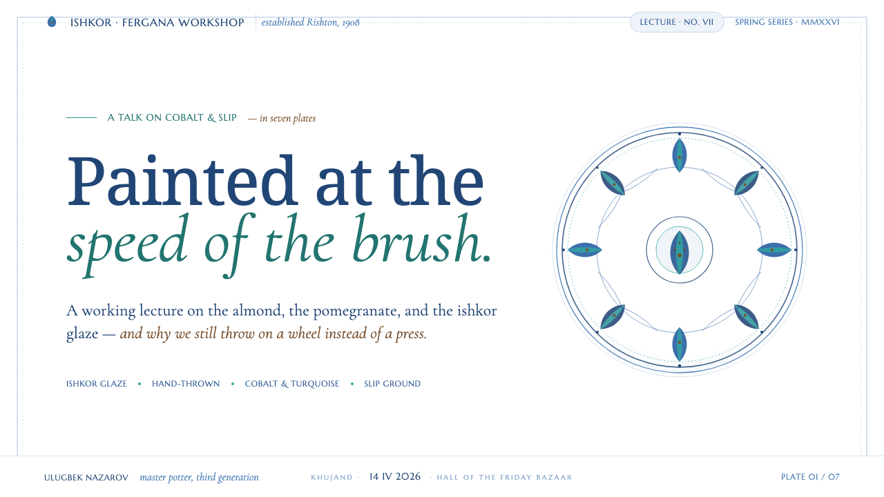
For presentation slides, use the cover as a ceramic field with one concentrated floral gesture at an edge or corner, allowing the title to remain spacious and calm. Content slides should place text on the pale ground and use painted motifs as framing devices rather than dividers between every section. Data slides work best when charts remain clear and direct, with cobalt, turquoise, and iron-brown assigning contrast and emphasis without turning the data into ornament.
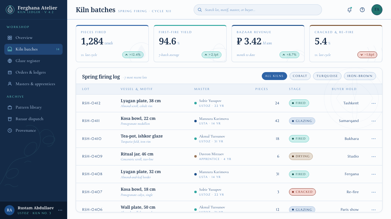
For web interfaces, this style is especially useful when a product needs warmth, cultural texture, and a crafted point of view without sacrificing legibility. Dashboards can keep their working area restrained and introduce floral painting in headers, empty states, or contextual panels. Pricing pages can use the ceramic field to create calm comparison zones, then reserve the more saturated painted language for plan distinctions and calls to action.
For editorial and marketing work, let motifs frame stories about craft, place, food, hospitality, or cultural exchange. A generous white field can support long reading, while a floral scroll creates a visual transition between sections or carries an image caption into the composition. Marketing layouts should feel like painted ceramic surfaces with information placed on them, not like generic promotional pages decorated afterward.
The common mistake is to turn Rishton Blue Ceramics into a repeating blue floral wallpaper. That removes the hand-painted hierarchy and overwhelms the cool white ground. Avoid perfectly identical motifs, uniformly thick contours, and indiscriminate saturation. Let the ornament gather at meaningful points, retain the breathing room of ceramic white, and keep the brushwork visibly more alive than print.
Rishton Blue Ceramics — FAQ
Is Rishton Blue Ceramics simply a blue-and-white style?
No. Cobalt blue and a pale ground are important, but the system also depends on copper-oxide turquoise, iron-brown drawing, almond and pomegranate motifs, floral scrolls, and the soft unity associated with ishkor ash glaze. Blue-and-white alone is too broad to describe the material and gestural character of this tradition.
How should the hand-painted quality appear in a digital layout?
Show it through purposeful variation in brushwork, not through indiscriminate roughness. Curves can change in density and apparent pressure, and motifs can carry slight asymmetry, but the overall composition must remain calm and deliberate. The goal is the responsive movement of a potter’s brush, not simulated damage or visual clutter.
Can the floral motifs be used as a full background?
Only with restraint. The tradition relies on the contrast between painted abundance and a clean white-slip field. A fully covered background can erase that contrast and make the work feel printed rather than ceramic. It is usually stronger to let floral scrolls enter from boundaries, gather around focal content, and leave substantial ceramic white visible.
What makes an application feel too modern or generic?
Perfectly flat color, identical repeated motifs, hard digital gloss, and lines with no variation all weaken the reference. So does treating turquoise and cobalt as unrelated interface colors. The style becomes convincing when color, line, ornament, white ground, and soft glaze-like cohesion read as one ceramic surface.
Related design styles
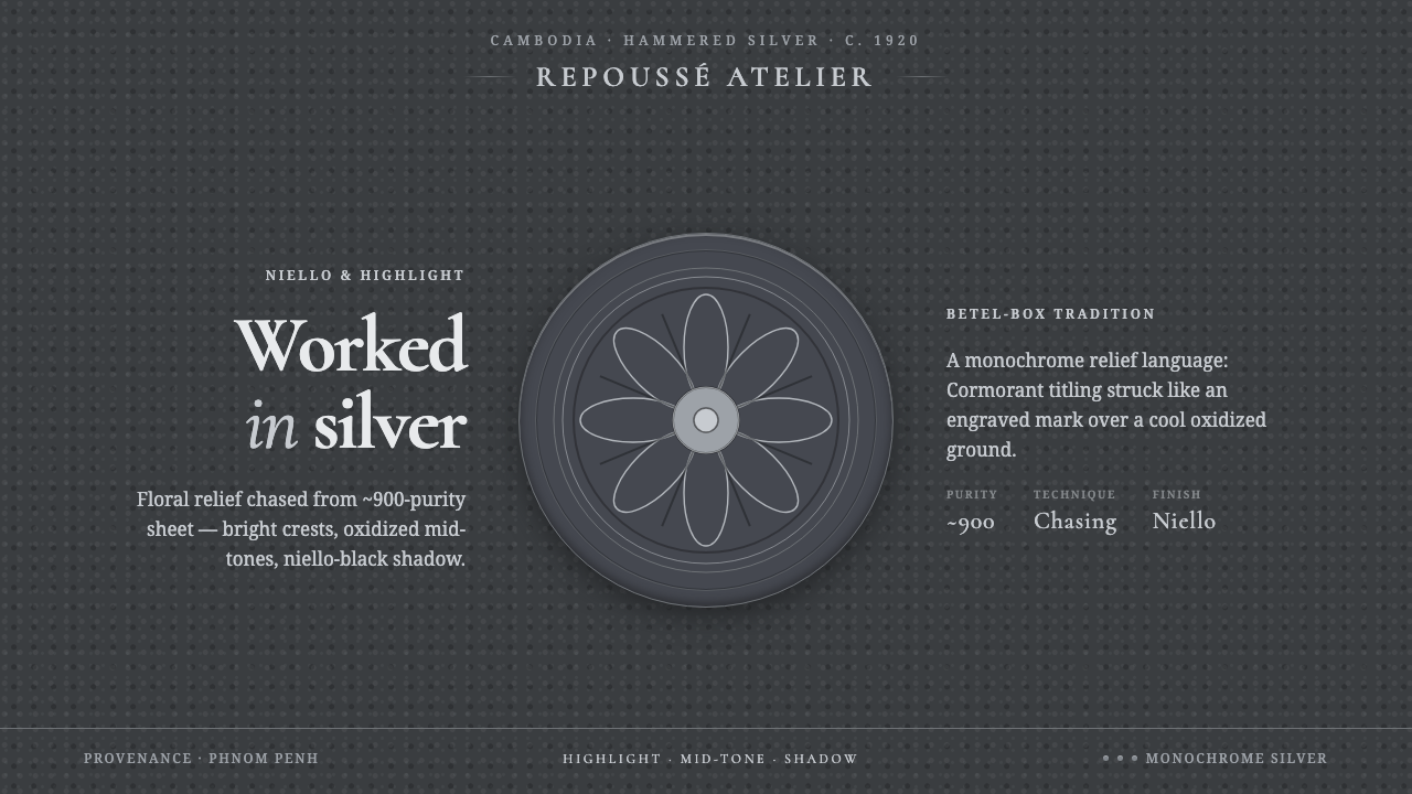 Khmer Silver RepousséHammered silver, on screen. Oxidized ground, bright highlight, niello-black r…
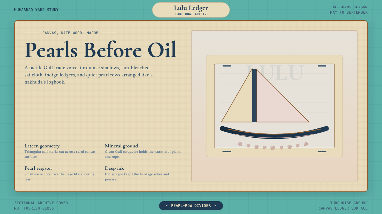 Bahraini Dhow Pearl-Diving BoatMineral and sun-bleached. Gulf turquoise, canvas cream, and pearl rows frame…
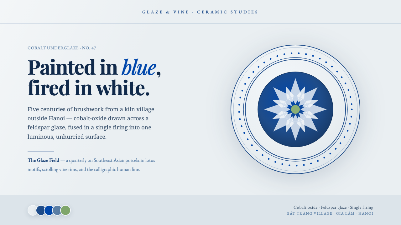 Bát Tràng Ceramic BlueCobalt brushed on glaze white. Muted underglaze blue, double-line plate rims,…
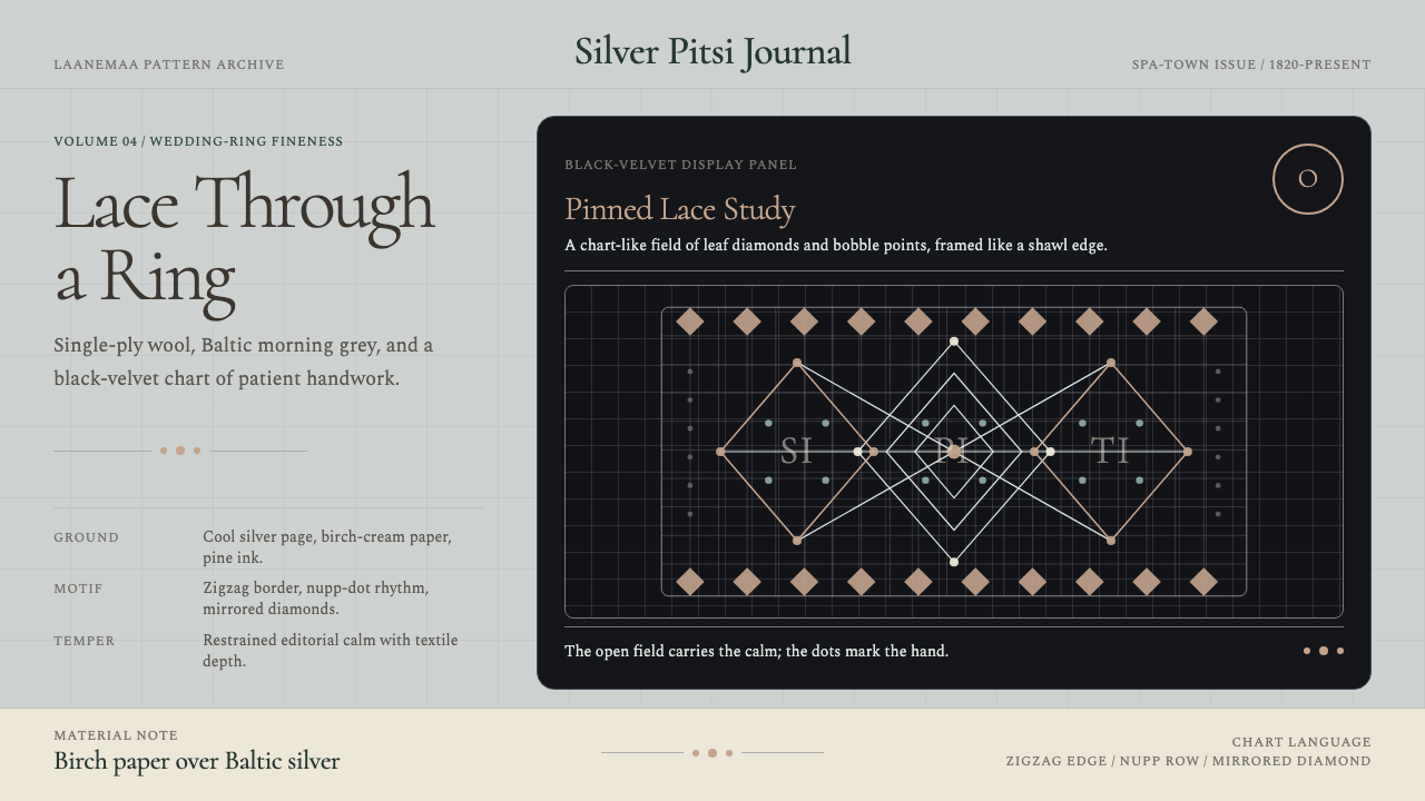 Estonian Haapsalu Lace ShawlQuiet craft, held in silver light. Cormorant type meets nupp dots and velvet…
 Anna Atkins CyanotypeScience turns spectral. Prussian blue ground, white reserves, Victorian serif…
 Balinese LontarHandmade memory, incised. Golden leaf strips carry soot script and spare cinn…