What is Bát Tràng Ceramic Blue?
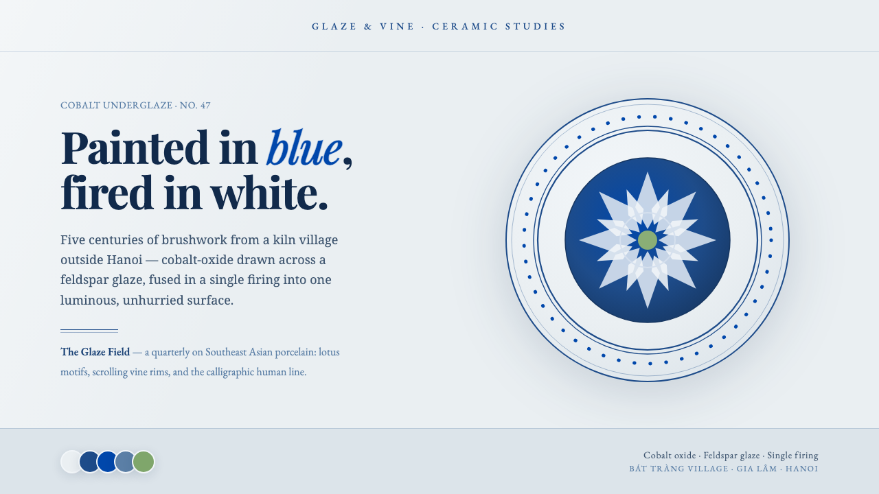
Bát Tràng Ceramic Blue brings cobalt brushed on glaze white into a quiet digital language of double rims, floating motifs, and editorial restraint.
Bát Tràng Ceramic Blue in brief
Bát Tràng Ceramic Blue is a design language distilled from the blue-and-white porcelain tradition of Bát Tràng, a ceramic village outside Hanoi. Its defining image is cobalt-oxide underglaze blue brushed onto a white feldspar glaze: blue linework that feels made by a hand, held by a pale surface that is cool, luminous, and materially calm. Rather than treating blue as a loud interface accent, the system gives it the role of pigment, contour, and memory.
The style translates porcelain’s visual logic into screens. A cool blue-gray glaze ground replaces a blank white canvas; cobalt marks describe rims, dividers, illustrations, and small points of emphasis. Lotus and dragon motifs appear as drawn presences rather than decorative wallpaper. The result should feel less like an ornamental imitation of a ceramic object and more like an editorial composition placed on the face of a plate.
Its character comes from restraint between line and ground. The pale field carries most of the atmosphere, while blue accumulates only where structure, hierarchy, or imagery requires it. Double-line plate rims create framing without heaviness. Playfair serif typography contributes a measured, literary calm, balancing the irregularity of hand-brushed marks with a composed reading rhythm.
Where does Bát Tràng Ceramic Blue come from?
The source of this visual language is Bát Tràng village in Gia Lâm, Hanoi, Vietnam, a ceramic village with more than five centuries of history. Its blue-and-white porcelain belongs to the wider Vietnamese tradition of cobalt-underglaze ceramics in East and Southeast Asia. The village is not presented here as a single authored school: its visual inheritance comes from sustained making, painting, firing, and transmission across a local ceramic culture.
At the center of the tradition is a specific material relationship. Cobalt oxide is brushed beneath a white feldspar glaze, producing blue imagery held under a pale ceramic surface. That relationship explains why the digital interpretation should privilege drawn blue marks over solid graphic blocks. The line is not merely an outline; it is the visible trace of a pigment applied before the glaze completes the object.
Bát Tràng craft reached a peak during the fifteenth and sixteenth centuries, in the period described as the Ming Gap. Export markets opened across Southeast Asia, allowing the village’s ceramics to circulate beyond Hanoi. For the style, this history gives blue-and-white porcelain an outward-looking dimension: it is local in material practice and regional in its movement through trade.
No named individual author defines the tradition in the supplied record. Anonymous Bát Tràng master potters and ceramic-painting families are the relevant makers, and that anonymity is meaningful. The style should not turn a collective craft history into a branded signature. Its digital adaptation is strongest when it preserves the sense of accumulated handwork: motifs, rims, and brush marks feel inherited, observed, and carefully re-composed rather than claimed as novelty.
What defines the Bát Tràng Ceramic Blue look?
Glaze Ground
The background should suggest a cool blue-gray glaze rather than a sterile document surface. It is pale, quiet, and slightly atmospheric, allowing the page to hold light without becoming glossy or theatrical. This ground is the dominant field of the composition. It should make cobalt details feel deposited onto a material surface, not placed over a generic neutral interface.
Cobalt Linework
Blue is used as underglaze-like linework: brushed, measured, and purposeful. It can define a rim, map a section boundary, draw a lotus, or give a dragon its movement. The line should retain slight variation in energy and density so that it reads as painted rather than mechanically duplicated. Its restraint is essential; blue gains authority through selective placement.
Double Rim
The double-line plate rim is the system’s framing device. Two quiet parallel contours establish a ceremonial edge around a page, card, image, or featured message without relying on a heavy box. It works best as a boundary with generous internal space, recalling the margin around painted porcelain rather than enclosing content tightly.
Motif as Drawing
Lotus and dragon motifs belong to the visual vocabulary, but they should function as drawings with compositional jobs. A lotus can soften an empty field or mark a transition; a dragon can guide the eye across a wider composition. They are not interchangeable ornaments. Cropping, scale, and placement should make each motif part of the page’s reading path.
Editorial Serif Calm
Playfair serif type gives the system its editorial poise. It should be set with room to breathe, especially in titles and introductory passages, so that the type feels considered rather than ornate. The contrast between orderly serif typography and hand-brushed cobalt is productive: one establishes calm structure, while the other supplies material life.
Porcelain Restraint
The overall composition favors pause over abundance. Open ground, sparse cobalt marks, and one or two carefully placed motifs create a porcelain-like sense of containment. Detail should gather at meaningful edges and focal areas, then fall away. The style is not about making every surface visibly traditional; it is about making the whole interface feel composed, glazed, and unhurried.
Who shaped Bát Tràng Ceramic Blue?
The supplied history identifies anonymous Bát Tràng master potters rather than a named founder or singular artist. Their importance lies in the continuity of the village’s ceramic practice: the blue-and-white tradition is inseparable from making objects whose painted cobalt imagery is completed beneath white feldspar glaze. In a contemporary interpretation, this collective authorship argues for respect, specificity, and restraint rather than a decorative claim of ownership.
Bát Tràng ceramic-painting families represent the transmission of painted knowledge within the village’s craft culture. Their presence in the source material keeps attention on the brush as a practiced act: cobalt marks are not abstract blue decoration but painted imagery associated with a living ceramic tradition. The digital system draws from that idea through linework that appears deliberate, composed, and materially aware.
The village’s shared workshop tradition is a useful collective figure for this style because it connects object, pigment, glaze, and circulation. Bát Tràng blue-and-white porcelain developed in a place with a long ceramic history and reached a major period of activity during the fifteenth and sixteenth centuries. Its export across Southeast Asia during the Ming Gap gives the tradition both rootedness and reach without requiring a single heroic author.
How do you use Bát Tràng Ceramic Blue today?
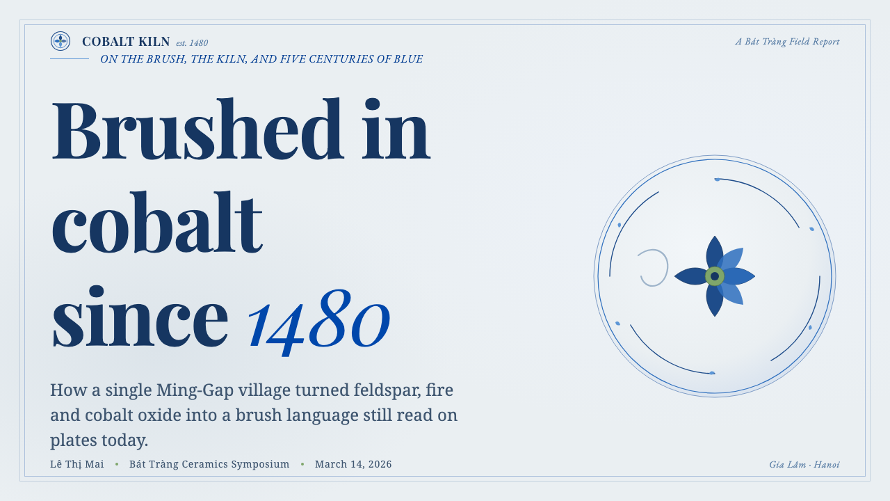
For presentation covers, use the plate logic rather than a poster crowded with references. Let a glaze-like field dominate, place a double rim near the perimeter or around one central message, and allow a cobalt lotus or partial dragon to occupy a deliberate corner. A Playfair title can sit calmly within that space. The cover should feel like a single composed object, not an inventory of every motif available to the style.
For content and data slides, turn cobalt linework into a hierarchy system. Section labels, fine dividers, chart outlines, and annotation marks can share the same drawn language, while the pale ground preserves readability. Charts should remain clear first: use blue to identify the most meaningful series or comparison, and use the double rim to frame a key conclusion rather than every data region. This keeps analytical material aligned with the style’s measured visual rhythm.
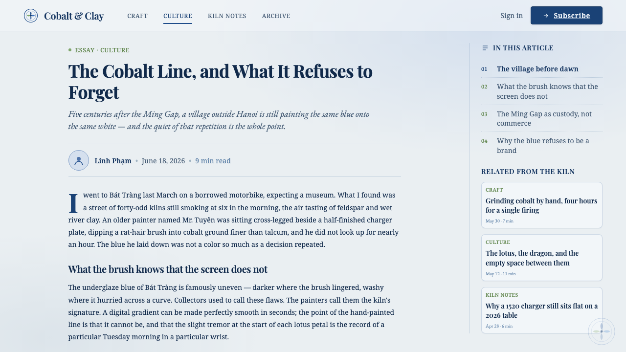
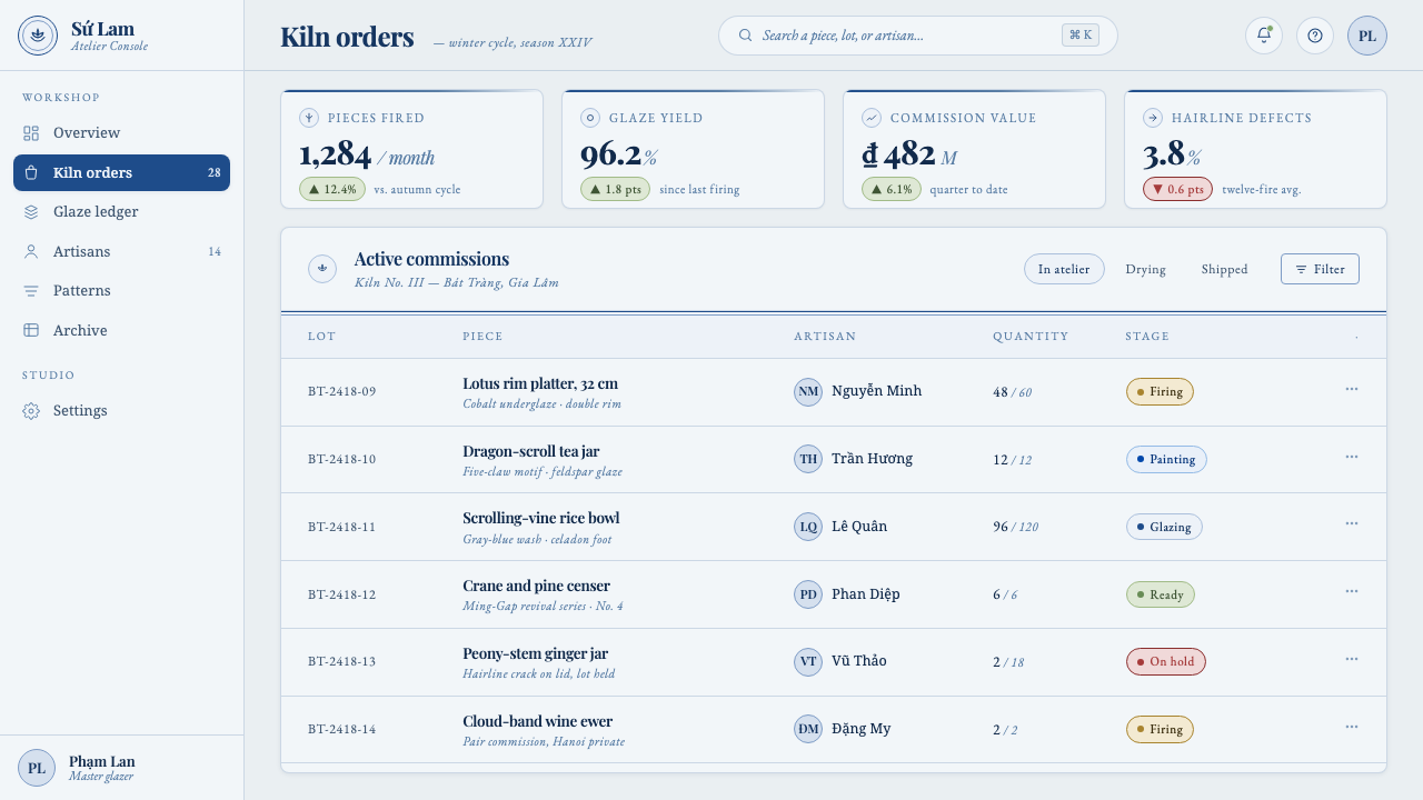
For web interfaces, the style suits dashboards, account areas, and pricing pages that benefit from trust, calm, and readable structure. Treat the interface as a sequence of pale ceramic fields, using cobalt for active paths, navigation emphasis, boundaries, and selected illustrations. Cards can feel like small plates when their framing is light and their content is given room. Avoid turning every control into a motif; utility elements should stay direct and legible.
For editorial and marketing work, Bát Tràng Ceramic Blue is particularly effective where heritage and contemporary care need to coexist. A long-form article can use blue line breaks, a small lotus at a chapter opening, and generous pale margins around serif text. A marketing page can reserve a dragon drawing for one expansive feature moment, then let product information remain quiet and editorial. The contrast between crafted imagery and composed typography gives campaigns a sense of provenance without requiring imitation of a physical vessel.
The common mistake is to treat blue-and-white porcelain as a pattern-fill theme. Repeating dragons and lotuses across every panel, making every border equally prominent, or saturating the page with cobalt erases the porcelain calm that the system depends on. Use motifs sparingly, retain open glaze ground, and let the double rim frame only what deserves attention. The aim is an interface shaped by painted restraint, not a surface covered with souvenirs.
Bát Tràng Ceramic Blue — FAQ
Is Bát Tràng Ceramic Blue simply a blue-and-white pattern style?
No. Pattern is only one possible expression of the system. Its deeper structure comes from cobalt underglaze blue on white feldspar glaze, the relationship between painted line and open ground, the framing logic of the double rim, and the calm editorial role of serif typography. If motifs are copied without those relationships, the result may look decorative but will not carry the style’s composed ceramic character.
How should lotus and dragon motifs be used?
Use them as focal drawings, not as default filler. A single cropped lotus can provide a quiet pause beside an introduction, while a dragon can create directional movement across a wider hero composition. Their scale and placement should respond to content hierarchy. When motifs do not help the eye enter, pause, or move through a composition, it is usually better to omit them.
Can the style support data-heavy dashboards?
Yes, if the ceramic references remain subordinate to clarity. The pale glaze ground can support dense information, cobalt linework can unify navigation and chart annotation, and double rims can isolate the most consequential summaries. The essential discipline is to keep functional controls and data legible before adding motifs. Blue should clarify emphasis, not make the dashboard feel like a decorated plate.
Why is the style paired with Playfair serif type?
Playfair contributes an editorial stillness that complements the material liveliness of brushed cobalt. The serif voice gives titles and reading passages a measured, composed presence, while the blue linework introduces a hand-painted counterpoint. The pairing works when neither side overwhelms the other: typography organizes language, and cobalt supplies contour, motif, and visual memory.
Related design styles
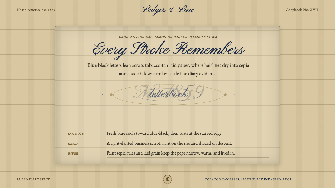 Spencerian PenmanshipLyrical ink, aged by time. Blue-black script rides tobacco-tan ruled paper.
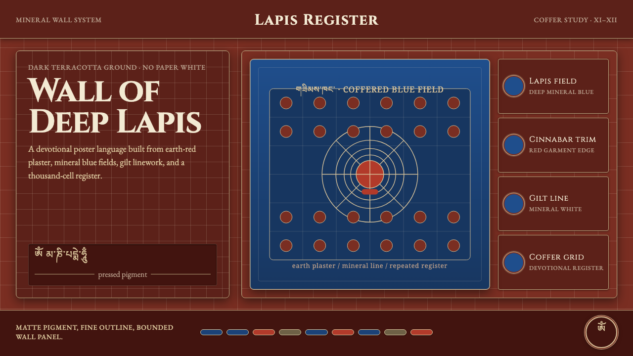 Alchi Monastery MuralDevotional depth. Lapis fields and coffered grids glow on terracotta plaster.
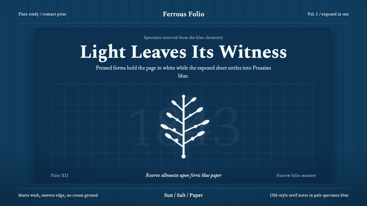 Anna Atkins CyanotypeScience turns spectral. Prussian blue ground, white reserves, Victorian serif…
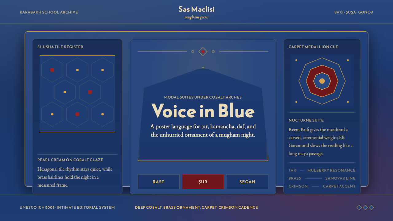 Azerbaijani Mugham Saz BlueMugham night, deeply tiled. Cobalt ground, brass hairlines, arched editorial…
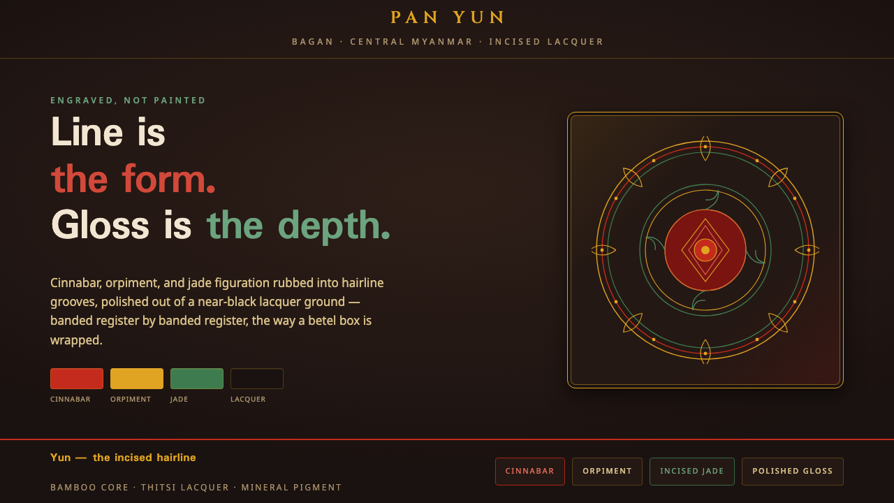 Bagan Yun LacquerwareEngraved, not painted. Cinnabar, orpiment and jade hairlines polished from ne…
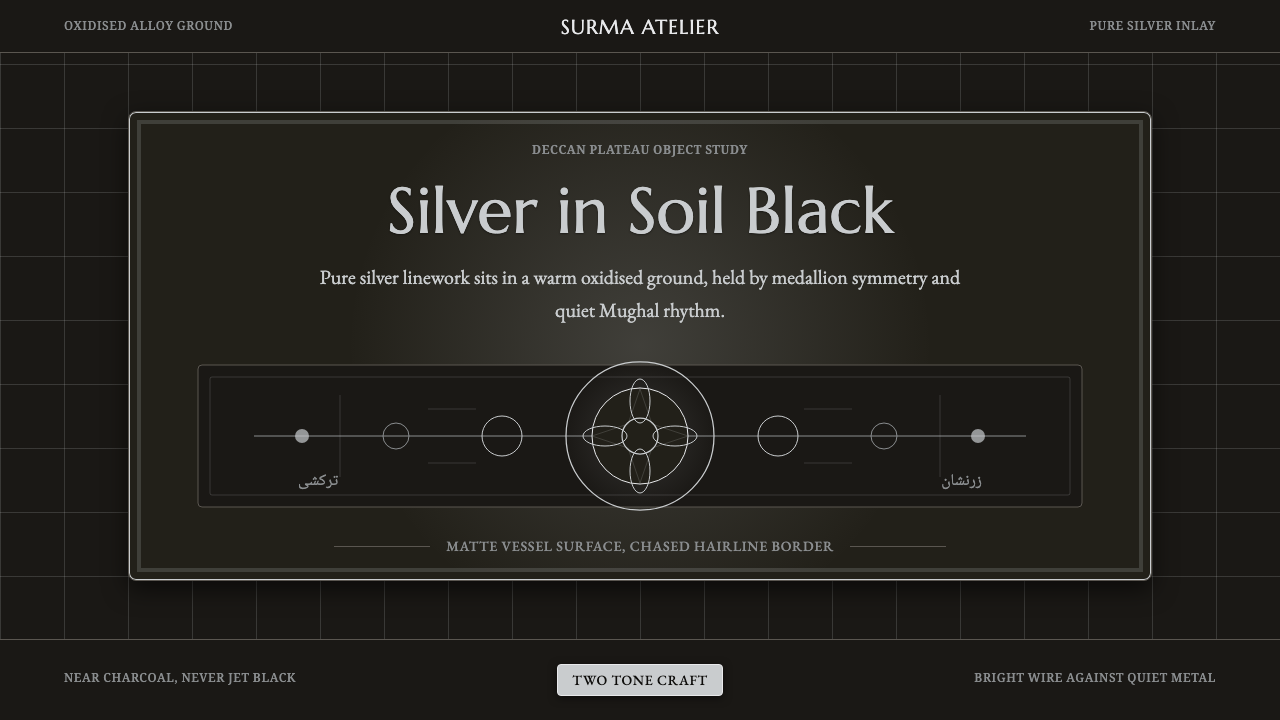 Bidar Bidriware VesselsSoil-black luxury. Crisp silver medallions and hairline borders cut the warm…