What is Alchi Monastery Mural?
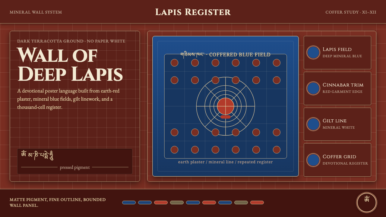
Alchi Monastery turns mineral pigment, dark terracotta plaster, and devotional geometry into a visual language of profound stillness.
Alchi Monastery Mural in brief
The murals of Alchi Monastery, especially those in the Sumtsek and Dukhang temples, are the great surviving witness to the Kashmiri Buddhist painting tradition. Their visual force comes from direct material presence: mineral pigments pressed into dark terracotta-red plaster, intense lapis-lazuli blue figures, and fine round-faced linework held against an earth-dark ground.
The defining impression is devotional depth rather than decorative richness. Lapis-blue bodhisattvas appear luminous without becoming glossy, while thousand-Buddha coffered grids create a field of repeated presence above or around them. The image is dense but not loud: color, line, and structure remain disciplined by the gravity of the wall.
This design system translates that mural environment into digital form. The page remains dark terracotta red instead of drifting toward cream, lapis blue stays deep and mineral rather than flat and electronic, and coffered lattices become the visual grammar for card grids, dividers, panels, and repeated information.

Where does Alchi Monastery Mural come from?
Alchi Monastery is located in Ladakh, in the western Himalaya and Central Asia. Its principal murals belong to the 11th–12th century and are associated with the Kashmiri Buddhist mural-painting tradition. The setting matters to the style: the work feels inseparable from a wall made of earth-colored plaster, where pigment does not sit above the surface as an applied graphic layer but becomes part of the surface itself.
The Sumtsek and Dukhang temples preserve the central visual evidence for this system. Their paintings unite devotional imagery with dense architectural organization. Lapis-lazuli bodhisattvas occupy fields of deep red, while thousand-Buddha coffering establishes repetition, containment, and rhythm. The result is neither an isolated illustration nor a loose decorative pattern; it is a complete environment in which image and structure sustain one another.
The painters are identified in the source material as anonymous Kashmiri master painters, together with the painters of the Alchi Sumtsek and Dukhang temples. Their anonymity is part of the historical character of the work. The tradition is understood through its surviving surfaces, materials, iconographic language, and regional continuity rather than through a documented chain of individual signatures.
The visual tradition is connected to Kashmiri Buddhist mural painting and Indo-Tibetan tantric iconography. In a digital adaptation, this origin should remain visible through restraint and material logic. The system is not a generic dark theme with sacred decoration added on top; it is a translation of painted plaster, mineral color, repeated devotional presence, and architectural enclosure into interface structure.
What defines the Alchi Monastery Mural look?
Terracotta Ground
The ground is a deep terracotta red with the weight of earth and plaster. It should remain dark, matte, and slightly earthen, never becoming cream, ivory, or a glossy wine red. This ground is not a backdrop chosen after the content; it is the condition that gives every lapis-blue figure, pale line, and light panel its devotional depth.
Mineral Lapis
Lapis blue is the signature accent, but it must feel mineral rather than digital-flat. Use it for figures, selected headings, active states, or structural marks that deserve spiritual and visual emphasis. Its power comes from depth and concentration. If every element receives the same blue intensity, the color loses its role as a rare, luminous presence.
Coffered Repetition
The thousand-Buddha coffered grid supplies the system's main organizing device. Repetition should feel architectural and devotional, not like a generic spreadsheet. Small repeated cells can hold icons, metadata, or compact cards, while larger framed fields can contain major content. The grid gives density a measured rhythm and prevents the dark palette from becoming shapeless.
Fine Round-Faced Line
Linework is fine, composed, and gently rounded in its treatment of faces and figures. It should clarify rather than dramatize. Avoid aggressive angular outlines, cartoon exaggeration, or thick ornamental strokes. In interface terms, this means using delicate rules, restrained icon contours, and calm silhouettes that carry attention without competing with the surface.
Devotional Enclosure
Content should feel held within a sacred architectural field. Panels, cards, and sections are framed or nested rather than floating freely in empty space. Enclosure does not mean heaviness: generous breathing room can exist inside the larger red field, while local borders and repeated cells create a sense of protected attention.
Matte Depth
Depth comes from layered surfaces, tonal restraint, and the relationship between plaster-dark ground and concentrated pigment. Avoid glassy gradients, glossy cards, and soft atmospheric effects that turn the wall into a polished screen. A panel may appear lighter or more pigment-rich, but its character should remain quiet, tactile, and materially grounded.

Who shaped Alchi Monastery Mural?
The anonymous Kashmiri master painters represent the tradition through its surviving material language rather than individual biography. Their work joins mineral pigment, dark plaster, fine round-faced line, and devotional composition into a coherent mural environment. In this design system, their importance is expressed through fidelity to surface, color depth, and disciplined repetition.
The painters associated with the Sumtsek temple contribute to the system's sense of architectural density and devotional enclosure. Their work is recalled through framed fields, repeated coffered structures, and the placement of luminous blue imagery within a dark earthen environment. The digital equivalent should feel built into the page rather than placed upon it.
The painters associated with the Dukhang temple extend the same visual world through sacred repetition, mineral color, and quiet figure-making. Their contribution is useful as a model for systems that must hold substantial information without losing solemnity. Every module can be distinct, yet the shared ground, lattice, and line discipline should make the whole remain continuous.
How do you use Alchi Monastery Mural today?
For presentation slides, use the terracotta ground as the persistent field across cover and content pages. A cover can place a concentrated lapis-blue emblem or framed figure against the dark surface, with the title held inside a quiet architectural field. Content slides should use coffered modules to separate ideas without decorative clutter. Data slides can treat repeated cells as devotional registers, allowing charts or comparisons to sit inside framed grids rather than floating as disconnected software objects.
For web interfaces, the style suits dashboards, catalogues, and pricing pages that need density with composure. Use the dark red ground to establish continuity, lapis blue for active states and selected emphasis, and framed grid modules for plans, metrics, or product groups. Cards should feel nested into a mural wall, not lifted above it by glossy depth. Navigation benefits from restrained labels, fine rules, and small geometric or architectural markers.
For editorial and marketing work, Alchi Monastery Mural supports a strong sense of place and considered authority. Long-form pages can alternate dense coffered information fields with quieter red intervals, allowing image, caption, and text to feel like parts of one painted environment. Marketing pages should lead with material atmosphere: a deep earth-colored opening, a concentrated blue focal element, and calls to action treated as rare points of illumination rather than repeated bright signals.
For cultural, educational, or archival communication, the system can express seriousness without becoming institutional or sterile. Use repeated frames for chronology, object records, or thematic groupings, while preserving enough open ground for contemplation. The visual language is especially effective when the content concerns craft, heritage, ritual, material history, or any subject where attention and continuity matter as much as rapid scanning.
The common mistake is turning the style into a generic dark interface with blue highlights. That approach keeps the palette but loses the wall. Avoid excessive neon blue, glossy surfaces, floating glass cards, random ornamental patterns, and unrestricted repetition. The system depends on a specific relationship between dark terracotta ground, mineral lapis concentration, fine line, and architectural enclosure. Remove that relationship and the result becomes decorative technology rather than Alchi-inspired design.

Alchi Monastery Mural — FAQ
Is this simply a dark red and blue color palette?
No. The palette is only the visible starting point. The essential character comes from the relationship between dark terracotta plaster, concentrated mineral blue, fine rounded linework, and coffered repetition. If those colors are placed on glossy cards with loose spacing and unrelated decorative patterns, the result may be attractive but it no longer carries the mural logic. Material restraint and architectural enclosure are as important as hue.
Can the design use a light background?
A light variant would move away from the approved source character. The defining ground is dark terracotta red, and it should not lighten toward cream or ivory. Supporting text or selected panels may be lighter for legibility, but the main field needs to retain its earth-dark presence. That persistent darkness is what allows lapis blue and pale linework to feel concentrated rather than merely colorful.
How should the thousand-Buddha grid be used in an interface?
Use it as an organizing structure rather than a literal decorative wallpaper. Repeated cells can contain compact cards, metadata, icons, or related records, while larger framed fields can hold primary content. Variation in scale and emphasis is important: every cell should not compete equally. The grid should create continuity and measured density, leaving the most concentrated blue or brightest information for places that deserve attention.
Does the style require religious imagery?
No, but removing the imagery does not remove the need for devotional discipline. The system can support dashboards, catalogues, editorial pages, or educational tools without depicting bodhisattvas. What should remain is the sense of protected attention: material ground, framed organization, quiet repetition, and rare concentrated accents. Borrowing the visual structure while treating the source as generic ornament would weaken the connection to Alchi.
Related design styles
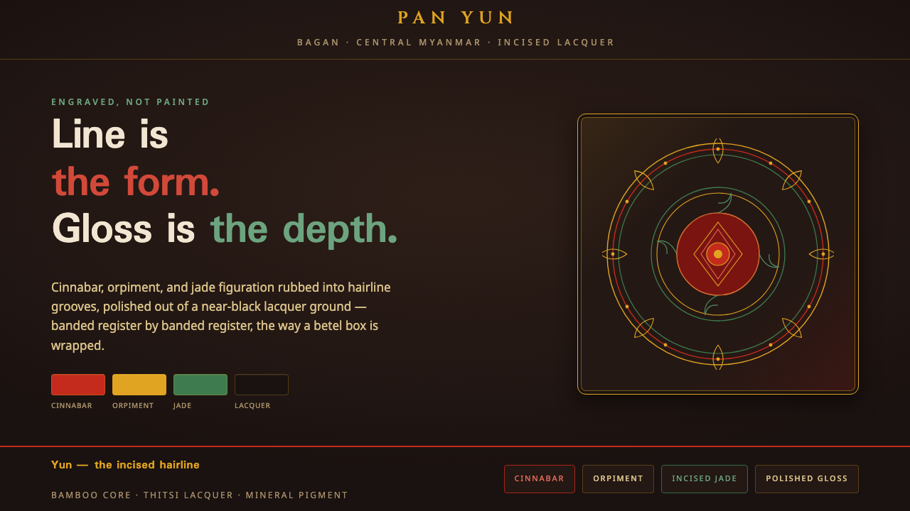 Bagan Yun LacquerwareEngraved, not painted. Cinnabar, orpiment and jade hairlines polished from ne…
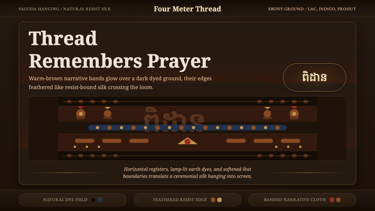 Cambodian Pidan IkatSacred cloth glows. Ebony-indigo bands carry warm-brown ikat figures with fea…
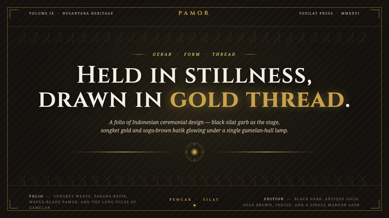 Indonesian Pencak SilatHeld in stillness, drawn in gold. Songket thread glows on black silat garb un…
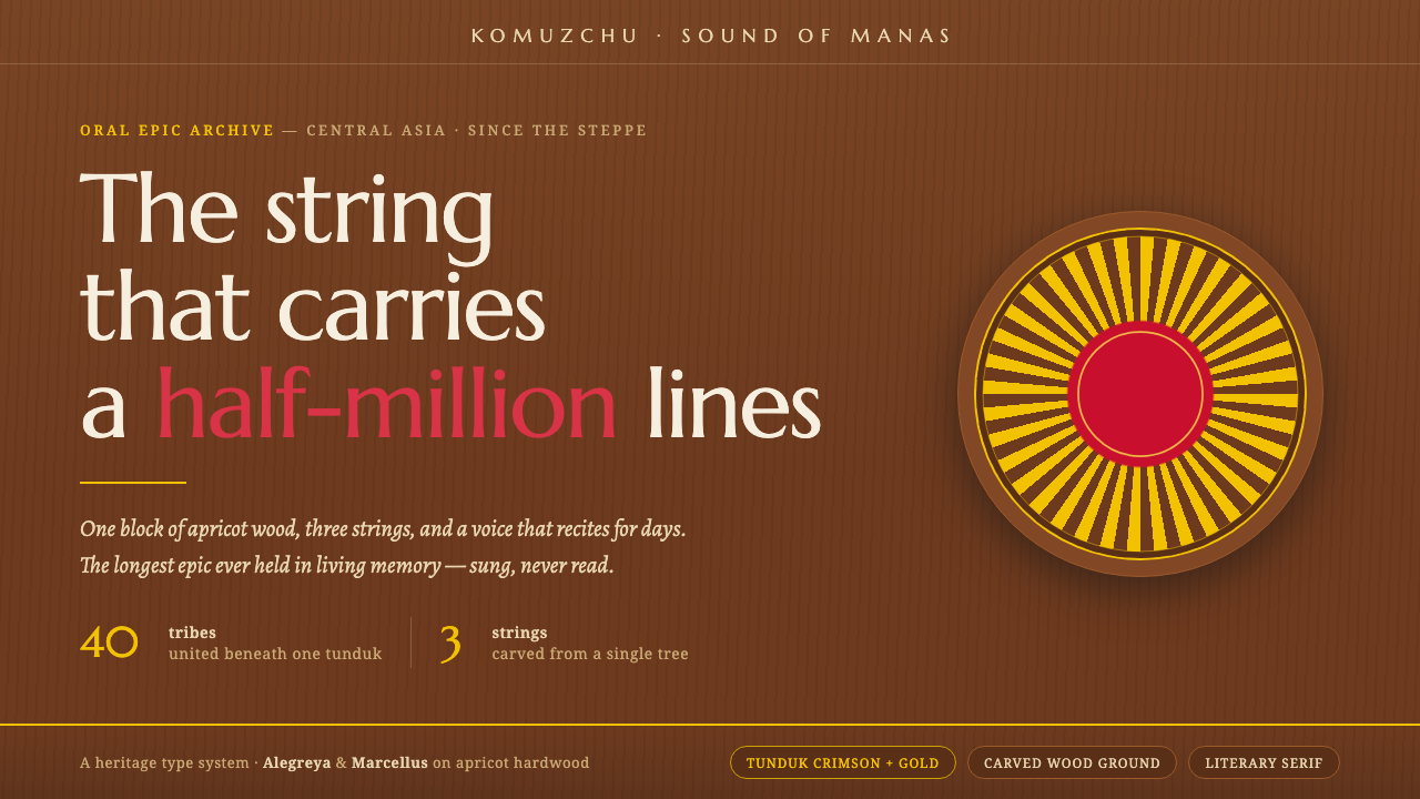 Kyrgyz Komuz & Manas EpicWarmth carved from apricot wood. Crimson-and-gold tunduk sun-rays on dark gra…
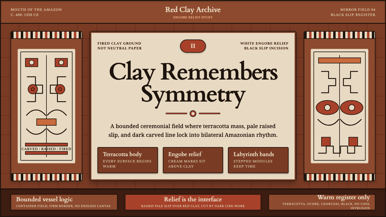 Marajoara Amazon CeramicClay holds memory. Terracotta ground, pale engobe relief, and black slip lock…
 Afghan Baluchi Prayer RugDevotional darkness glows. Plum field, oxblood mihrab, and camel borders surf…