What is Kyrgyz Komuz & Manas Epic?
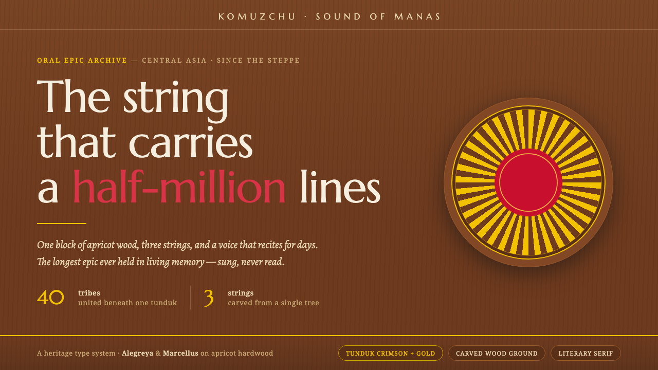
The Kyrgyz komuz turns carved apricot wood and the crimson-gold tunduk into a visual language of nomadic warmth, carried by the literary cadence of the Manas reciter.
Kyrgyz Komuz & Manas Epic in brief
Kyrgyz Komuz & Manas Epic is a dark, material-led design style rooted in Central Asian Kyrgyzstan. Its starting point is the komuz, a three-string lute carved from a single block of apricot or juniper wood, and its narrative center is the Manas, the world’s longest oral epic. The style therefore does not begin with a neutral interface canvas. It begins with an object, a voice, and a tradition in which craft and performance are inseparable.
Its visual atmosphere is honeyed amber hardwood, dark grain, warm felt, lacquer-crimson accents, and gold tunduk ornament. The tunduk is the yurt crown, rendered as a radial sun-ray motif and recognized as the central emblem on the Kyrgyz national flag. Against the dark wood ground, crimson feels like lacquer and gold reads as a concentrated glint. The result is warm without becoming rustic, ceremonial without becoming ornamental excess, and literary without becoming antique.
In digital form, the system translates the cadence of oral recitation into hierarchy and rhythm. Warm literary serifs carry long-form reading; carved-looking tonal layers give the surface a sense of hand and material; tunduk rays organize emphasis; crimson and gold mark importance. The ground remains amber wood rather than paper, so the page feels held inside a crafted instrument or a reciter’s performance space. Every choice should preserve that relationship between touch, sound, memory, and place.
Where does Kyrgyz Komuz & Manas Epic come from?
The source tradition belongs to Central Asia, specifically Kyrgyzstan, and is framed by the living relationship between nomadic instrument craft and oral epic tradition. The komuz is not described as an assembled object but as a form released from one block of wood. Apricot and juniper establish the material vocabulary: close, warm, organic, and visibly shaped by the hand. This is why the style’s dark surfaces should suggest carved hardwood rather than anonymous black. The darkness is a ground for grain, not an absence of material.
At the center of the tradition is the connection between the instrument and the voice. The komuz carries the Manas, while the manaschy — the Manas reciter — carries the epic through spoken performance. That pairing gives the style two distinct but interlocking tempos: the tactile patience of carving and the forward cadence of recitation. A digital composition can honor both by letting the surface feel grounded and the typography feel voiced, with paragraphs and headings arranged as movements in a remembered story.
The Manas is identified here as the world’s longest oral epic, so the design system must be capable of sustaining extended narrative rather than only making a dramatic first impression. Its literary serif is not a historical costume added after the fact; it is the typographic equivalent of the reciter’s cadence. Long passages should feel comfortable and dignified, while crimson and gold should guide the reader through the narrative as recurring signals. The visual language is epic because it supports duration, repetition, and memory.
The period supplied for this reference is 1950–1990, within a continuing tradition rather than a sealed historical style. Its symbolism draws on the tunduk, the yurt crown, whose crimson-and-gold sun-rays are also the central image of the Kyrgyz flag. The named key figures — komuzchu, manaschy, Sayakbai Karalaev, and Toktogul Satylganov — keep the system connected to makers and performers. They remind designers that this is not a generic wood texture with ethnic decoration, but a visual interpretation of a specific cultural relationship.
What defines the Kyrgyz Komuz & Manas Epic look?
Material Ground
The palette begins in dark amber hardwood: a deep, honeyed brown-black ground with warmth still visible inside it. Lacquer-crimson is the principal accent, while tunduk gold supplies the high point of light. Warm felt can soften the material story around the edges. These colors should feel absorbed into wood, laid down like lacquer, or caught in a metal-like glint; they should not read as arbitrary bright interface swatches. The strongest compositions let the ground do most of the visual work.
Literary Serif
Warm literary serifs are essential because they echo the cadence of the manaschy. Type should feel voiced, patient, and suited to sustained reading rather than optimized for sterile neutrality. Headings may carry the authority of an epic title, while body text remains calm and legible. Contrast comes through scale, spacing, and placement, not a parade of unrelated type styles. A single serif family with a considered range of expression will feel more faithful than decorative display lettering.
Tunduk Ornament
The tunduk is the signature motif: a crown-like circular structure whose rays spread outward with ceremonial clarity. Use it as an organizing device, seal, divider, or focal emblem, keeping the radial logic intact. The motif should appear deliberate and centered when it signifies identity, then become partial or cropped when it guides a larger composition. Repetition is welcome when it resembles a remembered pattern; random pattern scatter weakens the symbol.
Carved Depth
Surface depth comes from material suggestion rather than simulated realism. Dark grain, carved edges, warm felt, and lacquered crimson can establish layers, but each layer should remain quiet enough for text to survive. A good surface feels touched and made; it does not compete with the story. Treat texture as a cultural and sensory cue, not as noise. The contrast between rough wood and concentrated gold is more valuable than a collection of unrelated effects.
Epic Rhythm
Composition should carry the alternation of instrument and voice. Dense passages can sit within stable, grounded fields; titles and pull moments can arrive with the lift of a refrain. Tunduk rays, horizontal rules, or restrained color blocks may mark changes in register. The visual rhythm should be measured and cumulative, allowing the reader to sense continuity across sections. Excessive fragmentation would turn an epic tradition into a collection of disconnected ornaments.
Warm Darkness
This is a dark style, but darkness is not the same as blackness. The ground should retain the warmth of amber wood, with enough tonal variation to imply grain and carving. Crimson and gold need room around them so they remain accents rather than wallpaper. Light surfaces may appear as warm felt or restrained text tones, but a paper-white field changes the premise. The system works when every contrast still belongs to the same crafted, nocturnal material world.
Who shaped Kyrgyz Komuz & Manas Epic?
Komuzchu are the komuz masters named in the source tradition. They represent the craft side of the system: the instrument carved from a single block of apricot or juniper, the warmth of the wood, and the authority of a form shaped by making. In design terms, they anchor the visual language in material intelligence. The style should always feel as though its surfaces have been made, not merely colored.
Manaschy are the Manas reciters, the human voices through which the oral epic is carried. They explain why literary serif typography matters here: the page should suggest breath, cadence, memory, and sustained telling. Their role gives the style its temporal dimension. It is not only about how a surface looks at a glance, but about how language moves across it over the course of a story.
Sayakbai Karalaev is named among the key figures of the source tradition. His inclusion places the system within a lineage of specific Kyrgyz cultural carriers rather than an anonymous folklore category. When this style is applied to an editorial or educational product, the name calls for respectful context: the visual language should support the tradition it references, not turn a living epic into surface pattern.
Toktogul Satylganov is likewise identified as a key figure. In the design system, his presence reinforces the importance of named cultural memory and the continuity between music, voice, and public identity. The reference does not require invented biography to be useful. It is enough to let the name stand as a reminder that the style’s warmth comes from a tradition carried by people, not from wood grain alone.
How do you use Kyrgyz Komuz & Manas Epic today?
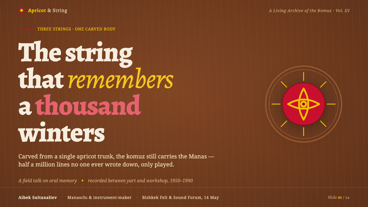
For presentation slides, use the dark amber wood as the persistent stage. A cover can place the title in a warm literary serif against a broad field of grain, with a partial tunduk sun-ray structure or a concentrated crimson-and-gold emblem establishing the subject. Content slides should feel like successive passages: calm text fields, clear serif hierarchy, and restrained ornamental markers. Data slides can turn charts into ceremonial diagrams, using crimson for the principal measure and gold for a highlighted finding, while keeping the geometry legible and the surface quiet. The system’s strength is continuity: the cover introduces the instrument, the content sustains the voice, and the data becomes another form of patterned evidence.
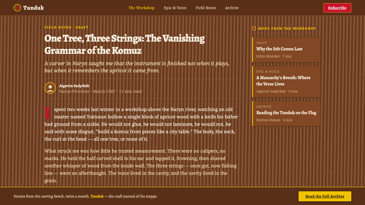
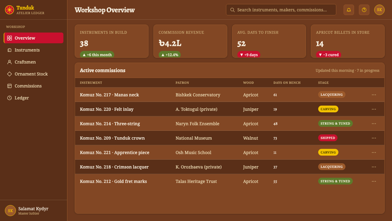
For web interfaces, the style suits dashboards and pricing pages that need authority, narrative warmth, and a memorable identity. Keep the underlying structure disciplined so the material surface does not reduce scanability. Use amber wood for the main environment, warm light tones for reading areas, and crimson or gold to distinguish active states, key figures, or plan emphasis. Cards can feel like carved plaques or felt-backed panels, but their hierarchy must remain quiet and predictable. A tunduk mark can identify a product tier or section; it should not become a repeated badge on every control. Serif-led navigation and headings can work especially well when the product has an educational, cultural, or editorial purpose.
For editorial and marketing work, let the style behave like a book of epic memory rather than a theme applied to a poster. Long-form articles benefit from generous reading fields, strong section openings, and recurring crimson or gold signals that help readers locate the next turn. A campaign cover can pair a large title with a cropped radial tunduk motif, while supporting pages use wood grain and warm felt cues to create continuity. Marketing blocks may alternate between dark carved surfaces and warmer text zones, but the transitions should feel like changes in voice, not decorative color swaps. The result is especially suited to cultural institutions, learning products, music projects, and brands that need depth without losing warmth.
The common mistake is to reduce the style to dark brown, red, gold, and a decorative folk pattern. That formula misses the relationship between komuz craft and Manas recitation. Avoid adding ornament without function, using bright gold everywhere, or treating the tunduk as generic mandala geometry. Avoid replacing the amber wood ground with pure black, paper white, or unrelated gradients. Avoid pairing the literary serif with novelty lettering that makes the page feel theatrical. The correct test is simple: can the design still suggest carved material, a sustained human voice, and the crimson-gold crown of the yurt when the ornament is quiet? If not, the palette is being used without the tradition.
Kyrgyz Komuz & Manas Epic — FAQ
Is this style meant to look like a literal traditional object?
No. It is a digital interpretation of the relationship between komuz craft, Manas recitation, and tunduk symbolism. The interface should carry the warmth of carved apricot or juniper wood, the cadence of a literary voice, and the visual authority of crimson and gold, but it does not need to imitate a complete instrument or yurt. The goal is cultural resonance through material, typography, and rhythm rather than stage-prop realism.
Why must the ground remain amber wood rather than paper?
Because the material ground is part of the style’s meaning, not a neutral backdrop. The komuz is carved from apricot or juniper wood, and the source system explicitly places its visual world in dark carved hardwood. A paper-white field shifts the emotional register toward print, modernist neutrality, or general editorial design. Warm light tones may support reading, but they should feel related to felt, wood, or restrained illumination rather than erase the crafted darkness.
How should the tunduk motif be used without becoming decorative clutter?
Treat the tunduk as a structural symbol before treating it as a pattern. It can organize a cover, identify a section, divide a long passage, or focus attention on a key figure. Its radial sun-ray logic should remain recognizable, while cropping can help it participate in larger compositions. Use repetition only when it creates continuity or memory. If the motif appears on every card, control, and corner, it stops carrying identity and becomes visual noise.
Can the style support modern dashboards and pricing pages?
Yes, provided that the material richness remains subordinate to information clarity. Dashboards can use the wood ground to establish identity, literary serifs to create a warm reading voice, and crimson or gold to distinguish active states, key figures, and plan emphasis. The underlying hierarchy must stay calm and predictable. This style is strongest when its cultural cues deepen a clear product structure; it becomes ineffective when texture, ornament, and color compete with the information users came to find.
Related design styles
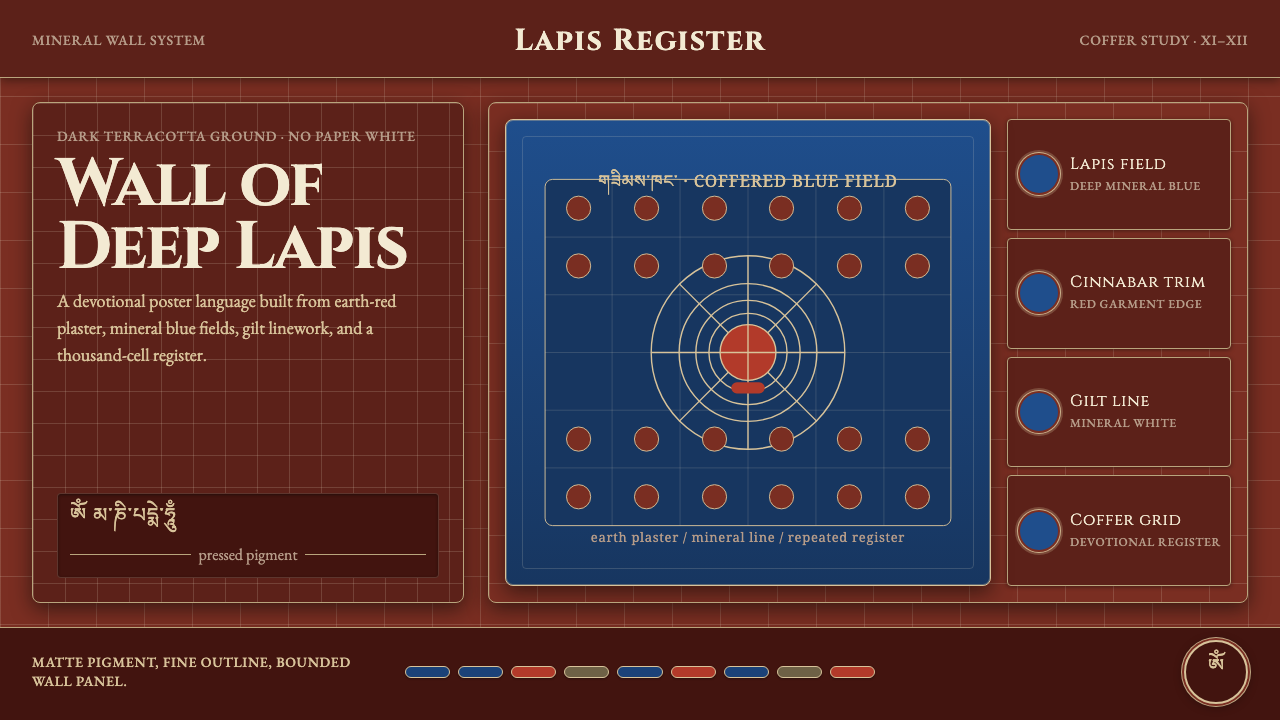 Alchi Monastery MuralDevotional depth. Lapis fields and coffered grids glow on terracotta plaster.
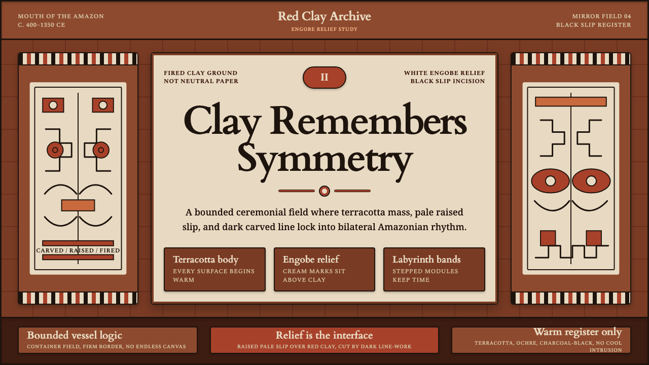 Marajoara Amazon CeramicClay holds memory. Terracotta ground, pale engobe relief, and black slip lock…
 Afghan Baluchi Prayer RugDevotional darkness glows. Plum field, oxblood mihrab, and camel borders surf…
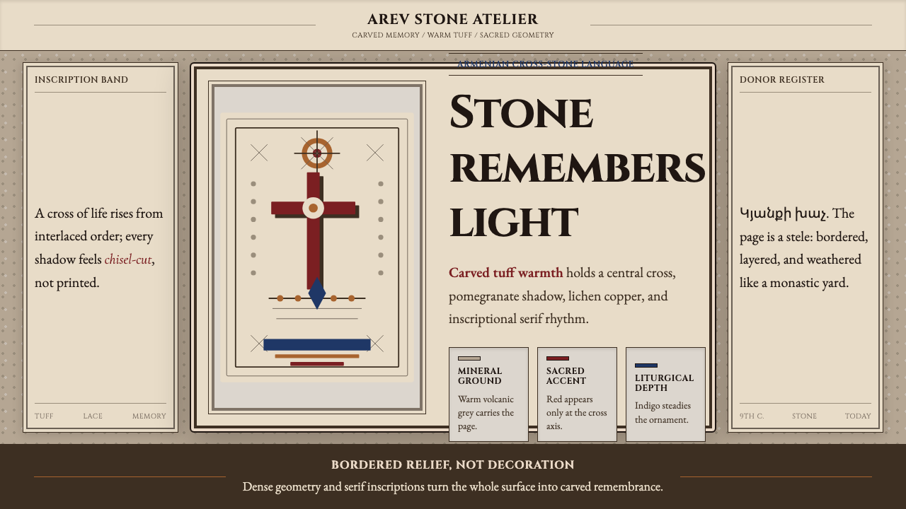 Armenian Khachkar Cross-StoneStone becomes memory. Tuff grey, pomegranate red, and carved borders hold the…
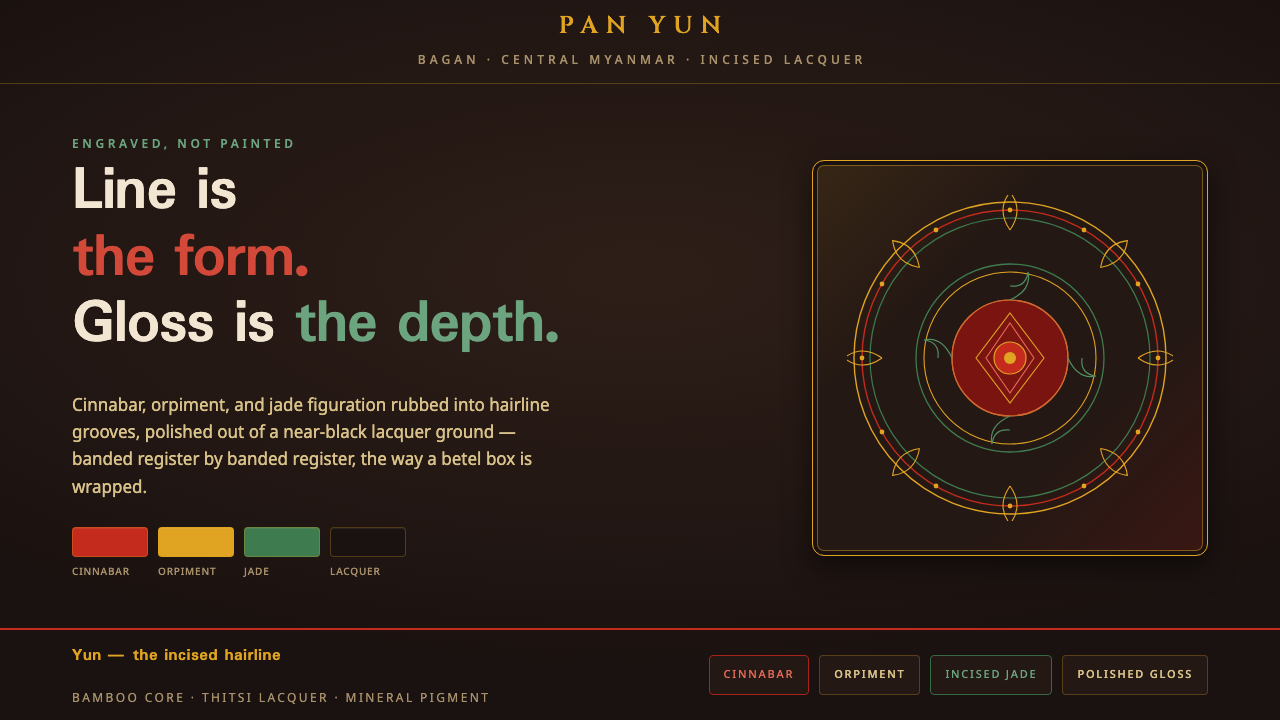 Bagan Yun LacquerwareEngraved, not painted. Cinnabar, orpiment and jade hairlines polished from ne…
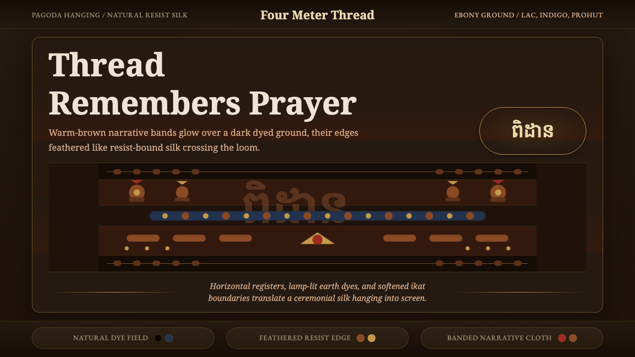 Cambodian Pidan IkatSacred cloth glows. Ebony-indigo bands carry warm-brown ikat figures with fea…