What is Cambodian Pidan Ikat?
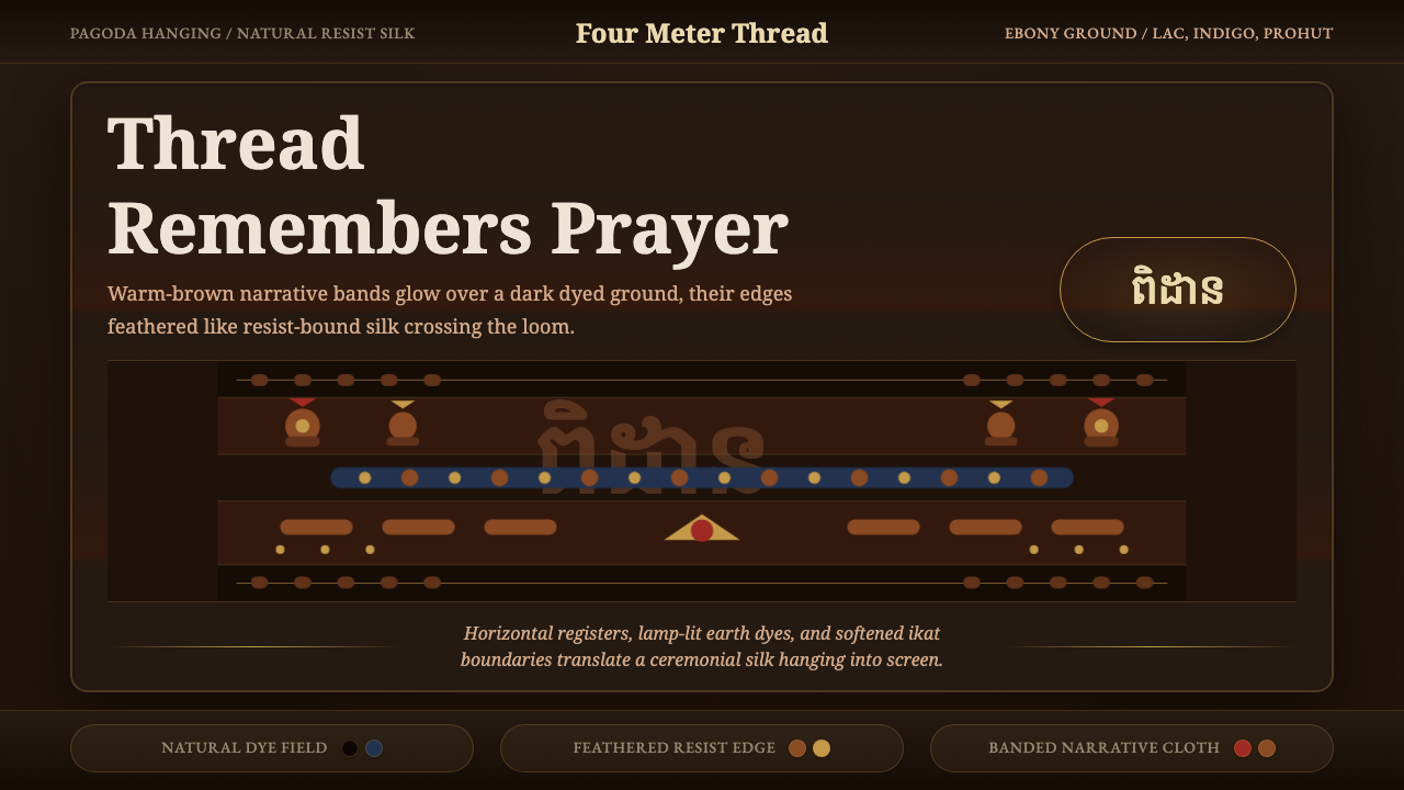
The hol pidan is a sacred Cambodian silk hanging woven above the Buddha, its warm earth-toned figures glowing out of a dark dyed ground with the soft feathered edges that only resist-dyed ikat can produce.
Cambodian Pidan Ikat in brief
Cambodian Pidan Ikat translates a devotional textile into a design system: the hol pidan, a roughly four-meter pictorial weft-ikat silk hanging traditionally displayed above or behind a Buddha image in Theravada pagodas. It is dyed entirely with natural resists — none of its color comes from paint or print — and the resulting field reads as warm earth browns glowing against a dark, dyed ground rather than as bright, flat color.
The system's most distinctive visual signature is the soft, feathered edge that surrounds every figure and band. This blur is not a stylistic flourish added afterward; it is the direct physical fingerprint of weft ikat, a resist-dyeing technique in which the weft threads themselves are tied and dyed into a pattern before weaving, so that the image only fully resolves once the cloth is on the loom — and never resolves into a perfectly crisp edge, because no hand-tied resist aligns with total precision.
Composition runs in horizontal bands across the cloth's long format, with warm-brown narrative figures set against a deep ebony-indigo ground, bordered by geometric registers. Nothing in this vocabulary is sharp-edged, saturated, or synthetic; every color and every boundary carries the visible trace of a slow, hand-controlled dyeing process.
Where does Cambodian Pidan Ikat come from?
The hol pidan tradition belongs to a long-standing devotional weaving practice in Cambodia, continuing from before 1900 through the mid-twentieth century, when pidan cloths remained in active use hung above Buddha images in Theravada pagodas across the country. A pidan was typically commissioned or woven as an act of religious merit — a family or community's contribution to a temple — rather than produced as a commercial object for sale, which set it apart from other Khmer textiles woven primarily for everyday clothing or use.
The technique behind it is weft ikat, one of the more demanding resist-dye methods in textile weaving. Before a single thread touches the loom, sections of the silk weft yarn are bound tightly to resist dye penetration, then dipped in successive natural dye baths, unbound and rebound to build up a multi-color pattern one color at a time. Only once this pre-dyed weft is finally woven against a plain warp does the pictorial design — figures, temples, geometric borders — resolve into visibility, and because binding by hand can never register with total precision, every pattern edge carries a soft, slightly blurred halo unique to this technique.
Color came entirely from natural, locally sourced materials: red from lac, a resin secreted by the lac insect; blue from indigo-yielding plants; a yellow-green from the bark of the prohut tree; and black from ebony bark. Combined, these dyes produced the warm, muted earth-tone register that defines the style — a palette bounded by what nature actually yields rather than by an unlimited synthetic range, which is part of why the finished cloth reads as glowing rather than garish.
This tradition, like much of Khmer artisanal craft, suffered catastrophic disruption during the Khmer Rouge period of the mid-to-late 1970s, when skilled weavers and the knowledge they carried were lost at devastating scale — a rupture that is inseparable from any honest account of why so much of this weaving tradition had to be painstakingly reconstructed rather than simply continued. In the decades since, dedicated revival efforts — including workshops such as the Institute for Khmer Traditional Textiles, founded in Siem Reap by the Japanese silk conservator Kikuo Morimoto — have worked to relearn natural dye recipes and ikat binding techniques directly from surviving elder weavers, so that the craft could be passed forward again rather than disappearing with the generation that carried it.
What defines the Cambodian Pidan Ikat look?
Color
A deep ebony-indigo ground carries the composition, with warm-brown narrative figures — the combined result of lac red, prohut yellow-green, and ebony black dyeing — glowing against it. Every hue in this system traces back to a specific natural dye source, which keeps the palette muted, earthy, and warm rather than bright or synthetic.
Technique: Weft Ikat
The pattern is produced by dyeing the weft threads in a bound, resist pattern before weaving, rather than by painting, printing, or dyeing the finished cloth. This means the image and the material are inseparable — the pattern is literally woven into the structure of the thread itself, not applied to its surface afterward.
Feathered Edges
Every pattern boundary carries a soft, slightly blurred halo rather than a crisp vector line — the inevitable result of hand-binding never registering with perfect precision across successive dye baths. This feathering is the single most identifying trait of authentic ikat and the detail most often lost when the style is flattened into a printed pattern.
Composition
Figures and motifs are organized into horizontal bands running across the cloth's long format, echoing the physical structure of a hanging scroll rather than a centered, single-focus image. This banded register system allows multiple narrative or symbolic scenes to coexist on the same cloth in a readable sequence.
Iconography
Figural content draws on Theravada Buddhist narrative and devotional subject matter: celestial beings, temple or palace structures, animals, and figures associated with stories from the Buddha's lives, interspersed with geometric border motifs. This is pictorial storytelling woven for religious use, not abstract or purely decorative pattern.
Material and Surface
The cloth is silk, but its surface reads as muted rather than glossy — the natural dyeing process and the density of the weft-ikat pattern soften what might otherwise be a high-shine material into something closer to matte, glowing warmth. Sheen is present but restrained, never treated as a bright, reflective highlight.
Devotional Function
A real pidan is not a neutral decorative object — it is a votive offering, made to be displayed in a specific, elevated position above a Buddha image as an act of religious merit. A design system drawn from it carries that gravity: it reads as reverent and considered rather than casual, and it is best applied with awareness of that sacred origin rather than as generic 'ethnic pattern' decoration.
Who shaped Cambodian Pidan Ikat?
The skilled artisans, historically almost entirely uncredited by individual name, who carried out the demanding process of binding, dyeing, and weaving weft ikat silk. Producing a single pidan required not just weaving skill but the ability to plan a full pictorial composition in advance, since the pattern had to be dyed into the weft before a single pass through the loom.
The specialists responsible for sourcing and preparing the natural dye materials — lac insect resin for red, indigo plants for blue, prohut bark for yellow-green, and ebony bark for black — and for managing the successive dye baths that built up the pidan's multi-color pattern one hue at a time.
A weaving workshop founded in Siem Reap by the Japanese silk conservator Kikuo Morimoto, dedicated to relearning and passing forward natural dye recipes and ikat binding techniques directly from surviving elder weavers after the tradition was catastrophically disrupted during the Khmer Rouge period. Its work is central to why pidan-related weaving knowledge survives today at all.
How do you use Cambodian Pidan Ikat today?
Cambodian Pidan Ikat carries genuine religious weight, so applying it well starts with treating it as a considered, respectful reference rather than a decorative motif stripped of context — the feathered ikat edge and the muted natural palette are its substance, not optional flourishes.
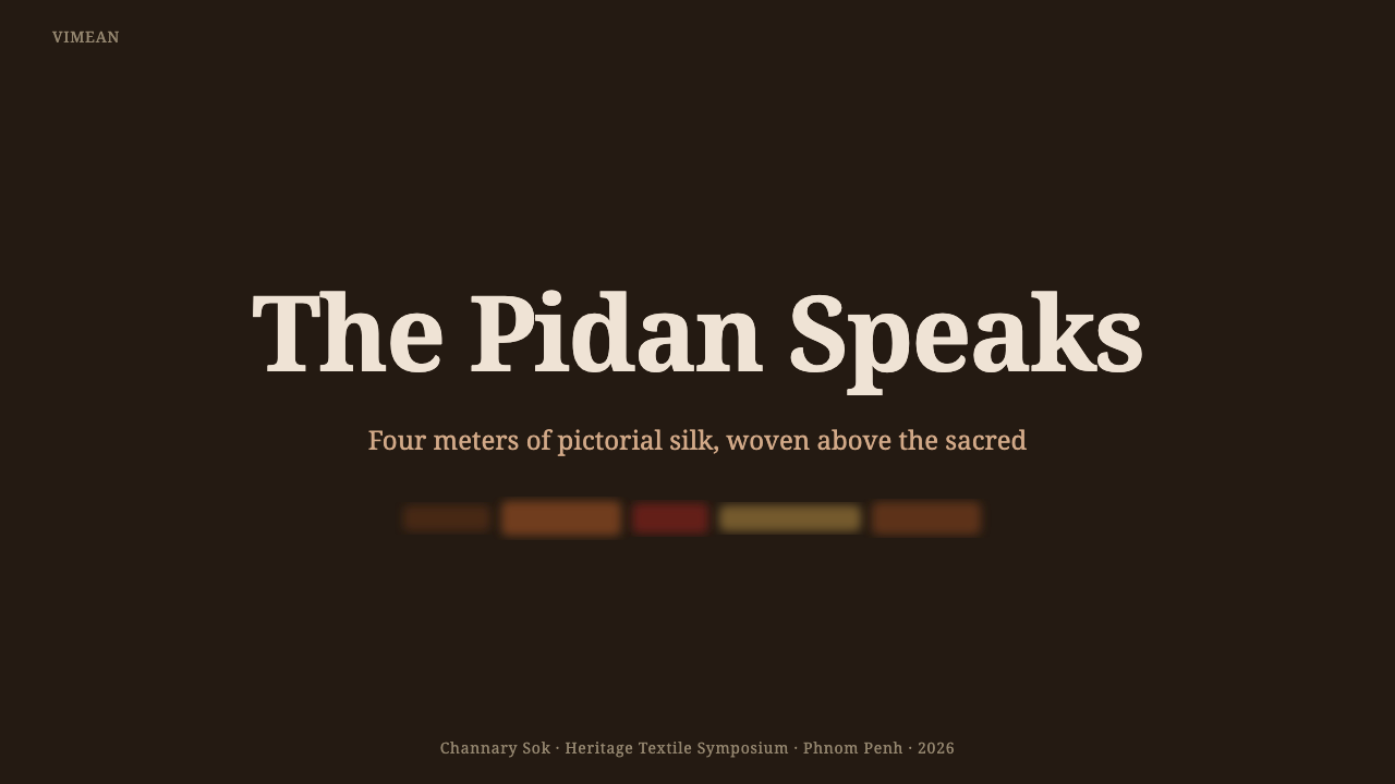
For presentation slides, a cover page works well built around the deep ebony-indigo ground with a single warm-brown figure or motif glowing at its center, echoing how a real pidan reads from a distance in a dim pagoda interior. Content slides should stay restrained — a narrow band of the pattern at the top or edge of a slide, rather than a busy repeated print across the whole surface — preserving the sense of a banded, sequential composition rather than an all-over wallpaper texture.
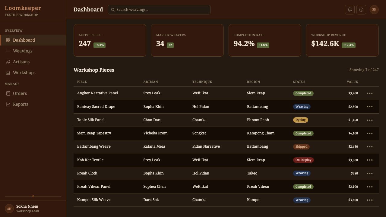
For web interfaces, this style is a difficult fit for conventional dashboards or data-dense products, where its slow, glowing, soft-edged register works against scannability. It suits cultural and heritage platforms, museum and archive sites, meditation or contemplative wellness products seeking a reverent mood, and premium storytelling around craft or textile heritage — always with real context about the object's origin and use.
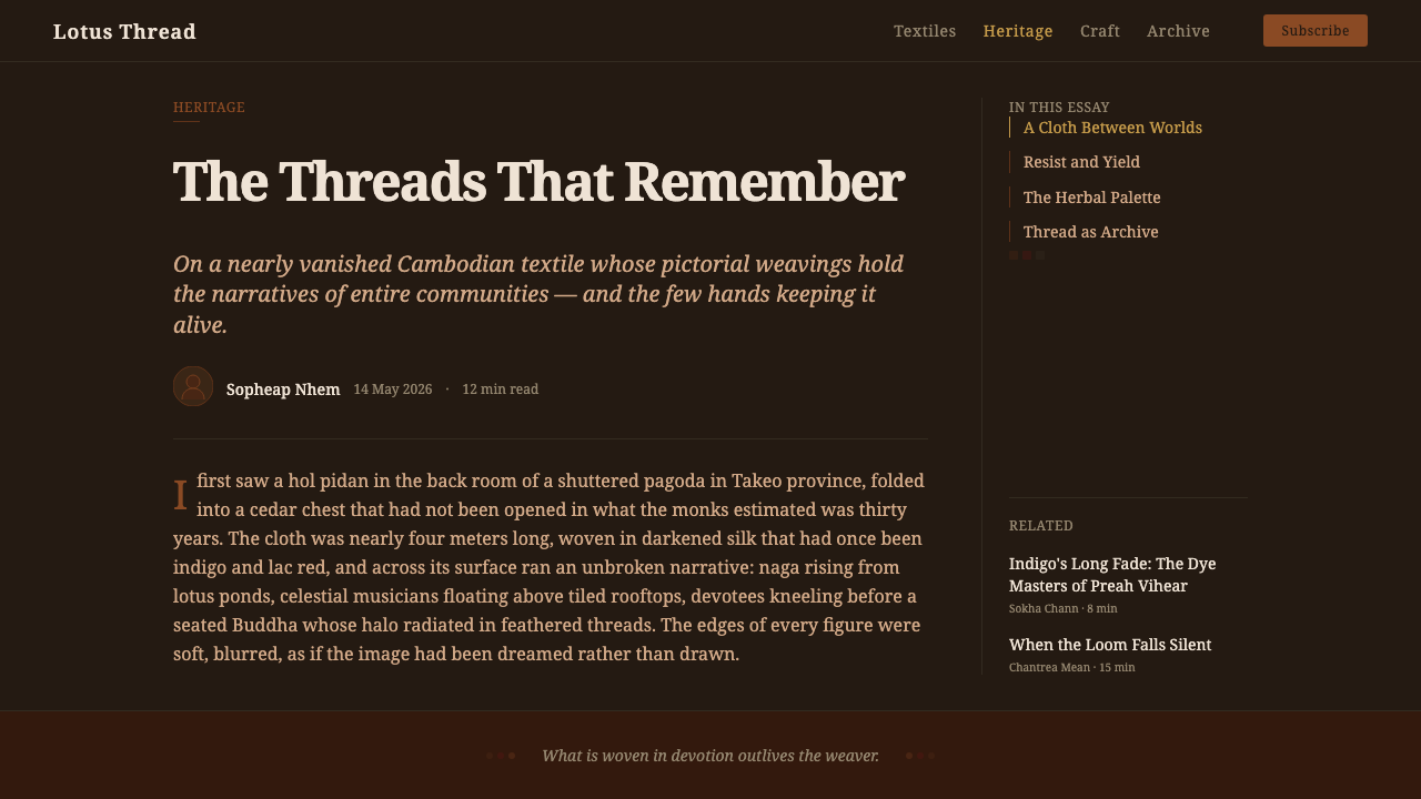
For editorial and marketing content, the style is strong for long-form writing about craft revival, religious textile traditions, or Southeast Asian material culture, where the reader benefits from understanding what a pidan is and why it looks the way it does. It is a poor fit for casual consumer marketing that would reduce a sacred object to generic pattern.
The most common mistake is rendering the pattern with crisp, vector-sharp edges instead of the soft feathering that defines authentic ikat — a mistake that erases the exact quality that makes this style recognizable. A second common mistake is treating the figural motifs as decorative 'ethnic pattern' without registering that they depict specific Buddhist narrative content, or brightening the palette into synthetic, high-saturation color that abandons the muted, natural-dye register the entire system depends on.
Cambodian Pidan Ikat — FAQ
What is ikat weaving, and how is weft ikat different from warp ikat?
Ikat is a family of resist-dyeing techniques in which sections of yarn are bound before weaving to block dye and build up a pattern, which only becomes visible once the dyed yarn is woven. In warp ikat, the pattern is pre-dyed into the lengthwise warp threads; in weft ikat, the technique used for pidan cloths, it is the crosswise weft threads that carry the pre-dyed pattern, which generally allows for more intricate, pictorial designs but demands a slower, more exacting weaving process to keep the pattern aligned.
What do the figures woven into a pidan typically depict?
The figural content is Theravada Buddhist in subject: celestial or divine beings, temple and palace architecture, animals, and scenes connected to narratives from the Buddha's lives, arranged in horizontal narrative bands and framed by geometric border patterns. The exact scenes vary between individual cloths, but the underlying purpose is consistently devotional rather than purely ornamental.
Why do the pattern edges look soft and blurred rather than crisp?
Because the pattern is dyed into the thread by hand before weaving, and hand-tied resist bindings can never register with total precision across successive dye baths. That small, inevitable misalignment produces the soft, feathered halo around every figure and band — a physical signature of the process itself, not a stylistic choice, and the detail most often lost when this style is imitated with a crisp, printed, or vector treatment.
Where were pidan cloths traditionally displayed, and who commissioned them?
A hol pidan was traditionally hung above or behind a Buddha image inside a Theravada pagoda, in an elevated position of religious significance. It was typically commissioned or woven by a family or community as an act of merit-making — a contribution to the temple — rather than produced as a commercial good for general sale, which is part of why individual weavers were rarely credited by name.
Given its sacred origin, is it appropriate to use this style for secular or commercial products?
It can be used respectfully, but it requires more care than a purely decorative pattern would: the style should be applied with real acknowledgment of what a pidan is and what it was made for, ideally in contexts — cultural storytelling, heritage commerce, considered craft or textile content — where that context can actually be communicated, rather than as an anonymous background texture on an unrelated product. Stripping the pattern of its meaning and using it as generic wallpaper is the outcome to actively avoid.
Related design styles
 Bagan Yun LacquerwareEngraved, not painted. Cinnabar, orpiment and jade hairlines polished from ne…
 Indonesian Pencak SilatHeld in stillness, drawn in gold. Songket thread glows on black silat garb un…
 Alchi Monastery MuralDevotional depth. Lapis fields and coffered grids glow on terracotta plaster.
 Yolngu Morning Star PoleCeremony becomes surface. Gold rarrk hatchwork climbs deep ochre-brown bands.
 Afghan Baluchi Prayer RugDevotional darkness glows. Plum field, oxblood mihrab, and camel borders surf…
 Armenian Khachkar Cross-StoneStone becomes memory. Tuff grey, pomegranate red, and carved borders hold the…