What is Bidar Bidriware Vessels?
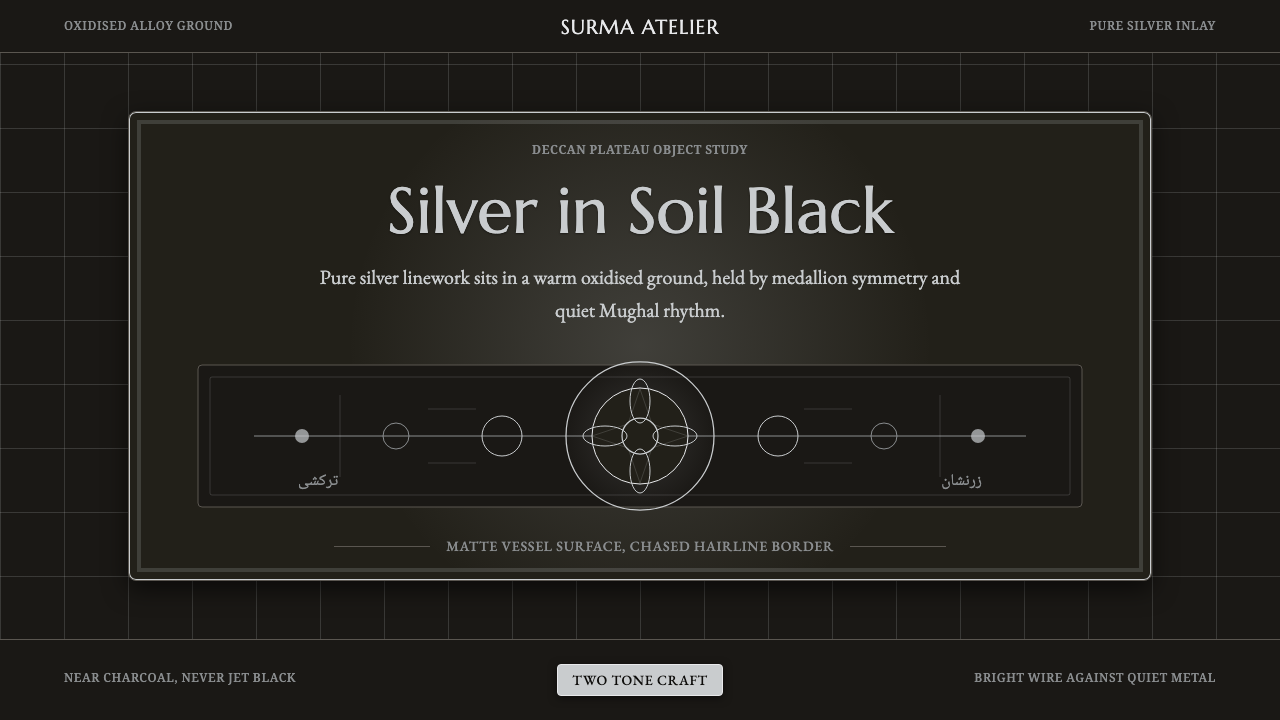
Bidriware turns a dull, blackened metal alloy into a canvas for silver so bright it looks inlaid with moonlight — a craft that has come out of a single town on the Deccan plateau for more than six centuries.
Bidar Bidriware Vessels in brief
Bidriware is a metal-inlay craft practiced in and named after Bidar, a town on the Deccan plateau in the state of Karnataka. Craftsmen cast vessels and objects — hookah bases, betel boxes, trays, jewelry caskets, decorative bowls — from an alloy of zinc and copper, then carve fine channels into the surface and hammer pure silver wire or sheet into those channels by hand. The surface is finally treated with a soil-and-mineral paste that oxidizes the exposed alloy to a deep, matte black, while the inlaid silver, protected from that reaction, stays bright.
The result is one of the starkest two-tone effects in any decorative metalcraft tradition: no bronze glow, no colored enamel, no gilding — only pure, blackened metal and pure, untouched silver, meeting at a hard edge with no transitional tone between them. Because the black is a chemical reaction rather than a paint or a patina applied on top, it never chips or flakes the way a lacquer finish would; the contrast is structural, built into the metal itself.
This design system distills that structural contrast into a digital palette: a warm, near-charcoal ground — never a flat, cold pure black — carrying crisp silver linework arranged in Persianate floral scrollwork, organized around a central medallion the way a finished Bidri platter organizes its pattern around the middle of the dish. The warmth in the dark ground matters: it is meant to read as oxidized metal rather than as a generic dark theme, and the silver should always look drawn rather than painted.
Where does Bidar Bidriware Vessels come from?
Bidriware's origins trace to the Bahmani Sultanate, which ruled a large swath of the Deccan from its capital at Bidar beginning in the fourteenth century. Tradition credits the craft's arrival to Persian metalworkers drawn to the Bahmani court — most closely associated with the reign of Sultan Ahmad Shah Al Wali in the early fifteenth century, a ruler known for actively recruiting artists, scholars, and craftsmen from Persia and Central Asia to build up Bidar as a cultural capital. Those imported metalworking techniques fused with local casting knowledge already present on the Deccan plateau to produce something genuinely new.
The craft's most distinctive technical secret is geographic rather than artistic: the blackening process depends on soil found only in and around the old Bidar fort, whose particular mineral composition is what drives the alloy's surface to oxidize into such a deep, consistent black. Artisans elsewhere have tried to replicate Bidriware using the same alloy and the same inlay technique, but without Bidar's specific soil the blackening never quite matches — which is part of why the craft has remained geographically anchored to one town for over six hundred years rather than spreading and fragmenting the way many decorative techniques do.
As Bahmani power fragmented in the early sixteenth century into five successor sultanates, Bidar itself came under the Barid Shahi dynasty, and Bidriware continued under their patronage and that of neighboring Deccani courts. The decorative vocabulary shifted over these centuries toward the floral idiom associated with Mughal and wider Persianate courtly taste — poppy blooms, cypress trees, paisley forms, and dense interlocking scrollwork — applied through two related inlay methods: a fine wire technique for delicate linear patterns and a heavier sheet technique for bolder, more solid motifs.
The craft survives today through a small number of hereditary artisan families still working in Bidar, passing the casting, engraving, and inlay skills down within workshops rather than through formal schools. Bidriware received Geographical Indication protection in 2006, formally tying the name to production within the Bidar region, and individual master craftsmen have received national recognition for sustaining a technique that modern industrial metalwork could easily have made extinct.
What defines the Bidar Bidriware Vessels look?
Color and Ground
The ground reads as a warm, near-charcoal black rather than a flat, neutral one — a residue of the fact that it comes from an oxidized metal alloy rather than a pigment. This warmth is what separates authentic Bidri-inspired work from a generic dark UI theme: the black should always feel like it has come from a physical material, faintly warm rather than cold and synthetic.
Silver Linework
Every accent in the system is rendered as a crisp, unwavering line, echoing the hand-hammered wire inlay of the original craft. Lines should look drawn with a steady hand — consistent weight, clean terminations, no fuzzy edges or glow — because in the physical object the silver is literally a solid wire pressed flush into a carved channel, not a soft highlight sitting on top of the surface.
Persianate Arabesque
Pattern vocabulary draws on the floral scrollwork shared across Persian and Mughal decorative traditions — stylized poppy blooms, cypress silhouettes, and continuous interlocking vines that fill a surface without ever quite repeating identically. The scrollwork should feel dense and confident rather than sparse; empty ground is used deliberately around a motif, not as an accidental gap in an unfinished pattern.
Medallion Symmetry
Historic Bidri platters and boxes organize their pattern around a central roundel, with the surrounding field built in radiating or mirrored symmetry outward from that center. Interface layouts drawing on this system benefit from the same logic — a strong, centered focal point with supporting content arranged in balanced, mirrored relation to it, rather than an off-center or purely asymmetric composition.
Two-Tone Discipline
The entire system runs on exactly two tones — dark ground and bright silver — with no third hue, no gold accent, no colored highlight. This restraint is the source of the craft's visual force: every additional color would dilute the stark, immediate contrast that makes even a small Bidri object legible from across a room.
Hairline Framing
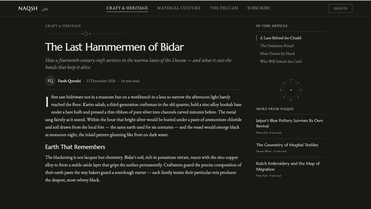
Panels, cards, and content blocks in this system take a thin, unbroken silver border rather than a thick frame or a colored fill — mirroring the way a finished Bidri object is often edged with a continuous fine band separating the patterned field from the vessel's rim. The border should read as a boundary line, not as a decorative thickness.
Who shaped Bidar Bidriware Vessels?
Ruling the Bahmani Sultanate from Bidar in the early fifteenth century, Ahmad Shah Al Wali actively recruited Persian and Central Asian artists, scholars, and craftsmen to his court, building Bidar into a cultural capital of the Deccan. His reign is the period tradition most closely associates with the arrival of the Persian metalworking knowledge that would fuse with local casting technique to produce Bidriware.
Bidriware has never been the work of a single named master but of workshop lineages in Bidar passing casting, engraving, and inlay skill down through families over generations. This hereditary, workshop-based transmission — rather than formal academic training — is why the craft's techniques remain so tightly concentrated in one town even after six centuries.
When the Bahmani Sultanate fragmented in the early sixteenth century, Bidar itself passed to the Barid Shahi dynasty, one of five successor states. Continued royal patronage under the Barid Shahis and neighboring Deccani courts kept Bidriware production active through the transition, embedding it as a signature craft of the region rather than letting it fade with the sultanate that had originally sponsored it.
A contemporary Bidar-based master craftsman honored with India's Padma Shri award for his lifelong work in Bidriware, Shah Rasheed Ahmed Quadri represents the small circle of living artisans keeping the centuries-old technique commercially and technically alive against the pressure of industrial manufacturing, and for training younger craftsmen to continue the hereditary line.
How do you use Bidar Bidriware Vessels today?
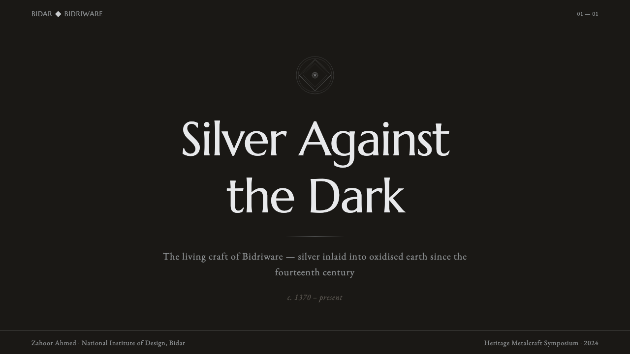
On presentation slides, this system reads best as a formal, high-contrast frame for content rather than a busy background. A cover slide works well with a centered medallion motif behind the title, rendered purely in silver linework against the charcoal ground. Content slides should keep the dark ground constant and use silver hairlines to separate sections rather than colored dividers; data slides benefit from the medallion logic too — a circular or radial chart reads naturally as the system's central roundel made functional.
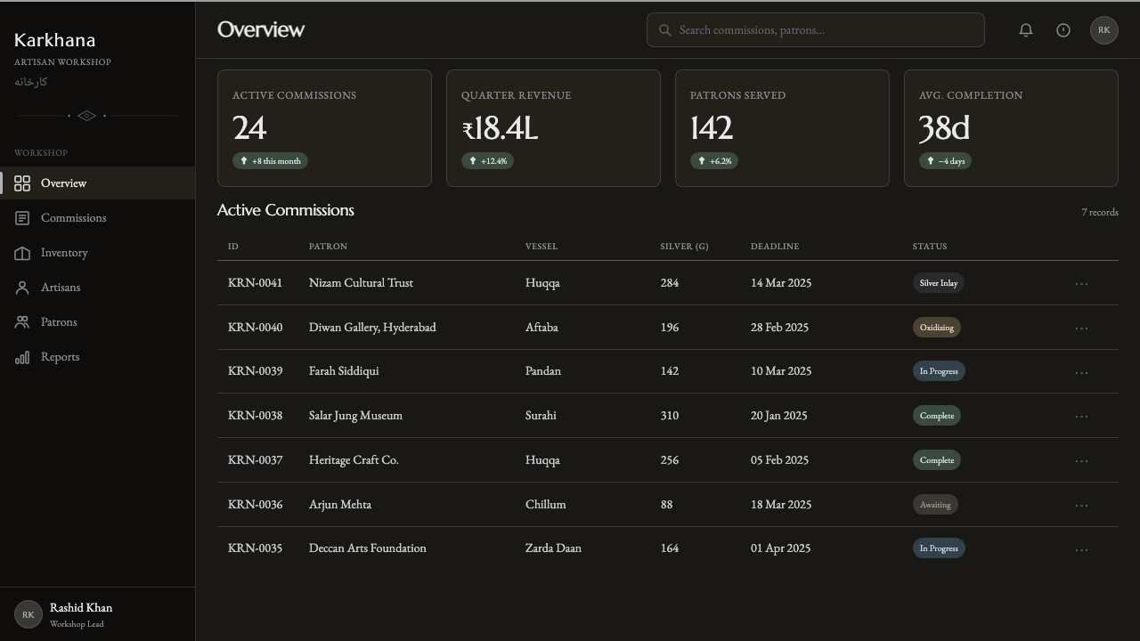
For dashboards and pricing pages, the two-tone discipline translates into a genuinely restrained dark UI: charcoal surfaces throughout, silver used exclusively for borders, icons, active states, and key numerals, with no secondary accent color introduced for alerts or highlights. Pricing tiers can be differentiated through line weight and ornamental density around each card rather than through color — a 'higher' tier earning a more elaborate scrollwork border rather than a brighter hue.
In editorial and marketing contexts, the arabesque patterning works well as a bordering device around a hero image or as a divider between article sections, but it should stay subordinate to a strong medallion or focal composition rather than tiling freely across a whole page, where dense scrollwork can start to feel like wallpaper rather than a considered accent. Pull quotes framed with a hairline silver border and set in the charcoal ground carry the two-tone contrast cleanly into long-form reading.
The most common mistake is treating this as simply 'dark mode with gold' — swapping the silver for a warm yellow-gold accent because gold reads as more universally luxurious. That substitution erases the specific material logic the system is built on: the contrast here is cool silver against warm dark metal, not gold against black, and gold immediately pulls the palette toward a generic luxury cliché rather than the precise, workshop-made feel of an inlaid object.
Bidar Bidriware Vessels — FAQ
Why is the dark ground described as 'never pure black'?
Because the black in real Bidriware is not a neutral pigment — it is the visible result of a metal alloy oxidizing, and oxidized metal carries a faint warmth that flat digital black does not. A pure, cold black reads as a generic dark-mode background; the warm near-charcoal the craft actually produces reads specifically as metal that has been treated, which is central to the material honesty the whole system is trying to preserve.
Can other colors be introduced alongside the silver and charcoal, for example for status indicators?
It works best if any additional color is treated as a rare exception rather than a regular part of the palette — a single small status dot or alert tone, used sparingly enough that it reads as an interruption to the two-tone system rather than a third permanent color. Introducing a full secondary palette of status colors quickly overwhelms the stark contrast that gives this system its identity.
Does the medallion-centered layout work for pages with a lot of unrelated content, like a blog feed?
The medallion logic is a compositional device for a single focal page — a cover, a hero section, a landing page — rather than a repeating content pattern. For a feed or list of many unrelated items, the system is better carried through the hairline borders, the two-tone discipline, and the arabesque used sparingly as section dividers, while reserving the actual medallion motif for one dominant moment on the page rather than repeating it per item.
How does this differ visually from generic 'dark mode with metallic accents' design?
Generic dark-with-metallic-accent design tends to scatter metallic highlights across many small elements — icon fills, gradient borders, glowing edges — as decoration. This system instead concentrates its silver into deliberate, continuous linework organized around symmetry and pattern density, closer to engraving than to highlighting. The difference is discipline: fewer metallic touches, each one doing real compositional work rather than simply adding shine.
What's the most common mistake when applying this system?
Treating the arabesque pattern as a texture to fill empty space rather than as a considered, symmetrical composition. When the scrollwork is scattered randomly or repeated as a seamless tiling background, it loses the hand-worked, deliberate quality of real Bidriware — where every line was carved and inlaid individually — and starts to read as generic 'ornamental' wallpaper instead of a specific craft tradition.
Related design styles
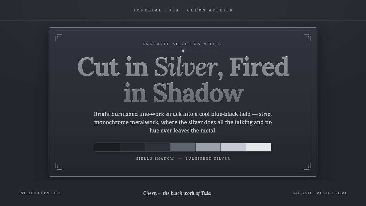 Tula Niello SilverStrict silver-on-shadow monochrome. Burnished line-work cut into a cool blue-…
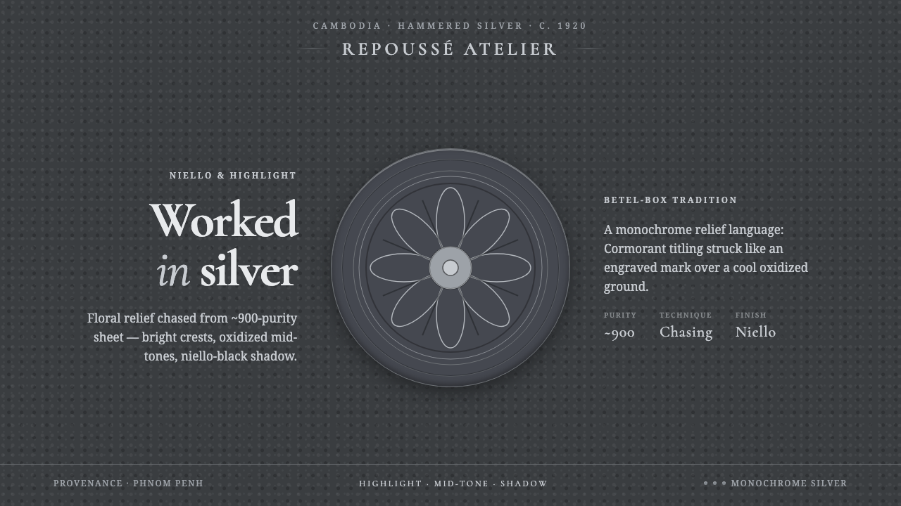 Khmer Silver RepousséHammered silver, on screen. Oxidized ground, bright highlight, niello-black r…
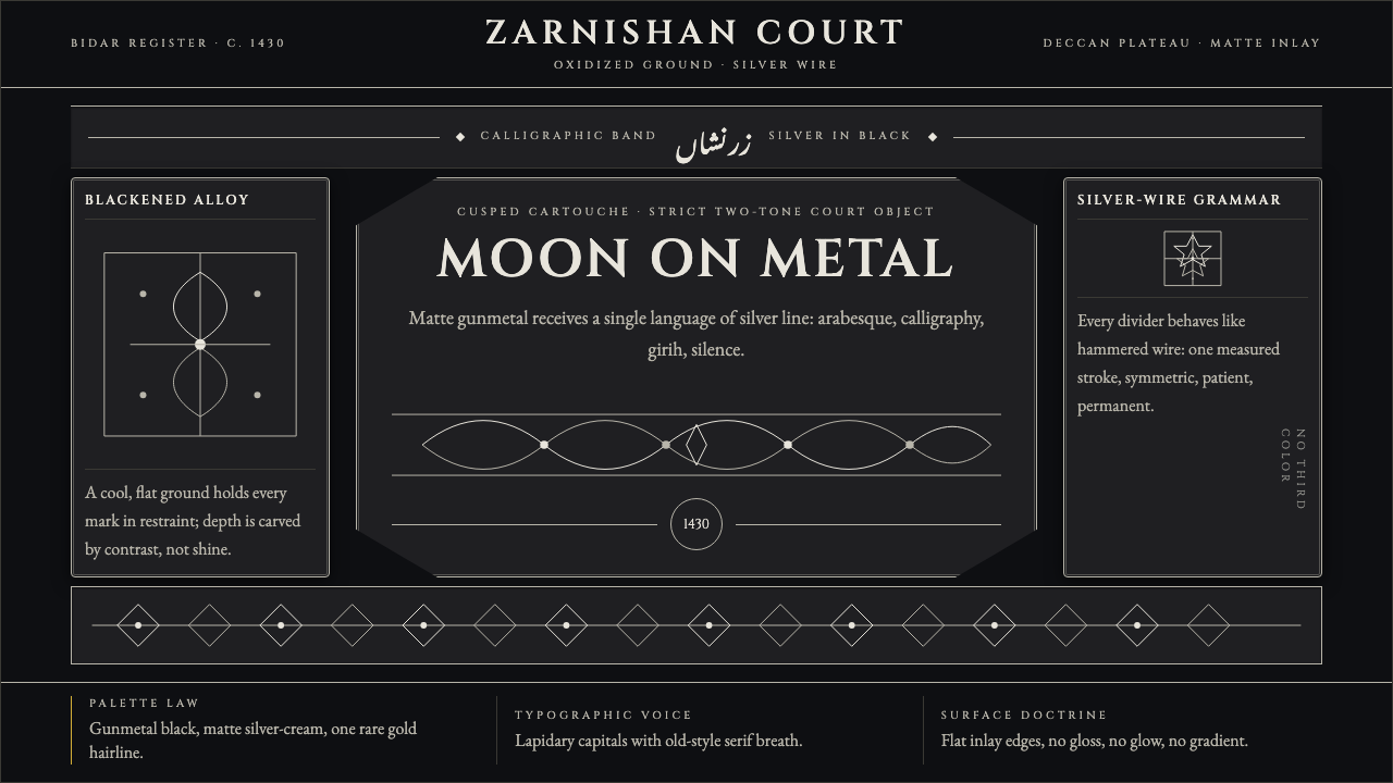 Bidri Deccan MetalworkCourtly darkness, tooled by silver. Cinzel caps and hairline arabesques cut g…
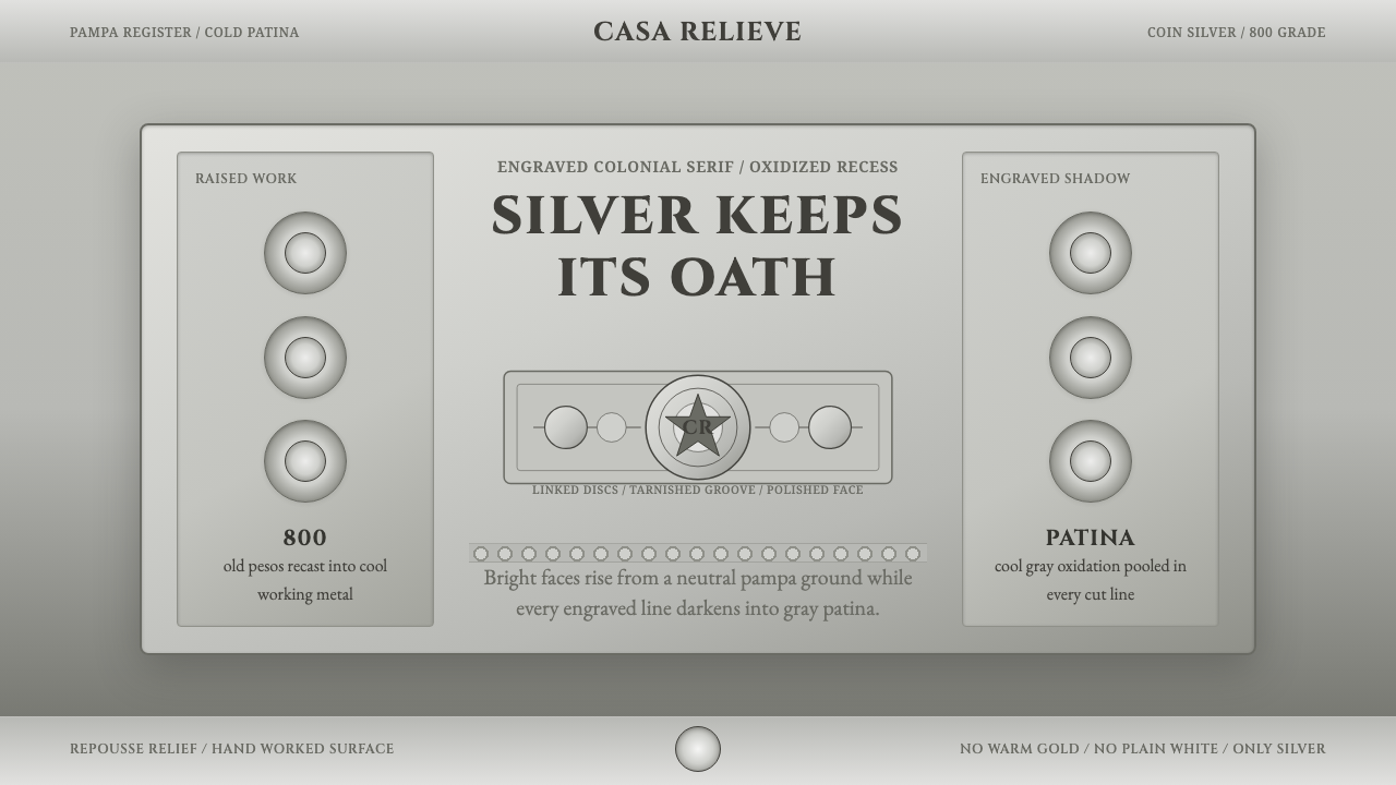 Criollo Silver GrayscaleCold luxury in aged silver. Cinzel capitals, rastra discs, and oxidized gray…
 Parsi Gara EmbroideryHeirloom needlework, made digital. Off-white silk vines glow over deep auberg…
 Thai NiellowareSpotless black, one bright line. Silver scrollwork engraved into near-lightle…