What is Criollo Silver Grayscale?
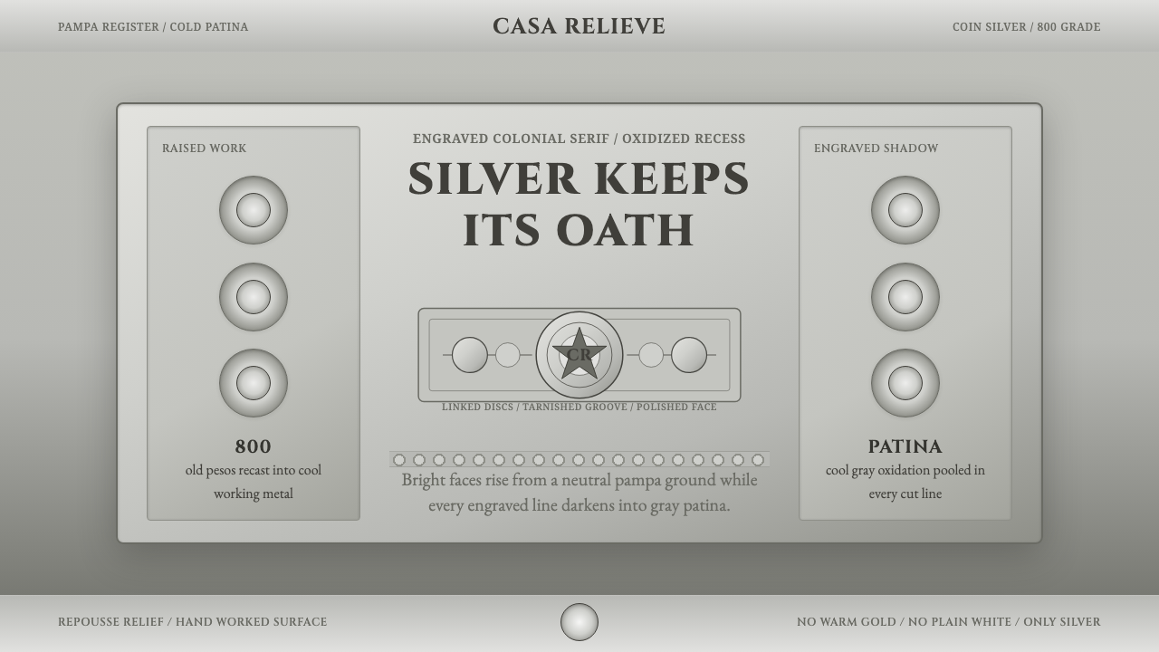
Gaucho silversmiths melted down old coin pesos and hammered them into cups, blades, and belt discs — and the cold shine of that metal became a design language of its own.
Criollo Silver Grayscale in brief
Criollo Silver Grayscale reconstructs the visual world of Argentine criollo silverwork — the hand-worked metal craft of the pampa's gaucho smiths, who transformed coin silver into mate cups, bombillas, facón daggers, and rastra belt discs through repoussé relief and fine engraving.
The system is built entirely in silver-gray tones rather than any warm metal palette: bright, polished silver at its highest points, darkening into oxidized gray patina wherever a line is engraved or recessed. This gradient from bright to tarnished is the system's central visual event, mimicking the way light and age actually interact with worked silver.
Typography follows the engraved, colonial-serif tradition of the pieces themselves — letterforms that look cut into metal rather than printed on paper. Nothing in this language is warm or golden; every surface, every shadow, every accent stays firmly within the cool grayscale range of aged silver.

Where does Criollo Silver Grayscale come from?
The gaucho — the horseman and cattle herder of the Argentine pampa — emerged as a distinct cultural figure over the eighteenth and nineteenth centuries, developing a material culture built around the practical objects of a mobile, ranching life: the mate gourd and its metal straw, the facón knife worn at the waist, the rastra belt with its row of decorative discs. By the late 1800s and into the early 1900s, criollo silversmiths — plateros criollos — had turned these everyday objects into a distinct craft tradition.
The silver itself often came from an unlikely source: old coin pesos, melted down and reworked into raw material of roughly 800-grade purity — not the finest possible silver, but consistent, workable, and drawn from currency already in circulation across the region. This gave criollo silverwork a specific material logic distinct from European fine-silver traditions: it was frontier metalwork, made from money itself, worked by hand rather than cast in a factory.
The technique combined repoussé — hammering relief designs from the reverse side of a sheet of metal to raise a pattern on the front — with fine engraving cut directly into the polished surface. This combination produced pieces with genuine three-dimensional relief alongside crisp linear detail, a material richness achieved through purely manual skill rather than mechanical reproduction. The engraved lines, in particular, aged in a specific way: polished silver oxidizes faster in recessed grooves than on raised, frequently handled surfaces, so over decades every engraved piece developed a natural contrast between bright highlight and dark, tarnished line work.
This craft drew on a broader Spanish-colonial engraving heritage brought to South America through centuries of colonial metalwork and decorative tradition, adapted by criollo smiths into a distinctly local vocabulary suited to gaucho life: mate cups sized for communal drinking, bombillas built for function as much as display, facón blades and rastra discs that served as both tool and status marker on the open pampa.
What defines the Criollo Silver Grayscale look?
Color
The palette is a strict silver-gray range, running from bright polished highlight through mid-tone metal to deep oxidized shadow. There is no warm hue anywhere in the system — no gold, no bronze, no cream. Every accent and shadow stays within this cool grayscale, mirroring the literal material of worked silver.
Bright-to-Tarnished Gradient
The system's signature effect is a gradient running from bright polished silver to darkened, oxidized gray, applied wherever a surface transitions from raised to recessed. This is not a generic metallic gradient but a specific replication of how engraved silver actually ages — recessed lines darken faster than exposed, handled surfaces.
Typography
Letterforms follow an engraved colonial-serif tradition — capitals with the crisp, cut quality of Cinzel-style engraving letterforms, evoking type that has been chiseled into metal rather than set in ink. This gives headline treatments in particular a distinctly worked, dimensional quality.
Repoussé Relief
Raised, dimensional relief patterns — the hallmark of repoussé technique — give the system a genuine sense of physical depth rather than flat surface decoration. Interface elements can echo this quality through subtle raised-edge treatments that suggest hammered metal rather than printed pattern.
Fine Engraving
Delicate incised lines — finer and more linear than the raised repoussé relief — carry decorative detail across every surface. These engraved lines are where the system's darkest oxidized tones concentrate, creating the crisp, dark linework that defines the style's graphic character.
Coin-Silver Origin
The material logic underlying this system traces back to coin silver — currency melted and reworked into craft material — giving the style a specific frontier, hand-worked authenticity distinct from fine European silversmithing traditions. This origin favors a slightly rougher, more matte polish rather than a mirror-bright, jeweler's finish.
Rastra Disc Motif
The circular, engraved disc format of the gaucho belt's rastra ornaments provides a recurring compositional device — round, medallion-like elements bearing fine engraved detail, suitable as icons, badges, or focal graphic devices within the system.

Who shaped Criollo Silver Grayscale?
The criollo silversmiths of the Argentine pampa developed this entire craft tradition, melting coin silver into raw material and hand-working it into mate cups, bombillas, facón daggers, and rastra discs through repoussé and fine engraving. Their technique — and the natural patina it produces over decades — is the direct visual source for this design system.
How do you use Criollo Silver Grayscale today?
This system rewards restraint and material honesty — its authority comes from mimicking real, worked metal rather than a generic metallic filter, and applying it well means respecting the strict silver-gray range throughout.
For presentation slides, the style suits luxury, craft, heritage, or artisanal-brand content well. Cover slides can use a large engraved-disc motif with the bright-to-tarnished gradient as a focal device, while content slides should keep typography in the engraved colonial-serif voice, with fine hairline rules echoing the engraving technique rather than bold modern dividers.
For web interfaces, the palette works well for luxury goods, artisan marketplaces, or heritage-craft product pages where a cool, refined materiality matters more than warmth. Backgrounds should stay in mid-tone silver-gray rather than shifting to pure white; buttons and key elements can use the bright-to-tarnished gradient to suggest dimensional metal; typography should stay in the engraved serif family throughout.
For editorial and marketing work, the style suits storytelling about craft, heritage silverwork, or South American cultural history particularly well. Photography should be treated with cool, neutral lighting rather than warm tones, keeping the material's inherent coolness intact rather than warming it toward gold or bronze.
A common mistake when applying this system is warming the palette toward gold or bronze to make it feel more 'luxurious' — this breaks the entire logic of the style, which depends specifically on silver's coolness. Equally common is flattening the bright-to-tarnished gradient into a single flat gray, which loses the dimensional, hand-worked quality that gives the system its authenticity.

Criollo Silver Grayscale — FAQ
Why is the palette strictly grayscale rather than including any silver-blue or silver-gold undertones?
Because the system is modeling a specific real material — coin silver worked and oxidized over decades — and that material's natural color range stays within cool gray tones. Introducing a blue or gold undertone would push the palette toward a generic 'metallic' effect rather than the specific, historically grounded silverwork this style reconstructs.
What is the significance of using coin silver rather than fine silver?
Coin silver at roughly 800-grade purity reflects the actual material history of gaucho silverwork, which grew out of melting down circulating currency rather than sourcing dedicated fine-silver stock. This gives the craft — and the design system derived from it — a frontier, resourceful character distinct from more refined European silversmithing traditions.
Why does the engraved detail matter so much to the overall look?
Engraved lines are where the system's characteristic bright-to-tarnished contrast concentrates — recessed grooves oxidize faster than raised, handled surfaces, producing the dark, crisp linework visible on any authentically aged piece. Without that engraved detail, the design loses the specific visual signature that distinguishes real worked silver from a flat metallic surface.
Does this style suit warm, food-related, or hospitality branding?
Not naturally, since its entire identity depends on a cool, silver-specific material logic rather than warmth or organic texture. It suits luxury goods, craft heritage, jewelry, and cultural or historical storytelling far better than food or hospitality contexts, which typically benefit from warmer, more inviting palettes.
Related design styles
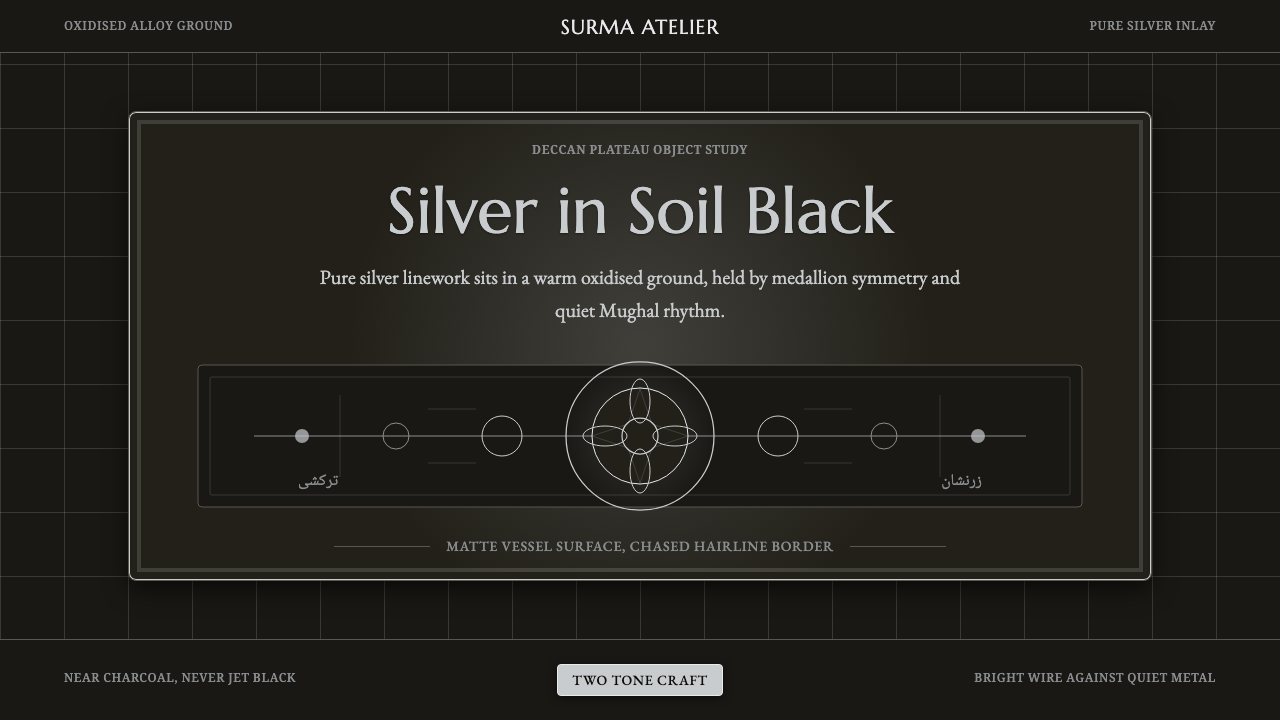 Bidar Bidriware VesselsSoil-black luxury. Crisp silver medallions and hairline borders cut the warm…
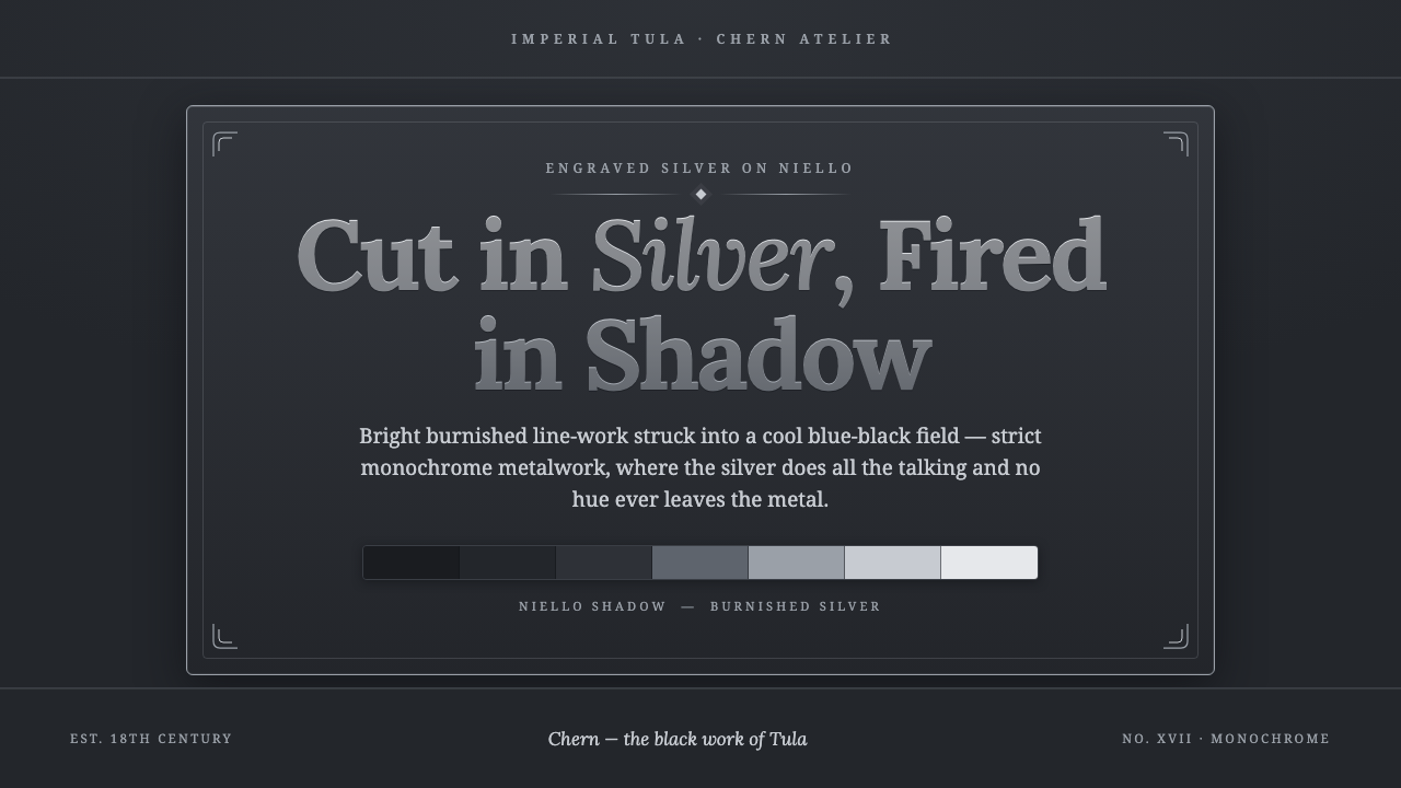 Tula Niello SilverStrict silver-on-shadow monochrome. Burnished line-work cut into a cool blue-…
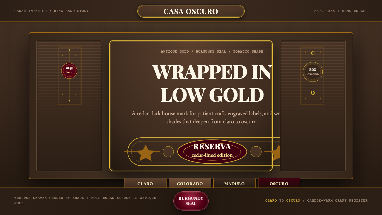 Cuban Habano CigarLuxury sleeps in shadow. Tobacco brown, antique gold rules, and burgundy seal…
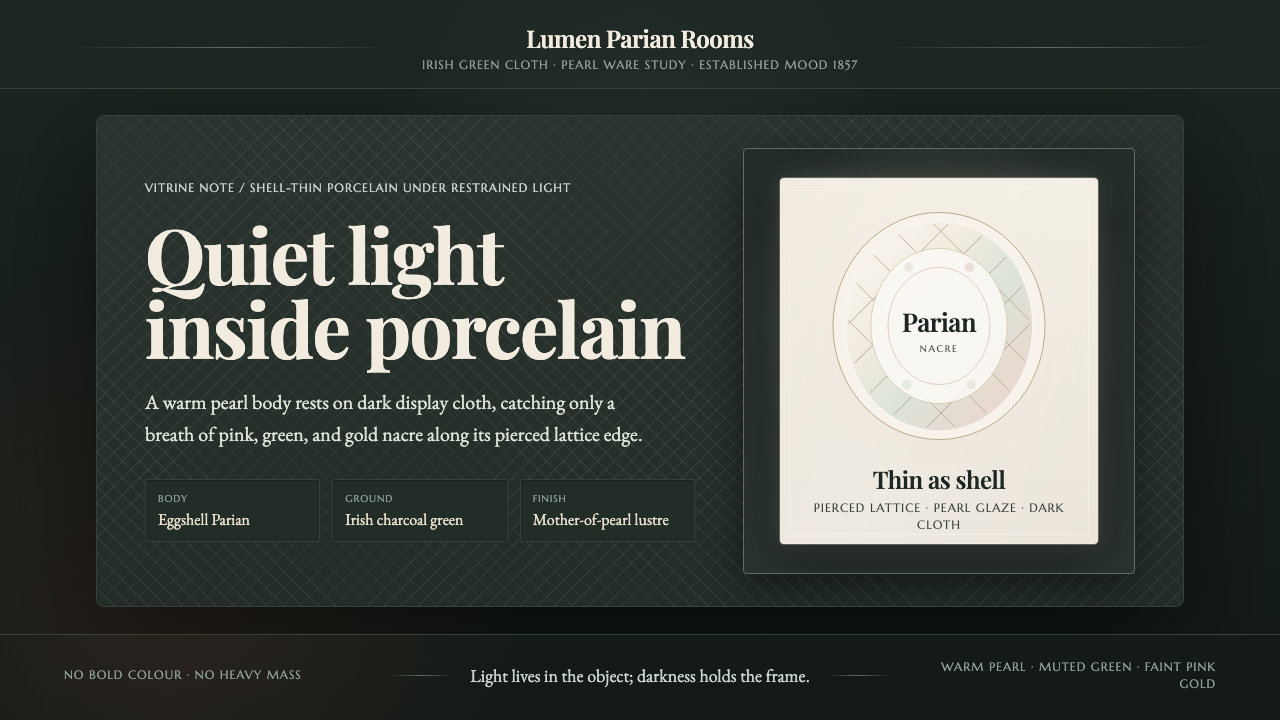 Belleek Parian ChinaPorcelain glows in restraint. Pearl white, nacre tints, and lattice sit on da…
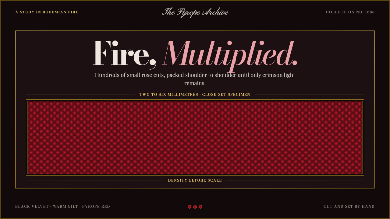 Bohemian GarnetFire thrives in density. Tiny pyrope facets pack tight against black velvet a…
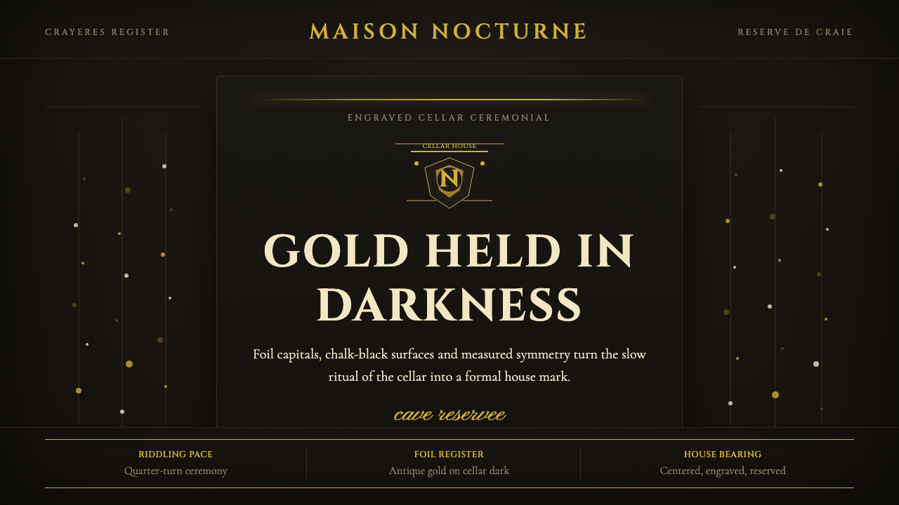 Champagne MaisonGrandeur without glitter. Cinzel capitals and gold foil rules glow in cellar…